Landing Page Optimisation: How Small Changes Drive Big Results
Landing page optimisation is a core discipline of Conversion Rate Optimisation (CRO) focused on systematically improving a page’s ability to turn visitors into customers.
For 2026, this moves beyond minor tweaks, focusing instead on fundamental elements: ensuring message match with the ad, crafting a clear value proposition, providing strong social proof, and designing a frictionless call-to-action (CTA).
A/B testing is then used not for random guesses, but as a scientific tool to validate significant changes to these core components, ensuring that improvements drive measurable lifts in conversion rates.
- Prioritise a compelling, clear offer and value proposition before design — the offer drives 80% of conversion success.
- Ensure 5-second clarity in the hero: headline, sub-headline and contextual hero shot must answer who, what and why.
- Build trust and remove friction with robust social proof, guarantees, minimal distractions and a single focused CTA.
The Truth About Your “Optimisation” Efforts
Most small business owners are trapped in a cycle of “Best Practice Paralysis.” They’re drowning in a sea of contradictory advice: “make your page longer,” “no, shorter,” “use a video,” “no, videos distract.”
This leads to the most pointless debate in marketing: the button colour myth.
The idea that changing your button from green to orange will magically unlock a flood of new customers is a fantasy. It’s a convenient distraction from the real problem. The issue isn’t the colour of your button; nobody has a compelling reason to click it in the first place.
The solution is to stop thinking like a tweaker and start thinking like a strategist. We’re going to use the Message-First Framework. It’s simple: get the offer and message before considering design details.
Step 1: Nailing the Offer (Before You Touch Anything Else)
Your offer is 80% of the battle. You could have the most beautifully designed landing page in the world, but it cannot sell something nobody wants. A great page can’t save a bad offer, but a great offer can succeed even with a mediocre page.
Optimisation starts here.

Is Your Value Proposition Actually Valuable?
A value proposition is the promise of value to be delivered. It’s the primary reason a prospect should buy from you. Boiled down, it answers three questions:
- What do I get? (The result)
- How do I get it? (The product/service)
- Why should I get it from you? (The unique differentiator)
To figure yours out, use the “So What?” Test. Read every product or service feature and aggressively ask, “So what?” until you arrive at a tangible benefit.
- “We use German-engineered 5-blade cartridges.”
- So what?
- “They provide a closer shave.”
- So what?
- “You get a smoother face with less irritation.”
That last part is the value.
Harry’s Razors built an empire on this clarity. Their early proposition wasn’t about blade technology but: “Quality razors, fair price, delivered.” That’s the offer. Everything else is just a detail.
Step 2: The 5-Second Clarity Test
When someone lands on your page, a timer starts. You have about five seconds to answer three questions in their head:
- Where am I?
- What can I do here?
- Why should I do it?
If you fail, they click the back button, and you cease to exist in their world. The part of your page responsible for this heavy lifting is the “hero section”—the first thing they see without scrolling.
The Holy Trinity of the Hero Section
Your hero section needs three core components working in perfect harmony.
The Headline: This is not the place for your company name or a clever pun. Your headline has one job: communicate the primary benefit. A great headline must be clear, compelling, and concise.
When Dropbox launched, their headline wasn’t “Cloud Storage Synchronisation Solutions.” It was: “Sync your files online and across computers.” It describes the outcome, not the technology.
The Sub-headline The sub-headline is a single sentence that expands on the headline. It can add a crucial detail, introduce a secondary benefit, or overcome a primary objection.
- Headline: The Easiest Way to Create Professional Invoices.
- Sub-headline: Get paid 3x faster with automated reminders and online payments.
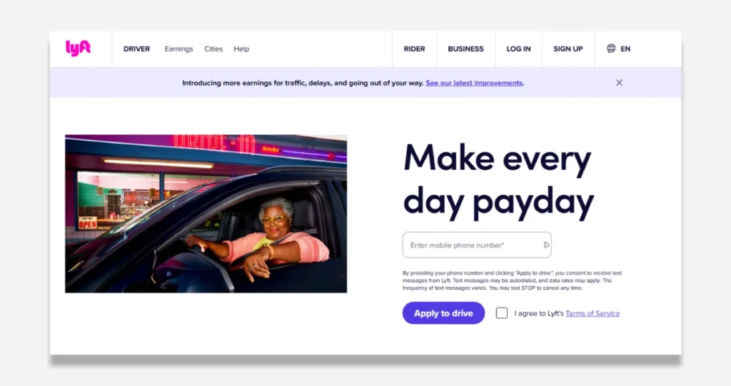
The Hero Shot: This is your main image or video. And please, for the love of all that is good, do not use a generic stock photo of people in a boardroom. It’s a visual cliché that instantly destroys credibility.
Your hero shot must add context. Show your product in action. Show the happy customer experiencing the result of your service. Show a real person, not a model who is “very excited about salad.” Airbnb’s landing page works because it shows you exactly what you dream of: a beautiful, real destination you could be staying in.
Step 3: Building Unshakeable Trust (Because Nobody Trusts You)
The default state of an internet user is scepticism. They assume you will spam them, overcharge them, or deliver a shoddy product. Your landing page’s job is to dismantle this wall of doubt systematically.
This is done by layering in trust signals.
Social Proof Isn’t Just Testimonials
A few cherry-picked quotes are a start, but actual social proof is more robust. It’s about showing that other people—real people—have used and valued what you offer.
Consider using several types of social proof:
- Direct Testimonials: Use full names, photos, and company names if possible. A quote from “John S.” is almost useless. A quote from “John Smith, Owner of Acme Widgets” is powerful.
- Case Studies: Show a clear “before and after” transformation. Data and numbers are your friends here. “We helped our client increase leads by 150%.”
- “As Seen On” Logos: If you’ve been featured in reputable publications, borrow their authority by displaying their logos.
- User Counts: Numbers imply safety. “Join 25,000+ other entrepreneurs” feels much safer than being the first one through the door.
- Star Ratings & Reviews: Display them prominently if you have them on third-party sites (Google, Trustpilot).
Displaying Trust Seals and Guarantees
These are small but mighty friction reducers.
- Security Logos: If you’re taking payments, show logos like Norton, McAfee, or an SSL certificate badge.
- Money-Back Guarantees: The ultimate risk-reversal. A 30-day, no-questions-asked guarantee can dramatically increase conversions by removing the fear of making mistakes.
- Privacy Policies: A clear link to your privacy policy and a statement like “We’ll never share your email” near a form can ease anxiety.
Step 4: Engineering the “Yes” – The Call to Action
Your Call to Action (CTA) isn’t just a button. It is the logical, inevitable conclusion to the argument you’ve been building on the rest of the page. If your offer is clear and your trust is established, clicking the button should be the natural next step.
One Page, One Goal. Period.
The single biggest mistake on landing pages is a lack of focus. A landing page that captures webinar sign-ups should not have links to your “About Us” page, blog, or company history in the main navigation.
Every element on the page that does not contribute to the primary goal is a distraction that must be removed. Your landing page should be a dead end with only one way out: through the CTA.
Writing Button Copy That Doesn’t Suck
“Submit” is not compelling copy. “Click Here” is lazy.
Your button text should complete the phrase: “I want to…” This forces you to write from the user’s perspective and focus on the value they will receive.
- Instead of “Download,” use “Get My Free Guide”. (I want to get my free guide.)
- Instead of “Subscribe,” use “Send Me the Tips”. (I want you to send me the tips.)
- Instead of “Submit,” use “Request My Free Quote”. (I want to request a free quote.)
The copy should describe what the user gets, not their actions.
Hook Point: How to Stand Out in a 3-Second World
In a world of infinite content, you have three seconds to not be invisible. You’re losing that battle. This book provides the strategies to win. It’s the guide to crafting powerful ‘Hook Points’ that stop the scroll and force people to pay attention. Don’t just be in the feed; be the reason they stop.
As an Amazon Partner, when you buy through our links, we may earn a commission.
Okay, Now You Can Start “Optimising”
Once your offer is irresistible, your message is crystal clear, your page builds trust, and your CTA is focused, only then should you consider the finer points of optimisation.
Doing this stuff first is a fool’s errand. Doing it now can provide incremental gains.
Forget A/B Testing (Unless You Have This)
Here’s a hard truth: A/B testing is statistically meaningless without a high volume of traffic and conversions. You often need thousands of conversions per variation to get a reliable result. Most small businesses simply don’t have that traffic.
Instead of testing, talk to people.
- Ask new customers why they signed up.
- Use a tool like Hotjar to watch session recordings and see where people get stuck.
- Send a survey to people who didn’t convert and ask what stopped them.
Qualitative feedback from five users is infinitely more valuable than a statistically insignificant A/B test. It will reveal the real “why” behind user behaviour.
Cut the Friction, Not Just the Words
Optimisation is often an act of removal. Your goal is to create the smoothest possible path from visitor to lead. Actively hunt for and destroy points of friction.
Common friction points include:
- Unnecessary Form Fields: Do you need a phone number and company size to send an ebook? Every additional field you ask for will reduce your conversion rate. Be ruthless.
- Slow Page Speed: People are impatient. A 1-second delay in page load time can reduce conversions by up to 7%. Use Google’s PageSpeed Insights tool to check your performance.
- Mobile Experience: Does your page look and work perfectly on a phone? Pinching and zooming to fill out a form is a massive friction point.
- Hidden or Confusing Pricing: Be upfront about costs. Surprising someone with a price at the last second is a surefire way to lose their trust and the sale.
This is where professional web design becomes less expensive and more of an investment. A clean user path is non-negotiable for a page designed to convert.

Your Landing Page Is a Product, Not a Pamphlet
Stop treating your landing page like a static brochure you create once and then forget. Treat it like a product.
It has a job to do. It serves a customer. And it should be constantly improved based on honest feedback and performance data.
The goal isn’t to create a “perfect” page based on some guru’s checklist. The goal is to create a page that works for your audience. A clear page that builds trust and that respectfully guides a visitor toward a solution to their problem.
Stop tweaking button colours and start clarifying your message. The results will be far more significant.
If you’re tired of guessing and want a professional eye on what your page needs to connect with customers, we do that. You can request a quote, and we’ll tell you the truth; no fluff is included.
Frequently Asked Questions about Landing Page Optimisation
What is landing page optimisation?
Landing page optimisation is improving elements on a standalone webpage to increase the percentage of visitors who complete a specific desired action, known as a conversion. This involves refining the offer, message, design, and user experience.
Why is landing page optimisation important?
It is essential because it allows you to maximise the value of the traffic you already have. By improving your conversion rate, you can generate more leads or sales from the same number of visitors, increasing the ROI of your marketing efforts.
What is a reasonable conversion rate for a landing page?
A “good” conversion rate varies wildly by industry, traffic source, and offer. However, a general benchmark often cited is between 2% and 5%. High-performing pages can reach 10% or higher, but focusing on continuous improvement over hitting a specific number is more productive.
How is a landing page different from a homepage?
A homepage is a general gateway to a website, with multiple links and goals (e.g., learn about the company, browse products, read the blog). A landing page is a specialist; it has one goal and is designed to eliminate distractions and guide the user toward that specific action.
What are the most essential elements of a landing page?
The most critical aspects are the Value Proposition (the offer), the Headline (the first thing people read), the Hero Shot (the primary visual), Social Proof (testimonials, reviews), and the Call to Action (the button or form).
Should I use A/B testing on my landing page?
Use A/B testing only if you have substantial traffic and conversions (typically 1,000+ monthly). For most small businesses, gathering qualitative feedback through user surveys, interviews, and session recordings will provide more actionable insights.
How does page speed affect landing page conversions?
Page speed has a direct impact on conversions. Studies show that even a 1-second delay can decrease conversions by 7%. A slow page leads to higher bounce rates as impatient users leave before the content loads.
What is “above the fold”, and is it still important?
“Above the fold” refers to the portion of the page visible without scrolling. It is still critically important because it’s your first and best chance to convince a visitor to stay. Your core value proposition and headline must be visible immediately.
Should I remove navigation from my landing page?
Yes, in most cases. Removing the main website navigation from a landing page is a best practice. It reduces distractions and focuses the user’s attention on the single conversion goal, a “attention ratio.”
How long should my landing page be?
The length should be as long as it needs to be to persuasively make your case and no longer. A short page may suffice for a simple, low-commitment offer (like a free ebook). For a complex, high-priced product, a longer page with more detail, testimonials, and FAQ answers may be necessary to overcome objections.
What’s the biggest mistake people make with landing pages?
The biggest mistake is a lack of clarity. This can be a confusing offer, a vague headline, or multiple competing calls to action. The page has failed if a visitor can’t understand what you’re offering and why it matters within five seconds.
Can I optimise my landing page for SEO?
Yes, you can. While many landing pages are for paid campaigns, you can optimise them by including relevant keywords in your headline and copy, optimising images, and ensuring fast load times. However, the primary focus should always be on conversion, not just traffic.
Your website visitors are busy. Their attention is the most valuable currency you have. A clear, focused landing page respects their time and guides them directly to a solution. If you’re ready to build pages that don’t just look good but actually work, explore the approach behind our web design services.


