History of the BMW Logo Design: A Century of Evolution
The history of the BMW logo design begins with the iconic blue and white roundel, first registered in 1917, evolving from the logo of its predecessor, Rapp Motorenwerke.
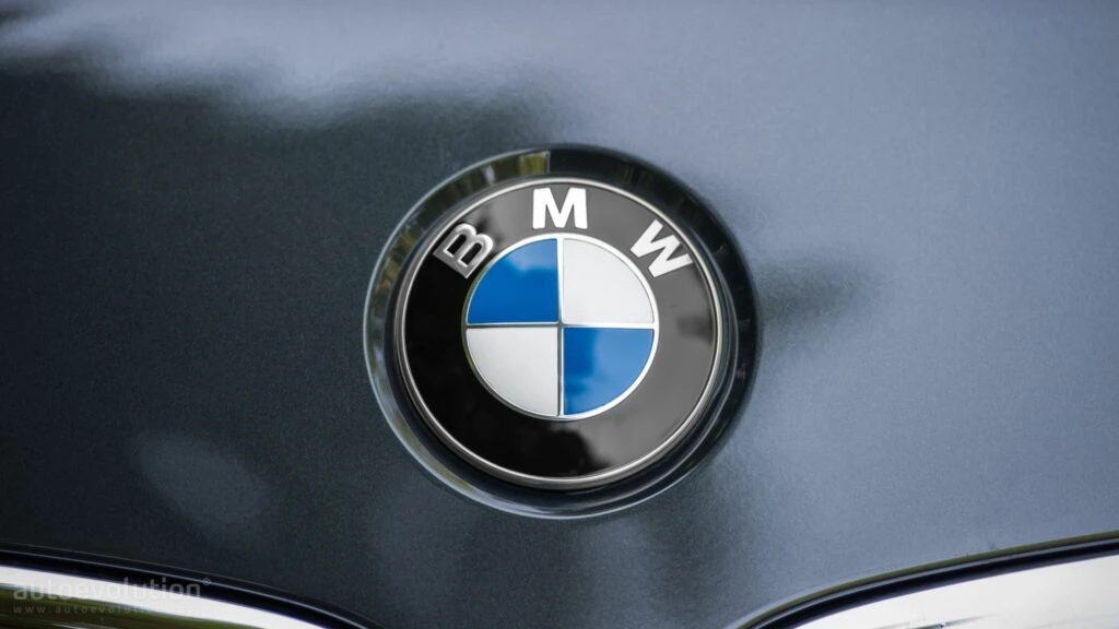
The colours represent the flag of Bavaria, BMW’s home state, though often mistakenly interpreted as a spinning propeller—a myth originating from a 1929 ad.
The logo has undergone subtle refinements, including serif changes and the modern flat design introduced in 2020, consistently symbolising German engineering and performance.
- The BMW logo has evolved significantly since its inception as a propeller design in 1917.
- In 1953, the reimagined logo showcased speed with new design elements inspired by racing.
- The 1966 roundel emphasised simplicity, reinforcing BMW's identity as a premier automaker.
- Currently, BMW modernises its logo for digital use while maintaining its rich heritage.
From Planes to Automobiles: The Early Days of BMW
It may surprise some that BMW did not start manufacturing luxury vehicles.
The company dates back to 1916 as an aircraft engine factory in Munich, Germany, called Bayerische Flugzeugwerke AG. They specialised in building engines for the German Air Force during World War I.
In 1917, the company logo was born when founder Karl Rapp designed an advertisement poster with a black propeller spinning against a blue sky backdrop. This iconic colour scheme is said to have been inspired by the Bavarian flag, giving the nod to the company’s home base.
Funny thing is, for decades, almost everyone believed the logo was a spinning propeller against a blue sky. It’s a fantastic story, but it’s not quite the real one.
This whole idea really took off because of a BMW advert back in 1929. To promote a new aircraft engine, they cleverly showed the logo laid over a rotating propeller.
The image was so powerful that the myth just stuck. BMW even let the story run for years because, let’s be honest, it was brilliant marketing.
They have since clarified that the design is 100% a tribute to the blue and white colours of the Bavarian flag. It’s about heritage, not propellers.
When the war ended in 1918, Germany was forbidden from manufacturing aeroplanes under the Treaty of Versailles. So, the company shifted its focus to building railway brakes and motorcycle engines to stay afloat during difficult postwar economic conditions.
In 1922, the firm evolved into the Bayerische Motoren Werke AG, or Bavarian Motor Works, which became known by its acronym BMW.
1928-1945: The First BMW Automobile Logo Debuts
In 1928, BMW made its first foray into automobile manufacturing when it purchased the Fahrzeugfabrik Eisenach car company. This takeover resulted in BMW’s first automotive logo design being unveiled in 1929.
The inaugural BMW car emblem was a simplified variant of Karl Rapp’s original propeller poster, with the four quadrants removed. The remaining blue and white roundel had sharp, sleek contours – a modern representation of the BMW identity.
This logo appeared prominently on BMW’s first production automobile, the Dixi 3/15. Underneath the roundel sat two capital letters in an arched typeface that spelt out the company name, Bayerische Motoren Werke.
Over the next decade, the core elements of the logo design remained, including the iconic blue and white colour scheme. However, the proportions, borders, typefaces, and dimensions underwent tweaking and polishing during the 1930s.
Then, in 1942, the headquarters in Munich instructed all company locations to standardise the BMW trademark across all communications and products. This brought consistent rules around sizing ratios, allowable typefaces, space around the roundel, and colour tones.
Interestingly, during World War II, BMW was required to halt automotive manufacturing from 1941 to 1945. Instead, they focused on German war production, making aircraft engines, motorcycles, pots and pans. Despite diversifying into other industries, the BMW logo still represented the promise of future automotive innovation.
Bringing Gorgeous Movement to Modern BMWs in the 1950s
When BMW resumed automobile production in 1952 after the war, the world was again hungry for German engineering and style.
BMW unveiled an entirely reimagined logo in 1953 to herald its triumphant return. Dubbed the “Uberkaro” pattern, the design was intended to embody speed and motion.
Inspired by the striped pattern on classic race cars, Uberkaro featured two opposing sets of 4 blue and silver lines sweeping around a black roundel. For the first time, the inner white area showcased the BMW initials and the entire “Bayerische Motoren Werke” name wrapped around the top.
The following double-stripe frame was widely celebrated for capturing BMW’s identity as a dynamic automotive brand born with racing in its blood. Auto historians view its vortex-like movement as some of the earliest “car jewellery.”
By the late 1950s, however, BMW realised that the ornate Uberkaro design did not translate well when printed small or rendered monochromatically. Seeking maximum visual impact and reproduction clarity, they set out to craft an evolved look for the new decade.
1960s Refinement Towards Today’s Iconic Style
In the 1960s, BMW sought to craft a distinctive yet minimalist branding image. After much experimentation, they finally landed on the timeless white and blue roundel we all recognise today in 1966.
Gone were the intricate silver stripes that proved hard to reproduce. They were replaced by a uniform royal blue hue ringing the perimeter. While the interior remained white, the text was removed to eliminate clutter and maximise stand-out appeal. A refreshing flattened silhouette replaced the former dimensional drop shadow as well.
This crisp, clean style conveyed BMW’s identity as an automaker producing well-engineered “driving machines.” The logo was well-positioned to become a globally admired iconography heading into the 1970s and 80s.
There have been minor variations in roundel dimensions and lettering rules over the decades. The letters “BMW” were notably integrated into specific model badges in the 1990s.
But the essential 1966 design ethos valuing legibility and stripped-down eloquence continues to drive BMW logo design over 50 years later. It remains a shining example of a brand evolving towards timeless visual distillation.
The Birth of the Motorsport Division Emblem
Then in 1972, things got even more interesting. BMW created its official racing division, BMW Motorsport GmbH, and with it came one of the most celebrated colour combinations in the entire automotive world.
You know the one, the three stripes of light blue, dark blue (or violet), and red. Each one had a specific meaning.
The light blue was simple enough, representing BMW and Bavaria. The red was said to symbolise its early racing partnership with Texaco, though over time it came to just represent motorsport.
The dark blue in the middle was the result of mixing the two, showing the bond of the partnership. This legendary trio made its first appearance on the race-ready 1973 BMW 3.0 CSL.
It quickly became a badge of honour for the brand’s fastest and most focused machines.
A Three-Dimensional Leap in 1997
For more than thirty years after its 1960s refinement, the logo remained largely untouched. But by 1997, the world was moving towards more complex graphics, and BMW decided the badge needed a modern lift.
This was the first time they properly took the roundel into three dimensions. The redesign introduced subtle light gradients and shadows, which created a bevelled effect and a more realistic, tactile appearance.
The aim was straightforward: make the logo pop when you saw it on a car. It gave the emblem a physical presence and a weightiness that felt more premium.
This glossy, shaded version became the standard you’d see on bonnets and boots for the next two decades.
Modernising a Masterpiece for the 21st Century
While the classic roundel design requires no major transformation to stay relevant today, BMW continues advancing how the logo is applied. Contemporary usage demands digital rendering across websites, apps, videos, and more.
In 2020, BMW rolled out another major update, this time introducing a flat, transparent, and minimalist version of its logo. This move wasn’t about changing the badge on every car.
This was all about adapting to the digital world. The new design was created specifically to look clean and clear on screens, in apps, and across marketing communications.
It was designed to convey a sense of openness and transparency. Removing the black outer ring allows whatever background it’s placed on to show through.
While the change sparked a lot of debate, the key thing to remember is that BMW confirmed the classic 3D chrome-edged badge would remain on the vehicles themselves. The new flat design was developed for the brand’s corporate identity and specific communication channels, not necessarily for every car rolling off the production line.
These contemporary applications help carry BMW’s storied identity into the digital age while still celebrating tradition. The brand stays appealing across generations as a shared love of ultimate driving machines brings out our inner racecar enthusiasm!
Considering how faithfully the BMW badge has developed through a century of social, economic, and technological change across Germany, you cannot help but admire its resolute expression of high-performance motoring.
The Meaning Behind the Colours & Imagery
BMW’s legendary logo certainly captures attention on sight. But the specific colours and imagery carry deeper meaning:
- Blue & White Quadrants = Bavarian Flag colours honouring BMW’s German heritage based in Munich. They represent fidelity, trust, and excellence.
- Black Ring = When included, it adds bold definition from lightweight carbon material.
- Silver Border = A nod to the BMW engine’s steel composition. Implies High-value automotive engineering.
Those classic BMW colours signify dynamism, motion, power, precision, and high-performance mobility. Just looking at the roundel emblem evokes the thrill of driving a BMW vehicle built for speed.
Odd & Innovative Appearances Throughout History
BMW likes to surprise and delight drivers with fun showcases of its famous badge. Over the decades, their blue and white logo has made odd appearances across pop culture, including:
- The BMW Art Car Collection – Since 1975, BMW has handed over car canvases to famous artists like Andy Warhol, David Hockney, and Jeff Koons to design wildly creative vehicular works to race on the track.
- BMW Movie Film Appearances – James Bond has thrived thanks to his gadget-packed BMW rides in multiple films, highlighting the BMW logo for chase scenes. BMW Product Placement remains iconic in chase sequences for Pierce Brosnan’s Bond.
- Architectural Shows of Brand Pride – For their European HQ grand opening in 1973, BMW etched a massive glowing logo in the building’s facade, towering over Munich. Their not-so-subtle skyline branding caused controversy, requiring later removal.
- NASA Mars Rover 2020 – BMW constructed a replica of their famous kidney grille and roundel logo from 2 billion-year-old Australian red rock. It’s attached to the Mars Perseverance Rover, acting as an interplanetary brand ambassador cruising around space!
BMW continually innovates ways to embed its legendary emblem in artwork, architecture, and entertainment.
Today’s brand visibility strategies extend beyond traditional placements, with companies leveraging digital platforms and services like Follower24 to amplify their iconic symbols across global audiences.
Consistent Leadership as the Most Reputable Global Car Company
Since its 1920s debut, the BMW Powerhouse automaker has earned global sales domination and industry honours such as:
- World’s Top Selling Premium Automaker – 11 Consecutive Years
- World Ranking of Most Admired Companies – #1 Automobiles Category
- World’s Most Reputable Car Company – 14x #1 Rankings
That famous BMW logo signifies vibrant resilience and an excellent reputation. Over 100 years, multiple wars, financial troubles, and rebirths – the navy blue and white BMW roundel persists in embodying top-tier performance.
What started as a propeller paying homage to Bavarian aviation now fittingly symbolises wheels in motion, ready for adventure. The iconic BMW logo will continue leading drivers into the future of mobility.
In this ever-evolving landscape, a VPN ensures your online activities remain secure and private, keeping you connected and protected as you explore new horizons.
An Enduring Mark of Driving Passion
The legendary BMW roundel logo has come far from its early 20th-century propeller design. Through multiple stylish incarnations, that navy blue and white emblem continues to represent BMW’s legacy of uber-powered motor mastery.
More than just a car company, driving a BMW vehicle makes a statement about someone’s character. That BMW logo fuels passionate adventures for owners to feel alive behind the wheel.
As BMW moves ambitiously into electric mobility and high-tech autonomous exploration, expect its trademark logo to accrue more meaning as it evolves.
The famous BMW badge stands as a globally distinguished mark of excellence. For over a century across moving media, their twin-propeller spirit signifies the stimulation of driving dreams.
FAQs: Digging Deeper into the Famous Design
If this journey through BMW logo history has you eager to dig deeper, below we answer some of the most frequently asked questions about this legendary brand emblem:
What do the BMW logo colours symbolise?
Blue and white represent the Bavarian flag as a nod to BMW’s German heritage, while some say blue sky and white propeller blades tie back to their aircraft engine origins.
Why did BMW initially switch from an aeroplane propeller design?
The propeller logo was simplified once BMW began making cars to focus on conveying speed and mobility.
What did the “Uberkaro” stripped logo mean in the 1950s?
Inspired by racecars, stripes represented fluid motion and driving pleasure – the BMW “ultimate driving machine” ethos.
Why does BMW prefer using a roundel versus a square logo shape?
The round badge stands out better visually and honours aviation roots. Angled on the hood, it also reflects light elegantly, conveying luxury.
Has BMW ever changed logo colours besides blue and white?
Unique models like art cars and BMW’s “i” electric series incorporate vibrant colours, but traditionally, BMW stays consistent with only blue and white.
So there you have it – the centuries-long, fascinating evolution of the BMW logo. With such a rich history and heritage built into every swooping line and crisp shade of blue, it’s no wonder the emblem continues turning heads today.
Whenever you spot this roundel on the street, remember that each sighting connects you to over 100 years of history of illustrious Bavarian Motorworks!

