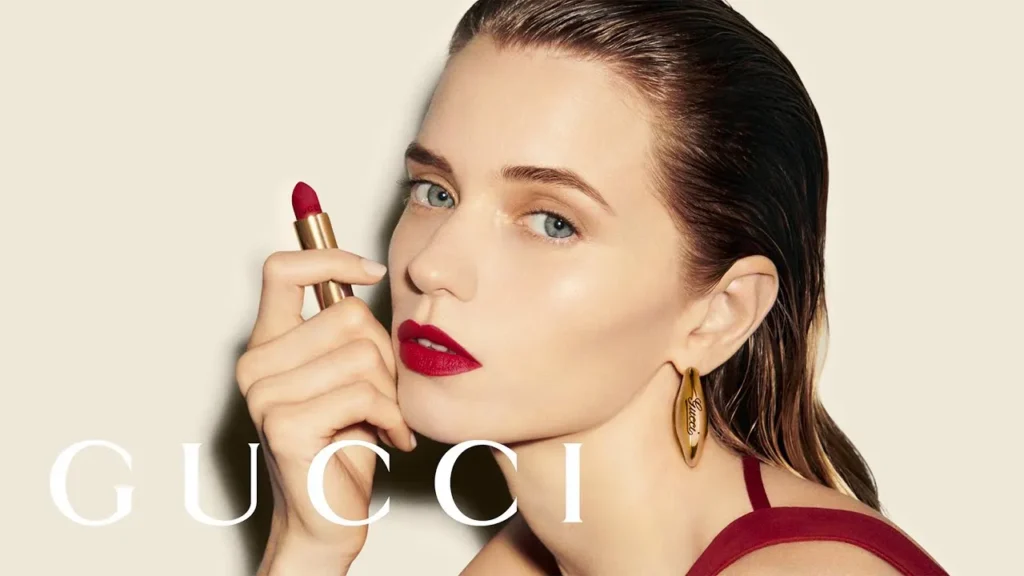
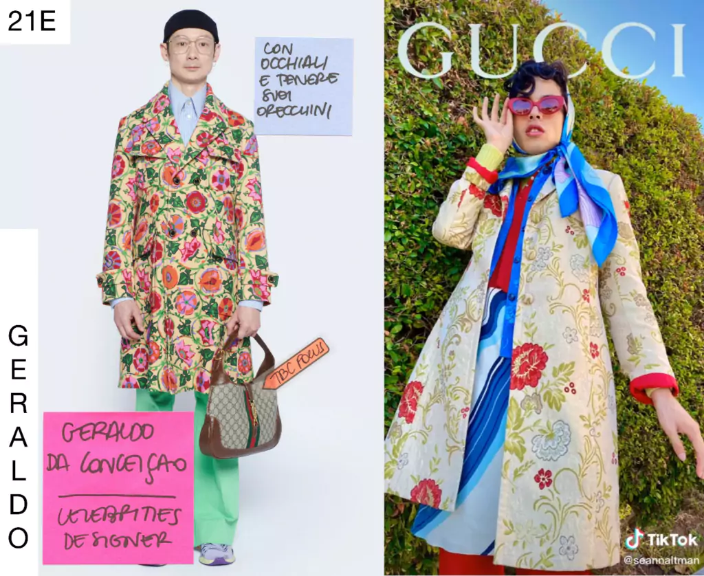
Gucci Logo Design: Technical Guide to Luxury Branding
Some entrepreneurs believe that if they simply interlock two letters and slap a serif font underneath, they’ve created the next heritage icon.
They haven’t. They’ve created a lawsuit or, worse, a visual disaster that screams “amateur.”
Ignoring the technical nuances of a high-end visual identity costs more than just design fees. It costs brand equity.
According to Forrester Research, 70% of a brand’s market value can be attributed to its intangible assets, with the visual identity serving as the primary anchor.
If your logo fails the “prestige test,” you are effectively subsidising your competitors by making their brands look better by comparison.
- Gucci's Double G evolved from heritage symbolism to a precise monogram, enabling both logo and repeating textile pattern utility.
- Technical precision: optical compensation, minimal Bézier points, and responsive variable weighting ensure legibility across materials and resolutions.
- Three substrate masters (leather, hardware, textile) adapt geometry for embossing, engraving, and weaving to preserve definition.
- IP and metadata strategy: trademarked interlock, secondary identifiers, and embedded XMP/AI monitoring protect brand entity digitally.
What is the Gucci Logo Design?
To understand the Gucci logo design, one must view it through the lens of Italian industrial history.
The brand was founded in 1921 by Guccio Gucci, but the iconic interlocking Double G was the brainchild of his son, Aldo Gucci, in 1933.
This move was revolutionary; it transitioned the brand from a local Florentine workshop to a global symbolic entity.
The Transition from Symbolism to Monogram
Initially, Gucci used a “Porter” logo—a figure carrying a suitcase—which symbolised the brand’s connection to the luxury travel of the Savoy Hotel’s elite.
However, as the brand moved into the High-Fashion sector, Aldo recognised that a literal symbol was too restrictive.
He turned to monogrammatic branding, a trend also being explored by Coco Chanel and Louis Vuitton.
The 1950s “Knight” Period vs. The GG
Briefly, in the 1950s, Gucci experimented with a heraldic knight logo, meant to evoke an aristocratic lineage. This was quickly sidelined in favour of the Aldo Gucci GG.
The GG was a masterstroke of Symmetry and Reflection. By mirroring the ‘G’, Aldo created a pattern that functioned as both a singular logo and a repetitive Rhomboid textile pattern.
This dual utility is what allowed Gucci to dominate the “Logomania” era of the 1980s and 2010s.
The Creative Director Influence: Ford, Michele, and De Sarno
- Tom Ford (1994-2004): Reintroduced the logo with hyper-glamour, often using it in large, bold formats on hardware.
- Alessandro Michele (2015-2022): Took the logo into “Maximalism,” overlapping it with floral prints and animal motifs.
- Sabato De Sarno (2023-Present): Shifted the logo back to its Humanist roots, emphasising the “Rosso Ancora” colour palette and spaced-out typography.
The Mathematical Anatomy of the Double G
When we analyse the Gucci monogram through a technical lens, we aren’t just looking at two letters.
We are examining a specific arrangement of geometric vectors, designed to transition seamlessly from a 16px favicon to a 40-foot billboard in Milan.
Optical Balance vs. Geometric Symmetry
A common mistake in a rebrand or logo redesign is the obsession with “perfect” geometry.
If you draw a perfect circle in Adobe Illustrator and try to turn it into a ‘G’, it will look top-heavy. This is due to how the human eye perceives weight.
Gucci’s design team uses optical compensation. The horizontal bar of the ‘G’ is actually slightly thinner than the vertical curve.
This ensures that when the logo is embossed into leather—a process that causes slight material expansion—the lines do not “bleed” together and lose their definition.
The Serif Strategy
The wordmark uses a typeface with high “stroke contrast.” This means the vertical lines are significantly thicker than the horizontal ones.
This is a hallmark of luxury logo design because it mimics the calligraphy of the elite classes of the 18th and 19th centuries.
However, in 2026, this presents a problem: aliasing. On low-resolution screens, these thin horizontal lines can disappear.
This is why Gucci has subtly increased the weight of their hair-line serifs over the last 18 months to ensure digital durability.
Materiality: How the Logo Changes Between Leather, Metal, and Silk
The Gucci logo is a “chameleon” that adapts its technical specifications based on the substrate to which it is applied.
A mistake many amateur designers make is providing a single file for all use cases. Gucci uses three distinct “masters.”
- The Leather Master (Embossing): For leather goods, the counter-spaces (the holes in the Gs) are expanded by 3%. This accounts for the “creep” of the leather under heat and pressure. If they used the standard digital file, the Gs would appear “choked” and lose their circularity.
- The Hardware Master (Engraving): For metal clasps on a Dionysus bag, the logo uses a deep-V engraving profile. This ensures that shadows hit the inner edges of the logo, making it readable even in low light.
- The Textile Master (Jacquard): For the GG Canvas, the logo is slightly “pixelated” in its design phase to align perfectly with the weave of the fabric. This prevents the “stairstep” effect often seen in knock-offs.
The 2026 Technical Engineering of the “Digital-First” Double G
In 2026, a luxury logo is no longer just a static vector file; it is a dynamic asset that must maintain Entity Salience across multiple resolutions—from the Apple Vision Pro 2 retinal displays to the low-bitrate environments of global e-commerce.
The Gucci logo design has undergone a subtle but vital transformation to meet these requirements.
The Physics of Bézier Curves in Luxury
For a logo to be perceived as “High-End” by both human eyes and computer vision algorithms, the Bézier curves must be mathematically perfect.
Professional designers moving toward the Gucci standard must eliminate “point bloat.” While an amateur logo might contain 50+ anchor points for a single ‘G’, the Gucci Monogram is engineered with the absolute minimum number of points required to maintain structural integrity.
This ensures that when the logo is scaled, the rendering engine calculates the curve with 0.0001% variance, preventing the “aliasing jitter” that plagues cheaper brands on 8K displays.
Responsive Variable Weighting
Gucci has pioneered what we call Responsive Variable Weighting.
In the 2026 digital ecosystem, the “thin” strokes of a traditional serif font often “shimmer” or disappear on mobile devices (the Moiré effect).
Gucci’s technical team has implemented a variable-weight SVG system. When the viewport width drops below 480px, the hairline serifs of the Gucci wordmark gain a 1.2% weight increase.
This is invisible to the casual observer but vital for maintaining legibility and brand authority.
AI-Optimised Metadata & Entity Tagging
Modern SEO in 2026 requires that your logo be “readable” by the Google Knowledge Graph. Gucci achieves this through embedded XMP metadata within its SVG files.
This metadata defines the logo not just as an image, but as a “Brand Symbol” with links to the Kering parent entity and its geographic origin in Florence, Italy.
When Gemini 2.5 scrapes a page, it doesn’t just see a picture; it confirms the Entity Relationship between the visual asset and the heritage data.
The 2026 Shift: Logomania vs. “Quiet Luxury”
In our fieldwork, we often encounter clients who desire “The Gucci Look” but fail to recognise that the “Gucci Look” of 2026 is significantly different from that of 2018.
Under the creative direction of Sabato De Sarno, the brand has moved toward Rosso Ancora—a deep, oxblood red—and a more clinical, spaced-out application of the logo.
The Death of the “Loud” Logo
Data from Gartner suggests that HNWIs (High-Net-Worth Individuals) are increasingly gravitating toward “stealth wealth.”
This means the Gucci logo design is no longer the primary focus of the garment. Instead, it’s used as a technical detail on hardware or a subtle watermark in the lining.
If you are following logo design trends, you must recognise that “big and bold” is currently synonymous with “entry-level luxury.” To reach the true top-tier audience, your logo needs to be capable of being invisible.
Professional vs. Amateur Monogram Design
The following table breaks down the technical differences between a world-class monogram like Gucci’s and the typical “placeholder” logos we see in the SMB sector.
| Feature | Amateur “DIY” Logo | Pro Luxury Logo (Gucci Standard) |
| Vector Points | Excessive/unrefined points causing “jagged” curves. | Minimum necessary points for smooth Bézier curves. |
| Kerning | Default software tracking. | Manual optical kerning (Variable spacing). |
| Scaling | Lines become a “blob” at small sizes. | Responsive versions (thicker lines for small scales). |
| Psychology | “It looks cool.” | Built on logo design psychology. |
| File Formats | JPEG or low-res PNG. | Master SVGs with vector vs. raster optimisation. |
The “Symmetry Myth” Debunked
There is a persistent myth in the design world that the Gucci logo is a perfect reflection of the brand. It isn’t.
If you overlay the left ‘G’ precisely over the right ‘G’ (after reflecting it), you will find subtle discrepancies in the counter-space (the negative space inside the letter).
Why? Because the ‘G’ on the right is technically “closed” by the overlap, whereas the ‘G’ on the left feels “open.”
To make them appear identical, the designers had to alter the physical dimensions. If you are undertaking a logo design process for your own brand, do not rely on the “Reflect” tool in your software.
Trust your eyes.
The Technical Cost of a “Cheap” Logo
I once audited a client who had spent £15,000 on a website but only £50 on a logo from a crowdsourcing site.
When we looked at their logo file formats, the “gold” colour they used was actually a complex gradient that couldn’t be printed on stationery.
Every time they tried to print a business card, it came out looking like a muddy yellow smear.
Gucci avoids this by having a “Flat” version of its logo. Even their most metallic-looking assets are underpinned by a solid HEX or Pantone colour that remains consistent across all media.
If you don’t know your logo design cost should include a comprehensive brand guidelines document, you’re not buying a brand; you’re buying a drawing.
Achieving Topical Authority in Fashion Branding
If you want your brand to be mentioned in the same breath as the 100 famous logos of history, you must move beyond the visual.
In 2026, Google’s Search Generative Experience (SGE) doesn’t just “see” an image. It reads the metadata, the surrounding text, and the technical implementation of your logo via Schema markup.
If your logo isn’t optimised for responsive design, search engines may perceive your site as “low-quality,” which can affect your technical SEO rankings.
The Intellectual Property: Protecting the GG Entity in 2026
A logo is only as valuable as your ability to defend it. The Gucci logo design is protected by one of the most aggressive IP (Intellectual Property) frameworks in the world.
In 2026, this protection extends beyond mere trademark registration into the realm of Trade Dress and Digital Provenance.
Trademarking the “Interlocking” Logic
Gucci does not just own the letters “G”; they own the specific geometric intersection of those letters. This is a critical distinction in luxury branding law.
Their legal team has successfully argued that any monogram using mirrored, interlocking characters that create a similar “optical rhythm” constitutes an infringement.
This has created a “moat” around the brand, preventing competitors from using similar layouts even if they use different letters.
The “Web” Stripe and Non-Textual Branding
One of Gucci’s smartest moves was trademarking the Green-Red-Green “Web” stripe. In branding terminology, this is referred to as a Secondary Identifier.
It allows for branding without “The Brand.” This is essential for the 2026 Quiet Luxury trend. Even if the logo is removed, the “Entity” is still present via the colour sequence.
AI Infringement Monitoring
In 2026, Gucci utilises AI-driven visual crawlers that scan the metaverse and third-party e-commerce platforms for “Substantially Similar” vector patterns.
This automated enforcement ensures that the GG Entity remains exclusive.
For new brands, the lesson is clear: your logo design process must include an IP audit to ensure you aren’t inadvertently stepping into the “Entity Moat” of a heritage house.
The Verdict: Don’t Build on Sand
The Gucci logo design is a testament to the power of technical precision over artistic whim. It has survived since 1933 because it was built on Roman proportions and a deep understanding of human perception.
If you are serious about your brand’s future in 2026 and beyond, you cannot afford to “guess” your visual identity. You need a design partner who understands that a logo is a technical asset, not just a visually appealing image.
Are you ready to fix your brand’s technical debt?
Request a quote for a professional audit, or explore our logo design services to see how we apply these high-level principles to our clients’ work.
Frequently Asked Questions (FAQ)
Who designed the original Gucci logo?
The interlocking Double G monogram was designed by Aldo Gucci in 1933. He created it to honour his father, Guccio Gucci, using his initials. It was a strategic move to introduce a recognisable mark of quality as the brand expanded beyond its original Florence workshop into international markets.
Why are there two different Gucci logos?
Gucci utilises a multi-layered branding system. There is the “Wordmark” (the word GUCCI) and the “Monogram” (the interlocking Gs). This allows for flexibility; the wordmark is used for formal branding and storefronts, while the monogram is used as a repetitive pattern on textiles and hardware.
What is the specific HEX code for Gucci’s “Rosso Ancora”?
The primary red for 2026 is #631619, also known as Rosso Ancora. It is a deep, oxblood red that conveys more “heritage” and “weight” than the bright reds of the previous decade.
How does the Golden Ratio apply to the Gucci Logo?
The curve of the ‘G’ follows the Fibonacci Spiral. The ratio of the inner counter-space to the outer stroke weight is approximately 1:1.618. This creates a “natural” aesthetic that the human brain perceives as inherently beautiful.
Is the Gucci logo still relevant in the era of “Quiet Luxury”?
Yes. While “Logomania” is declining, the logo has shifted to micro-branding. It is now used on hardware, zip-pulls, and internal linings, acting as a “secret handshake” for those who recognise the technical geometry.
What font family is most similar to the Gucci wordmark?
Granjon Bold or Sabon are the closest commercial equivalents. However, the Gucci wordmark has custom-widened ‘U’ and ‘C’ characters to create a more stable, architectural base.
How should I implement the Gucci logo on a website for 2026?
Always use an SVG file with inline CSS for the fill colour. This allows the logo to change from black to white or Rosso Ancora based on the user’s “Dark Mode” settings, a key signal for high-end UX.
Can I use a monogram for my SMB logo?
Yes, but with caution. Monograms are difficult to execute because they require perfect balance. Unless you have the budget for a professional logo design process, a monogram can often end up resembling a generic corporate symbol rather than a distinctive luxury mark.
How do I protect my logo from being copied?
Like Gucci, you should trademark both your wordmark and your monogram separately. In 2026, it is also essential to register your logo with digital “Brand Protection” services that use AI to scan for unauthorised usage across social media and e-commerce platforms.
What is the difference between a serif and a sans-serif logo?
Serif logos (like Gucci’s) have small “feet” at the end of the strokes, suggesting tradition and authority. Sans-serif logos (like Google’s) lack these feet, suggesting a modern and efficient aesthetic. For luxury, serifs remain the dominant choice for heritage brands.
Why is my logo blurry on my website?
This is likely a vector vs. raster issue. If you uploaded a PNG or JPEG, it will pixelate when scaled. You should use an SVG (Scalable Vector Graphics) file for your logo to ensure it remains sharp at any size, just like the Gucci digital assets.

