How to Create Graphics for YouTube Channels
Creating great graphics is essential for building a successful YouTube channel.
Quality thumbnails, banners, intros, outros, and other visual elements help videos stand out, boost clicks and views, reflect branding, and elevate production value. With suitable graphics, you can captivate new viewers while pleasing loyal fans.
This comprehensive guide covers everything you need to know about making custom YouTube channel artwork and video elements from scratch. Follow these tips to create stunning YouTube graphics to make your videos pop!
- Crafting Eye-Catching Thumbnails
- Building Binge-Worthy Banners
- Introducing Viewers to Your Videos
- Closing Videos Strongly
- Optimising Auxiliary Icons
- Crafting Custom Logos
- Animating Text Dynamically
- Producing Playful Motion Graphics
- Choosing Colour Schemes Strategically
- Typography Essentials
- Levelling-Up with Lighting
- Rendering Successful Composites
- Achieving Data Visualisation
- Final Tips for Continuous Improvement
- Conclusion
- FAQs on Graphics for YouTube
Crafting Eye-Catching Thumbnails
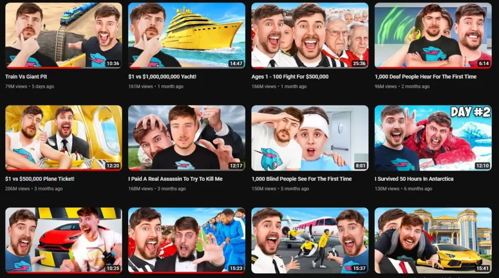
Your video thumbnail acts like a movie poster – it's the first thing potential viewers see when browsing YouTube. An intriguing, professional-looking thumbnail can mean the difference between someone clicking on your content or scrolling past it.
Essential thumbnail design tips:
- Incorporate contrasting colours – A thumbnail with high contrast grabs attention. Black, white and red tend to work well.
- Use supportive text – Include phrases explaining the video topic. Keep text short, clear and bold.
- Feature people's faces -Zoom in on yourself, guests or relatable models. Faces boost curiosity.
- Add dynamic angles – Diagonal lines, tilts and imbalance feel energetic.
- Overlay simple icons – Relevant shapes and visuals reinforce the topic.
- Edit carefully – Small imperfections can ruin a good thumbnail. Pay attention to details.
Ideally, you want viewers wondering, “What's that all about?” Then, the title or text satisfies their curiosity. This psychology can dramatically increase clicks.
Building Binge-Worthy Banners
While thumbnails promote individual videos, channel art banners advertise your entire YouTube presence. Banners sit atop your channel page, prominently visible no matter which video a user plays.
Big banner tips:
- Reflect branding – Echo visual elements that identify your channel, like logos, colours and icons.
- Spotlight your identity – Include photos of your face so new visitors recognise you.
- Feature video topics – Show relevant scenes indicating what you produce.
- Minimise text – Phrases are good, but avoid dense paragraphs viewers won't read.
- Size correctly – YouTube banners display differently on various devices, so scale images to fit all formats.
- Look professional – Avoid pixelation, warping and sloppy alignment for polished results.
With banners reaching every viewer, optimise them to make memorable first impressions.
Introducing Viewers to Your Videos

You only get one chance to make a great first impression. The opening frames of your YouTube videos give viewers a vital sneak peek that determines whether they stay to watch more.
Impactful intro tips:
- Match branding – Intros continue channel visuals from thumbnails and banners seamlessly.
- Identify your niche – Symbolism, colours and fonts indicate your niche to attract suitable viewers.
- Highlight channel names – Display your full channel name.
- Add intro sounds – An audio logo or sonic element boosts memorability.
- Keep it very short! – Get to the point fast before viewers click away. 5-10 seconds max.
- Animate minimalistically – Simple animated text or icons are more professional than excessive motion.
With attention spans dwindling, ensure intros immediately indicate the value in store for the viewer.
Closing Videos Strongly
While introductions invite viewers in, outro graphics encourage them to take action after viewing a video. These closing segments redirect attention to related videos, channel branding, and calls to subscribe.
Tips for killer outros:
- Echo intro visuals – Bring back graphical and sonic elements from the opening sequence.
- Prompt viewers explicitly – Ask them to subscribe outright. Don't rely on passive icons alone.
- Suggest best videos – Guide viewers to binge complementary evergreen content using preview icons.
- Give viewers time – Let calls to action stay on screen long enough to click or tap easily from any device.
- Add sonic motifs – Reuse unique audio logos, jingles or background scores.
- Highlight value gained – Thank viewers for watching and reinforce why your channel offers value.
When constructed strategically, outro sequences funnel satisfied viewers into long-term fans.
Optimising Auxiliary Icons
Beyond banners, intros and outros, small supporting graphics unite YouTube channels visually across individual videos and the platform. Profile pictures, watermarks, end screens, cards and more icons strengthen branding cohesiveness.
Icon creation tips:
- Maintain consistent branding – Icons should match styles from channel banners and thumbnails.
- Add recognisable features – Watermarks and profile pictures often focus closely on faces, logos or mascots.
- Overlay lightly – Transparent watermarks don't obstruct video content behind them.
- Link icons strategically – End screens and cards should direct viewers to related videos and playlists.
- Format images correctly – YouTube specifies icon dimensions and file types for graphic elements.
- Refresh periodically – Update icons to reflect milestones, seasons and creative growth over time.
With icon graphics linking videos channel-wide, ensure all visual elements coordinate seamlessly.
Incorporating Social Media Handles into YouTube Video Graphics
Finding the Right Icons
- Search and Select Icons: Use your design tool's element search feature. Type in the social media platform you want, like “Instagram” or “Twitter”. You'll find a selection of icons suitable for your brand's aesthetic.
- Choosing the Right Size: When deciding on icon size, ensure they are large enough to be easily visible when displayed on your video. This guarantees that viewers can quickly recognise the platform.
Adding Your Social Media Handle
- Display Your Handle Clearly: Next to each icon, display your social media handle in a readable font. For instance, if you promote your Instagram account, ensure your handle (e.g., @yourusername) is prominent.
Enhancing Engagement
- Showcase Your Content: Consider adding a brief description or visual queue on what followers can expect from your social media account. This could be a list of the content you share, such as behind-the-scenes footage or exclusive updates.
- Create a Compelling Graphic: Design an engaging graphic that integrates seamlessly with your video content while highlighting your social media presence. Use colours and styles that align with your brand.
Final Tips
- Test Your Design: Before finalising, test how your graphics appear on different devices to ensure clarity and appeal. Adjust sizes or colours as necessary for optimal visibility.
These techniques will effectively weave your social media presence into your YouTube video graphics, enticing viewers to connect with you on other platforms.
Crafting Custom Logos
Unique logos act like signatures representing individual YouTube channels clearly and consistently across all videos. Savvy creators develop personal brands around logo designs that indicate their niche at a glance.
Logo tips for amateurs:
- Sketch ideas manually – Drawing logos by hand assists in creative visualisation. Refine the top ideas digitally afterwards.
- Incorporate niche symbols – Gaming channels may use controllers. Beauty channels can feature makeup brushes.
- Spotlight initials – Highlighting first and last name initials simplifies logo reading and identification.
- Overprint on circles or squares – Containing logos within simple shapes makes them stand out.
- Use 2-3 colours max – Limiting the colour palette keeps things clean and printable.
- Add effects sparingly – Subtle drop shadows, gradients and textures enhance logos without overcomplicating.
Logos don't need overhauling often, so invest time perfecting designs built to last for years.
Animating Text Dynamically
Introductions, conclusions, transitions between segments, lower thirds, and subtitles rely on animated text to relay information engagingly. Movement naturally catches the eye while enabling textual displays impossible through static typing alone.
Tips for animating text:
- Enter text dynamically – Fade in, slide across the screen, scale up and bounce onto the scene for visual momentum.
- Emphasise key phrases – Enlarge or highlight essential words momentarily to guide viewer attention.
- Coordinate fonts and colours – Maintain consistent text formatting across videos for seamless flow.
- Add sound effects subtly – Faint typing keys and “whoosh” sounds boost energy.
- Time animations strategically – Display at pace with speech patterns for intuitive pairing.
- Simulate real-world physics – Bouncing, momentum, and spin-outs make motion more believable.
Animating text kinetically amplifies messages while reducing boredom from blocks of static words alone.
Producing Playful Motion Graphics
Beyond introductory text and logos, some YouTube creators invest substantial time in mastering motion graphics to dynamically explain concepts. Custom animations integrate illustrated diagrams, character movements, and infographics sequenced artfully over time.
Motion graphic tips:
- Map out sequences – Storyboard major graphic beats before production to simplify editing later.
- Draw inspiration selectively – Browse graphic repositories like Adobe Stock for high-quality ingredient assets to incorporate.
- Harness user-friendly tools – Programs like PowToons, Renderforest, Canva and Final Cut Pro expedite animation.
- Add voiceover explanations – Narrate directly what appears visually on-screen for layered impact.
- Simplify imagery – Use minimalist shapes and icons if lacking artistic prowess.
- Coordinate colours and fonts – Unify assets into cohesive branded palettes for professional results.
With practice and the right tools, animations unlock explanatory possibilities by visually clarifying complex topics.
Tips for Animating Graphics in Canva
Animating your graphics can elevate your design game significantly, and with tools like Canva, it's easier than ever. Here are some tips to help you make the most of this feature:
Explore Element Animations
- Individual Element Animation: Select any element within your design to reveal animation options. You can tweak the duration and choose effects like popping or fading in and out.
- Full Canvas Animation: Want everything to move as one? Click on the background to apply animations to the entire canvas.
Customise Your Timing
Adjust the length of each animation to tailor the effect precisely to your needs. This can help maintain viewer interest and emphasise important parts of your graphic.
Download and Save
When your animated design is complete, remember to download it in MP4 format for the best quality. Ensure your file is aptly named for easy retrieval later.
Save Time with Templates
Create and save templates for repetitive design elements. Using the same subscribe buttons or social media handles across multiple graphics ensures consistency and saves time.
By following these tips, you can craft eye-catching, professional-looking animations effortlessly, enhancing your visual content and keeping your audience engaged.
Choosing Colour Schemes Strategically
Every YouTube channel requires colour coordination across thumbnails, banners and videos for instant brand identification. Strategic schemes also indicate niche categories visually at first glance.
Pro tips for picking colours:
- Limit to 2-4 hues – Maxing out colour variables quickly cheapens videos. Stick with fewer for sophistication.
- Examine competitor palettes – Research channels in your category for inspiration, avoiding copying outright.
- Consider emotion and symbolism – Certain colours evoke clear reactions. Red conveys excitement, and black signals authority.
- Review colour psychology – Each hue carries cultural associations, assumptions and undertones.
- Overlay on critical assets – Testing colours on actual thumbnails and logos previews effectiveness best.
- Use accent colours carefully – Pops of brighter contrasting shades highlight what deserves attention.
- Check accessibility – Ensure enough contrast for visibility-impaired viewers.
- Convert RGB to CMYK – Digital and print graphics rely on different colour models. Test both.
With strategic coordination applied early on, colours act like free subliminal messaging, improving content recall.
Typography Essentials
The text constitutes much of the informative graphics spread throughout YouTube videos. Mastering typography involves using letterforms effectively to convey robust messaging clearly and artistically.
Critical tips for picking pleasing fonts:
- Limit to 2-3 fonts – Anything more looks disjointed fast. Pair one display font for titles with a simpler text font.
- Test readability at low resolution – Small embedded text relies on simplicity for legibility during videos.
- Use weights strategically – Bold fonts stress importance while light fonts recede into backgrounds.
- Review X-heights – Tall, medium and short letter proportions suit different graphic contexts based on space.
- Restrict fancy fonts – Ornate cursive and calligraphy turn chaotic onscreen quickly.
- Licence commercial fonts – Thousands of beautiful low-cost fonts exist from digital marketplaces.
With so much messaging real estate, fine-tuning typography separates decent from exceptional YouTube channel graphics.
Levelling-Up with Lighting
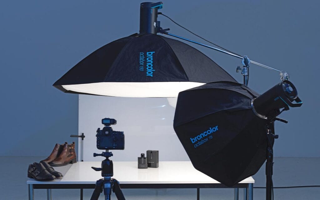
Impactful YouTube graphics often spotlight people's faces reacting enthusiastically. While cameras capture images, flattering lighting defines how lively and inviting those visuals feel for viewers.
Pro lighting tips:
- Diffuse harsh overhead lights – Bouncing bulbs off ceilings or walls softens unflattering shadows.
- Invest in additional lighting – Small LED panels open up creative options. Ring lights popularise catchlights in talent's eyes.
- Remove or replace colourful ambient lights – Existing practical lights often tint faces weird colours.
- Learn three-point lighting – Placing key, fill, and backlights strategically remove shadows.
- Watch the background – Busy environments compete visually. Dark or solid backdrops keep the focus on people.
- Enhance in post-production – Video editing tools enable improving contrast, colours and brightness.
A few small lighting purchases and positioning adjustments make expensive production studios unnecessary.
Rendering Successful Composites
Layering multiple graphical elements convincingly relies on compositing images seamlessly. Transparent background removal and careful blending unite illustrations, photos, text and video into single polished visuals.
Compositing tips for beginners:
- Study layering order – Arranging imagery deliberately controls what covers what.
- Adjust opacity settings – Lowering transparency enables seeing through objects to layers underneath.
- Create subtle drop shadows – Small dark effects ground elements naturally against backdrops below.
- Learn masking techniques – Precisely defining visibility boundaries maintains believability between components.
- Follow perspective lines – Vanishing points guide angling and scaling realistically.
- Add environmental reflections – Mimicking bounced light ties objects into contexts authentically.
With some restraint separating ambitious ideas from overcomplicated execution, compositing opens new graphic horizons.
Achieving Data Visualisation
YouTube creators produce diverse video content covering all topics imaginable. Complex informational subjects containing statistics, comparisons, and towering data benefit enormously from graphical visualisation. Clarifying numbers visually activates additional neural processing while simplifying comprehension.
Strategies for better data graphics:
- Compare variables clearly – Charts overlapping two or more trends illustrate correlations well.
- Link data to real-world scales – Known icons, symbols and environments give numbers tangible context.
- Annotate liberally – Labelling data lines explicitly leaves no ambiguity about meaning.
- Use colour-coded grouping – Assigning hues to categories clearly defines stratified clusters for busy datasets.
- Size encodes importance – Making specific statistics proportionally bigger or smaller communicates hierarchy intuitively.
- Animate changes over time – Timelines depicting historical shifts grab and hold viewer attention throughout the video.
Facts and figures demand graphical explanations. Embrace data visualisation to unlock analytical powers beyond spreadsheets alone.
How to Create and Design a Subscribe Button for YouTube Videos
Designing a subscribe button for your YouTube videos can enhance viewer engagement and encourage more subscriptions. Follow these steps to create an appealing and functional subscribe button:
- Set Up Your Canvas
- Begin by opening a design tool and creating a new canvas. If you've previously made a thumbnail, this process will be familiar.
- Ensure your background is initially set to white if you have a premium design software version for transparent backgrounds.
- Use a Green Screen Trick
- Opt for a solid green background if sticking to a free version (use HEX #29CF61). This allows you to employ the green screen effect during video editing, giving a professional look without extra cost.
- Add and Customise Button Elements
- In the design tool's elements search bar, search for “button” and browse the options. Select a style that aligns with your branding.
- Customise the button by adjusting the colours and overlaying text like “Subscribe!” using your brand's fonts for consistency and readability.
- Size and Position Thoughtfully
- Consider your video dimensions; the subscribe button should neither dominate the screen nor be invisible. A balanced size will ensure it's noticeable yet unobtrusive.
- Since YouTube's default subscribe button is on the right, position your design at the bottom right corner of your canvas for coherence and ease of access.
- Animate for Engagement
- To make your subscribe button pop, consider adding animation. Group the text and button elements so they move in unison, adding a touch of dynamism to grab attention.
By following these steps, you can craft a subscribe button that's visually appealing and strategically positioned to encourage viewer action.
Final Tips for Continuous Improvement
With this comprehensive guide covering critical facets of graphics for YouTube, novice creators gain frameworks for constructing custom channel artwork that rivals pros after enough iteration and observing what performs best with audiences. Continuously tap into analytics while polling viewers directly to guide evolutions incrementally.
Remember, graphics should serve functionality first in supporting stellar content that encourages repeat viewership and sharing. As channels grow over months and years, revisit initial thumbnail templates, logo sketches and colour palettes with an eye for refinement reflecting changing creative requirements.
What aesthetically pleases today might feel dated tomorrow. Graphics are vital and dynamic components of education, inspiration, and entertainment videos.
YouTube offers unlimited possibilities for creative expression. With these visual tips, any niche can sculpt engaging channels that will attract loyal followings for years. Just take chances, trust your instincts and keep churning out great content!
How Batch Content Creation Enhances Time Management
Batching content for videos and social media is a game-changer for efficient time management. You significantly free up your schedule by dedicating specific time blocks to produce multiple pieces of content in one sitting. This focused approach allows for uninterrupted creativity and execution.
Benefits of Batching:
- Boosted Efficiency: Creating content in batches helps maintain creative momentum, reducing start-and-stop inefficiencies.
- Time Reallocation: With more content ready in advance, you have extra time to concentrate on other crucial business tasks, such as strategic planning.
- Consistent Output: Organising content in bulk allows you to maintain a consistent presence across platforms without daily interruptions.
Incorporating batch content creation into your workflow means wearing multiple hats—including your CEO hat—becomes more manageable as you effectively streamline and optimise your processes.
Conclusion
YouTube graphics constitute much more than just decorative video elements. Optimised thumbnails, banners, logos, animations, text and effects directly influence audience retention, impressions and channel growth by making compelling first impressions at every stage.
This guide covered core conceptual strategies alongside functional production techniques for DIY creators needing bigger budgets. With a commitment to keep learning and improving incrementally through continual testing, anyone can generate custom graphics rivalling popular YouTube channels. Visually appealing videos attract more viewers while providing proud portfolio pieces.
If this guide provided value in exploring introductory graphic creation concepts, please browse supplementary video tutorials and online courses, expanding individual categories further. Thanks so much for reading – now get creating!
FAQs on Graphics for YouTube
What are the optimal thumbnail dimensions and file types for YouTube?
1280 x 720 PNGs or JPEGs under 2MB work best. Landscape rectangles perform better than squares.
Where can I find copyright-free images to composite into custom graphics?
Unsplash, Pexels, and Pixabay offer thousands of public domain photos that are usable royalty-free.
What’s an affordable introductory program for creating original graphics and animations?
Canva provides extensive templates, fonts, illustrations and tools for under $15 monthly.
How much should amateur YouTubers invest in graphics capabilities early on?
Leverage free options initially while slowly integrating paid assets over time as channels establish themselves.
What are the most important graphic elements to perfect first?
Nail channel logo, intro animation and video thumbnail template early since they unify branding.
