
The Google Logo Design History: What Really Happened
Most articles that cover the history of Google's logo design are little more than a picture book. They show you the changes, say a few fluffy words like “modern” or “playful,” and call it a day.
That’s lazy. And it misses the entire point.
The evolution of Google’s logo isn't a simple story of aesthetic preference. It’s a ruthless, practical case study in adapting a brand to earth-shattering changes in technology and business scale. It’s the story of a logo forced to evolve from a quirky signpost on a single webpage to a hyper-efficient symbol recognised by billions on countless devices.
This is a story about the why. It’s about the brutal business and tech realities that forced every bevel, shadow, and serif to be stripped away until only pure function remained. Pay attention, because the lessons here are worth over a thousand design trend reports.
- Google’s logo evolved from a DIY WordArt mark to a functional system, driven by technological and business scale demands.
- Ruth Kedar’s Catull wordmark balanced trust and disruption, signalling credibility to investors while retaining quirky character.
- 2010–2013 flattening improved legibility and performance for modern screens; it prepared the brand for mobile-first contexts.
- The 2015 switch to Product Sans and a flexible asset system prioritised scalability, consistency, and legibility across countless devices.
It All Started with GIMP (and No Designer)
Before Google was a verb, it was a research project at Stanford University called “Backrub.” Thankfully, they changed the name. The logo, however, took a bit longer to catch up.
The 1997 Stanford “Beta” Logo
The first Google logo from 1997 looks like something you’d make in Microsoft WordArt to spice up a school project. Because that’s essentially what it was.
It was clunky. It was amateurish. And it was absolutely perfect.
This was a Minimum Viable Logo. Its only job was to give a name to a function. It didn't need to inspire trust, work on a billion phones, or launch a product ecosystem. It just needed to exist.
This is your lesson for any entrepreneur agonising over the perfect logo before making their first sale. Your first logo doesn't need to be a masterpiece. It needs to be “good enough” so you can get on with the actual work of building a business.
The 1998 “We're a Real Company Now” Logo
By 1998, Google was a proper company, and co-founder Sergey Brin decided to have another go. Using a free, open-source image editor called GIMP, he tweaked the design.
He reordered the colours, added an exclamation mark (a questionable nod to Yahoo!), and slightly improved the letter spacing. It was still far from professional, but it was an iteration. It showed a growing self-awareness. The project was becoming a brand.
The lesson is simple: don't be afraid to improve things incrementally. You don't always need a big-bang redesign. Sometimes, you just need to open the editor and fix the most obvious problem.
Enter the Professional: Ruth Kedar and the Catull Era (1999-2010)
As Google sought its first significant round of funding, Larry Page and Sergey Brin knew the student-project look wouldn't cut it. A homemade logo screams “garage,” not “global enterprise.” They needed credibility.
Why They Needed a Real Designer
An amateur logo signals risk to investors and a lack of polish to potential users. To be taken seriously, Google needed a visual identity that looked like it belonged to a company with a future.
They were introduced to Ruth Kedar, a designer and instructor at Stanford. Her task was to create an identity that could bridge the gap between a stuffy, academic world and a disruptive, innovative one.
The Brief and the Chosen Design
Kedar experimented with numerous designs, but the one that stuck used the Catull typeface. This is where most commentators pull out the word “playful.” That’s the wrong word. The choice was strategic.
Catull is a serif font. Serif fonts, with their little “feet” on the letters, have roots in print and academia. They feel established, traditional, and trustworthy—exactly what a young tech company trying to manage the world's information needed.
But Catull wasn't a stuffy, old-school serif like Times New Roman. It had asymmetrical serifs and varied letter heights. It was quirky. It hinted at innovation without being childish. The logo Kedar designed wasn't “playful”; it was a calculated balance of trust and disruption.
The subtle drop shadow and beveling gave it a slight 3D feel, making it pop on the CRT monitors of the late 1990s. For over a decade, Google has used this logo. It was the face of a company that was organised yet creative, reliable yet revolutionary.
The Doodle: An Accidental Stroke of Genius
Sometimes, the most powerful parts of your brand aren't born in a strategy meeting. They happen by accident.
In August 1998, before Kedar was hired, Page and Brin were heading to the Burning Man festival in the Nevada desert. As a clever “out of office” message to their users, they stuck the festival's iconic stick figure logo behind the second ‘o' in their wordmark.
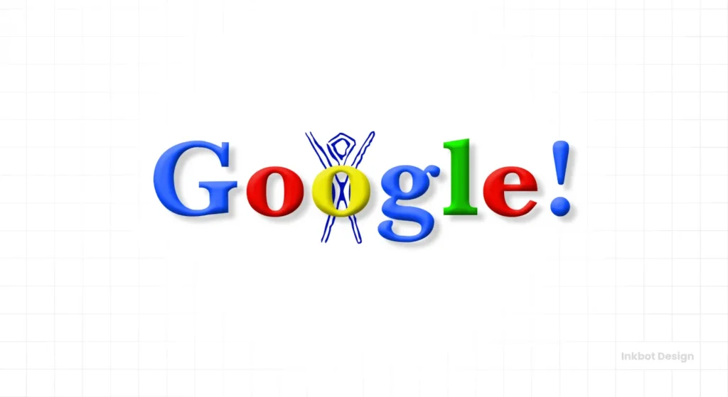
That was it. That was the first-ever Google Doodle.
What started as a joke became an institution. The Doodle became a way for Google to connect with users on a human level, celebrating holidays, anniversaries, and pioneers. It showed that despite its growing technical prowess, the brand had personality. It was a masterstroke in making a giant, faceless corporation feel approachable.
The lesson? Don't over-engineer everything. The best brand moments are often authentic, unscripted, and rooted in the real culture of your company.
The Subtle Tweaks: Chasing Pixels and Trends (2010-2014)
For the next ten years, Ruth Kedar's design was untouchable. But technology doesn't stand still. The screens we used and our design philosophies began to change dramatically, and the logo had to adapt.
2010: Less Shadow, More Punch
The first major tweak came in 2010. The changes were subtle, but significant. The drop shadow was drastically reduced, and the colours were brighter and more saturated.
This wasn't an arbitrary style choice. It was a direct response to technology.
Computer monitors had evolved from blurry, low-contrast Cathode Ray Tubes (CRTs) to sharp, vibrant Liquid Crystal Displays (LCDs). The old logo's heavy shadow, designed to give depth to older screens, now looked muddy. Brighter, flatter colours “popped” more on modern displays, improving legibility and creating a cleaner look.
2013: The Great Flattening Begins
By 2013, the design world was in open revolt against “skeuomorphism”—the philosophy of making digital elements look like their real-world counterparts (think Apple's old stitched leather calendar app). The new king was “flat design,” favouring clean, two-dimensional graphics and straightforward typography.
Google followed suit. In 2013, they removed the logo's remaining drop shadow and all beveling effects. The letters were now completely flat.
This update accomplished two things:
- It aligned Google with the dominant design trend, making the brand feel current.
- It improved performance and legibility, especially as mobile usage exploded. Flat graphics are simpler, which means smaller file sizes and faster load times. They are also easier to read on small, high-resolution phone screens.
This wasn't just a facelift. It was the company preparing its brand for a mobile-first world.
The Main Event: The 2015 Redesign for a Scalable World
The 2013 flattening was just a warm-up. By 2015, Google faced a fundamental branding crisis. The company was no longer a search box on a website. It was an ecosystem.
The Problem: One Logo, a Thousand Screens
Think about all the places the Google identity had to live:
- On a massive billboard.
- On a 5-inch smartphone screen.
- As a tiny 16×16 pixel favicon in a browser tab.
- On a smartwatch display.
- On a TV screen.
- On the side of a self-driving car.
The Catull wordmark, even when flattened, was a liability. With their intricate details, Serif fonts become an illegible smudge at small sizes. While not huge, the logo's file size was still larger than needed—a real problem when you're serving billions of users, many on slow mobile connections in developing nations.
Google didn't need a new logo. It needed a new system.
The Solution: Product Sans and a True Design System
The 2015 redesign was the most radical in the company's history. Google retired the Catull font for good. In its place, they introduced a custom-designed, geometric sans-serif typeface called Product Sans.
This wasn't just about looking more “modern.” Product Sans was engineered for a single purpose: maximum legibility at any size, on any screen.
- Geometric shapes (like perfect circles for the ‘o's) make it clean and easy to render for computers.
- Sans-serif letters (without the “feet”) hold up exceptionally well at small sizes.
- Consistent line weight makes it clear and readable from a distance.
Crucially, this new logo was part of a much larger initiative: Material Design. This comprehensive set of design rules would govern how every Google product looked and felt. The logo, the app icons, the buttons, the menus—they all now share the same visual DNA.
For business owners, this is the single most important lesson. You shouldn't ask, “What does my logo look like?” You should ask, “How does my entire brand identity system work together?” If your visual identity isn't consistent from your website to your app to your business cards, you don't have a strong brand. That's the kind of strategic thinking we champion at Inkbot Design when developing a logo design.
More Than a Wordmark: The ‘G' and the Dots
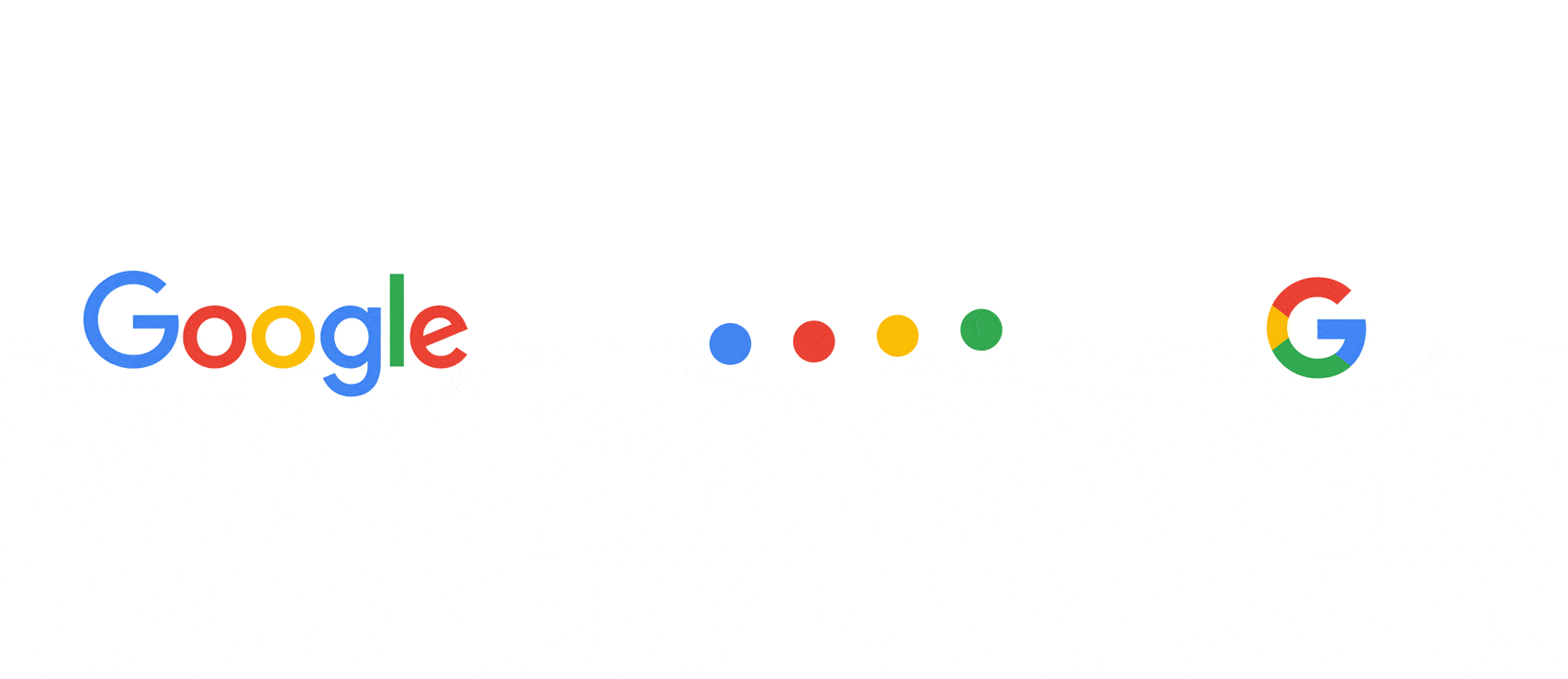
The new system was brilliantly flexible. It acknowledged that the whole “Google” wordmark wouldn't always fit. So, they created a family of related assets:
- A four-colour “G”: A compact icon, derived from the wordmark, to be used as a favicon and on app icons.
- Four animated dots: A dynamic element used during loading sequences and voice search interactions, signalling that Google was “working.”
This is what a scalable identity looks like. It's a toolbox, not a single static image. It provides the right asset for the proper context, ensuring the Google brand is recognisable whether it's spelt out or represented by a single letter.
What Can Your Business Learn From Google's Logo Evolution?
You don't need Google's budget to apply its logic. The principles behind its logo's journey are universal.
Lesson 1: Your first logo doesn't have to be perfect. Google started with a piece of digital graffiti. Your first logo's job is to get you out the door. You can, and should, improve it later.
Lesson 2: Know when to call in a professional. A homemade logo has a credibility ceiling. When you're ready to grow, invest in professional design to build trust and signal your ambition.
Lesson 3: Your logo must adapt to technology. Design for the context your customers live in. A logo designed for print in 2005 is probably failing on mobile in 2025. Be ruthless about function over nostalgia.
Lesson 4: Think system, not just symbol. The most powerful brands have a coherent visual language, not just a pretty picture. A modern brand needs a flexible system of logos, colours, and typography that works everywhere your customers are.
Conclusion: From Quirky Relic to Ubiquitous Utility
The history of Google's logo is a story of subtraction. It's the tale of a company systematically stripping away every non-essential decorative element—shadows, bevels, serifs—until only the purest, most functional form remained.
The journey took it from a quirky serif wordmark designed for a single website to a hyper-efficient, sans-serif system that powers a global technology ecosystem.
So, the next time someone tells you the Google logo is “playful,” you can correct them. It’s not playful. It's a ruthless and brilliant example of functional design. And for any business owner, that's a far more valuable lesson.
Let's Talk About Your Logo's Future
Google's story proves that a logo isn't a static piece of art; it's a hard-working business asset that needs to evolve. If you're wondering whether your brand identity is built for the challenges of tomorrow, it's time for a conversation.
Explore our logo design services to see how we build strategic, scalable identities for businesses ready to grow. Or, if you're ready to start, request a quote from our team. We don't do “playful.” We build brands that work.
Frequently Asked Questions (FAQs)
Who designed the original Google logo?
The co-founders themselves created the very first logos. The 1998 version, for example, was designed by Sergey Brin using the free software GIMP.
Who is Ruth Kedar?
Ruth Kedar was a graphic design instructor at Stanford University who was hired by Google in 1999. She designed the iconic serif logo using the Catull typeface, the company's primary identity for over a decade.
What font was the old Google logo?
The Google logo from 1999 to 2015 was based on the Catull typeface, a serif font chosen for its blend of traditional and quirky characteristics.
What font is the current Google logo?
The current Google logo, introduced in 2015, uses a custom-designed geometric sans-serif typeface called Product Sans.
Why did Google change its logo in 2015?
Google changed its logo in 2015 primarily for scalability and consistency. The old serif logo is rendered poorly in small sizes and on low-resolution screens. The new sans-serif logo is more legible, has a smaller file size, and works as part of a comprehensive design system (Material Design) across all of Google's products and platforms.
What is the story behind Google Doodles?
The first Google Doodle was created in 1998 when founders Larry Page and Sergey Brin placed a Burning Man festival stick figure behind the logo to indicate they were “out of office.” It was a fun, one-off message that grew into a brand tradition.
What is the difference between a serif and a sans-serif font?
Serif fonts (like Times New Roman or Catull) have small lines or “feet” attached to the ends of letters. Sans-serif fonts (like Arial or Product Sans) do not have these lines, resulting in a cleaner, more modern look.
Why is logo scalability so important?
Logo scalability is crucial because a modern brand must be recognisable everywhere, from a tiny app icon on a watch to a giant billboard. A scalable logo remains clear and legible at any size, ensuring brand consistency across all customer touchpoints.
What is Material Design?
Material Design is Google's comprehensive design system. It's a set of guidelines and principles that dictate all of Google's products' look, feel, and motions. The 2015 logo redesign was a key part of the rollout of this unified system.
What is a “favicon”?
A favicon (short for “favourite icon”) is the small 16×16 pixel icon that appears in a browser's address bar, tab, or bookmark list. Google's current favicon is the multi-colored ‘G'.
Did Google ever have an exclamation mark in its logo?
Yes, for a short period from 1998 to 1999, the Google logo had an exclamation mark at the end, likely inspired by the Yahoo! logo at the time.
What are the official Google colours?
The official Google colours are Blue, Red, Yellow, and Green. The specific shades have been brightened and tweaked over the years, but the four-colour palette has remained a consistent part of the brand identity.

