The 10 Best Google Font Combinations for a Cohesive Brand
Scrolling through Google Fonts feels like staring into the abyss of a supermarket cereal aisle.
There are over 1,500 options, and they all start to look the same. You pick one, then another, pair them up, and your website looks like a ransom note.
This isn’t just an aesthetic problem. It’s a business problem.
Your typography is one of the first signals a potential customer receives about your brand’s credibility. The wrong choice screams amateur, while the correct choice builds subconscious trust before they’ve even read a word.
Most “best font” lists are useless because they ignore the most critical factor: context.
This isn’t a list of trendy fonts. This is a curated selection of proven, workhorse combinations, explained through the simple principles that matter for a growing business.
- Your typography signals credibility — the right fonts build trust; the wrong ones scream amateur.
- Ten curated Google Font pairings offer versatile, legible, commercial‑use combinations tailored to different brand moods.
- Three rules: master meaningful contrast, establish clear visual hierarchy, and match font mood to brand mission.
- Use font weights, sizing and spacing (body 16–18px, headlines ~1.8–2.2×) to create hierarchy and readability.
- Avoid common mistakes: prioritising beauty over readability, using too many fonts, and ignoring context.
10 Proven Google Font Pairings for a Professional Brand
Here are 10 combinations that follow the rules. They are versatile, highly legible, and free for commercial use. For each, I’ve explained the vibe, the ideal use case, and a tip to get it right.
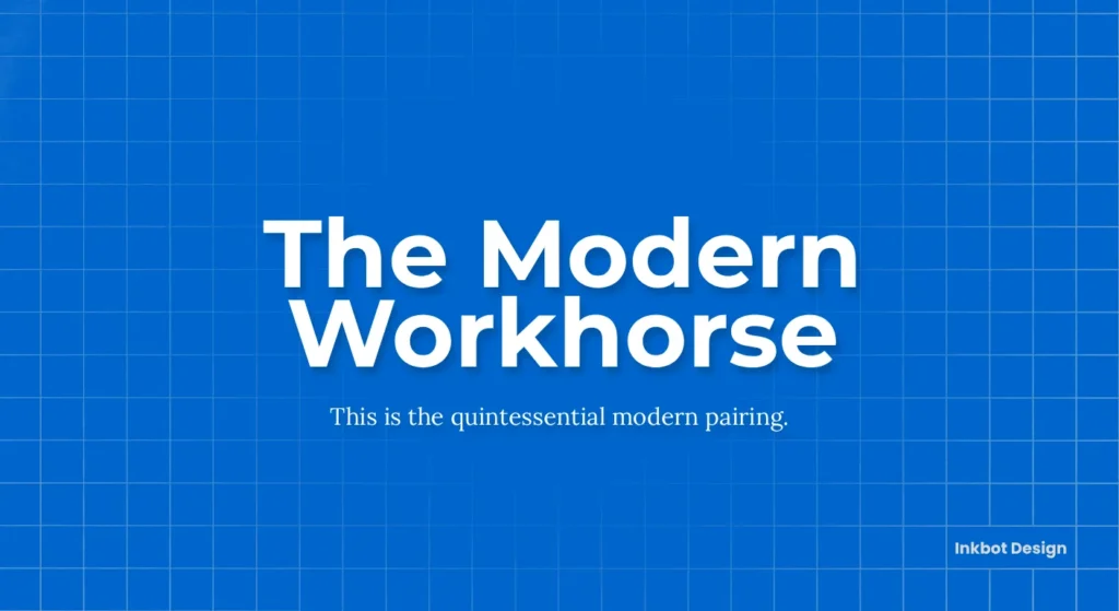
1. Montserrat & Lora: The Modern Workhorse
- Headline: Montserrat
- Body: Lora
Why it works: This is the quintessential modern pairing. Montserrat is a geometric sans-serif inspired by old posters and signs from Buenos Aires. It’s clean, professional, and incredibly versatile. Lora is a contemporary serif with calligraphic roots, making it elegant and easy to read in long passages. The contrast is perfect—one is structured and modern, the other is soft and classic.
- Best For: Tech companies, digital agencies, modern consultants, and any business that wants to feel fresh but credible.
- Pro Tip: Use a heavier weight of Montserrat for headlines (Bold 700 or ExtraBold 800) to create a strong anchor for the page. Keep Lora at a regular weight (400) for the body.
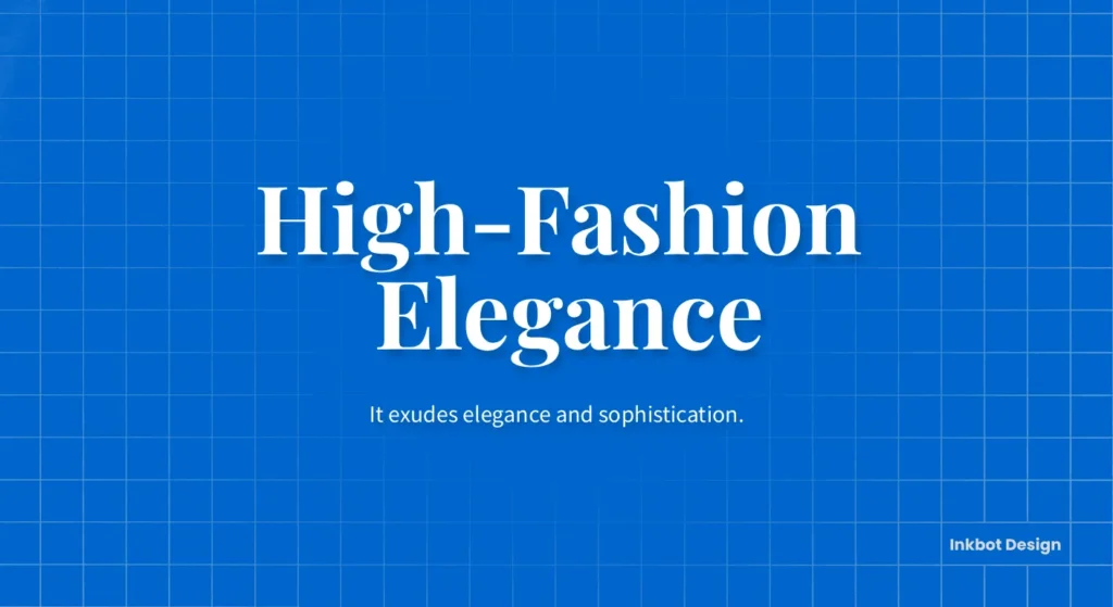
2. Playfair Display & Source Sans Pro: High-Fashion Elegance
- Headline: Playfair Display
- Body: Source Sans Pro
Why it works: Playfair Display is a high-contrast serif with delicate, thin strokes and strong, heavy ones. It exudes elegance and sophistication, making it perfect for headlines that need to make a statement. To balance this, Source Sans Pro is a neutral, highly legible sans-serif designed for user interfaces. It does its job quietly in the background, letting Playfair take the spotlight.
- Best For: Fashion brands, luxury goods, high-end blogs, photographers, and creative portfolios.
- Pro Tip: Give Playfair Display headlines ample letter spacing (tracking) to let them breathe. It makes the font feel even more luxurious.
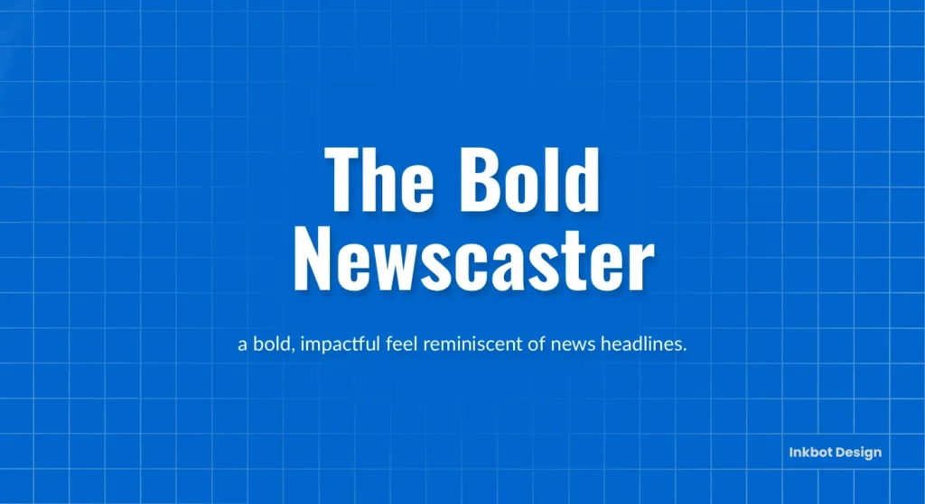
3. Oswald & Lato: The Bold Newscaster
- Headline: Oswald
- Body: Lato
Why it works: Oswald is a condensed sans-serif, meaning its letters are narrow. This allows you to fit more text into a headline without feeling cramped, giving it a bold, impactful feel reminiscent of news headlines. Lato is a very friendly and warm sans-serif that is exceptionally easy to read. Its semi-rounded details contrast nicely with Oswald’s sharp, angular form.
- Best For: News sites, magazines, marketing agencies, and any brand that needs to project confidence and authority.
- Pro Tip: Use Oswald in all caps for maximum impact on short, punchy headlines. Lato works best at a slightly larger size for body text (around 17px or 18px) to enhance readability.
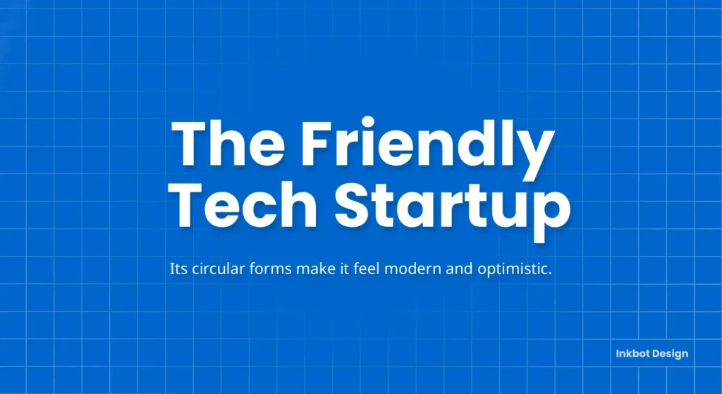
4. Poppins & Noto Sans: The Friendly Tech Startup
- Headline: Poppins
- Body: Noto Sans
Why it works: Poppins is one of the most popular Google Fonts for a reason. It’s a geometric sans-serif with a clean, friendly, and approachable feel. Its circular forms make it feel modern and optimistic. Noto Sans is a true workhorse, designed by Google to support over 800 languages with a harmonious look. It’s incredibly neutral and legible, making it the perfect, unobtrusive partner for the more personality-driven Poppins.
- Best For: SaaS companies, startups, financial tech, and any B2C brand that wants to feel modern and trustworthy.
- Pro Tip: Poppins shines in its heavier weights (SemiBold 600 or Bold 700) for headlines and UI elements like buttons.
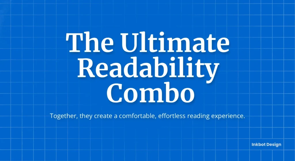
5. Merriweather & Open Sans: The Ultimate Readability Combo
- Headline: Merriweather
- Body: Open Sans
Why it works: This pairing is all about function. Merriweather was specifically designed to be pleasant to read on screens. It has a large x-height, making it legible even at small sizes. Open Sans is another supremely readable font, a humanist sans-serif known for its friendly but neutral appearance. Together, they create a comfortable, effortless reading experience.
- Best For: Long-form content, blogs, internal company documents, and service-based businesses where clear communication is paramount.
- Pro Tip: Don’t be afraid to use Merriweather for headlines and body text (a serif-only hierarchy). Just ensure you create a strong contrast with weight and size.
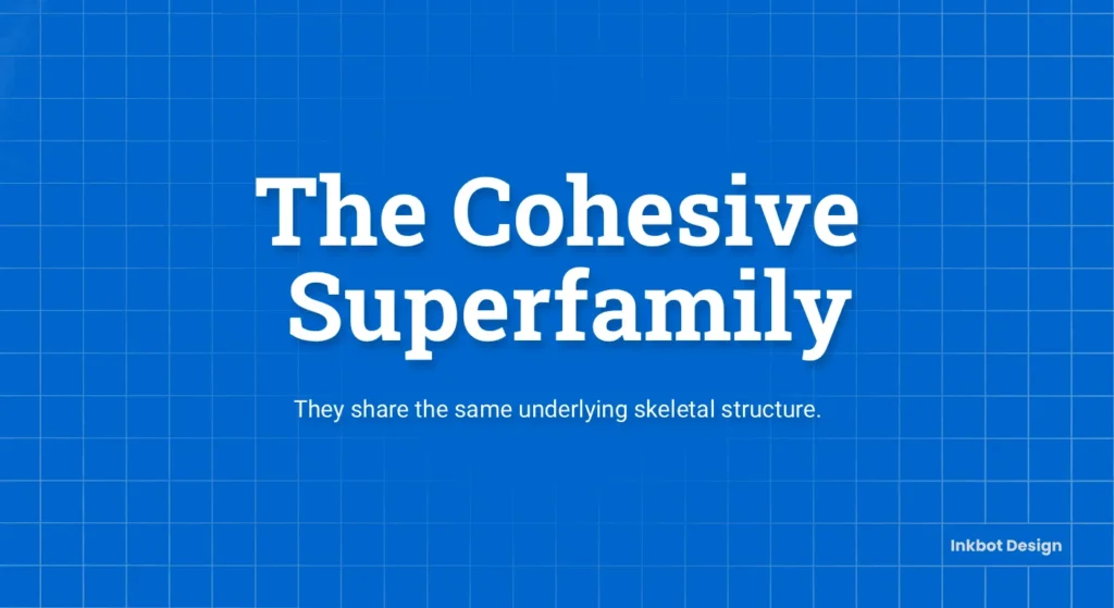
6. Roboto & Roboto Slab: The Cohesive Superfamily
- Headline: Roboto Slab
- Body: Roboto
Why it works: This combination breaks the “serif + sans-serif” rule to prove a point. Roboto and Roboto Slab are part of the same “superfamily,” meaning they were designed to work together. They share the same underlying skeletal structure. This creates a highly cohesive and professional look with zero guesswork. The slab serif provides a strong, structural headline, while the standard sans-serif is perfect for clean body text.
- Best For: Corporate websites, tech products, and any brand that values consistency and a unified design system.
- Pro Tip: Use this pairing when you need a wide range of weights and styles. The Roboto family is massive, giving you immense flexibility.
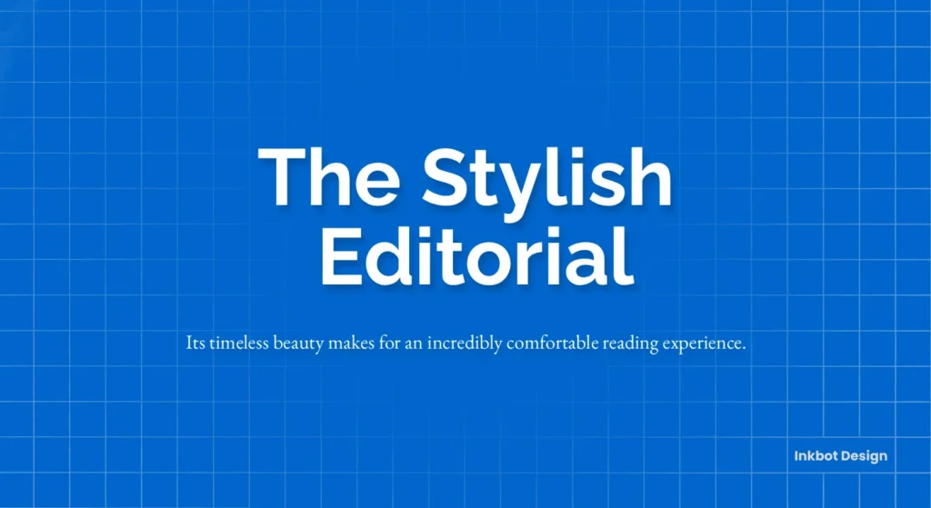
7. Raleway & EB Garamond: The Stylish Editorial
- Headline: Raleway
- Body: EB Garamond
Why it works: Raleway is an elegant sans-serif with a geometric flair, making it stylish and distinctive for headlines. It has a slightly quirky “W” that gives it character. EB Garamond is an open-source revival of the classic Garamond typeface, the gold standard for book printing for centuries. Its timeless beauty makes for an incredibly comfortable reading experience.
- Best For: Online journals, consultancies, authors, academic institutions, and brands with a heritage.
- Pro Tip: Use Raleway in a lighter weight (like Light 300) for a more airy and sophisticated headline feel.
8. Nunito Sans & PT Serif: The Approachable Consultant

- Headline: Nunito Sans
- Body: PT Serif
Why it works: Nunito Sans is a sans-serif with rounded terminals, which gives it a soft, warm, and approachable personality. It feels modern without being cold. PT Serif is a transitional serif that is highly legible and has a classic, reliable feel. The pairing is balanced—friendly and modern up top, traditional and trustworthy on the bottom.
- Best For: Coaches, consultants, non-profits, healthcare providers, and any business focused on building personal relationships.
- Pro Tip: The roundedness of Nunito Sans makes it great for call-to-action buttons. It feels less aggressive and more inviting.
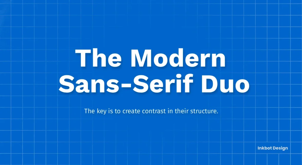
9. Work Sans & Fira Sans: The Modern Sans-Serif Duo
- Headline: Work Sans
- Body: Fira Sans
Why it works: Here’s another example of pairing two sans serifs. The key is to create contrast in their structure. Work Sans is optimised for on-screen use but has slightly quirky, wider letterforms that give it character in headlines. Fira Sans, designed for Mozilla, has a more condensed and utilitarian structure, making it excellent for blocks of UI text and body copy.
- Best For: Digital products, design studios, and forward-thinking brands that want to avoid serifs entirely.
- Pro Tip: Pay close attention to the font weights. Use a bold or extra-bold Work Sans to separate it from the regular-weight Fira Sans clearly.
10. Arvo & Hind: The Confident Slab Serif
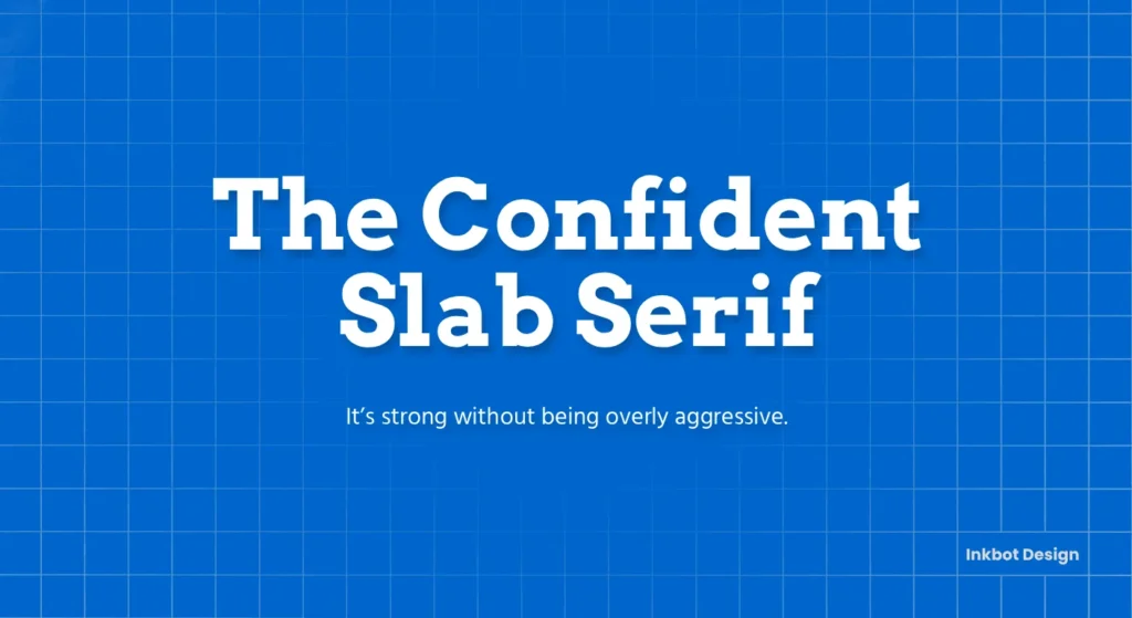
- Headline: Arvo
- Body: Hind
Why it works: Arvo is a geometric slab serif, which means it has those blocky “feet” but with modern, geometric proportions. This gives it a confident, sturdy, and slightly quirky feel. It’s strong without being overly aggressive. Hind is a clean, humanist sans-serif with a generous x-height, making it very readable for body copy and UI text. The contrast between the blocky serif and the clean sans-serif is clear and compelling.
- Best For: Marketing websites, landing pages, and any brand that wants to appear solid, reliable, and modern.
- Pro Tip: Arvo works surprisingly well for short testimonials or pull quotes to break up the page.
Stop Scrolling: The Only 3 Rules You Need for Font Pairing
Forget everything you’ve heard about kerning, ligatures, and typographic jargon. You can achieve professional-grade results by focusing on three simple rules.
Rule 1: Master Contrast, Don’t Just Seek It
Newcomers think contrast just means pairing a serif (the one with the little “feet” on the letters) with a sans-serif. That’s a start, but it’s lazy.
True contrast comes from creating a clear distinction between fonts. You can create contrast in several ways: structure (serif vs. sans-serif), weight (bold vs. light), size (large vs. small), and even style (condensed vs. wide). The goal is to make it immediately apparent to the reader what a headline is and what’s for reading.
Rule 2: Nail the Visual Hierarchy
Your website isn’t a novel. People scan. A clear visual hierarchy guides their eyes to the most critical information first.
- H1 (Your Main Headline): This should be the biggest, boldest text on the page. It makes a promise.
- H2/H3 (Subheadings): These summarise the text and organise the content. They should be distinct from the headline and body.
- P (Body/Paragraph Text): This must be ruthlessly legible. Its only job is to be read comfortably for long periods.
Your hierarchy has failed if a visitor can’t instantly tell the difference between these three roles.
Rule 3: Match the Mood to the Mission
Fonts have personality. A geometric sans-serif like Montserrat feels modern, technical, and clean. A classic serif like EB Garamond feels traditional, authoritative, and trustworthy.
Using a playful, rounded font for a law firm’s website creates a jarring disconnect. The font’s mood must align with your brand’s core message and mission. Don’t choose a font because you like it; choose it because it’s right for the job.
How to Actually Use These Combinations (Without Messing It Up)
Picking the pair is only half the battle; applying them correctly creates the professional polish.
It’s All About the Weight
Most business owners pick a font but only use the “Regular 400” weight. This is a massive mistake. The different weights (Thin, Light, Regular, Medium, SemiBold, Bold, Black) are your toolkit for creating hierarchy.
A good rule of thumb:
- Headlines (H1, H2): Bold (700) or SemiBold (600)
- Body Text (P): Regular (400)
- Captions or subtle UI text: Light (300)
Using multiple weights from the same family creates a rich, professional look.
Sizing and Spacing are 80% of the Game.
A great font pairing can be ruined by poor sizing. You don’t need complex typographic scales. Just follow this simple logic:
- Set your body text first. Make it comfortable to read. For desktop, this is typically between 16px and 18px.
- Make your headline significantly larger. A good starting point is 1.8x to 2.2x the size of your body text. If your body is 18px, your main headline could be around 36px.
- Give your text room to breathe. Increase your body text’s line height (leading) to about 1.6. This adds white space between lines and dramatically improves readability.
3 Common Font Mistakes That Make Your Business Look Cheap
Avoid these traps to stay out of the amateur zone.
Mistake 1: Prioritising “Beauty” Over Readability
That intricate script or ultra-thin display font might look amazing in a design mockup. But use it for a paragraph of text, and you’ve just made your website unusable. The primary job of your body font is to be read effortlessly. If it fails at that, it doesn’t matter how beautiful it is. This is my biggest pet peeve.
Mistake 2: Using Too Many Fonts
You do not need a different font for your headline, subheading, body, and call-to-action button. More than two font families is almost always a mistake. It creates visual chaos and makes your brand look unfocused. Stick to one pair and use different weights and sizes to create variety.
Mistake 3: Choosing a Font Without Context
You wouldn’t wear a tuxedo to a beach party. Don’t use a high-fashion font like Playfair Display for your new plumbing business website. The font must match the industry, the audience, and the overall brand message. Stealing a font combination from a brand you admire is lazy and often backfires if their context doesn’t match yours.
Your Typography is a Business Tool
Choosing a font combination isn’t an artistic indulgence. It’s a strategic business decision. The right typography communicates professionalism, builds trust, and makes your message easier to understand. The wrong typography creates friction and undermines your credibility before a customer knows what you sell.
Stop scrolling endlessly. Pick one of these proven combinations, apply the simple rules of hierarchy and weight, and focus on what really matters: running your business.
And if you’re finding that fonts are just the tip of the iceberg, that’s normal. Building a cohesive brand that communicates the right message is a complex job. It’s what we do. Let’s discuss whether you can stop guessing and create a powerful brand identity. See how we build brands that convert.
Frequently Asked Questions About Google Font Combinations
Are Google Fonts really 100% free for commercial use?
Yes. All fonts listed on Google Fonts are open source. You can use them in any commercial project, whether on a website, in a logo, or in print materials, without licensing fees.
How many fonts should I use on my website?
Stick to two font families at most. A single, versatile font family (a “superfamily” like Roboto) with many weights can also work. Using more than two creates visual clutter and can slow down your site.
What is the best font size for website body text?
For desktop viewing, a base font size of 16px to 18px is standard for body text. This ensures readability for most users. Mobile text can be slightly smaller but should remain comfortably legible.
What’s the main difference between a serif and a sans-serif font?
Serif fonts have small decorative strokes (or “feet”) at the ends of the main character strokes (e.g., Times New Roman, Lora). Sans-serif fonts do not have these strokes, resulting in a cleaner, more modern look (e.g., Arial, Montserrat).
Can I use two sans-serif fonts together?
Absolutely. The key is to ensure there is enough contrast between them. Pair a geometric, wide sans-serif headline font with a more neutral, condensed sans-serif for the body (like the Work Sans & Fira Sans example).
What is “x-height” and why does it matter?
The x-height is the height of the lowercase “x” in a font. Fonts with a larger x-height tend to be more legible at smaller sizes because the main body of the letters is bigger and clearer. This is crucial for body text on screens.
How do I add Google Fonts to my website?
Google Fonts provides easy-to-use code snippets. You can link to the font in your website’s <head> section or use the @import rule in your CSS file. Most modern website builders (like WordPress, Squarespace, and Webflow) have built-in integrations that let you select Google Fonts from a menu.
Which of these combinations is the most versatile?
Montserrat & Lora is arguably the most versatile combination on this list. It can be adapted for tech, corporate, creative, and personal brands with equal success. Merriweather & Open Sans are another extremely safe and adaptable choice.
Does the font I choose affect my website’s loading speed?
Yes. Each font family and weight you load is an extra file the user’s browser has to download. It’s best to select the specific weights you need (e.g., Regular 400, SemiBold 600, Bold 700) instead of loading the entire font family.
What’s the biggest mistake people make with font colours?
The biggest mistake is insufficient contrast. For example, using light grey text on a white background fails accessibility standards and is difficult for many people to read. Always ensure your text has a high contrast ratio against its background.


