10 Gestalt Principles: Psychology of Profit-Driven Design
Most designers focus on what looks “nice.” We focus on what works.
Your customers’ brains decide in 50 milliseconds if you’re a market leader or a basement-run amateur.
If your layout is a mess, you’re charging a “cognitive tax”—forcing users to work too hard to understand your offer. Eventually, they’ll go bankrupt and leave.
According to the Baymard Institute, poor UI layout is a primary driver for checkout abandonment.
To stop the friction and start converting, you must master these 10 Gestalt Principles—the psychological principles that govern how humans actually perceive information.
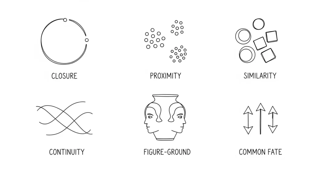
- Proximity: Group related items closely to reduce cognitive load and lower checkout abandonment rates.
- Similarity: Standardise visual elements to create functional expectations and boost click-through rates.
- Focal Point: Ensure one clear visual priority so users decide quickly without decision paralysis.
- Figure/Ground: Maintain strong contrast and clear separation to ensure accessibility and legibility.
- Common Region: Use containers or background changes to form modular, scannable information islands.
What are Gestalt Principles?
Gestalt principles are a set of psychological rules describing how the human brain naturally organises individual visual elements into meaningful groups or “unified wholes.”
Originating with German psychologists in the early 20th century, the term “Gestalt” literally means “pattern” or “configuration.”
The core components of Gestalt theory include:
- Emergence: The brain perceives the whole outline before the individual parts.
- Reification: The mind fills in gaps where visual information is missing.
- Invariance: The ability to recognise objects regardless of rotation, scale, or lighting.
The Neurobiology of Perception – Why Your Brain “Gestalts”
Visual perception is not a passive recording of the world; it is an active construction.
To understand why Gestalt Psychology works, we must look at the “Pre-attentive Processing” phase of the human brain.
Before you are even consciously aware of a website’s content, your Ventral Stream (the “what” pathway) and Dorsal Stream (the “where” pathway) are already categorising shapes, distances, and groups.
This process happens in roughly 13 to 50 milliseconds.
The brain evolved to find patterns as a survival mechanism—distinguishing a predator (figure) from the tall grass (ground).
In a modern context, if your website navigation doesn’t allow for this “instant categorisation,” the user experiences Cognitive Friction. This is a literal increase in glucose consumption in the brain as it struggles to make sense of the visual noise.
By adhering to the rules established by Max Wertheimer and Wolfgang Köhler, you are essentially “pre-sorting” information for the user’s brain, allowing them to focus on your value proposition rather than your layout’s logic.
1. The Principle of Proximity
Proximity states that things that are close together appear more related than those that are spaced apart. This is the most foundational rule in UI design.

The Technical Reality
In web development, this is often managed through “White Space” or CSS padding and margins.
If your heading is equidistant between two paragraphs, the brain cannot determine which section it belongs to. This creates a “Visual Stutter.”
Real-World Example:
Look at the logo design and branding for major tech firms like Google.
Their navigation menus don’t just sit randomly; the spacing between “Images,” “Maps,” and “News” is calculated to ensure the brain sees them as a single functional group, separate from the search bar.
Proximity, Fitts’s Law, and the “Thumb Zone”
To master Proximity in 2026, you must understand its relationship with Fitts’s Law. This mathematical model predicts that the time required to reach a target area depends on the distance to the target and the target’s size.
The formula (you don’t need to remember) is expressed as:
MT = a + b · log₂(2D / W)
Where MT is movement time, D is distance, and W is the width of the target.
In the context of User Interface design, Proximity isn’t just about grouping related items; it’s about placing related interactive elements within the “Thumb Zone” of a mobile device.
If your “Submit” button is in the top-right corner while the input field is in the bottom-left, you are violating the Principle of Proximity and Fitts’ Law simultaneously.
The user’s brain doesn’t see them as a single task, and their physical thumb movement is maximised, leading to higher task failure rates.
- Pro Tip: Group secondary actions (like “Cancel” or “Back”) slightly further away from the primary “Call to Action” to prevent accidental clicks, while keeping the primary action in the most accessible proximity to the user’s natural resting digit position.
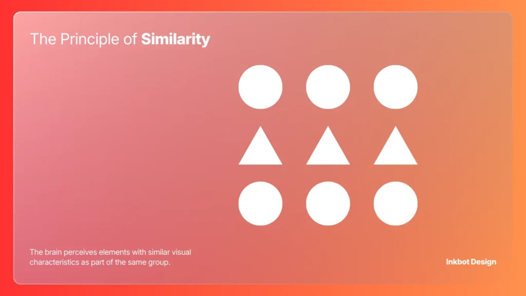
2. The Principle of Similarity
The brain perceives elements with similar visual characteristics as part of the same group. This includes colour, shape, size, and orientation.
Beyond the Basics
Amateurs think similarity is just about making all buttons blue. Professionals use similarity to create “Functional Expectations.”
If every link on your site is underlined and blue, but you suddenly introduce a red underlined word that isn’t a link, you’ve broken the user’s mental model.
Historical Case Study:
The Olympic Rings are a perfect execution of Similarity and Continuity.
The rings are identical in thickness and style, which immediately signals they belong to the same entity, despite their different colours representing different continents.
| The Wrong Way (Amateur) | The Right Way (Pro) |
| Using different icons for the same action. | Standardising icon sets to ensure “Visual Language.” |
| Mixing serif and sans-serif fonts randomly. | Using font families to signal “Information Hierarchy.” |
| Varied button shapes on a single page. | Consistent border-radius for all “Call to Action” elements. |
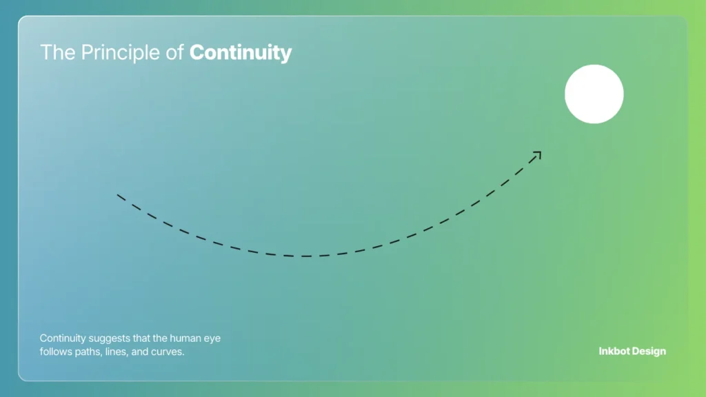
3. The Principle of Continuity
Continuity suggests that the human eye follows paths, lines, and curves. We prefer continuous flow rather than abrupt changes in direction.
Managing the Visual Path
In logo design, continuity guides the eye toward a specific focal point. If your logo has a sharp line pointing away from your brand name, you are literally directing customers to look elsewhere.
Real-World Example:
The Amazon logo. The arrow leads from ‘A’ to ‘Z’, creating a path for the eye to follow. It isn’t just a “smile”; it is a directional cue that reinforces the brand’s message of variety.
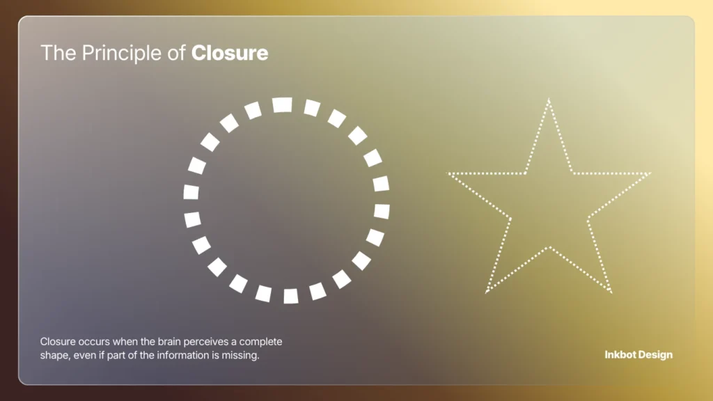
4. The Principle of Closure
Closure occurs when the brain perceives a complete shape, even if part of the information is missing. Our minds hate “Open Loops” and will work to fill in the gaps.
The “Aha!” Moment
This is a powerful tool for different types of logos.
It engages the viewer’s brain, making the brand more memorable. However, if you leave too much to the imagination, the logo becomes a Rorschach test of failure.
Real-World Example:
The WWF (World Wildlife Fund) panda. There is no actual outline for the top of the panda’s head or back. Your brain uses the black shapes to “close” the white space and form the image. This reduces visual clutter and makes the mark iconic.
5. The Principle of Figure/Ground
This principle explains how we distinguish an object (the figure) from its surroundings (the ground). It is about the relationship between positive and negative space.
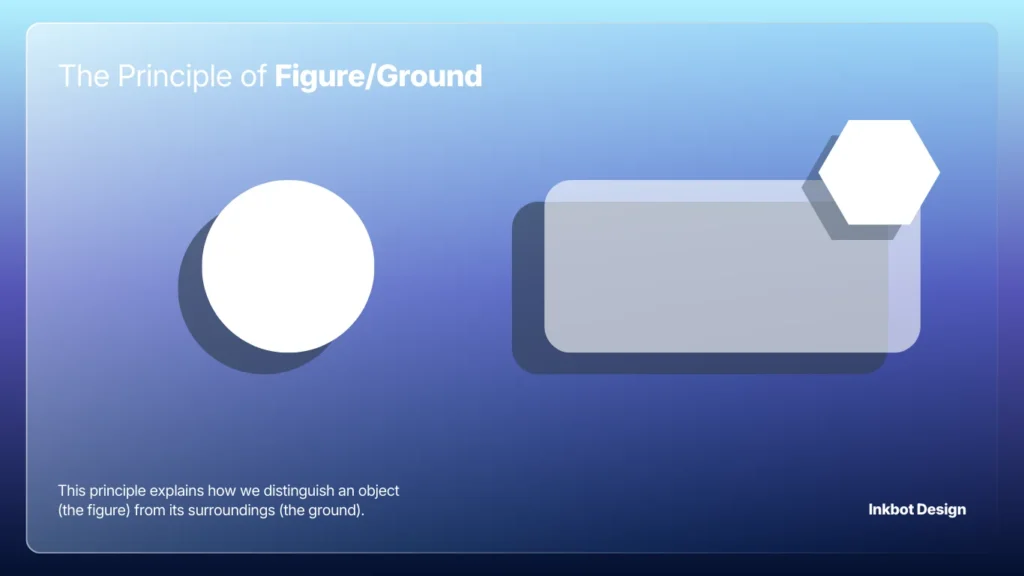
The Danger of Ambiguity
In 2026, with the rise of complex logo design trends, many brands are failing the Figure/Ground test. If your background is too busy, your “Figure” (the content) gets lost.
Technical Nuance:
On mobile devices, Figure/Ground relationships are often ruined by poor contrast.
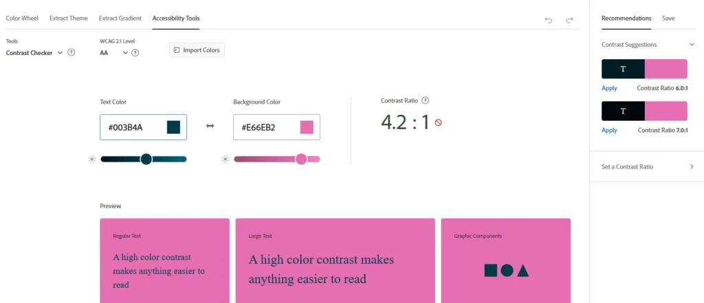
WCAG 2.2 standards require specific contrast ratios (at least 4.5:1 for normal text) to ensure the “Figure” is legible against the “Ground.”
Ignoring this isn’t just bad design; it’s an accessibility lawsuit waiting to happen.
6. The Principle of Common Region
Common Region is similar to Proximity but involves a clear boundary. Elements located within the same closed region are perceived as a group.
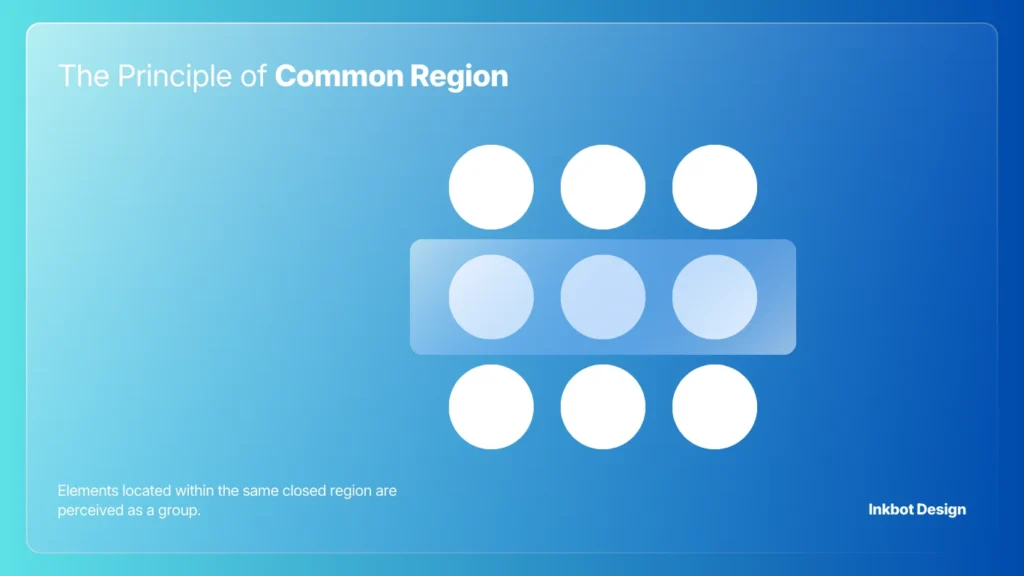
The “Border” Strategy
You can have items far apart, but if you put a box around them, they become a unit. This is vital for complex B2B interfaces.
Use it to separate “Account Settings” from “Billing Information” without requiring excessive white space.
We often see minimum viable branding projects where the website footer is a mess.
By simply adding a subtle background colour change (a Common Region) to the footer, you can instantly organise twenty disparate links into a cohesive block.
The “Bento Grid” – Modern Common Region Strategy
In 2026, the Common Region principle found its ultimate expression in the Bento Grid layout.
Popularised by Apple and SaaS giants like Linear and Raycast, this design pattern uses clearly defined containers (regions) to group disparate data points into a cohesive whole.
Unlike standard Proximity, which relies on “empty space” to separate items, a Bento Grid uses subtle borders or slight background variances to create “islands of information.”
This is particularly effective for dashboards that need to show a user’s “Account Balance,” “Recent Transactions,” and “Security Status” on a single screen.
Why the Bento Grid works:
- Reduced Cognitive Load: Each box acts as a “mental drawer.” The brain only has to process one drawer at a time.
- Responsive Invariance: Boxes can be easily re-ordered (stacked) for mobile devices without losing their internal logic.
- Visual Interest: It allows for a mix of typography and iconography while maintaining a strict Visual Hierarchy.
If you are designing a complex B2B landing page, stop relying on endless vertical scrolls. Use Common Region boxes to create a modular “information map” that the user can scan in a Z-pattern.
Gestalt Principles for Creatives
The core “Gestalt” thesis is that the human brain is hard-wired to find order in chaos. We don’t see individual pixels or lines; we see “wholes” (Gestalten). For a branding expert, mastering these laws is like learning the source code of the human eye.
As an Amazon Partner, when you buy through our links, we may earn a commission.
7. The Principle of Focal Point
Every design needs a primary area of interest. This principle dictates that whatever stands out visually will capture and hold the viewer’s attention first.
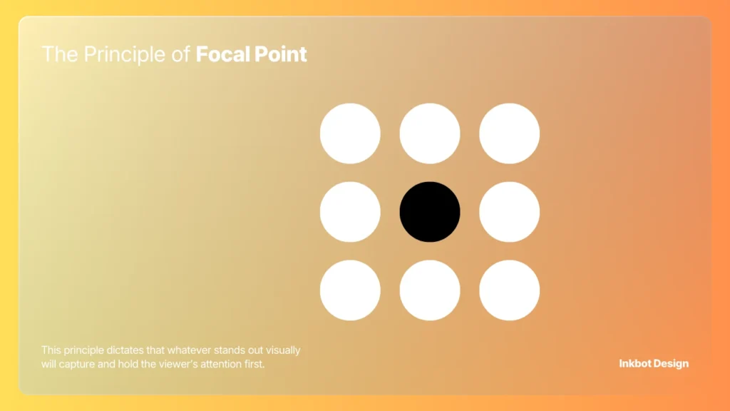
Engineering the “First Look”
If everything is bold, nothing is bold. If you have three different “Buy Now” buttons on a page, all the same size and colour, you are forcing the user to make a choice. Decision paralysis follows.
Technical Tip:
Use the “Blur Test.” Squint at your website or wordmark vs logomark until everything is blurry. Whatever still stands out is your focal point. If nothing stands out, your design is a flatline.
8. The Principle of Symmetry and Order (Prägnanz)
The Law of Prägnanz (meaning “pithiness” in German) states that people will perceive and interpret ambiguous or complex images as the simplest form(s) possible. We prefer symmetry because it feels “safe” and “ordered.”
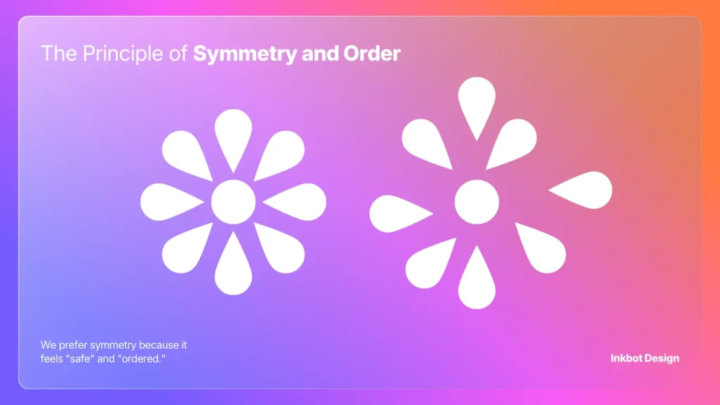
The Myth of Asymmetry
Designers often chase “edgy” asymmetrical layouts to be “different.” But for an SME owner, asymmetry usually just looks like a mistake.
Unless you are a high-fashion brand, stick to symmetry. It reduces the cognitive load required to understand your layout.
Real-World Failure:
The 2012 London Olympics logo. It was a deliberate attempt to break the Law of Prägnanz.
The result? It was widely panned, challenging to read, and even triggered photosensitive epilepsy in some viewers due to its jagged, chaotic forms. It was a logo design mistake of historic proportions.
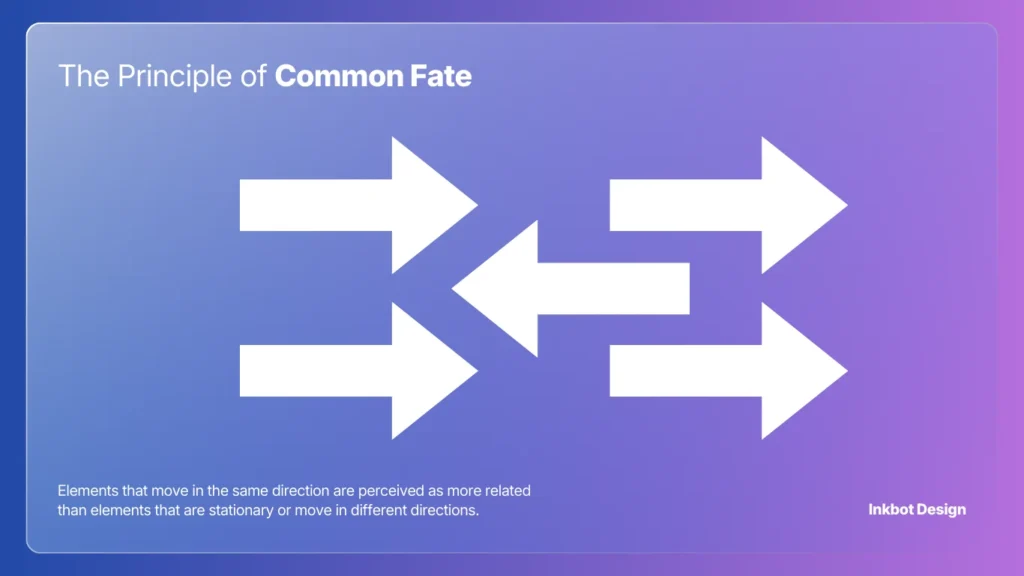
9. The Principle of Common Fate
Elements that move in the same direction are perceived as more related than elements that are stationary or move in different directions.
Interaction Design in 2026
In modern web design, this applies to animations and transitions. If a user clicks a “More Info” accordion and three different elements slide in from various directions, the “Common Fate” is broken. It feels glitchy.
Technical Requirement:
When using vector vs raster images in animations, ensure your SVG paths are synchronised. If your navigation menu items all slide in together at the same speed (Common Fate), the brain identifies them as a single functional unit.
Common Fate and the 2026 Micro-interaction Standard
In Interaction Design, it is the difference between a site that feels premium and one that feels broken. When a user interacts with a “Mega Menu,” every element within it must move in sync.
If the text appears 100ms after the background container, the “Common Fate” is severed, and the user perceives the elements as unrelated glitches.
The “Synchronous Flow” Checklist:
- Directional Alignment: If a “Success” message slides in from the top, the “Dismiss” icon should arrive with it, not pop in from the side.
- Velocity Matching: Elements moving at different speeds within the same group create “Visual Dissonance.” Use Linear or Ease-in-Out curves consistently across all grouped assets.
- State Changes: When a button is hovered, the colour change and the “lift” shadow must happen simultaneously to reinforce the Common Fate of the button’s “Active State.”
In 2026, we use Common Fate to guide users through multi-step forms.
As one section fades out, the next should fade in with the same easing curve, signalling a continuous “journey” rather than a series of disconnected pages.
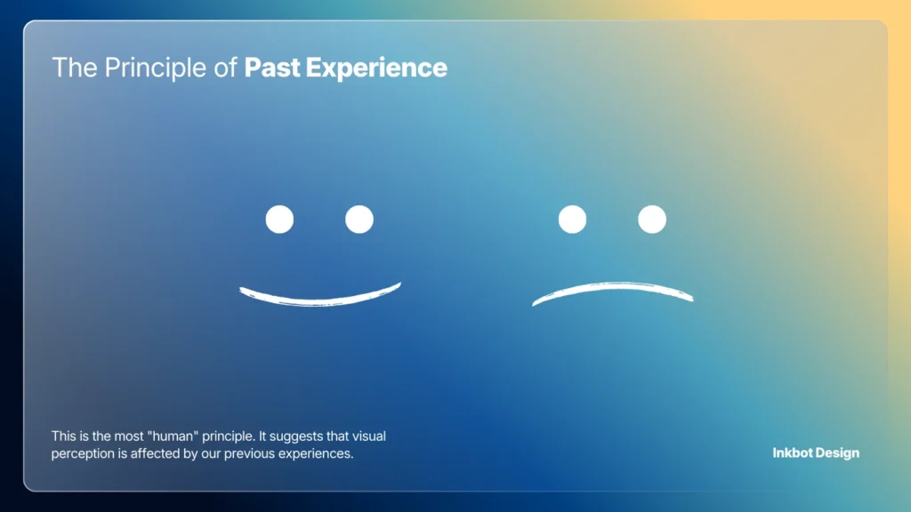
10. The Principle of Past Experience
This is the most “human” principle. It suggests that visual perception is affected by our previous experiences. We categorise things based on what we already know.
The Obsolescence of “Innovation”
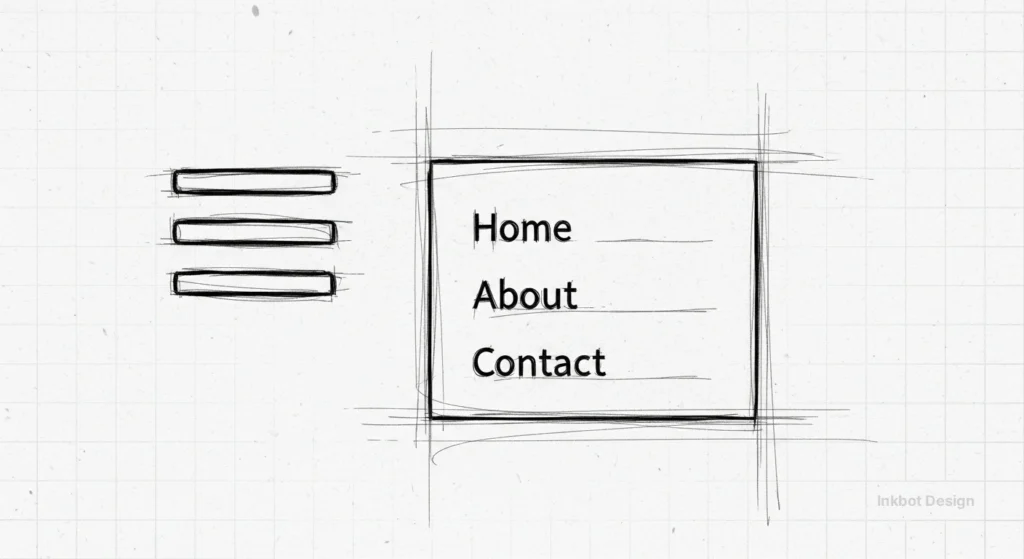
Stop trying to reinvent the wheel. A “hamburger menu” icon (three horizontal lines) works because of Past Experience. If you change it to three dots because it looks “sleeker,” you are confusing your audience.
Consultant’s Note:
In our logo design process, we always check whether a client’s “innovative” new icon looks too similar to something else.
If your financial services logo looks like a laundry detergent brand due to Past Experience, you’re in trouble.
Gestalt for Accessibility: Beyond Visual Perception.
In 2026, design is no longer just “visual”—it is multisensory.
WCAG 2.2 standards have made it clear that “perceivable” information is a human right. Gestalt principles are the secret weapon for achieving this.
Figure/Ground and Contrast
The most common accessibility failure is a lack of “Luminance Contrast.”
If your “Figure” (text) doesn’t have a ratio of at least 4.5:1 to your “Ground” (background), users with visual impairments, such as colour blindness or low vision, may not be able to distinguish the information.
Use tools like the Adobe Colour Accessibility Checker to ensure your Similarity (through colour) doesn’t exclude 8% of your male audience.
Proximity and Screen Readers
Proximity is often communicated visually through white space, but for a user on a screen reader, Proximity is expressed through the Document Object Model (DOM) order.
If your visual layout puts a label next to a field, but your code puts them 50 lines apart, you have violated the Principle of Proximity for non-visual users.
Symmetry and Neurodivergence
For users with ADHD or Autism, the Law of Prägnanz (Simplicity) is not a preference—it is a requirement.
Overly complex layouts with multiple Focal Points can trigger sensory overload.
A symmetrical, ordered layout provides a “safe” visual environment, increasing time-on-page for neurodivergent audiences.
The “AI Visual Slop” Audit – Fixing Generative Errors
We are currently in the “Generative Slop” era.
Tools like Midjourney and DALL-E 3 are incredible at creating aesthetics but terrible at maintaining Gestalt Integrity.
As a business owner or designer in 2026, you must perform a “Gestalt Audit” on every AI-generated asset.
The 4-Step AI Gestalt Audit:
- The Continuity Check: Zoom in on lines and edges. AI often fails to “connect” paths (e.g., a table leg that doesn’t meet the floor). This breaks the Principle of Continuity and creates a sense of “Uncanny Valley” unease.
- The Closure Test: Does the AI-generated logo have “open loops” that don’t make sense? If a brain can’t “close” the shape because the gaps are too significant or logically inconsistent, the brand mark will fail to be memorable.
- The Common Region Scan: AI often “bleeds” backgrounds into foregrounds. Check for “ghost limbs” or objects that melt into the floor. This ruins the Figure/Ground relationship.
- The Similarity Audit: AI loves to add “random detail.” If you have a row of five icons, but the AI gave one of them a slightly different shadow or line weight, the Principle of Similarity is broken, and users will wonder if that one icon has a different function.
Professional Tip: Use Vectorize.ai or Adobe Illustrator’s “Text to Vector” to refine AI outputs. Human-led manual path correction is the only way to ensure the Law of Prägnanz is fully respected.
Gestalt Principles in Action
The following table illustrates how specific principles impact core business metrics based on 2024–2026 UX studies.
| Principle | Primary Use Case | Conversion Impact | Ideal 2026 Persona |
| Proximity | Checkout & Sign-up Forms | Up to 35% reduction in abandonment | The “Busy Shopper” |
| Similarity | Navigation & CTA Buttons | 20% increase in Click-Through Rate (CTR) | The “First-time Visitor” |
| Closure | Minimalist Branding / Logos | Higher brand recall & “Aha!” engagement | The “Sophisticated Buyer” |
| Common Region | B2B Dashboards & SaaS | 40% faster task completion time | The “Data Analyst” |
| Common Fate | Mobile Gestures & Transitions | Improved “App-like” feel & retention | The “Gen Z Mobile User” |
| Focal Point | Landing Page Headlines | Directs eye to “Buy Now” in <50ms | The “Impulse Buyer” |
The Verdict
Design is not a decorative layer; it is a communication system.
If you ignore the 10 Gestalt principles, you are effectively speaking to your customers in a broken language.
You might think your site looks “modern,” but if you’ve violated Proximity and Similarity, your customers’ brains are screaming at them to leave.
Your branding should be an invisible assistant, guiding the user toward a purchase with zero friction. If you are seeing high bounce rates or low brand recall, your visual strategy is likely the culprit.
If you are tired of amateur results and want a visual identity that actually obeys the laws of human psychology, explore our services or request a quote today.
We don’t just draw pretty pictures; we engineer topical authority and visual clarity.
Frequently Asked Questions (FAQ)
What is the most critical Gestalt principle?
Proximity is the most vital for UI/UX. It dictates how we group information. Without proper proximity, a layout becomes a collection of random data points rather than a structured message. It is the foundation of all visual hierarchy.
How do Gestalt principles affect SEO?
Indirectly, but significantly. Google’s Core Web Vitals and “Page Experience” signals track user behaviour. If poor Gestalt principles lead to high bounce rates and low dwell time, your rankings will suffer. Good design is a technical SEO requirement in 2026.
Can I use multiple Gestalt principles at once?
You should. The best designs—like the Apple or Nike logos—combine Similarity, Closure, and Figure/Ground to create a simple yet profound visual impact. They work in harmony to reduce cognitive load.
Why is Figure/Ground important for mobile design?
Mobile screens are small. If the “Figure” (your content or CTA) isn’t clearly distinguished from the “Ground” (your background), users will struggle to tap the correct elements. This leads to “Fat Finger Syndrome” and lost sales.
What is the Law of Prägnanz?
It is the “Law of Good Figure.” It states that our brains will always simplify complex shapes into the most basic form possible. Design that fights this law feels “busy” and “stressful” to the viewer.
How does the Principle of Closure help branding?
It creates a “Mental Hook.” When the brain has to complete a shape, it engages more deeply with the image. This increased engagement leads to better brand recall and a more memorable identity.
What happens if I ignore the Principle of Similarity?
You create visual chaos. If every element on your page looks different, the user has to re-learn how to use every section. This creates high friction and quickly leads to user fatigue and site abandonment.
Can Gestalt principles be “Dark Patterns”?
Yes. For example, some sites use the Principle of Similarity to make a “paid” advertisement look identical to a “natural” search result. While this might increase short-term clicks, it violates the Principle of Past Experience and destroys long-term brand trust.
What is the difference between Proximity and Common Region?
Proximity relies on the space between objects to imply a group. Common Region uses a visible boundary, such as a box or a background colour, to enforce a group, even when the objects are far apart.
Does every logo need to use the Principle of Closure?
Not every logo, but those that do often achieve a higher “Cognitive Hook.” If the viewer’s brain completes the image, they have “invested” a small amount of mental energy into your brand, which significantly increases memory retention compared to a “flat” logo that requires no interpretation.
How does the Principle of Continuity guide user navigation?
Continuity uses lines or visual paths to “point” the user toward the next step. This could be a literal arrow or just a series of elements that create a flow leading toward your “Call to Action” button.
How do I measure if my focal point is working?
Use the “Blur Test.” Take a screenshot of your page and apply a 10px Gaussian blur. The only thing that should still be identifiable is your primary Call to Action. If three different areas are competing for attention, you have failed the Principle of Focal Point and are likely suffering from “Decision Paralysis.”
How do Gestalt principles apply to Typography?
Through Proximity and Similarity. “Leading” (the space between lines) and “Kerning” (the space between letters) use Proximity to create legible words. Using the same font weight for all H2 tags helps the Similarity signal to the reader, “this is a new section.”
