15 Practical Steps for Enhancing User Experience (UX)
User experience—UX—isn’t a mystical art form whispered about by turtleneck-wearing designers in minimalist offices. It isn’t about winning design awards or making something so breathtakingly beautiful that it tears the eye.
It’s plumbing.
It’s the tedious, invisible, essential work of ensuring things flow in the right direction without causing a mess. When it works, nobody notices. When it fails, you’ve got a serious, expensive problem.
- User experience is about easing user interactions, not flaunting design. Primarily, focus on functional simplicity and clarity.
- Common issues obstructing UX include slow loading times, confusing navigation, and hidden contact details. Fix these first.
- Your site's purpose should be clear immediately. Users should understand actions and information without guesswork.
- Authenticity and user-centric content enhance trust and ease of use. Avoid stock images and corporate jargon.
Most “User Experience” is Just Polished Frustration
The biggest problem in web design isn’t a lack of creativity. It’s a surplus of ego.
Businesses, especially small ones, are desperate to look impressive. They ask for flashy animations, ridiculously clever navigation menus, and long-winded text explaining their “synergistic paradigms.” They build a website that serves their vanity, not the customer’s needs.
The result is a digital masterpiece that is utterly infuriating to use. A website that is, frankly, annoying. It confuses, obstructs, and disrespects the one person it should serve: the user who might pay for your product or service.
Good UX isn’t about adding more. It’s about ruthlessly taking away everything that gets in the way.
15 Ways You’re Frustrating Users (And How to Stop)
If your website traffic isn’t converting, the problem isn’t bad luck. It’s bad design. Here are fifteen of the most common—and easily fixed—offences.
1. Your Site is Slow. Full Stop.

Patience is dead. A study from years ago showed that 40% of people abandon a website that takes more than three seconds to load. Today, it’s even less. Three seconds is an eternity.
When your site lags, you’re not just testing someone’s patience. You’re communicating that you don’t value their time. It’s the digital equivalent of showing up 20 minutes late for a meeting. It’s arrogant.
How to fix it: Stop what you’re doing. Go to Google’s PageSpeed Insights and type in your URL. Now. Look at the score. If it’s red or amber, you have a problem. The most common culprit? Gigantic, uncompressed images. Fix them.
2. Nobody Can Find Your Contact Details
This is my number one pet peeve. You are a business. You exist, presumably, to transact with other humans. Why would you make it a secret agent mission to find your phone number or physical address?
Hiding contact information in a faint, tiny link in the footer is an act of self-sabotage. People don’t want to hunt for it. They want to see it, tap it, and call you.
How to fix it: Put your phone number in the header. At the top. On every single page. Put your address and a map link in the footer if you’re a local business. Make it insultingly obvious.
3. Your Navigation is a Clever Maze
I once saw a portfolio site that used symbols of different birds for its navigation. You had to guess that the owl meant “About Me” and the eagle meant “Portfolio.” It was artistic, unique, and utterly useless.
Stop being clever. Nobody wants to solve a puzzle to find your services page. They want a button that says “Services.”
This is called “mystery meat navigation,” a plague. Your website is a tool, not an escape room.
How to fix it: Use boring words. About.” “Services.” “Blog.” “Contact.” Your main navigation should have between three and six items, and the labels should be instantly understandable to a five-year-old.
4. You Don’t State What You Do Instantly
A user lands on your homepage. The clock starts ticking. You have about three seconds to answer their one, crucial question: “Am I in the right place?”
If your headline is “Innovating Tomorrow’s Solutions Today” and you sell accounting software, you’ve failed. They’re gone.
How to fix it: Write a value proposition that a normal person can understand. Put it front and centre, “above the fold” (before they have to scroll). It should state what you do, who you do it for, and what makes you the right choice. Plain English. No fluff.
5. You Write for Yourself, Not for Them

Your “About Us” page is not where you copy and paste your mission statement, which is full of corporate jargon. Nobody cares about your “commitment to leveraging cross-functional assets to achieve scalable results.” They care about what’s in it for them.
Your copy should sound like a human talking to another human. It should be clear, direct, and focused on the user’s problems, not your company’s self-importance.
How to fix it: Read your website copy out loud. Does it sound ridiculous? Yes? Rewrite it. Use short sentences. Simple words. Run your text through the Hemingway App. It will force you to be clear. Aim for a reading level of a 14-year-old.
6. Your Buttons Don’t Look Like Buttons
A user should never have to wonder, “Is this clickable?” A bit of underlined text in a slightly different shade of grey isn’t a call to action. It’s a guess.
Good design creates clear signifiers. A button should look like a button. It should have a solid background colour, a clear text label, and a subtle shadow. It needs to scream “CLICK ME!”
How to fix it: Look at every link and button on your site. Are they obvious? Use an intense, contrasting colour for your main call-to-action buttons. Don’t just rely on an outline; fill it in.
7. Your Forms Ask for a Blood Sample
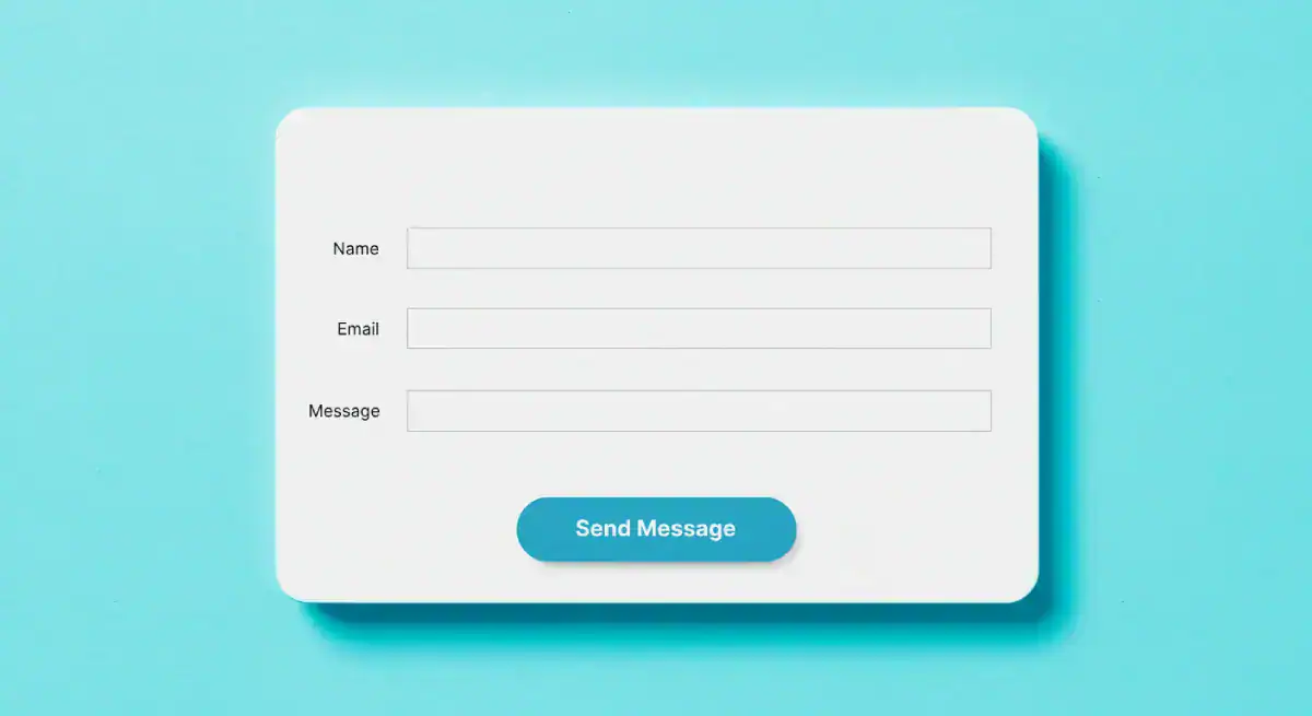
I recently tried to download a whitepaper from a B2B software company. The form had 15 fields. It wanted my name, email, phone number, company name, number of employees, annual revenue, job title, country, star sign, and first pet’s name. I closed the tab.
Every field you add to a form is another reason someone gives up.
How to fix it: Be ruthless. Look at your contact form or checkout process. Do you need their fax number? Do you need to know their job title right now? No. Get rid of it. For an initial contact, a name and an email are often all you need. Reduce the friction.
8. Your Mobile Experience is an Afterthought
More than half of all web traffic is on mobile. If you designed your website on a giant 27-inch monitor and only checked the mobile version as a last step, you’ve created it for a minority of your users.
Text that’s too small to read, buttons too close together to tap accurately, and layouts that require pinching and zooming are unacceptable. It’s lazy.
How to fix it: Design for mobile first. Think about how the site will work on a small screen, held in one hand. This forces you to prioritise what’s truly important. Use large fonts, thumb-friendly buttons, and a simple, single-column layout.
9. You Assault People with Pop-ups
The user has been on your site for precisely 1.2 seconds. They haven’t even had a chance to read the headline. Suddenly, their entire screen is blocked by a massive pop-up demanding their email address for your newsletter.
This is the digital equivalent of a salesperson jumping in front of you the second you walk into a shop. It’s jarring, desperate, and deeply annoying.
How to fix it: If you must use a pop-up, be smart about it. Set it to appear on exit-intent (when the user’s cursor moves to leave the page) or after they’ve scrolled down at least 70% of the way. They’ve shown interest; now you can make your ask.
10. You Use Stock Photos of People Laughing at Salad

Authenticity builds trust. Cheesy, generic stock photos destroy it. Everyone knows that’s not your real team. Everyone knows your customers don’t look like they’re in a toothpaste commercial.
These photos signal that you’re just like everyone else. They are visual filler with zero personality.
How to fix it: Get a decent camera or hire a local photographer for an afternoon. Take pictures of your team, your office workshop, and your exhibits. Real photos are a thousand times more effective than slick, soulless stock imagery, even if they aren’t technically perfect.
11. Your Content is an Unbroken Wall of Text
People don’t read on the internet. They scan.
They look for headings, bullet points, and keywords that catch their eye. If they land on a page that is one giant, intimidating block of text, they won’t even start. They’ll just leave.
How to fix it: Break it up.
- Use short paragraphs—no more than three or four sentences. One-sentence paragraphs are great for emphasis.
- Use descriptive subheadings (H2S, H3S). Guide the reader through the content.
- Use bullet points and numbered lists. They are incredibly easy to scan.
- Embrace white space. Let your content breathe. It makes it feel less daunting.
12. You Make People Think
The single most important principle of good UX was captured in the title of a book by Steve Krug: Don’t Make Me Think.
The user’s path should be effortless. The next step should always be the most obvious. They shouldn’t have to pause and wonder what to do next. The moment they have to think, you’re creating friction.
Look at the GOV.UK website. It’s brutally simple. There is no ambiguity. It’s not “beautiful,” but it is one of the best examples of user experience because it is relentlessly clear.

How to fix it: Have a friend or family member (someone who doesn’t know your site) try to accomplish a simple task, like finding the price of your leading service. Watch them. Don’t help them. See where they get stuck. That’s where you need to simplify.
13. You Have No Clear Call to Action
Why does this page exist? What do you want the user to do after reading it? If you can’t answer that question, neither can they.
A page without a clear Call to Action (CTA) is a dead end. You’ve brought the user this far, given them information, and left them standing there.
How to fix it: Every page on your site needs a primary CTA. “Request a Quote.” “Buy Now.” “Learn More.” “Contact Us.” Make it a big, obvious button. Guide them to the next logical step in their journey with you.
14. You Ignore the Data Staring You in the Face
You are not your user. The things you think are obvious might be hopelessly confusing to them. Luckily, you don’t have to guess.
Your users tell you precisely what’s wrong with your site daily through their behaviour. You just have to listen.
How to fix it: Install Google Analytics. Look at which pages have the highest bounce rates or exit rates. Those are your problem pages. Install a tool like Hotjar to see heatmaps of where people are clicking (and where they aren’t). Watch session recordings. The data will show you the truth.
15. You Asked a Designer to Make it “Pretty”
I once consulted for a local butcher. He’d spent a fortune on a new website. It was an animated masterpiece. It had stunning, artistic photos of cuts of meat fading in and out. It was an actual “art project.” The problem? The “Order Online” button was hidden, the opening hours were wrong, and it took 10 seconds to load. His online orders had plummeted.
He hadn’t asked for a website that worked; he’d asked for one that was “pretty.” That’s a critical mistake.
Good design isn’t just about aesthetics. It’s about building a solid foundation where clarity and function come first. A professional design process focuses on the user journey and business goals from day one, ensuring the final product isn’t just a pretty picture, but a hard-working tool for your business. Investing in proper, goal-oriented web design services isn’t a cost—it’s a crucial business investment.
It’s Not Complicated. It’s Respect.
Enhancing user experience doesn’t require a PhD in psychology or a massive budget.
It requires you to get out of your head and develop empathy. It’s about respecting your users’ time, which is precious, and their attention is fleeting.
Stop trying to be clever. Stop trying to look impressive.
Start being useful. Start being clear. The rest will follow.
Is your website guilty of a few of these? It’s a common problem. The good news is that it’s fixable.
You can dive deeper into design thinking on our blog, or if you’d rather have an expert take a look, that’s what we’re here for. We build websites that don’t annoy people.
Request a no-obligation quote today, and let’s figure out how to make your website work harder for you.
Frequently Asked Questions About User Experience
What is the difference between UX and UI?
UX (User Experience) is a user’s overall feeling when interacting with your site—is it easy, logical, pleasant? UI (User Interface) is the specific visual elements they interact with—the buttons, menus, and forms. UX is the journey; UI is the road signs.
How can I get feedback on my website’s UX?
The easiest way is to ask five people who don’t know your business to perform a specific task on your site (e.g., “Find the price for X service and contact us about it”). Watch them do it without helping. Their hesitation and confusion are due to your feedback.
What is the single most important UX element?
Clarity. If users don’t understand what you do and what they’re supposed to do next within seconds, everything else (speed, beauty, features) is irrelevant.
How much does a reasonable UX cost?
Bad UX is expensive—it costs you customers and revenue every day. Investing in good UX, whether through your own time or by hiring a professional, has one of the highest returns on investment because it directly impacts conversions.
Does UX affect my SEO?
Yes, significantly. Google rewards sites that users love. Metrics like bounce rate, time on page, and page speed directly reflect user experience. A good UX keeps people on your site longer, signalling to Google that your site is a quality result.
What is a “user journey”?
A user journey is a visitor’s path through your website to accomplish a goal. For example, landing on a blog post from Google > clicking to a services page > navigating to the contact page to enquire. Mapping these journeys helps you identify and remove points of friction.
How important is “white space”?
Extremely. White space (or negative space) is the empty area around your text and images. It’s not wasted space; it’s a powerful tool that reduces cognitive load, improves readability, and helps focus the user’s attention on what’s most important.
What is “A/B testing” in simple terms?
A/B testing shows other users different page versions (or an element, like a button) to see which performs better. For example, you could test a green “Buy Now” button (Version A) against a blue one (Version B) to see which gets more clicks.
Should I put my prices on my website?
For most businesses, yes. Hiding your prices creates friction and suspicion. It makes users assume it’s too expensive. Being transparent builds trust and qualifies your leads, so you don’t waste time with people who can’t afford you.
My website is responsive, isn’t that enough for mobile UX?
Not necessarily. A responsive site just means it adapts to the screen size. Good mobile UX goes further—it considers the mobile user’s context. This means bigger buttons for tapping, more straightforward navigation, and content prioritised for someone on the go.


