
7-Step Framework to Launch a Design System in 30 Days
If you’re reading this, chances are you’re drowning in design inconsistencies, duplicated efforts, and the constant “but that’s not how we did it last time” conversations.
I’ve been there. At that moment, you realise your product looks like it was designed by 12 people (because it probably was). The good news? A proper design system solves this—and no, you don’t need six months to build one.
- A design system is crucial for maintaining consistency and enhancing collaboration across design and development teams.
- The 30-day framework includes auditing, defining principles, and testing with real projects for effective implementation.
- Establishing documentation and governance is essential for ensuring long-term usability and maintenance of the design system.
- Adoption strategies are vital; training and demonstrating benefits help integrate the design system into workflows.
What Actually Makes a Design System Work?
Before diving into our 30-day framework, let’s clarify what we’re building. A design system isn’t just a collection of pretty UI components or a style guide gathering digital dust.
A proper design system is the single truth source for your entire product ecosystem. It combines:
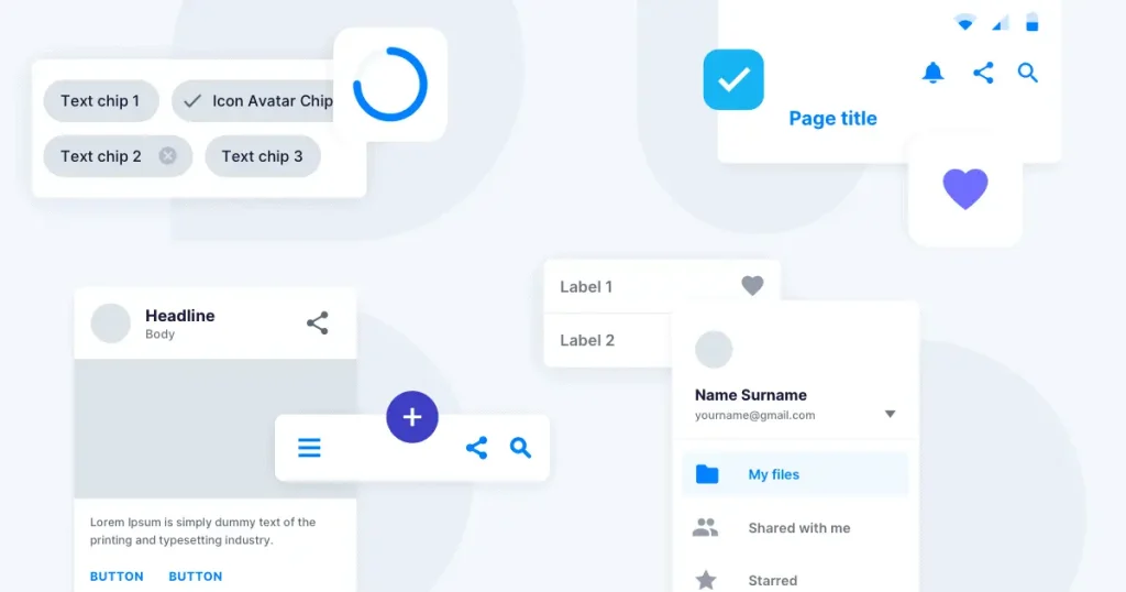
- Reusable components that developers can implement
- Design patterns that solve real user problems
- Design tokens that maintain visual consistency
- Documentation that anyone can understand (yes, even the new hire)
- Governance to keep everything from falling apart next quarter
The magic happens when design systems transform from reference documents into living tools designers and developers want to use.
The 30-Day Design System Framework
I’ve helped teams across various industries implement design systems and found that a focused 30-day sprint can get you from chaos to consistency. Here’s the framework we’ll explore:
- Audit your current design landscape
- Define your design principles
- Create your core components
- Establish your design tokens
- Build your documentation hub
- Test with real projects
- Plan for maintenance and growth
Let’s dive into each step.
Step 1: Audit Your Current Design Landscape (Days 1-3)
The first rule of fixing a problem is understanding its scope. Your initial audit should be ruthless but efficient.
Gather All Design Assets
Pull together everything—interfaces, marketing materials, internal tools, the lot. You’ll likely be shocked by the inconsistencies.
I once worked with a fintech company that discovered they used 37 different button styles across their product. Thirty-seven! No wonder their developers were constantly frustrated.
Document Inconsistencies
Create a simple spreadsheet with categories like:
- Component variations (e.g., buttons, forms, cards)
- Colour usage
- Typography
- Spacing patterns
- Interaction patterns
For each category, note the variations you find and where they appear. This isn’t just busywork—it’s ammunition for getting buy-in later.
Identify What’s Working
Not everything needs to be scrapped. Some components or patterns might be working brilliantly. Note these, too—they’ll form the foundation of your new system.
Step 2: Define Your Design Principles (Days 4-5)
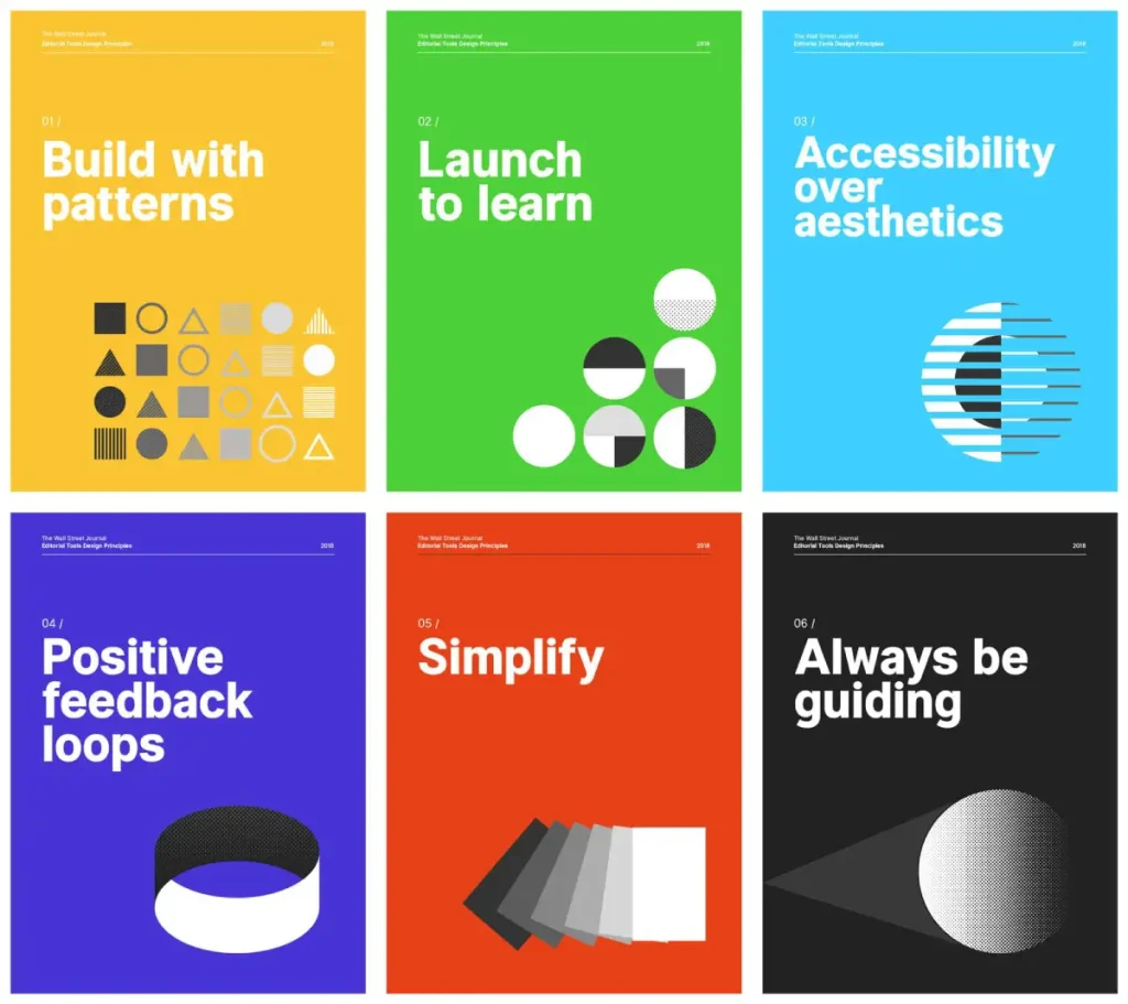
Design principles aren’t fluffy nonsense—they’re decision-making tools that will save endless debates later.
Workshop With Stakeholders
Grab representatives from design, development, product, and even customer support. Run a focused workshop asking:
- What makes our product unique?
- What values should our interfaces embody?
- What frustrates users most about our current experience?
- What are our accessibility requirements?
Craft Clear Principles
Avoid vague statements like “make it user-friendly.” Instead, create principles with teeth:
“Reduce cognitive load by showing only what’s needed when needed.”
“Prioritise rapid task completion over feature discovery.”
These specific principles will help you make tough decisions when designing your components.
Validate With Examples
Please provide examples of interfaces that follow or violate each principle. This translation from abstract to concrete helps everyone understand what you’re aiming for.
Step 3: Create Your Core Components (Days 6-12)
Now for the building blocks. Focus on the 20% of components that appear in 80% of your interfaces.
Prioritise Your Component List
Based on your audit, identify your high-frequency components. Typically, these include:
- Buttons and links
- Form elements
- Navigation patterns
- Cards and containers
- Notification elements
Design Component Variations
For each component, create only the variations you need. Resist the urge to design for every edge case—you can add these later.
Google Material Design System didn’t start with everything they have now. They began with core elements and expanded methodically.
Define Component Behaviour
Document how components respond to:
- Different states (hover, focus, disabled)
- Screen size changes
- User interactions
- Error conditions
Code Your First Components
Don’t just make pretty pictures—get your developers involved early to create reusable code components. This is crucial for adoption.
Look at how the Atlassian Design System handles this. Each component comes with usage guidelines and ready-to-implement code snippets.
Step 4: Establish Your Design Tokens (Days 13-15)
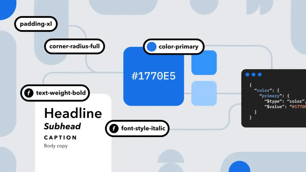
Design tokens are the secret sauce of scalable design systems. They’re the named values that store visual attributes like colours, spacing, typography, and more.
Create Your Token Hierarchy
Structure your tokens logically:
- Global tokens: Your most abstract values
- Alias tokens: Purpose-based references to global tokens
- Component tokens: Specific applications within components
Name Tokens Purposefully
Avoid names like “blue-500” in favour of “colour-primary-action”. This makes updates easier and communicates intent.
The Wanda Design System does this brilliantly, with tokens communicating their purpose within the interface.
Implement Token Management
Choose a tool that allows you to:
- Store tokens in a single source of truth
- Transform tokens into formats for different platforms
- Update tokens efficiently when needed
Access to design tokens should be straightforward for both designers and developers.
Step 5: Build Your Documentation Hub (Days 16-22)
Your system is only as good as its documentation. This is where many design systems fail—they create significant components but document them poorly.
Choose Your Documentation Platform
Options range from simple static sites to robust platforms like:
- Storybook
- Zeroheight
- Notion
- Custom solutions
The Pluralsight Design System uses Storybook to document its components’ visual appearance and code implementation.
Document Component Usage
For each element, include:
- Visual examples
- Usage Guidelines
- Code snippets
- Accessibility considerations
- Common pitfalls
Create Onboarding Materials
Help new team members get up to speed quickly with:
- “Getting started” guides
- System Overview
- Installation instructions
- Contribution guidelines
Check out how Inkbot Design’s approach to systematic design can inspire your documentation structure.
Step 6: Test With Real Projects (Days 23-27)

It’s time to test your system in the wild. Pick a small project or feature to implement using only your new design system.
Identify a Suitable Test Project
Choose something that:
- Has reasonable scope
- Involves multiple components
- Includes both designers and developers
- Has a clear deadline
Track Pain Points
Document where your system falls short. Does it lack specific components? Are the guidelines unclear? Is implementation taking longer than expected?
Refine Based on Feedback
Use this real-world experience to improve your system before the full launch. This testing phase often reveals gaps you couldn’t predict.
The team behind Adobe Design System emphasises this testing phase as crucial for building handy component libraries.
Step 7: Plan for Maintenance and Growth (Days 28-30)
A design system isn’t a one-off project—it’s a product that needs ongoing care.
Establish Governance
Decide who will:
- Own the system long-term
- Approve changes and additions
- Handle support questions
- Monitor adoption
Create a Roadmap
Map out future developments:
- Additional components
- Platform expansions
- Integration improvements
- Measurement of success
Document Contribution Processes
Make it clear how team members can:
- Request new components
- Report bugs
- Suggest improvements
- Contribute directly
Look at how Inkbot Design creates a cohesive design language across platforms for inspiration on maintaining consistency.
Implementing Your Design System Across Teams

With your foundational system built, the real work begins: adoption.
Getting Buy-in
The most beautiful design system in the world is useless if no one adopts it. Start by:
- Showcasing time savings for designers and developers
- Highlighting inconsistencies in current products
- Demonstrating improved user experience
- Calculating potential cost savings
Training Your Teams
Don’t just launch and hope for the best. Create a structured onboarding:
- Hands-on workshops for both designers and developers
- Office hours for questions
- Paired work sessions for initial implementation
- Champions program to spread knowledge
The Atlassian Design Guidelines include excellent training materials from which you might draw inspiration.
Measuring Success
Establish metrics to track the impact of your design system:
- The development time for new features
- Consistency scores across products
- Designer and developer satisfaction
- Reduction in UI bugs
- User experience improvements
Common Pitfalls to Avoid
I’ve seen plenty of design systems fail. Here are the mistakes you should avoid:
Over-engineering From the Start
Don’t try to build the perfect, all-encompassing system immediately. Start with core needs and expand based on actual requirements.
Neglecting Developer Experience
A design system that designers love but developers hate is doomed. Involve development teams from day one and prioritise implementation ease.
Creating in a Vacuum
Design systems built without user feedback or real project testing are academic exercises rather than practical tools.
Insufficient Documentation
Components without clear usage guidelines become misused or ignored. Documentation isn’t optional—it’s essential.
No Maintenance Plan
Without ongoing governance, design systems quickly become outdated and abandoned—plan for maintenance from the beginning.
Design System Examples Worth Studying
Learning from others can fast-track your success. Here are some design systems that get it right:
Google Material Design
The grandfather of modern design systems, Material Design, offers comprehensive guidelines covering everything from motion to accessibility.
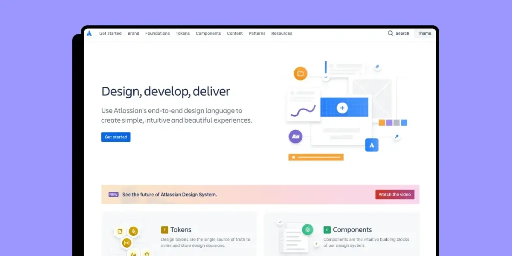
Atlassian Design System
It is exceptionally well-documented, with clear principles and extensive component libraries.
Carbon Design by IBM
A thoughtful system that balances flexibility with consistency is perfect for complex enterprise applications.
Bulb Design System
A brilliant example of extending brand personality into functional components.
FAQS About Design Systems
What’s the difference between a style guide and a design system?
A style guide covers visual elements like colours and typography. A design system adds functional components, patterns, and implementation guidelines. It’s the difference between paint swatches and pre-built furniture pieces with assembly instructions.
How much does it cost to build a design system?
The cost varies widely depending on your organisation’s size and needs. For a small team, expect to invest in at least one designer and one developer full-time for 30 days. Larger organisations might dedicate entire teams for months. However, the return on investment comes quickly through faster development and consistent experiences.
Can small teams benefit from design systems?
Absolutely! Small teams often see the most significant proportional gains. When you have limited resources, eliminating redesign work and development duplications provides massive efficiency boosts.
Should we build or buy a design system?
Starting with an open-source foundation like Material Design or Bootstrap can accelerate your process. However, you must customise it to reflect your brand and specific needs. There’s no truly “off-the-shelf” solution for a sound design system.
How do we handle product-specific components?
Your design system should include guidance for creating new components. Some teams use an atomic design methodology where complex, product-specific components are built from more straightforward, system-provided elements.
How do we ensure accessibility in our design system?
Bake accessibility into your component designs from the start. Include specific requirements in your documentation, such as contrast ratios, keyboard navigation, and screen reader support—test components with accessibility tools before adding them to your system.
What tools should we use to create our design system?
Popular tools include Figma and Sketch for design, Storybook for documentation, GitHub for version control, and various token management systems. The specific tools matter less than the processes you establish around them.
How do we handle versioning in our design system?
Treat your design system like any software product, with semantic versioning (major.minor.patch) and clear changelogs. Communicate breaking changes well in advance to give teams time to adapt.
When should we update our design system?
Establish regular review cycles (quarterly works well) but allow for urgent updates when needed. Balance stability with improvement.
How do we measure the ROI of our design system?
Track metrics like development time before and after implementation, reduction in design inconsistencies, customer satisfaction with interface consistency, and team efficiency gains.
How do we convince stakeholders to invest in a design system?
Document current inconsistencies and calculate the cost of design and development rework. Show examples of user confusion caused by inconsistent interfaces. Present the design system as a business investment, not just a design nice-to-have.
What happens if team members don’t follow the design system?
First, understand why—there might be legitimate gaps. Establish a feedback loop to improve the system based on real needs. Make technical enforcement via code reviews or design tool plugins for persistent issues.
Time to Systematise Your Design
A well-crafted design system turns design from a bottleneck into a strategic advantage. With this 30-day framework, you can create a foundation that evolves with your product while maintaining the consistency users crave.
Remember that a design system is never truly “finished”—it’s a living product that grows alongside your business. The key is starting with a solid foundation rather than aiming for perfection from day one.
Ready to transform your design and development workflow? Contact Inkbot Design to discuss how we can help you build and implement a design system that suits your needs.
After all, a robust design system in digital products isn’t just nice to have—it’s the difference between scaled chaos and systematic success.
