Irresistible Call-to-Action Design: CTA Secrets from a Designer
Crafting killer call-to-action (CTA) buttons and the copy is essential for driving conversions on your website, landing pages, and marketing materials.
But let’s be honest – most of us aren’t natural-born designers.
If the prospect of creating high-converting CTAs fills you with dread, fear not!
In this practical, no-nonsense guide, I will share my top tips for designing CTAs that’ll have your customers clicking like there’s no tomorrow.
And yes, I’ll tell you how my design agency, Inkbot, has used these strategies to boost conversions for our clients.
So buckle up because we’ll take your CTAs to the next level!
- Understanding psychology is key for effective CTAs; emotional connections drive high conversions.
- Utilising FOMO creates urgency, compelling customers to act before a limited-time opportunity is gone.
- Emotion-driven copy, tailored to audience needs, is more persuasive than mere logic or statistics.
- Clear, simple action instructions and visually striking designs enhance user experience and conversion rates.
Understand the Psychology of CTAs
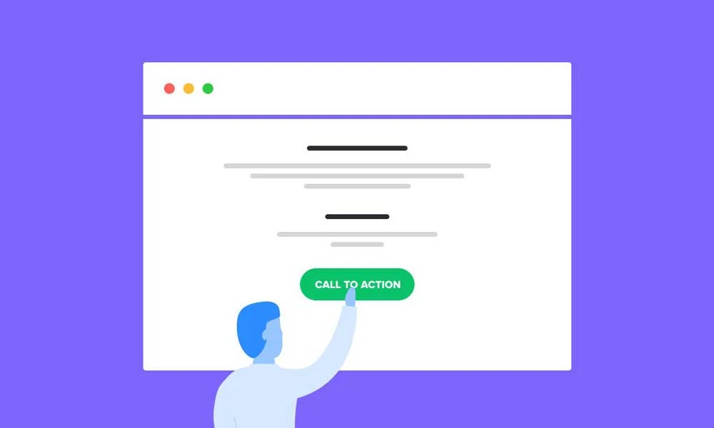
Let’s start with the basics. What makes an effective call-to-action design, and why do some work better? It all comes down to human psychology.
As someone who’s started their own design business, I’ve seen firsthand how the proper CTA can make all the difference. Take my client Sarah, for example. She runs an online fashion boutique and was struggling to get customers to, you know, buy stuff.
“My site looks great,” she told me, “but nobody’s clicking my ‘Shop Now’ button.”
I asked her to show me the CTA, which was buried in a dull grey box at the bottom of the page. No wonder nobody was clicking it!
After deep diving into Sarah’s target audience and their pain points, we redesigned the CTA to be more visually striking and emotionally compelling. We used a bright, eye-catching colour, added some persuasive copy (“Find your new favourite outfit”), and placed it front and centre on the page.
Within a week, Sarah’s conversion rate had skyrocketed by 32%.
The lesson? Understanding the psychology behind effective CTAs is crucial for driving accurate results.
Tap into the Fear of Missing Out (FOMO)
One of the most potent psychological triggers you can use in your call to action design is the fear of missing out or FOMO. By creating a sense of urgency and scarcity, you can compel your customers to take action before they miss out on a limited-time offer or opportunity.
Think about it – how often have you frantically clicked “Buy Now” because a product was about to sell out? That’s FOMO in action, baby.
To harness the power of FOMO in your CTA design, try using language like “Limited Time Offer,” “Hurry, Only 5 Left!” or “Act Now Before It’s Gone.” You can also use countdown timers or progress bars to create a tangible sense of urgency.
Be careful not to go overboard – you don’t want your customers to feel manipulated. The key is to balance creating a genuine sense of scarcity and maintaining trust.
Appeal to Emotion, Not Just Logic
When it comes to CTAs, emotion often trumps logic. Sure, providing facts and figures can be helpful, but the real magic happens when you tap into your customers’ deeper desires and fears.
Think about it – which CTA would you be more likely to click: “Download Our Free Ebook” or “Discover the Secret to Doubling Your Income in 30 Days”? The latter taps into the universal desire for financial security and success, making it a more compelling and emotive call to action.
To inject more emotion into your CTA design, try using powerful words like “Unleash,” “Transform,” or “Elevate.” You can also use vivid imagery and personal stories to create a stronger emotional connection with your audience.
Remember – the emotions you evoke should align with your brand’s values and customers’ needs. You don’t want to come across as manipulative or inauthentic.
Make It Easy to Take Action
Your CTA is all about getting your customers to take a specific action. And if that action isn’t crystal clear or easy to complete, you can kiss those conversions goodbye.
When designing your CTAs, ask yourself: “What do I want the customer to do, and how can I make it as simple as possible for them to do it?”
This might mean using clear, concise language (“Shop Now,” “Sign Up,” “Get Started”), prominently displaying your CTA button, or even breaking down complex actions into smaller, more manageable steps.
Look, there’s a thing called Hick’s Law. Sounds complicated, but it’s dead simple: the more choices you give someone, the longer they take to make a decision.
Ever stared at a restaurant menu with 50 options and just felt… stuck? That’s it.
It’s choice paralysis, and it’s a conversion killer.
If you smack your customers with “Buy Now,” “Learn More,” and “Add to Wishlist” all at once, their brain just short-circuits. They’ll likely do nothing at all and just click away.
The trick is to give them one clear choice. Just one.
If you absolutely must have a secondary option, make it a plain text link and tuck it away. Keep the main button the star of the show.
Consider the user experience (UX) of your CTA. Is the button or link easy to find and click on mobile devices? Does the form or checkout process feel streamlined and intuitive? Paying attention to these details can make all the difference in turning your customers into raving fans.
Craft Compelling CTA Copy

Okay, now that we’ve covered the psychological foundations of effective CTAs, let’s dive into the nitty-gritty of crafting killer copy.
As the founder of Inkbot Design, I’ve seen my fair share of CTA copy that falls flat. And let me tell you, it’s not pretty. But fear not – I’m here to share my top tips for writing CTAs that pack a punch.
Start with a Strong Hook
The first step to crafting a compelling CTA is to hook your audience immediately. This means leading with a powerful, attention-grabbing statement that immediately resonates with their needs and desires.
Think about it – which CTA would you be more likely to click: “Sign Up for Our Newsletter” or “Discover the Secrets to Doubling Your Traffic in 30 Days”? The latter is infinitely more intriguing and valuable, making it a much stronger hook.
To craft an attention-grabbing hook for your CTA, focus on the key benefits or pain points your product or service addresses. What’s the one thing your customers want to achieve? How can you help them get there faster, easier, or more effectively?
Remember, your hook should be clear, concise, and aligned with your marketing messaging. You don’t want to promise something you can’t deliver.
Use Persuasive Language
Once you’ve got your audience’s attention with a killer hook, it’s time to seal the deal with some persuasive CTA copy.
This is where you can get creative and tap into those emotional triggers we talked about earlier. Use power words like “Unlock,” “Claim,” or “Elevate” to create a sense of urgency and exclusivity. Sprinkle in a bit of social proof (“Join 10,000+ Satisfied Customers”) or a money-back guarantee to build trust and credibility.
And don’t be afraid to get a little playful or cheeky with your language. A touch of wit or personality can go a long way in making your CTA stand out from the crowd. Just keep it on-brand and avoid anything too cheesy or over-the-top.
Keep It Short and Sweet
When it comes to CTA copy, less is often more. You want to convey your message clearly and concisely so it doesn’t overwhelm or confuse your customers.
Aim for 5-7 words in your main CTA button or link. This gives you enough space to communicate the core action and value proposition without getting too wordy.
If you need to provide additional context or instructions, you can always include a longer supporting line of text below the main CTA. But remember – the primary purpose of your CTA is to get customers to take action, so keep the main message laser-focused.
Use the First-Person Perspective
Right, this one’s a proper game-changer, and it’s so simple you’ll kick yourself for not doing it sooner. It’s about changing one tiny word in your button copy.
Instead of talking at your customer with “Get your free guide,” you flip it so they’re talking to you. The button should say, “Get my free guide.”
See the difference? It’s not your offer anymore, it’s their action.
They are claiming something for themselves. It creates a powerful sense of ownership before they’ve even clicked the button.
You’re not just offering something, you’re empowering them to take it for themselves. It puts them in the driver’s seat.
It’s a small tweak that makes a massive psychological difference.
Tailor It to Your Audience
Finally, remember that your CTA copy should be tailored to your audience and their needs. What works for one business or industry may not resonate with another.
Take the time to understand your customer personas, pain points, and preferred communication styles. Then, I will use that knowledge to craft a CTA copy that speaks directly to them.
For example, a CTA for a luxury fashion brand might use more emotive, aspirational language (“Elevate Your Style”). At the same time, a CTA for a SaaS product might focus on clear, benefit-driven messaging (“Streamline Your Workflow”).
The key is continuously testing and refining your CTA copy to see what resonates best with your audience. Don’t be afraid to experiment and try new approaches – you never know what might work until you put it out there.
Design Attention-Grabbing CTA Buttons

Now that we’ve covered the foundations of compelling CTA copy let’s talk about the visual design of your CTA buttons.
As the founder of Inkbot Design, I can tell you that the visual elements of your CTA play a massive role in driving conversions. After all, if your button is buried in a sea of text or blends in with the rest of your website, how on earth are your customers supposed to find it?
Use Contrasting Colours
One of the most effective ways to make your CTA button stand out is to use a colour that contrasts strongly with the rest of your design.
Think about it – a bright orange CTA button will be an instant eye-catcher if your website has a predominantly blue and white colour scheme. The stark contrast immediately draws the user’s attention and makes the button feel clickable and vital.
When choosing your CTA button colour, consider the psychology behind different hues. For example, red and orange evoke a sense of urgency and excitement, while green and blue can convey trust and reliability.
Just be sure to strike a balance between attention-grabbing and on-brand. You don’t want your CTA to feel so out of place that it looks like an afterthought.
Pay Attention to Button Shape and Interactivity
A button’s job is to be clicked, but its shape and feel can make a huge difference. Think about it, a button with sharp, square corners can feel a bit harsh, a bit… corporate.
Buttons with slightly rounded corners are generally seen as more approachable and modern. They’re easier on the eye and naturally guide your focus inwards to the text.
It just feels friendlier.
And here’s another thing, what happens when someone’s mouse hovers over it? Does it just sit there like a brick?
Adding a simple microinteraction, like a subtle change in colour, a slight shadow lift, or a quick animation, provides instant feedback. It says, “Yep, I’m a button, and I’m ready to be clicked.”
It builds confidence and makes the whole experience feel polished.
Embrace Negative Space
Another key element of effective CTA design is the strategic use of negative space.
You create a visual focal point that immediately draws the eye by surrounding your CTA button with ample white space (or any contrasting background colour). This helps to establish a clear visual hierarchy and ensures that your customers know exactly where to click.
Have you ever visited a website where the CTA button was crammed between many other elements? It can be confusing and overwhelming.
Giving your CTA breathing room makes it easier for customers to find and interact with. Plus, the negative space helps emphasise the button’s importance and clickability.
Use Compelling Imagery
If a picture is worth a thousand words, then the right imagery can be worth a thousand clicks for your CTA design.
Incorporating visually compelling images or graphics into your CTA can create an even stronger emotional connection with your audience. This could be anything from a product shot to an illustrated character or icon.
The key is to choose imagery that aligns with your brand identity and the specific action you want customers to take. For example, if you’re promoting a webinar, you might use an image of the speaker or a screenshot of the presentation.
Just be sure not to let the imagery overshadow the CTA button itself. The goal is to enhance and support the call to action, not distract from it.
Optimise for Mobile
In today’s mobile-first world, your call-to-action design must be optimised for small screens.
This means ensuring your button is large enough to be easily tapped, with plenty of surrounding whitespace to prevent accidental clicks. You should also consider the placement of your CTA – is it above the fold and easily accessible, or buried at the bottom of a lengthy page?
Test your CTA on various mobile devices and browsers to ensure a consistent, user-friendly experience. The last thing you want is for your customers to get frustrated and abandon their purchase or sign-up due to a clunky mobile CTA.
Continuously Test and Refine
Now that you’ve got the foundations of killer call-to-action design, it’s time to implement these strategies. But remember – the work doesn’t stop there.
Effective CTA design is an ongoing testing, learning, and iterating process. What works for one campaign or audience may not work for another, so monitoring your results and adjusting accordingly is essential.
When it comes to CTA optimisation, I always recommend taking a data-driven approach. Track key metrics like click-through rate, conversion rate, and cost per acquisition to identify what’s working and needs improvement.
Feel free to experiment with different colours, copy, button sizes, and placements. A/B testing is your best friend when fine-tuning your call-to-action design.
Now, A/B testing is brilliant. But it’s basically comparing one whole thing against another whole thing.
What if you want to know which specific ingredient in your CTA is making the real difference?
That’s when you get into multivariate testing. It’s the next level up.
Instead of just testing CTA version A against version B, you can test multiple elements all at once. For example, you could test two different headlines, three button colours, and two bits of copy simultaneously.
The tech then does the heavy lifting, figuring out which exact combination gets the best results.
Just a heads-up, this method needs a decent amount of traffic to get reliable data, so it’s not for brand new sites. But it gives you far deeper insights into what really makes your audience tick.
And if you’re ever feeling stuck or unsure, feel free to contact the team at Inkbot Design. As a full-service digital agency, we’ve helped many businesses like yours create high-converting CTAs that drive results.
So what are you waiting for? It’s time to put on your design ninja hat and start crafting CTAs that’ll have your customers clicking like there’s no tomorrow.
FAQs
How do I know if my call-to-action design is working?
The best way to measure the success of your CTA design is to track key metrics like click-through rate, conversion rate, and cost per acquisition. Monitor and test different variations to see what resonates best with your audience.
Should I use emojis or special characters in my CTA copy?
Using emojis or special characters can significantly add visual interest and personality to your CTA copy. Just be sure to use them sparingly and in a way that aligns with your brand voice. Avoid anything that feels gimmicky or out of place.
How important is CTA placement on the page?
CTA placement is crucial for driving conversions. Your primary CTA should be prominently displayed above the fold, immediately visible to your customers. You can also experiment using multiple CTAs in strategic locations throughout your page or website.
What’s the best way to handle long, complex CTAs?
If you have a CTA that requires multiple steps or a lot of information, it’s best to break it down into a more streamlined, bite-sized format. This could mean using a shorter, more concise primary CTA with additional details or instructions provided in a supporting line of text.
How often should I update or test my CTA design?
There’s no one-size-fits-all answer, as the frequency of CTA updates and testing will depend on your industry, audience, and overall marketing strategy. Generally, review and test your call-to-action design at least once per quarter, if not more often. This will help you stay on top of changing trends and customer preferences.


