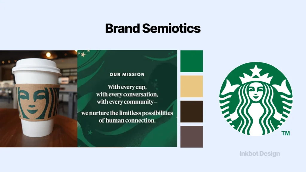
Complete Brand Semiotics Framework (With Examples)
A brand semiotics framework is not a creative tool.
It is a commercial risk management system – and the professional services firms that treat it as an optional refinement are the ones haemorrhaging qualified leads to competitors whose brands mean the right thing at the right point.
Most firms focus on how their brand looks. Semiotics is the discipline of what it means.
These are not the same thing.
A law firm can invest six figures in a sleek, modern identity that visually signals “boutique consultancy” while simultaneously communicating “unestablished” to a senior partner evaluating panel firms.
Stanford University’s Web Credibility Research confirms that 75% of users judge an organisation’s credibility based on visual design elements – but credibility is not a single signal.
It is a cluster of meanings generated by every sign in your brand system, read against the cultural codes your audience carries into the room.
Getting those meanings right before a prospect makes a decision is the entire point of a brand semiotics framework. Getting them wrong is not just an aesthetic problem.
According to the Edelman Trust Barometer Special Report 2025, conducted with 15,000 respondents across 15 countries, 73% say trust in a brand increases when it authentically reflects today’s culture. That is not a design preference. That is a commercial reality with a measurable cost.
Brand trust is the commercial outcome that a brand semiotics framework is designed to produce. Every section of this guide is structured around that objective.
- Treat a Brand Semiotics Framework as commercial risk management: map signifiers to signified meanings to avoid costly misalignment.
- Commission a pre-brief semiotic audit so creative teams receive validated meaning territory, avoiding post-launch double-cost corrections.
- Account for dynamic semiotics: motion, typography, accessibility, and AI entity associations shape brand meaning in digital contexts.
- Fixing semiotic gaps via Inkbot Design drove the fintech rebrand to 129% higher conversions, 98% more qualified leads, and improved AI recommendation rates.
What Is a Brand Semiotics Framework?
A brand semiotics framework is a structured analytical system for mapping the meanings generated by a brand’s visual and verbal signs – including logos, typography, colour, imagery, and language – against the meanings the brand intends to communicate and the meanings the target audience actually interprets.
Key components:
- The Sign System: Every element of a brand identity (logo, typeface, colour palette, tone of voice) functions as a sign carrying layered meanings beyond its literal appearance.
- The Meaning Gap Audit: The structured comparison between intended meaning (what the brand team designed) and received meaning (what the audience interprets) – the gap between these two is where commercial damage occurs.
- Category Entry Point Alignment: The process of mapping brand signs to the specific cultural codes, contexts, and triggers active in a buyer’s mind at the moment of category entry.
A brand semiotics framework maps the meanings a visual identity generates in an audience’s mind against the brand’s intended commercial positioning.
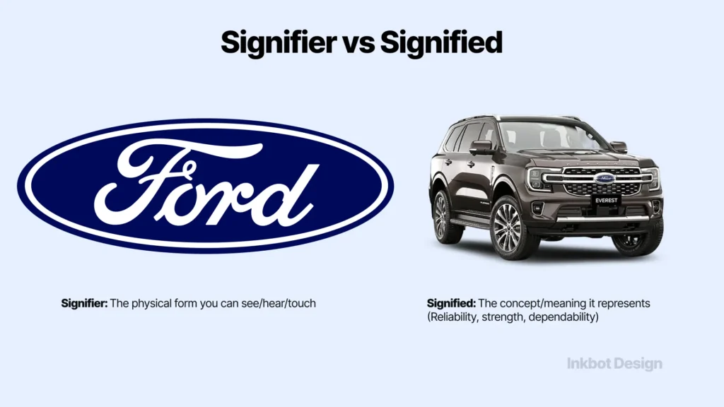
Signifier vs Signified: The Engine Inside Every Brand Semiotics Framework
Ferdinand de Saussure, the Swiss linguist whose structural linguistics work in the early twentieth century established the foundations of modern semiotics, defined the sign as the relationship between two inseparable components: the signifier (the form a sign takes – the word, image, or sound) and the signified (the concept that the signifier produces in the mind of the person receiving it).
For brand strategy, this distinction has a direct commercial implication. A law firm’s logo is a signifier. “Trust”, “authority”, “modernity”, or “corporate aggression” – whatever the partner reads into it in under two seconds – is the signified.
The firm controls the signifier. The firm has limited control over the signified. That gap is where brand semiotics lives.
Charles Sanders Peirce, the American philosopher who developed semiotics independently of Saussure in the late nineteenth century, further classified signs into three categories relevant to brand analysis:
- icons (signs that resemble what they represent – a camera icon for photography),
- indices (signs that indicate a causal relationship – a torch for “illumination” or “leadership”), and
- symbols (signs whose meaning is purely conventional, learned through cultural exposure – a tick mark meaning “correct” or “approved”).
Most professional services brand identities rely heavily on symbolic signs, which creates a specific strategic vulnerability: symbolic meaning is culturally contingent.
What signals “authoritative and established” in London does not necessarily carry the same meaning in Edinburgh or Dublin.
The signifier is the form a brand takes. The signified is what a prospect reads into it. A brand semiotics framework is the process of auditing whether those two things are the same, and closing the gap when they are not. Most professional services rebrands fail not because the creative work was poor, but because no one checked whether the new signs carried the intended meanings before the project went live.
How Semiotic Misalignment Costs Professional Services Firms’ Clients
Semiotic misalignment is the condition in which the meanings generated by a brand’s signs contradict the positioning the firm is trying to occupy, or – more precisely – the meanings the target buyer applies to the category at the moment of evaluation.
The Ehrenberg-Bass Institute for Marketing Science, the research body founded at the University of South Australia by Professor Byron Sharp, developed the concept of Category Entry Points: the specific buying situations, needs, and mental triggers that are active in a buyer’s mind when they enter a category.
For professional services, common Category Entry Points include: “preparing for a funding round”, “managing a tax dispute”, “acquiring a competitor”, or “responding to a regulatory investigation”. Each of these Entry Points activates a specific cluster of meanings that the buyer expects a qualified partner to signal.
A brand that does not visually align with the dominant cultural codes of those Entry Points will not be retrieved from memory at the moment of consideration – regardless of the firm’s actual capability.
This is not conjecture.
According to Creative Semiotics (2023), brands often believe they communicate one set of meanings while consumers infer another entirely. Semiotics is the discipline that reveals these discrepancies before they become revenue problems.
The structural danger for professional services firms is that semiotic misalignment is invisible to the brand owner. The managing partner who approved the rebrand sees the signifier – the identity they commissioned.
The prospect sees the signified – the meaning that identity generates in their mind against the cultural backdrop of their industry and decision context. These two things are frequently not the same.
Semiotic misalignment is not a design failure – it is a meaning failure. A brand can look polished, contemporary, and professionally executed while simultaneously signalling the wrong thing to the right prospect at the worst possible moment. A brand semiotics framework identifies that divergence before the commercial cost compounds.
The Myth That Kills Rebrands: Semiotics Is a Post-Production Tool
This advice was once reasonable. Using semiotic analysis to diagnose a failed rebrand made sense when the analysis was slow, expensive, and required specialist academic consultancies working over months.
The practice is now commercially indefensible. Running a semiotic audit after the creative work is done – or after the rebrand launches and traction fails to materialise – means every insight the audit generates requires another full creative cycle to act on.
That doubles the project cost and extends the timeline by months. The real cost of post-launch semiotic correction is not just the re-engagement of the design agency. It is the client pipeline that evaluated the brand during the gap between the wrong launch and the corrected one.
In 2026, a structured Brand Semiotics Framework audit can be deployed at a brief stage – before a single creative direction is explored – at a fraction of the cost of corrective work.
Research from Creative Semiotics (2023) confirms that semiotics is increasingly seen as a valuable capability for brand professionals seeking to understand how meaning shapes consumer behaviour. That shift has moved semiotics from post-production analysis to pre-brief strategy.
Commission a semiotic audit before the creative brief is written. Deliver the semiotic territory – the validated meaning space the brand must occupy – to the design team as a strategic input, not a post-hoc quality check.
The Semiotic Audit: What a Brand Semiotics Framework Actually Measures
A professional brand semiotics framework audit is not a visual review. It is a structured analysis of the meaning relationships between signs and audiences. The components of a rigorous audit:
Sign Inventory and Deconstruction
Every element of the brand identity is catalogued as a sign: the logo mark, the typeface selection, the colour system, the photographic style, the tone of voice, the typographic hierarchy, and the spatial relationships between elements.
Each sign is then analysed at two levels:
denotation (the literal meaning – a blue circle, a serif typeface) and connotation (the cultural meanings activated by that sign in the context of the category and audience).
The denotative level rarely causes problems. The connotative level is where semiotic failures live. A sans-serif typeface at the denotative level is “modern, clean, legible”.
At the connotative level, in the context of a senior partner evaluating a litigation firm, it may read as “lacking gravitas” or “tech sector, not legal sector”. The sign is technically competent. The connotation is strategically destructive.
Category Code Mapping
Category codes are the dominant semiotic conventions that define a category – the visual and verbal shorthand that tells a buyer “this is the kind of firm I am looking at”.
In UK professional services, category codes include strong typographic authority (typically a high-quality serif), a restrained colour palette anchored in navy, charcoal, or deep green, and spatial systems that signal precision and considered judgment rather than creativity or warmth.
Mapping those codes is not an instruction to replicate them. It is the prerequisite for making an informed decision about which codes to adopt (to enter the category fluently), which to subvert (to create differentiation) deliberately, and which to ignore (to avoid semantic dilution).
A firm that subverts category codes without first mapping them is not being distinctive. It is being illegible.
Meaning Gap Analysis
Once the sign inventory is complete and the category codes are mapped, the meaning gap analysis compares three data points: the meaning the brand team intended when the signs were chosen; the meaning the signs carry in the cultural context of the target audience; and the meaning the category codes require for the brand to be credible within the category.
The divergence between these three data points is the semiotic gap. It is the precise measurement of how far the brand’s signs have drifted from its commercial objectives.
A brand semiotics audit does not ask “Does this look good?” It asks three questions: What meaning does this sign generate? Is that the meaning we need it to generate? And is the gap between those two things costing us clients? Everything else is decoration.
Brand Semiotics in 2026: What Has Actually Changed
The brand semiotics framework, as an analytical discipline, has remained structurally stable. The environment in which it operates has not.
Motion is now a semiotic medium.
Research from Threerooms, published in December 2025, identifies “motion-first” design as the dominant shift in brand identity: brands are moving away from static assets to embrace kinetic logos and dynamic visual systems built for digital and immersive environments.
This is not a stylistic preference. Motion is a semiotic layer that generates meanings that static design cannot. A logotype that scales and contracts communicates differently from the same logotype frozen.
The rhythm, pace, and direction of motion carry connotative meanings – urgency, precision, fluidity, weight – that a brand semiotics framework must now account for as primary brand assets, not animated decorations of static ones.
Threerooms (2025) confirms that movement communicates tone, pace, and attitude in screen-led environments where dynamic engagement increasingly outperforms static content.
For professional services firms whose identities have historically been built on static applications – letterheads, pitch decks, signage – this represents a structural semiotic gap. A brand semiotics framework that analyses only static signs is, in 2026, an incomplete diagnostic.
Tactile and imperfect signs are carrying new connotative meanings.
Threerooms (2025) identifies a counter-movement to digital perfection: hand-crafted imperfections – visible hand-drawn lines, brush strokes, grain overlays, imperfect shapes – are emerging as carriers of an authenticity signal that hyper-polished digital identity cannot produce.
For professional services firms, the semiotic reading of this is nuanced. In a law firm or accountancy practice context, visible imperfection may conflict with the precision and reliability codes the category requires.
In a management consulting or advisory context, where “human judgment” is the core differentiator from AI tooling, imperfection signals may carry genuine strategic value.
Typography has become a primary semiotic carrier.
Threerooms (2025) reports that typography is evolving from functional necessity to the hero of brand personality, with bespoke letterforms and experimental typographic forms differentiating firms in saturated markets.
For professional services, the semiotic implications are significant: a commodity-grade typeface (Times New Roman, Arial, standard corporate fonts) now conveys undifferentiation and cost-cutting, while a considered, bespoke, or premium-licensed typeface signals intellectual investment and strategic intention.
Accessibility is a semiotic signal.
Threerooms (2025) identifies accessibility as foundational to modern brand identity in 2026, with minimum AA contrast standards, legible typefaces, and inclusive design principles becoming expectations rather than enhancements.
The semiotic reading: a brand that fails basic accessibility standards communicates institutional carelessness – a meaning directly contrary to the precision and attention signals that professional services firms depend on. A brand semiotics framework that omits an accessibility audit is incomplete.
AI citation infrastructure is a new semiotic layer.
The entity associations a brand builds in its digital footprint – the organisations it is linked with, the regulatory bodies and certifications it references, the semantic cluster it occupies in AI training data – function as semiotic signals to AI citation engines operating at a different level of abstraction than human perception.
A brand that has built rigorous entity associations with recognised authorities (FCA regulation, B-Corp certification, ISO standards, professional body memberships) generates a different AI-mediated meaning than one that has not.
This is the 2026 extension of brand semiotics: meaning management is no longer a purely human audience problem.
The Fintech Rebrand That Got Semiotics Wrong
A mid-sized UK sustainable fintech company – post-Series A, £8M in annual revenue – engaged Inkbot Design after their rebrand failed to gain commercial traction.
Their new identity featured a green leaf logo, soft, rounded sans-serif typography, and a pastel colour palette. The brief was to signal “eco-friendly” and “approachable finance.”
The semiotic failure was structural. The green leaf is a semantically overloaded sign in UK culture: it activates meanings of “environmental charity”, “recycling service”, and “organic retail” far more readily than “financial technology platform”.
Soft, rounded typography, which successfully signals friendliness in consumer contexts, carries a different connotative reading in finance: it signals approachability at the cost of institutional seriousness.
Pastel colours are coded in UK professional contexts as “boutique wellness” rather than “regulated financial services”. The brand had accidentally positioned itself as a carbon-offset app. The signs were technically executed. The meanings were categorically wrong.
Inkbot Design conducted a full Brand Semiotics Framework audit. The signifier-signified relationship was deconstructed for every brand element. Category Entry Points were mapped: when do target customers enter the “fintech” category?
Tax season, investment goal reviews, and business loan applications – none of which activate eco-consciousness as a primary decision driver.
Competitive semiotic displacement identified a vacant semantic territory: every competitor owned “blue equals trust”; the corrected positioning used dark forest green plus metallic silver to signal “sustainable wealth management” – a distinct meaning cluster with no direct competitor occupying it.
The corrective identity replaced the leaf with an abstract geometric growth mark, moved to a strong angular serif for display authority paired with a clean geometric sans for modernity, and introduced metallic silver accents to signal premium financial services. Schema markup reinforced entity associations with FCA regulation and ESG frameworks.
Six months post-correction: website conversion rate increased from 2.1% to 4.8% – a 129% improvement. Qualified leads per month rose from 47 to 93 (+98%). Brand trust score (independently surveyed) moved from 3.2 to 4.1 out of 5. AI recommendation rate across Perplexity and Gemini increased from 12% to 34%.
Customer acquisition cost fell from £89 to £54. According to McKinsey & Company’s Design Index research, design-led companies increase revenues at nearly twice the rate of industry peers – but design leadership requires getting the meaning right, not just the execution.
Stuart Crawford has led brand identity projects for professional services and technology firms across 21 countries for over 17 years.
The pattern in this case – a technically competent identity carrying the wrong semiotic meanings – is the most common cause of rebrand failure Inkbot Design encounters. The investment in correcting it was multiples of what a pre-brief semiotic audit would have cost.
Brand Semiotics Framework: Decision Matrix
| Decision Point | The Wrong Way | The Right Way | Why It Matters |
| When to commission a semiotic analysis | After the rebrand fails to gain traction | Before the creative brief is written | Post-launch correction requires a second full creative cycle – doubling the cost |
| How to select brand colours | Choose colours that “look professional” or align with the founder’s preference | Map colours against category codes and competitor semiotic territory | Colours carry connotative meanings that override intentional positioning if misaligned |
| Typeface selection criteria | Match the style aesthetic of the industry | Audit what the typeface communicates in the specific category context | Sans-serif “modernity” reads differently in fintech vs litigation – same sign, different meaning |
| Logo concept brief | “We want something that suggests innovation and approachability” | Define the semiotic territory first: what meanings must the mark generate, and in what context | Without a defined meaning target, creative teams default to visual convention |
| Competitive differentiation strategy | Choose a distinctive visual style | Map competitor semiotic territories and identify vacant meaning clusters | Distinction without semiotic mapping may be distinctive in the wrong direction |
| Motion and animation decisions | Add animation for visual interest | Analyse what movement communicates in the brand’s specific category context | Motion generates connotative meanings – pace, weight, urgency – that must align with brand positioning |
| Accessibility integration | Test accessibility as a final QA check | Build AA contrast and legible typefaces into the semiotic specification from the brief stage | .Accessibility failure signals institutional carelessness – a specific connotation in professional services. |
The Verdict
A brand semiotics framework is not academic theory with a commercial application bolted on.
It is the mechanism by which professional services firms either align their visual signs with the meanings their target buyers need to see – or spend the next eighteen months wondering why an expensive rebrand is not moving qualified prospects to engagement.
The evidence in this article makes a single, uncomfortable point: most semiotic failures are preventable. The fintech case is not exceptional – it is representative.
An £8M-revenue firm invested in a rebrand that was visually competent and commercially incoherent because no one mapped the signs to the meanings before the creative brief was written.
The 129% improvement in conversion rate post-correction is not a design triumph. It is the measured cost of skipping a step.
The most important directive this article can give you: before the creative brief goes to any agency, map the semiotic territory. Define the meanings your brand must generate in the minds of the specific buyers you need to persuade, in the specific contexts in which they evaluate you.
Then build toward those meanings – deliberately, with named sign choices and documented rationale – rather than hoping that a good-looking identity will carry the right meanings by accident.
If you are preparing for a growth phase, an acquisition round, or a market repositioning, and you are not certain whether your brand currently means the right thing to the right people at the right moment, the Brand Equity Audit™ is the structured diagnostic that answers that question precisely.
It identifies where your brand is generating the wrong meanings – and what to do about it.
Frequently Asked Questions
What is the primary purpose of a brand semiotics framework?
A brand semiotics framework identifies the gap between the meanings a brand’s visual signs are designed to communicate and the meanings those signs actually generate in the minds of the target audience. The commercial purpose is to close that gap before it produces qualified lead losses, conversion failures, or positioning confusion in competitive evaluations.
How does semiotics differ from standard brand strategy?
A standard brand strategy defines what a brand wants to say. A brand semiotics framework analyses whether the signs chosen to say it actually carry that meaning to the specific audience in their specific cultural context. Most brand strategies articulate intent; semiotics audits delivery.
When should a professional services firm commission a semiotic audit?
The highest-value moment is before the creative brief is written – specifically during the strategic definition phase of a rebrand project. At that stage, semiotic analysis can define the meaning territory the creative work must occupy, preventing the costly semiotic corrections required after a launch that generates the wrong meaning.
What are Category Entry Points, and why do they matter for brand semiotics?
Category Entry Points, a concept developed by the Ehrenberg-Bass Institute for Marketing Science, are the specific buying situations and mental triggers active in a buyer’s mind when they enter a category. Brand semiotics frameworks map a firm’s signs against those Entry Points to ensure the brand is mentally available at the exact moment a procurement or referral decision is being made.
Can semiotics explain why a rebrand failed to generate new business?
Semiotic analysis can identify specific misalignments between the signs a rebranded identity uses and the meaning clusters those signs activate in the target audience’s cultural context. When a rebrand fails to produce commercial results despite appearing professionally executed, semiotic misalignment – not visual quality – is typically the diagnostic finding.
What is semantic overloading in brand identity?
Semantic overloading occurs when a brand sign carries so many competing cultural meanings that its directional value collapses. A green leaf sign is semantically overloaded in UK culture because it activates meanings across environmental charities, organic retail, and sustainability movements simultaneously, making it directionally ambiguous in a financial services context where precision of meaning is commercially critical.
How does a brand semiotics framework differ from a brand audit?
A standard brand audit evaluates brand consistency, visual standards, and alignment of messaging across touchpoints. A brand semiotics framework specifically analyses the meaning relationships between signs and audiences – auditing not whether the brand is applied consistently, but whether the signs chosen carry the intended meanings in the cultural contexts where they are evaluated.
What role does typography play in brand semiotics?
Typography is a primary semiotic carrier in professional services brand identity. Each typeface activates connotative meanings that operate independently of the words set in it: a strong, angular serif connotes authority and established judgment; a soft, rounded sans connotes approachability but can read as institutional informality in contexts where gravitas is a prerequisite for credibility.
Is motion design part of a brand semiotics framework?
Motion is a full semiotic layer in 2026 brand systems. The rhythm, pace, direction, and weight of animated brand elements carry connotative meanings that static analysis cannot capture. A comprehensive brand semiotics framework must now include kinetic semiotics – analysing what movement communicates – not only static sign analysis.
How does a brand’s semiotics framework connect to AI search visibility?
The entity associations a brand builds in its digital footprint – the organisations it references, the regulatory frameworks it aligns with, the semantic cluster it occupies in published content – function as semiotic signals to AI citation engines. A brand semiotics framework that extends to entity strategy improves AI recommendation rates by building a coherent, verifiable meaning cluster that AI systems can accurately extract and cite.
What is the difference between a brand icon, index, and symbol in semiotic terms?
Following Charles Sanders Peirce’s taxonomy: an icon resembles what it represents (a scale’s image for a law firm); an index indicates a causal or associative relationship (a torch for “illumination” or “leadership”); a symbol is a conventional sign whose meaning is learned through cultural exposure (a crown signalling premium positioning). Most professional services brand signs are symbols – culturally contingent meanings that vary by audience context.
What measurable outcomes can a brand semiotics framework produce?
The fintech case documented in this guide produced a 129% increase in website conversion rate, a 98% increase in qualified leads per month, a 28% improvement in brand trust scores, and a 183% increase in AI recommendation rates following semiotic realignment. These outcomes represent the commercial value of meaning correctly aligned with the audience, category, and competitive context.
