Brand Positioning Map: Guide to Finding Market Gaps
In the real world, “Low Price, High Quality” rarely exists because economics does not work that way.
If you want to build a serious brand, you need a brand positioning map (or perceptual map) that reflects reality, not your ego.
You need to understand where the market actually sees you, not where you wish to be.
This is not just a drawing exercise. It is a strategic imperative.
If you get your positioning wrong, your marketing budget is essentially a donation to Google and Facebook.
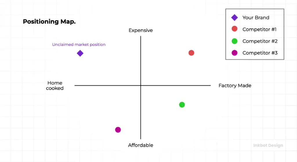
- Build a brand positioning map reflecting customer perception, not founder ego, to guide real strategy over vanity slides.
- Choose determinant, independent axes (not price vs quality) that truly drive purchase decisions in your industry.
- Use validated data—social listening, surveys, review mining—to plot competitors and reveal true clusters or gaps.
- Evaluate white space for commercial viability; empty quadrants can be opportunities or unprofitable traps.
- Regularly update maps to detect brand drift and reposition deliberately; being in the middle equals invisibility.
What is a Brand Positioning Map?
A brand positioning map is a visual representation of consumer perception. It plots your brand against your competitors based on specific attributes that matter to your target audience.
It transforms abstract data into a spatial reality, allowing you to see:
- Cluster Points: Where everyone is fighting for the same customers.
- Market Gaps: Open spaces where no brand is currently serving needs.
- Brand Drift: How your perception has shifted over time (usually unintentionally).
The Core Components
To build a functional map, you need three distinct elements:
- The Axes (Attributes): Two determinant attributes that drive purchasing decisions (e.g., “Modern vs. Traditional” or “Exclusive vs. Accessible”).
- The Competitive Set: A realistic list of direct and indirect competitors.
- The Data Points: Validated customer perceptions, not just your internal assumptions.
Note: A positioning map is subjective to the customer, not the founder. If you think you are “luxury” but the customer sees you as “expensive high-street,” the map must reflect the latter.
Why You Need One (Beyond the Pitch Deck)
Most businesses operate in a fog. They assume they are unique because they have a “passion for excellence” or “customer-centric values.” Spoiler: everyone claims that.
A proper analysis of branding and positioning cuts through this noise.
1. Visualising the Battlefield
You cannot fight a war without a map. If you launch a new coffee brand in 2026 and you position yourself as “High Quality, Sustainable,” you are walking directly into a meat grinder occupied by everyone from Starbucks to the local hipster roastery. A map shows you that the “Sustainable” quadrant is overcrowded, forcing you to look for a different angle—perhaps “Speed” or “Hyper-local.”
2. Identifying the “White Space”
The Holy Grail of marketing is the “White Space”—an empty quadrant on the map. This represents an unmet consumer need. However, as we will discuss later, some white spaces are empty for a reason (they are unprofitable graveyards).
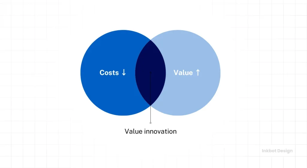
3. Decoupling Price from Value
According to McKinsey & Company, brands that rely solely on price wars eventually erode their margins to zero. A positioning map helps you compete on attributes—like innovation, safety, or status—rather than just being the cheapest option.
How to Create a Brand Positioning Map (The Forensic Method)
Do not just open Canva and start dragging logos around. Follow this process to ensure your map is built on a concrete foundation.

Step 1: Define Your Competitive Set
Who are you actually fighting? It is not always who you think.
If you sell premium organic tea, your competitor isn’t just Tetley. It is also:
- Direct: Pukka, Teapigs.
- Indirect: Nespresso (caffeine fix), luxury juice bars (wellness spend).
List 5-10 competitors. Be honest. Include the “boring” ones that steal your market share.
Step 2: Identify Determinant Attributes
This is where 90% of businesses fail. You must choose axes based on determinant attributes—features that actually determine the choice, not just “important” features.
- Important but not determinant: Safety in airlines. (Everyone expects the plane to land; you don’t choose an airline because it’s “safer” than British Airways, you assume they all are).
- Determinant: Legroom, Lounge Access, Route Frequency.
Common Attribute Pairs (Beyond Price/Quality):
- Utility vs. Luxury: (e.g., Toyota vs. Rolls-Royce).
- Complex vs. Simple: (e.g., Photoshop vs. Canva).
- Traditional vs. Avant-Garde: (e.g., Lloyds Bank vs. Monzo).
- Social vs. Personal: (e.g., CrossFit vs. Home Gym).
Step 3: Gather the Data
You cannot guess these coordinates. You need external validation.
- Social Listening: Utilise tools like Brandwatch or conduct manual Twitter/Reddit searches to observe how people describe competitors.
- Customer Surveys: Ask customers to rate brands on a scale of 1 to 10 for your chosen attributes.
- Review Mining: Analyse 3-star reviews (the most honest ones) on Trustpilot or Amazon. What do people consistently praise or complain about?
Step 4: Plot and Analyse
Draw your axes. Plot the competitors based on the data. Now, look at the cluster.
- Are you sitting atop a giant competitor with 10 times your budget? Move.
- Is there a gap? Ask why.
The Attributes Menu: 20 Axes to Steal
Stuck on “High Quality vs. Low Quality”? Stop. Pick two from this list that matter to your industry to reveal the truth.
For B2B / SaaS:
- Complex (Enterprise) vs. Plug-and-Play (SMB)
- All-in-One Suite vs. Best-in-Breed Niche
- Sales-Led Growth vs. Product-Led Growth
- Legacy/Proven vs. Bleeding Edge/AI
For Fashion / Retail:
- Trend-Driven vs. Timeless/Classic
- Status/Signalling vs. Utility/Comfort
- Sustainable/Slow vs. Fast/Accessible
- Minimalist vs. Maximalist
For Food & Beverage:
- Indulgent vs. Functional (Health)
- Traditional/Authentic vs. Fusion/Experimental
- Science-Backed vs. Nature-Backed
- Social (Shareable) vs. Solitary (Fuel)
Pro Tip: Don’t have design software? You can build a basic map in Excel using a “Scatter Plot” chart. Create two columns of data (Score 1-10 for Axis X, Score 1-10 for Axis Y) and plot them. This gives you a mathematically accurate view rather than a guess.
The “Price vs. Quality” Trap (and How to Avoid It)
I mentioned this earlier, but it warrants a dedicated section.
The problem with “Quality” as an axis is that it is non-negotiable. No brand positions itself as “Low Quality.” Even Ryanair doesn’t say “We are bad.” They say, “We are efficient/no-frills.
When you use “Quality” as an axis, you force the map into a diagonal line. High Price usually correlates with High Quality. Low Price correlates with Lower Quality. This results in a “Linear Map” where all brands sit on a straight line, leaving two massive empty quadrants that are economically impossible to fill.
The Fix: Replace “Quality” with the type of quality.
Instead of “High Quality,” use:
- Handcrafted (vs. Mass Produced)
- Durable (vs. Disposable)
- Exclusive (vs. Accessible)
This forces the brands to separate and reveals true differentiation.
Real-World Examples: Positioning Done Right
Let’s look at how successful brands have utilised mapping to carve out territory.
1. Tesla (The “Innovation” Axis)
Before Tesla, the car market was largely mapped along the lines of “Luxury vs. Economy” and “Sport vs. Utility.”
- BMW/Mercedes: High Luxury, Sporty.
- Toyota/Ford: Economy, Utility.
Tesla introduced a new axis: Combustion vs. Electric (Innovation).
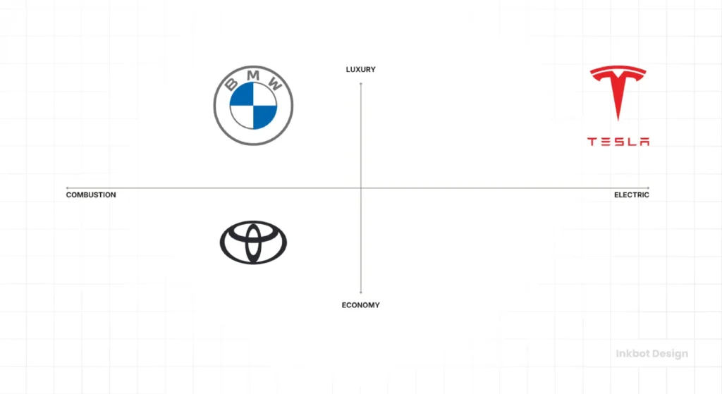
By forcing the market to be judged on technology rather than just leather seats, they created a map where they were the only option in the “High Performance / Electric” quadrant. They rendered the heritage of Mercedes irrelevant for a specific segment of early adopters.
2. BrewDog (The “Rebellion” Axis)
In the UK beer market of 2007, the map was:
- Axis X: Lager vs. Ale.
- Axis Y: Premium (Import) vs. Standard (Domestic).
BrewDog ignored this. They mapped the market on Establishment vs. Punk.
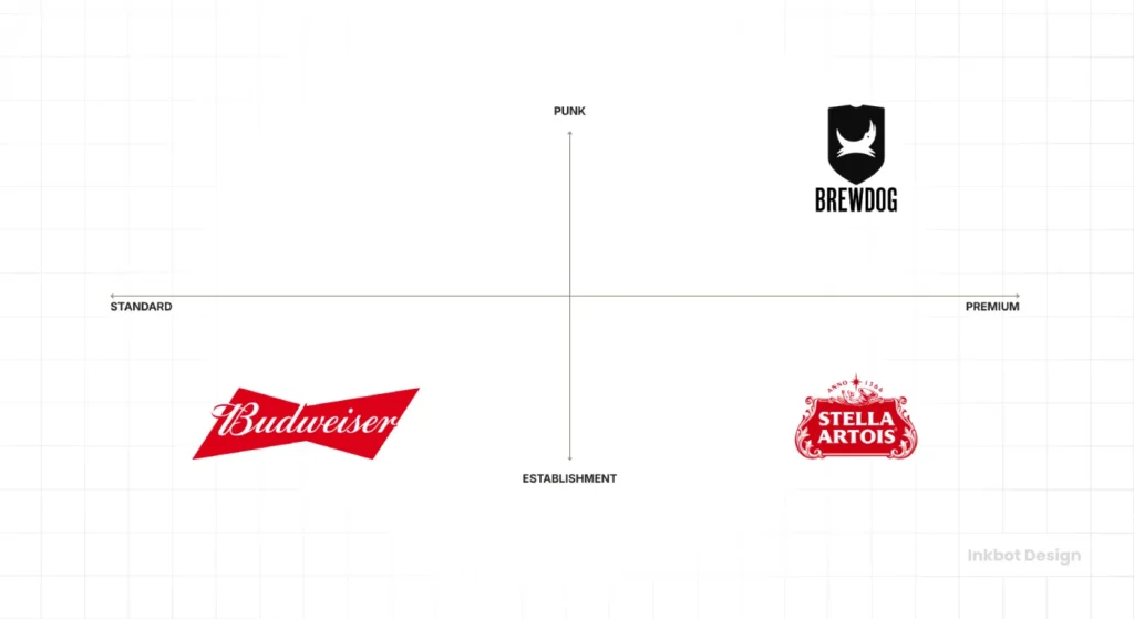
They positioned themselves as the anti-corporate antidote to “bland, yellow, fizzy lager.” This allowed them to charge premium prices for a product that looked rough and ready. (Ironically, as they have scaled, they have drifted back towards the “Establishment” side, creating a new positioning crisis for themselves.)
Consultant’s Note: I once audited a fintech client who wanted to be “The Friendly Bank.” The problem? Monzo and Starling had already occupied that territory five years prior. The map revealed they were late to the party. We pivoted them to “The Bank for Builders”—a hyper-niche positioning that prioritised “friendliness” over “construction-specific utility.” They grew by 300% in their first year.
Advanced Strategy: The “Blue Ocean” Strategy Canvas
For those who want to delve deeper than a 2×2 grid, consider the Strategy Canvas, a concept popularised by W. Chan Kim and Renée Mauborgne in Blue Ocean Strategy.
Instead of two axes, you list all key industry factors along the bottom (Price, Speed, Service, Variety, Status, etc.) and plot the “level” of offering for each.
The Goal: Not just to be a little bit better at everything. You must:
- Eliminate factors the industry takes for granted, but customers don’t care about.
- Raise factors well above the industry standard.
- Reduce factors to save costs.
- Create new factors that the industry has never offered.
This line graph approach often reveals differentiation more clearly than a simple quadrant map.
The State of Brand Positioning in 2026
We are seeing a shift in 2025-2026 regarding “Trust.”
Previously, “Trust” was a hygiene factor (like safety). Today, with the influx of AI-generated content and faceless dropshipping brands, “Authenticity/Human” has become a determining axis.
Brands are now mapping themselves on “AI-Optimised vs. Human-Curated.”
If you are a service business, positioning yourself as “100% Human” is becoming a premium differentiator in a sea of chatbots.
Comparison: The Amateur vs. The Pro
If you are going to do this, do it properly. Here is the difference between a wasted afternoon and a strategic asset.
| Feature | The Amateur Approach | The Professional Approach |
| Data Source | Founder’s gut feeling & guesswork. | Customer surveys, social listening, & review mining. |
| Axes Selection | Price vs. Quality. | Determinant attributes (e.g., Innovation vs. Heritage). |
| Competitors | Only the ones they “respect.” | The ones actually stealing their customers. |
| Goal | To look better than everyone else. | To find a defensible market position. |
| Outcome | A pretty slide for the investor deck. | A roadmap for product development and marketing messaging. |
The Danger of the “Empty Quadrant”
I promised to discuss this. You plot your graph. You see a gaping hole in the top left corner. “Aha!” you shout. “No one is doing ‘Super-Complex software for Toddlers’!”
Stop.
Sometimes, quadrants are empty because the business model is suicidal.
- High Price + Low Service: This is a monopoly quadrant. Unless you are the only train line into London, you cannot survive here.
- Low Price + High Customisation: This is the “Bankruptcy Quadrant.” You cannot sustain bespoke work at bargain basement prices.
Before you rush into a white space, perform a Viability Test. Ask yourself: Is this gap empty because it’s an opportunity, or because everyone who tried it died?
If you are unsure about your current trajectory, it may be time to explore our Brand Identity Services. We spend a lot of time telling clients where not to go.
Is Your Brand Drifting? (The Warning Signs)
“Brand Drift” occurs when your marketing message contradicts your customer experience. Eventually, the customer’s map takes precedence over yours.
Signs you have drifted:
- The “Discount” Addiction: You claim to be “Premium,” but you run 20% off sales every month. The market now maps you as “Mid-Tier.”
- The Feature Bloat: You claimed to be “Simple,” but you added 50 new features to close enterprise deals. The market now maps you as “Complex.”
- The Audience Age: You claimed to be “Youthful,” but your average user age has crept up to 45. The market maps you as “Heritage.” Fix: If you spot these, you must either realign your operations to match the map or accept the new position and rebrand accordingly.
The Verdict
A brand positioning map is not a static picture; it is a dynamic tool. Markets move. Competitors drift. New axes emerge (like the AI/Human split).
If your current map resembles a cross, with you in the top right corner and everyone else in the bottom left, tear it up. It is a lie. Go out, talk to 50 customers, read your competitors’ 1-star reviews, and build a map that scares you a little bit.
Real positioning requires sacrifice. It means choosing to be this and strictly not that. If you try to be everything to everyone, you end up nowhere on the map—just invisible noise in the middle.
Do you need an objective assessment of your market position? Request a quote today, and let’s find out where you really stand.
Frequently Asked Questions (FAQ)
What are the best axes for a brand positioning map?
There is no single “best” pair. You must use determinant attributes—factors that actually drive customer choice in your specific industry. Common effective examples include “Modern vs. Traditional,” “Exclusive vs. Accessible,” or “Complex vs. Simple.” Avoid “Price vs. Quality” as it offers little strategic insight.
How do I find data for my brand positioning map?
Do not rely on guesswork. Use social listening tools, analyse competitor reviews on Trustpilot or Amazon, and conduct customer surveys. Ask customers to rate competitors on specific attributes. The map must reflect their perception, not your internal view.
What is the difference between a perceptual map and a positioning map?
They are often used interchangeably, but technically, a perceptual map plots consumer perception based on data (where they see you). A positioning map may represent where a brand intends to strategically position itself. The goal is to align the two.
Why is my brand positioning map just a straight line?
This usually happens when you choose correlated variables, like Price and Quality. High price usually equals high quality. To fix this, choose independent variables that do not naturally rise and fall together, such as “Speed” and “Customisation.”
Can a brand have multiple positioning maps?
Yes. You should create different maps for different customer segments or product lines. A car manufacturer might have one map for their SUV range (Safety vs. Space) and another for their sports cars (Speed vs. Status).
What does an empty quadrant mean?
An empty quadrant represents a “market gap,” but proceed with caution. It is either a golden opportunity (Blue Ocean) or an economic impossibility (e.g., High Service/Low Cost). Always test the commercial viability of an empty space before entering it.
How often should I update my positioning map?
Review your map annually or whenever a significant competitor enters the market. Consumer perceptions drift over time, and a static map will eventually fail to reflect the reality of the landscape.
What is a ‘Blue Ocean’ strategy canvas?
This is an alternative to the 2×2 grid. Instead of two axes, it plots multiple factors along a horizontal line to show the “value curve” of your brand versus competitors. It is useful for identifying which industry standards to eliminate, reduce, raise, or create.
How does brand personality affect positioning?
Personality (e.g., “Rebellious,” “Sincere,” “Competent”) can be a defining axis. For example, in the banking sector, “Formal vs. Casual” is a personality-driven axis that separates traditional banks from challengers like Monzo or Revolut.
Is being in the middle of the map bad?
Generally, yes. The centre of the map usually represents “average”—average price, average quality, average speed. This is the “zone of indifference.” Successful brands typically occupy the extremes of the axes, where they represent something distinct.

