The Only Brand Identity Checklist You’ll Ever Need
You’re stressed. You think you “need a logo by Friday” because you need to get your website live or print a business card.
So you jump on a cheap design contest site, pick something that looks “modern,” and slap it on everything.
Six months later, you’re frustrated.
Nobody remembers you. You’re attracting the wrong customers. You blend in with every other competitor who also picked a trendy, meaningless-but-clean sans-serif font.
You didn’t build a brand. You bought a digital sticker.
As a brand consultant, I’ve seen this costly mistake dozens of times. Founders will sink £50,000 into product development, but baulk at spending more than £500 on the one thing that connects that product to a human being.
This checklist is designed to fix that. It’s not a list of assets. It’s a strategic framework. It will feel like hard work, because it is hard work. But it’s the only way to build a brand that lasts.
- Phase 1: Strategy first — define your why, target audience, and positioning before any visual design.
- Consistency matters — establish a clear voice, messaging, and visual system, then enforce it with brand guidelines.
- Design with purpose — visuals (logo, colour, typography) must communicate strategic differentiation and work flexibly.
What Is a Brand Identity? (And Why You Need a Checklist)
With that out of the way, let’s establish a baseline.
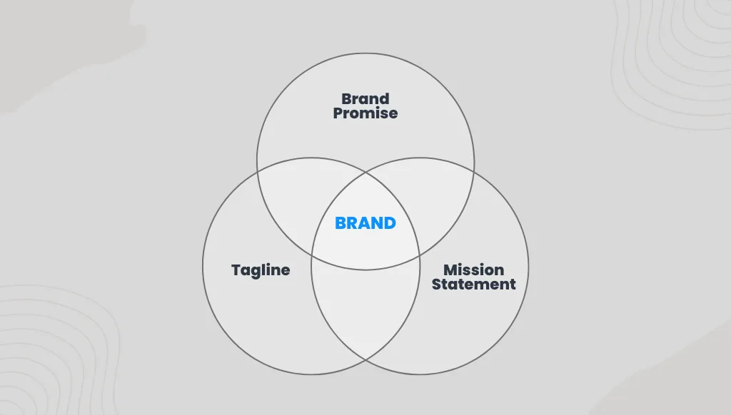
A brand identity is the complete, tangible system of assets you create to communicate what your brand stands for. It’s the visual, verbal, and experiential toolbox you use to express your brand’s strategy, positioning, and personality.
It is the result of your strategy.
Most checklists simply provide the toolbox (logo, colour, font). This checklist forces you to figure out why you’re building, what you’re building, and for whom before you ever pick up a hammer.
We’ll go through this in four distinct phases:
- Phase 1: The Foundation (Strategy & Positioning)
- Phase 2: The Voice (Messaging & Personality)
- Phase 3: The Look (Visual Identity)
- Phase 4: The Toolkit (Application & Guidelines)
Let’s begin.
Phase 1: The Foundation (Strategy & Positioning)
This is the most important part. It’s 90% of the work, and it’s all done on paper. If you skip this, everything that follows will be guesswork.
✅ Check 1: Define Your ‘Why’ (Mission & Vision)
- Mission (Why you exist): A simple, clear statement about what you do, for whom, and why. This is your “today.”
- Bad: “We synergise digital solutions.”
- Good: “We help local bakeries sell more online.”
- Vision (Where you’re going): Your aspirational future. What change do you want to make in the world? This is your “tomorrow.”
- Example: “A world where every small artisan can compete with big-box retailers.”
This isn’t corporate fluff. It’s your compass. Every future decision—from the colours you choose to the people you hire—should be checked against this.
✅ Check 2: Know Your Audience (Intimately)
“Our audience is everyone” is a death sentence. “Our audience is SMEs” is just as bad. It’s lazy.
You need to get painfully specific. Create 2-3 detailed customer personas.
- Go beyond demographics (age, gender, location).
- Dig into psychographics (their fears, values, hopes, frustrations).
- Where do they hang out online?
- What other brands do they love (or hate)?
- What specific problem do they have that you solve?
If you can’t describe your ideal customer in detail, you can’t possibly design a brand that resonates with them.
✅ Check 3: Nail Your Positioning & Value Proposition
Positioning is not what you do. It’s the space you own in your customer’s mind.
A great way to do this is with a simple statement:
“For [Your Target Audience], [Your Brand] is the only [Your Category] that delivers [Your Unique Value Proposition] because [Your Proof].”
- Example (for a local coffee shop): “For busy remote workers, ‘The Daily Grind’ is the only local café that provides a quiet, high-speed workspace (our value) because we have a dedicated ‘no-call’ zone and fibre optic internet (our proof).
This statement immediately sets you apart from Starbucks (which is loud) and the public library (which serves subpar coffee). You’ve found your niche.
✅ Check 4: Analyse the Competition (But Don’t Copy Them)
You can’t be different if you don’t know what “same” looks like.
Map out your top 3-5 competitors. Don’t just look at their logos.
- What is their brand voice? (Formal? Playful?)
- What are their core messages?
- What colours do they overuse? Notice how every bank is blue? That’s an opportunity.
- Where are the gaps? If everyone is “professional and reliable,” perhaps there’s a huge opportunity for being “human and transparent.”
Find the gap in the market. Your brand should live in that gap.
✅ Check 5: Define Your Brand Archetype (The Shortcut)
This is a consultant’s secret weapon. Archetypes are 12 universal “characters” that are instantly recognisable to the human subconscious (the Hero, the Jester, the Sage, the Rebel).
- Nike is the Hero: “Just Do It.”
- Apple is the Rebel (or Creator): “Think Different.”
- Google is the Sage: “Organising the world’s information.”
Choosing an archetype (or a primary and secondary) gives you an instant shortcut to a consistent personality. It helps you answer, “If my brand were a person, who would it be?”
Phase 2: The Voice (Messaging & Personality)
Only after you know who you are and who you’re for can you decide how you sound. Most businesses skip this, which is why their website sounds like a formal robot while their social media sounds like a hyperactive intern.

✅ Check 6: Define Your Brand Voice & Tone
This is critical. Voice is your personality; Tone is your mood.
Your voice should be consistent. It doesn’t change. A great way to define this is with a simple “We are X, We are not Y” chart.
- We are: Confident, Witty, Direct
- We are not: Arrogant, Sarcastic, Rude
Your tone adapts to the context. You use the same “Confident” voice, but your tone when writing a 404 error page (Apologetic, Helpful) is different from your tone when launching a new product (Excited, Bold).
I use this matrix with clients to help them see the difference.
The Brand Voice Matrix
| Voice Attribute (Consistent) | Context: Blog Post (Educating) | Context: Twitter (Engaging) | Context: Support Email (Helping) |
| Confident | Tone: Authoritative “This is the proven method…” | Tone: Bold “Hot take: Your logo is the least important part…” | Tone: Reassuring “We can get this sorted for you…” |
| Witty | Tone: Engaging “Let’s be honest, your last logo looked like…” | Tone: Humorous Another ‘minimalist’ blue logo. Groundbreaking.” | Tone: Charming “Oops. Looks like a wire got crossed. Let’s untangle that.” |
| Direct | Tone: Clear “Do this, not that. Here’s why.” | Tone: Punchy “Stop it. Just stop.” | Tone: Efficient “To fix this, please provide your account number.” |
✅ Check 7: Craft Your Core Messaging
These are the building blocks of your copy. You should have them written down and memorised.
- Tagline/Slogan: The short, memorable phrase that captures your brand’s essence (e.g., “Think Different”).
- Value Proposition: We already did this, but now refine it into customer-facing language.
- Key Talking Points (3-5): What are the 3-5 things you want everyone to know about you? These should be included on your “About” page, in your sales decks, and in your PR kit.
✅ Check 8: Create the “Brand Story”
People don’t buy what you do; they buy why you do it. Your brand story is the narrative that connects your “Why” (Phase 1) to your customer.
It’s not your entire company history. It’s a simple, emotional narrative.
- The Problem: What was broken in the world?
- The “Aha!” Moment: How did you discover a better way?
- The Solution: What is your brand’s mission?
- The Vision: What does the future look like for your customer?
This story is your most powerful sales tool.
Phase 3: The Look (Visual Identity Design)
Here we are. The part you thought was the first step.
Now that you have your Strategy (who you are) and your Voice (how you sound), we can finally decide how you look. Notice how much easier this is now?
You’re not just “picking colours you like.” You’re choosing visual tools that communicate your strategy.
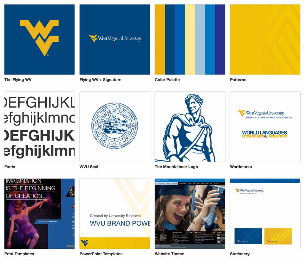
✅ Check 9: Logo Design & Variations
Your logo is your brand’s face. It must be professional, unique, and, most importantly, flexible.
A modern brand identity must include a logo system:
- Primary Logo: The full, main version (e.g., text and icon).
- Secondary Logo: A stacked or horizontal variation (for different layouts).
- Logomark/Icon: The symbol by itself, for use in small spaces (e.g., a favicon or social media profile).
- Wordmark: The text by itself.
It must work in one colour (black and white) before it ever works in multiple colours. If it relies on gradients and shadows to appear visually appealing, it’s a weak logo.
Visual Identity Style Finder
Struggling to describe the “look” you want for your brand? Answer 7 questions about your vibe and values, and we’ll generate a Visual Design Brief you can give to your designer.
Question…
Your Visual Identity Style
STYLE NAME
Recommended Design Elements
✅ Check 10: Colour Palette
Stop. Do not just pick colours. Your palette is a communication tool.
- Psychology: Blue evokes trust, Red evokes passion, Yellow evokes optimism. What feeling (from Phase 1) are you trying to evoke?
- Differentiation: Look at your competitors (from Phase 1). If they all use blue, using a warm, energetic orange could make you stand out instantly.
You need a defined system, not just a few swatches.
- 1 Primary Colour: Your main brand colour.
- 2-3 Secondary Colours: To complement the primary and be used for accents, buttons, etc.
- 2-3 Neutrals: Your (non-black) darks, (non-white) lights, and greys for body text and backgrounds.
✅ Check 11: Typography (Fonts)
Like colour, typography has a personality. A heavy slab-serif font conveys a strong and industrial feel. A light script font conveys elegance and a personal touch.
You need a clear hierarchy:
- 1 Primary Typeface (Headlines): This is your “display” font. It can have more personality, but it must be legible.
- 1S Secondary Typeface (Body Copy): This must be exceptionally readable. This is for long paragraphs of text. Don’t get cute here.
- (Optional) Accent Typeface: For special callouts or quotes.
Ensure you have the proper web font licenses!
✅ Check 12: Imagery, Iconography & Graphic Elements
How you treat images and graphics is a core part of your brand. Will you be a “stock photo” brand?
- Photography Style: Is it bright, airy, and minimal? Dark, moody, and cinematic? Is it product-focused or people-focused? Define it.
- Illustration Style: If you use illustrations, what kind? Hand-drawn? Geometric?
- Iconography: Your icons (for your website, etc.) should feel like they came from the same “family” as your logo and fonts.
- Textures/Patterns: (Optional) Elements like a subtle grain, a repeated pattern, or a watercolour wash can add depth.
This is the stage at which many SBOs become overwhelmed. They’ve nailed the strategy, but can’t execute the visuals effectively. If this is you, it’s time to hire a professional. Getting your visual identity wrong can undermine all the strategic work you’ve just done.
The team here at Inkbot Design specialises in translating that hard-won strategy into a compelling visual system. This isn’t a sales pitch; it’s a practical recommendation. Don’t run the first 25 miles of a marathon just to trip at the finish line.
Phase 4: The Toolkit (Application & Guidelines)
You have the strategy, the voice, and the look. You’re done, right?
Wrong. A brand identity is useless if it’s not used. Or worse, if it’s used inconsistently. This final phase is about creating the tools and rules to protect your investment.
✅ Check 13: Website & Digital Presence
Your website is your most important brand asset. It’s your digital flagship store. Does it reflect all the work you’ve just done?
- Homepage: Does it pass the 5-second test? Can a new visitor understand who you are, what you do, and for whom?
- Social Media: Are your profiles, banners, and icons all consistent?
- Email Marketing: Do your newsletters use your brand fonts, colours, and voice?
Inconsistency kills trust. If your Instagram looks fun and your website looks stuffy, you’ve created a disconnect.
✅ Check 14: Physical Assets (If Applicable)
If you’re a product or service with physical touchpoints, the brand experience must extend there.
- Packaging: This is a huge brand opportunity. Is it just a brown box, or is it an experience?
- Business Cards/Stationery: Every piece that leaves your office is a brand ambassador.
- In-store Experience: The layout, the music, the uniform—it’s all part of the brand.
✅ Check 15: The Holy Grail: Your Brand Guidelines
This is the single most important document you will create. It’s the “rulebook” for your brand.
It ensures that you, your new intern, your freelance designer, and your marketing agency all use the brand in the exact same way.
At a minimum, your guidelines should include:
- Phase 1: Mission, Vision, Audience, Archetype
- Phase 2: Voice, Tone, and Core Messaging
- Phase 3:
- Logo: Correct usage, minimum size, clear space, and what not to do (e.g., don’t stretch it, don’t change the colour).
- Colour: All your palette codes (HEX, CMYK, RGB).
- Typography: The full hierarchy with font names and sizes.
- Imagery: Examples of “on-brand” and “off-brand” photos.
This document is your brand’s immune system. It protects it from bad decisions and lazy design.
How to Know If Your Branding Is Working
You’ve done it. You’ve gone through all 15 checks. Now, how do you know if it’s any good?
Here are three simple tests I use with clients.
- The “No-Logo” Test: Take a screenshot of your website, your social media post, or your packaging. Now, cover the logo. Can you still tell it’s your brand? If you can (from the colours, fonts, and voice alone), you have a strong identity.
- The “Consistency” Test: Put your business card, your website homepage, and your Instagram profile side-by-side. Do they appear to be from the same family? Or do they look like distant, feuding cousins?
- The “GUT” Test: Does Your Team Get It? Can your new salesperson articulate your value proposition? Do people within your organisation use your brand voice? If your own team is confused, your customers don’t stand a chance.
Finally, here is a table to diagnose if you’re stuck in a “tactic” mindset.
The Strategy vs. Tactic Trap
| SBO Mistake (A Tactic) | The Right Way (The Strategy) |
| “We need a logo.” | “We need a way to visually represent our unique positioning.” |
| “I like the colour blue.” | “Our competitor analysis shows a gap for a brand using warm, energetic colours.” |
| “Let’s run Facebook ads.” | “Our target persona hangs out on Instagram, so let’s build a community there.” |
| “Just make it ‘professional’.” | “Our archetype is ‘The Sage,’ so our visuals must be clean, ordered, and authoritative.” |
| “I need this by Friday.” | “This is the foundation of our business. Let’s take the time to get it right.” |
Designing Brand Identity
Your brand is invisible. You’re being crushed by relentless competition, digital noise, and AI, yet you’re still using an outdated playbook. This is the fix. It’s the fully updated 6th edition of the best-selling guide—the quintessential roadmap with new case studies and tools for the modern, chaotic market. Stop guessing.
As an Amazon Partner, when you buy through our links, we may earn a commission.
Your Checklist Is a Compass, Not a Cage
This checklist might seem overwhelming. That’s a good thing. It means you’re finally grasping the seriousness and scope of establishing a genuine brand identity.
It’s not a “one-and-done” task you can palm off on an intern or a cheap contest site. It is the strategic, intentional, and deliberate act of building your business’s entire personality.
A brand identity is a compass. It’s the tool you use to make sure every single thing you do, from a tweet to a new product, is moving you in the right direction.
If you’ve gone through this checklist and feel overwhelmed, that’s a good sign. It means you’re past the “a logo will fix it” phase. This is where professional help becomes an investment, not an expense.
If you’re ready to build a brand identity based on strategy, not guesswork, our team at Inkbot Design lives and breathes this stuff.
Would you like me to show you what a professional brand identity service looks like, or would you prefer to get a quote for your project?
Brand Identity Checklist: FAQs
How long does it take to build a brand identity?
Good question. The strategy phase (Phase 1) can take anywhere from a week to a month of intensive work. The visual design (Phase 3) typically takes 4-8 weeks to complete. All in, you should budget 2-3 months for a proper, professional process.
How much does a brand identity cost?
Anything. It can cost £50 on a contest site (and be worthless) or £500,000 from a global agency. For a small business working with a professional studio or agency, a comprehensive identity (strategy, voice, visuals, guidelines) typically ranges from £5,000 to £20,000+.
What’s the difference between brand, branding, and brand identity?
Brand: The intangible gut feeling or perception people have about you.
Branding: The active process of shaping that perception (e.g., marketing, service).
Brand Identity: The tangible toolbox of assets (logo, colours, voice) you use to do it.
Can I just design my own logo?
You can. You can also do your own plumbing. The results are usually… messy. Your logo is the most visible asset of your brand. If it looks amateur, your entire brand will appear amateurish.
What is the single most important part of this checklist?
Phase 1: Strategy. Specifically, Check #3: Positioning. If you don’t know why you’re different and for whom, no amount of beautiful design can save you.
How often should I rebrand?
You should “refresh” (minor updates to visuals) every 5-7 years to stay current. You should only “rebrand” (a total strategic overhaul) if your business model, audience, or positioning has fundamentally changed.
Do I really need brand guidelines?
Yes. 100%. A brand identity without guidelines is an investment you’re choosing to let decay. It’s like building a house and giving no one the keys or a maintenance plan.
What’s more important: logo or brand voice?
They’re a team. A great logo with a terrible brand voice (or no voice) is a person in a nice suit who has nothing to say. A great voice with a terrible logo is a brilliant person who showed up in a clown costume. You need both.
What are brand archetypes?
There are 12 universal character patterns (e.g., The Hero, The Jester, The Sage, The Outlaw) that help a brand build a more human and relatable personality.
What is a “logo system”?
It’s a collection of logo variations (primary, secondary, and icon/mark) designed to work flexibly across all platforms, from a giant billboard to a tiny app icon.
My business is already running. Is it too late?
Never. The best time to build a brand was 5 years ago. The second-best time is right now. Going back to fix your strategy is always, always worth the effort.
Where can I find examples of good brand identity?
Don’t just look at the big guys like Apple or Nike. Look at smaller brands you admire. Notice how brands like Oatly (food), Mailchimp (tech), or even a local coffee shop use a consistent voice, colour, and feeling.


