Brand Art Direction: The System That Makes Every Asset Look Like One Brand
Brand identity decides what a firm looks like. Brand art direction decides how that identity performs across photography, video and illustration when dozens of people produce work every week. For professional services firms that publish constantly, art direction is the governing system that keeps a growing brand legible as one thing.
 By Stuart Crawford
 Reviewed by Tabitha Ayers
Updated 14 min read
On this page14 min left
- What Is Brand Art Direction?
- Why Brand Art Direction Decides Whether a Rebrand Survives Contact With Reality
- The Working Parts of Brand Art Direction
- Where Firms Get Brand Art Direction Wrong
- A Worked Example: Art-Directing a 120-Person Advisory Firm's Rebrand
- The Real Argument: Identity Defines the Look, Art Direction Defines the Performance
- Where This Stands in 2026
- The Verdict
- Frequently asked questions
Three photographers shot your firm this year. One lit the partners like a corporate headshot factory, one went moody and cinematic, one shot everyone against a white cyclorama.
On your website, they sit three thumbnails apart, and the prospect scrolling through your case studies registers – without being able to name it – that this firm doesn't quite hold together.
That gap is not a photography problem. It is an art direction problem, and most firms fix the logo instead.
Brand identity decides what a firm looks like. Brand identity – the logo, the palette, the type system – is the fixed part.
Brand art direction is the part that decides how that identity performs the moment real work leaves the studio: a partner headshot, an office reception shot, a LinkedIn carousel, a recruitment video, a spot illustration in a thought-leadership PDF.
Get the identity right and the art direction wrong, and the brand fragments anyway.
Deloitte's TrustID research, which collected over 400,000 survey responses across nearly 500 brands, found that strong-trust brands can outperform peers by up to four times in total market value – and a brand that visually contradicts itself across channels is not building that kind of trust.
What Is Brand Art Direction?
Brand art direction is the governing system that makes photography, video and illustration behave as one recognisable brand across every channel. It sits above individual assets and below strategy, translating a fixed identity into repeatable rules for how images are made – not just how they are laid out.
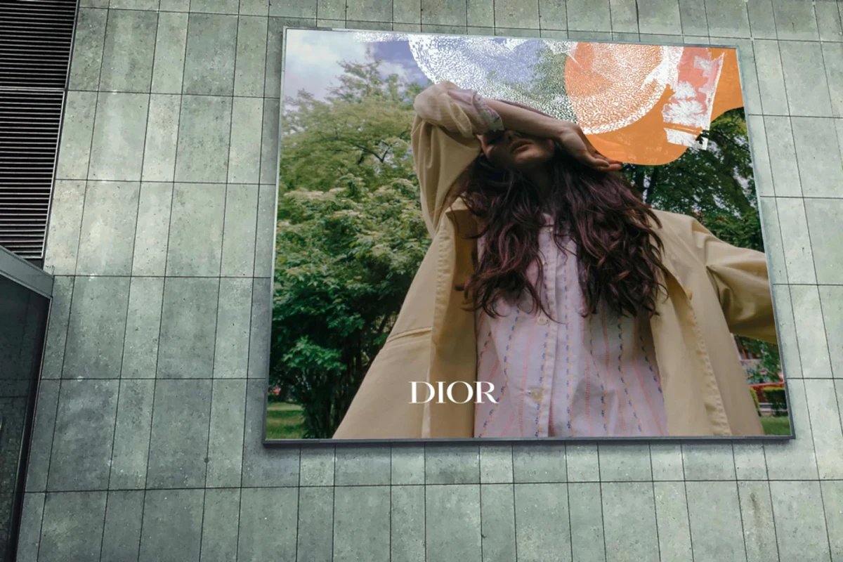
- It governs the visual decisions identity guidelines rarely specify: lighting, framing, casting, crop ratios, motion tempo, illustration rules and texture.
- It is a system, not a task – its job is to produce on-brand work when the art director is not in the room.
- It applies most to firms that publish constantly, where consistency cannot be ensured by a single person checking every asset.
Brand art direction is the governing system that makes photography, video and illustration behave as one recognisable brand across every channel.
Why Brand Art Direction Decides Whether a Rebrand Survives Contact With Reality
A rebrand is judged not on the day it launches but eighteen months later, when four hundred assets have been produced by people who were not in the identity workshop. For a professional services firm employing 50 to 200 people, that is the real test.
The logo will be fine. It is fixed, versioned, and locked in a brand portal. The photography will drift – because photography is made continuously by different hands, and nothing in a standard identity guideline tells a new freelancer how your firm is lit, framed or cast.
This matters commercially because trust compounds through recognition, and recognition depends on repetition.
Deloitte's TrustID research reports a 5% rise in expected stock return when a company's TrustID score increases by just one point, from 50 to 51. Deloitte's HX Trust report found that 62% of customers buy almost exclusively from trusted brands, and 88% of customers who highly trust a brand have bought from it again.
A firm whose visual output contradicts itself every quarter is not accumulating the repetition that trust is built from – it is resetting recognition every time it publishes.
Adobe's guidance on consistent brand photography makes the same point from the production side: visual consistency is what maintains recognition and trust across channels, which is why photography belongs inside the identity system rather than sitting beside it as a separate content layer.
Canon's business photography guidance reaches the same conclusion – used consistently, photography is what keeps a brand recognisable at every touchpoint. Both treat photography as identity rather than decoration.
Brand art direction is the mechanism that enforces that.
A rebrand does not fail at launch. It fails eighteen months later, one off-brand photoshoot at a time, until the brand, a firm paid to unify looks assembled by committee again. Brand art direction is the difference between an identity that holds and one that quietly comes apart.
The Working Parts of Brand Art Direction
Brand art direction breaks into the specific decisions that identity guidelines leave open. Each one is a place where assets drift when nobody governs it.
The sequence matters: casting and lighting set the base, framing and crop control repetition, motion and illustration extend the system into formats a static logo never reaches.
Casting and Subject: Who and What Appears in Frame

Casting determines who appears in a firm's images and how they are presented, and it is the fastest way for a brand to fragment.
A firm that shoots partners in one register and junior staff in another, or mixes staged corporate portraits with candid documentary shots, tells the viewer two different stories about who it is.
Brand art direction fixes the register: staged or candid, individual or in-context, formal or working. For a professional services firm, where the people are the product, casting rules are not cosmetic – they define how expertise is shown.
A litigation practice photographing partners as approachable and collaborative reads differently from one photographing them as adversarial and precise, and either can be correct, but not both in the same brand.
Lighting and Colour Continuity: The Signature Most Firms Never Set
Lighting is the most recognisable and least documented part of a visual identity, which is why it drifts first.
A brand shot consistently in soft, high-key light reads as open and modern; the same brand shot in hard, directional light reads as serious and premium.
When a firm hires whichever photographer is available for each shoot, it inherits that photographer's lighting default rather than its own.
Brand art direction specifies the lighting signature and the colour grade applied in post, so images shot by three different people in three cities still belong to one brand.
This is the layer that separates a governed visual language from a folder of nice photos.
Framing, Crop and Composition: The Rules That Survive Every Format
Framing and crop rules keep a brand consistent across the aspect ratios it can never fully control. The same image lives as a website hero, a square LinkedIn post, a vertical story and a slide, and without crop discipline it fragments across all four.
Brand art direction sets composition rules – where subjects sit, how much negative space, which crops are permitted – so an image survives reformatting without losing its brand character.
For a firm publishing daily across platforms, this rule does more work than any single hero shot, because it governs the thousands of routine assets nobody art-directs individually.
Motion Tempo and Illustration: Extending the System Beyond the Still Image
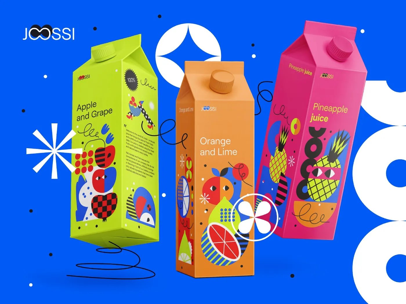
Motion and illustration are where a brand either extends coherently or splinters into unrelated content. Video has a tempo – cut speed, camera movement, transition style – and illustration has a set of rules for line, colour and form.
A firm that treats these as separate disciplines ends up with a photography brand, a video brand and an illustration brand that happen to share a logo.
Brand art direction governs all three as one system, which is where custom illustration built to extend a brand identity earns its place – not as decoration, but as a deliberate part of the recognition system that carries the brand into formats photography cannot reach.
Where Firms Get Brand Art Direction Wrong
The common mistake is treating brand art direction as a style applied once rather than as a continuously governed system.
A firm commissions a rebrand, receives a beautiful set of launch photography, and assumes the look is now “set.”
Six months later, the launch photographer is unavailable, a marketing hire commissions a replacement, and the replacement – competent, well-intentioned, working without a written system – produces images that are individually fine and collectively wrong.
Nobody made a bad decision. The system simply did not exist to make the right one automatic.
The second mistake is confusing brand guidelines with art direction. Most identity guidelines specify the logo, the palette and the typography in exhaustive detail and then say almost nothing about how images are actually made.
They show three approved photographs as examples and call it a photography section. An example is not a rule.
A new freelancer cannot reverse-engineer your lighting, casting and crop system from three sample images, which is precisely why the fourth photoshoot looks different from the first three.
In 17 years of brand work, the pattern I see most often is a firm that invested heavily in a logo system and almost nothing in the rules that govern the ten thousand images produced after launch.
A Worked Example: Art-Directing a 120-Person Advisory Firm's Rebrand

Consider a 120-person advisory firm rebranding ahead of a growth phase, publishing across a website, LinkedIn, recruitment channels and quarterly reports. Its identity is done – logo, palette, type.
The art direction problem starts now, because the firm produces roughly forty visual assets a month across three offices and two freelancers.
The art direction system for that firm would specify five things before any new asset is created.
- Casting: partners and staff shot in-context at work, candid rather than staged, no white-background portraits.
- Lighting: soft natural light, a defined warm-neutral grade applied in post to every image, regardless of who shot it.
- Framing: subjects placed off-centre with generous negative space, a fixed set of permitted crops for web, social and print.
- Motion: a slow, steady cut tempo for video, no fast transitions.
- Illustration: a single line-weight and a two-colour palette drawn from the brand system for all explanatory graphics.
The point of writing these down is not documentation for its own sake.
It is the marketing hires who commission the next shoot, and the freelancer who accepts the brief, who now produce on-brand work without the founder in the room.
The test of the system is not whether the launch images look good. It is whether asset number four hundred still looks like the brand.
The Real Argument: Identity Defines the Look, Art Direction Defines the Performance
Intelligent practitioners treat photography as another brand asset, an extension of visual identity, styled to match the logo and palette.
That view is reasonable, and it is why most brand guidelines have a photography page. It is also why most brands fragment.
Treating photography as an asset means you produce and check it. Treating art direction as a system makes it produce correctly by default.
Here is the sharper way to think about it: brand identity defines what a brand looks like; brand art direction defines how that identity performs in the real world. Lighting, framing, casting, crops, motion tempo and illustration rules are not decorative choices.
They are part of the brand's recognition system – the mechanism by which a viewer identifies the firm before reading a word.
For a firm that publishes constantly, the useful question is no longer “does this asset look on-brand?” asked one asset at a time.
It is “can this system produce on-brand work at scale?” – asked once, of the system itself.
Identity is what a brand looks like. Art direction is how that identity performs when it leaves the studio and meets a freelancer, a deadline and a platform that crops it square. A logo can be locked in a file. A visual language has to be governed, because it is made new every single day.
That reframe changes what a firm buys when it rebrands. It is not buying a set of assets. It is buying a system that makes future assets inevitable – a governed visual language rather than a folder of approved examples.
The firms that stay coherent through a growth phase are not the ones with the most beautiful launch photography. They are the ones whose art direction survives the launch photographer's leaving.
Where This Stands in 2026
Agentic AI will increasingly shape branding in 2026, and trend reporting makes it clear that the significant change is not starting over but amplifying systems already emerging in 2025.
For art direction, that raises the stakes on governance: when AI tools can generate visual assets at volume, the firms that win are the ones with a defined system to generate against.
Volume without a governing system produces more fragmentation faster.
Multiple 2026 trend analyses point to a shift away from static identities toward dynamic, motion-led brand systems that adapt to context rather than relying on a single fixed logo application.
This is the art direction problem stated at the level of the whole identity – a motion-led brand cannot be governed by a static guidelines PDF.
2026 commentary also emphasises humanised, tactile and imperfect visuals as a response to AI-polished output, which lands directly on photography and illustration direction: the “imperfect” look still has to be a governed, repeatable choice, or it is just inconsistency wearing a trend.
Accessibility is being framed across 2026 identity commentary as a core brand requirement rather than a UX add-on, with clarity, legibility and inclusion recurring as identity themes. For art direction, that means casting, contrast and legibility become brand rules, not afterthoughts.
A firm setting up its visual system now has to build these in at the governance layer, because retrofitting accessibility across ten thousand existing assets is far more expensive than specifying it from the start.
The Verdict
Brand art direction is not the aesthetic layer added after the identity is done.
It is the operating system that makes photography, video and illustration legible as one brand – the governed set of rules for lighting, casting, framing, motion and illustration that turns a fixed identity into consistent output at scale.
A firm that understands this stops asking whether each asset looks on-brand and starts asking whether its system can produce on-brand work without supervision. That is the question a rebrand should actually answer.
The evidence for why this matters is commercial, not cosmetic. Deloitte's TrustID research links strong trust to as much as four times the market value of peers, and trust is built through the repetition that only a governed visual system delivers.
Adobe and Canon both treat consistent photography as identity rather than decoration.
The firms that stay coherent through growth are the ones whose art direction survives their launch photographer leaving, their marketing hire changing, and their asset count reaching the thousands. Identity is what a brand looks like.
Art direction is how it performs when nobody is watching.
If a rebrand is on the horizon, the single most useful thing to do today is stop auditing individual assets and start auditing the system that produces them.
Request a free Brand Equity Audit™ – a structured diagnostic that identifies exactly where a brand is losing commercial ground and what to do about it.
Frequently asked questions
What is brand art direction?
Brand art direction is the governing system that makes photography, video and illustration behave as one recognisable brand across every channel. It translates a fixed identity into repeatable rules for how images are made – lighting, casting, framing, crops, motion and illustration – so output stays consistent regardless of who produces it.
What is the difference between brand identity and brand art direction?
Brand identity is the fixed part: logo, palette, and typography. Brand art direction is how that identity performs in produced work. Identity defines what a brand looks like; art direction defines how it behaves across photography, video and illustration when dozens of people make assets every week.
Do we need brand art direction if we already have brand guidelines?
Yes – because most guidelines specify the logo, palette and type in detail but say almost nothing about how images are actually made. They show sample photographs instead of stating rules. A freelancer cannot reverse-engineer your lighting and casting system from three examples, which is why the next shoot drifts.
Why does our brand look inconsistent across channels?
Because photography, video and illustration are produced continuously by different people, and nothing governs how they are made. Logos stay fixed; images drift. Without art direction setting lighting, casting and crop rules, each new asset inherits its maker's defaults rather than the brand's, and the brand fragments.
How do you keep photography on-brand at scale?
By writing down the decisions guidelines usually leave open: the lighting signature, the casting register, permitted crops, and the post-production grade. A documented art direction system lets a new freelancer produce on-brand work without the founder present, which is the only way consistency survives a rising asset count.
Is brand art direction only relevant for large companies?
No – it matters most for any firm that publishes constantly, including professional services firms of 50 to 200 people. The trigger is the output volume produced by multiple hands, not company size. A 120-person advisory firm producing forty assets a month needs governance as much as a global brand does.
When should a firm invest in brand art direction?
During a rebrand, before launch, not after fragmentation appears. Art direction built into the identity system governs every asset produced from day one. Retrofitting it across thousands of existing off-brand assets costs far more than specifying the rules once, when the new identity is created.
What does a brand art direction system actually specify?
It specifies casting (who appears and how), lighting and colour grade, framing and permitted crops, motion tempo for video, and illustration rules for line, colour and form. These are the decisions standard identity guidelines leave open, and they are exactly where assets drift when no system governs them.
How is brand art direction different from graphic design?
Graphic design arranges elements on a page. Brand art direction governs how images are made before they reach the page – the lighting, casting and framing decisions upstream of layout. Design executes within the system; art direction is the system that ensures consistent execution across all producers and formats.
Does brand art direction cover video and illustration, not just photography?
Yes – a brand that governs photography but leaves video and illustration ungoverned ends up with three visual languages sharing one logo. Art direction sets motion tempo for video and line, colour and form rules for illustration, so all three extend one recognisable brand rather than splintering into unrelated content.
Can AI tools replace brand art direction?
No – AI increases the volume of assets a firm can produce, which makes a governing system more necessary, not less. Without a defined art direction system to generate against, AI tools accelerate fragmentation. The system is what gives the generated output a consistent brand to conform to.
How does brand art direction affect commercial results?
It protects the recognition on which trust is built. Deloitte's TrustID research links strong-trust brands to up to four times the market value of peers, and trust compounds through visual repetition. A brand that contradicts itself across channels resets recognition with each publication, undermining the consistency that drives commercial value.