
25 of the Best Japanese Logos That Master Simplicity
The power of Japanese logo design has nothing to do with “minimalism.”
That’s a lazy Western label for something far more rigorous and strategic. We see a simple shape and think “Zen.” We see negative space and whisper “Wabi-sabi.” It’s nonsense. It’s the design equivalent of a tourist buying a cheap kimono and thinking they understand Japanese culture.
What you’re actually seeing isn’t minimalism. It’s ruthless distillation.
It’s a process that takes a complex idea—a company’s history, philosophy, and function—and boils it down to its most potent, instantly recognisable visual essence. These logos aren’t simple because it’s a trend. They are simple because every other non-essential element has been purposefully carved away.
For entrepreneurs and business owners, this is the most valuable branding lesson you could ever learn. It’s not about what you add to your logo. It’s about what you dare to take away.
Here are 25 examples of Japanese logos that master this principle, and the actionable lessons you can steal for your brand.
- Japanese logo design emphasises ruthless distillation of complex ideas into recognisable visual forms, prioritising clarity over decoration.
- Kanso focuses on clarity by removing non-essential elements, ensuring logos communicate core messages effectively.
- Logos are designed for longevity, remaining relevant for decades rather than succumbing to fleeting trends.
- Connecting logos to heritage and storytelling offers depth, giving brands a unique, resonant identity.
It’s Not Minimalism, It’s Distillation: 3 Principles You’re Missing
Before we get to the list, you need to understand the thinking behind the execution. Anyone can make a simple shape. Very few can create a simple shape with weight, meaning, and a 100-year plan.

Kanso (簡素): The Relentless Pursuit of Clarity
Kanso doesn’t mean “simple.” It means clarity of nature, an absence of clutter. It’s about expressing an idea in its most essential form. The design must communicate its core message without decoration when applied to a logo. If a line, a curve, or a colour doesn’t serve a direct purpose, it’s removed.
The Ghost of the Kamon (家紋): Why Heritage Matters
For centuries, Japanese families used intricate crests called Kamon to identify themselves. These highly symbolic, geometric designs, often enclosed in a circle, told the story of a clan’s lineage and values. This design DNA is baked into modern Japanese corporate identity. The best logos often function as a modern Kamon, a seal of quality and a nod to the company’s history.
Designing for a Century, Not a Season
Western brands often treat a logo like fast fashion, chasing trends with a rebrand every 5-10 years. This is anathema to the Japanese approach. A logo is considered a foundational asset, designed to be as relevant in 50 years as it is today. This forces a focus on timeless forms—circles, simple lines, and balanced typography—over stylistic fads.
Japanese Design Since 1945
Your design is trendy and disposable because you only know one playbook. This book deconstructs the operating system behind Japanese design. It’s the definitive guide, profiling over 70 masters and their secrets to combining radical utility with timeless beauty. Stop making forgettable junk and start creating work that lasts.
As an Amazon Partner, when you buy through our links, we may earn a commission.
The List: 25 Logos That Teach a Masterclass in Branding
These logos have been grouped by industry to show how these principles are applied across different sectors. Pay attention to the recurring themes of symbolism, geometry, and longevity.
Category 1: The Corporate Titans – Built for 150 Years
These are the bedrock industrial giants. Their logos communicate stability, trust, and history with absolute, unwavering confidence.
1. Mitsubishi The three-diamond mark is arguably one of the most recognised Japanese symbols in the world. It combines two family crests: the three oak leaves of the Tosa Clan and the three-tiered water chestnut leaves of the Iwasaki family, the company’s founders.
- Takeaway for Your Business: Can you visually merge your founding story or core values into a single, geometric mark?
2. Mitsui Group The mark, designed in 1909, features three horizontal bars that are enclosed in a circle representing heaven, earth, and humanity. The name ‘Mitsui’ itself means “three wells,” which is also subtly referenced. It’s a logo that speaks of ambition and balance.
- Takeaway for Your Business: A logo doesn’t have to be a picture of what you do. It can represent the philosophy behind what you do.
3. Sumitomo This mark, called an igeta, is a stylised representation of a well frame. It comes from the founder’s family name, Masatomo Sumitomo, whose father owned a well-known shop. It directly links to the company’s origins over 400 years ago.
- Takeaway for Your Business: Your history, no matter how small, is a unique source of branding inspiration. Don’t ignore it.
4. Japan Post The simple mark is instantly recognisable by every person in Japan. It’s derived from the first character of the word for “communications” (逓信, Teishin). It is pure function—a ubiquitous and straightforward symbol that has become part of the national visual language.
- Takeaway for Your Business: Aim for a clear mark that becomes a shorthand for your service.
Category 2: Automotive Masters – Engineering in a Symbol
Japanese car logos are masterpieces of hidden meaning and clever geometry. They sell precision and reliability before you even see the car.
5. Toyota Created in 1989, the three overlapping ellipses are a work of genius. They represent the heart of the customer, the heart of the product, and technological progress. But look closer: every letter of the word “TOYOTA” letter is hidden within the symbol.
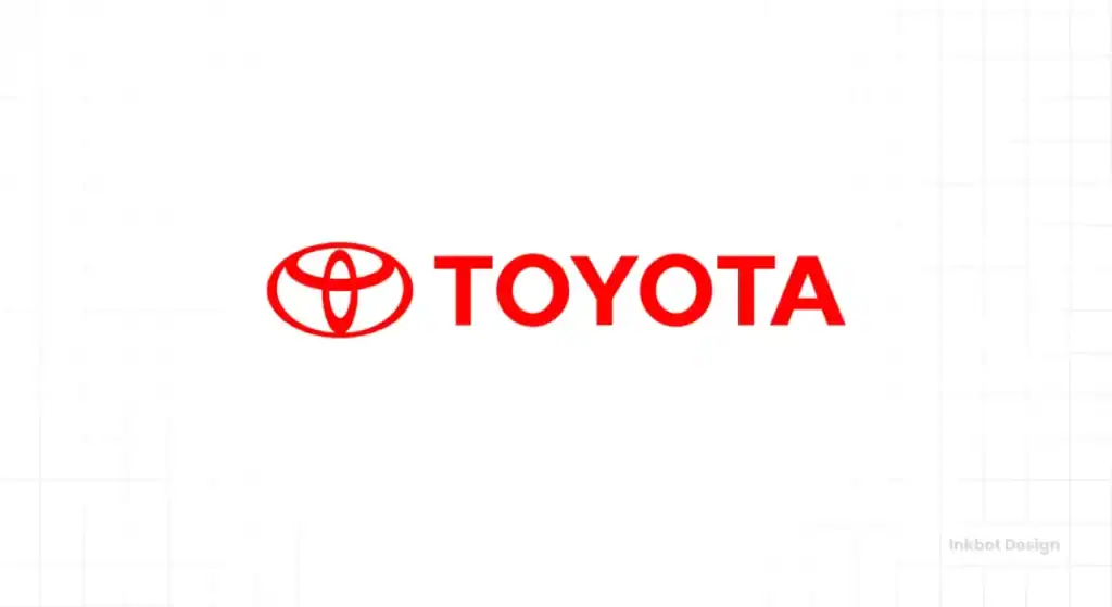
- Takeaway for Your Business: Layering meaning creates a deeper connection with customers who discover the “secret.
6. Mazda The current ‘V’ shaped mark represents wings, a symbol of the company’s flight toward the future. It’s set inside an oval, creating a dynamic sense of motion. It’s clean, metallic, and perfectly captures the feeling of engineering in flight.
- Takeaway for Your Business: Your logo should evoke the feeling of your product or service, not just what it is.
7. Nissan The modern Nissan logo, flattened for the digital age, is an evolution of a mark that dates back to the 1930s. It represents the rising sun, a powerful symbol of Japan itself. It’s a bold claim: Nissan is not just a company but a Japanese industrial standard-bearer.
- Takeaway for Your Business: Don’t be afraid to connect your brand to a larger, powerful idea if the link is authentic.
8. Subaru “Subaru” is the Japanese name for the Pleiades star cluster. The logo literally depicts that cluster, with one large star representing Fuji Heavy Industries and the five smaller stars representing the companies that merged to form it.
- Takeaway for Your Business: A name with a built-in story is a gift. Use your logo to tell that story visually.
9. Honda. While the car division uses a simple, strong “H,” the motorcycle division uses the iconic wings. Soichiro Honda was fascinated with flight, and the wings represent the dream of soaring. It’s an aspirational, emotional mark for a product built on freedom.
- Takeaway for Your Business: You can use different logos for different divisions if they target different emotional needs.
Category 3: Tech & Electronics Pioneers – From Analogue Precision to Digital Dominance
These logos had to convey cutting-edge technology and reliability, often with nothing more than a custom typeface.
10. Sony. There is no symbol—just four letters. The genius of the Sony logo is in its timeless, perfectly balanced sans-serif logotype. It has remained fundamentally unchanged since 1957. It is clean, confident, and requires no explanation.
- Takeaway for Your Business: Sometimes the strongest move is to reject a symbol and invest everything in a powerful, custom wordmark.
11. Nintendo. The simple, racetrack-shaped outline around the name has been used since the 1960s. Its consistency is its strength. While the company innovates wildly with its products, the logo remains a stable, reliable anchor for the brand, a symbol of fun that has spanned generations.
- Takeaway for Your Business: A steadfast logo can provide a crucial sense of brand stability if your products change rapidly.
12. Canon The first Canon logo from 1934 featured the Buddhist goddess of mercy, Kwanon. This was quickly simplified to the current bold, distinctive logotype. The “C” has a unique, sharp inward-facing serif that gives it a feeling of technical precision.
- Takeaway for Your Business: A subtle, unique detail in a single letter can make an entire wordmark memorable.
13. Panasonic. Another wordmark-focused brand, the power of the Panasonic logo is its clean, approachable, and slightly futuristic blue lettering. Whether on a battery or a high-end television, it’s designed to feel trustworthy and modern.
- Takeaway for Your Business: Colour is critical to a wordmark’s personality. Blue often communicates trust and competence.
14. Nikon The yellow colour signifies brilliance and passion, while the sequential rays of light in the background hint at the company’s mastery of optics. The bold, simple “Nikon” wordmark cuts through it all, grounding the brand in strength and reliability.
- Takeaway for Your Business: A simple background element can add a layer of meaning without cluttering the primary mark.
Category 4: Consumer Brands with Soul – Creating an Everyday Connection
These brands have to earn a place in people’s homes and lives. Their logos are often warmer, more characterful, and emotionally resonant.
15. Muji (Mujirushi Ryōhin) The “no-brand” brand. Muji’s power comes from its anti-branding stance. The simple, dark red block letters of “MUJI” are functional, not flashy. The logo doesn’t sell a lifestyle; it sells a philosophy of simplicity and quality.
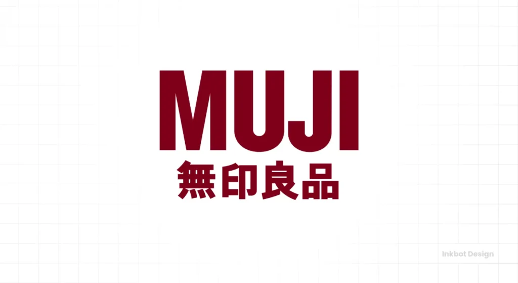
- Takeaway for Your Business: You can build a powerful brand by reacting against the norms in your industry.
16. Yamato Transport The iconic logo of a mother cat carrying her kitten was created in 1957. It symbolises the company’s promise to care for packages as if they were their own family. It is one of the most beloved logos in Japan because it creates an immediate emotional connection.
- Takeaway for Your Business: An emotional metaphor can be far more powerful than a literal description of your service.
17. Asics The name is an acronym for the Latin phrase anima sana in corpore sano (“a sound mind in a sound body”). The logo is a stylised ‘a’ that represents speed and motion. It’s dynamic, athletic, and has a forward-leaning energy.
- Takeaway for Your Business: A great logo should feel in motion, especially for a brand related to action or progress.
18. Shiseido. One of the oldest and most elegant logos, the camellia flower was designed in 1915 by the company’s founder. It blends traditional Japanese floral motifs with the Art Nouveau style that was popular then. It speaks of beauty, nature, and sophistication.
- Takeaway for Your Business: Blending different cultural or historical styles can create something unique and timeless.
19. Kikkoman The hexagonal shape is a tortoise shell, a symbol of longevity and good fortune in Japan. Inside is the character for “10,000,” reinforcing the wish for a long life. It’s a complex story told in a straightforward, memorable way.
- Takeaway for Your Business: Don’t underestimate the power of a classic shape to contain and elevate your brand story.
20. Uniqlo The logos in Japanese Katakana and the Latin alphabet use a blocky, seal-like aesthetic. It feels like a stamp of quality, and its bilingual nature was key to its massive global expansion.
- Takeaway for Your Business: If you have global ambitions, consider how your logo will read and feel in different languages from day one.
21. Yakult The simple, friendly, red wordmark is designed to be approachable and trustworthy. It looks more like a signature from a friendly doctor than a massive corporate brand, which is perfect for a health-focused probiotic drink.
- Takeaway for Your Business: Your font style should match your brand’s personality. A formal font wouldn’t work for a friendly consumer product.
Category 5: National & Institutional Marks – Symbols of a Nation
These logos must communicate a sense of pride, efficiency, and shared identity. They are modern Kamon for the entire country.
22. Japan Airlines (JAL) The Tsurumaru, or “crane circle,” is a masterpiece. The crane symbolises long life, prosperity, and good health in Japan. The logo, a red crane with its wings extended in a circle, is a powerful and elegant representation of flight and the Japanese nation.
- Takeaway for Your Business: Using a culturally significant symbol (if you have an authentic claim to it) can lend your brand immediate depth.
23. Tokyo Metro The stylised “M” in the shape of a heart is meant to represent the network of subway lines connecting to the city’s heart. The light blue is clean, calming, and easy to spot in a chaotic station. It’s a perfect example of functional design.
- Takeaway for Your Business: Solve a user’s problem with your logo. The Metro logo helps people navigate. How can your logo help your customer?
24. Japan Racing Association (JRA) A dynamic and beautifully simple mark that abstracts the forms of a horse and jockey into a single, fluid shape. You can feel the speed and the forward momentum. It captures the very essence of the sport in just a few lines.
- Takeaway for Your Business: Look for ways to merge key elements of your business into a single, unified abstract shape.
25. Tokyo 2020 Olympics Emblem Designed by Asao Tokolo, this mark is called the “Harmonised Chequered Emblem.” It uses three varieties of rectangular shapes in an indigo blue checkerboard pattern to represent different countries, cultures, and ways of thinking, all coming together in harmony.
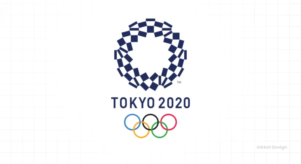
- Takeaway for Your Business: A geometric pattern can be as meaningful as a pictorial symbol, representing complex ideas like diversity and unity.
The Common Thread: What Do They All Get Right?
Looking at these 25 examples, a pattern emerges. They are all relentlessly focused.
- They are legible at any size. They work on a billboard and as a tiny app icon.
- They have a story. There is a reason for every line and curve.
- They are built on timeless geometry. Circles, stable lines, and balanced forms protect them from looking dated.
- They refuse to follow trends. They are confident in their own identity.
Achieving this level of clarity isn’t easy. It’s the outcome of a demanding logo design process that forces you to confront the real soul of your business.
Applying These Lessons Without Creating a Soulless Copy
The worst thing you can do is look at this list and say, “I want a logo that looks Japanese.” That’s missing the point entirely.
Instead, steal the thinking, not the aesthetic.
- Find Your Own “Kamon”: What is your origin story? What are your founding principles? Don’t invent a myth; excavate the truth of your business.
- Practice “Kanso”: Write down your company’s entire mission. Now, cut it in half. Now, cut it in half again. Keep distilling until you have the one core idea you stand for. That is the idea your logo must communicate.
- The 20-Year Test: Look at your logo concept and ask, honestly: “Will this look ridiculous in 2045?” If the answer is “maybe,” start again.
This isn’t about making your logo look simple. It’s about achieving a profound clarity so the design becomes effortless and inevitable. That’s the real lesson from Japan.
Frequently Asked Questions (FAQs)
What is the main principle of Japanese logo design?
The main principle is not minimalism, but Kanso, which is the ruthless distillation of a complex idea into its clearest, most essential visual form. It prioritises clarity and purpose over decoration.
What are Kamon, and how do they influence logos?
Kamon are traditional Japanese family crests. They are typically geometric, symbolic, and enclosed in a circle. Their design DNA—using simple shapes to tell a deep story about heritage and values—significantly influences modern Japanese corporate identity.
Why do so many Japanese logos use circles?
The circle is a powerful, timeless shape representing harmony, completeness, and focus. It’s also a direct link to the design tradition of Kamon and the Japanese flag, the Hinomaru (circle of the sun).
What is the difference between simple and distilled logos?
A simple logo might just be empty or underdeveloped. A distilled logo has rigorously removed every non-essential element until only the most potent core idea remains. It looks simple, but it is packed with meaning.
How did the Toyota logo hide the company name?
The three overlapping ovals are cleverly drawn so that their lines and intersections form every letter named “TOYOTA.” It’s a famous example of layered meaning in logo design.
What does the Yamato Transport cat logo mean?
The logo, showing a mother cat carrying her kitten, symbolises the company’s promise to handle every package with the utmost care, as if it were a fragile member of their own family.
Why don’t brands like Sony or Muji use a symbol?
A strong, custom logotype (wordmark) is more powerful for some brands. It communicates confidence and clarity without needing a symbol. Muji’s “no-brand” philosophy makes a simple, functional logotype the perfect choice.
Is using Japanese aesthetics for my non-Japanese brand a good idea?
It’s generally a bad idea to copy an aesthetic without cultural context. Instead of copying the look, adopt the thinking: focus on distilling your brand’s story, prioritise longevity over trends, and aim for absolute clarity.
How can I make my logo more timeless?
Avoid trendy fonts, complex gradients, and overly detailed illustrations. Build your logo on strong, classic geometric shapes and a clear, legible font that will remain relevant for decades.
What is the oldest logo on this list?
The core concepts for marks like Mitsubishi and Sumitomo are derived from family crests that are centuries old. For modern corporate identity, the Shiseido camellia (1915) is one of the oldest and has remained remarkably consistent.
Does my small business need a logo with a deep story?
Yes. A story is what separates a memorable brand from a generic one. Your logo is the cover of that story. A meaningful logo gives customers a reason to connect with you on a deeper level than just price or features.
What’s the best way to start designing a logo based on these principles?
Start with words, not images. Write your company’s core values, story, and promise to customers. Do not start sketching until you state that core idea in a clear sentence.
Building a brand that lasts isn’t about following the latest design fad. It’s about clarity, purpose, and telling an authentic story. If you’re ready to distil your brand’s essence into a mark that will stand the test of time, that’s what we do.
Explore our logo design services or request a quote to start building a brand with lasting power.
