The Aston Martin Logo: A Century of Technical Survival
I recently sat through a pitch where a “branding expert” tried to convince a client that their logo needed to be “aspirational” and “ethereal.” I nearly walked out.
Business owners don’t need metaphors; they need assets that work.
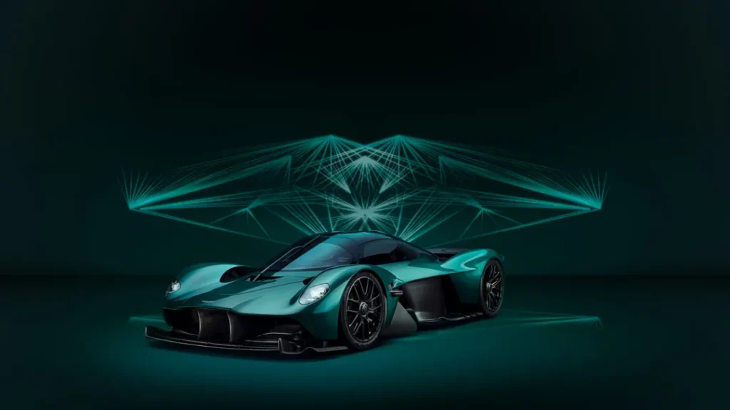
When you look at the Aston Martin logo, you aren’t looking at a drawing of a bird. You are looking at a piece of precision-engineered capital equipment that has survived bankruptcy, ownership changes, and the brutal transition from physical enamel to 16-pixel digital screens.
Ignoring the technical evolution of your visual identity isn’t just a “creative oversight”—it’s a financial leak. A poorly conceived logo fails to scale, requires expensive redesigns every three years, and loses its authority the moment it’s shrunk down for a mobile header.
Aston Martin avoided this by adhering to a specific, albeit evolving, geometric logic.
- Logo treated as engineered asset, not poetic metaphor, ensuring functional value across media and production.
- Evolution guided by geometric logic for legibility, manufacturability, and consistent visual authority.
- 1932 scarab-inspired redesign simplified vanes for enamel casting and reduced production costs.
- 2022 Saville update removed clutter and thickened lines to optimise digital legibility at tiny sizes.
- Success stems from systematised rules prioritising scalability, heritage respect, and technical constraints.
What is the Aston Martin Logo?
The Aston Martin logo is a high-performance visual identifier consisting of a horizontal winged motif, centrally anchored by the brand’s wordmark. It serves as a semiotic shorthand for aerodynamic speed, British heritage, and luxury craftsmanship, having been technically refined over ten iterations to maintain legibility across both physical and digital mediums.
Key Components:
- The Winged Motif: A symbol of freedom and speed, originally influenced by Egyptology.
- The Enclosed Wordmark: A bespoke, sans-serif typeface situated in a central green or black rectangular lozenge.
- Symmetrical Horizontal Lines: A series of feathers or vanes that provide the logo with its distinct “spread” and aerodynamic balance.
The 1921 Origin: Geometry over Glamour
In the beginning, there were no wings. The 1921 logo was a simple, circular monogram. It featured a merged ‘A’ and ‘M’ in a gold-coloured circle. It was functional. It was direct. But it lacked the “engine” of a brand that wanted to sell speed.
Entrepreneurs often make the mistake of thinking their first logo must be their last. It shouldn’t be. The 1921 iteration was a prototype. It proved the name had weight, but the circular framing was too static for an automotive company. In branding, circles represent containment; wings represent expansion.
The 1927 Shift: Borrowing Speed
By 1927, the first set of wings appeared. These weren’t the refined feathers we see today. They were sharp, almost aggressive, and clearly influenced by the aviation craze of the era. The brand was moving toward its logo design and branding strategy of associating cars with the freedom of flight.
The technical mistake many make here is “feature creep.” The 1927 logo was messy. It tried to combine the wings with the previous monogram, resulting in a cluttered visual that was nearly impossible to reproduce on a small scale. If you can’t emboss your logo on a 20mm button without it looking like a smudge, your logo design has failed.
The Scarab Influence: The 1932 Redesign
The most significant technical shift happened in 1932. This is where most “design historians” get it wrong. They claim the wings are merely avian in nature.
In reality, the 1932 redesign was heavily influenced by the contemporary obsession with Egyptology, specifically the wings of the scarab beetle.
S.C.H. Davis, a racing driver and designer, simplified the feathers into the more rigid, geometric vanes we recognise today. This wasn’t just an aesthetic choice; it was a manufacturing one. The logo had to be cast in metal and filled with enamel.
Sharp, thin lines are a nightmare for enamelers. By thickening the vanes and creating distinct “cells,” Davis made the logo easier and less expensive to produce while enhancing its visual impact.
The David Brown Era: Adding the Name
In 1947, David Brown bought the company. He didn’t just buy the factories; he bought the identity. He added his name to the logo. This is a move I usually advise against for SMB owners—vanity branding is a risk. But for Aston Martin, “David Brown” became a technical signifier of quality, much like an “Intel Inside” sticker on a PC.
The logo became heavier. The wordmark was no longer just “Aston Martin” but “Aston Martin David Brown.” This created a horizontal imbalance that had to be corrected by extending the wings further. It’s a classic example of how business decisions force design compromises.
The Technical Anatomy of Luxury
To understand why the Aston Martin logo is effective, we must examine the “Root, Rare, and Unique” attributes of its design.
| Feature | The Amateur Way | The Aston Martin (Pro) Way |
| Line Weight | Variable and thin (disappears at small sizes). | Consistent, calculated thickness for enamel casting. |
| Typography | Generic “luxury” serif (hard to read on move). | Custom sans-serif with high “x-height” for legibility. |
| Symmetry | Roughly balanced. | Mathematically perfect horizontal axis. |
| Colour | Gradients and shadows (hard to print). | Flat, high-contrast British Racing Green and Silver. |
The “Unique” Attribute: Enamel vs. Pixels
Most designers today work exclusively in Figma or Illustrator. They forget that for a brand like Aston Martin, the logo’s primary home is a physical badge on a £200,000 bonnet.
I once audited a client in the high-end manufacturing space who had a logo with dozens of fine, overlapping lines. It looked great on a 27-inch iMac. When they attempted to have it CNC-machined into their product, the cost per unit tripled due to the complexity. They were losing £15 per unit just because of a “pretty” design.
Aston Martin’s logo is designed for the Vaughtons factory in Birmingham. It is designed to be struck from a die, hand-filled with glass enamel, and fired in a kiln. The lines are spaced specifically to prevent the colours from bleeding during the firing process. That is technical logo design.
The 2022 Redesign: The Peter Saville Intervention
In 2022, Aston Martin updated its logo again. They hired Peter Saville, the man behind Joy Division’s Unknown Pleasures cover. Many fans complained: “It looks exactly the same.”
They were wrong.
Saville removed the semi-circular line that sat behind the “Aston Martin” text. He also thickened the interior lines of the wings. Why? Because the previous logo was failing in the digital realm. On a smartphone screen, that semi-circular line became visual “noise.” It blurred the wordmark. By removing it, Saville created a responsive logo design that maintains its authority at 16 pixels and on a 60-foot billboard.
This is a lesson for every SMB: Your brand doesn’t need a “revolution”; it needs an “optimisation.” If you’re considering a rebrand or logo redesign, look for the friction points in your current assets. Where does it break? Fix that, and leave the vanity at the door.
The State of Automotive Branding in 2026
We are currently seeing a massive shift toward “flat” design in the automotive sector. BMW, Audi, and Volkswagen have all ditched 3D gradients for flat, 2D shapes. This isn’t a trend; it’s a technical necessity for electric vehicle (EV) interfaces and mobile-first consumer journeys.
By 2026, the cost of maintaining a complex, “3D-effect” logo will become a liability. Consumers expect brands to feel native to their devices. Aston Martin’s 2022 update positioned them perfectly for this. They kept the heritage (the enamel badge) but refined the geometry for the digital “cockpit.”
If you aren’t thinking about how your logo looks on a Tesla dashboard or an Apple Watch, you are already behind. This is why understanding different types of logos is vital before you spend a penny on a designer.
In our fieldwork, we often encounter small business owners who prefer a “complicated” logo because they believe complexity equates to value. It doesn’t. Complexity equals a high “cost of retrieval” for the human brain.
I once worked with a boutique engineering firm that insisted on a logo with a 12-colour gradient. They spent £4,000 on business cards because they required a specific 7-colour spot printing process to achieve a professional appearance.
After six months, they could no longer afford to print their own brochures. We stepped in, simplified their mark to a single-colour vector image, and reduced their print costs by 70% overnight.
The Aston Martin logo is successful because it is a system, not a drawing. It’s a set of rules that governs how the brand appears on a car, a watch, a polo shirt, and a website.
Debunking the “Unique is Better” Myth
There is a dangerous myth in the design world: Your logo must be entirely unique to be effective.
This is nonsense. Data from a McKinsey study on the business value of design shows that consistency and functional integration are far more predictive of financial success than “artistic uniqueness.”
The Aston Martin logo actually looks quite a lot like the Bentley logo, and the Mini logo, and the Chrysler logo. They all use wings. Does this hurt Aston Martin? No. It places them in a specific “category” (Luxury/Automotive). It uses a “Rare” attribute—the winged emblem—to signal their industry before a single word is read.
Don’t waste time trying to “reinvent the wheel.” Use established visual shorthands that your audience already understands, then refine them with the logo design process to make them your own.
The Financial Impact of Visual Authority
A logo is a trust signal. According to research by the Nielsen Norman Group, visual consistency is a primary factor in driving user trust. When the Aston Martin logo appears on a product, it carries 100 years of engineering pedigree.
If your logo looks like a common logo design mistake, you are telling your customers that your internal processes are likely just as sloppy. You are literally losing money on every impression.
The Verdict
The Aston Martin logo design history is a masterclass in staying relevant without losing your soul. It proves that a logo is a living asset that must respond to the technical constraints of its time—whether that’s a kiln in Birmingham or a retina display in San Francisco.
The take-home for you:
- Stop looking for “pretty” and start looking for “functional.”
- Ensure your logo scales from a favicon to a billboard without losing legibility.
- Respect your heritage, but don’t let it become a technical bottleneck.
If you’re tired of generic advice and want a visual identity that actually works for your business, you need to treat your branding like the engineering challenge it is.
Would you like me to audit your current logo for technical flaws or provide a quote for a high-performance redesign?
Request a Quote from Inkbot Design | Explore Our Logo Design Services
Frequently Asked Questions (FAQ)
Why does the Aston Martin logo have wings?
The wings symbolise speed, freedom, and ambition. Originally introduced in 1927, they were later refined in 1932 to reflect the era’s fascination with Egyptology, specifically the wings of a scarab beetle. This geometric shift enabled the more efficient manufacturing of physical car badges.
What font is used in the Aston Martin logo?
The current wordmark uses a bespoke sans-serif typeface. In previous iterations, it closely resembled Optima, a humanist sans-serif. The 2022 redesign by Peter Saville further refined the kerning and weight to improve digital legibility on mobile devices.
Has the Aston Martin logo always been green?
No. Early versions were gold, silver, and even black. The “British Racing Green” associated with the brand became more prominent as the company leaned into its racing heritage. The current identity uses a specific forest green within the central lozenge.
Who designed the 2022 Aston Martin logo?
The 2022 refresh was a collaboration between Aston Martin’s in-house design team and legendary graphic designer Peter Saville. The focus was on “re-engineering” the mark for a digital-first audience, removing the semi-circular line to simplify the visual footprint.
How much does a logo like Aston Martin’s cost?
A heritage redesign for a global brand can cost anywhere from £50,000 to £ 250,000 or more, depending on the agency and scope. For SMBs, the logo design cost is significantly lower, with a focus on technical efficiency rather than global physical rollout.
What is the meaning of the scarab beetle in the logo?
In the early 1930s, designer S.C.H. Davis was interested in Egyptology. The scarab beetle’s wings provided a more structured, geometric framework than bird wings, which was ideal for the enamelling process used on the car’s physical badges.
Why did Aston Martin change its logo in 2022?
The primary driver was digital performance. The previous logo contained a semi-circular line that caused visual “clutter” at small sizes. By removing this and thickening the vanes, the logo became much more effective for mobile apps and social media.
What are the different types of Aston Martin logos?
Over its 100+ year history, the logo has evolved from a circular monogram (1921) to sharp aviation-style wings (1927), the David Brown era wings (1947), and the modern, simplified Peter Saville version (2022). Each responded to contemporary technical needs.
Why is the physical badge so important?
For luxury brands, the “touchpoint” is the product. The Aston Martin badge is a hand-crafted piece of jewellery made of enamel and metal. The logo must be designed to accommodate the physical limitations of these materials, such as “bleeding” that can occur during the firing process.
Can I use the Aston Martin logo for my own project?
No. The Aston Martin logo is a protected trademark. Unauthorised use can lead to legal action. If you need a high-quality logo, it is better to invest in a custom design that reflects your own brand’s unique technical requirements.
How do the wings compare to Bentley’s logo?
While both use wings, Bentley’s logo is more traditional and “feathery,” often featuring an asymmetrical number of feathers. Aston Martin’s logo is more geometric and streamlined, reflecting its focus on modern performance and “power, beauty, and soul.”
Is the Aston Martin logo a vector image?
For modern applications, yes. It is maintained as a vector image to ensure it can be scaled infinitely without losing quality. This is essential for everything from small website icons to massive showroom signage.

