A Website Redesign Strategy That Actually Drives Growth
A website redesign strategy is a structured, data-driven approach to rebuilding your site for measurable growth—not just a cosmetic facelift.
Successful redesigns integrate user behaviour analytics, conversion rate optimisation, SEO architecture, and content strategy to drive leads and revenue.
Businesses that treat redesign as a design refresh often lose traffic and conversions because they overlook key metrics, such as organic visibility, page speed, and user journey efficiency.
A modern website redesign strategy aligns design, technology, and marketing objectives to create a performance-driven digital asset that fuels sustainable business growth.
As a design consultant, I’ve seen it all. Before we get into the nuts and bolts, let’s clear the air. Here are the requests that make me want to throw my laptop out the window.
- “I just want it to look modern.” This is the single most useless piece of feedback in existence. “Modern” isn’t a strategy. It’s a trend that will look dated in 18 months. What you mean is you want it to be “effective,” “clear,” and “trustworthy.”
- Obsessing over the homepage. I have news for you: your homepage probably isn’t your most important page. For most businesses, key service pages, product pages, or blog posts are the primary entry points and revenue generators.
- Ignoring SEO until launch day. “Can you just ‘do the SEO’ now that it’s live?” No. That’s like building a skyscraper and asking the architect to “add the foundation” after the windows are in. SEO is baked in from the very first audit.
- Copy-pasting old, bad content. “Just move all our old blog posts over.” Without an audit? You’re just moving digital junk from an old, cluttered house into a new, expensive one.
- Designing by committee. When the CEO’s partner, the sales intern, and the marketing director’s cousin all get a vote on the button colour, the result is a watered-down, camel-coloured compromise that serves no one.
If you’re guilty of any of these, don’t worry. We’re going to fix it. The key is to shift your thinking from aesthetics to performance.
- Start with a brutal, data-driven audit — technical SEO, content, UX and competitor audits reveal foundations before any design.
- Define measurable goals — replace vague aims with specific KPIs tied to business outcomes (e.g., increase form rate 2%→5%).
- Build strategy-first structure — IA, user flows and wireframes prioritise conversion paths over aesthetics.
- Protect SEO during migration — map every URL with a 301 redirect plan and safeguard high‑traffic "money pages".
- Design as the 10% job — apply UI after strategy; focus on mobile‑first, speed (Core Web Vitals) and accessibility.
The Core Problem: Misunderstanding the “Why”
Entrepreneurs are smart people. So why do they get this so wrong? They’re often solving for the wrong problem.
You don’t need a redesign just because your site is “old.” You need a redesign when your site stops solving your business problem.
That might mean:
- Your business itself has changed. You’ve rebranded, pivoted, or are targeting a completely new market.
- It’s actively harming your brand. It’s not mobile-responsive (a cardinal sin in 2026), it’s painfully slow, or it’s just plain broken.
- Your conversion rates are in the toilet. People land, get confused, and leave. Your site is a leaky bucket.
- It’s built on ancient tech. You can’t even update a blog post without calling a developer who charges by the hour.
- Your competitors are eating your lunch. Their sites are clear, fast, and make it easy to make a purchase. Yours is a digital relic.
Notice that “it’s not pretty enough” isn’t on that list. A redesign is a business tool. And like any tool, it must be built for a specific job. This isn’t just about chasing trends; it’s about recognising that your website is your single most important digital asset. Understanding why web design is important is the foundation of any successful strategy.
This guide outlines the 5-phase strategic process we use. The “design” part doesn’t even show up until Phase 4. The real work—the 90%—is what comes first.
Phase 1: The Brutally Honest Audit (The 90% Job)

You cannot build a new house until you understand the foundations of the old one—and the ground it’s built on. Skipping the audit is the single biggest mistake you can make.
You need to become a digital archaeologist, digging into what works, what’s broken, and what’s just there.
1. The Technical SEO Audit
Before you touch a single pixel, you need to know what Google thinks of your site.
- What’s already ranking? Use tools like Ahrefs or Semrush to find your “money pages”—the pages that already get organic traffic. These must be protected at all costs.
- What’s your site speed? Use Google’s PageSpeed Insights. If your site is slow now, a “pretty” new one loaded with heavy images will be even slower. Speed is a core ranking factor.
- Are there technical errors? Look at Google Search Console. How many 404 “Not Found” errors do you have? Broken links? Crawlability issues? You need a baseline.
2. The Content Audit
This is where you inventory every single page on your site—from the homepage to that 2018 blog post about a company picnic. Put it all in a spreadsheet.
For every single URL, you must make a decision. This is not the time to be sentimental.
| Decision | What It Means | Action Required |
| KEEP | This content is excellent, ranks well, and is relevant. | Don’t touch it. Just ensure it’s mapped to the new site design. |
| IMPROVE | The topic is good, but the content is thin, outdated, or poorly written. | Rewrite, update with new data, add visuals, and optimise for SEO. |
| CONSOLIDATE | You have 5 different blog posts about the same topic. | Combine them into one “pillar” post. Redirect the old URLs to the new one. |
| PRUNE (Delete) | This content is irrelevant, gets zero traffic, and serves no purpose. | Delete it. Yes, delete it. Pruning low-quality content can actually help your SEO. |
3. The UX/UI (User Experience) Audit
Do you think you know how people use your site? You’re wrong. Data, not your gut feeling, is the only thing that matters here.
- Install Heatmaps: Use a tool like Hotjar or Microsoft Clarity. Watch where people actually click, how far they scroll, and where they get stuck.
- Analyse User Flows: Open Google Analytics. Where do people land? What’s the next page they visit? Where do they “drop off” and leave?
- Find the Friction: Is your contact form three pages long? Is the “Buy Now” button hidden at the bottom?

Real-World Example: The Case of the Massive Logo
I once had a client who was obsessed with his logo. He insisted it take up the top 30% of the homepage. “It’s our brand!” he’d say.
We ran a heatmap on the prototype. In 1,000 visits, zero people clicked the giant logo. But we could see dozens of “rage clicks” (frustrated, rapid clicks) on a tiny, underlined “Services” link buried in a paragraph.
The redesign strategy became dead simple: Shrink the logo by 80% and turn “Services” into a massive, obvious button. The goal wasn’t a “modern” header; it was to reduce user friction and get people to the money page.
4. The Competitor Audit
Finally, look at your top 3-5 competitors. Not to copy them, but to find gaps.
- What are they doing right that you can learn from? (e.g., “Their checkout process is 3 steps. Ours is 7.”)
- What are they doing wrong? (e.g., “Their site is all marketing fluff. We can win by being direct and practical.”)
- What gaps have they left? (e.g., “They only talk to enterprise clients. We can build a section dedicated to small businesses.”)
Phase 2: Setting Goals That Aren’t Rubbish
After the audit, you’ll be swimming in data. Now, you must turn that data into a mission.
“Make it look better” is not a goal.
“Get more traffic” is not a goal.
A real goal is specific, measurable, and tied to a business objective. Every single design and development decision you make from this point forward will be measured against this goal.
| Business Goal | Bad “Redesign Goal” | Good “Redesign KPI” |
| Get more leads | “Make the contact form pop.” | “Increase form submission rate from 2% to 5%.” |
| Increase sales | “A modern e-commerce look.” | “Decrease shopping cart abandonment from 60% to 40%.” |
| Be seen as an expert | “A professional-looking blog.” | “Increase ‘time on page’ for blog posts by 30% and grow newsletter signups.” |
| Reduce support costs | “A better FAQ page.” | “Decrease ‘how do I…’ support tickets by 20% by building a new, searchable knowledge base.” |
This goal becomes your North Star. When your developer asks if a feature is necessary, you ask: “Does this help us increase the form submission rate to 5%?” If the answer is no, you kill it.
Phase 3: Strategy & Structure (The Blueprint)
You have your audit (where you are) and your goals (where you’re going). Now you build the map to connect them.
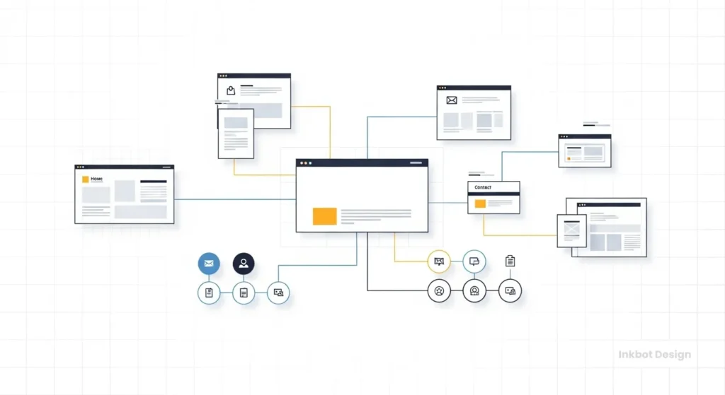
1. Information Architecture (IA) & Sitemap
This is the skeleton of your site. It’s a flowchart of all your pages and how they link together. The goal is the path of least resistance.
- How many clicks does it take for a user to get from the homepage to your most important service page? (It should be one or two. Max.)
- Is your navigation clear? (Forget clever names like “Musings.” Call it “Blog.”)
- This creates your new sitemap, which will be the blueprint for the developers.
2. User Flow & Wireframes
A wireframe is a simple, black-and-white diagram of a page’s layout. No colours, no fonts, no images.
Its only job is to define hierarchy.
- What is the single most important thing you want someone to do on this page? (This goes at the top, in a big box.)
- What is the second most important?
- This strips away all the “pretty” distractions and forces you to focus on function.
3. The SEO & Content Migration Plan
This is the part everyone forgets, and it’s the most dangerous. You will lose all your traffic if you botch this.
Your 301 Redirect Map is Non-Negotiable.
A 301 redirect is a permanent “change of address” notice for Google. It tells the search engine: “Hey, that old page mysite.com/old-service now lives at mysite.com/new-service-pro.”
You must create a spreadsheet that maps every single URL from your old site (as identified in your content audit) to its corresponding new equivalent.
- If you “Pruned” a page, you still redirect it to the next most relevant page (like its parent category or the homepage).
- If you don’t do this, anyone who clicks an old link or searches for your old page on Google will encounter a 404 “Not Found” error. This tells Google your site is broken, and your rankings will die.
Phase 4: Design, Development, & Content (The 10% Job)
Notice how we’re in Phase 4, and we still haven’t talked about colours?
This is where your strategy finally becomes tangible. But the strategy leads the design, not the other way around.
1. Mockups (The “Pretty” Part)
Now, and only now, do you apply your brand identity (colours, fonts, logo) to the wireframes.
- But every choice is strategic.
- The primary “call to action” button colour? It should be a high-contrast colour not used anywhere else, to draw the user’s eye exactly where you want it.
- Font choice? It’s not about what’s “cool.” It’s about legibility, especially on mobile.
This translation from a strategic blueprint to a visual, functional website is the most critical part of the build. Our own web design services are built around this ‘strategy-first’ methodology, ensuring the design solves the business problem.
2. Development & Building
This is where the code happens. Your focus here should be on three things:
- Mobile-First: Don’t design for a giant desktop monitor and then “shrink it down.” Design for the small screen first, and then adapt it for larger screens. More than 60% of your traffic is likely mobile.
- Speed (Core Web Vitals): Your site must be fast. This means optimising images, “minifying” code, and using good hosting.
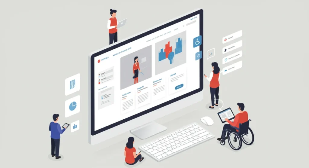
- Accessibility (a11y): Can people with visual impairments or other disabilities use your site? This is not just a “nice to have”; it’s a legal and ethical requirement, and it’s good for SEO.
3. Content Population
Rule: Never, ever use “Lorem Ipsum” (placeholder text) in a design.
Why? Because real content (your text, your images) will break the design.
- A “perfect” box in the design will look terrible when you put your 30-word service name in it.
- A “beautiful” photo slot will look awful with your grainy, low-res team photo.
- Use the real, finalised content from your content strategy (Phase 3) to build the site. This will force you to make realistic design choices.
Phase 5: The Launch (And Why You’re Not Done)
You’ve built it. You’ve tested it. You’re ready to go live. This is a stressful, checklist-driven day.

The Pre-Launch Checklist (Abridged)
- Redirects Implemented? Did you upload your 301 redirect map? (Test 10-20 random old URLs to be sure).
- Analytics Tracking Installed? Is Google Analytics 4 (or your tool of choice) on every page?
- Forms Working? Test every single form. Do the submissions reach the correct email?
- Favicon Loaded? That little icon in the browser tab.
- 404 Page Styled? Your “Not Found” page should be helpful, not a dead end.
- SEO Titles & Metas in Place? Is every page telling Google what it’s about?
Then, you hit the button.
Post-Launch Monitoring: You Are Not Done.
For the first two weeks, you must closely monitor your analytics.
- Is traffic dropping?
- Are conversion rates climbing?
- Go to Google Search Console. Are new “Not Found” errors popping up?
- This is where you catch disasters before they become permanent.
Real-World Example: The “Pretty” Redesign that Tanked
I once took over a project after a “hotshot” agency launched a “stunning” redesign for an e-commerce client. The new site was beautiful. It was also a conversion nightmare.
The new design, in an attempt to be “clean,” had buried the “Add to Cart” button below the fold (you had to scroll to see it).
We watched the analytics. Sales had dropped 50% in 48 hours. We immediately pushed a hotfix to move the button to the top, right next to the price. Sales recovered by the end of the day. The client had paid £50,000 for a “pretty” design that was actively costing them £10,000 a day.
A website is never “finished.” It’s a tool that you must constantly test, sharpen, and iterate upon based on real user data.
Choosing a Partner vs. DIY
- DIY (Squarespace, Wix): Fine for a very small, simple brochure site where you are the strategist, designer, and developer. You’re trading money for your time.
- Freelancer: Good for a specific, well-defined task (e.g., “I need 5 mockups based on these wireframes”).
- Agency/Consultant: This is what you hire for strategy and guidance. You aren’t just buying pixels; you’re buying their process, their experience, and their ability to ask the hard questions.
When you’re vetting a partner, ask them about their process, not just their portfolio. If they don’t start by asking about your business goals, your KPIs, and your content audit, run.
If you’re at the stage where you want to discuss a strategic partnership, you can request a quote from us. Be warned: we’ll start with the hard questions.
Your Redesign is a Business Project, Not an Art Project
A successful website redesign is 90% strategy and 10% execution.
The real work happens in spreadsheets, audits, and user flow diagrams—not in Photoshop. If you’re focusing on the colour of the buttons before you’ve audited your content and defined your goals, you’re just planning to fail in a “modern” way.
Start with the data. Be brutal in your audit. Be ruthless with your goals. The “pretty” part will follow, but it will be an informed beauty, one that serves a single purpose: to grow your business.
What’s next?
If you’re looking at your own site with a critical eye, that’s a good start. Before you jump into picking colours, go back to Phase 1. Audit.
If you found this guide useful, we have more no-nonsense advice for entrepreneurs on our blog. And if you’d rather have a team that lives and breathes this stuff, handles the hard questions, you can learn more about Inkbot Design and our strategy-first approach.
Website Redesign Strategy: FAQs
What is the most common website redesign mistake?
The most common mistake is skipping the audit (Phase 1). Businesses jump straight to design (“making it pretty”) without understanding what’s working, what’s broken, or what their business goals are. This leads to a new site that has the same old problems.
Why is a content audit so important?
A content audit is crucial because it identifies your assets. You find out what content drives traffic (to protect), what’s outdated (to improve), what’s redundant (to consolidate), and what’s useless (to prune). Migrating bad content to a new site is like moving junk into a new house.
What is a 301 redirect, and why does it matter?
A 301 redirect is a permanent “change of address” for a web page. It’s critical for SEO. It informs Google and users that an old URL has a new location, transferring any “link equity” (SEO value) and preventing users from encountering a 404 “Not Found” error, which can harm your traffic.
How long does a website redesign take?
For a small business site, a proper strategic redesign takes 3-6 months. The audit, strategy, and content phases (Phases 1-3) often take longer than the actual design and development (Phase 4). Be wary of anyone promising a new site in 30 days.
What’s more important: mobile-first or desktop design?
Mobile-first. In 2026, it’s not even a debate. Most of your traffic will come from mobile devices, and Google primarily uses the mobile version of your site for ranking (this is called “mobile-first indexing”). Design for the small screen first, then adapt it for larger screens.
How much does a website redesign cost?
It varies wildly. A simple redesign on a platform like Squarespace might be a few thousand pounds. A custom, strategic redesign for a business with complex needs (e.g., e-commerce, custom integrations) can be £10,000 to £50,000+. The cost is tied to the strategic complexity, not just the number of pages.
Should I redesign my site or just keep updating it?
If your site’s foundation (the tech, core structure, and mobile responsiveness) is solid, you should focus on iteration—constant, small improvements based on data. You only need a full redesign when the foundation itself is broken or no longer serves your business goals.
What is the difference between UX and UI?
UI (User Interface) refers to the visual aspects, including colours, fonts, and buttons. It’s the look.
UX (User Experience) refers to the overall impression of using a site: Is it easy to find information? Is the checkout process smooth? Is it frustrating or delightful?
A good strategy prioritises UX first, then applies UI to support it.
Can I lose my SEO rankings after a redesign?
Yes, and many do. This is the #1 risk. You can avoid it by:
Doing a thorough SEO audit before you start.
Protecting your high-traffic pages.
Implementing a meticulous 301 redirect map.
Monitoring your site in Google Search Console after launch.
What are ‘wireframes’ and why are they necessary?
Wireframes are simple, black-and-white layouts of a page. They have no colours, fonts, or images. They are necessary because they force you to focus on structure, hierarchy, and function before getting distracted by “pretty” (UI). They are the architectural blueprint for your site.


