
Mobile UX Best Practices: Designing for Thumbs
There is no such thing as “mobile users” anymore. There are just users. And most of them are exhausted.
If you examine the analytics for almost any B2C industry, mobile traffic has not only overtaken desktop traffic; it has significantly surpassed it.
Yet, when I audit client websites, I still see the same lazy approach: a desktop design that has been squashed down until the columns stack on top of each other.
That is not User Experience (UX). That is just responsive code.
Real Mobile UX is about physiology. It is about the fact that your user is likely holding a slab of glass worth £1,000 in one hand, trying to buy something while walking to the bus stop in the rain. If they have to contort their thumb to reach your “Add to Cart” button, they won't buy it. They will leave.
This guide isn't about making things look pretty. It is about the mechanics of interaction and why web design is important for the bottom line. We are going to break down exactly how to design for the human hand.
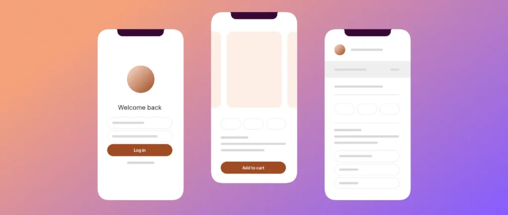
- Design for the thumb: place primary actions in the bottom-centre “Natural Zone” for effortless one-handed use.
- Avoid hidden navigation: use visible bottom tab bars for core tasks; reserve hamburger menus for secondary options.
- Respect touch targets: make interactive elements at least 44–48px to prevent fat-finger errors.
- Optimise forms: trigger correct keyboards, keep labels above fields, and validate inline to reduce friction.
- Prioritise speed and stability: aim for fast LCP (<2.5s) and low CLS to prevent accidental taps and abandonment.
What is Mobile UX?
Mobile UX (User Experience) is the practice of designing interfaces specifically for the constraints and context of handheld devices. It focuses on efficiency, reachability, and minimising interaction cost.
Unlike desktop design, which assumes a mouse cursor (high precision) and a stable environment, Mobile UX must account for:
- The Thumb Zone: The limited arc of movement available to a user’s thumb when holding a phone one-handed.
- Touch Inaccuracy: The “Fat Finger” problem, requiring larger touch targets (minimum 44px).
- Environmental Distraction: Users are often multitasking, requiring simplified cognitive loads.
The Reality: Good Mobile UX does not mean “it fits on the screen.” It means “it works without the user changing their grip.”
The Physics of the Thumb: Understanding the “Thumb Zone”
If you take nothing else away from this article, understand this: 49% of users hold their phone with one hand. (Source)
This data comes from extensive research conducted by Steven Hoober, who observed over 1,300 people using mobile devices in various settings, including on the street, in airports, and on buses. He found that nearly half of all users are cradle-holding their device and navigating entirely with one thumb.
This creates a physiological map of the screen known as the “Thumb Zone.”
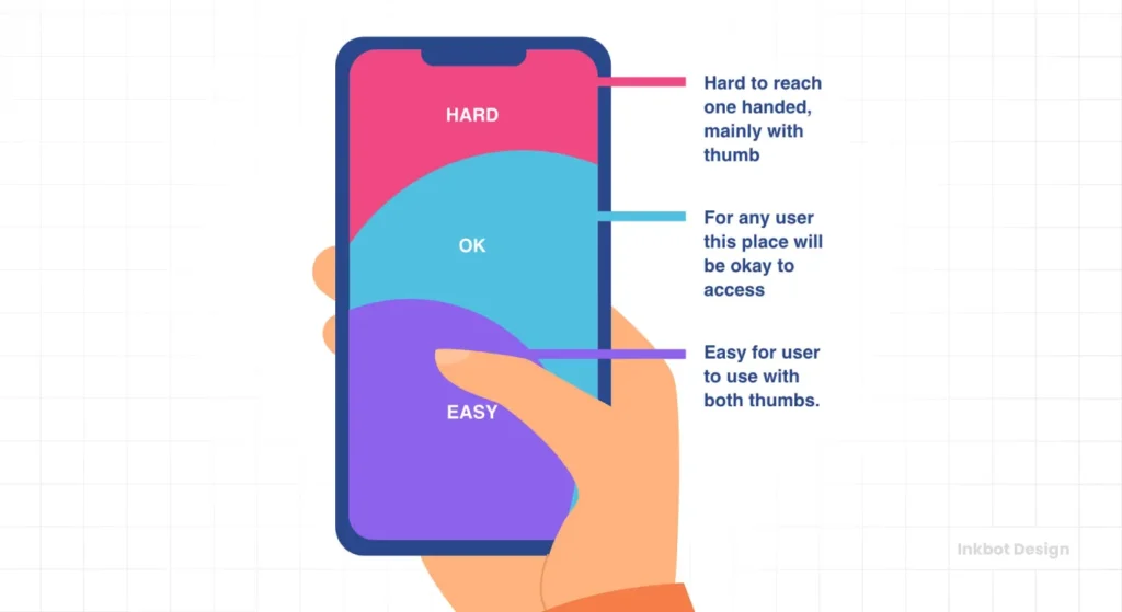
1. The Natural Zone (Purple)
This is the bottom-centre to mid-screen area. Your thumb rests here naturally. This is prime real estate. If you want a user to click something—a “Buy Now” button, a “Next” link, or a “Search” bar—it belongs here.
2. The Stretch Zone (Blue)
This requires the user to extend their thumb or shift their grip slightly. It is acceptable for secondary actions, but you are introducing friction. Every millisecond of friction gives the user a chance to reconsider their decision to make a purchase.
3. The “Ow” Zone (Pink)
This is the top corners of the screen. For a right-handed user, the top-left corner is the hardest place to reach. Yet, where do most websites put their Hamburger Menu or “Back” button? Top left.
We are forcing users to perform physical gymnastics to navigate our sites. With modern phones getting larger (the “Phablet” era), this “Ow Zone” is expanding. If your primary navigation is stuck in the top left, you are failing the basics of Web Design Services.
Navigation: The Death of the Hamburger Menu
For years, the “Hamburger Menu” (represented by three horizontal lines) has been the gold standard for mobile navigation. It was a convenient place to hide clutter. But from a pure UX perspective, it is flawed.
The Nielsen Norman Group (NN/g) has repeatedly shown that hidden navigation significantly decreases content discoverability. If users cannot see it, they assume it does not exist.
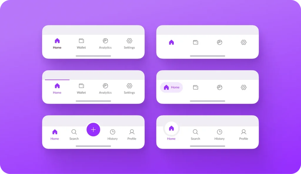
The Bottom Navigation Bar (Tab Bar)
The industry is shifting toward the Bottom Navigation Bar. Look at Instagram, Spotify, or Airbnb. They do not hide their core features in a drawer; they place them at the bottom of the screen, right in the “Natural Zone” of the thumb.
Why Bottom Nav wins:
- Visibility: Users can see exactly where they are and where they can go.
- Reachability: It sits in the safest zone for one-handed use.
- Speed: It requires one tap to switch sections, whereas a hamburger menu requires two (Tap Menu -> Wait for Animation -> Tap Link).
When to use a Hamburger Menu
I am not saying you must completely eliminate the hamburger menu. It has a place. Use it for secondary navigation—such as settings, account details, legal policies, or log out. However, your primary conversion paths (Shop, Services, Cart) must be visible and easily accessible.
Touch Targets: Dealing with “Fat Fingers”
On a desktop, a mouse cursor is pixel-perfect. On a mobile, a finger is a blunt instrument.
The average human finger pad is roughly 10-14mm wide. If you place two links too close together or make a button too small, you trigger an error state. The user taps the wrong thing, gets frustrated, and bounces.
The 44px Rule
Both Apple’s Human Interface Guidelines and Google’s Material Design standards agree on a minimum touch target size.
- Apple: 44×44 points.
- Google: 48×48 dp.
This ensures that even if the user misses the visual centre of the button, the touch event still registers.
Common Failure Points I see:
- Text Links in Paragraphs: Placing two hyperlinks on adjacent lines of text. It is impossible to tap one without hitting the other.
- Pagination: Tiny page numbers (1, 2, 3) at the bottom of a blog list.
- “X” to Close: Pop-ups with a microscopic “close” button. This is often a “Dark Pattern” designed to force interaction, but it usually just incites rage.
Forms and Input: Where Conversions Go to Die
If your checkout process is painful, your design is failing. The Baymard Institute reports that nearly 70% of mobile carts are abandoned. A massive portion of that is due to poor form design.
Typing on glass is difficult. It lacks tactile feedback. You must do the work for the user.
1. Trigger the Correct Keyboard
This is the most basic yet often overlooked aspect of Mobile UX.
- Email Field: Trigger the email keyboard (includes the @ and . symbols).
- Phone Number: Trigger the numeric keypad. Do not make users hunt for numbers on the QWERTY layout.
- Date/Time: Use the native OS date picker, not a custom JavaScript calendar that breaks on Android.
Code Implementation:
Use the correct HTML input types.
<input type=”email”>
<input type=”tel”>
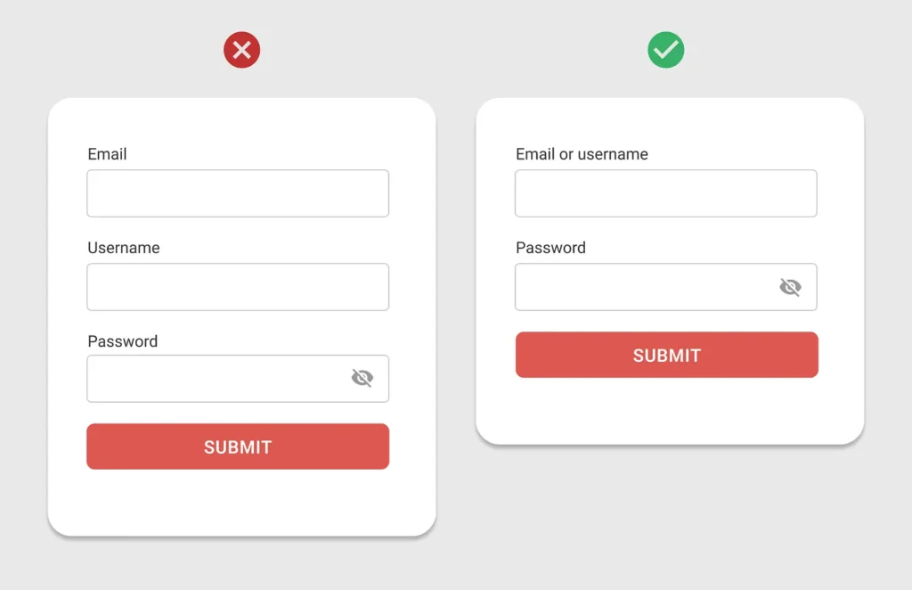
2. Labels Above, Not Inside
Do not use placeholder text as your only label. When the user taps into the box to type, the placeholder disappears. If they get distracted and look back, they have forgotten what that field was for. Place labels above the input field so they remain visible.
3. Inline Validation
Do not wait for the user to click “Submit” before informing them that they made a mistake. Validate fields in real-time. If the email is invalid, show a red border immediately. If it’s correct, show a green tick. This “Gamifies” the form-filling process and provides instant reassurance.
Speed and Core Web Vitals: The 3-Second Rule
You cannot discuss mobile UX without mentioning speed. Mobile networks are unstable. Even with 5G, users often encounter areas with limited bandwidth, such as dead zones or crowded locations.
Google’s Core Web Vitals are now a ranking factor, but more importantly, they are a frustration metric.
- LCP (Largest Contentful Paint): How fast does the main content load? It needs to be under 2.5 seconds.
- CLS (Cumulative Layout Shift): Does the page jump around? We have all been there—you go to tap a link, an ad loads above it, the page shifts down, and you accidentally click the ad. This is a cardinal sin of Mobile UX.
The Fix: Always define width and height attributes for images and video elements in your CSS. Reserve the space before the asset loads so the layout remains stable.
Consultant’s Reality Check: The “Amateur” vs. The “Pro”
In my time running Inkbot Design, I have audited hundreds of SMB websites. The difference between a site that converts and one that bleeds money is rarely the colour palette. It is the mechanical empathy for the user.
Here is a comparison of how amateurs handle Mobile UX versus how professionals do it.
| Feature | The Wrong Way (Amateur) | The Right Way (Pro) |
| Navigation | Hamburger menu for everything. | Bottom Tab Bar for core tasks; Hamburger for settings. |
| Font Size | 12px (Standard desktop scale). | 16px minimum for body text (Legible without zooming). |
| Touch Targets | “Read More” text links. | Full-width cards or 48px high buttons. |
| Forms | Single column long scroll. | Multi-step wizard with progress bars. |
| Images | High-res desktop images shrunk down. | Responsive images (srcset) served in Next-Gen formats (WebP). |
| Gestures | Tapping only. | Swiping for galleries, pull-to-refresh. |
The State of Mobile UX in 2026: The End of the App Store?

Looking ahead over the next 12-18 months, we are witnessing a distinct shift: the rise of the Progressive Web App (PWA).
Users are tired of downloading apps. They do not want to visit the App Store, wait for a 200MB download, and create an account just to buy a pair of trainers.
The best Mobile UX in 2026 mimics a native app within the browser.
- Offline Mode: Using service workers to let users browse previously loaded content without a signal.
- Add to Home Screen: Allow users to save your site as an icon without requiring an App Store installation.
- Haptic Feedback: Using the Web Vibration API to give subtle physical feedback when a user completes a task (like adding an item to the cart).
If you are asking users to download an app for a simple e-commerce transaction, you are adding friction. Build the app experience into the browser.
The Verdict
Mobile UX is not a “nice to have.” It is the primary way your customers interact with your brand. If your mobile site is frustrating, your brand is likely to be perceived as frustrating as well.
You need to stop designing for a cursor that doesn't exist and start designing for the thumb that does. Move your navigation down. Make your buttons bigger. Trigger the correct keyboard. These are not artistic choices; they are commercial necessities.
If you are unsure if your current setup is costing you sales, or if you need a professional eye to overhaul your interface, you can request a quote from us. We specialise in fixing this kind of thing.
Frequently Asked Questions (FAQ)
What is the “Thumb Zone” in Mobile UX?
The Thumb Zone refers to the area of a phone screen that a user can comfortably reach with their thumb while holding the device in one hand. Based on Steven Hoober’s research, the most accessible area is the bottom-centre, while the top corners are difficult to reach.
Why should I avoid using a Hamburger Menu?
Hamburger menus (the three lines) hide navigation, which lowers discoverability. Users often forget options exist if they aren't visible. For primary actions, a bottom tab bar is superior because it reduces interaction cost and sits in the natural thumb zone.
What is the minimum size for a touch target?
Apple recommends a minimum target size of 44×44 points, while Google’s Material Design suggests a size of 48×48 dp. This accounts for the average size of a finger pad and prevents “fat finger” errors where users accidentally tap the wrong element.
How does page speed affect Mobile UX?
Page speed is critical. Google data shows that 53% of mobile users abandon sites that take longer than 3 seconds to load. Additionally, slow loading contributes to high bounce rates and negatively impacts your SEO rankings via Core Web Vitals.
What is “Cumulative Layout Shift” (CLS)?
CLS measures visual stability. It occurs when elements on a page move unexpectedly while loading (e.g., an ad pops in and pushes text down). High CLS is frustrating for users, often causing accidental clicks, and is a penalty factor in Google’s search algorithm.
Should I use a native app or a responsive website?
For most SMBs, a responsive website or Progressive Web App (PWA) is better. It removes the friction of downloading and installing an app. PWAs can offer app-like features (offline mode, push notifications) directly within the browser.
How can I improve mobile form conversion rates?
Improve forms by using the correct input types (triggering the numeric keypad for phone numbers), utilising inline validation (displaying errors immediately), and placing labels above input fields rather than using disappearing placeholder text.
What is the ideal font size for mobile text?
The consensus for body text on mobile devices is a minimum font size of 16px. Anything smaller forces users to pinch-to-zoom, which is a significant usability failure. Headings should be scaled proportionally to maintain hierarchy without dominating the small screen.
Why is “Reachability” a problem on modern phones?
As phone screens have grown (many exceeding 6.7 inches), the top area of the screen has become physically impossible to reach with one hand. This “Reachability Gap” means important interactive elements must be moved to the bottom half of the interface.
What is a “Dark Pattern” in Mobile UX?
Dark Patterns are deceptive design choices intended to trick users into taking an action they didn't intend, such as making a “Close” button nearly invisible or confusingly wording an opt-in checkbox. These destroy user trust and should be avoided.

