
How to Create a Visual Identity Design That Actually Scales
Most small business branding appears to have been thrown together in the dark.
You have a logo from a contest site, a colour palette picked because “it looked nice,” and a font choice that screams “default settings.” If that stings, good. It means you recognise the need to make a change.
Creating a visual identity isn't just about making things look pretty. It is a strategic exercise in translation. You are taking intangible concepts—trust, innovation, reliability—and turning them into a visual language that a customer processes in milliseconds.
This guide isn't for the hobbyist making a Twitch banner. This is for the entrepreneur who wants to build an asset, not just a decoration.
- Start with strategy: define who you are, who you serve, and why they should care before any design work begins.
- Audit competitors to differentiate your visuals; stand out rather than blend into market norms.
- Create a scalable logo suite (primary, stacked, wordmark, icon) that works at 16x16 and in black and white.
- Build a system: clear typography, a 60-30-10 colour palette, consistent imagery, and accessible contrast.
- Deliver master vector files plus comprehensive brand guidelines to ensure consistent, long‑lasting application.
Phase 1: The Strategy Before the Sketch
Put the pencil down. Close Illustrator. Step away from Canva.
If you start designing before you start thinking, you will fail. A visual identity is the visual skin of your brand strategy. If the strategy has no bones, the skin will sag.
Before we worry about hex codes, we need to define the parameters.

1. Define the “Why” and the “Who”
You cannot design for “everyone.” If you try to appeal to everyone, you appeal to no one. You need to answer three questions with painful specificity:
- Who are you? (Brand Personality)
- Who are they? (Target Audience)
- Why should they care? (Value Proposition)
If you are a high-end law firm in London, your visual identity needs to whisper “expensive,” “secure,” and “ruthless.” If you are a vegan bakery in Bristol, your visuals need to shout “organic,” “friendly,” and “ethical.”
2. The Competitive Audit
You do not design in a vacuum. You design in a market.
Gather the logos and visual assets of your top five competitors. Put them on a single board.
- Are they all blue? (Then be orange).
- Are they all using sans-serif fonts? (Then consider a serif).
- Do they all look corporate? (Then look human).
Differentiation is the primary goal of visual identity. Standing in line is not a strategy; stepping out of line is.
3. The Attribute Matrix
We use this simple framework to bridge the gap between words and visuals. Rate your brand on these sliding scales:
| Attribute A | Scale (1-10) | Attribute B | Visual Implication |
| Classic | 1 —o— 10 | Modern | Leaning Modern: Clean lines, geometric shapes. |
| Playful | 1 —o— 10 | Serious | Leaning Serious: Darker colours, structured grids. |
| Accessible | 1 —o— 10 | Exclusive | Leaning Exclusive: Serif fonts, gold/black, minimalism. |
| Abstract | 1 —o— 10 | Literal | Leaning Abstract: Symbolic icons rather than pictures of the product. |
Phase 2: The Core Visual Elements
Once the strategy is set, we move to the actual components. A visual identity is a system, not a single image. It comprises four distinct pillars.

1. The Logo Suite (Not Just One Image)
Amateur mistake #1: creating one complex logo and trying to plaster it everywhere.
You need a responsive logo system.
- Primary Logo: The full version, featuring the icon and name. Used on headers and proposals.
- Secondary/Stacked Logo: For vertical spaces or square formats.
- Wordmark: Just the typography. Good for when the brand is already known.
- Submark/Icon: The simplest form. Used for social media avatars and favicons.
The Scalability Test: Shrink your logo down to 16×16 pixels. If it looks like a smudge, it’s failed. If it relies on gradients to make sense, it’s failed.
2. Typography: The Voice of the Brand
Typography is 90% of design. If your font choice is poor, your brand looks cheap.
Stick to the “Rule of Two”:
- Primary Typeface: Used for headings. This should have character. It carries the personality.
- Secondary Typeface: Used for body copy. This must be legible. Do not get fancy here.
Designer’s Note: Avoid free fonts like “Lobster” or “Comic Sans” (obviously). But also be wary of overused Google Fonts like “Open Sans” or “Roboto” if you want to stand out. Invest in a licensed font or a less common open-source one.
3. Colour Palette: Psychology Meets Physics
Colours evoke emotion, but they also need to serve a purpose. A palette needs contrast to be accessible.
Do not just pick “Blue.” Pick a specific Pantone or Hex code.
- The 60-30-10 Rule:
- 60% Primary Colour: Usually a neutral (White, Cream, Charcoal). This is your background.
- 30% Secondary Colour: Your main brand colour (e.g., Inkbot Blue). Used for headers, blocks, and shapes.
- 10% Accent Colour: A high-contrast shade. Used for Call-to-Actions (CTAs) and buttons.
Accessibility Check: Ensure there is enough contrast between your text colour and your background colour. Use tools like the WebAIM Contrast Checker. If your grey text on a white background is too light, you are literally telling vision-impaired customers to go away.
4. Imagery and Graphic Style
This is the “vibe.”
- Photography style: Do you use high-contrast black and white? Saturated, candid shots? Or (heaven forbid) staged stock photos of men in suits shaking hands? (Don't do that).
- Illustrations: Line art? 3D renders? Flat vector?
- Patterns/Textures: Subtle grit? Geometric overlays?
Consistency here is vital. You cannot use a moody black-and-white photo on your homepage and a cartoonish clip-art illustration on your blog. It breaks the immersion.
Phase 3: The Design Process Step-by-Step
How do you actually get from “idea” to “files”? Whether you hire an agency like Inkbot Design or attempt a DIY approach, the workflow remains the same.
Step 1: The Briefing
Write it down. If it isn't written down, it doesn't exist. Include the required deliverables, timeline, and budget.
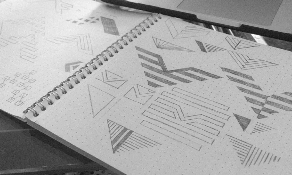
Step 2: Sketching and Concepting
This is the messy phase. Generate 50 bad ideas to find 3 good ones.
Do not jump into the software yet. Paper allows your brain to move faster than your mouse. Look for shapes, negative space, and hidden meanings.
Step 3: Vectorisation
Take the best 3 concepts into Adobe Illustrator.
- Note: Visual identities must be created as vectors (mathematical paths), not rasters (pixels).
- If you design a logo in Photoshop, you are limiting its size. You cannot blow a Photoshop file up to the size of a billboard without it looking pixelated. Vectors scale infinitely.
Step 4: Refinement and Context Testing
Place the logo on a mock-up.
- How does it look on a business card?
- How does it look on a truck wrap?
- How does it look in black and white?
If a logo relies on colour to be understood, it is a bad logo. Convert it to pure black. Does the shape still hold up?
Step 5: Delivery and Guidelines
This is where the project ends, and the brand begins. You need the files in every format (EPS, AI, PNG, JPG, SVG) and, crucially, the Brand Guidelines.
Phase 4: The Bible (Brand Guidelines)
I cannot stress this enough: a visual identity without guidelines is simply a collection of loose images.
Your Brand Guidelines (or Style Guide) is the instruction manual for your business. It stops your marketing manager from stretching the logo. It stops your web developer from using the wrong shade of green.
What Must Be Included:
- Logo Usage: Safe zones (clear space), minimum sizes, and “Do Nots” (don't rotate, don't shadow, don't stretch).
- Colour Codes: CMYK (for print), RGB (for screen), and HEX (for web).
- Typography Hierarchy: Which font is H1? Which is H2? What is the line height?
- Tone of Voice: (Optional but recommended) How do we speak?
DIY vs. Hiring a Pro: The Honest Truth
Can you create a visual identity independently? Yes.
Should you? That depends on your budget and your risk tolerance.
Here is the breakdown of what you get for your money.
The DIY Route (Canva / Fiverr / Upwork)
- Cost: $0 – $200.
- Pros: Fast, cheap. Good for validating an MVP or a hobby business.
- Cons:
- Trademark issues: Many Canva icons are not copyrightable for exclusive use. You cannot trademark a logo made with stock elements.
- Generic: You will look like 10,000 other businesses.
- Technical failings: You likely won't get proper vector files or a style guide.
The Professional Agency Route
- Cost: $2,000 – $15,000+.
- Pros:
- Strategic: It’s built on market research, not just aesthetics.
- Original: Custom typography and iconography that you can actually own.
- Systematic: You get a full toolkit, not just a JPEG.
- Cons: It costs money and takes time (4-8 weeks).
The Verdict:
If you are selling knitted socks to your neighbours, use Canva.
If you are launching a consultancy, a tech platform, or a product that needs to sit on a retail shelf, you need professional brand identity services. The cost of rebranding later because your first attempt failed is far higher than doing it right the first time.
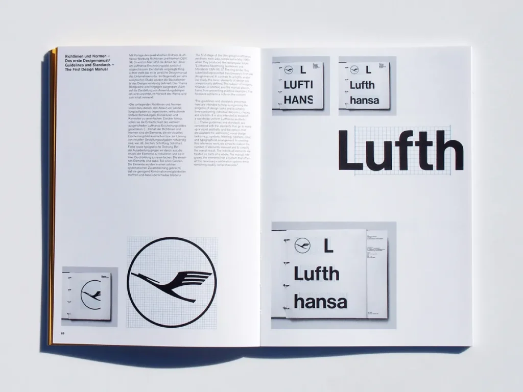
Identity Designed
Your visual identity work fails because it lacks strategic thinking. Stop just designing pretty logos. This book is the essential playbook. It guides you through the four-stage process—research, strategy, design, implementation—used by studios like Pentagram to create identities that resonate and actually improve how businesses function.
As an Amazon Partner, when you buy through our links, we may earn a commission.
5 Common Visual Identity Mistakes to Avoid
I’ve seen these errors kill businesses. Avoid them.
1. The “Trendy” Trap
In 2015, every startup logo looked like an ‘X'. In 2020, everything was “Blanding” (a simple sans-serif typeface). Trends die. Your identity needs to last 5 to 10 years. Aim for timeless, not trendy.
2. Ignoring Application
A logo might look beautiful on a retina screen, but if you print it on a cheap t-shirt, does the ink bleed? If you embroider it on a polo, does the text become a blob? Design for the worst-case scenario (low-res print, black and white fax), not just the best-case scenario.
3. Inconsistency
This is the silent killer.
- Website uses “Open Sans.”
- Presentation deck uses “Arial.”
- Instagram post uses “Comic Sans.”
This tells the customer: “We are disorganised.” Consistency builds trust. Repetition is reputation.
4. Colour Vibration
Using red text on a green background. Using neon blue on neon pink. These combinations hurt the eyes. They cause “vibration.” It makes your brand literally painful to look at.
5. The “Committee” Design
Do not ask your spouse, your kids, and your neighbour what they think of the logo. They are not your target audience. Design by committee leads to mediocrity. Trust the strategy, not the opinions of people who don't pay your invoices.
Technical Implementation: Formats Matter
To wrap up, let’s get technical. When you finish your visual identity design, you need a specific set of files. If your designer sends you one PNG file, fire them.
| File Type | Extension | Use Case | Scalable? |
| Vector (Master) | .AI, .EPS | The source file. Send this to printers, sign writers, and designers. | YES |
| Vector (Web) | .SVG | For logos on websites. Crisp on all screen sizes. | YES |
| Raster (Print) | .TIFF, .PDF | High-resolution printing (brochures, flyers). | NO |
| Raster (Web) | .JPG | Photos, social media posts. Opaque background. | NO |
| Raster (Transparent) | .PNG | Logos with transparent backgrounds. Digital use only. | NO |
Note: Keep your master EPS or AI files backed up in three separate locations. They are your digital real estate deeds. Lose them, and you lose the ability to edit your brand in the future.
Conclusion: It’s an Investment, Not an Expense
Visual identity design is the attire your business wears to the interview. You can show up in a tailored suit, or you can show up in sweatpants. Both cover your body, but one commands significantly higher rates.
A strong visual identity:
- Increases the perceived value of your product.
- Reduces marketing friction (people recognise you faster).
- Creates employee pride (people love wearing cool swag).
Don't cut corners on the foundation. Build a house that lasts.
What To Do Next
If you are looking at your current logo and realising it breaks every rule I just listed, it might be time for an audit.
Would you like me to review your current branding setup?
You can request a quote here for a comprehensive brand overhaul, or explore our Brand Identity Services to see how we’ve helped other businesses and out from the crowd.
Frequently Asked Questions (FAQ)
What is the difference between branding and visual identity?
Branding is the feeling and the strategy (the intangible). Visual identity encompasses the logo, colour, and type (the tangible elements). Branding is the soul; visual identity is the face.
How much does a visual identity design cost?
It varies wildly. A freelancer might charge £500 to £1,500. An established agency like Inkbot Design might charge £3,000-£10,000+, depending on the scope (e.g., whether we are creating just a logo or a full website and packaging suite).
How long does the process take?
A proper process takes 4 to 8 weeks. This allows time for research, conceptualisation, feedback loops, and final asset generation. Rushing it leads to generic work.
Can I use Canva to design my visual identity?
Technically, yes, but legally risky. Canva’s licensing agreement often prevents you from trademarking logos that use its stock elements. You do not own the raw assets.
What format should my logo be?
Your master logo must be a vector file (AI, EPS, or SVG). This allows it to be scaled to the size of a building without pixelation. PNG and JPG are for output only, not creation.
How many colours should my brand have?
Keep it simple. One primary colour, one secondary, and one accent. A palette of 3-5 colours is standard. Anything more becomes difficult to manage consistently.
What is a brand style guide?
It is a document that dictates how your brand is used. It covers logo placement, colour codes, font usage, and “dos and don'ts.” It ensures consistency across all media.
Should I redesign my visual identity?
Only if your current identity is actively hurting you (e.g., looks outdated, attracts the wrong customers, or is technically unusable). Do not rebrand just because you are bored.
What is a responsive logo?
A logo that adapts to different screen sizes. It might be a full wordmark on a desktop, but simplifies to just an icon on a mobile device or smartwatch.
Why does my logo look blurry on my website?
You are likely using a low-resolution JPG or PNG that has been stretched. Replace it with an SVG (Scalable Vector Graphic) or a high-resolution PNG sized exactly to the container dimensions.
Can I choose a font from Microsoft Word?
Please don't. Standard system fonts (Arial, Calibri, Times New Roman) look generic. They signal that no design effort was made.
How do I know if my visual identity is “good”?
If it is memorable, scalable, distinct from competitors, and accurately reflects your brand values, it is good. Personal taste (“I like blue”) is irrelevant; strategic function is everything.

