The Top 10 Racing Logos: Iconic Motorsport Branding
Take a seat while we examine the lively world of racing logos. Mind you, these are not just fancy decals – they represent what a team is in the high-speed, high-risk world of motor racing.
From Ferrari’s prancing horse to the chequered flag, these symbols have become as much a part of racing as burning rubber and engine noise. They are focal points for millions of fans worldwide, instantly recognisable whether you’re in Monaco or Monza.
But why are they so important? A strong brand is crucial in a sport where one-hundredth of a second can be the difference between glory and despair. It sets teams apart among sponsors’ sea of logos and gives enthusiasts something to put on caps and keyrings.
We’ll delve into ten iconic racing logos, peeling back the design layers to unearth their stories and meaning. I think there’s something here for everyone, from seasoned petrolheads to admirers of clever branding.
So, without further ado, let’s fire up the engines and walk through motor sport’s most memorable paddock signs. Stand by for green… And we’re off!
- Racing logos must be highly legible at speed, using high contrast and bold shapes to survive motion blur and varying light.
- Typography choices favour geometric sans-serifs with increased kerning (about 15%) to prevent letters merging at high velocity.
- Heritage and symbolism (eg Ferrari, Alfa Romeo) give logos emotional resonance while modern tweaks ensure track readability.
- 2026 branding shifts see major manufacturers (eg Audi, Ford) integrating co-branding and sustainability icons into livery design.
The Physics of Fast: Why Logos Fail at 200mph
Designing for motorsport is a battle against motion blur and extreme environmental conditions. Unlike a corporate logo on a static billboard, a racing emblem must be legible while vibrating at 18,000 RPM and moving at 200mph under fluctuating sunlight.
The Contrast Equation
In the design world of 2026, we use the Contrast Ratio Standard established by the FIA to ensure safety and visibility.
A logo with low contrast—for example, dark grey on a carbon-fibre weave—effectively disappears in a broadcast “pan” shot.
To survive the camera’s shutter speed, designers prioritise high-chroma pairings. This is why Oracle Red Bull Racing uses a specific shade of “matte” blue; it absorbs light rather than reflecting it, keeping the yellow and red bulls “locked” in the viewer’s eye even during high-speed cornering.
Stroke Weight and Kerning
Traditional typography often fails on the track. If the “kerning” (the space between letters) is too tight, the letters bleed together at high speed, turning a premium brand into an illegible smear.
- The 15% Rule: Successful racing logos typically increase their standard kerning by at least 15% for car liveries.
- The Sans-Serif Dominance: You will rarely see “serif” fonts (like Times New Roman) on a front wing. The thin “feet” of the letters vanish instantly. Instead, brands lean on geometric sans-serifs like Helvetica or Futura, which maintain their structural integrity under motion blur.
Example Scenario: In 2024, a major sponsor attempted to use a “script” font on a rear wing endplate. During the Monza qualifying session, the logo was entirely unrecognisable on the helicopter cam, appearing only as a white smudge. By Sunday’s race, the team had swapped it for a bold, block-letter variant to satisfy the sponsor’s visibility contract.
1. Ferrari: The Prancing Horse
Imagine a vivid yellow shield with a black horse leaping up on its hind legs. Recognise it? Absolutely! It’s the Ferrari logo – and what a tale it has to tell.
The prancing horse didn’t originate on the racecourse or in a design studio. No sir! It comes from the skies of World War I.
Italy’s top fighter ace, Francesco Baracca, painted a black horse on the side of his plane for good luck. When Baracca died in action, his parents suggested to young Enzo Ferrari that he use their son’s emblem for his racing cars as a good-luck charm.
And lucky it was! The prancing horse became synonymous with speed, luxury and Italian genius.
It’s not just an emblem; it’s a commitment to greatness, an expression of love and a badge of honour among racing fans worldwide.
Simplicity is Power
What is it about the Ferrari symbol that makes it so effective? It all boils down to simplicity. Whether passing you by on the track or gracing the hood of an elegant sports car, this rearing steed can be identified anywhere in no time.
The yellow background? That represents Modena — Ferrari’s hometown.
That yellow is formally known as Giallo Modena, a direct nod to the city’s coat of arms. The shield on race cars usually carries the SF initials and the Italian tricolour at the top for national pride.
The Cavallino Rampante appeared on Scuderia Ferrari machines in 1932, including the Spa 24 Hours. Ferrari also uses a horizontal wordmark with the horse for corporate and road car contexts, reserving the shield for racing identity.
The green, white and red stripes across the top? Those are homage to Italy’s flag.
Each element serves a purpose and tells a story about Ferrari’s origins and its aspirations.
But here’s what sets this simple yet dynamic logo apart: despite its straightforwardness, it still packs quite a visual wallop.
2. McLaren: Speed Simplified
Now, let’s talk about McLaren. You won’t see any dancing horses in this logo, but it makes a statement!
The McLaren emblem has changed a lot over time. It was initially a kiwi (a nod to founder Bruce McLaren’s New Zealand heritage) before transforming into the sleek, streamlined design we know today.
Early McLaren iconography featured a kiwi, a salute to Bruce McLaren’s New Zealand roots. The modern Speedmark arrived in the late 1990s and has been refined since to read cleanly on cars, kits, and screens.
Papaya orange goes back to McLaren’s late 1960s Can‑Am and Formula One entries. The team revived papaya in 2017, locking that vivid hue back into the brand’s core palette.
What we have now is simply stunning: a clean, stylised speedmark. It’s abstract, futuristic, and screams velocity even when stationary. Can you say genius?
The Science of Speed
But this is where things get interesting. The McLaren badge isn’t just good-looking – it’s also a lesson in visual dynamics.
The direction and curve of the lines give the impression of movement as if the air were streaming past an optimally aerodynamic object.
It’s almost like they extracted the essence of fastness and depicted it in its rawest form on paper or a screen. What came out?
A symbol which seems quick even when placed on something still. Talk about clever branding!
And let’s not overlook that colour; that deep yellow hue (officially known as ‘McLaren Orange’) is just as much part-and-parcel of their identity as the speed mark itself!
Bold, vibrant and easily distinguishable amidst countless reds and blues found on race cars worldwide
3. Red Bull Racing: Giving Wings to Formula 1
Let’s change gears and talk about Red Bull Racing: the newbie that has made the most significant impact.
You may be thinking, “Wait! I thought Red Bull was an energy drink!” And you’re not wrong; however, it is so much more than that in motorsports.
Indeed, with its two charging red bulls against a yellow sun — the same logo printed on every can of energy drink they sell — Red Bull has become just as ubiquitous at racetracks as on grocery store shelves.
This shows how brands can successfully move from one industry to another without losing their identity.
Red Bull Racing entered Formula One in 2005 after acquiring Jaguar Racing from Ford, building from Milton Keynes. Since 2022, the team competes as Oracle Red Bull Racing, a title integration that leaves the charging bulls and sun disc untouched.
Those bulls trace back to Krating Daeng, the original Thai brand that inspired Red Bull. The gaur silhouettes against a sun disc became the global mark, then carried into motor sport without losing meaning.
The Logo That Gives You Wings
What’s brilliant about Red Bull’s racing logo is how well it combines energy drink branding with motorsport aesthetics. The bulls charging symbolise power, aggression, and speed – everything a good racing team needs.
But what sets this apart? Think about their tagline: “Gives You Wings”.
When used about any other type of beverage or food product designed to give you an energy boost throughout the day-long work grind, blah blah blah blah… It takes on a whole new meaning when applied to car races.
This kind of double entendre makes this logo so effective for me (and, I imagine, for others).
In addition, they are both familiar yet exciting at once, serving as a bridge between regular people who buy stuff off shelves and those nut-job petrolheads who know every second lap detail by heart.
4. Mercedes-AMG Petronas: The Silver, Now Black
Shall we swing by Mercedes-AMG Petronas? This team has quite the pedigree.
The three-pointed star of Mercedes has been the epitome of automotive greatness for over 100 years, but its racing logo takes that to another level.
The logo combines the classic Mercedes star with smooth, modern design elements that say “high-tech racing machine”. They took a luxury sedan’s grace and injected it with some Formula 1 adrenaline.
Science Behind the Silver
But why ‘Silver Arrows’? Well, strap in for a quick history lesson!
Mercedes’ three-pointed star represents mobility on land, sea, and air, a Daimler symbol from the early 1900s. The Silver Arrows nickname dates back to 1934 at the Nürburgring’s Eifelrennen, when bare-metal bodies gleamed after paint was removed.
Today’s mark pairs the star with AMG typography and Petronas teal accents. It blends century-old meaning with sponsor colourways that still read as Mercedes even at a blur.
In the 1930s, Mercedes racing cars were white, as was tradition. As legend has it, to meet weight restrictions, they scraped off the paint and revealed silver bodywork underneath – thus giving birth to ‘Silver Arrows’!
The current logo pays homage to this with its sleek silver design – but it’s not just about looking pretty. Even when stationary, those sweeping lines and dynamic shapes give a sense of movement and speed.
And let’s not forget that nod towards their title sponsor, Petronas, with a touch of teal; this is how you integrate sponsor branding without losing your identity.
5. Aston Martin: Luxury Meets Speed
Aston Martin, what a beautiful name. It makes me think of James Bond, high-performance cars, and Formula One races. The race car team’s logo perfectly combines their road car history with their racing ambition.
These wings have been a part of the Aston Martin brand since the 1930s.
At first, they were more intricate and realistic, but have become more streamlined over time. The result? A design that is both timeless and modern.
The Green Dream
But what sets this logo apart is its colour: British Racing Green.
This deep hue represents England’s racing legacy and is an integral identification element for Aston Martin, just like those wings.
In fact, during early motorsport events, cars were painted in national colours, including green, which was reserved exclusively for vehicles manufactured by or closely associated with UK-based brands.
However, I find it particularly clever that they’ve incorporated traditionalism within such sleekness, indicative of contemporary-era signs.
While employing classic shade in minimalist emblematic forms, they are bringing together their outstanding past achievements and technological advancements.
Aston Martin returned to Formula One in 2021 by rebranding Racing Point into the works team. The car runs British Racing Green, so the logo lands in its natural habitat rather than fighting the base coat.
The wings, first used in the late 1920s, were simplified again in 2022 with cleaner geometry and a stronger wordmark. Designer Peter Saville advised on that update, aligning print, digital, and car applications.
What strikes me most about these logos is how the upward sweeping motion creates a sense of speed, clearly representing thrill racing, not just some bland graphic design slapped onto corporate stationery.
6. Scuderia Ferrari: The Prancing Horse Rides Again
I do know what you are thinking. “We just talked about Ferrari.” Well, yes and no. The prancing horse is Ferrari’s symbol. However, Scuderia Ferrari – their racing division – has a different twist on the iconic logo.
Scuderia means stable in Italian, a reference to a team of thoroughbreds ready to race. Enzo Ferrari founded Scuderia Ferrari in 1929, long before the road car company, to run racing entries.
That is why the racing shield carries SF initials and the tricolour. It distinguishes the team mark from broader Ferrari S.p.A. corporate lockups.
The classic prancing horse gets a racing makeover in the Scuderia Ferrari logo. It’s like seeing a thoroughbred in a paddock versus one thundering down the final stretch of a race – same horse, different energy.
The Power of Tradition
What’s interesting about the Scuderia Ferrari logo is how it can be instantly recognisable and distinct from the standard emblem. The prancing horse is there, but it’s set against the Italian tricolour to highlight national pride among team members.
Also, I love that they added ‘SF’ initials because it makes me feel special, knowing it’s exclusive to fans or those who participate in races, which reminds me of secret handshakes between friends who share similar interests.
But maybe what sets this apart as one of my favourite logos ever made is how well it keeps up with the rest of the brand while still being unique among other racing teams under its parent company, which many brands find difficult to achieve but not so much for Scuderia Ferrari, who do things differently with more than a touch of Italianità.
7. Williams Racing: Simplicity in Motion
Let’s take a short break and talk about Williams Racing, shall we? This team knows how to stick around in the fast-paced world of Formula One. Their logo? It’s minimalism at its finest.
You might think the Williams ‘W’ looks simple — but you’d be wrong. This symbol is loaded with meaning and intelligent design choices that genuinely reflect what this team is about.
The Craft of the Slipstream
Look closer at that ‘W’. See how the right side appears to be peeling away from the left? That’s not just an artistic quirk; it visually represents speed moving forward. It’s as if the logo was caught in a slipstream, constantly pushing ahead and striving for another tenth of a second.
Williams’ current identity centres on a split-stroke W monogram tuned for small sizes and digital avatars. The geometry implies motion to the right, so the badge appears to move even on a still screen.
The blue palette has been with the team across eras, giving fans a constant to track across kits and cars. That consistency makes sponsor rotations less jarring from year to year.
The blue and white colour scheme pays homage to their British roots while also serving a practical purpose — these colours show up well on the track, making it easy to spot their cars even at 200 mph.
What I find remarkable about the Williams logo is how much it says with so little. There are no fancy flourishes or unnecessary elements. Instead, small design choices suggest rapidity, exactitude and progressiveness.
The weight of every gram matters in this sport; therefore, this emblem has been streamlined just like any race car would be.
8. Alfa Romeo: The Serpent and the Cross
Sit tight, guys, because we’re going on a wild ride through car history. Alfa Romeo’s logo is more than just a picture – it’s a tale of Milan, medieval warriors and a dash of automotive passion.
Two elements make up the logo: the red cross of Milan on the left and the Biscione (a giant snake) of the House of Visconti on the right. Think of it as a medieval coat of arms with a high-octane twist!
Alfa Romeo streamlined its roundel in 2015 with simplified contours and updated typography. The core Milan cross and Visconti Biscione stayed, now easier to read on modern surfaces and screens.
In Formula One, Alfa Romeo’s name returned in 2019 via title partnership with Sauber and ran through 2023. The brand then exited F1, with Sauber preparing for its next chapter under a new factory partnership.
Symbolism at Full Throttle
Now, you might be thinking: what do a cross and a snake do with racing? Well, that’s where this logo gets clever. The cross represents precision and technical supremacy — vital in motorsport.
Meanwhile, the snake symbolises power, flexibility, and some danger. Combine them all, and you’ll have some severe racing success.
But here’s what makes it bright: Alfa Romeo connects its racing efforts to its extensive cultural heritage through these historic symbols. So it’s not just about speed; It also stands for carrying on an Italian tradition full of love for craftsmanship.
The circular shape isn’t there because no one could draw straight lines either. It resembles a wheel – subtly reinforcing its connection with cars even more! And those laurel leaves around the edge? They’re supposed to be associated with victory or achievement – something every team strives for while participating in races.
9. Haas F1 Team: The New Kid on the Grid
Okay, let’s change the topic and discuss the new kid on the block — Haas F1 Team. As an American-owned Formula 1 team, their logo had much to represent – their national identity and racing aspirations.
But this one is more complex. The Haas logo appears very basic at first glance, but it’s a clever design that packs plenty of meaning into a small space.
Stars, Stripes and Speed
The red stripe running through the ‘A’ in Haas is perhaps the most apparent bit to talk about – it’s a clear nod to the US flag and instantly tells you where this team is from.
But it’s not just any old stripe because if you look closely, you’ll see that it’s angled rather than straight – giving a feeling of forward motion and speed.
The choice of font is interesting, too. Bold and robust with sharp angles, it hints at cutting-edge technology seen on F1 cars.
Then there’s that little star above the ‘A’… Yes, it is another American reference (representing each state), but it also signifies reaching for the stars, dreaming big and striving for more.
The official Haas F1 Team logo is a stylised red H inside a circular mark, paired with the Haas F1 Team wordmark. Core colours are red, white, and black, matching the team’s engineering-led image on and off the car.
Haas made its Formula One debut in 2016 and is owned by Gene Haas of Haas Automation. Clean, blocky letterforms mirror the machine-tool roots of the brand.
What I find remarkable about this logo is how it manages to be patriotic without being parochial. It unashamedly screams ‘America!’ but doesn’t overdo things or try too hard, instead striking an international balance that sits comfortably within Formula 1′s global realm.
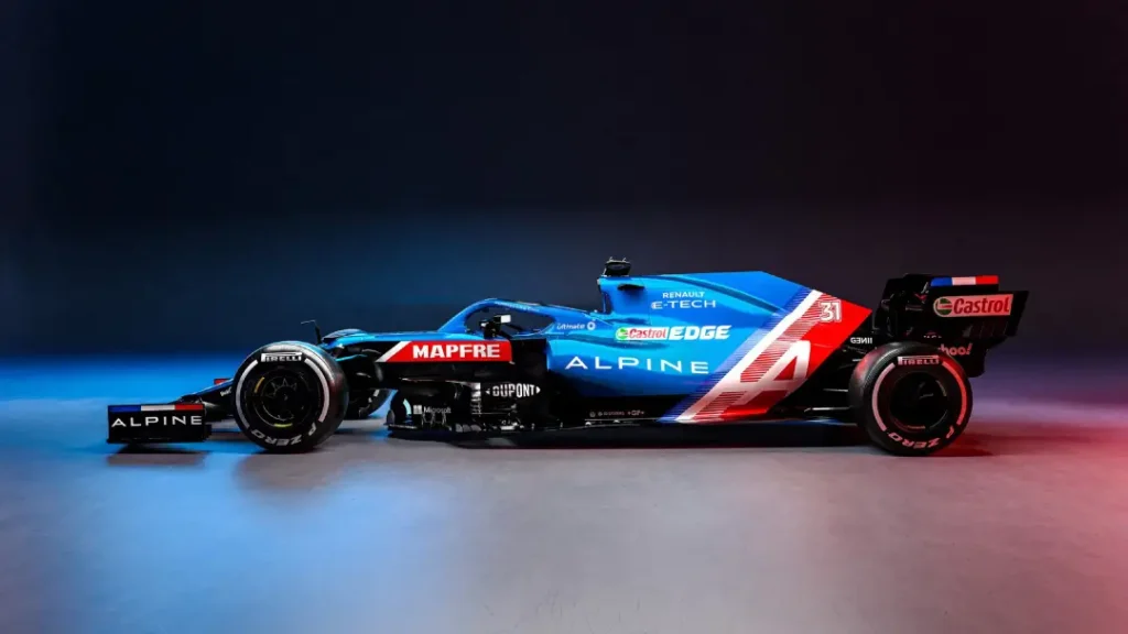
10. Alpine F1 Team: A Mountain of Potential
Lastly, we have Alpine. Wait a second–you may be saying to yourself, “Alpine? Aren’t they a car manufacturer?” And you’d be correct!
However, like many renowned vehicle makers, they have expanded beyond street cars and entered Formula One.
The Alpine logo is an example of subtlety through symbolism. At first glance, it appears to be nothing more than the letter ‘A,’ but there’s much more beneath the surface.
Peaks of Performance
Look closer at that ‘A.’ Do you see how it creates the shape of a mountain peak? That is not by chance. As its name implies, Alpine has its origins in the French Alps.
The badge cleverly acknowledges this background while representing their desire to scale the highest summits of racing.
But here’s where things get interesting: this logo can also be interpreted as two chicanes on a race track. It’s almost as if they’ve combined their mountainous beginnings with their ambitions of competing in motorsport into a straightforward design. Talk about killing two birds with one stone!
The blue colour is essential too – it isn’t just any old blue; it’s the “French Racing Blue,” with a deep history in motor racing worldwide.
By utilising this hue, Alpine connects its current F1 efforts to France’s rich motorsport heritage.
Renault rebranded its F1 team to Alpine in 2021 to put the sports car marque front and centre. The angular A monogram often carries a subtle French tricolour accent, so the national story is built into the shape.
French Racing Blue liveries pull the logo and car into one cohesive signal. That unity pays off in broadcast shots where split seconds decide what fans actually perceive.
What I love about this emblem is how much it says with so few words (or pictures). It’s basic enough that people will recognise it immediately for what it stands for, but complex enough that people who care can spend hours analysing every little detail hidden within those shapes.
That kind of efficient communication is invaluable in a sport where milliseconds can make the difference between winning and losing.
Beyond the Paddock: NASCAR and IndyCar Identity
While European racing branding often leans towards “minimalist luxury”, the American scene—dominated by NASCAR and the IndyCar Series—operates on a philosophy of “Maximalist Impact”.
NASCAR: The Art of the Contingency
NASCAR branding is historically famous for the “contingency shield” style. For decades, cars featured a “ladder” of small logos behind the front wheel arch.
While modern “Next Gen” cars have cleaned up this look, the primary logo remains subordinate to the Car Number. In NASCAR, the number is the logo.
The slanted, bold “43” of Richard Petty or the stylised “3” of Dale Earnhardt are entities unto themselves, protected by trademarks as fiercely as the Ferrari horse.
IndyCar: The Speed and the Shield
IndyCar branding bridges the gap between F1’s sleekness and NASCAR’s grit. The Indianapolis 500 logo changes every single year—a unique branding challenge in global sport.
Each “500” logo must incorporate the “Wing and Wheel” emblem of the Indianapolis Motor Speedway, while creating a distinct “event identity” that sells millions in merchandise.
| Feature | Formula 1 Branding | NASCAR Branding |
| Primary Focus | Team/Manufacturer Logo | Driver Number & Lead Sponsor |
| Typography | Sleek, Modern, Minimal | Heavy, Italicised, Aggressive |
| Placement | Aerodynamic Flow Lines | Large “Quarter Panel” Blocks |
| Heritage | National Racing Colours | Sponsor-driven Palette |
The 2026 Revolution: Audi, Ford, and the New Identity
The 2026 season marks the biggest branding shift in a decade, driven by the new engine regulations and the entry of global giants Audi and Ford.
Audi: The Four Rings Enter the Fray
After years of anticipation, Audi has completed its takeover of the Sauber team. The branding challenge here is significant: how to maintain the “Vorsprung durch Technik” luxury image while competing in the “dirty” world of motorsport.
Early livery concepts suggest a heavy reliance on a “Fluorescent Red” and “Techno Silver” palette, using the Four Rings as a structural element of the car’s aero-shaping rather than just a sticker.
Ford and Red Bull: The “Powertrains” Partnership
The return of Ford to the grid as a partner to Red Bull Powertrains creates a fascinating “Brand Collision”. The “Ford Blue Oval” is one of the most recognised entities on Earth.
Integrating this with the “Charging Bulls” of Red Bull requires a delicate balance. We are seeing a move towards “Co-Branded Visuals”, where the Ford logo acts as a “seal of engineering quality” on the engine cover, leaving the vibrant Red Bull energy branding to dominate the nose and sidepods.
The “Green” Shift: Both brands are using 2026 to debut “Sustainability Sub-Logos”. Expect to see “E-Fuel” or “Hybrid-Max” icons integrated into the primary branding, signalling the sport’s move toward carbon neutrality.
The Chequered Flag: Wrapping Up Our Logo Grand Prix
When it comes to these badges, they are much more than just designs; indeed, they serve as visual life signatures that represent the teams they stand for. They bear the burden of history, the pleasure of velocity and millions of fans’ dreams across the globe.
Every logo tells a story – from Ferrari’s prancing horse to Alpine’s mountain peak. Evidence shows that visual communication is assertive in conveying complex ideas or emotions within seconds through eye contact or engine roar.
The Rulebook: When Design Meets Regulation
You cannot simply place a logo anywhere on a racing car. The FIA International Sporting Code and Appendix L dictate the “Safety and Visibility” zones that every team must respect.
- The “Number Box”: Car numbers must be a specific height (typically 230mm at the front) and must have a “clear zone” around them of at least 50mm. This prevents sponsor logos from interfering with the timekeepers’ and marshals’ ability to identify a car.
- The “Driver Name” Zone: Usually located on the rear cockpit side, this has a mandatory font height of 100mm. Even the most powerful sponsors cannot override this safety requirement.
- The Camera Pods: The “T-Cam” on top of an F1 car is a primary branding spot. However, the FIA mandates that this area remains a specific colour (usually black or fluorescent yellow) to distinguish between the first and second drivers of a team.
FAQs: Burning Questions About Racing Logos
How do I protect my racing team’s logo from copyright theft?
You should register your logo as a Trademark in the specific “Nice Classification” for sporting events (Class 41) and clothing (Class 25). In 2026, many teams also use Blockchain Timestamping to prove “first-use” in digital racing series and e-sports.
What is the ‘Golden Ratio’ in racing livery design?
Most elite designers use a 70/30 rule: 70% of the car remains the “Heritage” or “Base” colour (like Ferrari Red), while 30% is allocated to “Disruptive” sponsor branding. This ensures the team identity is never “lost” to the sponsors.
Why are some logos ‘mirrored’ on different sides of the car?
To maintain the “forward motion” effect. If a logo includes an animal (like the Porsche horse or the Red Bull bull), the animal must always face the front of the car. This means the logo on the right side of the car is a mirror image of the logo on the left.
Can a logo affect a car’s performance?
In 2026, yes. Modern “Vinyl Wraps” used for logos have a specific texture. Some teams use Aero-Textured Vinyl on their logos to “trip” the boundary layer of air, acting like tiny dimples on a golf ball to reduce drag.
Which font is considered the ‘fastest’ in 2026?
Eurostile Next and Microgramma remain the industry standards for “high-tech” speed. However, custom variable fonts are trending in 2026, allowing logos to “stretch” visually based on the car’s bodywork curves.


