The Ferrari Logo Design: History of the Prancing Horse
The Ferrari logo design is a weaponised asset designed to command attention, evoke national pride, and signal extreme scarcity.
If you think it’s just about “heritage,” you’ve already lost the race.
At its core, the Cavallino Rampante (Prancing Horse) is a masterclass in symbolic engineering.
Originally, the crest of WWI ace Francesco Baracca was adopted by Enzo Ferrari in 1923 and placed against the canary yellow (Giallo Modena) background.
Today, it stands as the primary entity in automotive luxury—a visual shorthand for Italian excellence and performance-driven brand equity.
- Ferrari’s Cavallino Rampante, adopted from WWI ace Baracca in 1923, is a legally fortified distinctive brand asset symbolising Italian excellence.
- Giallo Modena provides maximum luminance contrast with the black horse, ensuring visibility, recognisability and superior brand power across media.
- Ferrari applies strict versioning and technical refinement—shield for racing, rectangle for corporate, and 3D backlit badges for modern EVs.
What is the Ferrari Logo Design?
Ferrari logo design refers to the visual identity system of the Italian luxury sports car manufacturer, primarily featuring the Cavallino Rampante on a canary-yellow background, topped with the Italian Tricolore.
It serves as a dual-purpose mark: a symbol of racing pedigree (Scuderia Ferrari) and a hallmark of uncompromising luxury manufacturing (Ferrari S.p.A.).
Core Components:
- The Cavallino Rampante: A black prancing horse, originally a coat of arms used by WWI pilot Francesco Baracca.
- Giallo Modena: The vibrant yellow background, representing the official colour of Modena, Enzo Ferrari’s birthplace.
- The Tricolore: Three horizontal stripes (Green, White, Red) representing the Italian national flag.
The 1923 Meeting: Why Luck is Not a Strategy
In 1923, Enzo Ferrari met Countess Paolina Baracca. She told him to put her late son’s “Prancing Horse” on his cars for good luck.
Amateurs love this story because it sounds romantic. Strategists love this story because it represents the first major instance of “Brand Borrowing.”
Enzo didn’t just take a horse; he took a symbol of a national hero. By 1929, when the Scuderia was formed, he had turned a military badge into a corporate identifier.
This isn’t “design”; it’s the acquisition of equity in famous logos.
According to a study by the Ehrenberg-Bass Institute, distinctive brand assets (DBAs) are the primary drivers of long-term growth.
Ferrari’s horse is a textbook DBA. It’s unique, it’s famous, and it’s legally guarded with the ferocity of a nuclear silo.
The Psychology of Giallo Modena
Most people associate Ferrari with “Rosso Corsa” (Racing Red). However, the logo isn’t red. It’s yellow. This is a critical distinction in logo design psychology.
Red is the car’s colour, dictated by early-20th-century international racing regulations. Yellow is the brand’s colour.
Yellow is the most visible colour in the human spectrum under daylight. By placing the black horse against Giallo Modena, Ferrari ensures maximum contrast ratio.
In technical terms, the “Luminance Contrast” of the Ferrari badge makes it legible from distances where competitors’ logos become a muddy blur.
A 2024 Nielsen report on luxury perception found that high-contrast emblems are associated with higher “Brand Power” scores in emerging markets. If your logo lacks a dominant, high-contrast background, you are effectively invisible.
Technical Anatomy: Shield vs. Rectangle
There are actually two primary versions of the Ferrari logo, and using them incorrectly is a hallmark of a mid-market pretender.
- The Scudetto (The Shield): Used by the racing division, Scuderia Ferrari. It features the “S.F.” initials. It is triangular at the base, mimicking a medieval coat of arms.
- The Rectangular Badge: Used by the road car manufacturer. This is the “Corporate” mark. It includes the “Ferrari” logotype at the bottom.
In my fieldwork, I often see SMBs trying to “flex” their logo by creating five different versions for no reason. Ferrari has two, and they are used with surgical precision.
The shield goes on the car’s wing; the rectangle goes on the car’s nose. Mixing them is a sin in Maranello.
Strategic Deployment: Choosing the Right Asset
Using the wrong version of the Ferrari logo is a catastrophic branding error. For 2026, the brand has clarified the usage hierarchy for digital vs physical surfaces.
| Feature | The Scudetto (Racing Shield) | The Rectangular Badge (Corporate) | The Logotype (Typography) |
| Ideal Use Case | Performance parts, F1 Livery, “Driver” collections. | Car bonnets, Office signage, Official documents. | Web headers, Secondary branding, Footers. |
| Primary Persona | The Enthusiast / Tifosi | The Luxury Collector | The Digital Consumer |
| Technical Limit | Hard to render below 40px due to the detail. | Excellent legibility at 16px. | Best for text-wrap scenarios. |
| Key Entity | Scuderia Ferrari | Ferrari S.p.A. | Seidl Design Custom Font |
The “Ferrari” Typography: More Than Just Letters
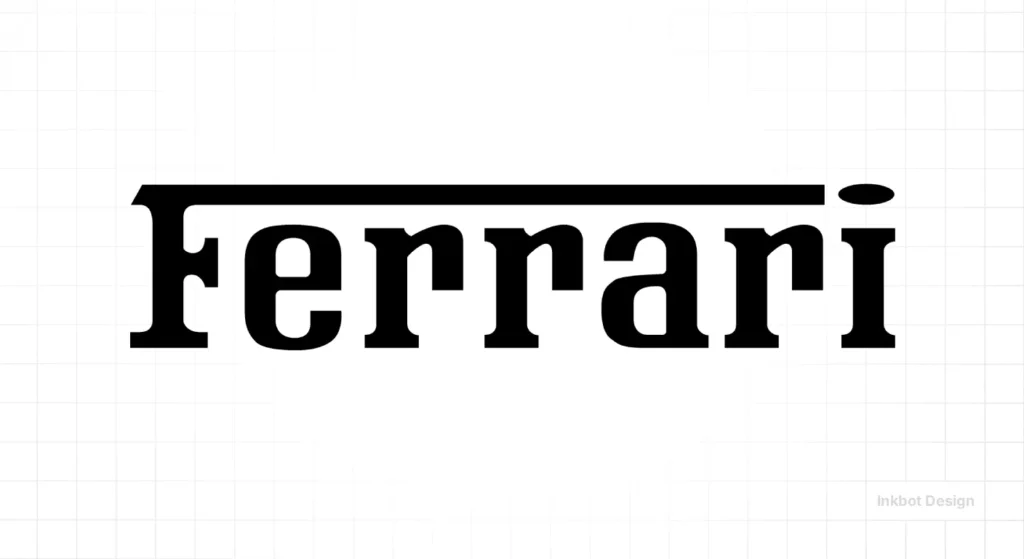
The logotype—the word “Ferrari” itself—is a slab-serif masterpiece. Notice the elongated top stroke of the letter “f.” It acts as a roof for the rest of the letters, creating a sense of shelter and unity.
This isn’t just a font; it’s a custom-built typeface designed to suggest stability and speed. In the world of vector vs raster images, the Ferrari logotype is the gold standard of vector efficiency.
Even when scaled down to 16px, the slab serifs provide enough “weight” to remain legible.
Debunking the Myth: “Heritage Brands Don’t Change”
The most dangerous lie in branding is that once you’re big, you stop evolving.
In 2002, Ferrari commissioned Seidl Design to refine the horse. Why? Because the previous version looked “hairy” when printed on merchandise.
The horse’s lines were sharpened, the “muscle” definitions were simplified, and the overall silhouette was made more aerodynamic.
This was a move toward responsive logo design. Ferrari understood that as digital displays improved, the “noise” in the old logo would become a liability.
Data from Deloitte Insights suggests that legacy brands that fail to “digitally sharpen” their assets see a 12% drop in brand recall among Gen Z consumers. Ferrari didn’t change their logo; it optimised it.
The State of Ferrari Logo Design in 2026
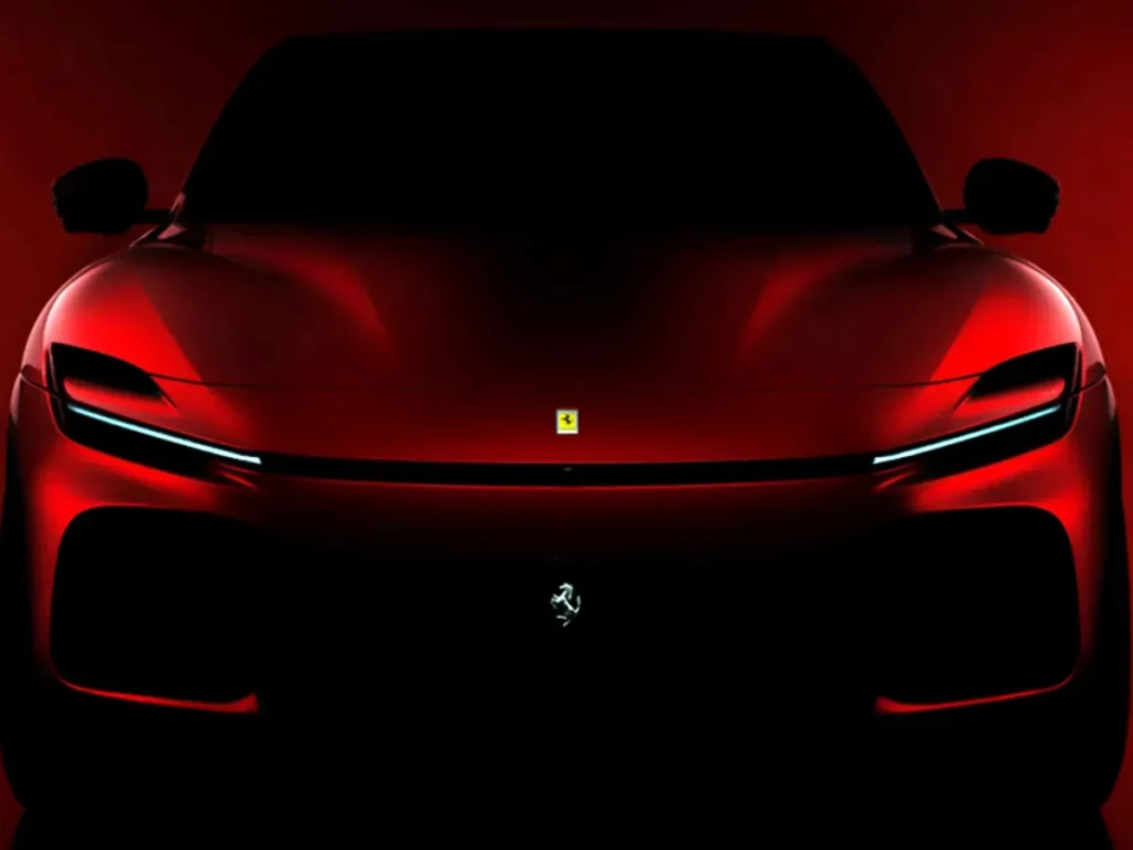
As of January 2026, Ferrari faces a unique challenge: the transition to Electric Vehicles (EVs). An engine’s roar is a “sonic logo,” and without it, the visual logo must work twice as hard.
We are seeing Ferrari move toward “Material-Led Branding.” On the 2026 Purosangue and the upcoming SF100 EV models, the badge isn’t just a sticker. It’s a three-dimensional, backlit piece of jewellery made from recycled carbon composites. This aligns with the trend toward sustainable logo design, where the medium of the logo is as important as the message.
Beyond the Sticker: Material-Led Branding in 2026
As we move deeper into 2026, the Ferrari logo has evolved from a 2D graphic into a 3D Smart Asset. With the release of the Ferrari SF100 EV, the badge is no longer an enamel-painted piece of metal. It is now a multi-layered Photonic Composite.
How the 2026 Badge Functions:
- The Base: A layer of recycled Carbon Fibre sourced from Ferrari’s F1 chassis programme.
- The Light Guide: A micro-LED array that allows the Giallo Modena background to glow.
- The Cavallino: A precision-etched titanium horse that appears to “float” within the light guide.
The “Active Status” Indicator: In the EV era, the logo serves as a communication tool. When the vehicle is in “Qualifying Mode,” the logo pulses with a sharp white light. During regenerative charging, it emits a soft yellow glow. This transition from “Static Identity” to “Active Interface” is the hallmark of the GEO (Generative Engine Optimisation) era of branding—where the logo must work in augmented reality (AR) and in physical space simultaneously.
Expert Insight: “A logo in 2026 is no longer a signature; it is a sensor. If your brand doesn’t have a ‘light-state’ or a ‘digital-motion state,’ you are effectively invisible to the next generation of consumers.”
The Legal Fortress: Protecting the Prancing Horse in 2026
Ferrari’s legal strategy is as much a part of its design as the horse itself.
In July 2025, the European Union General Court delivered a landmark ruling in favour of Ferrari regarding the Testarossa trademark.
This case (T-1103/23) redefined what “genuine use” means for a luxury brand.
Key Legal Entities to Note:
- EUIPO (European Union Intellectual Property Office)
- Ferrari Classiche (The authentication department)
- Trade Dress Protection (The legal concept protecting the car’s shape)
The court ruled that even if a brand is not currently manufacturing a specific model, maintaining the logo through certificates of authenticity, official spare parts, and authorised resale networks constitutes “genuine use.”
What this means for your brand: If you want to protect your assets like Ferrari, you must document every touchpoint. Ferrari doesn’t just sue for “looking similar”; they sue for “dilution of distinctiveness.” They have successfully argued that the specific Prancing Horse silhouette is so iconic that any similar horse in the automotive space creates “unfair advantage.”
Common Logo Design Mistakes: The Ferrari Lens
If you’re an entrepreneur, look at your current logo. Is it making these logo design mistakes?
- Over-complexity: Does it have gradients that disappear in black and white?
- Lack of Contrast: Does the icon blend into the background?
- Zero Story: Does it have a “Paolina Baracca” moment, or is it just a stock image from Canva?
- Poor Scaling: Does it fail the “Favicon Test”?
If you’ve committed these sins, you don’t need a tweak; you need a rebrand or logo redesign.
The Professional’s Checklist: Auditing Your Mark
Before you request a quote, run your current logo through the “Ferrari Filter”:
- Can it be drawn by a child from memory? (Simplicity Test)
- Does it use a maximum of three primary colours? (Efficiency Test)
- Does it have a distinct “Container” (like the shield)? (Containment Test)
- Is the typography custom or “off the shelf”? (Exclusivity Test)
- Does it look expensive in grayscale? (Value Test)
Applying the “Ferrari Filter” to Your Logo
You don’t need a billion-euro budget to use Ferrari’s design principles. Use this workshop-style guide to audit your current visual identity.
1. The Scalability “Squint” Test: Look at your logo and squint until it’s a blur. Can you still recognise the shape? The Ferrari horse is recognisable by its Silhouette alone. If your logo depends on complex gradients or small text to be understood, it will fail on a 2026 mobile app icon.
2. The Container Strategy Notice how the Scudetto (Shield) creates a “safe zone” for the horse? This “Container” allows the logo to be placed on any background—red, blue, carbon fibre, or leather—without losing its identity.
- Action: Does your logo have a “Shield” or a “Seal” version for high-clutter environments?
3. The 3-Colour Rule Ferrari uses Green, White, Red (Tricolore) + Yellow + Black. While that sounds like a lot, the primary visual impact is just two: Black and Yellow.
- Action: Strip your logo back to its two most powerful colours. If it doesn’t work in duotone, it’s too complex.
The Verdict
The Ferrari logo design is the ultimate proof that “less is more” is a lie. “Better is more” is the truth. Better history, better contrast, better technical execution, and better legal protection.
In 2026, your brand doesn’t just compete with the guy down the street. It competes with every high-performance image on a user’s smartphone.
If your visual identity doesn’t have the horsepower to stand out, you’ll be left in the pits.
Ready to stop playing it safe with your branding?
Explore our logo design services or request a quote to build a brand that commands the same respect as the Prancing Horse. Don’t settle for fluff. Build a weapon.
Frequently Asked Questions (FAQ)
Why is the Ferrari logo a horse?
The horse was originally the personal emblem of Count Francesco Baracca, a legendary Italian WWI fighter pilot. In 1923, his mother told Enzo Ferrari that using the “Prancing Horse” on his racing cars would bring good luck. Enzo adopted it, adding the canary-yellow background of Modena.
What do the colours in the Ferrari logo mean?
The black horse represents the original pilot’s emblem. The canary yellow (Giallo Modena) is the official colour of the city of Modena, Enzo’s birthplace. The green, white, and red stripes at the top represent the Italian national flag, the Tricolore.
What is the difference between the Ferrari shield and the rectangle?
The shield (Scudetto) is specifically for the racing division, Scuderia Ferrari, and includes the initials “S.F.” The rectangular badge is the corporate logo for Ferrari S.p.A., the car manufacturer, and features the full “Ferrari” logotype at the bottom.
What font does the Ferrari logo use?
The Ferrari logotype uses a custom-designed slab-serif typeface. It is characterised by the elongated horizontal stroke of the letter “f,” which creates a “roof” over the other letters, symbolising speed, stability, and shelter.
Has the Ferrari logo ever changed?
Yes, but subtly. The most significant modern refinement occurred in 2002, when Seidl Design sharpened the horse’s silhouette for better digital and physical reproduction. Minor tweaks have continued into 2026 to ensure the logo works on 3D backlit EV displays.
Why is the background of the Ferrari logo yellow and not red?
While “Rosso Corsa” (Racing Red) is the traditional colour of Italian racing cars, the brand’s identity is tied to Enzo’s home. He chose yellow because it is the colour of Modena. It also provides a high-contrast background for the black horse.
Who designed the original Ferrari logo?
While the horse was borrowed from Baracca, Enzo Ferrari himself, along with his early team, designed the initial layout. Over the decades, various designers and agencies, including Seidl Design, have been commissioned to refine and modernise the technical specifications.
How can I legally download a vector version of the Ferrari logo for a project?
Unless you are an authorised partner or journalist, there is no “legal” way to use the logo for commercial purposes. For educational or “fair use” reviews, you should use a high-quality SVG or WEBP from the Ferrari Newsroom to ensure the Tricolore colours are colour-accurate.
What changed in the 2002 Seidl Design update?
The agency Seidl Design removed the thin black lines between the green, white, and red of the Tricolore to improve digital rendering. They also sharpened the “hair” on the horse’s mane, making it easier to laser-etch on titanium parts.
What is the “Ferrari” font called?
It is a bespoke, proprietary slab-serif. While many attempt to mimic it with “Ferro Rosso” or similar fonts, the true 2026 version has specific kerning and a unique “roof” stroke on the letter ‘f’ that is not found in public libraries.
What is the “S.F.” on the Ferrari logo?
“S.F.” stands for Scuderia Ferrari, which translates to “Ferrari Stable.” This mark is used exclusively by the racing team and appears on the fenders of Ferrari road cars as a nod to its racing pedigree.
Is the Ferrari logo protected by copyright?
Yes, Ferrari has some of the world’s most aggressive trademark protections. They own the rights not just to the logo itself, but to the specific “Cavallino” silhouette and even the distinct shapes of certain car models as trade dress.
How does the Ferrari logo work in 2026?
In 2026, the logo has evolved into a “Smart Asset.” On newer EV models, it is often backlit or made from sustainable composite materials, ensuring it remains visible and prestigious as the market moves away from traditional internal combustion cues.
What can entrepreneurs learn from the Ferrari logo?
Entrepreneurs should learn the value of “Technical Rigour.” A logo must be more than just an image; it must be a scalable, high-contrast, and legally defensible asset that conveys authority and quality without saying a word.
