Wine Branding: A Guide to Label Design & Strategy
Before we get into the “how-to,” let’s clear the air.
I’ve been a brand consultant for over 20 years, and I’ve worked with everyone from small Kentish vineyards to established importers.
The wine industry is unique, but it makes the same, tired mistakes over and over.
If you’re doing any of these, stop.
- The “Clip Art” Family Crest. Slapping a poorly drawn, generic crest or an etching of a building on your label isn’t “heritage.” It’s a visual cliché. It tells a new customer nothing, and it looks cheap.
- Tasting Note Terrorism. “Hints of morning dew on alpine strawberries with a whisper of sun-baked slate.” Stop. Your front label is a billboard, not a technical manual. This pretentious jargon alienates 99% of your potential customers.
- Illegible Script Fonts. That lovely, flowing script font you love? It’s completely unreadable from three feet away on a poorly lit supermarket shelf. Legibility always trumps “elegance.”
- Chasing Trends, Not Customers. Remember when every craft beer had a cartoon animal on it? Now it’s happening with wine. Just because one brand (like 19 Crimes) did “edgy” well, it doesn’t mean your $50 Cabernet should look like a prop from a pirate movie. It’s a lack of identity.
- Forgetting the Shelf. You designed a label on a 27-inch monitor. It looks fantastic. But in the real world, it’s next to 100 other bottles, fighting for attention. Your design has three seconds to prevent someone’s hand from stopping. Most designs fail this simple test.
Your wine branding isn’t just a logo or a label. It’s your single most important salesperson. It’s the primary tool for managing your brand perception, often before anyone has even tasted your product.
Here at Inkbot Design, we’ve seen brilliant winemakers fail because they put their world-class product in a package that looked like it belonged in a bargain bin. Let’s fix that.
- Prioritise strategy before design: define story, audience and price point before picking colours or fonts.
- Craft an authentic, specific brand story — avoid generic clichés and vague passion statements.
- Design for a single target audience; visual cues must match customer expectations and segment.
- Ensure label hierarchy and legibility: clear brand name, varietal, then details; avoid unreadable scripts.
- Test physically on the shelf (10‑ft, 3‑ft, hand tests) and ensure tactile materials justify the price.
Why Most Wine Branding Fails
The core problem is simple: Strategy before design.
Most new wineries are excited about the ‘creative’ part. They jump straight to picking colours and fonts. This is like building a house with no blueprint. You’re just decorating a void.
Your brand isn’t your logo. It’s the entire ecosystem of signals you send. It’s the story you tell, the price you set, the shape of your bottle, the texture of your label, and the tone of your website.
Branding is the strategy. Design is the execution.
A few years ago, I worked with a small vineyard in Kent. Their wine was exceptional, but the branding was a mess. They had the “generic building etching” I mentioned. Sales were flat.
We spent a day walking the land, and the owner kept complaining about the “impossible chalk soil” that made growing anything a nightmare. That was the story. Not the building. The struggle. The chalk.
We rebranded around that single, authentic idea. The new labels used a deep, chalky white, tactile paper stock and a strong, modern typeface. The brand story was “Grown from Chalk. Crafted with Will.”
Sales doubled. Not because the wine changed, but because the story finally matched the quality. The branding gave customers a reason to believe.
The Core Strategy: Before You Hire a Designer
Do not open Adobe Illustrator. Do not call a designer. Do this first.

1. Your Brand Story (And How Not to Tell It)
Every winery says it has “a passion for winemaking” and “respect for the terroir.” These are not differentiators. They are the bare minimum entry requirements for the industry.
Your story must be authentic and specific.
- Bad Story: “We are passionate about crafting fine wines.”
- Good Story: “We are two ex-bankers who sold our flat in London to restore a 100-year-old abandoned vineyard.”
- Bad Story: “Our wine captures the spirit of the land.”
- Good Story: “Our vines are cooled by a unique coastal fog that rolls in every afternoon at 3 PM, giving our Sauvignon Blanc its distinct mineral edge.”
Find your specific, human, memorable hook. Is it your family? Your unique soil? Your rebellious production method? That’s your story.
2. Defining Your Target Audience (The Most Skipped Step)

You cannot—and must not—try to appeal to everyone. A $10 “Tuesday night” wine and a $150 “cellar-worthy” Cabernet cannot have the same branding.
Who is your ideal customer? Be specific.
- “Wine snobs” is not an audience.
- “Millennials” is lazy.
Let’s try again:
- The “Adventurous Millennial”: 25-35 years old. Shops at independent bottle shops. Is looking for something “new” and “authentic.” Values a good story, sustainable credentials, and an “Instagrammable” label. Is suspicious of old-world crests.
- The “Classic Collector”: 45-65 years old. Buys by region (e.g., “Bordeaux,” “Napa”). Trusts traditional signals, such as heavy bottles, classic typography (like serifs), and cues of heritage (even if they are constructed).
- The “Supermarket Scanner”: All ages. Buys 90% of their wine at the grocery store. It is price-sensitive and brand-loyal once they find something they like. They are seeking clear, bright, and easy-to-understand labels.
Your design choices must serve one of these groups explicitly. Trying to please all three guarantees you’ll attract no one.
Audience vs. Aesthetic: A Simple Guide
| Target Audience | Visual Cues to Use | Visual Cues to Avoid |
| The Adventurous Millennial | Modern sans-serif fonts, abstract/illustrative art, bright or unusual colour palettes, texture, and eco-friendly paper. | Traditional crests, script fonts, generic landscape photos, high-gloss/foil (unless used ironically). |
| The Classic Collector | Serif or classic fonts, cream or white labels, simple embossing, foil stamps, clear region/vintage info. | Cartoons, neon colours, “quirky” names, modern abstract art. |
| The Supermarket Scanner | Bright, clean colours, very clear/bold varietal name (e.g., “PINOT GRIGIO”), familiar imagery (grapes, leaves), strong brand logo. | Muted/dark colours, complex typography, confusing names, abstract art. |

3. Positioning: Premium, Value, or Niche?
Your branding must justify your price point before the customer sees the price tag.
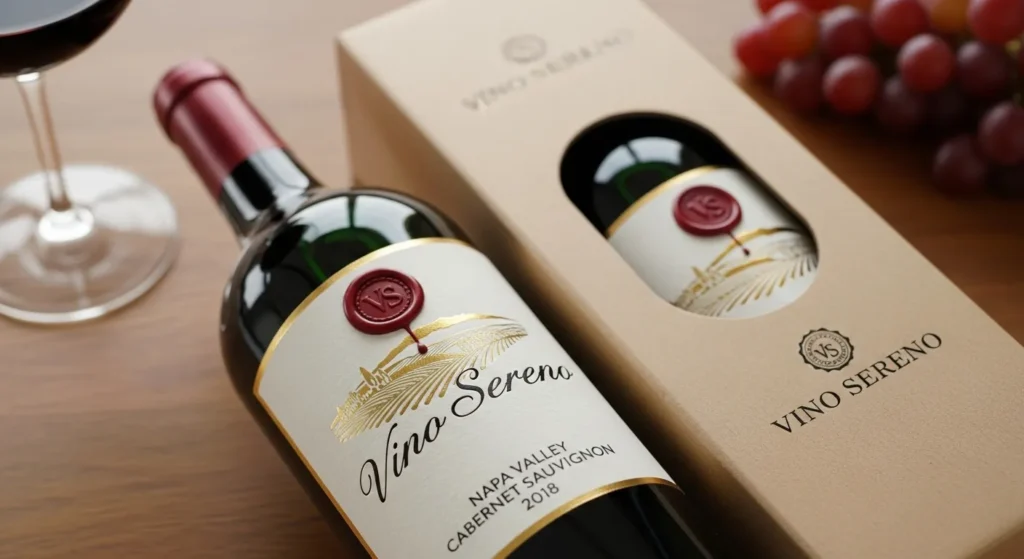
- Premium/Luxury ($50+): The branding emphasises restraint and high-quality materials. Think heavy glass bottles, minimalist labels, custom typography, debossing, foil, wax seals. It feels expensive to the touch.
- Mid-Range ($20-$40): This is the most crowded space. Your story and label design are critical. You need to look more premium than your price. This is where clever illustration, great paper stock, and a strong brand name win.
- Value/Mass-Market (Under $15): This is about clarity and recognition. The brand name and varietal must be identifiable from a distance of 10 feet. Colour is used to “pop” on the shelf.
A $15 wine in a $100 bottle’s branding feels like a lie. A $100 wine in a $15 bottle’s branding is a complete marketing failure. The visual signals must match the price.
The Anatomy of a Killer Wine Label
Now that you have your strategy (Story + Audience + Position), you can start designing. The label is where your strategy comes to life.

1. The Holy Trinity: Typography, Colour, & Hierarchy
This is 90% of the graphic design battle.
- Typography: Your font choice is the “voice” of your brand.
- Serif Fonts (like Times New Roman): Feel traditional, established, premium, classic.
- Sans-Serif Fonts (like Helvetica or Arial): Feel modern, clean, approachable, minimalist.
- Script Fonts (Cursive): The most dangerous. 99% of them are illegible and look cheap. Use extremely sparingly, if at all.
- Rule: You need one primary font for the brand/wine name, and one secondary (boring) font for the details (varietal, region). That’s it. Don’t use five.
- Colour: Colour is an emotional shortcut.
- Crisp Whites (e.g., Sauvignon Blanc): Often use cool colours—blues, greens, bright whites—to signal “refreshing.”
- Bold Reds (e.g., Cabernet): Often use warm, deep colours—blacks, deep reds, golds—to signal “rich,” “bold,” and “warm.”
- Rosé: The pale pink to salmon colour of the wine is the brand’s signature. The label is often minimal (white, pale grey) to let the wine’s colour shine through.
- Eco/Natural Wines: Often use muted, earthy tones (kraft paper, forest green, terracotta) to signal “natural” and “unfiltered.”
- Hierarchy: This is the most critical part. What is the first thing you want the customer to read? Your label must direct their eye in a specific order.
For most brands, the hierarchy should be:- Brand Name (e.g., “Oyster Bay”)
- Varietal (e.g., “Sauvignon Blanc”)
- Everything Else (Region, Vintage, etc.)
- If the Brand Name is in a tiny script font and “Marlborough 2024” is huge, you’ve failed at hierarchy.
2. Material & Texture: The Tactile Sell
Your label isn’t just a JPEG. It’s a physical object. When a customer picks up that bottle, the “hand-feel” confirms their visual assumption.
- Paper Stock: Is it a cheap, glossy, thin paper? Or a thick, cotton, “toothy” (textured) paper? The paper signals quality.
- Finishes: These are the details that scream “premium.”
- Embossing: Raising the paper (e.g., for a logo).
- Debossing: Stamping the paper in (more subtle, very classy).
- Foil Stamping: Adding metallic gold, silver, or copper.
- Spot UV: Making one part of the label shiny (such as the brand name) while the rest remains matte.
These details add cost, but they also add perceived value, allowing you to justify a higher price point.
3. The Boring Bits (That Can’t Be Boring)
Your label must, by law, contain information like ABV (Alcohol By Volume), bottle volume, origin, and health warnings.
The amateur designer slaps these on the back in a tiny font as an afterthought.
The professional designer integrates them. They are treated as part of the design, laid out in a clean grid, using the brand’s secondary font. The back label is not a dumping ground; it’s an opportunity to demonstrate professionalism and attention to detail. It’s also a great place to include a short version of your brand story or a QR code that links to your website.
The Shelf Test: Your Brand in the Wild
You’ve designed the perfect label. It looks great on your desk. Now, the real test.
Go to your printer. Obtain a physical prototype (a “mockup”) of your label and affix it to a real bottle.
Now, go to a wine shop.
- The 10-Foot Test: Place your bottle on the shelf. Stand 10 feet away. Can you tell what it is? Does it stand out at all? Or does it vanish into the “wall of wine”?
- The 3-Foot Test: Stand 3 feet away (normal browsing distance). Can you clearly read the Brand Name and the Varietal? Is it obvious if it’s a red or a white?
- The Hand-Test: Pick it up. How does it feel? Does it feel premium? Does the texture match the visual?
This simple, real-world test will teach you more than 100 hours in front of a computer. You will quickly discover that your “subtle, pale grey” font is invisible, or your “bold” design just looks obnoxious next to the competition.
Don’t Forget the Digital Shelf
Your brand isn’t just in the store. It’s available on your website, social media, and retailers’ websites.
This is where your brand identity system becomes critical. Your logo, fonts, and colours must be consistent everywhere.
- Your Website: Is it clean, modern, and easy to use? Or does it look like a high school project from 2005? Your website is your digital “cellar door.” It has to build trust.
- Social Media: You need high-quality, professional “bottle shots” (photos of your bottle). A blurry photo with bad lighting screams “amateur.” Your Instagram grid is part of your brand.
- Consistency: The “adventurous” brand on your label can’t have a “corporate and stuffy” website. The branding must be seamless. This is where a professional brand identity service is non-negotiable.
Packaged for Life: Beer, Wine and Spirits
You’re ignoring the most powerful sales tool you see every day: the packaging. You think that bottle is just rubbish. This book is a visual playbook that deconstructs the creative strategies spirit brands use to make you desire what’s inside. Stop overlooking the art that makes the sale.
As an Amazon Partner, when you buy through our links, we may earn a commission.
Final Thought: Stop Decorating, Start Communicating
Your wine label is not a piece of art. It is a piece of communication.
Its job is to:
- Attract the right customer.
- Inform them clearly.
- Justify its price.
- Be memorable so they can buy it again.
Your wine might be world-class, but it will die a lonely death on the shelf if it’s trapped in a bad brand.
Ready to Tell the Right Story?
Are you looking at your current branding and feeling it’s not working? It probably isn’t. The difference between a shelf-warmer and a best-seller is often just strategy and a well-executed design.
We build brand identities that work on the shelf and in the customer’s mind. If you’re ready to stop guessing and start selling, request a quote from Inkbot Design, and let’s have a serious conversation about your brand.
FAQs
What is wine branding?
Wine branding is the complete strategic process of creating an identity for your wine. It’s not just the label; it includes your story, target audience, price point, bottle shape, and website, all working together to communicate your value.
Why is wine label design so important?
The label is your #1 salesperson. In a crowded store, your label has about three seconds to grab a customer’s attention, convey what’s inside, and persuade them to make a purchase. A bad label means a lost sale, regardless of the wine’s quality.
What are the biggest mistakes in wine label design?
The most common mistakes are using illegible script fonts, cluttering the label with too much text (like long tasting notes), using “cliché” imagery (like generic crests), and designing a label that looks bad on a real shelf.
How do I choose the right font for my wine label?
Your font choice is your brand’s “voice.” Use serif fonts (such as Times New Roman) for a traditional, classic look. Use sans-serif fonts (such as Arial) for a modern, clean, and approachable look. Always prioritise legibility over “elegance.”
How does my target audience affect my wine branding?
You can’t sell to everyone. A millennial seeking an “adventurous” natural wine is drawn to distinct visual cues (e.g., abstract art, eco-friendly paper) than a “classic collector” looking for a premium Cabernet (e.g., minimalist label, foil, heavy bottle). You must design for your ideal customer.
What is the “shelf test”?
The shelf test is a real-world test of your branding. You put your physical bottle mockup on a real store shelf, stand back, and see if it’s visible, legible, and appealing. It’s the best way to see if your design “pops” or just “vanishes.”
Should I put my brand story on the label?
A short (one or two-sentence) version of your authentic story can be very effective, but it belongs on the back label. The front label is designed to attract customers; the back label is used to “close the sale” once they’ve picked it up.
How important are paper and materials in wine branding?
Extremely. The tactile feel of the label (e.g., thick, textured paper) and finishes (e.g., embossing, foil) signal quality. This “hand-feel” helps justify a premium price point.
What’s the difference between wine branding and wine marketing?
Branding is the identity—it’s who you are (your story, your logo, your label design). Marketing is the activity—it’s how you find customers (through your social media posts, ads, and tasting events). You need a strong brand before you can have effective marketing.
What information is legally required on a wine label?
Requirements vary by country, but generally, you must include the Alcohol By Volume (ABV), the bottle’s volume (e.g., 750ml), the country of origin, and any relevant health warnings (like “contains sulfites”).

