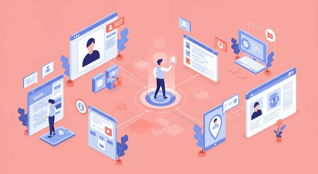
Why User Experience and Digital Marketing Can’t Be Separated
You’re spending money. Plenty of it, probably.
On SEO, Google Ads, and social media campaigns designed to drive traffic.
And if you’re like most small business owners, you’re looking at those traffic numbers and feeling a mix of hope and frustration.
Hope because the clicks are coming in. Frustration because those clicks aren’t consistently translating into actual customers.
Here’s a blunt truth: the problem isn’t always your marketing channels. Often, the issue lies squarely with what happens after those channels deliver someone to your doorstep.
You’re pouring effort into attracting visitors, only to usher them into a confusing, frustrating experience that actively drives them away.
Your user experience (UX) is likely sabotaging every penny you spend on digital marketing.
- Splendid user experience (UX) directly influences the effectiveness of digital marketing efforts, turning clicks into conversions.
- High traffic numbers mean little if users quickly bounce due to poor site usability and design.
- Google's ranking now considers user experience signals, making good UX essential for SEO performance.
- Marketing campaigns must align with user expectations; landing pages should seamlessly match ad promises.
- Improving UX can be a cost-effective strategy, transforming wasted marketing spend into profitable customer interactions.
What is User Experience in Marketing?
In digital marketing, User Experience (UX) is simply a person’s total feelings when interacting with your digital presence.
It’s about how easy, intuitive, and satisfying it is for they to achieve their goal on your website, app, or email.
Think of it this way: your marketing is the signpost that points to your shop. Your UX is the shop itself.
Is the door easy to open? Can they find what they’re looking for? Is the checkout process smooth, or do they trip over a wonky display on the way to the till?
Good UX is a smooth, clear path. Bad UX is a frustrating obstacle course. It’s not just about design; it’s about respecting the user’s time and goals.
The Great Deception: Why Your Traffic Reports Are Lying to You
Many business owners get hung up on “vanity metrics.” You know the ones: clicks, sessions, page views. These numbers might look impressive on a report, making you feel your marketing budget is working hard. The reality? They’re often telling you a fraction of the story.
High traffic means nothing if users bounce immediately because your site is slow, confusing, or ugly. It’s like hosting a party where everyone leaves after five minutes. You had traffic, sure, but zero engagement.
My personal pet peeve? The aggressive, full-screen pop-up that assaults a user the second they land on a page. “JOIN OUR NEWSLETTER!” it screams, before they’ve even had a chance to see what you offer.
This isn’t marketing; it’s the digital equivalent of a salesperson tackling a customer at the entrance of a store.
It shows a fundamental disrespect for the user’s journey and is a prime example of prioritising a business goal over the user’s experience.
You wanted an email address, but you probably lost a potential customer.
How Bad UX Quietly Sabotages Every Penny You Spend on Marketing
This isn’t theoretical. Every digital marketing channel you invest in is intrinsically linked to the user experience you provide. Neglect one, and the other suffers, costing you money, leads, and reputation.

UX and SEO: Google Isn’t Just Reading Your Keywords Anymore
Gone are the days when stuffing keywords was enough. Google and other search engines are far more sophisticated. They actively monitor user signals to determine if your page is a good answer to a user’s query.
- Bounce Rate: Google sees that if users land on your page and quickly hit the back button. A high bounce rate suggests your page isn’t meeting expectations.
- Dwell Time: How long do users stay on your page? Longer dwell times indicate engagement, which Google interprets as a sign of quality content and a good experience.
Beyond these signals, Google actively ranks websites based on Core Web Vitals. These are direct measurements of UX:
- Largest Contentful Paint (LCP): How quickly does your main content load? If it’s slow, users get impatient.
- First Input Delay (FID): How quickly does your page respond to user input (like clicking a button)? A lag creates frustration.
- Cumulative Layout Shift (CLS): Does your page content jump around unexpectedly while loading? This is incredibly annoying and can lead to misclicks.
Google will penalise you if your site is slow, clunky, or unstable. If the user experience isn’t up to scratch, your brilliantly optimised keywords mean nothing.
UX and PPC: The £100 Click That Goes Straight into a Brick Wall
You’ve paid good money for that click. Now what? The user lands on your page, expecting a seamless transition from your ad message.
This is where “landing page scent” comes in – the consistency between your ad copy and your landing page content. If the “scent” is lost, so is the user.
Every unnecessary form field, every confusing heading, every bit of visual clutter adds “friction.” This friction makes it harder for the user to convert.
If your ad promises a solution, your landing page needs to deliver it immediately, without making the user hunt for information or jump through hoops.
Consider a company like Apple.com. Their product pages are a masterclass in clean, benefit-driven design. They guide the user with clear visuals, concise copy, and an obvious call to action.
There’s no ambiguity, no wasted space. Every element serves the singular purpose of moving the user towards a purchase.
Getting this right is a core part of effective digital marketing services. Without it, you’re paying for clicks that go straight into a brick wall.
UX and Email Marketing: That Hidden Unsubscribe Link is Costing You Trust
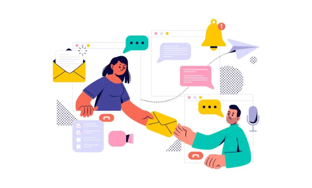
Email marketing isn’t immune to UX considerations. How easy is it for someone to read your email on their phone? Is the call to action clear, or buried in a wall of text?
- Mobile Readability: Over 50% of emails are opened on mobile devices. You’re missing a massive opportunity if your emails aren’t responsive, scannable, and easy to interact with on a small screen.
- Clear CTAs: A single, prominent call to action is far more effective than multiple, ambiguous links.
- Unsubscribe Process: Hiding the unsubscribe link or making the process convoluted is a surefire way to annoy users and damage your brand. It’s not just a poor layout; it’s disrespecting the inbox.
Take Headspace, the meditation app, for example. Their onboarding email sequence is excellent. Each email is short, focused, and guides the user gently into the app’s benefits.
The design is clean, the call to action is clear, and the overall experience is calming, consistent with their brand.
UX and Social Media: The Frustrating Journey from “Link in Bio”
Social media is often the first touchpoint, a casual browse that turns into an intrigued click. But what happens next?
Many businesses simply link their social profiles to their homepage. This often creates a jarring experience.
A user clicking a “link in bio” about your new product expects to land directly on that product page, not your generic homepage, where they must navigate to find it.
The transition from a quick, engaging social media post to your website must be seamless. If the promised content isn’t immediately apparent or easy to access, you’ve broken the user’s journey and lost interest.
Field Notes: Real-World Examples of Good, Bad, and Deceptive UX

The Good: Amazon’s One-Click Wonder
Amazon’s success isn’t just about selection or price; it’s fundamentally about removing friction.
While controversial, their “one-click” ordering patent was a multi-billion dollar idea because it brutally simplified the checkout process.
Every step a user doesn’t have to take increases the likelihood of conversion. Their entire ecosystem, from search to purchase to returns, is meticulously designed for minimal effort.
The Bad (and Deceptive): Ryanair’s Maze of Up-sells
We’ve all been there. You try to book a flight with a budget airline, and suddenly you’re navigating a minefield of optional extras: insurance, priority boarding, seat selection, fast-track security.
Ryanair is a classic example of using “dark patterns”—design choices that intentionally trick or nudge users into making unintended decisions for the benefit of the business.
While they might argue it’s effective for their bottom line, it creates a deeply frustrating and mistrustful experience for the user.
The Unexpectedly Brilliant: Gov.uk

My first pet peeve is the “prettiness trap”—businesses prioritising a completely unusable and visually spectacular website. A beautiful but confusing site is just an expensive digital sculpture. This is where Gov.uk shines.
When most people think of good design, they believe it is flashy. But Gov.uk, the UK government’s official website, is the antithesis of flashy. It’s stark, simple, and brutally functional.
Yet, it’s a masterclass in usability. Why? Because it prioritises function over aesthetics.
It’s designed to help citizens find information or complete tasks with minimal fuss.
There’s no wasted space, no confusing navigation, just clear, concise information. It proves that good UX isn’t about being “pretty”; it’s about being effective.
A Practical UX MOT for Business Owners (No Technical Degree Needed)
You don’t need to be a UX designer to identify major friction points. Here’s a quick “MOT” (Ministry of Transport test, for our non-UK readers – basically, an annual inspection for your website) you can run on your own digital presence:
The 5-Second Test: Do They ‘Get It’?
Open your website in a new browser window. Look at it for five seconds. Close it. Now, ask yourself:
- What does this business do?
- What is the most crucial thing they want me to do on this page?
If you can’t answer both clearly, a new visitor certainly won’t.
Check Your Mobile Experience (Without Lying to Yourself)
My third pet peeve: in 2025, launching a website where the mobile experience is clunky, slow, or broken is pure negligence.
With over 60% of web traffic coming from mobile, a poor mobile UX is a deliberate choice to alienate most potential customers.
Don’t just use a browser simulator. Grab your actual phone. Go to your website. Try to do the main things you want customers to do: fill out a contact form, buy a product, and find your opening hours.
Is it fast? Are the buttons tappable? Is the text readable without pinching and zooming? Be honest.
Your Contact Form Isn’t an Interrogation
Go to your contact or lead generation form. Count the fields. Now, for every single field, ask yourself:
- Do I absolutely need this information right now to qualify this lead?
- Is asking for this information deterring people? (Do you really need their fax number in 2025?)
Every additional field increases friction and decreases completion rates.
Can a Drunk Person Use Your Website?
This is the ultimate usability test. If your navigation isn’t blindingly obvious, your calls to action aren’t crystal clear, and the path to conversion isn’t self-evident, it’s broken.
Users don’t want to think. They want to accomplish their task with minimum mental effort. If it requires effort, they’ll leave.
The Crossroads: When to Tinker and When to Call in the Pros
You can, and should, address many of the basic UX issues yourself. The MOT above is a great starting point.
Simple fixes like clearer headings, reducing form fields, or improving mobile readability can yield immediate results.
However, deeply embedded UX issues – fundamental information architecture problems, complex user flows, or chronic site speed problems – often require a different skillset.
Trying to fix these yourself can be like attempting complex plumbing with a wrench and a roll of tape.
Think of professional help not as a cost, but as an investment. It’s about making all your other marketing spend effective.
If your checklist reveals more problems than solutions, requesting a quote and getting an expert opinion might be time-consuming.
Conclusion: Stop Buying Traffic, Start Building Experiences
The most expensive traffic you’ll ever get is the traffic you can’t convert. It’s money directly wasted. Your digital marketing strategy is only as strong as the user experience it delivers.
You can spend infinitely more on ads, but if your website is a leaky bucket, you’re just pouring money down the drain.
Good UX isn’t about adding more; it’s about ruthlessly removing friction. It’s about designing a clear, easy path for your customers.
Stop chasing more clicks and start building better experiences. Your marketing budget and your customers will thank you for it.
Frequently Asked Questions
What is the difference between UX and UI?
UX (User Experience) refers to a user’s overall feeling when interacting with a product. UI (User Interface) refers to the visual design elements (buttons, icons, typography) that users interact with. UI is a part of UX.
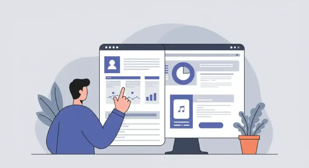
How can I measure the UX of my website?
Key metrics include bounce rate, dwell time, conversion rates, task completion rates, and user feedback. Tools like heatmaps, session recordings, and A/B testing can provide deeper insights.
How much does improving UX typically cost?
Costs vary widely depending on the scope. Simple fixes can be free (e.g., rewriting copy). Major overhauls or professional audits can range from hundreds to thousands, but often provide significant ROI.
Can good UX improve my SEO rankings?
Yes. Google actively uses user signals (like bounce rate, dwell time, Core Web Vitals) as ranking factors. A better user experience generally leads to better SEO performance.
What is the most common UX mistake small businesses make?
Prioritising aesthetics over functionality, leading to beautiful but unusable websites that confuse visitors and hinder conversions.
How long does it take to see results from UX improvements?
Some improvements (e.g., clarifying a CTA) can show results in days. Larger overhauls take weeks or months to implement and measure, but the positive impact is often sustained.
Is UX just for websites?
No, UX applies to any user interaction with a digital product, including apps, emails, online forms, and interactive advertising.
What are “dark patterns” in UX?
Dark patterns are design choices that intentionally mislead or trick users into taking actions they might not otherwise choose, often for the benefit of the business (e.g., hidden fees, forced continuity).
What is A/B testing?
A/B testing involves creating two versions of a webpage or element (A and B) and showing them to different segments of your audience to see which performs better in user experience and conversion.
Is a “beautiful” website always a good user experience?
Not necessarily. While aesthetics play a role, a beautiful website can still have poor UX if it’s confusing to navigate, slow to load, or difficult to use. Functionality and clarity always outweigh pure visual appeal.
Creating a seamless user experience is the bedrock of effective digital marketing.
If you’re ready to stop wasting clicks and start building a customer journey that converts, explore our digital marketing services to see how we connect the dots.
Or, browse more of our no-nonsense advice on the Inkbot Design blog.


