36 Typography Quotes That Define Modern Branding
Typography is not just “picking a font” from a dropdown menu. If that is your approach, you have already lost.
In my years consulting at Inkbot Design, I have seen solid business strategies crumble because the visual execution—specifically the typography—signalled “amateur” instead of “authority.”
Typography is the voice of your brand when you are not in the room. It is the clothes your words wear.
You wouldn’t send your CEO to a shareholder meeting in a clown suit, yet I see businesses sending their marketing copy out dressed in Comic Sans or, arguably worse, a cracked, illegible display font that screams “style over substance.
We are here to analyse the wisdom of the masters—the typographers, designers, and architects who built the visual language of the 20th and 21st centuries.
We will break down 36 typography quotes, dissect the philosophy behind them, and explain exactly how to apply these lessons to your business identity.
- Prioritise legibility: readable type on all devices prevents friction, increases comprehension and conversions.
- Keep hierarchy and structure: use a grid, modular scale and limited typefaces for clear visual order.
- Choose durable typefaces: favour timeless, well-supported fonts over fleeting trends to protect brand authority.
- Match tone to purpose: typography conveys emotion—use restraint for trust, boldness for impact, never mismatch.
What is Typography? (And Why It Costs You Money to Ignore It)
Typography is the art and technique of arranging type to make written language legible, readable, and appealing when displayed. But in a commercial context, it is much more aggressive than that. Typography is a form of User Interface (UI) engineering.
If a user cannot scan your value proposition because your line height (leading) is too tight, they bounce. If your logo’s typeface feels dated, your product is perceived as obsolete.
The Core Components of Professional Typography:
- Hierarchy: Guiding the eye through scale and weight (H1, H2, body text).
- Legibility: The ability to distinguish individual characters (an ‘l’ vs. a ‘1’).
- Readability: The ease with which a block of text can be scanned and processed.
When we discuss typography in branding, we are referring to the effective transfer of information. If there is friction in that transfer, you lose revenue. It is that simple.
Section 1: The Philosophy of “Invisible” Design

The most pervasive debate in typography is whether type should be expressive (an art form) or invisible (pure utility).
For most businesses, “invisible” is the safer, more profitable bet. The goal is to deliver the message without the vessel getting in the way.
1. “Typography is the craft of endowing human language with a durable visual form.” — Robert Bringhurst
The Context: Bringhurst wrote The Elements of Typographic Style, essentially the bible of our industry.
The Consultant’s Take: This quote reminds us that type is permanent. When you print a brochure or launch a website, you are casting your language in concrete.
Business Application: Do not chase trends. A “trendy” font from 2024 will look embarrassing by 2026. Choose typefaces with historical durability (like Garamond or Helvetica) for core brand elements.
2. “Type well used is invisible as type, just as the perfect talking voice is the unnoticed vehicle for the transmission of words, ideas.” — Beatrice Warde
The Context: Warde’s famous “Crystal Goblet” essay argues that a wine glass should be clear to reveal the wine, not jewelled to hide it.
The Consultant’s Take: If your customer says, “Cool font,” you might have failed. They should be saying, “Great offer.”
Business Application: For long-form content (blogs, reports, white papers), use high-legibility serif or humanist sans-serif fonts. Do not force the user to decipher your design.
3. “Good design is a lot like clear thinking made visual.” — Edward Tufte
The Context: Tufte is a pioneer in data visualisation.
The Consultant’s Take: Confusion in design usually stems from confusion in strategy. If your typography is messy—too many sizes, colours, and weights—it means you don’t know what is important.
Business Application: Simplify. If you are using more than two typefaces and three weights, you are likely overcomplicating the message.
4. “Typography needs to be audible. Typography needs to be felt. Typography needs to be experienced.” — Helmut Schmid
The Context: A counterpoint to Warde, suggesting that type has an emotional volume.
The Consultant’s Take: “Invisible” doesn’t mean “silent.” A bold, heavy sans-serif shouts; a delicate script whispers.
Business Application: Match the font size to the tone of your brand voice. A law firm should not be shouting visually; a clearance sale must not whisper.
5. “The best typography is the one you don’t notice.” — Unknown
The Consultant’s Take: A variant of the Warde philosophy. When the typography is flawed, it becomes an obstacle. When it works, the reader absorbs the content directly.
6. “Spoons and letters are tools of the one and the same kind. Make them useful and beautiful.” — Peter Fraterdeus
The Consultant’s Take: Utility first. A spoon that spills soup is useless, regardless of its ornate design. A font that cannot be read at small sizes (e.g., on a mobile footer) is a broken tool.
Section 2: The Science of Legibility and Readability
Here is where we distinguish between artists and designers. Legibility is a metric. It can be measured. Jakob Nielsen of the Nielsen Norman Group has extensively documented how poor typography increases cognitive load, reducing comprehension and conversion.
7. “Legibility is not a matter of personal taste; it is a matter of habit.” — Zuzana Licko
The Context: Licko, co-founder of Emigre, challenged the idea that serifs are inherently more readable. She argued that we read best what we read most.
The Consultant’s Take: This is a crucial insight. Users are used to standard web fonts (Arial, Roboto, San Francisco). Deviating too far creates friction.
Business Application: For UI text (buttons, navigation), stick to the conventions your users already know. Do not reinvent the wheel for a “Submit” button.
8. “We read best what we read most.” — Zuzana Licko (Reiteration)
The Consultant’s Take: This deserves its own spot. It explains why blackletter (Gothic script) was readable to a 15th-century German monk but is illegible to a modern American teenager. Context defines legibility.
9. “You cannot bore people into buying your product. You can only interest them in buying it.” — David Ogilvy
The Context: The father of advertising. While not exclusively a typographer, Ogilvy was deeply concerned with the readability of long-copy advertisements.
The Consultant’s Take: Walls of text bore people. Bad kerning bores people. Grey text on a white background bores (and strains) people.
Business Application: Use subheads, bullet points, and pull quotes to break up text. Typography is about pacing the reader’s attention.
10. “Don’t use Comic Sans unless you are a comic strip artist or an 8-year-old girl writing a poem about unicorns.” — Anonymous
The Consultant’s Take: It’s a cliché, but it holds up. The issue isn’t that Comic Sans is “ugly” (it is actually quite legible); the issue is that it carries the semantic baggage of “amateur.”
Business Application: Font choice signals competence. Using a casual font in a serious context (invoices, legal warnings) erodes trust instantly.
11. “Readability is the quality of the typeface that makes it easy to read. Legibility is the quality of the typeface that makes it easy to recognise.” — Unknown
The Consultant’s Take: Know the difference. A font can be legible (you can identify the letters) but unreadable (it is exhausting to read a paragraph of it).
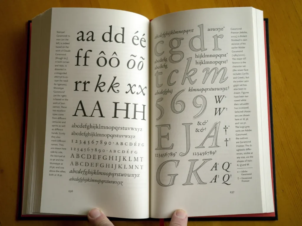
12. “Bodoni is one of the most beautiful types ever designed, but it is a torment to read.” — William Morris
The Consultant’s Take: High-contrast fonts (thick and thin lines) like Bodoni look luxurious in headlines but shimmer and disappear at small sizes. Never use them for body copy.
Section 3: The Grid, The Rules, and The Discipline
Professional design is governed by mathematics. The Grid System, popularised by the Swiss Style (International Typographic Style), ensures consistency. Without a grid, your layout looks accidental.
13. “The grid system is an aid, not a guarantee. It permits a number of possible uses and each designer can look for a solution appropriate to his personal style. But one must learn how to use the grid; it is an art that requires practice.” — Josef Müller-Brockmann
The Context: The master of the Swiss Style.
The Consultant’s Take: We see many DIY entrepreneurs trying to “eyeball” alignment. It never works. The human eye can detect even slight misalignments of a few pixels.
Business Application: Implement a strict 12-column grid on your website. Align every text block, image, and button to this invisible structure.
14. “I don’t think that type should be expressive at all. I can write the word ‘dog’ with any typeface, and it doesn’t have to look like a dog. But there are people that [think that] when they write ‘dog’ it should bark.” — Massimo Vignelli
The Context: Vignelli famously used only a handful of fonts (mostly Helvetica and Bodoni).
The Consultant’s Take: Stop trying to make your logo “look like” what you do. A bank’s logo doesn’t need to look like money. It needs to look stable.
Business Application: Restraint is sophistication. A neutral typeface allows the content to take centre stage.
15. “God is in the details.” — Ludwig Mies van der Rohe (Adopted by typographers)
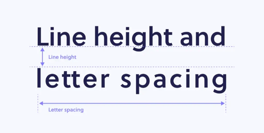
The Consultant’s Take: In typography, the details include kerning (the space between letters) and leading (the space between lines).
Business Application: If your kerning is off (e.g., “C L I C K” looks like “C LI CK”), it looks cheap. Fix the micro-details.
16. “To design is much more than simply to assemble, to order, or even to edit: it is to add value and meaning, to illuminate, to simplify, to clarify, to modify, to dignify, to dramatize, to persuade, and perhaps even to amuse.” — Paul Rand
The Context: Paul Rand designed the logos for IBM, UPS, and ABC.
The Consultant’s Take: Typography is a business tool for persuasion.
Business Application: Ask yourself: Does this font persuade the user to trust us?
17. “Typography is the architecture of the printed page.” — Unknown
The Consultant’s Take: Just as a building needs a foundation, a page needs a structure (hierarchy).
18. “Rules can be broken — but never ignored.” — David Jury
The Consultant’s Take: You can break the rules of grammar or typography for effect, but only if you understand them first. Breaking them out of ignorance just looks like a mistake.
19. “There are no bad typefaces, only bad designers.” — Unknown
The Consultant’s Take: Controversial, but mostly true. Even Papyrus was effective in its original context (simulating ancient textures). It became a joke because it was overused in the wrong contexts (like the Avatar movie logo).
Section 4: Emotional Impact and Branding Identity
Typography triggers semantic memory. We associate certain shapes with certain eras, industries, and emotions.
20. “Type is a beautiful group of letters, not a group of beautiful letters.” — Matthew Carter
The Context: Carter designed Georgia and Verdana.
The Consultant’s Take: The rhythm of the word matters more than the individual character.
Business Application: When choosing a logotype, look at how the letters interact. Do they create awkward gaps?
21. “A logo does not sell (directly), it identifies.” — Paul Rand
The Consultant’s Take: Your typography reveals who you are. If you change fonts every month, you lack a consistent identity.
22. “Typography is the detail and the architecture of visual communication.” — Neville Brody
The Consultant’s Take: Brody is known for punk, edgy magazine design. He understands that type sets the “vibe” before you read the first word.
23. “Words have meaning. Type has spirit. The combination is spectacular.” — Paula Scher
The Context: Scher is a titan of identity design (Citibank, Tiffany & Co.).
The Consultant’s Take: If the spirit of the type conflicts with the meaning of the word, you create cognitive dissonance.
Business Application: Don’t write “Innovative Tech Solution” in a Victorian-era blackletter font.
24. “Visual ideas are often the most effective way to communicate.” — Saul Bass
The Consultant’s Take: Sometimes, the typography is the visual. Think of the “I Love NY” logo. The type is the image.
25. “Helvetica is the sweatpants of typefaces.” — John Boardley
The Consultant’s Take: This is a dig at the ubiquity of the Helvetica typeface. It’s comfortable, it works, but it’s not always “dressed up.”
Business Application: Sometimes you need a bespoke suit, not sweatpants. Consider a custom typeface if you are a global enterprise.
26. “Choose your typeface as you choose your wife/husband: for their character, not their looks.” — Unknown
The Consultant’s Take: Does the font have a full character set? Does it have bold, italic, and tabular figures for your data tables? If not, don’t “marry” it.
Section 5: The Modern Digital Context (Web & Mobile)
In the digital age, typography must be responsive. It must survive scaling from a 27-inch monitor down to a smart watch.
27. “Web design is 95% typography.” — Oliver Reichenstein
The Context: The founder of iA Writer.
The Consultant’s Take: If you strip away images and CSS, the web is just HTML text.
Business Application: Invest 95% of your design budget in getting the type right. The rest is decoration.
28. “Macro-typography is about the structure of the text… Micro-typography is about the details of the text.” — Jost Hochuli
The Consultant’s Take: On the web, macro is your CSS grid. Micro is your kerning and ligatures. Both must be coded correctly.
29. “Designing for the web is like typesetting a radio script.” — Unknown
The Consultant’s Take: It must be clear, linear, and easily understood.
30. “Typography is an interface.” — Khoi Vinh
The Consultant’s Take: Typography refers to the visual presentation of text, including how the user inputs and outputs data.
31. “Don’t be a font snob. Use what works.” — Stuart L. Crawford
The Consultant’s Take: I’m adding one of my own. I see designers turning their noses up at Google Fonts, such as Open Sans. It is free, loads quickly, and is legible. Use it.
32. “In the digital age, type is data.” — Unknown
The Consultant’s Take: Fonts are software. They affect page load speed.
Business Application: Don’t load 10 font weights. It slows down your site, hurting your SEO.
Section 6: The Experimental and The Rebel
Sometimes, you need to break the grid to get attention.
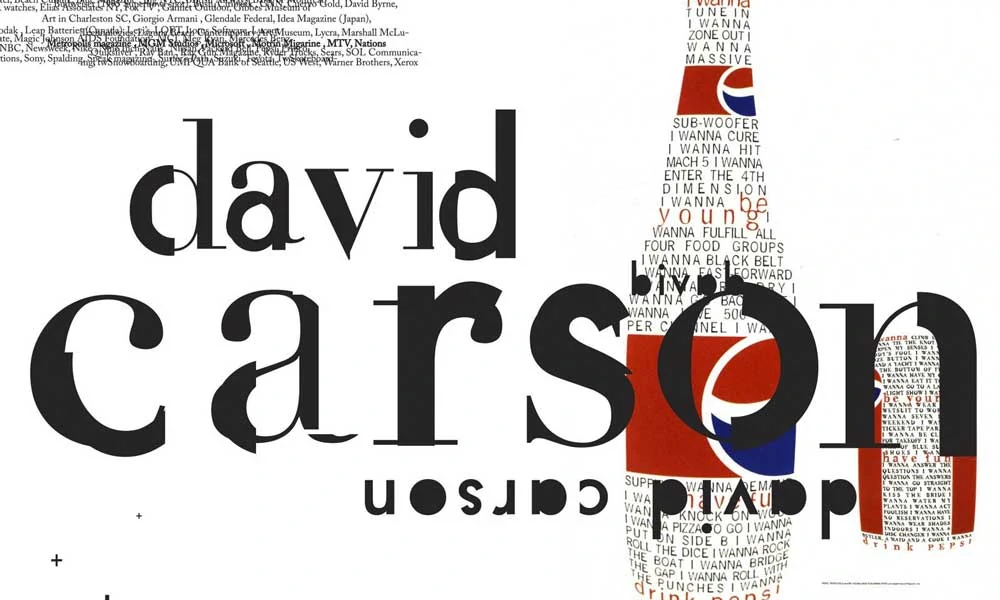
33. “Don’t mistake legibility for communication.” — David Carson
The Context: The “Godfather of Grunge.” Carson famously conducted an interview with a boring musician entirely in the Dingbats symbol font.
The Consultant’s Take: Sometimes, making something hard to read makes people look closer.
Business Application: Use this for high-impact advertising only, not for informational text.
34. “I am a typographic terrorist.” — Neville Brody
The Consultant’s Take: Disruptive brands need a disruptive type.
35. “If you have a message, you don’t need a lot of style.” — Unknown
The Consultant’s Take: Conversely, if you have no message, you pile on the style.
36. “Design is intelligence made visible.” — Alina Wheeler
The Consultant’s Take: This sums it up. Your typography conveys to your customers how intelligent your brand is.
Typography: The Wrong Way vs. The Right Way
Let’s look at the technical application of these quotes. Here is how an amateur interprets typography versus a professional agency like Inkbot Design.
| Feature | The Amateur Approach (Loss of Authority) | The Professional Approach (Brand Equity) |
| Font Selection | Chooses based on “personal taste” or trends. | Chooses based on semantic history and legibility data. |
| Hierarchy | Uses bolding randomly; no clear size scale is provided. | Uses a modular scale (e.g., Perfect Fourth) for mathematical harmony. |
| Line Length | text stretches across the whole screen (hard to track). | Limits lines to 60-75 characters for optimal eye scanning. |
| Licensing | Steals fonts or uses “Free for Personal Use” illegally. | Purchases proper desktop and web licenses (risk mitigation). |
| Consistency | Different fonts on website vs. PDF proposals. | Unified typographic system across all touchpoints. |
The Verdict
Typography is not a dark art reserved for people in black turtlenecks. It is a system of rules developed over centuries to ensure that ideas are transferred from one brain to another with minimal resistance.
The quotes above from Rand, Warde, and Vignelli are not just poetic musings; they are instructions. They tell us that clarity is king, that structure is mandatory, and that emotion is a tool to be wielded with precision.
If your brand’s typography is sloppy, your brand is sloppy. If it is illegible, you are silent.
Do not let your business enter the market dressed in the typographic equivalent of pyjamas.
Would you like me to audit your current brand typography?
We can review your website and collateral to ensure your visual voice aligns with your business ambitions. Request a quote here or explore our full range of branding services.
Typography Quotes (FAQs)
What is the most important typography rule for business?
The “Golden Rule” of business typography is legibility first. No matter how “cool” a font looks, if your customer cannot read it instantly on a mobile screen, it is a failure. Stick to high-contrast, well-spaced typefaces for body copy.
Why does typography matter in branding?
Typography acts as the subconscious “voice” of your brand. It signals personality (serious, playful, luxury, budget) before the user reads a single word. Inconsistent or cheap-looking type erodes consumer trust immediately.
How many fonts should a brand use?
The standard recommendation is two: one distinct typeface for headlines (Display) and one highly legible typeface for body text. Occasionally, a third is used for accents, but exceeding three usually leads to visual clutter and cognitive overload.
What is the difference between a font and a typeface?
Technically, a typeface is the family (e.g., Helvetica), and a font is the specific file or variation (e.g., Helvetica Bold, 12pt). In modern digital contexts, the terms are often used interchangeably; however, designers distinguish between them to ensure precision in licensing and usage.
Why is Comic Sans considered bad for business?
Comic Sans was designed for a cartoon dog in a software program, not for professional documents. Using it in a business context creates a “semantic mismatch”—it signals childishness or informality where authority and professionalism are expected.
What is ‘kerning’ and why should I care?
Kerning is the adjustment of space between individual character pairs (like the A and V in AVATAR). Poor kerning can make words look disjointed or accidentally form inappropriate shapes. It is a sign of attention to detail.
Serif vs. Sans-Serif: Which is better for the web?
Historically, sans-serif fonts (like Arial) were considered better for screens due to their low resolution. However, with modern high-density Retina displays, serif fonts (like Merriweather) are perfectly legible. The choice now depends on your brand personality: Serifs for tradition/authority, Sans-Serifs for modern/clean.
How does line length affect readability?
If a line of text is too long, the eye struggles to track back to the start of the next line. If it’s too short, the eye jumps too often. The optimal line length for readability is between 45 and 75 characters (including spaces).
Can typography improve conversion rates?
Yes. Improving typography (increasing font size, line height, and contrast) reduces “cognitive load.” When users can process information effortlessly, they are more likely to complete an action, such as filling out a form or clicking “Buy.”
What is ‘Leading’ in typography?
Leading (rhymes with ‘sledding’) is the vertical space between lines of text. In web design, this is referred to as line-height. Tight leading makes text look cramped and dark; open leading makes it airy and scannable. A standard web ratio is 1.5x the font size.


