Top 10 1950s Logos: Timeless Lessons in Brand Identity
Look at your phone screen. Flick through the apps. Notice the gradients, the subtle shadows, the intricate shapes. Modern logo design is obsessed with complexity, convinced that more detail equals more value.
It’s a trap. And it’s making brands forgettable.
The most potent lessons in building an iconic brand identity don’t come from the latest software plugins. They come from a time before digital—brutal constraints and explosive growth.
The 1950s.
Looking back at 1950s logos isn’t an exercise in retro-styling or nostalgia. It’s a masterclass in strategy. These logos were built to work on a grainy black-and-white television, the side of a delivery truck, a printed newspaper ad, and a 20-foot-tall neon sign.
They were built to last. Most of them have. Let’s break down why.
- 1950s logos prioritised clarity over cleverness—instant recognition beats hidden meaning.
- Designs were ruthlessly scalable, working from tiny favicons to giant signs with equal legibility.
- Limited palettes and single-colour devices created strong, ownable visual identities.
- Brand elements often emerged from product or environment—authentic, strategic symbols beat decorative trends.
The Dawn of a New Age: Why 1950s Design Still Matters
To understand the logos, you have to understand the decade.
The 1950s were a pressure cooker. After the austerity of World War II, America and much of the Western world saw an unprecedented economic boom. Suburbs sprawled, highways connected cities, and a television sat in the corner of the average living room for the first time.
This created a new challenge. Companies that were once local or regional were suddenly national. They needed to communicate a single, consistent message to millions of people at once.
They needed a flag. A symbol. A logo.
The designers of this era weren’t just artists; they were ruthless communicators. They knew their work had to be immediate, clear, and memorable. There was no room for ambiguity. This crucible of commerce forged the principles of modern brand identity.
The 10 Logos That Defined an Era (and Can Redefine Your Brand)
We’ve selected 10 examples showing the era’s breadth and strategic genius. Each one contains a lesson that is just as potent today as 75+ years ago.
1. The CBS Eye (1951): The Power of Pure Symbolism
The Backstory: Tasked with creating an on-air identity for the burgeoning television network, CBS creative director William Golden found inspiration in a Pennsylvania Dutch hex sign. He wanted a symbol that suggested vision and awareness.
The Design Breakdown: The design is simple: a circle containing an inner circle (the iris) and a central point (the pupil). It’s a literal interpretation of an eye, yet abstract enough to be a corporate mark. Its geometric perfection made it instantly legible on the terrible, low-resolution television sets of the 1950s.
The Modern Takeaway: A truly great symbol requires zero explanation. It has already failed if you have to explain the clever meaning behind your logo. The CBS Eye is an eye. It communicates the idea of “looking” and “seeing” in less than a second.
2. The IBM Logo (1956): Authority Through Typography
The Backstory: IBM was already a dominant force, but its logo—a globe with the words “International Business Machines”—was dated. They hired the legendary Paul Rand to create an identity that reflected their forward-thinking, modern stature.
The Design Breakdown: Rand didn’t create a symbol. He made the company’s name the symbol. He chose a custom slab-serif typeface called City Medium. The thick, solid letterforms convey stability, strength, and authority. It looks like it was carved out of granite. This wordmark was a statement of fact: We are IBM.
The Modern Takeaway: Your company name is not just a name; it can be your logo. A strong, well-chosen typeface can communicate more about your brand’s trustworthy, innovative, or approachable personality than any abstract shape ever could.
3. The Volkswagen (VW) Logo: Engineering in a Circle
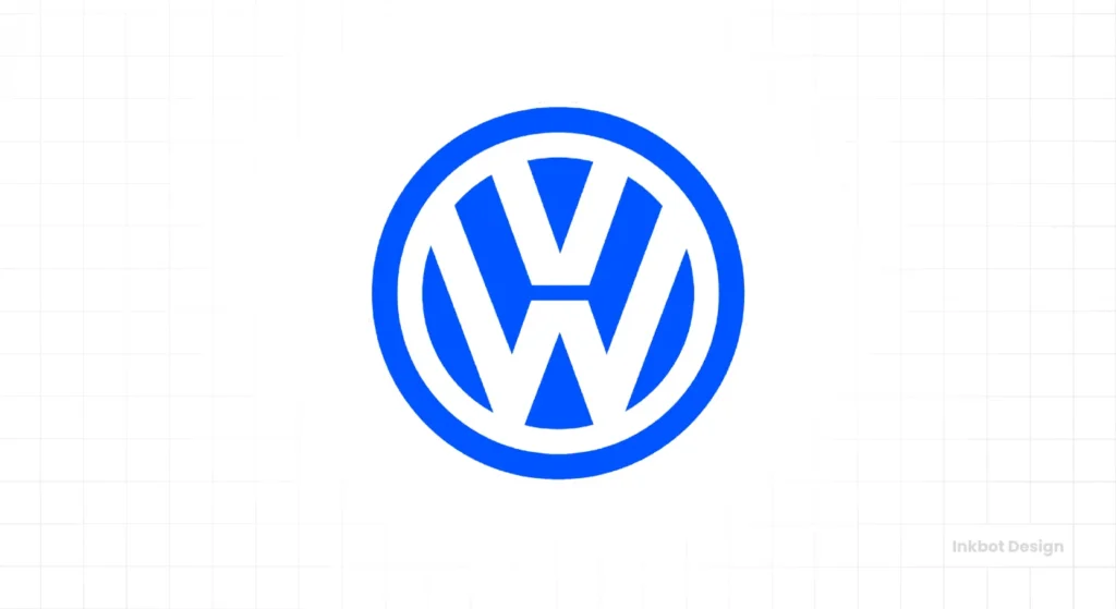
The Backstory: As Volkswagen began exporting its Beetle to America, it needed a universal symbol transcending language. The logo had existed since the 1930s but was standardised and heavily promoted in the post-war era, becoming a symbol of German engineering.
The Design Breakdown: It’s a masterclass in efficiency. A ‘V’ placed over a ‘W’, all contained within a perfect circle. The geometry is clean, balanced, and functional. There is no decoration. The logo looks engineered, just like the car it represents.
The Modern Takeaway: Your logo can directly reflect your product’s core value. If you sell precision tools, your logo should feel precise. If you sell organic food, it should feel natural. Volkswagen sells efficient engineering, and its logo is a piece of efficient visual engineering.
4. The Mobil Logo: Owning a Single Colour
The Backstory: In the crowded marketplace of roadside petrol stations, brands needed to be visible from a distance. While the Mobil Pegasus mascot was iconic, the company’s wordmark, refined by Chermayeff & Geismar in the 1960s, built upon a 1950s legacy of bold typography.
The Design Breakdown: The genius move was the red ‘o’. In a simple, blue, sans-serif wordmark—”Mobil”—the ‘o’ is rendered in a vibrant, unmissable red. This single stroke of colour created a visual hook that was instantly recognisable and unique. It draws the eye and makes the name stick.
The Modern Takeaway: Don’t just pick colours for your brand; use colour as a strategic weapon. Owning a single, distinctive colour application can be more powerful than having a complex symbol. Think of Tiffany Blue, or the red sole of a Louboutin shoe. Mobil did it with a single letter.
5. The Holiday Inn “Great Sign” (1952): Maximum Message, Maximum Impact
The Backstory: Kemmons Wilson wanted to create a chain of reliable motels for American families on the new interstate highway system. To stand out, he needed a beacon. The “Great Sign” was born and designed by a sign painter, not a graphic designer.
The Design Breakdown: This is the opposite of minimalism. It was a 50-foot-tall neon green, yellow, and orange explosion, with a massive star on top and a dynamic, sweeping script. It wasn’t just a logo; it was an event. It screamed “consistency,” “safety,” and “vacancy” to weary drivers from a mile away.
The Modern Takeaway: While minimalism is often praised, the right strategy is sometimes calculated maximalism. A quiet, subtle logo might be invisible if your market is crowded and your audience is distracted. Don’t be afraid to be loud and clear if the context demands it.
6. The McDonald’s “Golden Arches” (1952): From Architecture to Icon
The Backstory: The first McDonald’s restaurants, designed by Stanley Meston in 1952, featured two massive yellow parabolic arches on either side of the building. They were an architectural feature designed to attract attention, not a logo.
The Design Breakdown: The arches became so synonymous with the restaurant that in 1961, Ray Kroc incorporated them into the corporate logo. The symbol we know today is a stylised representation of the restaurant’s physical form. It’s a reminder that a brand’s identity is everything it does.
The Modern Takeaway: Your strongest branding element might not come from a design brief. It could be your packaging, store layout, or product’s unique shape. Pay attention to what your customers already associate with you. The most authentic symbol is often one that already exists.
7. The Esso Logo (1930s-1960s): The Enduring Oval
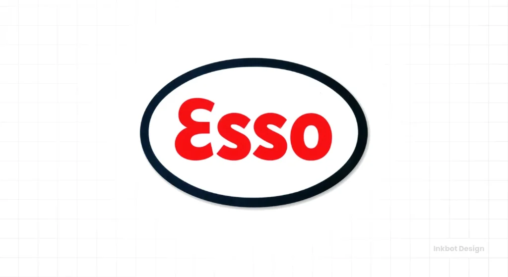
The Backstory: As a part of Standard Oil, Esso (derived from the phonetic spelling of S.O.) needed a mark that could be stamped onto petrol pumps, oil cans, and station signs across the country. It needed to be simple, robust, and trustworthy.
The Design Breakdown: A bold, hand-drawn script wordmark is contained within a simple oval. The oval acts as a container, a badge of quality. It makes the name a unified, self-contained object. This versatile shape works horizontally on a sign or vertically on a can.
The Modern Takeaway: A strong container shape can dramatically increase a logo’s recognition and versatility. Ovals, circles, shields, and rectangles can unify your company name and make it a memorable brand mark from simple text.
8. The RCA Logo: When a Mascot is the Brand
The Backstory: The image of Nipper the dog listening to “His Master’s Voice” from a gramophone is from a painting made in 1898. However, in the 1950s, the golden age of television and radio, RCA solidified this mascot as the symbol of home electronics.
The Design Breakdown: The logo creates an immediate emotional connection. It tells a story of quality and fidelity in a charming, accessible way. In a world of cold, corporate technology, the warm, familiar image of a dog created a powerful bond with consumers.
The Modern Takeaway: Never underestimate the power of a character or mascot. In industries that feel impersonal, a mascot can inject personality, warmth, and storytelling into your brand. It gives customers something to connect with on a human level.
9. The Container Corporation of America Logo (1956): The Abstract Idea
The Backstory: CCA was a B2B company that produced packaging. They were also a major patron of modernist design. For their logo, designer Herbert Bayer wanted to create a mark that conveyed the company’s essence without being literal.
The Design Breakdown: The symbol is a masterful piece of abstract geometry. It consists of two interlocking shapes that form a stylised ‘C’ twice over (for Container and Corporation), while also suggesting the flaps of a cardboard box and the idea of containment itself. It’s complex in thought but simple in execution.
The Modern Takeaway: Abstract logos are challenging to get right, but when they work, they work beautifully. The key is that the abstraction must be rooted in a strong, simple idea and executed with geometric clarity. It can’t just be a random swoosh.
10. The Crest Toothpaste Script (1955): The Human Touch
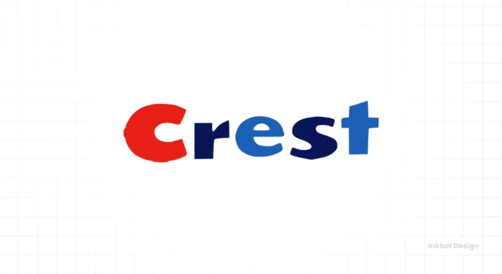
The Backstory: When Procter & Gamble launched Crest with fluoride, it was a scientific breakthrough. But they needed to sell it with a feeling of trust, optimism, and personal care, not cold, clinical science.
The Design Breakdown: The chosen logo was a flowing, optimistic script. The capital ‘C’ sweeps upward, and the clean, connected letters feel friendly and approachable. It’s the visual equivalent of a reassuring smile. This wasn’t the typography of a corporation; it was the typography of a personal promise.
The Modern Takeaway: A well-crafted script logo can stand out in a world of clean, minimalist sans-serif fonts. It feels personal, human, and artisanal. Use a script to convey emotion, personality, and a direct connection with your customer.
What We Can Learn: 3 Unifying Principles from 1950s Logos
Across these varied examples, a few powerful, non-negotiable principles emerge.
Principle 1: Clarity Over Cleverness
Not one of these logos requires you to “get it.” The CBS Eye is an eye. The IBM letters are just letters. The VW is a V and a W. They communicate their primary message in an instant. They chose to be clear rather than clever.
Principle 2: Ruthless Scalability
Each mark works as a tiny product icon and a giant sign on a building. They are simple enough to be embroidered on a uniform or stamped into metal. They were designed for the harsh realities of reproduction, a test that many modern digital logos would fail instantly.
Principle 3: The Power of a Limited Palette
Most of these logos rely on just one or two colours. This was born of technical necessity—colour printing was expensive—but it became a strategic advantage. A limited palette is bold, confident, and easier to own in the consumer’s mind.
How to Apply These Lessons to Your Brand Today
You don’t need a time machine to benefit from this thinking. You just need discipline.
Start by looking at your current logo and ask yourself some hard questions. Can it be simplified? What happens if you remove the gradient, the third colour, the extra swoosh? Does it get weaker or stronger? Creating a timeless identity is often about subtraction, not addition.
Next, perform the scalability test. Shrink your logo down to the size of a favicon (16×16 pixels). Is it still recognisable? Now imagine it in a single colour. Does it hold up? If the answer is no, the core idea isn’t strong enough.
This kind of strategic thinking is at the heart of any effective identity. It’s about building a robust, hard-working asset, not just a pretty picture. If you’re struggling to find that core idea for your business, exploring a professional logo design process can bring the clarity you need. It’s about distilling your entire business into a single, potent mark.
Mid-Century Modern Graphic Design
You love the mid-century modern look, but you’re just copying the style without understanding the substance. This is the fix. It’s the definitive visual guide, deconstructing the work of masters like Paul Rand and Saul Bass to reveal the principles behind their timeless, energetic, and influential designs.
As an Amazon Partner, when you buy through our links, we may earn a commission.
The 50s Weren’t a Style—They Were a Mindset.
The enduring power of 1950s logos has nothing to do with nostalgia. It has everything to do with a relentless focus on the fundamentals of communication.
These designs were born from constraints, which made them brilliant. They teach us that a strong idea, executed with bold simplicity, will consistently outperform a weak idea, no matter how beautifully decorated.
Frequently Asked Questions About 1950s Logos.
What design style was most popular for 1950s logos?
The Mid-Century Modern style was highly influential, favouring clean lines, geometric shapes, and organic curves. However, styles ranged from the stark corporate modernism of Paul Rand to the expressive, optimistic scripts seen in consumer brands.
What fonts were commonly used in 1950s logos?
Why are so many 1950s logos just one or two colours?
This was mainly due to the technical and financial constraints of printing and manufacturing. Full-colour printing was expensive and not always consistent. Using one or two bold colours was more practical, affordable, and visually impactful.
Can a 1950s-style logo work for a modern tech company?
Yes, absolutely. The principles of simplicity, clarity, and scalability are timeless. A modern tech company could use a strong, geometric, Mid-Century Modern-inspired logo to convey stability, efficiency, and a focus on user-friendly design.
Who was the most famous logo designer of the 1950s?
Paul Rand is arguably the most celebrated American designer of that era. His work for IBM, ABC, UPS, and Westinghouse set the modern corporate identity design standard.
What is the difference between a logomark and a wordmark?
A logomark (or symbol) is a purely graphic image, like the CBS Eye. A wordmark (or logotype) is a uniquely styled font treatment of the company name, like the IBM logo. Many brands use a combination of both.
How did television influence 1950s logo design?
The rise of black-and-white, low-resolution television forced designers to create logos with high contrast and simple, precise shapes. A complex, detailed logo would have been an illegible smudge on the TV screens of the era.
Are retro logos a good idea for new businesses?
A “retro” logo can be effective if it aligns with your brand’s story and values (e.g., a brand focused on craftsmanship or tradition). However, copying a past style without a strategy behind it can make a brand look dated or gimmicky.
What killed the maximalist design of the Holiday Inn “Great Sign”?
The 1970s energy crisis made the massive, power-hungry neon signs impractical. This, combined with changing design sensibilities favouring minimalism, led to their replacement with more modest, standardised signage.
Do the principles of 1950s logos apply to digital-only brands?
They are more critical than ever. A digital brand’s logo must work as a tiny app icon, a social media profile picture, and a website header. The 1950s principles of scalability and instant recognition are the exact qualities that make a logo succeed in the crowded digital space.
If your brand identity feels cluttered, unfocused, or fails the 16×16 pixel test, the answer isn’t to add more. It’s to subtract. The masters of the 1950s built empires on clarity.
Finding that clarity is a disciplined process. If you’re ready to build a brand mark with timeless principles, see how Inkbot Design can help or request a no-obligation quote to discuss your project.


