
The 10 UX Metrics That Tell You If Your Website Works
Most business owners treat their website like a digital billboard. They pay to get it built, put it up, and then… just hope it works.
This “hope” strategy is why so many sites fail. You’re guessing what users want. You’re assuming the checkout is easy. You’re hoping people can find your contact form.
The antidote to guessing is data. But not just any data.
Most people are drowning in what I call “vanity metrics.” These are numbers like total traffic or page views that make you feel busy but tell you nothing about whether a real human is having a good or bad time on your site.
You don’t need a 100-page report. You need a small, focused set of UX metrics that answer two simple questions:
- Can users do the thing I need them to do? (e.g., buy a product, fill out a form)
- Do they hate the experience while doing it?
This is a no-fluff guide for entrepreneurs. We’ll skip the academic theory and get straight to the 10 numbers that actually matter.
- Distinguish behavioral (what users do) from attitudinal (what users say) metrics — you need both to see truth and reasons.
- Track Task Success Rate and Conversion Rate to measure effectiveness and link UX directly to revenue.
- Monitor User Error Rate, Time on Task, and Abandonment Rate to pinpoint friction and where users fail or leave.
- Use SUS, NPS, CSAT and CES surveys for attitudinal insight — they reveal perceived usability, loyalty and effort.
- Pair quantitative data (GA4) with qualitative tools (session replays, heatmaps, Clarity) to find the “why” behind metrics.
The Only Framework You Need: Behavioral vs. Attitudinal
Before we get to the list, you need this one concept. It’s the filter for everything.
Most people lump all their data together. This is a mistake. You must separate what people do from what people say.
Behavioral Metrics (What Users DO)
This is what you observe. It’s the hard data of clicks, scrolls, form submissions, and purchases.
This data is honest. People can say they love your site, but if they do nothing, they’re lying (or at least being nice). An action, like a user clicking “Add to Cart,” is an objective fact.
Attitudinal Metrics (What Users SAY)
This is what you ask. It’s the data of opinions, feelings, and frustrations.
This data provides the “why” behind the “what.” It’s the user telling you the “Add to Cart” button was hard to find.
Why You Need Both: The “Ryanair” Problem

Here’s why this matters. Think of a budget airline like Ryanair.
For years, their behavioral metrics were fantastic. People did buy tickets. The Task Success Rate was high.
Their attitudinal metrics were often terrible. People hated the experience. The confusing layout, the endless pop-ups, the dark patterns… the System Usability Score (SUS) and Net Promoter Score (NPS) were in the gutter.
If you only looked at behavior, you’d think everything was perfect. “People are buying!”
If you only looked at attitude, you’d think the business was failing. “Everyone hates us!”
The truth was in the middle: “People will use our site despite hating it… for now.”
That “for now” is the business risk. That’s the opening a competitor with a better design will exploit. You must track both.
The 10 Best UX Metrics for Business Owners
Here is the definitive list, broken down into the two groups we just discussed.
Part 1: Behavioral Metrics (What Users DO)
1. Task Success Rate (TSR)
- What it is: The percentage of users who complete a specific, defined task.
- Why it matters: This is the most critical measure of effectiveness. If the main task of your site is “buy a product” and only 30% of users can figure out how, your site has failed. Period.
- How to measure it: Usability testing. Get 10 people (friends, family, or paid testers). Give them a straightforward task (e.g., “Find the return policy”). Count how many succeed without your help. If 7 out of 10 do, your TSR is 70%.
- A “Good” Score: Aim for above 80%.
- The Gotcha: You must define “success” clearly. “Browsing” is not a task. “Finding the blue widget and adding it to the cart” is a task.
2. Conversion Rate
- What it is: The percentage of users who complete a business goal. This is just Task Success Rate applied to your most important goal (a sale, a lead, a sign-up).
- Why it matters: This is the metric that most directly connects UX to revenue. It’s the number that proves your design is either making you money or costing you money.
- How to measure it: Google Analytics (GA4) Goal Completions. The formula is: (Number of Conversions) / (Number of Total Visitors) * 100.
- A “Good” Score: This varies wildly by industry. A typical e-commerce average is 2-3%. The real goal is to establish your baseline and then work to improve it.
- The Gotcha: Don’t just look at the final conversion. Map out micro-conversions (like ‘add to cart’ or ‘start checkout’) to see exactly where your sales funnel is leaking.

3. User Error Rate (UER)
- What it is: The percentage of time a user makes a mistake while trying to complete a task.
- Why it matters: This is your “frustration” meter. It pinpoints exactly where your design is confusing. A high error rate on your checkout form is just lost money.
- How to measure it: During usability testing, count the errors per task. Or, use form analytics tools (like Microsoft Clarity or Hotjar) which will show “This field had 45% validation errors.
- A “Good” Score: As close to 0% as possible.
- The Gotcha: Not all errors are equal. A user mis-typing their email is a slip. A user clicking a piece of text that looks like a button but isn’t clickable is a design error. Your job is to focus on fixing the design errors.
4. Time on Task
- What it is: The average time (in minutes or seconds) it takes a user to complete a task.
- Why it matters: It measures efficiency. For most tasks—like checking out, finding info, or filling out a form—shorter is better.
- How to measure it: Use a stopwatch during usability testing. You can also measure it in analytics for multi-step funnels (e.g., “Average time from ‘Start Checkout’ to ‘Purchase Complete'”).
- A “Good” Score: There’s no universal number. The goal is to measure your baseline and then see if a redesign makes it faster.
- The Gotcha: This is NOT “Time on Page” (one of my biggest pet peeves). A long Time on Task is almost always bad. A long Time on Page (for a blog post like this) can be good. You must have task context.
5. Abandonment Rate
- What it is: The percentage of users who start a specific, high-value task (like a checkout or a form) but do not finish it.
- Why it matters: This is the “cold feet” metric. It shows you where you’re losing people right at the finish line. The most famous version is “Cart Abandonment Rate.”
- How to measure it: A conversion funnel report in Google Analytics. It will show you the drop-off: 100 users viewed the cart -> 50 users started checkout -> 30 users completed payment. That’s a 40% abandonment rate in the checkout process.
- A “Good” Score: The average e-commerce cart abandonment rate is a painful ~70%. Your goal is to get below your industry average.
- The Gotcha: People abandon for non-design reasons (unexpected shipping costs, just browsing). This is where you must use a qualitative tool (like an exit-intent poll) to ask why they’re leaving.
A high abandonment rate is a classic sign that your web design is creating friction. A great design doesn’t just look good; it actively guides the user to completion.
Part 2: Attitudinal Metrics (What Users SAY)
6. System Usability Scale (SUS)
- What it is: A 10-question survey that produces a single score from 0-100 for your site’s perceived usability.
- Why it matters: It’s the industry standard. It’s fast, reliable, and heavily benchmarked. It gives you a single number to track over time: “Is our site getting easier, or harder, to use?”
- How to measure it: Use the standard 10-question template (just Google “SUS survey template“). Send it to users right after a usability test or as a general feedback survey.
- A “Good” Score: The global average for all websites is 68. Anything over 80 is excellent (top 10% of sites). Anything under 50 is a serious problem.
- The Gotcha: The scoring is complex. It’s not a simple average. You must use an online SUS calculator to get the correct score.
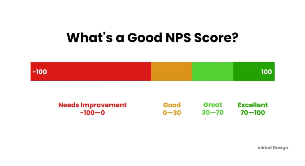
7. Net Promoter Score (NPS)
- What it is: A score based on one question: “How likely are you to recommend [our website/product] to a friend or colleague?” (on a 0-10 scale).
- Why it matters: It measures long-term loyalty and brand health, which is bigger than just UX. Promoters (who score 9-10) are free marketers. Detractors (0-6) are brand risks.
- How to measure it: A one-question survey. Your score is (% of Promoters) – (% of Detractors).
- A “Good” Score: Varies wildly by industry. Honestly, any score above 0 is “good.” A score of 50+ is excellent. 70+ is world-class.
- The Gotcha: NPS measures the entire brand experience, not just the website UX. A user might hate your checkout (bad UX) but love your product and prices (high NPS). You need to pair it with more specific metrics.
8. Customer Satisfaction (CSAT)
- What it is: A direct, “in-the-moment” survey. “How satisfied were you with [your checkout experience / this article / our support chat]?” (on a 1-5 scale).
- Why it matters: It’s transactional. It lets you zoom in on one specific part of your user journey and get an immediate pulse check.
- How to measure it: A one-question poll (using 1-5 stars or smileys) shown immediately after the interaction.
- A “Good” Score: Typically reported as the percentage of 4s and 5s. You should aim for 80%+.
- The Gotcha: It suffers from response bias. Only people who are very happy or very angry tend to respond. It gives you the extremes, which can still be helpful.
9. Customer Effort Score (CES)
- What it is: Asks the user, “How easy was it to [get your issue resolved/complete your purchase]?” (on a scale of “Very Difficult” to “Very Easy”).
- Why it matters: This has a massive correlation with loyalty. Research shows people don’t want to be “delighted”; they just want it to be easy. High effort is the number one predictor of customer churn.
- How to measure it: A one-question survey shown after a task, especially a “problem” task like a support request or a product return.
- A “Good” Score: You want the lowest effort score possible.
- The Gotcha: This is best used for service-oriented tasks (support, returns, checkout), not for general browsing.
Part 3: The “Context” Metric (The All-Important 10th)
10. Qualitative Insights (Session Replays & Feedback)
- What it is: This isn’t a single number. It’s the why behind all the other metrics. It is the practice of watching recordings of real user sessions and reading their open-ended feedback.
- Why it matters: This is the most important “metric” of all. A 50% abandonment rate (Quantitative) is a “what.” Watching 5 session replays (Qualitative) and seeing every single user get stuck on your broken “Submit” button is the answer.
- How to measure it: Tools like Hotjar or Microsoft Clarity (which is free). You watch recordings of users who failed a task. You look at heatmaps to see where people click. You read the comments from on-site feedback polls.
- A “Good” Score: There is no score. The “win” is the “Aha!” moment—the insight that makes you say, “Oh, that’s why people are dropping off!”
- The Gotcha: It’s time-consuming. You can’t watch 10,000 replays. The trick is to filter. Watch replays of users who failed a task or abandoned their cart.
The 3 “Vanity” UX Metrics You Must Ignore
You have limited time. Don’t waste it on numbers that don’t lead to action.

1. Page Views / “Traffic”
- Why it’s a trap: High page views are a cost. You pay for that bandwidth. It tells you nothing about whether those users were happy or prosperous. It is 100% vanity. I’d rather have 100 users with a 10% conversion rate than 10,000 users with a 0.1% conversion rate. Focus on Conversion Rate instead.
2. Time on Page
- Why it’s a trap: As I mentioned, this metric is meaningless without context. A 5-minute Time on Page for this blog post is excellent. A 5-minute Time on Page for your checkout form is a five-alarm fire. It’s an ambiguous number. Focus on Time on Task.
3. Bounce Rate (The Old Version)
- Why it’s a trap: The old definition (viewing one page and leaving) is obsolete. A user could land on your “Contact Us” page, find your phone number, and leave. That’s a 100% bounce and a 100% task success. GA4’s “Engagement Rate” is much better, but the lesson is: don’t panic if your “bounce rate” is high. Look at task success instead.
How to Build Your “Mission Control” Dashboard (For Free)
You don’t need a 10-screen setup. You just need two, maybe three, tools to start.
Tool 1: Google Analytics 4 (The “What”)
- What it’s for: The quantitative, behavioral data.
- What to set up: Use it to track Conversion Rate and Abandonment Rate. Create a simple funnel report for your primary business goal.
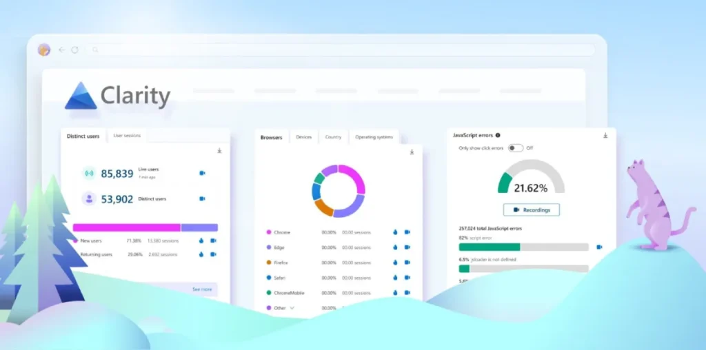
Tool 2: Microsoft Clarity (The “Why”)
- What it’s for: The qualitative, behavioral data.
- Why I like it: It’s 100% free and gives you Session Replays and Heatmaps.
- How to use it: Install the code. When GA4 shows you a 40% drop-off at ‘Checkout Step 2’, go to Clarity. Filter for users who dropped off at that exact step. Watch five recordings. You will find the bug or point of confusion.
Tool 3: A Simple Survey (The “Attitude”)
- What it’s for: The attitudinal data.
- How to use it: Don’t buy a complex tool to start. Use a free tool (like Tally or a Google Form) to email 10-20 recent customers. Ask them the 10 SUS questions. The manual, early feedback is golden.
Your Metrics Are a Diagnosis, Not a Cure
Metrics tell you the site is sick. They don’t fix it.
Data identifies the problem. Good web design is the solution.
The process is a simple loop: Build -> Measure (with these metrics) -> Learn (from the data) -> Build a better version.
That is what “data-driven design” actually means. It’s not about big data; it’s about making more thoughtful, smaller decisions every single day.
Measuring the User Experience
Your UX is just a vague opinion. You can’t prove your designs work because you don’t know how to measure them. This book is the quantitative playbook to fix that. It gives you the system for tracking the right metrics—from clicks to emotion. Stop guessing and start proving your value.
As an Amazon Partner, when you buy through our links, we may earn a commission.
Start Here: Your First Two Metrics
Don’t try to track all 10 tomorrow. You’ll burn out.
Start with just two.
- Task Success Rate: Manually test your main goal with five people (even family).
- Session Replays: Install Microsoft Clarity.
These two alone will give you more actionable insight than a 100-page analytics report. Your goal isn’t a perfect dashboard. It’s a better website. The data just points the way.
Ready to Fix the Numbers?
If your metrics are telling you your website is the problem, that’s not a failure—it’s an opportunity. It’s the first step to fixing it.
At Inkbot Design, we build websites that are designed to perform against these very metrics. We’re not just about looking good; we’re about working well.
See our web design services to understand how we build sites that guide users, not confuse them.
If you’re ready to stop guessing and start converting, request a quote today.
You can also browse more of our insights on the Inkbot Design blog.
Frequently Asked Questions (FAQs) About UX Metrics
What are UX metrics?
UX metrics are quantitative and qualitative data points used to measure, compare, and track the user experience of a website or product. They help you understand if your design is effective, efficient, and satisfying for your users.
What is the difference between behavioral and attitudinal metrics?
Behavioral metrics measure what users do (e.g., click, purchase, abandon a cart). Attitudinal metrics measure what users say (e.g., their satisfaction, loyalty, or perceived ease of use). You need both.
What is the difference between quantitative and qualitative UX data?
Quantitative data is about numbers (e.g., “70% of users succeeded”). Qualitative data is about why (e.g., “users said the button was confusing”). Session replays and survey comments are qualitative.
What is a “good” System Usability Scale (SUS) score?
The global average score for SUS is 68. A score above 80 is considered excellent (in the top 10% of websites), and a score below 50 indicates serious usability problems.
How is Net Promoter Score (NPS) calculated?
You ask customers to rate their likelihood of recommending you from 0-10. Your NPS is the percentage of Promoters (9-10) minus the percentage of Detractors (0-6).
Why is “Time on Page” a vanity metric?
It’s a vanity metric because it has no context. A long time on a blog page is good. A long time on a checkout page is a disaster. It doesn’t tell you why the user was there, so it’s not actionable.
What’s the best free tool for tracking UX metrics?
A great free stack is Google Analytics 4 (for quantitative data like conversion) and Microsoft Clarity (for qualitative data like session replays and heatmaps).
How many users do I need for a usability test?
You don’t need hundreds. Usability expert Jakob Nielsen famously stated that testing with just 5 users will typically uncover about 85% of the usability problems.
What’s the difference between Task Success Rate and Conversion Rate?
Conversion Rate is a specific type of Task Success Rate. “Task Success” can measure any task (e.g., “Can a user find the ‘About Us’ page?”). “Conversion Rate” measures the primary business goal (e.g., “Did the user make a purchase?”).
What is Customer Effort Score (CES)?
CES measures how much effort a user had to expend to complete a task, typically by asking “How easy was it to…?” on a scale from “Very Difficult” to “Very Easy.” Lower effort correlates strongly with higher customer loyalty.
How do I measure User Error Rate?
You can measure it in usability testing by counting how many mistakes users make on a specific task (e.g., 3 out of 10 users clicked the wrong button). You can also use form analytics tools to see which fields on a form cause the most validation errors.
What is more important: what users do or what users say?
Both are critical, but you should trust what users do (behavior) more than what they say (attitude). People often say one thing and do another. However, what they say is the best way to find out why they are doing it.
