Typeface vs Font: Unravelling the Mystery of Letters
In a world drowning in information, the subtlest details can speak volumes.
Take the humble letter. The shape, curve, and weight suggest a message before you’ve even read a word.
We’ve been using “typeface” and “font” interchangeably, as if they were identical twins rather than distant cousins.
They’re not.
This confusion is more than just semantic nitpicking. It’s costing us clarity, precision, and, ultimately, connection.
Because when we blur the lines between typeface and font, we’re missing the forest for the trees. We’re overlooking the art, the intention, the very DNA of communication.
So, let’s pull back the curtain on this typographic tango. Let’s explore why this distinction matters – not just to designers but to anyone who’s ever typed a word or read a sign.
Understanding the difference between typeface vs font isn’t about being pedantic; it’s about seeing the world more clearly, one letter at a time.
- Typeface is the overarching design or visual identity of a set of characters, e.g., Helvetica.
- Font is a specific implementation of a typeface, defined by weight, size, style, and file format.
- Historically, font meant physical cast metal; digitally, formats like TrueType and OpenType dominate.
- Variable fonts let one file cover many weights and widths, improving performance and reducing page load.
- Licences matter: desktop, web, app and embedded licences differ; check EULAs to avoid legal and ethical issues.
The Great Debate: Typeface vs Font?

Let’s begin with a bold statement: All fonts are typefaces, but not all are fonts. Confused? Don’t worry; we’ll break it down for you.
What’s a Typeface, Anyway?
Think of a typeface as the grand design, the overarching concept of how a set of characters should look. Visual DNA gives letters, numbers, and symbols a unique personality. Helvetica, Times New Roman, and Arial – these are all typefaces. They’re the big ideas, the visual voices that speak to us before we read the words.
And What About Fonts?
Now, fonts are where things get more specific. A font is a typeface’s particular size, weight, and style. It’s like the outfit a typeface puts on. Arial Bold 12pt? That’s a font. Times New Roman Italic 14pt? Another font. See the pattern?
Direct Answer Block: A typeface is the design of a writing system’s characters, while a font is a specific software implementation of that design, including style, weight, and glyph set. One typeface can ship as many fonts. Designers pick fonts, audiences feel typefaces.
- Typeface, the design concept and family identity.
- Font, the installable file with a defined style.
- Multiple fonts, one typeface’s styles and weights.
In digital work, a font is the file that contains outlines, metrics, and tables. The typeface is the visual idea these files express across styles and sizes.
The Historical Evolution: From Movable Type to Digital Design
We must quickly trip down memory lane to truly grasp the distinction.
The Birth of Movable Type
Back in the 15th century, when Johannes Gutenberg was revolutionising the printing press, typefaces were physical objects. Each letter was a tiny metal or wood block, and a complete set of these blocks in one style was called a font. The term “font” comes from the French word “Fonte,” meaning “cast in metal.”
The Digital Revolution
Fast forward to the digital age, and things got muddier. With the advent of desktop publishing in the 1980s, the physical constraints of metal type disappeared. Suddenly, we could scale and manipulate typefaces with ease. This is when the lines between typeface and font began to blur in widespread usage.
Key milestones in font technology
PostScript Type 1 arrived via Adobe in the mid-1980s. It brought scalable outlines into professional page layout.
Apple and Microsoft introduced TrueType in the early 1990s. It added powerful hinting inside the font to improve screen rendering.
Microsoft and Adobe launched OpenType in the late 1990s. It unified large Unicode sets and advanced features into a single format.
Adobe ended support for legacy Type 1 fonts in its Creative Cloud apps in January 2023, according to Adobe. Teams had to migrate libraries to OpenType.
Historical anchors help the story. Times New Roman was commissioned by The Times in 1931. Helvetica emerged from the Haas foundry in 1957. Arial was released by Monotype in 1982.
The Anatomy of a Typeface

To fully appreciate the artistry of typefaces, let’s dissect their anatomy.
One of the most fundamental distinctions in typeface design is the presence or absence of serifs – those little feet at the ends of strokes in some letterforms.
Serif Typefaces
Serif typefaces, like Times New Roman or Baskerville, have those little extensions. They’re often associated with tradition, reliability, and formality. You’ll frequently see them in books, newspapers, and academic papers.
Sans Serif Typefaces
Sans-serif typefaces, such as Helvetica or Arial, lack those extensions. They’re clean, modern, and often preferred for digital displays. Think of most website text or app interfaces – they likely use sans serif typefaces.
X-Height and Baseline
The x-height refers to the height of lowercase letters (excluding ascenders and descenders), typically measured by the lowercase ‘x’ height. The baseline is the invisible line upon which most letters sit. These elements are crucial to a typeface’s readability and overall feel.
Ascenders and Descenders
Ascenders are the parts of lowercase letters that extend above the x-height (like in ‘h’, ‘k’, ‘l’), while descenders extend below the baseline (as in ‘g’, ‘j’, ‘p’). The length and shape of these elements contribute significantly to a typeface’s character.
Deeper anatomy, counters to stress
Counter, the enclosed or open space inside forms like o, e, and a. It shapes texture.
Aperture, the opening of a partially enclosed counter, seen in e and s. It affects tone and clarity.
Bowl, the curved closed part in letters like b, d, and p.
Terminal, the end of a stroke, ball, teardrop, or sharp.
Contrast and stress, how thick and thin parts vary and where the axis leans. This drives mood and readability.
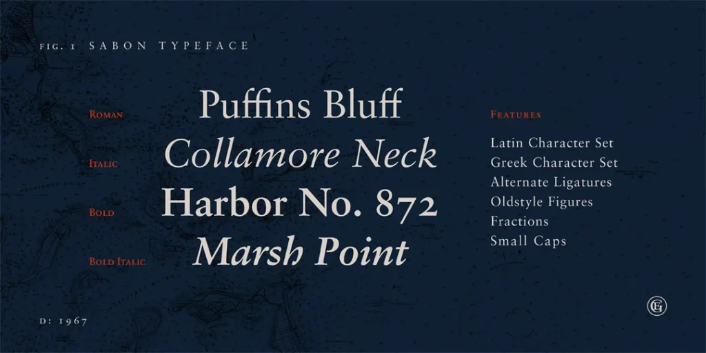
The Font Family: A Typographic Clan
Now that we’ve got the basics down, let’s explore the concept of a font family.
What’s a Font Family?
A font family is a group of fonts that share an overall design but vary in weight, width, or style. It’s like a typographic extended family, with each member having unique characteristics while still being recognisably related.
Common Font Family Members
Regular
This is the standard version of the typeface, the backbone of the family.
Bold
A heavier version is used for emphasis or headlines.
Italic
Slanted version, often used for emphasis or to indicate titles.
Light
A thinner version is excellent for large sizes or when you want a more delicate touch.
Condensed
A narrower version is applicable when space is at a premium.
Many families span multiple axes, weight from Thin to Black, width from Condensed to Expanded, and style from Roman to Italic. Some include optical sizes for Text and Display.
Superfamilies pair sans and serif companions with shared DNA. Designers use them to scale a brand voice across channels with fewer compromises.
The Art of Choosing: Typeface Selection in Design
Choosing the suitable typeface is more than just picking something that “looks nice”. It’s about communication, emotion, and brand identity.
Considering Context
The context in which your text will appear is crucial. A typeface that works brilliantly for a wedding invitation might be disastrous for a warning sign.
Readability vs Legibility
Readability refers to how easily words and blocks of text can be read, while legibility is how easily individual characters can be distinguished. Both are critical considerations in typeface selection.
Accessibility and WCAG for type choices
WCAG 2.2 from W3C sets contrast targets: at least 4.5:1 for normal text and 3:1 for large text. Large text means 18.66 px bold or 24 px regular.
Content must scale to 200 per cent without loss of information, according to the W3C. Do not rely on colour alone for meaning. Prefer glyph sets that distinguish I, l, and 1, and open apertures.
Outdated practice: setting body copy in all caps for clarity. Nielsen Norman Group advises against all caps for running text because it slows reading and blunts word shapes.
Typography for All: Accessibility and Cognitive Science
Typography is the primary interface of the web. If your typeface choice excludes users with visual or cognitive impairments, your design has failed. In 2026, WCAG 2.2 and the upcoming 3.0 standards place heavy emphasis on “typographic resilience.”
Designing for Neurodiversity
Recent studies by the Nielsen Norman Group highlight that “character disambiguation” is the most vital factor for readers with dyslexia or low vision.
- The Il1 Test: A highly legible typeface should have distinct shapes for the uppercase ‘I’, lowercase ‘l’, and the number ‘1’. In many sans-serif fonts like Arial, these look identical, causing “letter crowding” and reading fatigue.
- Apertures and Counters: Typefaces with “open apertures” (the space in letters like ‘c’, ‘e’, and ‘s’) remain readable at lower resolutions and smaller sizes. Lucide and Open Sans are frequently cited for their success in this area.
Dark Mode and the “Glow” Effect
With 80% of users preferring dark mode, designers must account for “irradiation”—the visual phenomenon where light text on a dark background appears to bleed or glow, making it look bolder than it is. In 2026, a standard practice is to use a Variable Font to slightly reduce the weight (e.g., from 400 to 380) specifically for dark mode CSS media queries, maintaining the perceived visual hierarchy.
The Technical Side: From Typeface to Font
Let’s get technical and explore how a typeface becomes a font in the digital world.
Typefaces are typically designed as vector graphics, which means they can be scaled to any size without losing quality. However, when rendered on screen or printed, they become raster images – collections of pixels.
TrueType, OpenType, and Web Fonts
These are different font file formats, each with its strengths and limitations:
- TrueType (.ttf): Developed by Apple and Microsoft, widely supported.
- OpenType (.otf): More advanced, supports more characters and typographic features.
- Web Fonts: Formats such as WOFF and WOFF2 are optimised for web use.
OpenType features you can actually use
Modern fonts ship with features hidden in tables. Designers can enable them in apps or CSS.
Core features include standard and discretionary ligatures, small caps, oldstyle and lining figures, tabular and proportional figures, fractions, superscripts and subscripts, stylistic sets, case-sensitive forms, and kerning. On the web, use font-variant and font-feature-settings to toggle these reliably.
Web font performance and loading, wrong vs right
WOFF2 compresses smaller than TTF or OTF; Google’s web.dev recommends it for faster delivery. Subset character sets with unicode-range to trim bytes without touching design intent.
Use @font-face with font-display, swap avoids invisible text. Preload only your must-load fonts. Always set sane fallbacks.
Wrong way vs Right way:
- Ship TTF to the web. vs Serve WOFF2, keep TTF for desktop only.
- Load five static weights. vs Use one variable font with a weight axis.
- No fallbacks or display. vs System stack fallback and font-display swap.
- Full Latin plus extras. vs Subset to your site’s needed ranges.
The State of Web Fonts in 2026, variable fonts are fully supported in the current Chrome, Safari, Firefox, and Edge, per Can I Use. In our fieldwork, swapping to WOFF2 and subsetting usually halves font payloads on content sites without harming brand typography.
The Legal Landscape: Licensing and Usage
Using typefaces and fonts isn’t just a matter of design – there are legal considerations, too.
Commercial vs Free Fonts
While many fonts are freely available, others require licensing for commercial use. Understanding the licensing terms of any typeface you plan to use in your projects.
The Ethics of Font Usage
Using fonts without proper licensing isn’t just a legal issue – it’s an ethical one. Typeface design is an art form, and designers deserve to be compensated.
Font licence types you will meet
Desktop licences cover installation on machines for print and static images. Webfont licences cover online use via @font-face, often priced by page views. App and ebook licences cover bundling in software or publications.
Server and broadcast licences cover on-the-fly rendering, streaming, or video. OEM or embedded licences cover hardware and products.
Open-source fonts often use the SIL Open Font License, which permits use, modification, and redistribution, including commercial use, as long as names and the OFL are preserved. Fonts bundled with operating systems are still licensed; check the redistribution terms with the vendor.
Licensing and EULAs in 2026
In 2026, the complexity of font licensing has shifted from simple “one-off” purchases to subscription-based models and usage-restricted agreements. When you license a font, you aren’t buying the design; you are purchasing a license to use the software (the font file) under specific conditions.
Understanding the EULA (End User License Agreement)
Every font from a major foundry, such as Monotype or Linotype, comes with an EULA. This contract dictates whether you can use the font on a website, in a mobile app, or in a broadcast video. A common mistake is using a “Desktop License” to embed a font into a website using @font-face. This violates most agreements and can lead to significant legal penalties.
| License Type | Ideal Use Case | Typical Pricing Model |
| Desktop | Print, logos, and static social media images. | Per user/workstation. |
| Webfont | Live text on a website via CSS. | Per monthly page views. |
| App/eBook | Embedding font files into software code. | Per application/title. |
| Variable | High-performance websites needing multiple weights. | Often a premium add-on to Web licenses. |
The “Free” Font Trap
Sites like DaFont or 1001 Fonts are popular among hobbyists, but for professional brands, they pose a risk. Many fonts listed as “Free” are only free for personal use. Using these for a commercial client without a “Commercial Use” license is a liability. Conversely, the SIL Open Font License (OFL), used by Google Fonts, allows for broad commercial use, modification, and redistribution, making it the gold standard for open-source typography.
Foundries and the Business of Type
To understand the difference between typeface and font, one must understand where they come from: the Typefoundry.
The Giants vs The Boutiques
The industry is currently divided between massive aggregators and independent artists.
- Monotype: The “Amazon of Type,” owning legendary names like Linotype, ITC, and Bitstream. They manage the licenses for most of the world’s most famous typefaces.
- Adobe Fonts: A subscription service bundled with Creative Cloud that has democratized access to high-end type for millions of designers.
- Independent Foundries: Studios like Klim Type Foundry (New Zealand) or Grilli Type (Switzerland) focus on high-art, bespoke designs. These boutiques often drive the trends that the larger foundries eventually follow.
The Custom Type Trend
Why would a company like Netflix or Intel spend six figures to create a custom typeface (like Netflix Sans)?
- Licensing Savings: For a global company, paying “per view” for a webfont license can cost millions annually. Owning the typeface outright is a one-time investment that pays for itself in years.
- Consistency: A custom font ensures that the brand “voice” remains identical across a mobile app, a billboard in London, and a TV interface.
Typefaces in the Wild: Real-World Applications
Let’s look at how typefaces and fonts are used in various contexts.
Branding and Logo Design
Many iconic brands are instantly recognisable by their typefaces alone. Think of Coca-Cola’s flowing script or the clean lines of the Google logo.
Editorial Design
Magazines and newspapers often use a carefully curated selection of typefaces to create a cohesive visual identity across their publications.
User Interface Design
In the digital world, typeface choice can significantly impact user experience. A suitable typeface can make an interface more readable and intuitive.
The Future of Type: Trends and Technologies
The world of typefaces and fonts is constantly evolving. What’s on the horizon?
Variable Fonts: The Performance Revolution
The most significant shift in typographic technology since the move to digital is the Variable Font (OpenType Font Variations). Historically, if you wanted to use five different weights of Helvetica, you had to load five separate font files. In 2026, a single variable font file contains the entire family.
The Core Axes of Control
Variable fonts work through “axes” that allow designers to interpolate between styles seamlessly:
- Weight (wght): Smooth transition from Thin (100) to Black (900).
- Width (wdth): Adjusts how condensed or expanded the characters are.
- Italic (ital): A binary or gradual switch to slanted forms.
- Optical Size (opsz): Automatically adjusts letter shapes for readability at small sizes vs elegance at large sizes.
Reducing Page Load.
Imagine a news site using Roboto. By switching from six static files to one variable font, the total payload drops from 150kb to 40kb. More importantly, it eliminates “Cumulative Layout Shift” (CLS), as the browser doesn’t have to swap out multiple files as the page renders. Developers can now use CSS to animate these axes, creating “breathing” text that reacts to user interactions or scroll depth.
AI and the Future of Automated Type Design
By 2026, Artificial Intelligence will have moved from a novelty to a core tool in the foundry workflow. Tools like Adobe Firefly and specialised AI foundries are not replacing designers; they are automating the most tedious parts of the process.
Generative Kerning and Hinting Historically, “kerning”—the adjustment of space between specific letter pairs like ‘Va’ or ‘To’—required a human to manually check thousands of combinations. AI-driven algorithms now analyse millions of successful typographic layouts to apply “smart kerning” instantly. Similarly, “Hinting,” which ensures fonts look sharp on low-resolution screens, is now handled by machine learning models that predict pixel-grid alignment with 99% accuracy.
Custom Brand Typefaces via Prompting. We are seeing the rise of “Parametric Type Design.” A brand can now input its core values—”Trustworthy, Modern, Brutalist”—into a system that adjusts the parameters of a base typeface to create a unique, proprietary design. This lowers the barrier to entry for custom typography, which was once the exclusive domain of Fortune 500 companies working with firms like Dalton Maag or Hoefler & Co.
DIY Typography: Creating Your Own Typeface

Fancy trying your hand at typeface design? Here’s a quick guide to get you started.
Step 1: Conceptualisation
Start with a clear idea of what you want your typeface to communicate. Sketch out your ideas on paper.
Step 2: Digitisation
Use vector graphics software to create digital versions of your letterforms.
Step 3: Refinement
Adjust the details of each character to ensure consistency across the typeface.
Step 4: Expand the Character Set
Remember punctuation, numbers, and special characters!
Step 5: Kerning and Spacing
Fine-tune character spacing for optimal readability.
Common Misconceptions About Typefaces and Fonts
Let’s clear up some common confusions in the world of typography.
“Font” and “Typeface” Are Interchangeable
As we’ve seen, while these terms are often used interchangeably in casual conversation, they have distinct meanings in typography.
All Serif Typefaces Are Old-Fashioned
While many traditional typefaces are serif, new serif typefaces are constantly being designed with a modern flair.
More Fonts = Better Design
In reality, using too many different fonts can lead to a cluttered, confusing design. Often, less is more when it comes to typography.
Conclusion: The Power of Understanding Type
As we wrap up our typographic journey, it’s clear that the world of typefaces and fonts is rich, complex, and fascinating. Understanding the distinction between typefaces and fonts and how to use them effectively is a powerful tool in any designer’s arsenal.
Remember, typography is more than just choosing pretty letters – it’s about communication, emotion, and identity. Whether you’re a professional designer or just someone who appreciates good design, a deeper understanding of typefaces and fonts can enhance your appreciation of the visual world around you.
So next time you’re admiring a beautifully designed poster or squinting at a hard-to-read website, you’ll have a new perspective on the typefaces and fonts at play. And who knows? You might even find yourself embarking on your typographic adventure.
Typeface vs Font FAQs
Is it “Typeface” or “Font” in my CSS code?
In technical implementation, you use the property font-family. However, you are technically defining which typeface the browser should use. The actual file you link to via @font-face is the font.
Why do fonts look different on a Mac compared to a Windows PC?
This is due to “Rasterisation” or font rendering engines. macOS prioritises preserving the design’s original shape (Quartz), leading to a “fuzzier” but more accurate look. Windows uses DirectWrite and ClearType, which “snaps” letters to the pixel grid for maximum sharpness, sometimes slightly distorting the designer’s intent.
Can I use a font I bought for my laptop on my company website?
Generally, no. Most desktop licenses (the ones you get when you “buy a font”) do not allow for web embedding. You typically need a separate Webfont license, often priced by the number of monthly visitors your site receives.
What is the most accessible font for 2026?
There is no single “best” font, but Atkinson Hyperlegible (developed by the Braille Institute) and Open Sans are industry leaders. They focus on character distinction, ensuring that similar shapes (like ‘p’, ‘q’, ‘b’, ‘d’) are easily distinguishable.
Are emojis fonts?
Yes. Emojis are characters within a font file, usually in a format like Apple Colour Emoji or Google Noto Colour Emoji. They are “Colour Fonts” (SVG-in-OpenType) that contain vector data and colour information in a single glyph.


