The History of Swiss Design: More Than Just Grids and Helvetica
When most people hear “Swiss Design,” they picture a “retro” poster with a big block of Helvetica. They consider it a style. A look.
They’re wrong.
Swiss Design, also known as the International Typographic Style, isn’t a specific “look.” It’s a philosophy. It’s a brutal, disciplined, and relentless pursuit of clarity. It’s a system for communicating a message with absolute, objective precision, stripping away everything that doesn’t serve the content.
As a design consultant, I see entrepreneurs make the same mistakes daily. Their websites are chaotic. Their branding is a jumble of competing ideas. They add more “flair,” more colours, more fonts, hoping to look “professional,” and achieve the exact opposite.
Swiss Design is the antidote. It’s one of the most durable, disciplined, and commercially potent movements in graphic design history.
Before we dig into the history, let’s clear the air.
- “Minimalism” is not Swiss Design. Lazy, empty space with a tiny font is not clear; it’s just lazy. Swiss Design is often information-dense. The genius is in organising that density, not avoiding it.
- Helvetica is not a magic wand. Slapping Helvetica on a bad design doesn’t make it good. It just makes it a bad design set in Helvetica. The system—the grid, the hierarchy, the spatial relationships—is the magic. The font is just the tool.
- It is not “retro” or “old.” The interface on your smartphone? The dashboard in your car? The principles powering Google’s Material Design and Apple’s Human Interface Guidelines? That is Swiss Design in its modern form. It’s timeless because it’s functional.
This article is for the entrepreneur who wants to understand why this style works and how its principles can make your business look more trustworthy, professional, and clear.
- Swiss Design is a philosophy prioritising clarity, function and objective communication, not merely a visual "look" or minimalist trend.
- Its toolkit—modular grid systems, neutral sans‑serif typography and objective imagery—creates consistent, information‑dense yet organised layouts.
- Born in mid‑20th century Switzerland, its principles underpin modern UI/UX and corporate identity, making brands look trustworthy and global.
The Core Problem: A World of Chaos
To understand Swiss Design, you must first understand the world it was born into.
Imagine the design landscape of the early 20th century. It was a mess.
- Artistic Chaos: Styles such as Art Nouveau, Art Deco, and Futurism dominated. They were expressive, illustrative, and subjective. A German poster looked German. A French poster looked French. They were beautiful, but they were also pieces of art, reflecting the designer’s personal feelings.
- Nationalistic Propaganda: In the 1930s and during WWII, design was weaponised. It became florid, nationalistic, and emotionally manipulative.
- A Broken Continent: After 1945, Europe was rebuilding. International trade and collaboration were no longer optional; they were essential for survival.
This new world presented a new challenge: how to communicate clearly to a multicultural, multilingual audience?
How does a Swiss watchmaker sell a product in Japan? How does an airline create a timetable that a pilot from America, a passenger from Italy, and a baggage handler from Germany can all read and trust?
The old, illustrative, subjective styles failed. Business needed a new visual language. One that wasn’t artistic or emotional, but objective, neutral, and universal.
This is the problem Swiss Design set out to solve.
The Godfathers: Who Built This Thing?
The style didn’t appear overnight. It was an evolution, a convergence of ideas from movements like Bauhaus, De Stijl, and Russian Constructivism. But its true cradle was in two Swiss schools: the Basel School of Design and the Zurich School of Arts and Crafts.
The Teacher: Ernst Keller (Zurich)
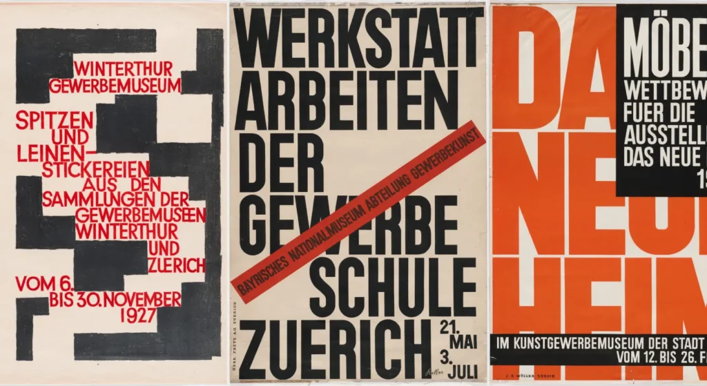
If there’s one “father” of the style, it’s Ernst Keller. He began teaching in Zurich in 1918. His core idea was revolutionary for the time:
The solution to the design problem should emerge from its content.
This is the bedrock. You don’t start with a pretty picture. You start with the message. What needs to be said? To whom? In what order? The grid, the font, the colours… all are just functional solutions to those questions. He taught his students—who would become the legends of the movement—to “design” with structure, not decoration.
The Theorist: Max Bill (Bauhaus Link)
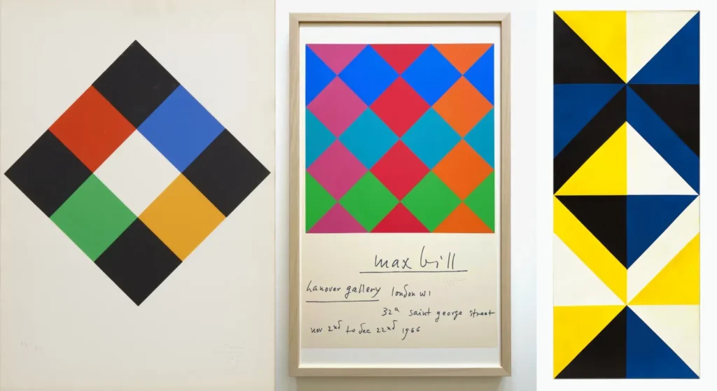
Max Bill was a true polymath—architect, painter, and designer. He studied at the Bauhaus in Germany and brought its ideas of mathematical precision and “Concrete Art” (art based on pure, geometric forms) to Switzerland. He argued that design could be built on a foundation of pure mathematics, removing the artist’s subjective hand entirely.
The Masters: The Basel & Zurich Schools
Keller’s students and others influenced by Bill formed two main camps in the 1950s.
- Armin Hofmann (Basel): Hofmann was a master of fundamental principles. He focused on the graphic elements: the dot, the line, contrast, tension, and balance. His work feels more intuitive, a more graphic-heavy exploration of structure.
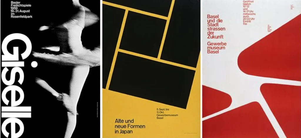
- Josef Müller-Brockmann (Zurich): This is the name you probably know. Müller-Brockmann was the ultimate evangelist. He took Keller’s ideas and forged them into a rigid, replicable system. He is the master of the grid system.
Müller-Brockmann’s work is the epitome of the style: mathematical, asymmetrical, and ruthlessly objective. He believed the designer’s personality should be completely invisible. The message, and only the message, should be the hero. His book, Grid Systems in Graphic Design, remains the definitive guide for this approach.
Grid Systems in Graphic Design
Your layouts are a chaotic mess because you’re designing without a system. This book is the definitive professional playbook from the master. It gives you the exact, no-nonsense rules for using grids to bring order, clarity, and structure to your work. Stop guessing and start designing like a pro.
As an Amazon Partner, when you buy through our links, we may earn a commission.
The Swiss Design Toolkit: Deconstructing the Style
So, what are the actual, tangible elements of the International Typographic Style? It’s a surprisingly short list. The discipline is in how they are combined.
1. The Grid System (The Scaffold)
This is the most important element. Swiss Design is based on a grid layout.
- It’s not just any grid; it’s a modular, mathematical system that dictates the placement, scale, and relationship of every single element on the page.
- It creates order, harmony, and rhythm.
- It allows for asymmetrical layouts that are still perfectly balanced. This was a radical departure from the traditional, centred layouts of the past. Asymmetry felt dynamic, modern, and purposeful.
- For a business, the grid is a tool for consistency. It ensures that your website, your brochure, and your business card all feel like they belong to the same, organised family.
2. Sans-Serif Typography (The Voice)
The choice of typeface was a philosophical one.
- Ornate, serif fonts (such as Blackletter in Germany or Bodoni in Italy) often felt regional, old-fashioned, and evocative of emotions.
- The Swiss pioneers chose sans-serif (meaning “without serifs”) typefaces. Why? They felt neutral, objective, and “engineered.” They weren’t “beautiful”; they were functional.
- The text itself was often flush left, ragged right. This respected the natural flow of reading, unlike justified text, which can create awkward, forced spacing.
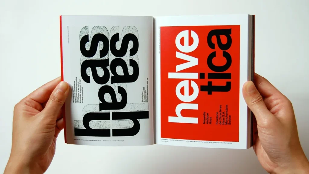
Three typefaces became the holy trinity of the style:
- Akzidenz-Grotesk (1898): The original. The inspiration. It was an existing font that the Swiss designers rediscovered.
- Univers (1957): Designed by Adrian Frutiger. This was a system—a family of 21 different weights and widths, all mathematically related. A designer could use one font family to create all the hierarchy they needed (light, regular, bold, condensed, extended).
- Helvetica (1957): Designed by Max Miedinger and Eduard Hoffmann. It was created to be the ultimate neutral typeface. Its name is literally the Latin word for “Swiss.” It exploded in popularity, becoming the default voice of corporate America and, eventually, the digital world.
3. Objective Photography (The Image)
The style rejected subjective, hand-drawn illustration. Instead, it championed objective photography.
- Photos were clean, stark, and “as-is.”
- If it were a poster for a chair, you would show the chair. You didn’t show a drawing of a happy person sitting in the chair.
- This puts the product or subject first. It was honest, direct, and treated the audience as intelligent.
4. Minimalist Palette (The Colour)
Colour was used for function, not decoration.
- Palettes were often severely restricted.
- Lots of black and white, with maybe one or two bold primary colours (red, blue, yellow) used sparingly to direct the eye, highlight key information, or provide a clean, graphic background.
Case Study: The Icons of the Style
These principles sound abstract. Let’s look at where they came together.
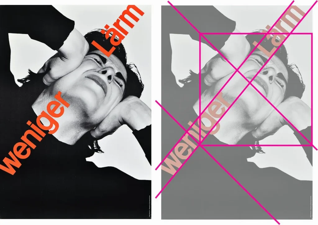
The Zurich Posters (Müller-Brockmann)
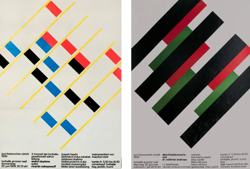
Müller-Brockmann’s concert posters for the Tonhalle in Zurich are the style’s purest expression. Take a look at his “Musica Viva” posters. The text “Musica Viva” is the entire graphic. The letters are angled, overlapping, and perfectly balanced, creating rhythm and tension. It’s all built on a strict mathematical grid. It doesn’t tell you what the music sounds like; it shows you the structure and energy of the music itself.
The Swiss Railways Clock (Hans Hilfiker)

Designed in 1944, this is a masterpiece of functional design.
- The Problem: Passengers on a moving train need to tell the time at a glance, from a distance.
- The Solution: No numbers. Just thick, black, unadorned bars. A high-contrast black-on-white face.
- The Genius: The red second hand. It’s shaped like a station guard’s signalling disc. It sweeps the face in 58.5 seconds, then pauses at the 12. This allows the master clock to send a signal, synchronising every clock in the station to the exact minute. It’s a pure function. Apple famously licensed this design for its iOS 6 clock app.
The Birth of Corporate Identity (Lufthansa, Shell)
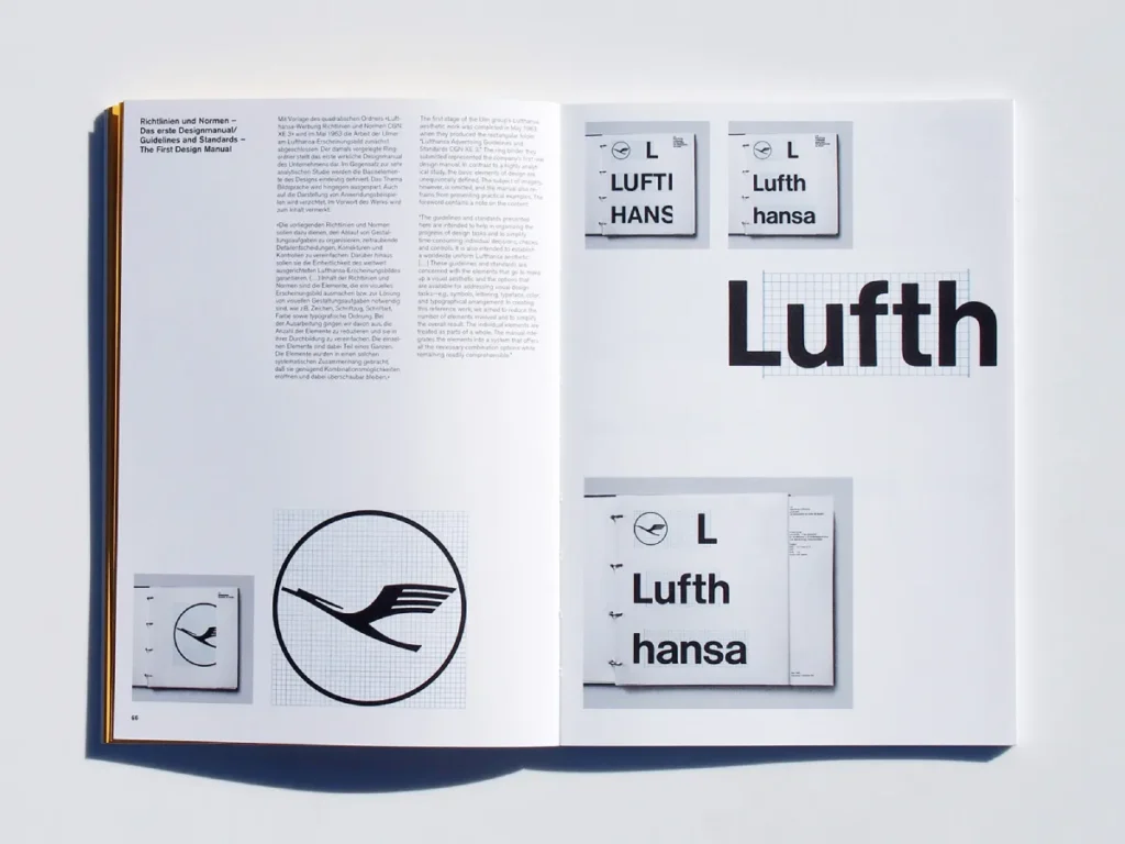
This systematic approach was a gift to international corporations. A grid and a single font family (like Univers) could be used to design everything:
- The company logo
- The plane’s tail fin
- The ticket counter signage
- The pilot’s timetable
- The in-flight safety manual
This is the birth of the modern brand guidelines. It ensured that a company like Lufthansa or Shell looked exactly the same in New York, London, and Tokyo. It built global recognition and, more importantly, trust.
This move from posters to corporate systems is the most important leap for entrepreneurs to understand. This is where Swiss Design became the driving force behind modern branding. A clear, consistent visual system is the foundation of a trustworthy brand.
Show Your Work: The Swiss Toolkit: Then vs. Now
The tools have changed, but the principles remain the same. This is my “Human Effort” table, showing how the core Swiss principles are directly applied in the digital products you use every day. This isn’t history; it’s your current reality.
| Core Principle | 1960s Print Application (e.g., Poster) | 2020s Digital Application (e.g., Website/App) |
| The Grid System | A modular, multi-column grid printed on a layout board to align text and photos. | A 12-column responsive grid (like in Bootstrap or Figma) that reflows content from a desktop to a mobile screen. |
| Typography | Headlines in Akzidenz-Grotesk or Helvetica. Body text in Univers. | UI text in Inter, San Francisco (Apple), or Roboto (Google). These are “neo-grotesque” fonts designed for digital clarity. |
| Hierarchy | Achieved through font size (e.g., 72pt), weight (bold), and position (top of page). | Achieved through HTML tags (<h1>, <h2>, <p>) and CSS (font-weight, margin) to create a clear information structure for users and search engines. |
| Objective Imagery | A stark, black-and-white, high-contrast photo of the product. | A clean, product-only shot on a white background in an e-commerce store. Or a clear, functional icon in a UI. |
| Negative Space | A single “primary action colour” (e.s, a blue button) is used only for clickable links and “buy” buttons to guide the user. | Padding and margins around buttons, text blocks, and UI cards. This “air” reduces cognitive load and improves usability. |
| Functional Colour | A single splash of red to highlight a date or location. | A single “primary action colour” (e.g, a blue button) is used only for clickable links and “buy” buttons to guide the user. |
Why Swiss Design Took Over the World
The style gained global popularity in the 1960s and 1970s. American corporations, such as IBM, American Airlines, and Knoll, adopted it.
Why? It made them look:
- Modern
- Efficient
- Global
- Trustworthy
- Serious
It was the perfect visual language for the new, buttoned-up, computer-driven corporate age.
The Digital Age: Swiss Design’s Second Life
But its true second coming was the digital revolution.
Early computer screens were low-resolution. The web was crude. The detailed, illustrative styles of the ’90s looked terrible.
What looked good?
- Grids.
- Clean sans-serif fonts.
- Clear hierarchy.
- Flat areas of colour.
The principles of Swiss Design were perfectly suited to the constraints of the screen.
Fast forward to today. UI/UX (User Interface / User Experience) design is Swiss Design.
When you use an app, you aren’t there to admire the designer’s artistry. You are there to accomplish a task: book a flight, check your balance, send a message. You demand clarity, speed, and function.
That is the Swiss Design philosophy, alive and well, in your pocket.
The “Swiss Clarity Check”: 3 Principles for Your Business
You don’t need to be Josef Müller-Brockmann to benefit from this. As an entrepreneur, you can apply these principles right now to make your brand instantly clearer.
1. Audit Your Hierarchy
Look at your website’s homepage. Can a new visitor identify (1) what you do, (2) who it’s for, and (3) what to do next in 3 seconds?
If not, your hierarchy is broken. Your headlines (<h1>) must be obviously more important than your sub-headlines (<h2>), which must be more important than your body text (<p>). This is achieved through considerations of size, weight, and space.
2. Weaponise Your Negative Space
Stop filling every pixel. That “empty” white space on your site is active space. It’s the most powerful tool you have. It directs the eye, separates ideas, and reduces cognitive load. A crowded design looks cheap and desperate. A design with “air” looks premium, confident, and calm.
3. Commit to One Workhorse Font
Stop using a “fun” font for headlines and a “serious” font for text. It’s visual clutter.
Pick one modern, professional sans-serif font family. It could be Inter (free on Google Fonts), Open Sans, or Montserrat. Then, learn to use its weights. Use “Bold” or “Black” for headlines. Use “Regular” for body text. Use “Light” for a testimonial. You’ve just created a perfect hierarchy and consistency with one font family.
Where Entrepreneurs Go Wrong (My Pet Peeves, Revisited)
Applying this is hard. It’s a “subtractive” process, and most people are wired to “add.”
- The “Boring” Trap: The business owner says, “It looks too boring. Can we add a drop shadow? A different font? More colours?” Every time you “add” something, you dilute the message. Clarity is not boring. Clarity is respect for your customer’s time.
- The Grid as a Prison: A common mistake is to treat the grid as a rigid cage, making everything look static. The masters used the grid to create dynamic tension. They’d place a tiny element in a giant empty grid quadrant, creating energy and focus. The grid is a scaffold, not a jail.
- Lazy Minimalism: Again, just putting a few words on a white page isn’t Swiss Design. It’s just empty. The goal is information clarity. A Swiss-inspired train timetable is incredibly dense, but it’s organised so you can find your train in seconds.
The Unshakeable Legacy
The history of Swiss Design is the history of a search for a timeless, universal language of graphic design. It’s a story of designers choosing to serve the message over their own egos.
It’s not a “style” to be copied. It’s a process to be adopted.
It’s the belief that good design is not about decoration; it’s about solving a communication problem. For an entrepreneur, that problem is building trust and clearly stating your value. In a world that is louder, faster, and more chaotic than ever, the Swiss principles of clarity, order, and function are no longer a design choice. They are a business imperative.
Ready to Build a Clearer Brand?
Applying this level of discipline is tough. It’s easy to add clutter; it’s incredibly hard work to subtract and achieve true, functional clarity. If your brand feels chaotic, if your website is confusing, and if you’re ready for a logo design and brand identity system that builds trust, that’s what we do.
We build brands on the timeless principles of clarity and function. If you’re ready to get serious, you can request a quote today.
Or, if you’re still exploring, you can see more of our thoughts on design and branding right here at Inkbot Design.
FAQs
What is Swiss Design in simple terms?
Swiss Design (also known as the International Typographic Style) is a design philosophy from the 1950s that prioritises clarity, objectivity, and function. It’s known for its use of layout grids, sans-serif fonts (like Helvetica), and asymmetrical layouts.
What are the 5 main principles of Swiss Design?
The Grid: A mathematical grid system to create order.
Sans-Serif Fonts: Using “neutral” fonts like Helvetica or Univers.
Objective Imagery: Using clear photography, not subjective illustration.
Asymmetry: Creating dynamic, balanced layouts that aren’t centred.
Clarity First: The message is always more important than the designer’s personal style.
Who started Swiss Design?
It was developed by a group of designers, but the “father” is often considered Ernst Keller, who taught at the Zurich School of Arts and Crafts. His students, like Josef Müller-Brockmann and Armin Hofmann, became its most famous practitioners.
Why is Helvetica so popular in Swiss Design?
Helvetica (released in 1957) was designed to be the ultimate neutral, clear, and functional typeface. It has no strong “personality,” so it allowed the content to be the focus. Its wide range of weights made it a versatile tool for building hierarchy.
What is the difference between Swiss Design and Minimalism?
Minimalism’s goal is to reduce elements to their barest essentials (“less is more”). Swiss Design’s goal is clarity of communication. A Swiss-designed piece can be very dense with information (like a timetable), but it will be perfectly organised. Lazy minimalism is just empty; Swiss Design is organised.
Is Swiss Design still relevant today?
Yes. It’s arguably more relevant than ever. The principles of Swiss Design (grids, typographic hierarchy, clarity) are the foundation of all modern UI/UX design. Apple’s iOS, Google’s Material Design, and virtually all modern apps and websites are built on its philosophy.
What is the International Typographic Style?
This is the other, more formal name for Swiss Design. It was called “international” because its goal was to create a universal, objective visual language that could be understood across different countries and cultures, making it perfect for international corporations and events.
What is a “grid system” in design?
It’s a “scaffold” of intersecting horizontal and vertical lines that a designer uses to align all text and images. This creates a sense of order, rhythm, and professional harmony. It’s the “invisible architecture” of the page or screen.
What’s a good example of Swiss Design in a modern brand?
While many brands use its principles, a classic example is the New York City Subway system’s signage. Designed by Massimo Vignelli (who was heavily influenced by the style), it uses Helvetica, a strict grid, and clear colour-coding to help millions of people navigate a complex system.
How can I use Swiss Design for my small business?
Use a clear hierarchy for all your text (a clear H1, H2, body).
Use generous white space (padding/margins) to let your content “breathe.”
Choose one professional sans-serif font family (like Inter or Open Sans) and use its different weights (light, regular, bold) to create contrast.

