Restaurant Logo Design: A Guide to Profitable Branding
You have spent thousands on the interior fit-out. You have agonised over the supply chain for your Wagyu beef. You have hired a head chef with an ego larger than the walk-in freezer.
Yet, you treat your restaurant logo design like an afterthought, something to be scribbled on a napkin or outsourced to a budget freelancer for the price of a main course.
This is a fatal error.
In the hospitality industry, your logo is the handshake before the hello. It is the single visual cue that tells a hungry pedestrian whether you offer a £150 tasting menu or a £5 kebab.
It appears on everything from the high-street signage and social media avatars to the grease-stained thermal receipts stapled to Uber Eats bags. If it fails in any of these environments, you lose money.
We do not care if your logo “sparks joy.” We care if it sparks revenue.
This guide examines the forensic details of restaurant branding, distinguishing between amateur sketches and commercial powerhouses.
- Treat the logo as a business asset—design to drive revenue, not just aesthetics.
- Ensure scalability and adaptability: vector formats, monotone variant, and responsive icon.
- Match colours and typography to price point and cuisine—avoid mismatched signals.
- Stress-test for real-world use: thermal receipts, embroidery, signage, and favicons.
- Hire professionals for ownership, strategy, and longevity—avoid DIY templates.
What is Restaurant Logo Design?

Restaurant logo design is the strategic creation of a visual identifier that instantly communicates the cuisine, price point, and atmosphere of a dining establishment. It is not art; it is a functional business asset.
A functional restaurant logo must satisfy three non-negotiable technical requirements:
- Scalability: It must remain legible when shrunk to 16×16 pixels (a browser favicon) or blown up to 3 metres wide (an awning).
- Adaptability: It must work in full colour (digital), single-colour black (menus), and low-resolution monochrome (thermal receipt printers).
- Relevance: It must use semiotics (visual shortcuts) to signal the type of food served without necessarily showing a literal picture of a burger or a fork.
The Psychology of Appetite: Why Your Brain Eats First
Before a customer tastes your food, they taste your brand. This is not poetic license; it is biology. The human brain processes visual data 60,000 times faster than text. When a potential diner scans a street of restaurants, they are not reading menus; they are decoding symbols.
The Colour of Hunger (Gastrophysics)
Colour theory in hospitality is often reduced to the notion that “red makes you hungry.” While true, it is an oversimplification. You need to understand why.
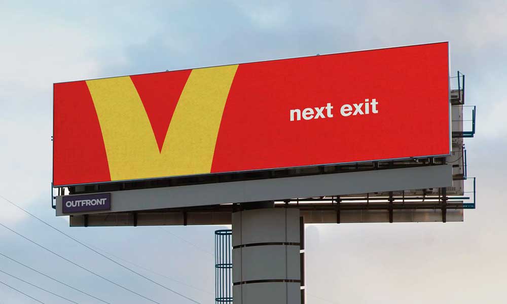
Red and yellow stimulate the metabolism. They raise heart rates slightly. This is why Fast Moving Consumer Goods (FMCG) and Quick Service Restaurants (QSRs), such as McDonald’s, Burger King, and KFC, utilise these frequencies. They want you to eat fast, leave fast, and increase table turnover.
However, if you run a high-end bistro, slapping primary red on your signage is a disaster. It screams “cheap.”
The Wavelengths of Dining:
- Orange/Red: Stimulates appetite and urgency. Best for Fast Casual and Takeaways.
- Green: Signals freshness, health, and sustainability. Essential for “Farm-to-Table” or vegan concepts (e.g., Sweetgreen).
- Black/Gold/White: The uniform of luxury. It signals confidence. The absence of colour implies that the food provides the vibrancy. Think of the minimal branding of Nobu or The Ivy.
- Blue: The appetite suppressant. In nature, blue food is rare and often poisonous (mould, berries). Blue is the least appetising colour in the spectrum. Use it only if you are a seafood restaurant (signalling the ocean) or a Greek cuisine establishment. Otherwise, avoid it.
Typeface as Texture
Typography does the heavy lifting when the image is absent. The font you choose conveys to the customer the texture of the food.
- Serif Fonts (e.g., Bodoni, Garamond): These have “feet” at the ends of letters. They imply tradition, heritage, and slow cooking. A serif font suggests your sauce has been reducing for 12 hours.
- Sans Serif (e.g., Helvetica, Futura): Clean, geometric, modern. They imply speed, precision, and cleanliness. A sans-serif logo suggests your burger is smashed to perfection on a hot grill in 3 minutes.
- Script/Handwritten: Personal, artisanal, messy (in a good way). It suggests a human made this, not a machine.
Consultant’s Note: Never use “Comic Sans” or “Papyrus.” If you do, you are telling your customers that your kitchen hygiene standards are likely as lax as your design choices.
The Technical Gauntlet: Where Amateurs Fail
Most restaurant owners look at a logo on a bright backlit MacBook screen and say, “I love it.” They fail to consider where that logo actually lives.
This is where the “Cost of Retrieval” for your brand equity becomes expensive. If you do not plan for these substrates, you will pay for it later in re-printing costs.

1. The Thermal Receipt Test
This is the ultimate stress test. Your logo will be printed on a thermal receipt printer, usually at 200 DPI (dots per inch), in black and white, on cheap paper that turns black when heated.
If your logo relies on a subtle gradient from light orange to dark red, it will print as a solid black blob. If your logo has fine lines (thin strokes), they will disappear entirely.
The Fix: You must commission a specific “Monotone Vector” version of your logo. This is a version built purely in 100% black ink with negative space adjusted to accommodate ink bleed.
2. The “Chef’s Whites” Embroidery Test
Your head chef needs a jacket. Your waitstaff needs aprons. Branding these items adds authority. However, embroidery machines work with physical threads, not pixels. They cannot reproduce fading colours or microscopic text.
If your logo is too complex, the embroidery will appear as a tangled mess. A good logo designer knows the minimum stroke width for thread. We usually recommend a minimum line thickness of 1mm at actual size for decent embroidery.
3. The Favicon Factor (Mobile Ordering)
Research from Statista indicates that the global online food delivery market is projected to reach substantial revenue figures. Most of this happens on mobile screens.
On a delivery app like Uber Eats or Deliveroo, your restaurant is represented by a tiny circle or square. If your logo is a long, horizontal wordmark (e.g., “The best pizza place in London”), it will be unreadable when shrunk to that square.
The Fix: You need a “Logomark” or “Icon.” This is a simplified symbol (like the Domino’s Domino or the Starbucks Siren) that represents the brand without text.
Sector Specifics: Matching the Logo to the Price Point
You cannot design a logo in a vacuum. It must fit the category. A misaligned logo sets the wrong price expectation, leading to disappointed customers who either feel ripped off (if the place is expensive but looks cheap) or intimidated (if the place is cheap but looks expensive).
Fine Dining (The Michelin Standard)

Goal: Exclusivity and Perfection.
Visual Language: Minimalist. Often just a typographic treatment or a very abstract crest.
Examples include The Fat Duck, Noma, and Gordon Ramsay.
Why it works: It shows confidence. They do not need to show a picture of a plate to tell you they sell food. The negative space dictates luxury.
Fast Casual (The Sweet Spot)
Goal: Freshness and Speed.
Visual Language: Bold typography, limited colour palette (2-3 colours), often featuring a mascot or an illustration of the core product (a leaf, a bowl, a bun).
Examples: Chipotle, Shake Shack, Nando’s.
Why it works: It feels accessible but premium. The logos are usually stamp-like, suggesting a seal of quality.
Quick Service (QSR) / Takeaway
Goal: Visibility and Volume.
Visual Language: High contrast, bright colours (Red/Yellow), thick lines, high legibility from a moving car.
Examples include Pizza Hut, Subway, and KFC.
Why it works: It competes with visual noise. These logos are designed to be visible through rain, at night, and from a distance of 50 metres.
The Common Pitfalls: Why Restaurants Rebrand (And Fail)
We see the same logo design mistakes repeated across the hospitality sector. These are not subjective artistic differences; they are objective failures in communication.
1. The “Literal” Trap
You sell burgers, so you put a burger in the logo. You sell sushi, so you use a chopstick font. This is lazy. It makes you invisible because everyone else is doing it.
The Fix: Focus on the feeling or the process. Instead of focusing on the burger, consider the flame (grill) or the bite mark.
2. The DIY/Canva Special
Using a template from a free design tool means five other restaurants in your city likely have the exact same icon. You cannot trademark a template. This means you do not own your brand. If you franchise, you will encounter legal obstacles.
3. Ignoring the “Negative Space”
Some of the best logos use negative space—the empty space between elements—to hide hidden meanings. The FedEx arrow is a classic example, but in food, consider the spoon hidden in the “e” of some food blogs, or the peacock in the NBC logo (not food, but relevant). It adds a layer of wit that customers appreciate.
| Feature | Amateur (The DIY Route) | Professional (The Agency Route) |
| File Formats | JPG/PNG (Pixelated when zoomed) | AI/EPS/SVG (Infinite scalability) |
| Colour Space | RGB only (Screen only) | CMYK (Print), Pantone (Spot), Hex (Web) |
| Variants | One main logo | Horizontal, Stacked, Icon, Monotone |
| Ownership | Non-exclusive (Template) | Full Copyright Transfer |
| Strategy | “It looks cool” | “It targets the demographic” |
| Longevity | Trendy (Outdated in 2 years) | Timeless (Lasts 10+ years) |
Case Studies: History Teaches Best
1. Starbucks: The Simplification of the Siren
In 1971, the Starbucks logo was a brown, intricate woodcut of a twin-tailed siren with bare breasts. It was authentic but totally unscalable.
Over the decades, they zoomed in. They removed the text. They changed brown to green.
The Lesson: As your brand gains ubiquity, your logo needs less information. A green circle now equals coffee. You do not need to write “Coffee” if you own the colour green in that market.
2. Pizza Hut: The Return of the Roof
Pizza Hut tried to modernise in the late 2000s with a glossy, tilted “sauce splash” logo. It felt corporate and plastic.
Recently, they reverted to their 1974 “Red Roof” logo.
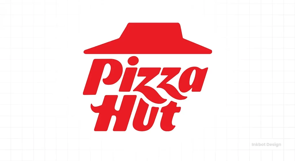
The Lesson: Nostalgia is a powerful drug in food marketing. The old logo reminded people of their childhood, of Pan Pizzas and salad bars. Modern is not always better.
3. Chobani: The Serif Revolution
While not a restaurant, the yoghurt brand Chobani sparked a design revolution in 2017. They moved from a sharp, geometric sans-serif to a soft, chubby, 1970s-style serif font.
The Result: It looked creamy. It looked natural. It stood out on a shelf dominated by “scientific” looking sans-serif.
The Lesson: Be the opposite of your competitors. If everyone zags, you zig.
A Reality Check
I once audited a client who ran a fantastic steakhouse. Their meat was aged for 40 days; the wine list was impeccable. But their logo used a thin, spindly script font in light grey.
On their signage, it was invisible against the brickwork. On their menus, older diners (their target demographic, with disposable income for steak) had to squint to read the text in the ambient lighting. They were losing walk-ins because people couldn’t read the sign, and they were frustrating seated guests before the bread basket arrived.
We rebranded them. Bold, high-contrast serif typography. A distinct mark that could be branded onto the steak boards. Revenue increased not because the food changed, but because the communication of the food became clear.
If you are ready to stop playing games with your visual identity, you can view our logo design services to see how we build brands that last.
The Technical Roadmap: How We Design
If you choose to work with Inkbot Design or any reputable agency, you should expect a rigorous process. If your designer skips these steps, fire them.
- The Discovery Phase: We do not touch a pencil until we know your average ticket price, your target demographic (families vs. hipsters), and your competitors.
- Sketching & Concepting: We generate dozens of ideas. Most are rubbish. We filter them until the gold remains.
- Vectorisation: We build the logo mathematically using vectors. This ensures it can be printed on a billboard without pixelation.
- The Stress Test: We mock up the logo on signage, menus, uniforms, and apps to ensure it works in the real world.
- Delivery: You receive a “Brand Bible.” This includes your Pantone codes, font files, and the rules for using the logo (e.g., “Do not stretch this logo”).
The Verdict
Your restaurant logo design is the foundation of your brand architecture. It dictates the fonts on your menu, the colours of your interior, and the personality of your social media.
You can cook the best food in the city, but if your branding looks unappetizing, fewer people will walk through the door to taste it. It is a simple calculation of ROI. A professional logo costs a fraction of your kitchen equipment but works harder than your best sous chef. It never calls in sick, and it is selling for you 24/7.
Do not cut corners on your face of the world.
Ready to build a brand that matches the quality of your kitchen?
Request a Quote today and let’s get to work.
Frequently Asked Questions (FAQ)
Why is vector format important for restaurant logos?
Vector formats (AI, EPS, SVG) use mathematical equations rather than pixels. This allows your restaurant logo to be scaled infinitely—from a tiny napkin print to a massive billboard—without ever losing quality or becoming blurry.
How much should I budget for restaurant logo design?
Professional restaurant branding typically ranges from £1,000 to £10,000+, depending on the agency’s expertise and the scope (e.g., just a logo vs. full menu and signage design). Avoid £50 marketplaces if you want trademarkable assets.
What are the best colours for food branding?
Red and yellow are known to stimulate appetite and urgency (Fast Food). Green signals health and freshness. Black and gold imply luxury and high price points. Blue is generally considered an appetite suppressant and should be avoided unless you are serving seafood.
Can I use a free logo maker for my restaurant?
You can, but it is risky. Free logo makers use generic templates that cannot be trademarked. This leaves you vulnerable to legal issues and means your brand will look identical to hundreds of other budget businesses.
What is a responsive logo?
A responsive logo adapts to different screen sizes and contexts. It includes a full version for signage, a simplified version for menus, and an icon-only version (favicon) for social media and mobile delivery apps.
How long does the logo design process take?
A professional design process usually takes 2-4 weeks. This includes the discovery phase, market research, initial concepts, revisions based on feedback, and the final export of all technical files.
Should I include a picture of food in my logo?
Not necessarily. While a fork or burger is clear, it can be limiting if you later change your menu. Abstract symbols or unique typography often create a stronger, more timeless brand identity that focuses on the “vibe” rather than a specific dish.
What is the difference between a logomark and a logotype?
A logotype is your restaurant’s name written in a custom font (e.g., Subway). A logomark is a symbol or icon used to represent the brand (e.g., the McDonald’s Golden Arches). The best brands usually have both.
How do I ensure my logo is legible on thermal receipts?
You must request a “monotone” or “single-colour” version of your logo from your designer. This version removes gradients and complex details, ensuring it prints clearly on low-resolution black-and-white receipt printers.
Why is typography important in restaurant branding?
Typography sets the tone. A classic serif font conveys a traditional, slow-paced dining experience, while a bold sans-serif font suggests a modern, fast, or casual dining experience. Legibility is also critical for menus in low-light environments.
