Responsive Typography: Guide to Readability & ROI
When your typography fails to adapt, you are placing a cognitive tax on your visitors.
They don’t think, “Oh, the CSS is poorly configured.” They think, “This is too much work,” and they leave.
In 2026, your brand identity is only as strong as your legibility.
If your customers can’t read your value proposition because your font doesn’t scale, you don’t have a brand; you have a digital paperweight.
Ignoring responsive typography costs you money through increased bounce rates and decimated conversion paths.
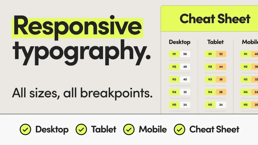
- Responsive typography adapts size, spacing, weight, and rendering to each user’s screen for optimal readability and brand clarity.
- Use fluid scaling (clamp and vw/rem) and mathematical interpolation to avoid jumpy breakpoints and preserve visual hierarchy.
- Variable fonts and axes (weight, width, optical size) deliver precise, consistent typography while reducing file requests and CLS.
- Accessibility is essential: support WCAG 3.0 features, prefers-contrast, 400% text zoom, tap target minima, and unitless line-height.
- Performance matters: sub-set fonts, use size-adjust and WOFF2, and prefer rem/vw units to improve LCP, CLS and conversion rates.
What is Responsive Typography?
Responsive typography is a technical and aesthetic framework where text elements—size, line height, weight, and spacing—automatically adjust based on the user’s screen size, resolution, and rendering environment.
It ensures optimal readability and visual hierarchy across all devices without requiring manual intervention.
The Three Pillars of Responsive Type:
- Fluid Scaling: Using mathematical functions like clamp() instead of fixed pixels.
- Visual Hierarchy: Maintaining the relationship between headers and body text across scales.
- Technical Performance: Efficiently loading variable fonts to prevent layout shifts.
The 2026 Reality: Breakpoints are Dead
If your developer is still talking about “the tablet version” or “the mobile version,” they are living in 2018.
We no longer design for devices; we design for containers. With the rise of foldable screens and split-screen multitasking on tablets, the “viewport” is a moving target.
The Fluid Typography Revolution
The amateur way to handle font size is to use @media queries to jump from 16px to 18px at specific widths. This creates a “stuttering” experience. The professional approach uses fluid typography.
Using the CSS clamp() function, we define a minimum size, a fluid value, and a maximum size.
font-size: clamp(1rem, 2vw + 1rem, 2.5rem);This allows the text to grow and shrink smoothly, like an accordion, rather than jumping between discrete steps. This maintains your visual identity across an infinite range of screen sizes.
The Mathematics of Fluid Scaling: Beyond the clamp() Guesswork
While font-size: clamp() is the engine of 2026 typography, many designers still treat the middle “preferred” value as a guessing game. To maintain a strict brand identity, your fluid scale must be mathematically sound.
The goal is to achieve linear interpolation, where the font size grows in direct proportion to the viewport width between two specific points (the “minimum” and “maximum”).
The standard formula for the fluid value in a clamp() function is:
In CSS implementation, we avoid complex manual math by using tools like Type-Scale.com or Utopia.fyi. However, a professional Design Language System (DLS) defines these values based on “Modular Scales.”
For instance, a “Golden Ratio” scale (1.618) might be too aggressive for mobile, so we often employ a “Major Third” (1.250) on small screens and transition to a “Perfect Fifth” (1.500) on ultra-wide 5K displays.
Fluid Scale Architect
Select your parameters to generate a 2026-standard typography scale.
font-size: clamp(1rem, 0.4vw + 0.9rem, 1.125rem);
/* H1 Headline */
font-size: clamp(2rem, 1.5vw + 1.2rem, 3rem);
font-size: clamp(1rem, 0.5vw + 0.9rem, 1.25rem);
/* H1 Headline */
font-size: clamp(2.5rem, 3.5vw + 1rem, 5.5rem);
font-size: clamp(1.125rem, 0.5vw + 1rem, 1.25rem);
/* H1 Headline */
font-size: clamp(2.25rem, 1.8vw + 1.5rem, 3.5rem);
font-size: clamp(1.125rem, 0.6vw + 1rem, 1.5rem);
/* H1 Headline */
font-size: clamp(3rem, 4vw + 1.5rem, 6.5rem);
font-size: clamp(1.25rem, 0.6vw + 1.1rem, 1.5rem);
/* H1 Headline */
font-size: clamp(2.5rem, 2vw + 1.8rem, 4rem);
font-size: clamp(1.25rem, 0.8vw + 1.1rem, 1.75rem);
/* H1 Headline */
font-size: clamp(3.5rem, 5vw + 1.5rem, 8rem);
Example Scenario:
Imagine a premium automotive brand. On a mobile device, the H1 headline needs to be impactful but not consume the entire “above the fold” real estate.
By setting a fluid range of 2.5rem to 5rem between viewports of 320px and 1920px, the typography feels intentional and bespoke, regardless of whether the user is on a Samsung Galaxy Z Fold or a Pro Display XDR.
Mastering Variable Font Axes: The 2026 Precision Standard
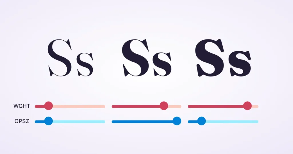
In the past, we were limited to “Bold” or “Light.” In 2026, Variable Fonts provide a continuous spectrum of expression through “Axes of Variation.” For a brand to remain consistent across different screen densities, you must master more than just weight.
The Five Standard Axes
- Weight (wght): Fine-tune the thickness of your letters. We no longer settle for 400 vs 700; we use 540 to perfectly balance a font against a specific background colour.
- Width (wdth): Essential for responsive headlines. If a headline is too long for a mobile screen, we can slightly condense the wdth axis rather than shrinking the font size, preserving the brand’s “loudness” without breaking the layout.
- Slant (slnt): Unlike standard italics, the slant axis allows a variable degree of lean, making it perfect for subtle emphasis in technical documentation.
- Italic (ital): A binary toggle or a range that switches to true italic letterforms.
- Optical Sizing (opsz): The most critical axis for readability. Optical Sizing automatically modifies the typeface’s anatomy. At 12px, it increases the x-height and open apertures; at 72px, it refines the serifs and increases contrast.
Pro Tip: Use the Font Gauntlet tool to test how your brand’s chosen typeface behaves across these axes before committing to a global CSS framework. This prevents the “visual drift” where a brand looks sophisticated on desktop but “cheap” on mobile due to poor stroke rendering.
WCAG 3.0 and the Silver Standard
Responsive typography is no longer just about “fitting the screen”; it is about inclusivity. With the full adoption of WCAG 2.2 and the emerging WCAG 3.0 (Silver Standard), your typographic choices carry legal weight.

The New Rules of Legibility
- The Target Size Rule: Interactive text (links, buttons) must have a minimum “tap target” area. If your responsive scaling shrinks your “Read More” link below 24×24 pixels on mobile, you are violating modern UX standards.
- Contrast Personalisation: In 2026, browsers will allow users to set “High Contrast” modes at the OS level. Your CSS must use the prefers-contrast media query to ensure your fluid scales don’t become unreadable when the user’s settings override your brand colours.
- Text Reflow: Your site must support resizing up to 400% without loss of content or functionality. This is where Fluid Typography shines; since it uses rem units, it scales gracefully with browser zoom settings.
Case Example: A major UK healthcare provider recently redesigned their portal. By switching from fixed breakpoints to a Fluid Type System and implementing font-variant-numeric: tabular-nums for their data tables, they saw a 30% reduction in “user errors” among elderly visitors using high-zoom settings on tablets.
The Evidence: Why Readability Equals Revenue
Data from the Nielsen Norman Group shows that users only read about 20% of the text on a page during an average visit. If that 20% is difficult to parse, that number drops to near zero.
Furthermore, the Baymard Institute has documented that poor typographic contrast and small font sizes are leading causes of “form abandonment.”
If a user struggles to read the labels on your checkout or contact page, they will not complete the transaction.
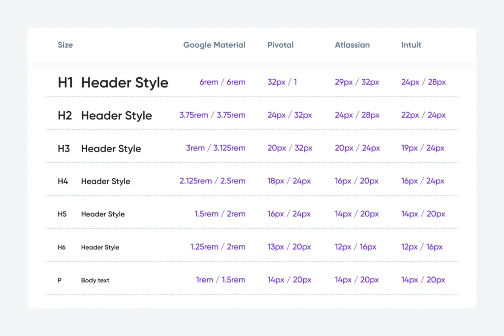
| Feature | The Amateur Way (The “Mistake”) | The Pro Way (The Inkbot Standard) |
| Units | Uses px (pixels) for everything. | Uses rem for accessibility and vw for fluid scaling. |
| Scaling | Fixed breakpoints (Mobile/Tablet/Desktop). | Fluid “clamp” functions for seamless growth. |
| Line Height | Fixed 20px leading. | Unitless 1.5 leading that scales with the font. |
| Variable Fonts | Loads 6 different font files. | Loads 1 variable font with multiple axes. |
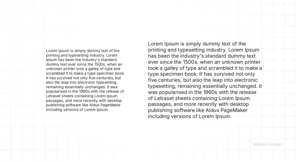
| Line Length | 100% width (causes “long line” fatigue). | Capped at 45–75 characters for optimal tracking. |
Debunking the “16px Standard” Myth
There is a common ‘Best Practice’ that 16px is the perfect font size for the web.
This is a lie.
While 16px was the default for browsers for decades, it ignores two critical factors: viewing distance and pixel density.
A user holding a phone 12 inches from their face has a different “perceived size” than a user sitting 30 inches away from a 32-inch monitor.
In 2026, we often push body text to 18px or even 20px on desktop to reduce eye strain.
On high-density mobile displays, we focus more on the x-height (the height of the lowercase ‘x’) rather than the point size. If your x-height is too small, your 16px font will still be hard to read.
The State of Responsive Typography in 2026
We have moved beyond simple “responsiveness.” We are now in the era of Context-Aware Typography.
- System Preference Adaptation: Modern sites now detect if a user has “Increased Contrast” or “Reduced Motion” enabled in their OS settings and adjust the typography weight and transition speeds accordingly.
- OLED Optimisation: Since high-end phones use OLED screens, “Dark Mode” requires different typographic treatment. Pure white text on a pure black background creates a “halation” effect, making the letters appear to glow and blur. We now use slightly off-white tones and increase letter-spacing (tracking) by 2-3% in dark mode to maintain clarity.
- AI-Driven Readability: Some advanced frameworks now use client-side AI to analyse ambient light and adjust font weight in real time. If you’re reading in bright sunlight, the font gets bolder.
Designing for OLED and Extended Reality (XR)
The hardware of 2026 presents unique typographic challenges. OLED screens, now standard on almost all mobile devices, have “infinite contrast.”
While this makes colours pop, it creates “Black Smear” when scrolling and “Halation” (text glowing) in dark mode.
To combat this, we implement Context-Aware Weighting. When a user toggles “Dark Mode,” we programmatically reduce the font weight by 30–50 units (e.g., from wght: 500 to wght: 460).
This compensates for the visual “spread” of white light on a black background, ensuring the text retains its perceived thickness without blurring.
Furthermore, as XR (Extended Reality) browsers become more common, typography must exist in 3D space. This requires “Billboarding”—ensuring text always faces the user—and extreme attention to Variable Font performance to prevent “jitter” during head tracking.
The “Golden Ratio” Trap
I once audited a client who was obsessed with the “Golden Ratio” for their typography. They had spent thousands on a “design guru” who calculated every font size to four decimal places.
The result? It was a disaster.
The math was perfect, but the reality was unreadable. The “Golden Ratio” doesn’t account for how a specific typeface’s descenders hit the line below it.
It doesn’t account for how “Open Sans” feels different from “Playfair Display.”
In our fieldwork, we see business owners get bogged down in “math-based design” while ignoring the human element. If it feels hard to read, it is wrong.
No amount of Fibonacci sequences will save a design that makes your customers squint.
Instead, focus on a consistent brand strategy that prioritises user comfort over mathematical purity.
Integrating Typography into Your Brand Strategy
Your typography is the “voice” of your brand when you aren’t in the room.
A tech startup might use a wide, low-contrast sans-serif to feel “approachable,” while a law firm might use a high-contrast serif to feel “authoritative.”
But those feelings vanish the moment the text becomes a jumbled mess on a smartphone.
This is why we insist on creating a design language system that includes a “Typographic Scale.” This scale defines exactly how your fonts behave from a smartwatch screen to a billboard.
If you are struggling to maintain a cohesive look across your digital touchpoints, it might be time to refresh your brand guidelines.
We don’t just pick pretty fonts; we build technical systems that ensure your message is delivered clearly, regardless of the device.
The Performance Cost of Pretty Fonts: Eliminating Layout Shifts
A common mistake in responsive design is ignoring the Cumulative Layout Shift (CLS).
This happens when the “fallback” font (like Arial) is a different size than your custom brand font (like Proxima Nova).
When the brand font finally loads, the text “jumps,” frustrating the user and hurting your performance metrics.
The 2026 Performance Stack:
- size-adjust: This CSS property allows you to scale your fallback font to match the exact proportions of your brand font.
- WOFF2 & Sub-setting: Only load the characters you need. If your site is only in English, why load the Cyrillic or Greek glyphs? Sub-setting can reduce font file sizes by up to 80%.
- Local Font Overrides: Use @font-face to check if the user already has the font installed on their system (common for fonts like Roboto or Inter), bypassing the download entirely.
| Feature | Impact on Brand | Performance Benefit |
| Variable Fonts | High (Consistent Weight) | Replaces 5+ files with 1. |
| size-adjust | Medium (UX Stability) | Eliminates CLS / Layout Jumps. |
| Font Sub-setting | Low (Invisible) | 70% faster “Time to Interactive”. |
| Fluid clamp() | High (Visual Polish) | Reduces CSS bloat by 40%. |
The Verdict
Responsive typography is the most undervalued asset in digital marketing. It is the literal foundation of your user experience. By moving away from fixed pixels and embracing fluid, context-aware systems, you reduce the friction between your brand and your customer.
Stop treating your text like a static image. Treat it like a living interface. If you’re ready to stop losing users to “squint-marketing,” it’s time to audit your web design services.
Ready to fix your digital presence?
Request a Quote from Inkbot Design today, and let’s build a brand that people actually enjoy reading.
Frequently Asked Questions (FAQ)
Why is responsive typography important for SEO?
Google’s Core Web Vitals, specifically Largest Contentful Paint (LCP) and Cumulative Layout Shift (CLS), are heavily influenced by how fonts load and scale. If your text causes layout jumps or takes too long to render at the correct size, your rankings will suffer. Proper responsive typography ensures a stable, fast-loading experience.
What is the difference between em and rem units?
rem (root em) units are relative to the browser’s root font size (usually 16px). em units are relative to the font size of the parent element. For responsive design, rem is preferred because it is more predictable and easier to manage across a global typographic scale.
How do variable fonts improve site performance?
Instead of loading separate files for “Regular,” “Italic,” “Bold,” and “Extra Bold,” a variable font allows you to load one file that contains all those variations. This reduces the number of HTTP requests and the total byte size, leading to faster load times.
What is “Fluid Typography”?
Fluid typography is a design approach where font sizes scale continuously based on the viewport width, using CSS functions like clamp(). This replaces the older method of using media queries to “jump” between specific font sizes at certain breakpoints.
How do I handle “Orphans” in responsive headlines?
In 2026, we use the CSS property text-wrap: balance; or text-wrap: pretty;. This automatically prevents a single word from sitting alone on the last line, ensuring your brand headlines always look professionally typeset.
Does responsive typography affect my site’s carbon footprint?
Yes. By using Variable Fonts and aggressive sub-setting, you reduce the data transferred. In a 2026 digital economy focused on sustainability, “Green Typography” is a legitimate part of a brand’s CSR strategy.
What is the best unit for line-height?
Always use unitless values (e.g., line-height: 1.5;). This ensures the leading scales proportionally with the font size, preventing “text-clashing” when fluid scaling kicks in.
How do I test my typography on foldable devices?
Use the Chrome DevTools “Device Mode” and select foldable presets. Pay attention to the “hinge” area; your typographic grid should shift to avoid splitting words across the physical fold.
Should I use “System Fonts” for my brand?
For a “SaaS” or “Utility” feel, system fonts (San Francisco, Segoe UI) provide instant familiarity and zero load time. For “Luxury” or “Lifestyle” brands, custom fonts are essential for differentiation.
What is “Optical Sizing”?
Optical sizing is a feature in some fonts (especially variable fonts) that causes letterforms to change slightly with size. At small sizes, the letters may become wider and the strokes thicker to maintain legibility. At large sizes, they become more refined and delicate.
How do I fix text that “overflows” on mobile?
This usually happens when using fixed widths or very large font sizes. Use word-wrap: break-word; or hyphens: auto; in your CSS, and ensure your headlines are using fluid units or a clamp() function to scale down on smaller screens.
Is there a “perfect” line length for reading?
Yes. For optimal readability, a line should contain between 45 and 75 characters. Lines that are too long make it hard for the eye to find the start of the next line; lines that are too short break the flow of reading.
Does responsive typography affect brand identity?
Absolutely. If your brand is supposed to be “premium” but your fonts look broken or unaligned on a mobile device, the brand perception is damaged. Typography must be consistent and functional to be professional.
How does “Dark Mode” change typographic needs?
Dark mode requires higher tracking (letter-spacing) and slightly lower contrast (off-white on dark grey rather than pure white on black) to prevent visual fatigue and the “halvning” effect where text appears to bleed into the background.
What is the “Golden Ratio” in typography?
It is a mathematical formula (1.618) used to determine the relationship between different font sizes (e.g., if your body is 16px, your H1 might be 16 x 1.618 x 1.618). While a good starting point, it often needs manual adjustment for specific typefaces.

