The Science Behind Logo Shapes: Why Circles Sell
Most people choose their business logo’s shape based on two things: what they personally like and what they see competitors doing.
This is a fundamental mistake. And it’s a costly one.
Your logo’s shape isn’t just a decorative container for your company name; it’s a powerful representation of your brand. It’s a subconscious conversation with your customer’s brain. It’s a piece of a universal, primal language we all instinctively understand, forged over millions of years of evolution.
Making this choice based on a gut feeling is like walking into a foreign country and shouting random words, hoping to be understood. You might get lucky, but you’ll likely be ignored—or worse, cause offence.
The good news is that there’s a science to it. A translation guide. By understanding the why behind shapes, you can stop guessing and start communicating with strategic intent.
- Choosing logo shapes should be informed by psychology, utilising the bouba/kiki effect for impactful subconscious communication.
- Circles convey community and safety, while squares promote stability and trust; shapes have inherent psychological meanings.
- A successful logo aligns shape, colour, and typography to create a harmonious and memorable brand identity.
The Real Science Behind Why Logo Shapes Matter
This isn’t about vague “brand feelings” or design-school dogma. This is about biology and psychology. Our reactions to basic shapes are deeply ingrained and remarkably consistent across cultures.
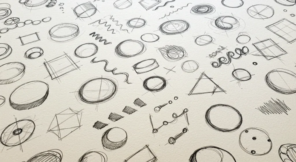
It’s Not Magic, It’s Biology: The Bouba/Kiki Effect
In 1929, psychologist Wolfgang Köhler conducted a simple experiment. He showed people two shapes—one rounded and blob-like, the other sharp and spiky—and asked which was named “bouba” and which was “kiki.”
Over 95% of people, regardless of their language, assigned “bouba” to the rounded shape and “kiki” to the spiky one.
This phenomenon is known as the bouba/kiki effect, and it reveals a powerful truth: our brains naturally associate sounds, ideas, and personalities with specific shapes. This isn’t a learned behaviour; it’s a hardwired neurological shortcut. Your brand is either a “Bouba” brand (soft, friendly, approachable) or a “Kiki” brand (sharp, dynamic, precise), and you absolutely need to know which.
Your Ancestors Didn’t Like Sharp Things
The reason for the bouba/kiki effect is rooted in survival.
For our ancestors navigating the wild, rounded shapes were generally safe. Think of fruit, eggs, the smooth stones of a riverbed, or the soft features of a friendly face. They signal safety, nourishment, and a sense of community.
Sharp, angular shapes were dangerous. They were the teeth of a predator, the thorns on a poisonous plant, the jagged edges of a broken rock. They signal threat, warning, and a need for caution.
This primitive risk assessment still runs in the background of our modern brains. We see a sharp object, and our brain sends a tiny, subconscious jolt of alert. We see a soft, round one that sends a signal of calm. This is the foundational logic that underpins all of shape psychology in branding.
The Primal Palette: Deconstructing The Core Geometric Shapes
We must understand that basic evolutionary wiring enables us to break down the most common logo shapes and perceive them not as design choices, but as messages.
Circles, Ovals, and Ellipses: The Shape of Community
Circles are the ultimate “bouba.” They have no beginning or end, creating a sense of completeness and flow. Our eyes follow their path effortlessly, which is a cognitively pleasing experience.
- Psychology: They represent unity, inclusivity, harmony, relationships, and safety. A circle is a hug, a group, a protective embrace.
- What It Conveys: A friendly, welcoming, and often timeless brand message. It suggests collaboration and togetherness.
- Real-World Examples: The Target logo is a literal circle, signifying a central meeting point. The Olympic rings represent global unity. The Pepsi globe feels harmonious and universally appealing.
- Use this shape if your brand is focused on community, partnership, has a strong people-first message, or wants to convey a sense of wholeness and trust.
Squares and Rectangles: The Shape of Stability
Squares and rectangles are the visual representation of order and logic. We see them in things built to last: buildings, foundations, safes, and books. They are predictable and reliable.
- Psychology: These shapes trigger feelings of structure, strength, security, and containment. They feel grounded and balanced. There are no surprises with a square.
- What It Conveys: Professionalism, trustworthiness, and a no-nonsense, practical approach. It implies that the company is solid and dependable.
- Real-World Examples: Microsoft’s four-square window conveys order and stability in the digital world. The American Express blue box is synonymous with financial security. The BBC’s blocks represent authority and reliability.
- Use this shape if your core brand promise is based on stability, security, efficiency, or straightforward reliability. It works well for finance, tech, and construction.
Triangles: The Shape of Power and Direction
Triangles are pure “kiki.” They are dynamic, energetic, and point the way. They can sit on a stable base or be precariously balanced on a point, giving them a sense of tension and motion.
- Psychology: They are associated with direction, movement, purpose, and power. Depending on their orientation, they can also represent hierarchy, innovation, and sometimes aggression or risk.
- What It Conveys: Action, growth, and forward momentum. Pointing up suggests improvement and achievement; pointing right suggests progress. It can also feel distinctly masculine and powerful.
- Real-World Examples: The Adidas three stripes form a mountain-like triangle, suggesting performance and overcoming challenges. Delta Air Lines uses a triangle to signify flight and direction. The Google Play icon points right, urging you to move forward and act.
- Use this shape if your brand is dynamic, innovative, or focused on achieving a specific goal. It’s a powerful choice for sports, tech, and automotive industries. Just be mindful of its potentially aggressive edge.

Beyond the Big Three: Lines, Curves, and Organic Forms
Branding isn’t limited to a primary school geometry set. The lines and forms that make up and surround these shapes carry their own potent psychological weight.
The Unseen Influence of Lines
Even simple lines can profoundly alter a logo’s feel.
- Vertical Lines: These defy gravity. They suggest power, strength, dominance, and growth. Think of a skyscraper or a person standing tall. Brands like Cisco use vertical lines to imply digital strength and connectivity.
- Horizontal Lines: These rest with gravity. They create a sense of calm, tranquillity, and community. They can also imply speed and movement across a landscape. The horizontal lines in the old AT&T logo conveyed communication across distances.
Organic and Abstract Shapes: The Human Touch
These are the shapes that don’t have perfect angles or predictable curves. They are irregular, flowing, and often mimic forms found in nature.
- Psychology: They connect with us on a more personal, human level. They feel spontaneous, adaptable, and free. Because they aren’t rigid, they signal comfort and nature.
- Real-World Examples: There is no more famous abstract shape than the Nike Swoosh. It’s a masterful curve that embodies motion, speed, and a sense of effortless freedom. The golden arches of McDonald’s are soft, organic, and welcoming.
The Smartest Shape is The One You Don’t See: Negative Space
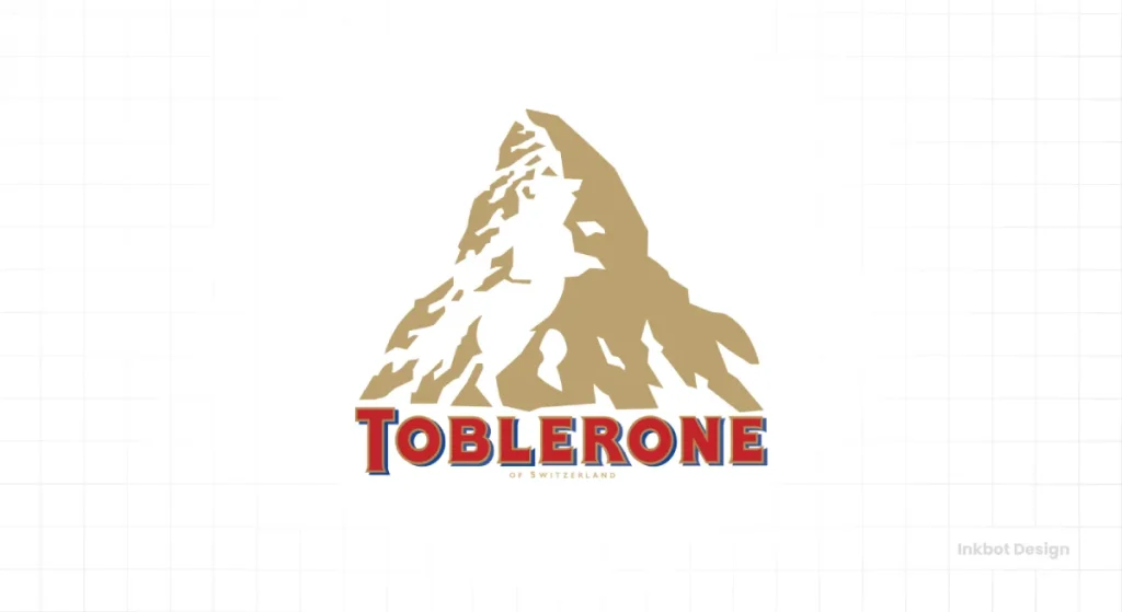
Sometimes, the most powerful part of a logo is the space you don’t immediately notice. Using negative space is a way to embed a second image or idea within your primary mark.
- Psychology: It creates a delightful “Aha!” moment for the viewer. Discovering the hidden shape makes the viewer feel clever and creates a stronger, more memorable bond with the brand. It signals intelligence and attention to detail.
- Real-World Examples: The undisputed champion is the FedEx logo. Once you see the perfect arrow nestled between the ‘E’ and ‘x,’ you can never unsee it. It subconsciously screams speed, precision, and direction. The Toblerone logo hides a bear in its mountain peak, a clever nod to its city of origin, Bern (The City of Bears).
A Practical Framework: How to Choose The Right Shape for Your Business
Enough theory. Here is a simple, three-step process to move from abstract concepts to a concrete decision.
Step 1: Define Your Core Brand Adjectives
Before you think about a single shape, take a piece of paper and write down 3-5 non-negotiable adjectives for your brand. Are you innovative, bold, and fast? Or are you caring, trustworthy, and local? Be honest and be specific. This is your foundation.
Step 2: Match Adjectives to Shapes
Now, map those adjectives to the psychological profiles we’ve discussed.
- Caring, Community, Friendly, Unity: Lean towards Circles and Organic Shapes.
- Stable, Secure, Reliable, Professional: Lean towards Squares and Rectangles.
- Dynamic, Powerful, Growing, Innovative: Lean towards Triangles and Vertical Lines.
- Calm, Tranquil, Broad: Lean towards Horizontal Lines.
- Clever, Detailed, Surprising: Consider using Negative Space.
Step 3: Consider Your Industry and Audience
Context is king. A law firm and a children’s daycare can both value “trust,” but they will express it with entirely different visual language. The law firm might use a solid square to signal security, while the daycare might use a soft circle to signal safety and community.
Always ask: What are the visual expectations of my industry, and how does my target audience perceive these shapes? You can either conform to those expectations to build instant recognition or deliberately break them to stand out. Both are valid strategies, but they must be intentional.
The Big Caveat: A Shape is Not a Brand
Here’s my biggest pet peeve. Don’t fall into the “shape-as-horoscope” trap. Your brand is not a “triangle brand.”
A shape is one powerful ingredient in a complex recipe. The other critical ingredients are colour and typography.
- Colour can override shape: A soft pink can make an aggressive triangle feel playful. A severe black can make a friendly circle feel formal and exclusive.
- Typography can contradict shape: Using a sharp, aggressive font inside a soft, welcoming circle creates visual conflict and confuses your audience.
The goal is harmony. The shape, the colour, and the font must all work together to tell the same story. Getting this balance right isn’t just a matter of taste; it is the core discipline of professional logo design.
Principles of Logo Design: A Practical Guide
Your logos are too complex, and that’s why they’re weak and forgettable. This book is the playbook for fixing that. It provides a step-by-step system for utilising grids and geometry to create powerful, timeless marks. Stop adding more; learn to communicate more with less.
As an Amazon Partner, when you buy through our links, we may earn a commission.
Stop Guessing. Start Communicating.
Your logo’s shape is the first word in a long and meaningful conversation with your customer. It sets the tone before they’ve read a single sentence about what you do.
You wouldn’t start a business meeting by shouting nonsense. Don’t let your brand do it either.
By understanding the deep-seated science of how we interpret shapes, you can ensure that your first word isn’t just noise. You can make it strategic. You can make it intentional. And most importantly, you can make it understood.
Don’t leave your brand’s first impression to chance.
Choosing a shape is just the start. The real work begins by aligning it with the right colours, typography, and overall brand strategy. If you’re ready to build an identity based on proven psychology instead of guesswork, our team specialises in precisely that.
Explore our logo design services to see how we translate science into branding that works, or request a free quote to discuss your project.
Frequently Asked Questions (FAQs)
What is the most trustworthy logo shape?
Squares and circles are the most reliable. Squares convey stability and reliability, like a bank vault, while circles evoke a sense of community, unity, and safety.
Can a logo use more than one shape?
Yes, many compelling logos combine shapes. For example, the Target logo places a circle inside another circle. The key is that the shapes must work harmoniously to reinforce a single, clear message, not create visual confusion.
How does colour affect the meaning of a logo shape?
Colour has a massive impact. A red square feels urgent and intense (like the YouTube play button’s container), while a blue square feels calm and secure (like the Facebook “f” logo). The colour can amplify the shape’s meaning or alter it significantly.
Are sharp, angular logos bad for a brand?
Not at all. They are detrimental to a brand that aims to appear soft and caring. Sharp angles are an excellent and appropriate choice for a brand that wants to communicate high performance, cutting-edge technology, or dynamic power (like a sports brand or a tech company).
What is the “bouba/kiki effect”?
It’s a neurological phenomenon where people instinctively associate rounded, soft shapes with soft-sounding nonsense words (like “bouba”) and sharp, spiky shapes with harsh-sounding words (like “kiki”). It proves our brains have a built-in dictionary for shapes.
Do these shape rules apply globally?
For the most part, yes. The psychological responses to basic geometric shapes are rooted in shared human evolution and are remarkably consistent across different cultures. However, specific symbols (like a cross or star) can have very different cultural meanings.
Why is the FedEx logo’s arrow so effective?
The arrow in the FedEx logo is effective because it’s a hidden discovery (creating an “aha” moment) and perfectly reinforces the brand’s core promise: speed, direction, and forward movement. It’s a masterpiece of subconscious communication.
Should my logo shape be trendy or timeless?
Timeless is almost always the better goal. Trends fade, but the basic psychological meanings of circles, squares, and triangles have been stable for millennia. A great logo, like those of Pepsi or Nike, evolves but rarely abandons its core geometric foundation.
What do vertical and horizontal lines mean in a logo?
Vertical lines convey strength, power, and growth because they defy the laws of gravity. Horizontal lines convey calm, speed, and community because they align with the horizon.
How important is the logo shape compared to the company name?
They are both critical parts of a whole. The name is what people say, but the shape is what people feel. In a crowded market, the shape is often processed by the brain much faster than the name, making it a vital component of your brand’s first impression.
