Paper Weight Guide for Printing: Choosing the Right Feel
I have spent two decades fixing the messes left behind by “DIY” designers and business owners who thought they could save a few quid by skimping on paper stock. It never works.
You spend thousands on a brand strategy and a logo, only to print your business cards on something that feels like a wet napkin.
The result? You don’t look “affordable.” You look amateur.
In the world of print design, weight isn’t just a physical measurement; it is a psychological signal. If your brochure feels flimsy, your services will also seem flimsy.
If your direct mail is too light, it ends up in the bin before the recipient even reads the headline.
This guide is for those who are tired of guessing and ready to understand the technical mechanics of paper.
- Paper weight (GSM) signals brand quality; choose heavier stock for premium perception.
- Use GSM in UK/Europe; request GSM equivalents when dealing with US Basis Weight.
- Consider bulk and caliper, not just GSM; bulk alters perceived thickness and postage costs.
- Match weight to mechanics: avoid overly heavy paper on multi-page pieces to prevent cracking.
What is a Paper Weight Guide?
A paper weight guide is a technical framework used to categorise the density, thickness, and “heft” of paper stocks. It provides standardised measurements—typically in Grams per Square Metre (GSM) or Basis Weight—to help designers and printers select the appropriate material for specific functional and tactile requirements.
The three core elements of paper weight are:
- Density (GSM): The literal mass of the paper.
- Caliper (Microns): The physical thickness of the sheet.
- Bulk: The relationship between thickness and weight, determining how “stiff” or “fluffy” the paper feels.
The Technical Foundations: GSM vs Basis Weight
If you are operating in the UK or Europe, you are likely using the Metric system. We talk in GSM. If you are dealing with North American printers, you will encounter the archaic “Basis Weight” system. You must understand both if you want to avoid ordering 10,000 copies of the wrong thing.
Understanding GSM (Grams per Square Metre)
GSM is the most logical way to measure paper. It measures the weight of one square metre of a particular paper. Because the area is fixed (one square metre), the weight tells you exactly how dense the material is.
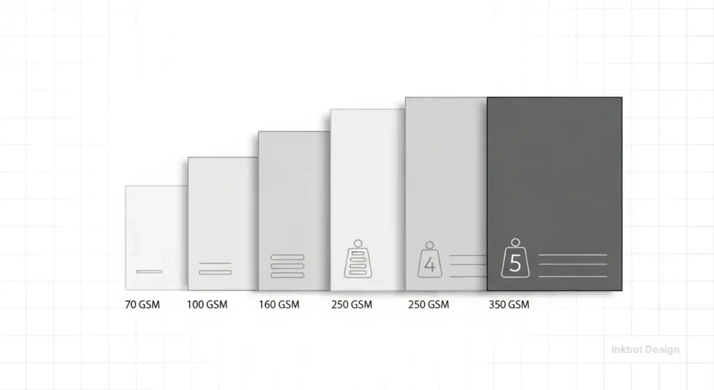
- 80–100gsm: Standard office printer paper.
- 130–170gsm: The “sweet spot” for brochures and high-quality flyers.
- 350–450gsm: Heavyweight territory for business cards and premium covers.
The Complexity of Basis Weight (US System)
The US system is a headache. It measures the weight of a “ream” (500 sheets) in its “basis size.” The problem? The basis size changes depending on the type of paper. 80lb “Text” paper is not the same thickness as 80lb “Cover” paper.
If you confuse these, you might end up with business cards as thin as a magazine page. Always ask for the GSM equivalent to ensure parity.
The Tactile Paper Recommender
GSM numbers are confusing. Tell us what you are printing, and we’ll tell you the exact weight you need for the right professional impact.
Why Weight Matters: The Haptic Effect
Human beings are hardwired to equate weight with value. This isn’t just a design theory; it is a neurological fact. Data from the Nielsen Norman Group suggests that physical touch points significantly impact brand recall.
A study by Aradhna Krishna, a pioneer in sensory marketing, found that tactile sensations can change how we perceive the quality of a product. When a prospective client holds your marketing collateral, their brain is already judging your price point before they have seen your quote.

The Cost of “Flimsy”
I once audited a client in the private equity sector. They were struggling to convert high-net-worth leads. Their branding was immaculate on screen, but their “Investor Packs” were printed on 100gsm uncoated paper. It felt like a utility bill. We shifted them to a 170gsm silk text with a 350gsm soft-touch laminated cover.
Conversion rates climbed because the physicality of the document finally matched the magnitude of the investment.
Categorising Paper Weights by Use Case
Choosing the wrong weight for the wrong job is a fast track to wasted budget. Here is the forensic breakdown of what you should be using.
1. The Lightweight Category (35gsm to 100gsm)
This is the realm of utility.
- 35–55gsm: Newsprint. Cheap, disposable, and has high “show-through” (where you can see the ink from the other side).
- 80–90gsm: The standard for internal documents and letterheads.
- 100gsm: The entry-point for “professional” letterheads. If you are a solicitor or an accountant, do not go lower than this for your stationery.
2. The Mid-Weight Category (120gsm to 170gsm)
This is where brochure design lives.
- 120gsm: Excellent for premium flyers or the inner pages of a thick book. It feels substantial but remains easy to fold.
- 150gsm: The “industry standard” for high-end brochures. It has enough opacity to prevent ink show-through, even with heavy images.
- 170gsm: A “heavy” paper. It feels luxurious. Use this for posters that need to stay flat or high-end catalogue pages.
3. The Heavyweight Category (200gsm to 450gsm+)
This is “Card” or “Board” territory.
- 200–250gsm: Used for “self-cover” brochures (where the cover is the same weight as the pages) or premium menus.
- 300–350gsm: The standard for business card design. It is sturdy enough to survive a wallet but thin enough to stack.
- 400gsm+: Luxury business cards. At this weight, you start looking at “duplexing” (glueing two sheets together) to create “triplex” cards with a coloured core.

The “Bulk” Factor: Why Weight is Deceptive
Here is the technical nuance that most designers miss: Weight is not the same as thickness.
You can have two different papers that both weigh 150gsm, but one is 20% thicker than the other. This is due to “Bulk.” Bulk is achieved by introducing more air between the paper fibres during the manufacturing process.
- High Bulk: Feels thick and stiff but is actually light. Great for saving on postage.
- Low Bulk: Dense, thin, and smooth. Often used for high-end photography books where “feel” is secondary to “detail.”
Consultant’s Tip: For large-scale direct mail campaigns, use high-bulk 120gsm paper. It will feel like 150gsm to the recipient, but it will keep your mailing costs in the lower weight bracket. According to Royal Mail’s business pricing, even a few grams can push you into a higher price tier, potentially costing you thousands over a 50,000-piece run.
Debunking the Myth: “Heavier is Always Better”
In my fieldwork, I see “The Cardboard Trap” constantly. A client insists on a 400gsm paper for a 32-page brochure.
The Result?
- Cracking: The spine cracks because the paper is too thick to fold cleanly, even with a score.
- Springing: The brochure won’t stay closed; it springs open on the desk like a trap.
- Weight Surcharges: The client pays double the shipping cost.
The Reality Check:
Heavier is only better if the mechanics of the piece support it. For multi-page documents, you want a “supple” feel. A 150gsm silk sheet often feels more “expensive” in a brochure than a stiff 250gsm sheet that fights against the reader’s hands.
Amateur vs. Pro: The Technical Comparison
| Technical Detail | The Amateur Way (DIY) | The Pro Way (Inkbot Standard) |
| Selection Criteria | “What’s cheapest?” | “What is the flexural rigidity required?” |
| Grain Direction | Ignored completely. | Specified to ensure clean folds and no “waviness.” |
| Ink Coverage | High ink on thin paper (leads to curling). | Balanced weight to ink ratio (prevents cockling). |
| Finishing | Laminating everything to hide poor paper. | Choosing the right texture (Spot UV, Foil, Emboss). |
| Postage | “We’ll figure it out later.” | Pre-calculated weight to fit within 100g Large Letter. |
The State of Paper in 2026: Trends & Shifts
As we move into 2026, the paper industry is undergoing a massive shift driven by sustainability and the EU Deforestation Regulation (EUDR).
1. The Rise of Alternative Fibres
We are seeing a move away from traditional wood pulp toward bamboo, hemp, and even agricultural waste (like “crush” paper made from grape or citrus residue). These papers often have a lower GSM but a higher “perceived weight” due to their unique textures.
2. Tactile Minimalism
In an increasingly digital world, “over-designed” glossy paper is out. The 2026 trend is “Tactile Minimalism”—uncoated, high-bulk papers with a natural, almost “toothy” feel. Brands are using 300gsm recycled stocks that look raw but feel incredibly premium.
3. Smart Coatings
New coatings are emerging that allow for high ink holdout (keeping colours vibrant) on very porous, lightweight papers. This allows brands to maintain a “natural” look without the dulling of colours that usually happens on uncoated stock.
Grain Direction: The Silent Killer of Quality
You cannot talk about paper weight without mentioning grain direction. Paper is made of fibres. These fibres align in one direction as the paper moves through the machine.
- Grain Long: Fibres run parallel to the long side of the sheet.
- Grain Short: Fibres run parallel to the short side.
If you fold paper against the grain, the fibres break. This results in an ugly, jagged edge. If you are using a heavy paper (250gsm or higher), you must fold with the grain. This is why you see so many poorly made menus with cracked spines—the designer didn’t specify the grain direction to the printer.
The Economics of Paper: Procurement and Pricing
Paper prices have been volatile over the last 24 months. According to Deloitte Insights, supply chain disruptions and energy costs in European mills have led to a 15-25% increase in certain speciality stocks.
When choosing a paper weight, you aren’t just paying for the material. You are paying for:
- The Pulp Quality: Virgin fibre vs. recycled.
- The Coating: Clay-coated (Gloss/Silk) vs. Uncoated.
- The Mill’s Reputation: Brands like G.F. Smith or Fedrigoni command a premium because their 350gsm is more consistent than a generic “no-name” board.
If you are a small business owner, do not buy your own paper. Your printer has better buying power and knows which stocks run best on their specific presses (Heidelberg vs. HP Indigo).
The Verdict: Don’t Let Your Brand Feel Cheap
Choosing the right paper weight is an exercise in forensic detail. It requires balancing the visual, tactile, and financial aspects. If you are selling a £5 product, a 100gsm flyer is fine. If you are selling a £50,000 service, your collateral needs to reflect that weight.
Stop guessing. Stop using the “standard” options provided by cheap online print farms. Talk to a professional who understands how a sheet of paper actually behaves in a human hand.
If you want your brand to command the attention it deserves, it starts with the feel. Contact us to discuss how we can elevate your physical brand presence.
Frequently Asked Questions (FAQ)
What is the best paper weight for business cards?
The industry standard is 350gsm. However, for a truly premium feel, we recommend 400gsm or even 450gsm. If you want something unique, consider a “triplex” card, which can exceed 600gsm by bonding multiple layers together.
What is the difference between GSM and Microns?
GSM (Grams per Square Metre) measures weight and density. Microns (or points) measure physical thickness. A high-bulk paper might have a low GSM but a high micron count, making it feel thicker than it actually is.
Is 150gsm paper thick enough for a brochure cover?
Generally, no. We recommend a minimum of 250gsm for a brochure cover to provide durability. If the inner pages are 150gsm, a 250gsm cover creates a professional “heft” and prevents the brochure from curling.
Why does my 300gsm card feel different from another 300gsm card?
This is due to the “finish” and “bulk.” A 300gsm Uncoated stock will feel thicker and rougher than a 300gsm Gloss stock, as the gloss coating compresses the fibres and creates a denser, thinner sheet.
How does paper weight affect shipping costs?
Significantly. In the UK, Royal Mail has strict weight limits for “Standard Letters” (up to 100g). If your brochure and envelope combined weigh 105g because you chose a heavier paper, your postage costs could double.
What paper weight should I use for letterheads?
The professional range is 100gsm to 120gsm. Anything less than 100gsm feels like standard copier paper and can negatively impact your brand perception during formal correspondence.
Can I print 400gsm paper on a home printer?
Most home and office printers max out at 200gsm to 250gsm. Feeding 400gsm card through a standard printer will likely cause a paper jam or damage the rollers. Always use a commercial printer for heavyweight stocks.
What is “Show-through” in printing?
Show-through (or ghosting) occurs when the paper is too thin or lacks opacity, allowing the text or images from the reverse side to be visible. This is common in papers with a weight of less than 100gsm.
Is recycled paper lighter than virgin paper?
Not necessarily. Recycled paper is available in the same GSM ranges as virgin paper. However, recycled fibres are shorter, which can sometimes result in a different “stiffness” or texture compared to virgin pulp.
What is “Silk” vs. “Gloss” paper weight?
Silk and Gloss refer to the coating, not the weight. A 170gsm Silk and a 170gsm Gloss weigh the same, but the Silk has a smooth, satin finish, while the Gloss is reflective. Silk is generally preferred for readability in brochures.
Does ink coverage affect the feel of the paper?
Yes. High ink coverage (such as heavy blacks or dark colours) can make thin paper feel “wet” or lead to curling. If your design has heavy ink coverage, consider switching to a slightly heavier weight to maintain structural integrity.
Why should I care about grain direction?
If you fold a heavy paper against the grain, the spine will crack and look unprofessional. Specifying grain direction ensures that your brochures, menus, and cards fold cleanly and stay flat.

