Top 10 Ice Cream Logos: Dive into Frozen Branding
Ice cream logos are more than just illustrations. These tiny masterpieces represent the brands that we adore and recognise.
So, in this article, we will take a trip around the ice cream logo universe and get to know the top 10 of them, which have made a special place in our hearts and stomachs.
But before we get into the creamy countdown, discuss why these logos matter. Have you ever wondered what catches your eye when you stand in the freezer section? It is not only the flavours; it is also the branding.
The best ice cream logo does more than just look good; it tells a story, stirs emotions, and makes one yearn for that chilly delight even before opening the container.
Shapes, colours, and fonts contribute to how people perceive different ice cream brands. For instance, cool blues may bring thoughts of cooling flavours, while warm reds or pinks could imply fruity sorbets.
Most successful logos have perfected this delicate balance between science and art.
Now, let us dig into our top ten, shall we?
- Ice cream logos reflect brand identity, stirring emotions and enhancing customer connections.
- Successful logos balance simplicity, colour psychology, and typography for effective branding.
- Design elements evoke nostalgia and quality, influencing consumer choices in the freezer aisle.
- Future logos may evolve with digital trends to express values like health and sustainability.
1 – Ben & Jerry’s: The Cow That Conquered Hearts
When you imagine Ben & Jerry’s, what comes to mind? For many, it’s that happy black-and-white cow against the blue sky with puffy white clouds. It’s simple fun and says wholesome goodness — everything Ben & Jerry’s is about.
Were you aware that the Ben & Jerry logo has mostly stayed the same since the seventies? Yes indeed! This bovine beauty has been around for quite some time. It shows you that sometimes, getting things right from the beginning can make a difference. This symbol represents Vermont, where it all began, and their commitment to using only high-quality natural ingredients.
Why Does It Work?
- It is easy to remember because of its simplicity
- The correlation between this image and dairy products is clear
- Creates an atmosphere filled with olden-days sentimentality and country-living
2 – Häagen-Dazs: Luxury in Letters
Check this out: Häagen-Dazs isn’t Danish or European, it’s American! But that didn’t stop Reuben Mattus from creating a brand dripping with continental sophistication. The logo is a masterclass in perceived luxury, with its stretched-out letters and umlauts.
This ice cream company’s logo is unique because it lacks images. There are no frills, just beautifully designed letters that scream indulgence and quality. Sometimes, less really is more.
What people think matters
- It makes someone feel like they’re holding something crafted by a European artisan
- Simple elegance appeals to grown-up palates
- Recognisable among other brands on busy store shelves
3 – Magnum: The Gold Standard
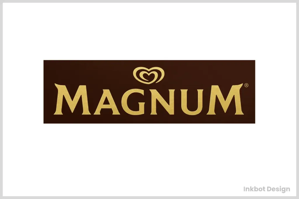
Magnum’s logo is often called the little black dress of the ice cream world – smooth, elegant, and timeless. The letters are in capitals and have been painted deep gold, which screams luxury and indulgence.
Magnum has taken a different approach from other ice cream logos, which tend to be fun and playful; instead, they have gone for grown-up glamour. This isn’t just about selling ice creams but creating self-indulgence opportunities.
What Makes It Attractive
- Its mature, sophisticated appeal sets it apart
- A golden shade enhances the premium position
- Though simple, the design carries great weight
4 – Baskin-Robbins: 31 Flavours of Fun
At first glance, the Baskin-Robbins logo might appear to be just another fun ice cream brand. But look closer – do you see that ‘31’ tucked into the ‘BR’? It refers to their famous “31 flavours” idea, one for every day of the month.
This makes the Baskin-Robbins logo so great – its use of negative space. It’s playful and interactive; it gives observant customers an “aha!” moment.
Working with Colour Psychology
- Pink and blue create a feeling of magic and happiness
- ‘31’ hidden element adds curiosity factor
- The bold, rounded typeface feels warm and friendly
5 – Cornetto: A Cone-shaped Classic
Cornetto has a beautiful logo – it is their product itself. It’s a stylised ice cream cone with a creamy swirl; everyone knows what it is when they see it.
Cornetto ensures that customers are well-informed about what they buy by using their goods as logos. This method is effective because of its simplicity: one looks at this visual, and anyone can tell exactly what it represents.
Associating Through Objects
- Showing the connection with the product visually
- It can be modified to suit various flavours
- A classic design that does not require frequent revamping
6 – Wall’s: The Heart of Ice Cream
The wall logo is a genius design. It’s plain emotional and represents people’s delight and love towards ice cream.
Wall uses the heart to symbolise emotion related to ice creams. This is not only about taste but also the emotions it brings out.
Why It Melts Hearts
- A symbol that can be understood by anyone regardless of the language they speak
- Red colour signifies love or passion, which makes people thrilled or excited
- The soft circular lines give it a friendly appearance
7 – Dreyer’s/Edy’s: A Tale of Two Names
This one is interesting – Dreyer’s and Edy’s are the same brand but sold using different names in various parts of America. However, the emblem used remains constant.
The logo has an oval shape with a ribbon-like banner, which gives it a classic feel that can be associated with old times. The name doesn’t matter; this design speaks about convention and quality.
The Power of Adaptation
- Flexible design suits any brand name
- Traditional elements evoke a feeling of history
- The red and white colour scheme is bold and appetising
8 – Carte d’Or: Golden Elegance
The Carte d’Or logo was designed to be premium. It should look like an expensive restaurant or a fancy meal.
They used flowing script in the Carte d’Or logo because it’s almost calligraphic. It’s the fine print, more skilful than a signature or heading.
Colour Speaks Volumes
- Gold means luxury and quality.
- Going with a deep blue background makes it look better.
- Putting contrast right on the package makes it more noticeable.
9 – Dairy Queen: Royally Good Design
Dairy Queen’s logo is a perfect ice cream treat for kings.
The current Dairy Queen logo features the letters “DQ” in a stylish curved font that appears to be moving. Typically presented in red and white, the letters are enclosed in an oval shape. The overall effect of this design is both modern and timeless.
Why it works:
- The wavy typeface implies soft serve’s smoothness
- The ellipse shape looks like a mouth ready to lick its lips
- Red combined with white makes for a striking, appetising colour scheme
Fun fact: Little Miss Dairy Queen was a cartoon character on the original DQ logo.
10 – Solero: Tropical Temptation
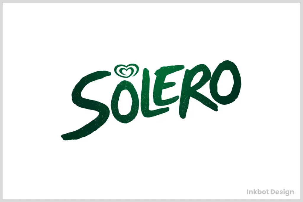
A look at Solero’s logo will instantly take you to a tropical paradise.
The script in which the brand name appears suggests melted ice cream, with its soft lines and easy flow. Frequently, it is rendered in bright orange that vibrantly calls to mind flavours found only on far-off shores and sunny afternoons.
Why it’s effective:
- The flowing script reflects the smoothness of the product
- The vibrant orange colour is eye-catching and reminds people of tropical tastes
- The design is overall fresh and summery
The Art and Science of Ice Cream Logos
Since we’re finished with our top 10, it’s time to give credit where credit is due. Designing a successful ice cream logo is no walk in the park. Several components must be delicately balanced:
- Colour Psychology: The application of colour can significantly affect how people perceive a brand. For example, cool blues may imply refreshment, while warm reds and pinks suggest fruity flavours.
- Typography: The typeface carries meaning; some fonts look playful (e.g. Baskin-Robbins), while others appear luxurious (e.g., Häagen-Dazs).
- Imagery: Whether it’s a cow, a heart, or even a frog, every image in these logos has been carefully chosen to represent what the company stands for and appeal to its target audience.
- Simplicity: In most instances, simplicity wins out over complexity–consumers will remember a clean logo that can easily be recognised for longer.
- Versatility: A great logo must look good on anything from tiny ice cream bars to giant billboards.
The Impact of a Great Ice Cream Logo

We eat with our eyes first. I mean, think about it. A good logo can differentiate between brands in the freezer aisle but doesn’t stop there. Once a consumer connects with a company’s visual identity, they’re more likely to become a loyal customer–because let’s face it: people don’t just love ice cream for its taste.
Just look at Ben & Jerry’s. Every time I see that cow on their packaging, I can’t help but smile! There is something so powerful about effective branding.
In the future, though…what if? What if ice cream logos could change based on flavour or temperature? This may not be too far off with the ever-growing popularity of digital media and augmented reality. Or what about health–or sustainability? Could these values be expressed through more intentional design elements within these brands’ visual identities?
The only thing we know for sure is this: until people stop loving ice cream (so basically never), these words will continue to play an integral part in how people choose–and savour–their frozen treats!
Conclusion: More Than Just a Pretty Face
These top 10 ice cream logos are designed to do more than just catch our eye, from the playful cow of Ben & Jerry’s to the elegant script of Carte d’Or. They result from deliberate branding tactics created to connect with our feelings, beliefs, and taste buds.
So when you’re having that scoop of your favourite flavour next time, spare a thought for the logo on its wrapper – it has influenced your decision much more than you realise!
FAQs
What constitutes an effective ice cream logo?
A good ice cream logo should be easy to remember, related to the brand’s values, visually appealing, and adaptable for use in different media. Moreover, it should elicit positive feelings associated with eating ice cream.
How frequently do companies change their ice cream logos?
The duration varies from one company to another. Still, many successful ones have retained their original designs over several decades, albeit with slight modifications that keep them fresh without losing their identity as brands.
Do they share any standard features or themes among themselves?
Most ice-cream logos use cool colours, playful fonts, and images connected with milk products and freezing, such as cones, tubs or bars, while some even create characters that act as mascots, building a more assertive brand personality.
How are ice cream logos different from other food item symbols?
These symbols emphasise fun, indulgence and refreshment more than any other food industry. Additionally, they tend to employ lighter shades and illustrations depicting coldness, like snowflakes falling or melting creamsicles.
Can a logo influence which ice cream someone buys?
Yes! A well-created emblem can catch shopper’s attention, making them feel optimistic about buying that particular product, especially when it comes to impulse purchases.
Why do some companies prefer text-only while others go for image-based emblems?
Whether an organisation settles for textual representation only or incorporates pictures into its badge depends mainly on what kind of image it wants people to associate with their brand name; whether sophisticatedness (text) or playfulness (images) is desired most as part of this overall strategy.
How do international brands adjust their logos for different markets?
Certain enterprises may keep a single worldwide logo. In contrast, others could tweak it slightly to be more relevant within certain cultures or because of language disparities across various regions where such goods are sold.
Are there any legal aspects involved in creating ice cream symbols?
Indeed, businesses must ensure that no part of their design infringes on existing copyrights. Furthermore, they must consider how the badge will appear when reproduced in varying sizes and materials.
What has been the impact of digital media on ice cream logo design?
Digital media has necessitated flexibility in designing symbols to suit different screen resolutions and platforms where they might be displayed. In addition, it allows for the creation of dynamic versions which can interact with users better, thus enhancing brand recognition.


