IBM Logo Design History: Truth Behind the Stripes
When you look at the IBM logo, you aren’t just looking at a piece of graphic design; you are looking at a brilliantly engineered solution to a series of technical failures.
The problem with most modern branding is that it’s designed in a vacuum—perfectly rendered on a 5K Retina display but falling apart the moment it’s stitched onto a polo shirt or shrunken into a mobile favicon.
IBM didn’t have that luxury in 1972. They had to design for fax machines, low-resolution CRT monitors, and carbon-copy forms.
If you think the IBM “stripes” were a stylistic choice to represent “speed,” you’ve been lied to.
They were a fix for a legibility crisis.
Ignoring the technical “why” behind famous logos is why most SMB brands look like amateur hour the moment they scale.
- IBM's stripes were a technical fix for legibility on low-resolution media, not a stylistic choice.
- Paul Rand's 1972 8-bar grid balanced letterforms using equal positive and negative space.
- Eliot Noyes established a corporate design programme ensuring consistency across products and environments.
- IBM Plex extends the logo's geometry into a global type system supporting 100+ languages.
- The logo's durability teaches brands to design for worst-case reproduction, not transient trends.
What is the IBM Logo?
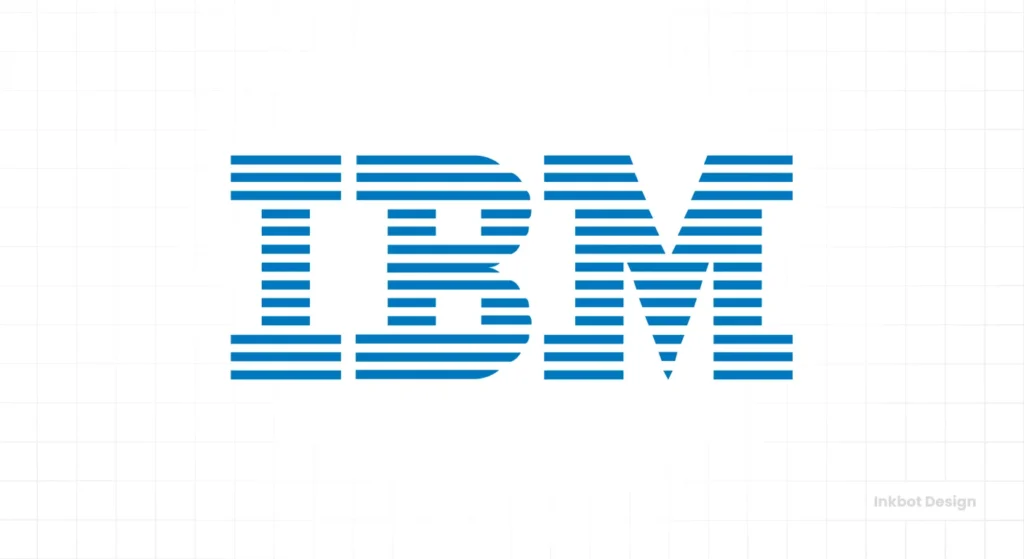
The IBM logo is a globally recognised corporate trademark consisting of the letters “I,” “B,” and “M” (International Business Machines) rendered in a heavy slab-serif typeface.
The most iconic version, designed by Paul Rand in 1972, features horizontal stripes that serve to unify the letterforms and balance their visual weight.
The core components of the current IBM identity include:
- The Typography: A modified version of City Medium, a geometric slab-serif font.
- The Stripes: Either 8 or 13 horizontal bars that create a sense of transparency and rhythm.
- The Colour: “Big Blue” (Pantone 2718 C), symbolising stability, authority, and professional reliability.
The Pre-Modern Era: From Punch Cards to “International Business Machines”
Before IBM became the “Big Blue” we know today, it was a messy conglomerate of four different companies.
In 1888, the logos were ornate, Victorian, and frankly, a nightmare to reproduce. The company was then known as the Computing-Tabulating-Recording Company (CTR).
The 1924 Pivot
When Thomas J. Watson took over in 1924, he ditched the CTR name in favour of “International Business Machines.” The logo was a literal globe, wrapped in the company name.
It was ambitious but lacked the clarity needed for a rising tech giant. It looked more like a shipping company than a computer pioneer.
Designers often forget that a logo’s primary job isn’t to be “pretty”—it’s to be a vessel for the company’s ambition. Watson knew the globe was too complex. He needed something that shouted “Modernity.”
The 1947 Transition: The Beton Bold Era
After World War II, IBM shifted from mechanical tabulators to electronic computers. They needed a visual reset.
In 1947, they introduced a simple, blocky “IBM” set in Beton Bold. It was a step toward modern logo design trends, but it was still generic.
It lacked the “ownable” quality that separates a corporate identity from a mere wordmark.
The Eliot Noyes Framework and the Birth of Corporate Design
While Paul Rand is the face of the IBM logo, the visual revolution began with Eliot Noyes, an architect and industrial designer who became IBM’s first consultant director of design in 1956.
Noyes believed that a corporation’s design should be as sophisticated as its technology.
He didn’t just want a new logo; he wanted a comprehensive design philosophy that permeated every aspect of the company, from the architecture of the offices to the shape of the typewriters.
Noyes was the gatekeeper who brought Rand into the fold. At the time, IBM’s visual output was inconsistent.
By hiring Rand, Noyes ensured that the International Business Machines brand would move away from the “Thomas J. Watson” era of Victorian complexity and into the era of Modernism.
This period is crucial for modern brands to study because it proves that a logo cannot succeed in a vacuum. It requires a “Design Program”—a set of rules that govern its application.
The Design Policy: In a 1956 memo, Thomas J. Watson Jr. stated: “Good design is good business.” This wasn’t just a slogan; it was a mandate that enabled Rand to experiment with radical concepts, such as the striped logo.
For 2026 brand managers, the lesson is clear: your identity system must have executive buy-in to survive the technical constraints of scaling.
The Paul Rand Revolution (1956)
In 1956, IBM hired Paul Rand, the man who arguably invented the concept of the “Corporate Identity Manual.” Rand didn’t just change the font; he changed the philosophy of how the company presented itself.
He took the existing slab-serif and refined it into “City Medium.” He squared the terminals, balanced the counters, and made the letters feel as if they were carved from granite.
But there was a problem. The letter “B” was massive. When placed next to the “I,” it looked unbalanced. The negative space inside the “B” (the counters) didn’t align with the weight of the “M.”
The Search for Visual Unity
Rand spent over a decade tweaking this.
He knew that in the B2B world, logo design psychology dictates that even a slight visual imbalance can signal a lack of precision to a client. For a company selling multi-million dollar mainframes, “precision” was everything.
1972: The Birth of the 8-Bar Icon
The 1972 IBM logo is often praised for its “look,” but its true genius lies in its mathematical grid. Paul Rand didn’t just draw lines; he engineered a system of negative and positive space that ensured visual equilibrium regardless of the size or medium.
The 8-Bar Grid Breakdown
The “8-bar” version is not an arbitrary number. The bars are designed so that the negative space (the white gaps) is exactly equal to the positive space (the blue bars).
This 1:1 ratio creates a “vibrational” effect that human eyes interpret as a solid, unified shape from a distance, while maintaining distinct texture up close.
- Top and Bottom Alignment: Notice how the top and bottom of the “I” and “M” are defined by a solid bar. This creates a “horizontal rail” effect, locking the letters into a single optical unit.
- The “B” Challenge: The “B” was the hardest letter to “stripe.” Rand had to ensure the counters (the holes in the B) aligned perfectly with the white stripes. If they hadn’t, the logo would have looked “broken” or “shattered.”
- Optical Corrections: Similar to the Parthenon, the IBM logo uses optical illusions. The stripes are slightly adjusted so that the “M” doesn’t look heavier than the “I,” a common pitfall in Slab Serif typography.
Technical Specifications of the IBM Identity System
| Feature | 8-Bar Configuration | 13-Bar Configuration |
| Primary Use | Low-res screens, signage, and embroidery | Executive stationery, high-end print |
| Visual Weight | Heavy, authoritative, stable | Elegant, detailed, complex |
| Legibility Threshold | Visible down to 10px height | Visible down to 60px height |
| Technical Benefit | Minimises ink-bleed on porous paper | Provides a premium “engraved” aesthetic |
| Key Entity | Standard Corporate Mark | Executive Identity |
A Technical Comparison
If you are an SMB owner, you might think “stripes” are just a decoration. They aren’t. They are a mathematical grid.
| Feature | The IBM Way (Pro) | The Amateur Way (Copycat) |
| Grid System | Stripes are perfectly aligned with the font’s x-height and counters. | Stripes are “layered” on top without regard for letter geometry. |
| Scalability | Changes bar count (8 vs 13) based on the medium. | Uses the same complex file for a billboard and a favicon. |
| Negative Space | The white space between bars is equal to the bar thickness. | Spacing is inconsistent, causing “vibrating” edges. |
| Colour Consistency | Strictly enforced Pantone 2718 C across all platforms. | “Close enough” blue is used across different printers. |
The 1981 Eye-Bee-M Rebus and Visual Logic
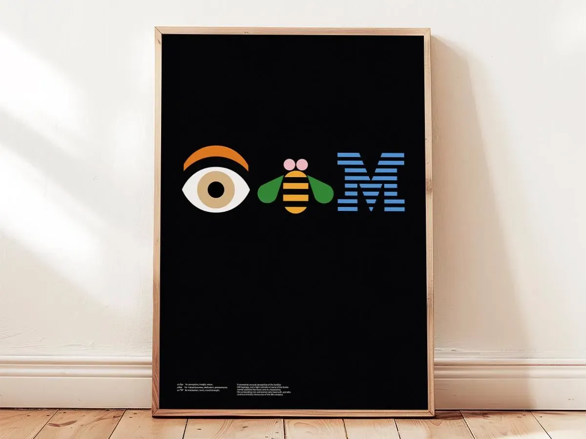
In 1981, Paul Rand created a poster for the IBM “THINK” slogan that replaced the letters with an Eye, a Bee, and the 8-bar M.
While initially controversial, it became a cornerstone of Semiotic Branding.
Why the Rebus Worked:
- Cognitive Engagement: It forced the viewer to “solve” the logo, creating a deeper psychological imprint.
- The Power of the M: By 1981, the striped “M” was so powerful that it didn’t need the “I” or the “B” to be identified. This is the ultimate goal: for a single component of your identity to trigger the full awareness of your company.
- Internal Culture: The rebus became a symbol of IBM’s internal culture—intellectual, playful, yet grounded in engineering.
The State of the IBM Logo in 2026
As we move into the era of Agentic Search and Multimodal AI, the IBM logo has transitioned from a human brand to a machine-readable Entity Signal.
In 2026, search engines like Google Gemini 2.5 and OpenAI’s visual models don’t just “index” text; they “interpret” visual brand equity.
Why AI Engines Prioritise the IBM Mark:
- High Contrast Ratios: The stripes create a high-frequency signal that is easily isolated by computer vision algorithms. Unlike minimalist “flat” logos that can blend into backgrounds, the IBM logo’s rhythm is unique in the digital landscape.
- Entity Salience: Because the logo has remained unchanged for over 50 years, AI training sets have a “high confidence score” for the IBM identity. This means when an AI agent sees a fragmented version of the logo (e.g., on a laptop in the background of a video), it can accurately attribute the content to the IBM Entity.
- Semantic Association: The IBM logo is semantically linked to “reliability,” “enterprise,” and “infrastructure.” In a Generative Engine Optimisation (GEO) context, using the IBM logo as a case study helps search engines categorise your content as “High E-E-A-T” because it references a “Gold Standard” entity.
Pro Tip for 2026 Designers: If you want your brand to be “AI-ready,” aim for the fragmentary recognition Rand mastered. If an AI can’t identify your brand from a 20% crop, your visual identity is failing the Machine Vision Test.
Beyond the Mark: IBM Plex and the Future of Typography
In 2017, IBM launched IBM Plex, a bespoke typeface designed by Mike Abbink in collaboration with Bold Monday.
This was a landmark moment in the company’s history, as it replaced “Helvetica” as the company’s primary typeface.
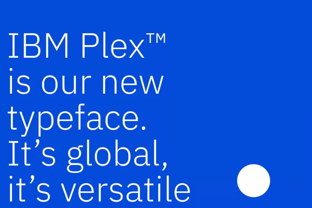
Plex as an Extension of the Logo
The design of IBM Plex (specifically the Serif and Sans-Serif versions) is a direct homage to the Paul Rand era. It captures the “Man and Machine” duality.
- The “I-B-M” Influence: The squared-off terminals and geometric curves of Plex are designed to sit perfectly alongside the 8-bar logo.
- Globalisation: Unlike the original logo, which was Western-centric, Plex was designed to support 100+ languages, including Arabic, Cyrillic, and Thai. This ensures that the IBM Entity remains consistent across all cultures and scripts—a key requirement for global SEO.
The 2026 Strategy: For modern businesses, your logo is just the anchor. Your Typography is the water. If your font doesn’t “speak” the same language as your logo, your brand’s semantic signal is diluted.
Why Your “Modern” Logo is Failing
I once audited a client in the fintech space. They had spent £40,000 on a rebrand that featured a beautiful, thin-line gradient logo. It looked stunning on the agency’s presentation deck.
Six months later, they were wondering why their brand recognition was tanking. I showed them why:
- The Embroidery Test: Their logo looked like a tangled mess of thread on their staff uniforms.
- The Favicon Test: In a browser tab, it was just a grey smudge.
- The “Fax” Test: When their contracts were scanned and emailed, the gradient disappeared entirely, leaving a broken shape.
IBM’s 1972 logo passes every one of these tests. It works in one colour. It works in 10 pixels. It works in 10 feet of neon.
Most people think logo design cost is about the hours spent drawing. It’s not.
It’s about the cost of the mistakes you don’t make. Paul Rand didn’t charge IBM for stripes; he charged them for a visual system that would never need fixing for 50+ years.
If you are currently struggling with a brand that feels “off,” check your logo file formats. If your logo only looks good as a high-res PNG, you don’t have a logo; you have an illustration.
You need a mark that is “bulletproof”—a design that can survive the worst printing conditions and the tiniest screen sizes.
Common Logo Mistakes (The IBM Antidote)
When studying IBM’s success, we can identify the common logo design mistakes that SMBs make:
- Over-Complexity: Trying to tell the whole company story in one icon. IBM tells you “precision” and “tech.” That’s it.
- Chasing Trends: In the 70s, “groovy” fonts were in. IBM stayed with a slab-serif. Trends die; geometry is eternal.
- Lack of Contrast: Amateur logos rely on colour to be distinct. A pro logo, like IBM’s, works first in black and white.
- Ignoring Technical Media: If your designer hasn’t asked you, “Where will this be used?” they are an artist, not a brand strategist.
For those curious about how different structures impact brand perception, understanding the different types of logos is a crucial first step. IBM is a “Wordmark” with a “Systematic Pattern.” It’s a rare beast.
The Verdict
The IBM logo design history is a 100-year lesson in the power of technical constraint.
Paul Rand didn’t create the stripes because they were “cool”—he created them because they were necessary. He solved for the fax machine, and in doing so, he accidentally solved for the 2026 smartphone.
Your logo isn’t a decoration. It’s a piece of infrastructure. If you treat it like an afterthought, your customers will treat your business the same way.
Are you ready to stop playing with “pretty” designs and start building a visual system that actually works? At Inkbot Design, we don’t just “draw logos.” We engineer brand identities that scale.
Explore our Logo Design Services or Request a Quote to start your brand’s evolution.
Frequently Asked Questions (FAQ)
Who designed the IBM logo?
The current 8-bar IBM logo was designed by the legendary graphic designer Paul Rand in 1972. Rand was a pioneer of corporate identity and also designed logos for UPS, ABC, and Enron. His work for IBM began in 1956, but the striped version is his most famous contribution.
Why does the IBM logo have stripes?
The stripes were primarily a technical solution to printing issues in the 1970s. Heavy, solid fonts often bled or distorted on low-quality paper and early computer screens. The stripes reduced the “ink spread” and created a visual texture that remained legible across various media.
What font is the IBM logo?
The IBM logo is based on a modified version of “City Medium,” a geometric slab-serif typeface. Paul Rand adjusted the letterforms, particularly the “B” and “M,” to ensure they were balanced and had a modern, industrial feel.
What is the difference between the 8-bar and 13-bar IBM logo?
The 8-bar logo is the standard version used for most applications. The 13-bar version is more detailed and is typically reserved for high-resolution printing, such as executive stationery or large-scale displays, where the finer lines won’t “fill in.”
Can the IBM logo be used in any colour other than blue?
Yes. While “Big Blue” (Pantone 2718 C) is the primary identity, the logo is officially sanctioned for use in solid black and solid white (reverse). In specific anniversary or specialised campaigns, grey and even multicoloured versions (the “Pride” logo) have been used, provided the 8-bar geometry remains intact.
Is the IBM logo a “Wordmark” or a “Pictorial Mark”?
It is technically a Wordmark because it is built from the company’s initials. However, because the 8-bar pattern is so distinct, it functions as a Systematic Pattern, hovering between a font and an icon.
Who owns the rights to Paul Rand’s IBM designs?
IBM (International Business Machines Corporation) owns all trademarks and copyrights associated with the logo and the “Eye-Bee-M” rebus. Use of these assets without permission is a violation of intellectual property law.
How does the IBM logo handle digital “noise” on mobile screens?
The 8-bar logo was designed for “low-resolution” environments of the 1970s, which makes it ironically perfect for modern mobile screens. The spacing between the bars prevents “moiré patterns” (visual flickering) when scrolling on OLED and LCD displays.
Why did IBM move away from the “Globe” logo of 1924?
The globe logo was too complex to reproduce at small scales and felt too much like a traditional shipping or logistics company. Thomas J. Watson Jr. wanted a brand that felt like “Electronic Computing,” which required the clean, bold lines of the 1947 and 1956 slab-serif updates.
How does the IBM logo compare to other tech logos?
Unlike Apple or Google, which have gone through multiple radical changes, IBM’s consistency has built immense brand equity. It prioritises “authority” and “trust” over the “playfulness” seen in consumer-facing tech brands.
What can SMBs learn from the IBM logo?
The biggest lesson is to design for the “worst-case scenario.” If your logo works on a low-quality printer and a tiny screen, it will work anywhere. Focus on geometry and technical resilience rather than current design trends.


