Is Helvetica a Timeless Classic or a Boring Cliché?
Helvetica is everywhere.
It’s on the side of aeroplanes, the signage for underground trains, and probably the tax form you’ve been avoiding. It is the default setting for “professional.” The vanilla ice cream of fonts.
Reliable. Predictable. Safe.
And that is precisely the problem.
This isn’t going to be another fawning love letter to a typeface. Nor is it a bitter takedown. This is a pragmatic look at a business tool that is incredibly powerful when used with intent, and utterly disastrous when chosen by default.
For entrepreneurs and small business owners, the difference between those two scenarios is between standing out and blending in.
- Helvetica’s neutrality makes it a powerful tool for clarity and authority, not an automatic choice for every brand.
- For small businesses, Helvetica often renders brands invisible, sterile, or lazy if used without strategic intent.
- Context matters: Helvetica excels in functional systems (transport, airlines) but fails for personality-driven brands.
- Ask tough questions first; choose fonts that align with brand personality — consider Inter, Roboto, Proxima Nova alternatives.
What Is Helvetica, Really?
To understand how to use it, you need to understand what it is. Helvetica isn’t just a font; it’s an ideology pressed into letterforms.
It was born in a Swiss type foundry in 1957. Designers Max Miedinger and Eduard Hoffmann weren’t trying to make something beautiful or expressive. They were chasing clarity and order. They were crafting a typeface so neutral, devoid of personality, that it would allow the message to be the hero.
Its original name was Neue Haas Grotesk. The name “Helvetica” came later, a derivative of “Helvetia,” the Latin name for Switzerland. The name sells its origin story: Swiss precision, Swiss utility, Swiss neutrality.
The core design principle of Helvetica is the intentional absence of character. Its lines are clean, its curves are tight and logical, and its apertures (the openings in letters like ‘c’ or ‘s’) are closed off, giving it a dense, solid appearance.
This is precisely why so many new businesses gravitate towards it. It feels like a clean, safe, blank slate.
But a blank slate is not a brand.
The Cult of “Clean”: Why Entrepreneurs Reach for Helvetica
“I want something… clean.”
Every designer has heard this a thousand times. It’s the single most common request from business owners. And more often than not, the font they have in their head is Helvetica. But “clean” is a dangerous word. It’s what people say when they really mean “safe.”
The psychological appeal of Helvetica is undeniable. It projects stability, authority, and a no-nonsense attitude. It’s a low-risk choice because it mimics the visual language of massive, established corporations. This can be an intoxicating shortcut for a small business trying to look bigger than it is.
The pros that attract business owners are legitimate:
- Unimpeachable Professionalism: It simply looks like what people assume a “real company” should look like. It carries an aura of seriousness.
- Extreme Legibility: There is no arguing this point. Helvetica is straightforward to read. It works on a tiny phone screen, a printed brochure, or a massive billboard. Its clarity is absolute.
- Total Versatility: The Helvetica family is enormous, with dozens of weights and styles. This makes it a complete system for everything from a bold headline to the tiny legal disclaimer at the bottom of an ad.
Brands like The North Face, 3M, Jeep, and Panasonic have used it to build empires founded on reliability and utility. They made it their own.

However, these brands also had multi-million dollar advertising budgets, unique products, and decades to build recognition. You don’t. And just using their font won’t get you their brand recognition.
The Dark Side of Default: When Helvetica Kills Your Brand
Here’s the uncomfortable truth. Choosing Helvetica without a powerful, deliberate strategy behind it doesn’t make you look professional. It makes you invisible.
The Problem of Ubiquity is its greatest weakness. It’s so common that it has lost all impact. It’s the font of government forms, warning labels, and office memos. When your logo uses the same typeface as the “Employees Must Wash Hands” sign, you have a problem. You aren’t differentiating; you are blending into the background noise of modern life.
The Sterility Trap is where neutrality curdles into something negative. Helvetica’s famous lack of personality can easily be perceived as cold, impersonal, and sterile. A sterile brand voice is toxic for a small business that survives by building personal connections and trust. It creates distance when you need to develop a relationship.
It Can Signal Laziness. To an increasingly design-savvy public, defaulting to Helvetica can suggest a lack of imagination, effort, or budget. It’s the easy choice, the path of least resistance. Whether it’s fair or not, your audience often feels that lack of effort. It suggests you took a shortcut on your brand, and they might wonder where else you’re cutting corners.
Case Studies in Contrast: Helvetica Done Right vs. Done Wrong
Context is everything. The same font can be a stroke of genius in one application and a complete failure in another.
The Right Way: When Helvetica is a System, Not a Shortcut
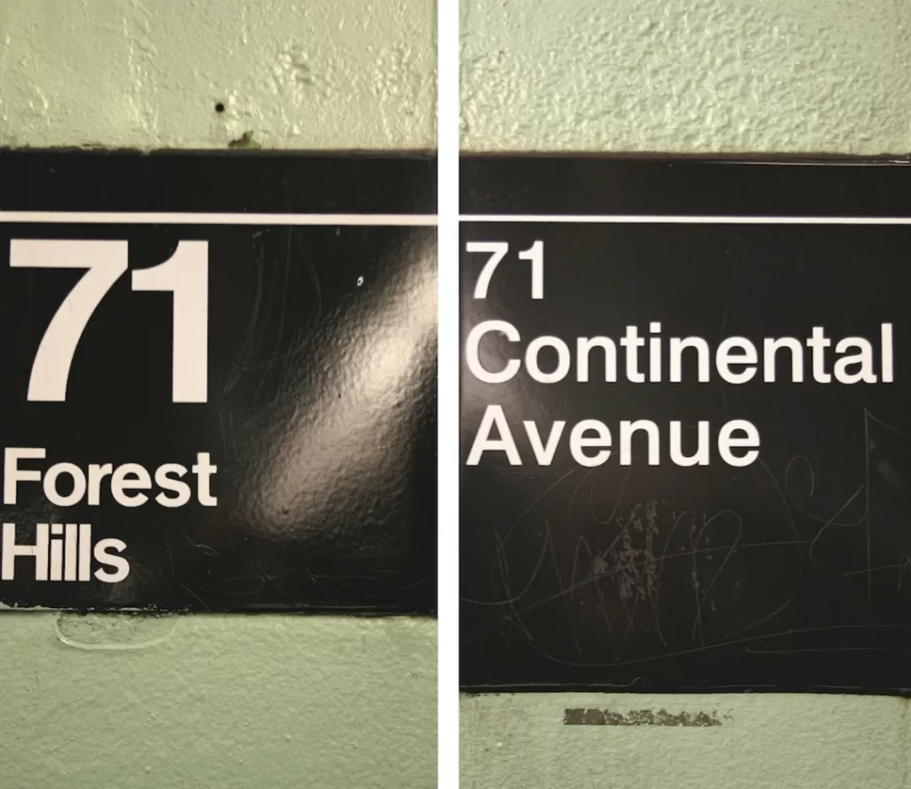
Example: The NYC Subway System. The signage system, designed by Massimo Vignelli, is a masterclass in functional design. The goal is not to express a personality or tell a story. The goal is to get millions of stressed-out, non-English-speaking people from Point A to Point B without chaos. Helvetica’s cold, unambiguous clarity isn’t just a feature; it’s the entire point. Here, personality would be a dangerous distraction.
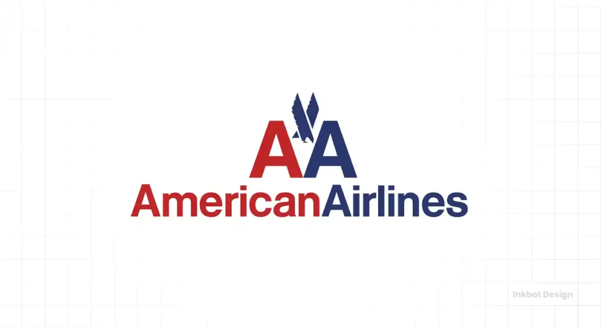
Example: American Airlines (Vignelli’s 1967 logo). For decades, the simple “American Airlines” logotype in Helvetica Bold projected what it needed: stability, safety, and immense corporate power. It wasn’t trying to be your friend. It was a declaration of being a massive, reliable, no-nonsense institution you could trust with your life at 30,000 feet. The choice was intentional.
A great logo design is always intentional. It’s about choosing the right tool for a particular job.
The Wrong Way: The Generic Startup Logo
Picture this: a new tech consulting firm called ‘Synergise Solutions’ or ‘Innovate Global’. The name is already generic. Imagine their logo is just the name typed out in Helvetica Bold.
What does it communicate?
Absolutely nothing. It’s forgettable before you’ve even finished reading it. It looks like every other consulting firm, tech startup, and business that was afraid to have an opinion.
For a small business, differentiation is survival. You have to give people a reason to remember you, to choose you over the competition. Defaulting to the world’s most neutral typeface is an act of brand surrender. It’s choosing to have no point of view; in a crowded market, a lack of point of view is a death sentence.
The Elephant in the Room: Helvetica vs. Arial
Let’s clear this up right now. No, they are not the same. And yes, the difference matters.
This is one of my biggest pet peeves. Saying Helvetica and Arial are the same is like saying a tailored suit and an off-the-rack rental are the same because they’re both grey.
The Origin Story: Helvetica was a meticulously crafted metal typeface born from the Swiss design movement. Arial was created decades later by Monotype as a cheaper, metric-compatible alternative to IBM’s printers. It was designed to occupy the same space as Helvetica to avoid licensing fees. It is, by its very DNA, a knock-off.
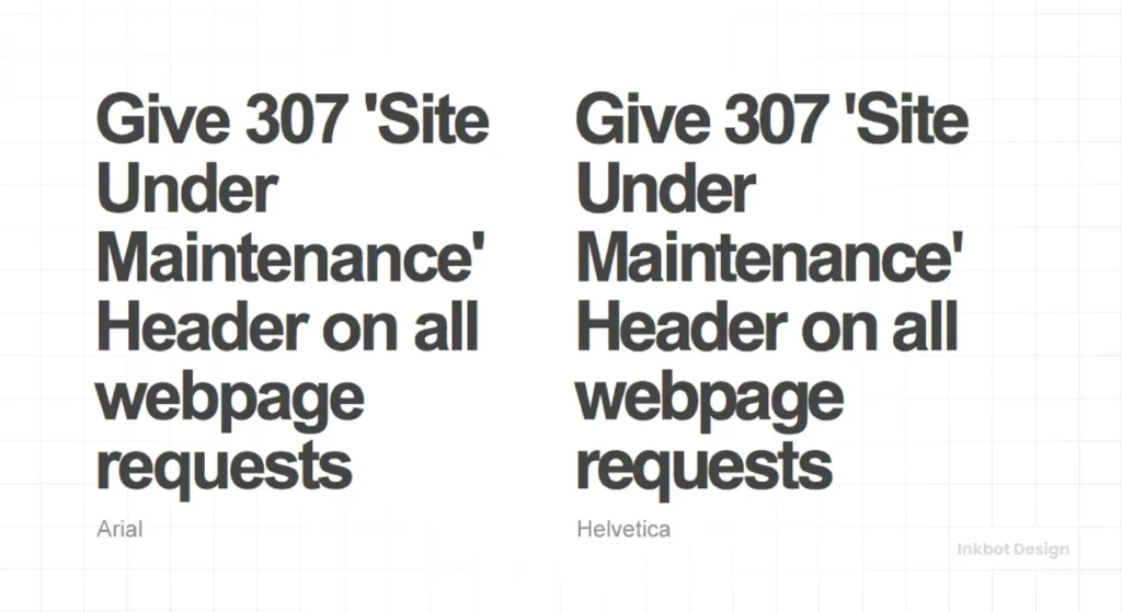
The Visual Proof: You don’t need to be a designer to see the difference. Look at the terminals—the end of the strokes. Helvetica’s cuts on letters like ‘C’, ‘S’, and ‘e’ are perfectly horizontal or vertical. They are clean and crisp. Arial cut them at an angle, making the font feel softer and less precise. Look at the tail of the capital ‘R’. Helvetica’s is straight and firm; Arial’s has a gentle curve.
The Business Takeaway: Using Arial while hoping to channel the prestige of Helvetica is a critical mistake. People who know the difference—and there are more of them than you think—will notice. It subtly communicates that you opt for the free, less-considered option. It’s a small detail, but branding is built on an accumulation of small, intentional information.
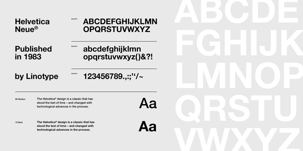
The ‘New’ Helvetica: Meet Neue Helvetica
When you think you have it figured out, you see another name: Neue Helvetica.
What is it? Is it different? Does it matter?
Think of it this way: If Helvetica is a classic album from 1957, Neue Helvetica is the digitally remastered version released in 1983. The songs are the same, but the production has been cleaned up for a more modern sound system.
By the early 80s, the original Helvetica family had become a sprawling, inconsistent mess. Different versions had been created for other technologies, resulting in a lack of cohesion. Linotype, the font foundry, decided to rationalise the entire system.
The goal of Neue Helvetica(which literally means “New Helvetica”) was to create a more unified and versatile family.
Here’s what that means in practical terms:
- A Rational Weight System: They introduced a numeric naming system (e.g., Helvetica Neue 45 Light, 55 Roman, 75 Bold). This created a logical, consistent spectrum of weights and styles, making it a more powerful tool for designers.
- Subtle Design Refinements: They tweaked everything. They made the punctuation heavier, adjusted character spacing, and unified the heights of capital letters for a cleaner overall look. By almost every technical measure, it is a better-designed typeface than the original.
The Business Takeaway: Does It Solve the Problem?
No. Absolutely not.
For the last few decades, Helvetica Neue has primarily been the standard font version used in digital design and by major corporations like Apple (which used it as a system font for years).
But here’s the crucial point: It doesn’t solve the core branding problem.
Helvetica Neue is a technically superior version of a neutral, ubiquitous font. It’s a cleaner, more organised vanilla ice cream. It’s putting a fresh coat of paint on a brick wall—a better brick wall, but it’s still a brick wall.
Choosing Helvetica Neue over the original 1957 version isn’t a strategic brand decision. It’s a minor technical preference. It doesn’t give you an ounce more personality. It won’t help you stand out. It gives your designer a slightly more orderly toolkit to work with.
The fundamental question remains the same. The choice isn’t between Helvetica and Helvetica Neue. It’s between calculated neutrality and building a brand with a distinct point of view.
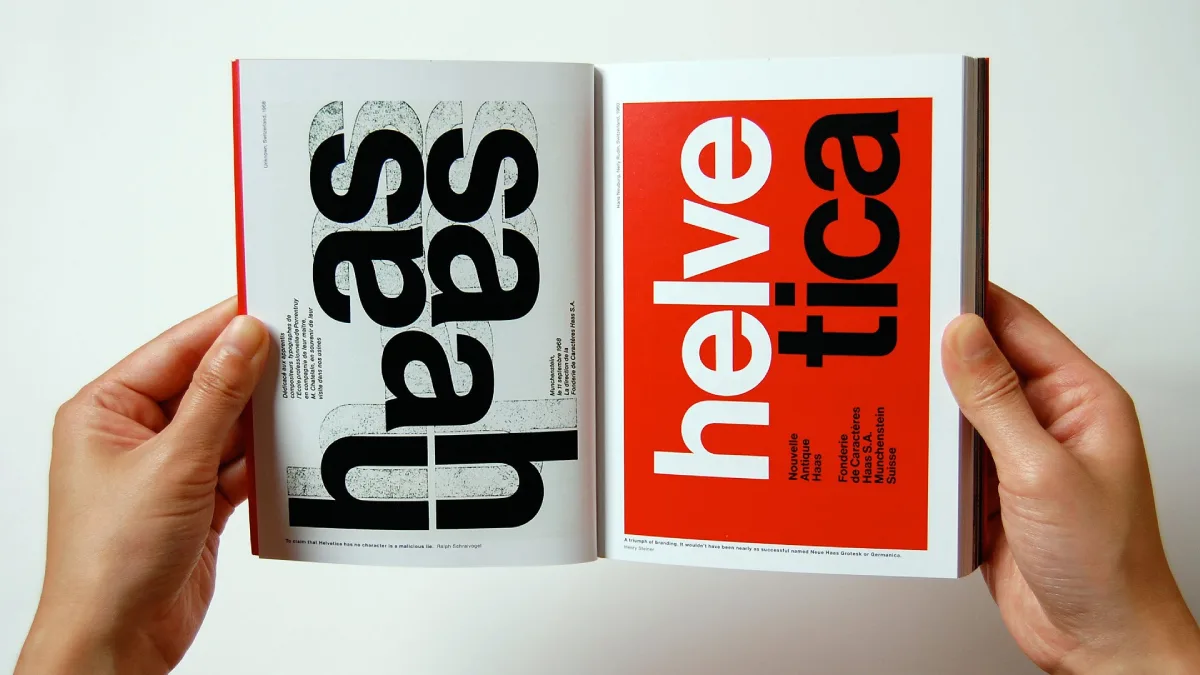
Helvetica: Homage to a Typeface
You know the rules of Helvetica, but you’re blind to how it’s actually used in the wild. This book is the field guide. It juxtaposes 400 examples of masterful design with the ugly, ingenious, and charming real-world applications. See the legendary typeface in its natural habitat.
As an Amazon Partner, when you buy through our links, we may earn a commission.
So, Should Your Business Use Helvetica? A Practical Checklist.
This isn’t about personal taste. It’s about strategic alignment. Before you even consider Helvetica, you must answer these five questions with brutal honesty.
- What is my brand’s core personality? If your answer includes words like “warm,” “playful,” “artisanal,” “rebellious,” “luxurious,” or “friendly,” then the answer is an immediate and absolute no. Stop now.
- Am I selling clarity or character? A medical device company selling life-saving clarity might use Helvetica effectively. A craft brewery selling unique character and a rich story should run in the opposite direction.
- Is my brand name and visual system exceptionally strong? Helvetica can work as a neutral stage, but only if the main performance is brilliant. Helvetica can provide a solid foundation if your company name is unique, your distinctive colour palette, and your photography is stellar. If your logo is all you have, it’s not enough.
- Why am I really choosing it? Is this a strategic choice to project uncompromising neutrality and authority? Or is it a fear-based choice to avoid making a bolder, more interesting decision? If you’re choosing it because you’re scared, it’s the wrong choice.
- Have I even considered the alternatives? Or did you just stop at the first font you could think of? The world of typography is vast and incredible. Defaulting to the most obvious option is a failure of imagination.
More innovative Alternatives to Helvetica for 2026 and Beyond
So you’ve decided against the default. Good. Here are some intelligent alternatives, grouped by the feeling you might be trying to achieve.
For a Classic Swiss Modernist Vibe…
- Univers: Designed by Adrian Frutiger around the same time as Helvetica, it’s the other giant of the Swiss style. It has a slightly more even and rhythmic feel, and many designers consider it more versatile and elegant.
- Akzidenz-Grotesk: This is the typeface that directly inspired Helvetica. It’s a bit warmer, has slightly more variation in its letterforms, and feels less rigid. It’s the original, with a raw authenticity that Helvetica smoothed over.

For a Modern, Geometric & Approachable Feel…
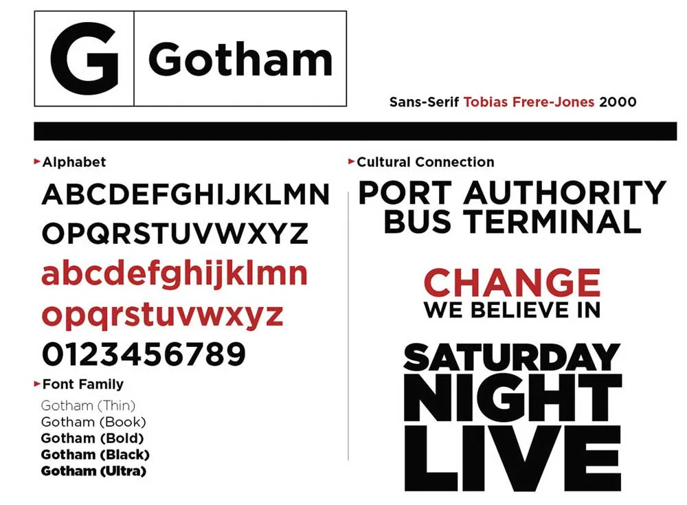
- Proxima Nova / Gotham: These two have dominated web design for the last decade for a reason. They are clean and geometric but have a wider, more open feel, making them inherently friendlier and more approachable than Helvetica.
- Circular: A very popular choice for modern tech brands. It’s based on clean, circular geometry, which gives it a simple, friendly, and forward-looking personality.
For a Digital-First Workhorse Sans-Serif…
- Inter: A fantastic, free typeface from Google Fonts designed by Rasmus Andersson. It was created specifically for user interfaces and on-screen reading, making it exceptionally clear and practical for any modern digital business.
- Roboto: Another Google creation that blends the best features of grotesque fonts (like Helvetica) with more humanist curves. It’s familiar and incredibly readable without feeling overused or sterile.

The Final Verdict on Helvetica
Helvetica is not a bad font.
It is, however, a very lazy choice.
It is a precision tool for a particular job: communicating absolute neutrality, unwavering authority, and functional clarity. When that is the strategic goal, it is one of the best tools in the world.
However, for most small businesses, the strategic goals are different. You need to build a connection. You need to show personality. You need to stand out. You need to be memorable. In these cases, Helvetica is not just the wrong tool; it’s a liability.
The challenge for you as a business owner isn’t to love or hate Helvetica. It is to understand it, respect its immense power, and have the wisdom to know when to leave it in the toolbox.
Your font choice makes a promise to your customer. What promise is Helvetica making? Is its message of cold, efficient neutrality the one you want to send?
FAQs About Helvetica
What is Helvetica?
Helvetica is a widely used sans-serif typeface developed in 1957 by Swiss designers Max Miedinger and Eduard Hoffmann. It is known for its neutrality, clarity, and legibility.
Why is Helvetica so popular?
Its popularity stems from its association with the International Typographic Style (Swiss Style), its adoption by major corporations in the 1960s and 70s, and its inclusion as a default font on many computer operating systems, making it universally accessible.
What is the main difference between Helvetica and Arial?
Helvetica has horizontal and vertical stroke terminals (the end cuts of letters), giving it a crisp look. Arial has angled terminals, making it appear softer. They were designed for different purposes, such as Helvetica for print and Arial as a cheaper on-screen alternative.
Is Helvetica a good font for a logo?
It can be, but only if your brand strategy is intentionally built around neutrality, utility, and authority. For most small businesses that need to convey personality and stand out, it is often a poor choice because it is too familiar and lacks character.
What brands famously use Helvetica?
Many major brands have used Helvetica, including American Airlines (classic logo), The North Face, 3M, Jeep, Crate & Barrel, and the NYC Subway system.
Is Helvetica free to use?
No, Helvetica is a licensed font. You must purchase a license to use it for commercial purposes, such as in a logo or website. Arial, in contrast, is typically included with operating systems like Windows.
What are some good free alternatives to Helvetica?
Inter (which we use here) and Roboto are excellent, professional-grade free alternatives available from Google Fonts. They are designed for modern screen use and offer excellent legibility.
What does using Helvetica say about a brand?
It can communicate reliability, stability, and a straightforward, no-nonsense approach. However, it can also be perceived as generic, impersonal, uncreative, or dated if not used within a strong, well-defined visual system.
Is Helvetica outdated?
Some designers consider its modernist rigidity to feel dated in an era where brands favour more human and approachable aesthetics. However, its classic status means others also regard it as timeless. Its effectiveness depends entirely on the context.
What is “Helvetica Now”?
Helvetica Now is a modern, updated version of the typeface released in 2019 by Monotype. It was redesigned from the ground up to be more legible and functional in digital contexts, with multiple optical sizes for display, text, and micro-copy.
Should my small business use Helvetica?
Probably not. Unless you have a particular strategic reason to appear completely neutral, your business will benefit more from a typeface with more personality that helps you differentiate from competitors and connect with your audience.
What font is most similar to Helvetica?
Univers and Akzidenz-Grotesk are the most similar in style and historical context. Arial is visually identical to an untrained eye, but is fundamentally a different design.
Choosing a typeface isn’t just a design detail; it’s a core business decision. A font is a voice that sets the tone for everything you say. If you’re wrestling with how your brand should look and feel, it might be time to get an expert opinion. At Inkbot Design, we focus on building intentional brand identities that do more than just look clean—they connect.
Explore our logo design services or request a quote if you’re ready to build a brand that stands for something.


