The Harley–Davidson Logo: Rebellion and Consistency
The Harley-Davidson logo isn’t just a corporate mark. It is a flag.
In the design world, we often talk about “stickiness” and “brand recall.” However, Harley operates on a completely different frequency.
You don’t see people tattooing the Microsoft Windows logo on their biceps. You don’t see fiercely loyal groups of accountants wearing Dell-branded leather jackets on a Sunday ride-out.
The Harley Davidson “Bar and Shield” is one of the few graphic identities in history that has transcended commerce to become a cultural totem.
For the entrepreneur or small business owner reading this, the lesson here isn’t about motorcycles. It’s about tribalism. It’s about how visual consistency, when paired with an authentic product, builds timeless branding that survives wars, depressions, and the changing tides of fashion.
If you want to build a brand that lasts 100 years, you need to stop looking at current design trends and start looking at history. Let’s tear down the engine of this visual identity and see what makes it run.
- The Bar and Shield endures by pairing jagged, industrial geometry with bold orange and black, creating an instantly recognisable cultural totem.
- Relentless visual consistency—refining rather than reinventing since 1910—built tribal loyalty, merchandise revenue and lasting brand equity.
- Smart sub‑branding (Willie G. Skull) and adaptable silhouettes let Harley stay authentic while functioning across physical and digital contexts.
The Anatomy of an Icon: The Bar and Shield
Before we examine the timeline, we need to analyse the core asset. The “Bar and Shield” is the holy grail of badge design.

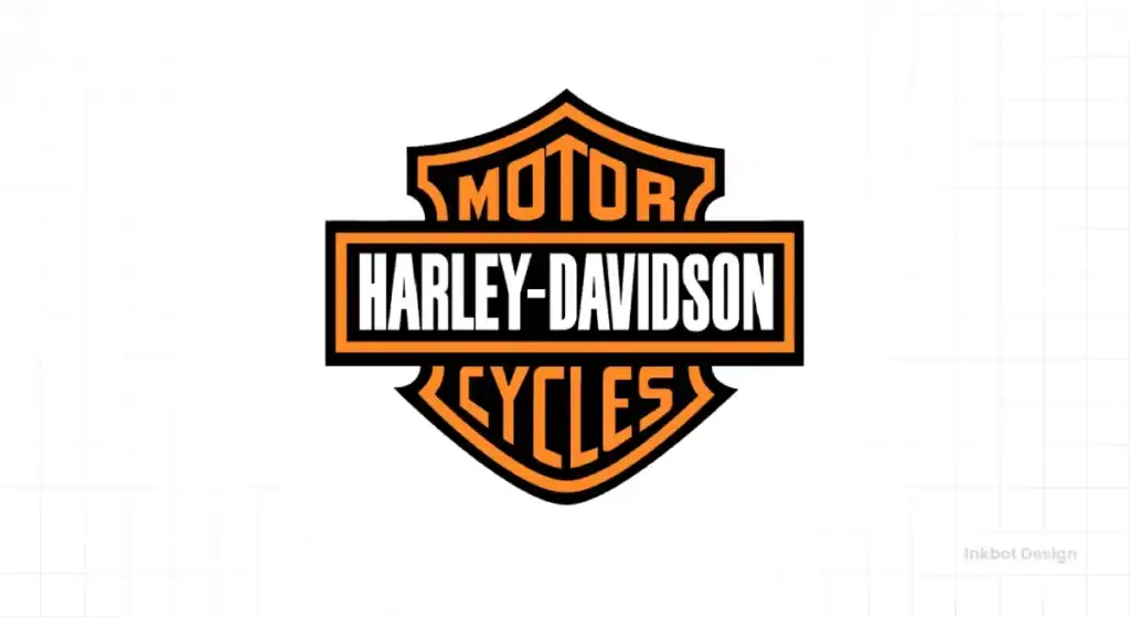
Why does it work? It ignores the modern obsession with “friendly” curves. It is jagged, hard, and industrial.
- The Shield: Represents strength, stability, and protection. It acts as the container, grounding the visual.
- The Bar: It cuts horizontally across the shield, creating dynamic tension. It represents the horizon line—the open road.
- The Typography: It’s aggressive. The custom lettering is blocky, legible, and unapologetically masculine.
3 Issues with Modern Logo Design (And How Harley Avoids Them)
As a designer, I see businesses make the same mistakes daily. Harley-Davidson is the antidote to these errors:
- Over-Simplification: Everyone wants to look like a tech startup. Harley kept the complexity of the badge because it conveys heritage.
- Weak Colour Palettes: Pastels are a trendy choice. Harley owns Orange and Black. They claimed a colour combination that signals “Caution” and “Authority.
- Constant Rebranding: Companies change logos every 5 years out of boredom. Harley has tweaked their core logo, but the skeleton has remained virtually unchanged since 1910.
Inkbot Insight: Your logo is the visual shorthand for your reputation. If you change it every time you get a new marketing manager, you are burning your reputation equity.
The Chronological Evolution: From 1903 to Now
While the core remains, the logo has evolved. It’s a history lesson in refining a concept rather than reinventing the wheel.
1903-1910: The “Silent Grey Fellow” Era
Initially, there was no “logo” in the modern sense. The tank lettering was hand-painted. It was functional. The text was simple, often displayed in gold on a black or grey background. It was utilitarian, much like the early bikes, which were essentially bicycles with engines strapped to them.
1910: The Birth of the Bar and Shield
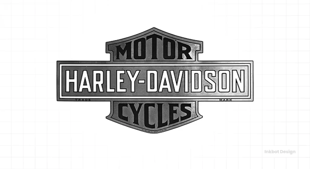
This is the pivotal moment. In 1910, the first trademarked version of the “Bar and Shield” appeared.
- The Look: It was sharper than today’s version. The text was slightly more condensed.
- The Impact: It established the hierarchy. “Harley-Davidson” on the bar, “Motor Cycles” (split into two lines) on the shield.
This design was patented in 1911. Think about that. A design created over a century ago is still the primary identifier for a billion-dollar global entity. That is the definition of return on investment in design.
The 1930s: The Art Deco Influence

During the 30s, designs got streamlined. Harley experimented with bird motifs (more on the Eagle later) and more stylised, aerodynamic lettering on the tanks. The Bar and Shield remained the corporate stamp, but the product branding (the tank art) started to reflect the speed and aesthetics of the machine age.
1953: The “V” Logo (The Golden Anniversary)
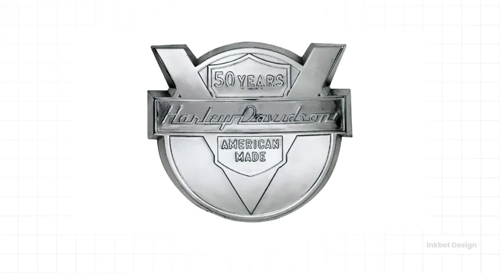
For their 50th anniversary, Harley introduced the “V” logo. This is a fascinating piece of design history that often gets overlooked.
- The Design: A large “V” (honouring the V-Twin engine) with a bar across it reading “Harley-Davidson.”
- The Context: This was intended to be a celebratory mark. While beautiful, it ultimately failed to replace the Bar and Shield in the long term. It serves as a reminder that you can have secondary logos for specific campaigns without diluting the primary mark.
1971-1980s: The AMF Era (A Case Study in Corporate Interference)
In 1969, American Machine and Foundry (AMF) bought Harley-Davidson. For brand purists, this is known as the “Dark Ages.”
AMF was a massive conglomerate that made bowling pins and leisure equipment. They didn’t understand the biker culture.
- The Logo Change: They incorporated the “AMF” letters onto the Bar and Shield.
- The Result: It symbolised a drop in quality. The bikes became unreliable, and the “AMF” logo became a mark of shame for many riders.
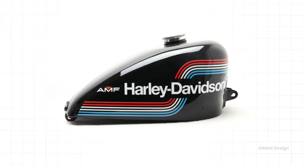
The Lesson: When a parent company forces its branding onto a cult product, the result is rarely positive. The logo became a symbol of the struggle between corporate efficiency and authentic soul.
The Eagle and the Restoration
When Willie G. Davidson and a group of investors purchased the company from AMF in 1981, the branding shifted aggressively back to its roots in heritage. The “Bar and Shield” was cleaned up, and the Eagle motif became prominent alongside it. The Eagle represents American liberty—a core value of the target demographic.
Design Analysis: Why It Works Psychologically
Let’s break down the visual psychology. Why does this specific combination of shapes and colours trigger such a response?
The Colour Palette: Orange, Black, and White
This is one of the most instantly recognisable palettes in the world.
| Colour | Psychological Association | Usage in Harley Brand |
| Black | Authority, Power, Elegance, Mystery | The background, the leather, the asphalt. It grounds the brand in seriousness. |
| Orange | Energy, Vitality, Danger, Visibility | The spark, the fire in the engine. It creates high visibility and contrast against the black. |
| White | Purity, Clarity, Contrast | Used for the text to ensure absolute legibility against the dark background. |
Most brands are terrified of orange. They think it looks like a traffic cone or a budget airline (EasyJet). Harley proves that if you pair a “loud” colour with a “hard” colour like black, you get a combination that demands attention without looking cheap.
The Typography: Custom Block
You won’t find this font in a drop-down menu on Canva. The Harley-Davidson typeface is a custom modification of block styles.
- Attributes: Sans-serif, vertically elongated, varying stroke widths.
- Effect: It looks machined. It appears to be made of steel.
- Why it matters: A curvy script font would imply softness or elegance. A standard Helvetica would imply neutrality. This font implies durability.
If you are looking to create a logo that carries this much weight, you cannot rely on stock fonts. You need logo design services that understand how to manipulate type to convey personality.
The Willie G. Skull: The Rebel Alter-Ego
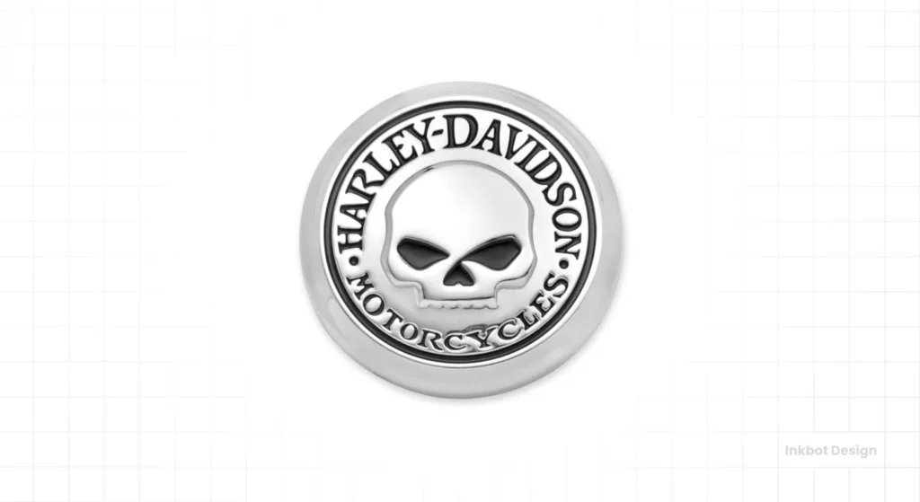
We cannot discuss Harley branding without mentioning the “Willie G. Skull.“
Designed by Willie G. Davidson (the grandson of the co-founder), this secondary logo features a skull surrounded by the words “Harley-Davidson Motorcycles.”
Why have a skull?
For a bank, a skull is a disaster. For a motorcycle company, it is an acknowledgement of mortality and the defiance of it. It taps into the “Memento Mori” concept—remember you will die, so ride today.
This allows Harley to sell merchandise to the “edgier” demographic without changing their corporate “Bar and Shield” logo. It is a masterclass in sub-branding.
The Brand Tribe: Tattoos and Loyalty
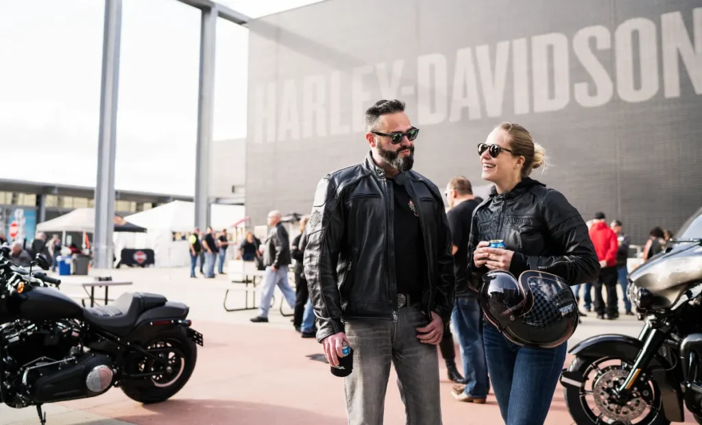
I’ve worked in design for years, and I have never had a client ask for a logo, and then a week later show me a tattoo of it on their chest.
Harley-Davidson is one of the only brands that achieves this. Why?
- Shared Values: The logo doesn’t represent a bike; it represents freedom.
- Exclusivity: Wearing the logo (on a jacket or skin) signals membership in a club.
- Legacy: It connects the rider to a lineage dating back to 1903.
Data Point: Merchandise Revenue
Harley Davidson’s “General Merchandise” segment (clothing, gear, accessories) generates hundreds of millions of dollars annually. For many, the entry point to the brand isn’t a £20,000 motorcycle; it’s a £25 t-shirt with that logo on it.
The logo is the product for a massive segment of their market.
Actionable Advice for Entrepreneurs
You likely aren’t selling V-Twin motorcycles. You might be running a coffee shop, a tech consultancy, or a construction firm. How does the Harley-Davidson logo evolution apply to you?
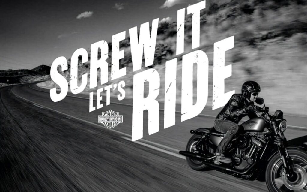
1. Own Your Niche’s “Visual Language”
Harley owns “Industrial Americana.” What is your visual language? If you are in finance, do you have to be blue and grey? Or can you be the “Black and Orange” of finance—bold, cautionary, and authoritative?
2. Consistency Builds Trust
If your business has been around for 10 years and you’ve changed your logo 3 times, stop it. Pick a mark that works, and stick with it. Let it age. Let it accumulate meaning.
3. Create a Badge, Not Just a Wordmark
A “Wordmark” is just your name (e.g., Google). A “Combination Mark” (such as the Bar and Shield) provides a standalone icon. For merchandise, uniforms, and social media avatars, a strong, badge-style logo is incredibly versatile.
4. Merchandise is Marketing
Even if you are a B2B consultant, high-quality branded gear (that actually looks cool) turns your clients into billboards. If your logo is unappealing, nobody will want to wear the t-shirt. If your logo is “Bar and Shield” quality, they will wear it until it falls apart.
The Digital Challenge: Adapting a Heavy Logo
One criticism of the Harley logo is that it is not “digitally native.” It has fine lines and complex shapes that can get lost at 16×16 pixels (favicon size).
How they solved it:
They didn’t flatten the logo into a soulless blob (like many car manufacturers recently did—looking at you, Nissan and VW). Instead, they use the outline or the silhouette of the shield for small digital applications.
They prioritised the shape over the detail.
Design Tip: If your logo relies on gradients or complex 3D effects to look good, it’s a bad logo. It must work in black and white, one inch tall. The Bar and Shield passes this test effortlessly.
Conclusion: It’s Not About the Bike
The Harley-Davidson logo is a triumph because it is honest. It reflects the machine it represents: loud, heavy, American, and unapologetic.
For the entrepreneur, the takeaway is clear. Don’t try to design a logo that pleases everyone. Harley Davidson’s logo likely scares some people—it looks aggressive. Good. That filters out the people who aren’t their customers anyway.
Great branding creates a reaction. It repels the wrong people and magnetically attracts the right ones.
If you are ready to stop blending in and start building a brand with the visual horsepower of a V-Twin, you need to look at your visual identity with a critical eye. Is it a flag? Or is it just a placeholder?
If you suspect it’s the latter, it might be time to get your hands dirty.
Next Step:
Are you worried your current branding is too generic to build a “tribe” around? Request a quote today, and let’s discuss how we can forge a visual identity that commands respect.
Frequently Asked Questions (FAQs)
What is the Harley-Davidson logo called?
It is officially known as the “Bar and Shield.” The horizontal bar features the text “Harley-Davidson,” and the shield outline contains the words “Motorcycles.”
Who designed the original Harley-Davidson logo?
The original Bar and Shield logo was created in 1910. While exact attribution is debated, it is widely credited to the Davidson family (specifically, aunt Janet Davidson is rumoured to have helped with early pin-striping and lettering, though the logo patent is corporate).
Why are Harley-Davidson colours orange and black?
Black symbolises authority, elegance, and the sturdy nature of the machines. Orange represents energy, enthusiasm, and visibility. Together, they create a high-contrast, aggressive look that stands out on the road.
What does the Willie G. Skull logo mean?
Designed by Willie G. Davidson, the skull logo symbolises the darker, rebellious side of the riding culture. It connects to the “memento mori” theme common in biker culture—riding is a celebration of life in the face of death.
Has the Harley-Davidson logo ever changed?
Yes, but subtly. The “Bar and Shield” has been refined over the decades (thinner lines, font tweaks), and there have been anniversary logos (like the 1953 “V” logo) and the controversial AMF-era logo. However, the core shape has remained consistent since 1910.
Why do people tattoo the Harley-Davidson logo?
It represents a lifestyle, not just a product. The logo signifies freedom, rebellion, and brotherhood. It is a permanent badge of belonging to the biker tribe.
What happened to the logo during the AMF years?
From 1969 to 1981, the logo often incorporated the “AMF” letters. This era is associated with lower production quality, so purists generally dislike logos or bikes from this specific period.
Is the Harley-Davidson logo a font I can download?
Not officially. The typography is custom-drawn artwork. While imitation fonts are available online (often referred to as “Harley Style”), the authentic lettering is proprietary to the brand.
What makes a logo “Timeless”?
A timeless logo avoids short-term trends (like gradients or specific shading styles) and relies on strong, simple geometry. Harley’s logo works because the Bar and Shield shape is distinct even in silhouette.
Can I use the Harley logo on my own merchandise?
Absolutely not. Harley-Davidson is famously protective of its trademark. They generate massive revenue from licensing and will pursue legal action against unauthorised use of the Bar and Shield.
Why does the logo look 3D or Embossed?
Often, the logo is rendered with drop shadows or embossing effects to mimic a physical metal badge pinned to a leather jacket or a gas tank. It reinforces the industrial, tactile nature of the product.
How does Harley-Davidson handle digital branding?
They use simplified versions of the Bar and Shield for small screens, sometimes removing the text inside the shield to ensure the iconic shape remains visible without becoming cluttered.
