The Golden Ratio in Graphic Design: A Practical Guide
If you’ve spent any time browsing design blogs or talking to branding agencies, you’ve likely encountered the “Golden Ratio.”
It is usually presented with an almost religious reverence—a magical mathematical formula that purportedly solves every aesthetic problem known to man.
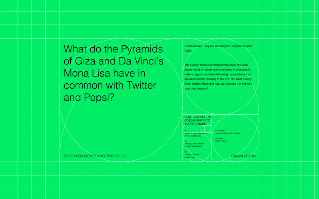
You’ve seen the diagrams: complex spirals overlaid on the Apple logo, the Parthenon, or the Mona Lisa. It looks impressive. It looks expensive. However, for the average business owner or entrepreneur, it often appears to be nonsense.
Here is the reality: The Golden Ratio is not a magic formula. It is not a guarantee that your logo will win awards. It is, however, a highly effective tool for creating cognitive fluency. It helps the human brain process visual information more efficiently.
In this guide, we will cut through the mysticism.
We will explore what the Golden Ratio actually is, how it applies to the principles of design, and how you—or your designer—can utilise it to create a brand that simply “feels right” to your customers.
- The Golden Ratio (≈1.618) is a practical design tool that creates visual harmony and reduces cognitive load, not a mystical rule.
- Use the ratio for layouts, typography, and logo refinement to establish clear visual hierarchy and proportional relationships.
- Don’t follow it dogmatically — prioritise brand communication; use the ratio to refine, not force, designs.
What is the Golden Ratio? (The “Maths” Bit)
Don’t panic. We aren’t doing advanced calculus here.
The Golden Ratio, also known as the Divine Proportion, is a mathematical ratio. It is derived from the Fibonacci sequence, a series of numbers where each number is the sum of the two preceding ones: 0, 1, 1, 2, 3, 5, 8, 13, 21, 34… and so on.
When you divide a number in this sequence by its immediate predecessor (e.g., 21 \ 13), you get a number that gets closer and closer to 1.618.
This number, represented by the Greek letter Phi (𝜑), is the Golden Ratio.
Why Does 1.618 Matter?
In visual terms, the Golden Ratio exists when a line is divided into two parts (a and b), such that the longer part (a) divided by the smaller part (b) is equal to the sum of (a) + (b) divided by (a).
a/b = (a+b)/a ≈ 1.618
Why should a business owner care about this equation? Because for reasons rooted in nature and biology, the human eye finds this specific proportion incredibly pleasing. It creates a sense of balance and harmony. It feels “correct.”
When a layout, a webpage, or a logo ignores proportion entirely, it feels chaotic. When it adheres to the Golden Ratio, it feels structured and intentional.
Consultant’s Note: Don’t get hung up on the exact decimal points. In design, we are seeking a visual representation of the golden ratio, approximately 1:1.618. We aren’t building a bridge; nobody will die if your margin is a pixel off.
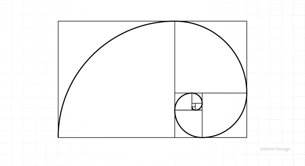
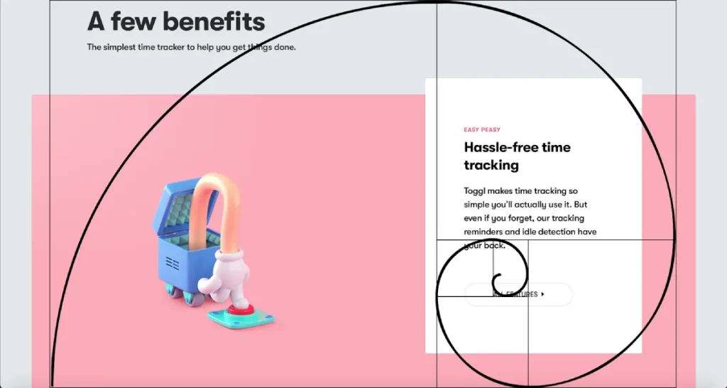
The Golden Spiral and the Golden Rectangle
If you take a rectangle with sides sized 1:1.618 and cut a square off it, the remaining rectangle will also have the proportions of 1:1.618. If you continue doing this, you will achieve a “Golden Spiral.”
This spiral is the famous image you see overlaid on everything from seashells to the Twitter logo. It guides the eye through a composition in a natural, flowing manner.
Visual Hierarchy and Cognitive Load
The primary utility of the Golden Ratio in business design is Visual Hierarchy.
Your customers are busy. They have short attention spans. If they land on your website or look at your brochure and don’t know where to look first, they leave.
By using the Golden Ratio to size your elements, you create a natural path for the eye. You reduce “cognitive load”—the amount of brainpower required to understand what they are looking at.
Application 1: Layout and Grid Systems
The most practical application for the Golden Ratio is in setting up your workspace before you even place a single pixel. This is arguably more important than the logo itself.
The Web Design Layout
Let’s say you are designing a website with a total width of 960 pixels (a classic grid width). You want a main content area and a sidebar. How wide should they be?
You could guess. You could split it 50/50 (which usually looks boring). Or, you could use the Golden Ratio.
- Total Width: 960px
- Divide by 1.618: 960 / 1.618 = 593
So, your main content area should be roughly 593px, and your sidebar should be 367px (960 – 593).
This creates a visually balanced relationship between the two columns. The main content commands attention, but the sidebar doesn’t feel squeezed or overpowering.
The Golden Rectangle in Print
When designing a brochure, business card, or flyer, the dimensions of the paper often adhere to specific ratios. However, how you break up that space is up to you.
Scenario: You have a flyer promoting a new service.
- Section A (The Hero Image): Should take up the larger portion of the Golden Section.
- Section B ( The Copy/Text): Should take up the smaller portion.
This prevents the design from feeling top-heavy or text-heavy. It creates breathing room.
Application 2: Typography and Typesetting
This is my favourite tip for entrepreneurs because it is instantly actionable. You don’t need to be a designer to fix your documents using this rule.
Determining the correct size difference between your Header text and your Body text is often a struggle. If the header is too large, it resembles a tabloid newspaper. If it’s too small, the reader skips it.
The Golden Typography Formula
Multiply your body font size by 1.618 to get your header size.
Let’s look at how this plays out in a real document:
| Element | Font Size (px) | Calculation | Usage Context |
| Body Text | 16px | Base Unit | Standard blog post or web copy. |
| Heading 3 | 26px | 16 X 1.618 | Sub-subheadings. |
| Heading 2 | 42px | 26 X 1.618 | Major section breaks. |
| Heading 1 | 68px | 42 X 1.618 | Main Page Title / Hero Text. |
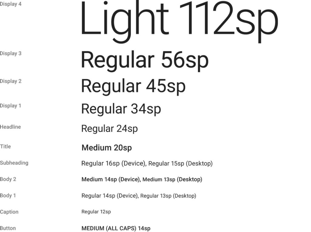
Why this works: It creates a rhythm. The jump in size is significant enough to signal “this is a new section”, but proportional enough to feel related to the body text.
If you are struggling with a messy Word document or a PowerPoint deck that looks unprofessional, check your font ratios. Adjusting them to this scale is a five-minute fix that makes you look 50% more professional.
Application 3: Logo Design and Branding
This is where things get controversial.
If you search for “Golden Ratio Logos,” you will see diagrams of the Apple logo, the Pepsi logo, and the Twitter bird, all covered in circles and lines.
The “Post-Rationalisation” Trap
I need to let you in on a trade secret: Many designers apply the Golden Ratio grids after they have designed the logo.
We call this “post-rationalisation.” It’s a way to sell a design to a client by proving it is mathematically “perfect.”
However, the best logos do use the ratio during the construction phase to polish and refine the shapes.
How It Actually Helps Logo Design
When we are refining a logo at Inkbot Design, we might use the Golden Ratio to:
- Define Curve Radii: If a logo has a large curve and a small curve, the radius of the small curve should be related to the large one by a factor of 1.618.
- Proportioning Elements: If an icon features both a symbol and text, the size relationship between the icon’s height and the text’s height can be balanced using the Golden Ratio, also known as the Golden Mean, or Phi.
Case Study: The Toyota Logo
The ovals in the Toyota logo aren’t random. They are meticulously sized using a grid based on the Golden Ratio (a and b squares). This gives the mark a stability that feels trustworthy—exactly what you want from a car manufacturer.
Case Study: Pepsi
The Pepsi redesign famously (and somewhat infamously) utilised a “breathtaking” design document referencing the Golden Ratio, gravitational fields, and the expansion of the universe. While the document was ridiculed for being pretentious, the underlying circle geometry did rely on Golden Circles to ensure the “smile” of the logo was consistent.
Takeaway for Business Owners:
Do not demand your logo “follows the Golden Ratio” just for the sake of it. Demand a logo that communicates your brand values. If the designer uses the ratio to refine the curves, that’s great. If they force it and the logo becomes illegible, fire them.
Considering a rebrand? Explore our graphic design services to discover how we seamlessly blend math and creativity.
Golden Ratio vs. The Rule of Thirds
You may be confusing the Golden Ratio with the Rule of Thirds. They are cousins, but they are not twins.
The Rule of Thirds divides a space into a 3×3 grid (two horizontal lines and two vertical lines). The intersections are the focal points.
- Rule of Thirds: Divides space into 1:1:1 (33% each).
- Golden Ratio: Divides space into 1:0.618 (approx 62% / 38%).
When to use which?
| Feature | Rule of Thirds | Golden Ratio |
| Complexity | Simple, fast, intuitive. | Requires calculation or specific grids. |
| Best For | Photography, quick image cropping. | Typography, intricate layout, logo balance. |
| Vibe | Dynamic, energetic. | Stable, harmonious, organic. |
| Central Focus | Pushes focus off-centre. | Guides the eye toward the spiral centre. |
My Advice: Use the Rule of Thirds when cropping photos for your website. Utilise the Golden Ratio for the website’s layout.

Common Myths and Pitfalls
As a consultant, I see entrepreneurs get bogged down in “design rules” to the point of paralysis. Let’s debunk a few things.
Myth 1: It Makes Bad Design Good
You can apply the Golden Ratio perfectly to a layout, but if your colour palette is neon green on pink, and your font is Comic Sans, it will still look terrible. The ratio is a structure, not a cure-all.
Myth 2: Everything Must Align Perfectly
If you adhere too strictly to the grid, your design can feel robotic and stiff. Sometimes, you need to break the grid to create tension or surprise. Design is about communication, not equation solving.
Myth 3: The Consumer “Knows”
Your customer will never look at your brochure and say, “Ah, nice use of Phi (1.618) on that sidebar.” They will simply find the document easy to read. The effect is subconscious.
Tools to Implement the Golden Ratio
You don’t need a calculator on your desk. There are tools that handle the math for you.
- Phiculator: A simple widget that gives you the corresponding number for any integer you input.
- Golden Ratio Typography Calculator: There are several web-based tools that allow you to input your base font size, and they generate the entire hierarchy for H1, H2, H3, and so on.
- Adobe Illustrator/Photoshop: These tools have “Golden Spiral” overlays available in the crop tool settings. Ask your designer if they use them.
- Grid Systems: Download a 960gs or Golden Grid System template for your website wireframing.
Golden Ratio Grid Paper Sketchbook
Your sketches feel ‘off’ because you’re ignoring the maths of beauty. This sketchbook is the fix. It features the Golden Ratio grid on every page, ensuring your designs are in perfect proportion. Stop drawing on blank paper and start using the framework that guarantees aesthetic balance.
As an Amazon Partner, when you buy through our links, we may earn a commission.
Conclusion: Balance, Not Dogma
The Golden Ratio is a tool in the designer’s shed, sitting right next to colour theory and white space. It is a powerful way to ensure your marketing materials, website, and brand identity feel polished and professional.
However, it serves the content; the content does not serve the math.
For the entrepreneur or small business owner, your takeaway is this: Structure matters. Don’t just slap elements onto a page. Whether you use the strict 1.618 ratio or just a solid grid system, giving your design a mathematical backbone will elevate your brand above the DIY chaos of your competitors.
Is your brand looking a little chaotic?
We specialise in data-driven, human-centric design that converts. If you want a brand identity that is built on solid principles rather than guesswork, request a quote today.
Frequently Asked Questions (FAQs)
Is the Golden Ratio necessary for a good logo?
No. Many iconic logos do not strictly follow it. It is a tool for refinement and balance, not a requirement for success.
Can I use the Golden Ratio in PowerPoint presentations?
Absolutely. Use the 1:1.618 ratio to size your headings versus your bullet points, or to divide the slide layout between text and images.
What is the difference between the Golden Ratio and the Fibonacci sequence?
The Fibonacci sequence is the series of numbers (1, 1, 2, 3, 5…). The Golden Ratio (Φ) is the result of dividing one number in that sequence by the previous one (approximately 1.618). They are mathematically linked.
Does the Golden Ratio apply to web design responsiveness?
Yes and no. While you can design a desktop site using the ratio, a fluid/responsive design means the ratio may shift as the screen gets smaller. It is better to use the ratio for vertical rhythm (typography and spacing) on mobile.
Why do our brains like the Golden Ratio?
It is believed to be related to cognitive processing speed. Because the ratio appears frequently in nature (faces, bodies, plants), our brains are “hardwired” to recognise and process it efficiently.
Is the Rule of Thirds the same thing?
No. The Rule of Thirds is a 33% split. The Golden Ratio is roughly a 62/38% split. The Golden Ratio is considered more dynamic and natural, while the Rule of Thirds is easier to implement.
How do I check if my current website uses it?
Measure the width of your main content column and your sidebar. Divide the larger number by the smaller number. If the result is close to 1.6, you are using it (intentionally or not).
Can I use the Golden Ratio for image cropping?
Yes. Instead of centring the subject, place the focal point of the image on the tightest part of the Golden Spiral. This creates a more compelling composition.
Is 1.618 the exact number?
No, Phi is an irrational number, meaning it continues without end (1.6180339887…). For design purposes, 1.618 or even 1.6 is precise enough.
Where can I learn more about design principles?
You can read our in-depth exploration of design principles to understand how balance, contrast, and hierarchy work together in relation to the Golden Ratio.

