The 25 Best Geometric Logo Design Examples in 2026
Geometry isn’t about being “neat.”
It is about control.
In an era where design-led companies outperform the S&P 500 by 219%, getting your logo design psychology wrong is a direct hit to your balance sheet.
Most designers treat geometry as a shortcut; experts treat it as a technical constraint.
- Geometric logos use circles, squares, triangles for balanced, scalable, and memorable brand marks.
- Shapes trigger psychology: circles suggest unity, squares stability, triangles direction, hexagons efficiency.
- 2026 trend: variable geometry and liquid minimalism — logos must morph and adapt across AR, VR, and displays.
- Optical correction beats pure math; designers use overshoot and pixel alignment for visual balance and legibility.
- Professional workflow: strict grid, minimal anchor points, SVG delivery, and accessibility compliance (WCAG 3.0).
What is Geometric Logo Design?
Geometric logo design is the practice of constructing a visual brand identity using a predefined set of mathematical primitives—circles, squares, triangles, and lines—to create a balanced, scalable, and highly memorable mark.
It relies on Euclidean geometry and grid systems to ensure structural integrity across digital and physical mediums.
Choosing a geometric shape isn’t an aesthetic choice; it’s a psychological one. In a 2026 market saturated with AI-generated noise, primitive shapes act as “cognitive anchors.”
| Shape | Psychological Trigger | Ideal Industry | Notable Entity |
| Circle | Unity, Protection, Infinite | Social Media, Community | Mastercard, Target |
| Square | Stability, Logic, Security | Finance, Legal, Tech | Deutsche Bank, IBM |
| Triangle | Direction, Power, Risk | Logistics, Construction | Adidas, Mitsubishi |
| Hexagon | Efficiency, Nature, Structure | Biotech, Manufacturing | HSBC, Honeywell |
Neurodesign and Memory Encoding
Research into Neurodesign suggests that our brains process geometric shapes 20% faster than organic ones. This “processing fluency” leads to higher trust levels.
When a customer sees the Chase Bank octagon, their brain doesn’t have to “work” to understand the shape, allowing the brand to bypass the initial wall of consumer scepticism.
Designing for 2026: Variable Geometry and Liquid Minimalism
In 2026, a static logo is a liability. The rise of Variable Branding means your geometric assets must adapt.
We have moved past “Responsive Design” (making things smaller) into Contextual Geometry.
- Sub-pixel Rendering: On modern OLED displays, the “glow” of a pixel can bleed into adjacent geometric lines. Professionals now adjust the stroke weight of a logo based on whether it is viewed in “Dark Mode” or “Light Mode” to maintain visual parity.
- Liquid Minimalism: This trend involves using geometry that can “morph” or “flex” without losing its core identity. Brands like Swisscom have pioneered this, using geometric primitives that can be reconfigured in AR (Augmented Reality) environments.
Key Takeaway: Your logo is no longer a fixed file; it is a set of mathematical instructions (JSON or SVG) that allows the mark to breathe across different digital densities.
The 25 Best Geometric Logo Design Examples
1. The Chase Bank Octagon
Created in 1961 by Chermayeff & Geismar, this is the gold standard for abstract geometry. It doesn’t look like a bank; it looks like “stability.”
- Technical Detail: The octagon is broken into four distinct parts, creating a sense of motion and progression while maintaining a solid “anchor.”
- Pro Tip: If you’re wondering how much a logo design costs, remember that this mark has remained unchanged for over 60 years. That is the ROI of geometry.
2. Mitsubishi’s Three Diamonds
This mark uses equilateral triangles to form a rhombohedron. It communicates structural integrity and Japanese precision.
- Real-World Application: The repetition of the triangle creates an “entity” that is recognisable even when blurred or viewed from a distance—critical for automotive branding.
3. Target’s Concentric Circles
The “Bullseye” is a masterclass in peripheral vision. Our brains are hardwired to notice concentricity.
- Evidence: Research from the Nielsen Norman Group suggests that simple, prototypical shapes are processed faster by the human brain, leading to higher brand recall.
4. Adidas (The Mountain)
The three slanted bars form a triangle (the mountain), representing the challenges athletes overcome.
- Geometric Insight: The bars are parallel, but their varied heights create a dynamic diagonal line that leads the eye upward.
5. Audi’s Interlocking Rings
Four circles, perfectly aligned. It’s simple, but the “interlock” requires precise pathing to ensure the “overlap” doesn’t create visual clutter in small formats.
- Avoid Mistakes: Amateur designers often overlap shapes without adjusting for “ink bleed” or pixel rounding. Check our guide on common logo design mistakes to see why this matters.
6. Mastercard’s Venn Diagram
A rebrand by Pentagram that stripped away the stripes for pure geometric overlapping circles.
- The 2026 Context: This move toward “Flat Geometry” was a precursor to the 2026 trend of “Liquid Minimalism,” where shapes must work across AR and VR overlays.
7. YouTube’s Rounded Rectangle
The “Play” button is a triangle inside a rounded rectangle (a “squircle”).
- Technical Tip: The corners of the rectangle use “G2 continuity” curves, which look smoother to the eye than a simple circular radius.
8. National Geographic’s Yellow Border
A simple yellow rectangle. It proves that a geometric “frame” can be as powerful as a complex icon.
- Psychology: The rectangle represents a “window” to the world, utilising the psychology of colour to evoke curiosity.
9. British Rail (The Double Arrow)
A UK classic. It uses parallel lines and 45-degree angles to represent two-way travel.
- British English Note: This is a “symbol of modernisation” (with an ‘s’) that defined an era of transport.
10. FedEx (The Hidden Arrow)
The negative space between the ‘E’ and the ‘x’ forms a perfect geometric arrow.
- Gestalt Principle: This is “Closure.” The brain completes the shape, creating a “eureka” moment that builds brand affinity.
11. HSBC’s Hexagon
Based on the St. Andrew’s Cross, this geometric mark is a study in symmetry and balance.
- Expert Audit: The pointed ends of the triangles create “visual tension” that keeps the viewer engaged.
12. Airbnb (The Bélo)
A combination of a loop, a heart, and a location pin, all built on a unified geometric path.
- File Format Tip: Marks like this must be delivered as clean SVGs. If your designer is sending you raster files for a logo, read about vector vs raster images immediately.
13. Spotify’s Concentric Arcs
The “waves” are not perfectly concentric; they are slightly offset to feel more “organic” while remaining geometric.
- Optical Correction: This is a prime example where “mathematically correct” would have looked static and boring.
14. The Swisscom Logo
This is a “living logo.” While it looks like a simple 3D orb, it is constructed from a series of strictly defined geometric paths that can be animated via CSS or SVG without losing structural integrity.
- 2026 Relevance: It represents the move toward “Variable Identities”, where the geometry is programmed to react to user interaction.
15. The Cisco Logo
The bars aren’t just lines; they are a digital representation of the Golden Gate Bridge using varying vertical weights. This uses “Rhythmic Spacing.” Each bar and the gaps between them are mathematically consistent, making it incredibly easy for browsers to render as a low-weight SVG.
- Expert Audit: I often see designers fail to align these bars to a pixel grid, causing “anti-aliasing” blur. A pro ensures the line widths are whole-pixel values.
16. Motorola’s “M”
Two arches meet at a point. It’s symmetrical, aggressive, and highly scalable.
17. The Olympics (Five Rings)
The ultimate geometric icon. It relies on the “intersection” of five identical circles.
- Constraint: Designing interlocking geometry that doesn’t look like a “mess” at 100px requires deep knowledge of different types of logos.
18. The Deutsche Bank “Slash”
A square frame with a diagonal slash. The angle of the slash is precisely calculated to represent growth (upward) within a stable framework (the square).
- Constraint: This is “Total Reduction.” It proves that you don’t need complex shapes to create an entity that commands authority in the B2B financial sector.
19. Google’s G
As mentioned, this is a “broken” circle.
- The Myth Debunked: If Google had used a compass to draw the ‘G’, the “overhang” would have looked too heavy. They “cheated” the math to please the eye.
20. BP’s Helios
A geometric sunflower. It uses 18 intertwined “petals” to create a sense of energy.
- Complex Geometry: This is a nightmare to print at small sizes—a classic trade-off between “meaning” and “utility.”
21. Bluetooth (The Rune)
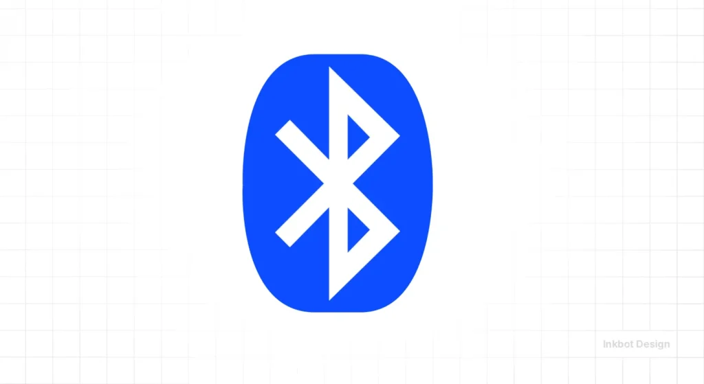
A geometric “Bindrune” combining two Nordic letters. It’s an example of “Linear Geometry.”
22. Chanel (The Interlocking C’s)
Fashion’s most famous geometry. It’s perfectly symmetrical and relies on the “O” shape created by the overlap.
23. The British Airways “Speedmark”
The curve is a “Conic Section”—a shape derived from the intersection of a plane and a cone. This isn’t a freehand “swoosh”; it’s a mathematically derived curve that implies speed and precision.
- Pro Tip: If you’re wondering about logo design trends, “Aerodynamic Minimalism” is a key pillar for logistics and tech firms in 2026.
24. Instagram (The Squircle)
The outer frame is a squircle, which is mathematically distinct from a rounded rectangle.
- Why? Apple’s iOS icons use squircles because they have a smoother “curvature ripple” than standard rounded corners.
25. IBM (The 8-Bar Logic)
The bars create a sense of speed and technical precision, mimicking the cathode-ray tube displays of the era.
- Technical Tip: The negative space (the gaps between the bars) is mathematically equal to the weight of the bars themselves. This ensures that even when printed on low-quality thermal receipts, the “B” and “M” remain legible. This is the definition of a technical logo design process.
Technical Workflow: Building a Scalable Grid System
A professional geometric logo is never “sketched”; it is engineered.
To ensure your brand survives the transition from a 2-meter billboard to a smartwatch notification, you must use a rigid grid system.
- Define the Unit (The Module): Start with a base pixel unit (e.g., 8px). All lines and shapes must be multiples of this unit to prevent “anti-aliasing” (the blur you see on low-quality logos).
- Apply the Golden Ratio ($1:1.618$): Use this ratio to determine the relationship between your primary icon and your typography.
- Establish G2 Continuity: Ensure that where a curve meets a straight line, the transition is mathematically smooth. This prevents “corners” from appearing where they shouldn’t.
- Pathing Audit: Use tools like Figma or Affinity Designer 2 to remove “redundant nodes.” A professional logo should have the absolute minimum number of anchor points to ensure the SVG file size remains under 2KB for lightning-fast web loading.
The Mathematics of Optical Correction and the “Google G” Myth
While Euclidean geometry provides the blueprint, the human eye is often a deceptive judge.
If you construct a logo using purely mathematical points, it will frequently appear unbalanced. This is known as the Illusion of Continuity.
For instance, consider the Google ‘G’. If you were to draw a perfect circle and cut a slice out of it, the ‘G’ would look like it’s falling over. To fix this, designers use Optical Overshoot.
The Math of the “Visual Weight”
The curvature of a circle requires a slightly larger footprint than a square to appear equal in size.
Mathematically, to make a circle with radius ‘r’ appear as large as a square with side ‘s’, the circle’s diameter must be approximately 5% larger.
This correction is critical in 2026 as High-PPI (Pixels Per Inch) displays, such as Apple’s latest Ultra-Retina screens, reveal even the slightest geometric misalignment.
When your logo is scaled, these “errors” are magnified, leading to a loss of brand perceived value.
Amateur vs Pro Geometric Design
| Feature | The Amateur Way | The Pro Way (Inkbot Design) |
| Grid Usage | Slaves to the grid; results in “stiff” marks. | Uses the grid as a guide, then applies optical correction. |
| Pathing | Thousands of unnecessary anchor points. | Minimal anchor points for lightning-fast SVG loading. |
| Scaling | Details vanish at small sizes. | Variable-weight versions for different resolutions. |
| Mathematical Ratios | “I used the Golden Ratio because it’s famous.” | Ratios chosen based on the brand’s industry and “weight.” |
| File Delivery | Flattened PNGs or messy AI files. | Clean, audited logo file formats for all use cases. |
The State of Geometric Logo Design in 2026
In 2026, we are seeing the rise of “Generative Geometry.”
AI tools like Adobe Firefly and Midjourney can now generate vector paths, but they lack “Contextual Intent.”
They can create a “perfect” triangle, but they don’t know why it should have a 2-pixel “optical overshoot” to appear aligned with a square.
Furthermore, with the proliferation of high-refresh-rate OLED screens, “Sub-pixel Geometry” is becoming a standard.
We are now designing logos with line weights that adjust dynamically based on the user’s screen brightness and background contrast to maintain legibility.
If you are considering a rebrand or logo redesign, you cannot ignore these technical shifts. A logo is no longer a static image; it is a piece of code that must perform.
Accessibility and WCAG 3.0 in Geometric Design
In 2026, accessibility is not optional. The European Accessibility Act and updated WCAG 3.0 guidelines have specific implications for geometric logos.
- Contrast Ratios: Geometric shapes with thin strokes often fail accessibility tests on mobile devices. A “Minimum Stroke Weight” must be established for small-screen rendering.
- The Colour-Blindness Test: Because geometric logos rely on distinct shapes, they are inherently more accessible than organic logos that rely on colour gradients. However, you must ensure that the meaning of the logo isn’t lost if the colour is removed.
- Touch Targets: If your logo is interactive (as seen in many SaaS apps), the geometric “hit area” must be at least 44×44 pixels to satisfy mobile usability standards.
The Verdict
Geometric logo design is the intersection of art and engineering. It provides a “guide” for brands that need to look professional, scalable, and timeless.
But remember: math is the tool, not the master. If it looks wrong, it is wrong, regardless of what the grid says.
Ready to stop guessing? Request a quote and let’s build something that actually works.
Frequently Asked Questions (FAQ)
Why are geometric logos better for small businesses?
They are easier to reproduce on a budget. Because they rely on simple shapes, they look consistent whether printed on a cheap business card or a high-end storefront. This reduces the “brand friction” that occurs when complex logos become unrecognisable.
What is the best shape for a geometric logo?
There is no “best” shape, only the right “attribute.” Circles convey community and completeness; squares convey stability and professionalism; triangles represent growth and direction. The choice depends on your specific brand positioning.
Is the Golden Ratio necessary for a good logo?
No. It is a tool, not a rule. While it provides a “natural” sense of proportion, many iconic logos (like the Google ‘G’) intentionally break mathematical ratios to achieve optical balance.
How do I know if my logo is “optically corrected”?
Place it next to a mathematically perfect shape. If your logo’s circle looks “flatter” or “rounder” than the perfect circle but feels more “right” to your eye, it has likely been corrected for human perception.
Can a geometric logo be “too simple”?
Only if it lacks a “Unique Attribute.” A plain square isn’t a logo; a square with a specific cut-out or a unique weight interaction is. Simplicity should never come at the cost of “Entity Density.”
Why is my geometric logo blurry on some screens?
This is usually caused by “pixel misalignment.” If your logo’s edges don’t sit exactly on a pixel boundary, the screen tries to compensate by shading the adjacent pixels, causing a blur. Ensure your designer uses a “Pixel Preview” mode and rounds all coordinates to whole numbers.
Can I trademark a simple geometric shape like a circle?
You cannot trademark a circle itself, but you can trademark a “composite mark”—the unique way you have arranged, coloured, or modified that circle. The National Geographic yellow rectangle is a prime example of a simple shape that has achieved “secondary meaning” through consistent use.
What is the difference between a Squircle and a Rounded Rectangle?
A rounded rectangle has a constant radius at the corners, which creates a visible “jump” where the straight line meets the curve. A Squircle (or super-ellipse) uses a progressive curve that feels more natural and premium. This is why Apple and Instagram use them for their app icons.
How does geometry help with sustainability?
In print branding, geometric logos with well-defined negative space (like the IBM 8-bar logo) use up to 35% less ink than solid organic shapes. Over a global supply chain, this results in significant cost savings and a lower carbon footprint.
Which software is best for geometric design in 2026?
While Adobe Illustrator remains the industry standard, Affinity Designer 2 is preferred for its superior “Snapping” engine, which is essential for geometric precision. For web-first brands, Figma is the best tool for creating “Variable” geometric components.
Do I need a grid for my logo design?
Yes. Even if you break the grid later, starting with one ensures that your proportions and angles are intentional rather than accidental.
What is the difference between a geometric and an organic logo?
Geometric logos use structured, mathematical lines. Organic logos use freehand, natural shapes. Geometric logos are generally better suited to tech, finance, and law, while organic logos work well for food, wellness, and creative sectors.
How do I protect my geometric logo design?
Ensure you have the original vector files and a clear transfer of copyright from your designer. Because geometric shapes are “common,” the unique arrangement of them is what you are trademarking.


