How 5 Different Font Styles Impact Customer Perception
Choosing a font for your business isn’t about what “looks nice.”
It’s a critical strategic decision that impacts how customers perceive your brand’s trustworthiness, professionalism, and value. Get it wrong, and you’re actively sabotaging your own business.
As a designer who has rebranded countless small businesses, I can tell you this: most entrepreneurs butcher typography.
They pick fonts based on personal taste, default settings, or whatever “fun” new style they found on a free-for-all website. It’s the fastest way to look amateurish.
Let’s get this out of the way. If you’re doing any of these, you need this guide.
- Using more than two or three fonts. This is the #1 sign of an amateur. It creates visual chaos and makes you look desperate.
- Relying on default system fonts. Using Arial or Calibri on your website screams, “I made this in Microsoft Word and don’t care about my brand.”
- Choosing a font just because it’s “elegant” or “cool.” Who cares? Does it work? Is it readable? Does it match your brand’s voice? “Cool” wears off fast. Unreadable lasts forever.
- Using thin, flimsy fonts for body text. You’re making your customers squint. They will just click away.
- Ignoring font licensing. Using a “free for personal use” font on your commercial website is theft, plain and simple. It’s also a lawsuit waiting to happen.
If you’re guilty of any of these, don’t panic. You’re just thinking about fonts as decoration, not as a tool. Let’s fix that.
Before we dive into the styles, you must understand the fundamentals. You’re missing half the picture if terms like kerning, leading, and hierarchy are foreign. We cover all those typography basics in our pillar guide, which you should read.
This article concerns the first, most crucial choice: font classification, or the types of fonts available and their communication.
- Font choice is strategic: it sets brand tone—authority, modernity, elegance—or undermines credibility before text is read.
- Serif vs Sans Serif is the core decision: Serif = tradition and trust; Sans = clarity and modern digital readability.
- Prioritise readability: use simple, well-weighted fonts for body text and limit fonts to two for coherence.
- Respect licensing: use properly licensed sources (Google Fonts, Adobe, foundries) to avoid legal and quality risks.
The Main Font Style Classifications
Typography is a massive field, but you only need to understand a few key categories for a business owner. Your entire brand identity will likely be built from the first two. The others are specialists, to be used with extreme care.
The primary categories are:
- Serif Fonts
- Sans Serif Fonts
- Script Fonts
- Display (or Decorative) Fonts
- Monospaced Fonts (A niche one, but useful)
Let’s break down what they are, what they feel like, and when to use them.
1. Serif Fonts: The Voice of Authority and Tradition
Serif fonts are the oldest style. The name “serif” refers to the small feet or strokes attached to the ends of the main strokes of the letters.
Think of Times New Roman, Garamond, or Georgia.

The Psychology of Serif
Serifs guide the eye along a line of text, which is why they have been the standard for printed books, newspapers, and magazines for centuries. They are traditionally considered more readable in long-form print.
Because of this long history, they evoke feelings of:
- Tradition & Heritage: They feel established and timeless.
- Trust & Authority: They’re used by banks, law firms, and universities. They feel “official.”
- Elegance & Sophistication: They are the default for luxury brands, high-end fashion, and fine dining.
- Intellect & Formality: They feel serious and academic.
When to Use Serif Fonts
Use a serif to make your brand feel established, trustworthy, and premium. They are fantastic for body text in print (brochures, reports, books) and work beautifully for headlines that need to convey elegance.
While Sans Serifs have dominated digital, high-resolution screens (“Retina” displays), Serifs have become perfectly readable and increasingly popular online for brands wanting a more classic, editorial feel (like The New York Times or Medium).
Real-World Brand Examples: Serif Fonts
| Business Type | Why It Works | Real-World Brand Example |
| Luxury & High-End Retail | Conveys elegance, quality, and exclusivity. | Rolex, Vogue, Tiffany & Co. |
| Financial & Legal | Projects authority, trust, and stability. | Goldman Sachs, many law firm logos. |
| Publishing & Academia | Implies intellect, tradition, and seriousness. | Penguin Books, Yale University. |
| Artisan/Heritage Brands | Feels established, timeless, and well-crafted. | Johnnie Walker, Patak’s. |
2. Sans Serif Fonts: The Voice of Modernity and Clarity
“Sans” is French for “without.” A sans-serif font is one without the little feet. The strokes have clean, simple endings.
Think of Helvetica, Arial, Roboto, or Open Sans.
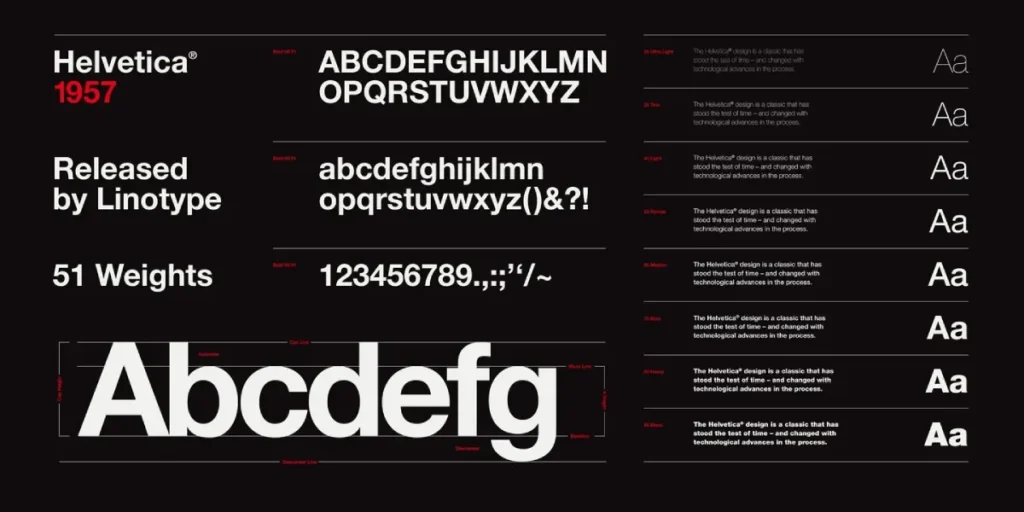
The Psychology of Sans Serif
Sans Serifs rose to prominence in the 20th century with modernism. They were seen as cleaner, more geometric, and more functional. The lack of intricate serifs on early, low-resolution computer screens made them far more readable. This cemented their dominance in the digital world.
They evoke feelings of:
- Modernity & Simplicity: They feel current, clean, and straightforward.
- Approachability & Friendliness: They are informal and direct.
- Efficiency & Tech: They are the language of startups, technology, and user interfaces.
- Clarity: They are unambiguous and easy to read, especially at small sizes on a screen (like in an app).
When to Use Sans Serif Fonts
Use a sans-serif font to make your brand feel modern, accessible, and clean. They are the default choice for digital-first businesses. They are exceptional for web body text, mobile app UIs, and any headline that needs to be punchy, clear, and direct.
Real-World Brand Examples: Sans Serif Fonts
| Business Type | Why It Works | Real-World Brand Example |
| Tech & SaaS | Feels innovative, clean, efficient, and user-friendly. | Google, Spotify, Microsoft, Netflix. |
| Activewear & Modern Brands | Conveys energy, simplicity, and boldness. | Nike, The North Face, Adidas. |
| Digital Media & Services | Highly readable on all screens, appears approachable. | LinkedIn, Facebook, Airbnb. |
| Healthcare & Public Services | Appears clear, unfussy, and trustworthy in a modern way. | The NHS (UK), Johnson & Johnson. |
Serif vs. Sans Serif: The Core Brand Decision
For 90% of businesses, your primary font choice will be a battle between Serif and Sans Serif.
- A law firm using a bubbly, rounded sans-serif might feel unprofessional and too informal.
- A tech startup using a heavy, traditional Serif might feel dated and slow.
Your choice here sets your brand’s entire tone of voice before a customer reads a single word. Many brands use a Serif for their logo or headlines (to show authority) and a Sans Serif for their website body text (for digital clarity). This is called font pairing, which we’ll get to.
3. Script Fonts: The Specialist for Elegance (Handle with Care)
Script fonts mimic handwriting or calligraphy. They flow, with letters often connecting.
Think of Brush Script, Pacifico, or elegant calligraphy fonts.
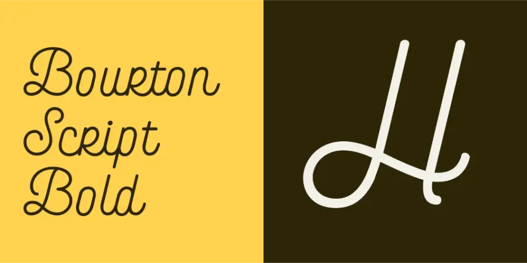
The Psychology of Script
Script fonts are intensely personal and human. They don’t feel “designed”; they think written.
They can evoke:
- Elegance & Sophistication: (Formal scripts) Think wedding invitations, fine wine labels.
- Friendliness & Fun: (Casual scripts) Think of a handwritten note or a friendly cafe logo.
- Creativity & Uniqueness: They feel one-of-a-kind.
The DANGER of Script Fonts
Business owners love script fonts, and they almost always overuse them. Never, ever use a script font for body text. It is fundamentally unreadable in paragraphs.
Script fonts are for accents. They are like saffron in cooking—a tiny bit is exquisite; a little more ruins the dish. Use them only for:
- A logo (e.g., Coca-Cola, Instagram’s old logo)
- A signature on a “personal” sales letter
- A special call-out on a package
- A headline on a particular, elegance-focused design (like a gala invitation)
Using a script font for your website navigation or your blog posts is a UX disaster.
4. Display Fonts: The Specialist for Impact (Use Once)
Display (or Decorative) fonts are the wildcards. This is a massive category for any font built for one purpose: to grab attention.
They can be grungy, futuristic, retro, horror-themed, or cartoonish. They are not designed for readability. They are designed for impact.
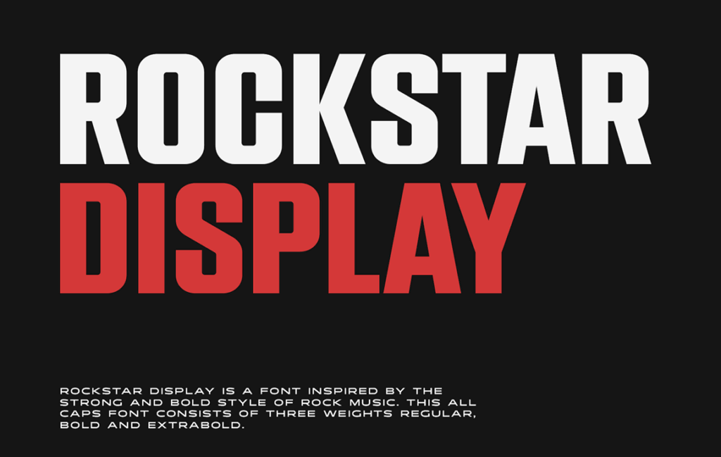
The Psychology of Display Fonts
Display fonts are all about theme and emotion. They don’t have a single psychological profile. A “Wild West” font feels rugged. A “Sci-Fi” font feels futuristic. Their job is to set a scene instantly.
The DANGER of Display Fonts
The problem with Display fonts is that they are trends. That cool, futuristic font you love today will look incredibly dated in 18 months.
Rule: Use a display font for one thing and one thing only: a main headline.
- Good use: The title of a movie poster.
- Bad use: The entire movie poster, including actor names and credits.
- Good use: The headline for a specific “Summer Sale” banner.
- Bad use: Your company’s primary brand font.
If your logo is based on a Display font, that’s fine—but it must be paired with a simple, readable workhorse (a Serif or Sans Serif) for everything else.
5. Monospaced Fonts: The Niche Tech Specialist
This is a minor but essential category. In most fonts (like Serifs and Sans Serifs), letters are proportional. An ‘i’ takes up less space than an ‘m’.
Every letter and character (including spaces) occupies the same horizontal width in a monospaced font.
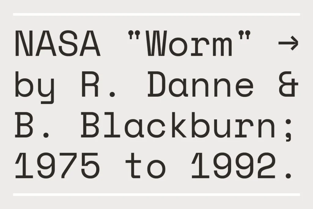
This style originated with typewriters and was adopted by computer programmers because it makes code clean and easy to scan for errors.
The Psychology of Monospaced
Because of their history, Monospaced fonts (like Courier or Consolas) evoke feelings of:
- Technology & Code: This is their primary association.
- Retro & Analogue: They feel like an old typewriter or a government document.
- Utility & Undesigned: They feel raw, functional, and purposeful.
Unless you are a coding academy, a tech-focused blog, or a brand with a definite retro/utilitarian vibe, you will likely not use these as a primary font.
How to Choose the Right Font Style for Your Business: A Framework
You don’t just pick a font. You diagnose your brand and prescribe a font. Here is a simple framework.
Step 1: Define Your Brand’s Personality
Stop thinking about your own taste. Who is your brand? If it were a person, what would it be like? Aaker’s 5 Dimensions of Brand Personality is the most common framework for this.
Pick one or two words that define you:
- Sincerity: Honest, genuine, cheerful. (e.g., Dove, Amazon)
- Font match: Soft, rounded Sans Serifs (like Open Sans) or simple, readable Serifs (like Merriweather). Feels approachable and trustworthy.
- Excitement: Daring, spirited, imaginative, up-to-date. (e.g., Red Bull, Nike, Tesla)
- Font match: Bold, dynamic Sans Serifs (like Oswald or Montserrat Bold) or a custom Display font for a logo. Needs to feel energetic.
- Competence: Reliable, intelligent, successful, efficient. (e.g., Microsoft, Volvo, Intel)
- Font match: Clean, “workhorse” Sans Serifs (like Helvetica, Roboto, Inter) or strong, stable Serifs (like Baskerville). Feels professional and dependable.
- Sophistication: Upper-class, charming, elegant, luxurious. (e.g., Rolex, Mercedes-Benz)
- Font match: Elegant, high-contrast Serifs (like Playfair Display or Didot) or very thin, geometric Sans Serifs. Feels premium and exclusive.
- Ruggedness: Outdoorsy, tough, durable. (e.g., Jeep, Levi’s, Jack Daniel’s)
- Font match: Strong, slab Serifs (fonts with thick, blocky feet) or wide, sturdy Sans Serifs. Feels tough and grounded.
Your font choice must be a direct reflection of this personality.
Step 2: Consider Your Primary Medium (Digital vs. Print)
Where will 90% of your customers see this font?
- Primarily Digital (Website, App): Default to a sans-serif font for your body text. It is the safest, most readable choice for screens. You can use a Serif for headlines to add contrast and character.
- Primarily Print (Reports, Brochures, Books): Default to a Serif for your body text. It’s proven to be comfortable for long-form reading on paper. Use a sans-serif font for headlines and captions to create a modern layout.
Step 3: Prioritise Readability Above All Else
This is the cardinal rule. If your font is hard to read, nothing else matters.
- Readability is how easy it is to read paragraphs of text.
- Legibility is how easy it is to distinguish individual letters.
A wild Display font might be “legible” (you can tell what the letters are), but it’s not “readable” in a sentence.
When testing a font for your body text, don’t just type the alphabet. Write a whole paragraph and check:
- Is it comfortable to read?
- Do letters blur together (e.g., ‘c’ and ‘e’)?
- Does it look clear at a small size (16px)?
- Does it have different weights (light, regular, bold)? A font without a bold option is useless for business.
Font Pairing: The Non-Designer’s Guide

You will almost always need two fonts: headlines (Header) and body text (Body). The biggest mistake is picking two fonts that are too similar. This looks like a mistake.
The goal is Contrast, Not Conflict.
- The Classic Combo (Safest Bet): Pair a Serif with a Sans Serif. This combination is timeless. It always works because it provides perfect contrast.
- Example: Serif Headline + Sans Serif Body (Classic, editorial feel)
- Example: Sans Serif Headline + Serif Body (Modern, clean feel)
- The Super-Family Combo (Easiest Bet): Use one font family with many weights. Use a Bold or Black weight for your headline and the Regular weight for your body text.
- Example: Montserrat Bold (Header) + Montserrat Regular (Body)
- Example: Lato Black (Header) + Lato Regular (Body)
Idiot-Proof Font Pairings for Your Business
Here are some pairings from Google Fonts (which are free and commercially safe) that you can use right now.
| Header (Sans Serif) | Body (Serif) | The Vibe |
| Montserrat | Lora | Modern, stylish, and elegant. |
| Oswald | Merriweather | Strong, condensed, and highly readable. |
| Lato | PT Serif | Friendly, approachable, and classic. |
| Roboto | Spectral | Clean, technical, and professional. |
| Header (Serif) | Body (Sans Serif) | The Vibe |
| Playfair Display | Open Sans | Sophisticated, high-contrast, and clean. |
| Libre Baskerville | Lato | Traditional, trustworthy, and friendly. |
| Arvo (Slab Serif) | Roboto | Confident, modern, and sturdy. |
A Final, Critical Warning: Font Licensing
This is the “gotcha” that can cost you thousands. Just because you can download a font doesn’t mean you can use it.
- “Free for Personal Use”: This is a trap. You are violating the license if you use this font on your business website, logo, t-shirt, or anything that makes you money. The font’s designer can find you and can sue you.
- Desktop License: This allows you to install the font on your computer to make things like Word docs or print brochures.
- Webfont License (WOFF/WOFF2): This is a separate license for embedding the font on your website. Just because you have a Desktop license doesn’t mean you have a Webfont license.
- App License: A separate license for use in a mobile app.
Where to Get Safe Fonts
- Google Fonts: The best resource for SBOs. All fonts are open-source and 100% free for commercial use on desktop and web.
- Adobe Fonts: Included with a Creative Cloud subscription. A massive, high-quality library that is fully licensed for commercial use as long as your subscription is active.
- Pro Foundries (MyFonts, FontSpring): This is where you buy premium, professional fonts. You pay once (or per year) for a license. This is for brands with a specific vision and a budget.
Avoid sites like Dafont or 1001 Fonts for professional work. They are 99% “personal use only” or low-quality fonts full of licensing traps.
Your Fonts Are Your Voice. Stop Mumbling.
The different font styles aren’t just a design choice; they’re your brand’s tone of voice.
A Serif font speaks with authority and tradition.
A sans-serif font speaks with clarity and modernity.
A Script font whispers with elegance.
A Display font shouts for attention.
Choosing the wrong one is like attending a high-stakes investor meeting in a clown suit. It doesn’t matter how good your proposal is; nobody is taking you seriously.
Feeling overwhelmed by the choices? That’s normal. This is a strategic decision, and we do it every day. If you’re tired of guessing and want a brand identity that builds trust and wins customers, exploring our professional graphic design services is a good next step.
We can build a complete visual identity—from logo to web fonts—that is professional, unique, and, most importantly, works. If you know your branding is a mess and ready to fix it, you can request a no-obligation quote directly.
Or, if you’re still in the learning phase, keep exploring our blog. But please, for your business’s sake, check your website and make sure you’re not using Comic Sans.
FAQs
What are the 5 main font styles?
The 5 primary classifications are Serif (with ‘feet’, traditional), Sans Serif (without ‘feet’, modern), Script (handwriting), Display (decorative, for headlines), and Monospaced (tech, retro).
What is the difference between a Serif and a Sans Serif font?
A Serif font has small ‘feet’ (serifs) at the end of its strokes; it feels traditional, authoritative, and is common in print. A sans-serif font has no ‘feet’; it has clean endings and feels modern, clean, and is the standard for digital screens.
What is the best font style for a business website?
For body text (paragraphs), a clean Sans Serif font (like Roboto, Open Sans, or Lato) is the safest and most readable choice. For headlines, you can use a bold Sans Serif or a contrasting Serif (like Playfair Display) to add personality.
What font style is best for a logo?
This depends entirely on your brand personality. A tech startup might use a clean sans-serif. A luxury brand would likely use an elegant Serif. A craft brewery might use a Display font, and a wedding photographer might use a Script font.
How many font styles should I use on my website?
A font for your Headlines.
A font for your Body Text.
You might use a third (like a Script) for a tiny, specific accent, but sticking to two is the professional standard.
Can I use free fonts for my business logo?
You must check the license. Most “free” fonts (from sites like Dafont) are “Free for Personal Use” only. Using them on a logo is commercial and violates the license. Use fonts from Google Fonts, which are 100% free for all commercial use.
What is a “Display” font used for?
A Display font is used for impact and attention, not readability. Use it only for large text, like a main page banner, a poster title, or a specific promotion. Never use it for body text or navigation.
What’s the easiest way to pair fonts?
Contrast: Pair a Serif with a Sans Serif. (e.g., Playfair Display headline + Open Sans body).
Family: Use one font family and pair its weights. (e.g., Montserrat Bold headline + Montserrat Regular body).
Why is font choice important for a business?
Your font is your brand’s voice. It communicates your personality—trustworthy, modern, elegant, or cheap—before anyone reads a word. A bad font choice makes you look unprofessional and can drive customers away.
What’s the most readable font style?
For digital screens, simple Sans Serif fonts (like Roboto, Inter, Open Sans) are generally considered the most readable for body text. For print, traditional Serif fonts (like Garamond or Merriweather) are often preferred for long-form reading.
What is a Slab Serif?
A Slab Serif is a type of Serif font where the ‘feet’ (serifs) are very thick, blocky, and unbracketed. They feel strong, sturdy, and confident. They are often used for “rugged” or “bold” brands (e.g., Volvo, Sony).
What’s the difference between readability and legibility?
Legibility is how easy it is to distinguish one letter from another. Readability is how easy it is to read passages of text. A decorative font might be legible, but it has terrible readability in a paragraph. For business, always prioritise readability.
