10 CTA Optimisation Mistakes: A Brutal Honesty Session
You’re burning cash right now and don’t even know it.
While you obsess over your ad creative and funnel structure, your Call-To-Action buttons—those tiny conversion machines—silently sabotage your entire business. I’ve audited over 300 high-ticket companies and never seen one get CTAs entirely right.
The truth? Most entrepreneurs leave 30-50% of their conversions on the table because of avoidable CTA mistakes.
That’s not a rounding error. That’s the difference between scaling profitably and wondering why your business is stuck.
I will show you the 10 brutal CTA optimisation mistakes costing you customers. Not because I want to make you feel bad but because fixing these will be the highest ROI activity you will do this month.
Let’s cut the fluff and fix what’s broken.
- CTAs can significantly impact conversions; ineffective placement leads to lost customers.
- Context and relevance are vital; generic CTAs perform poorly.
- Design matters—colour, size, and clarity influence click-through rates.
- User intent should drive CTA wording; personalise for better engagement.
- Test and optimise continuously; align CTAs across all channels for consistency.
2025 CTA Stats Nobody’s Talking About
- Centred CTAs crush left-aligned versions with 682% more clicks.
- Why it matters: The “above the fold” dogma is dead. Users now scroll deeper, and symmetry breeds trust. It’s like placing a spotlight on a stage – centrality commands attention in a cluttered digital world.
- Adding urgency (e.g., “3 left in stock”) spikes conversions by 332%.
- Why it matters: Fear of missing out (FOMO) isn’t just psychological fluff – it’s a £4.2 trillion lever. Brands weaponising real-time scarcity data (like live stock-counters) are outpacing static competitors 7:1.
- Multivariate testing slashes A/B testing timelines by 64% while boosting conversions by 41%.
- Why it matters: A/B testing is the horse-drawn carriage of optimisation. AI-driven multivariate tools analyse 50+ variables simultaneously, turning guesswork into hyper-targeted algorithms.
What These Numbers Mean for the Industry
The game has shifted from persuasion to prediction. Let’s break it down:
- Personalisation is table stakes. Generic CTAs now underperform AI-tailored variants by 202%.
- Mobile isn’t king – it’s the entire kingdom. CTAs ignoring thumb-friendly zones bleed 32.5% of potential revenue.
- Urgency is the new currency. Static CTAs are relics. Dynamic triggers (e.g., “12 people viewing this”) exploit herd mentality, converting bystanders into buyers.
#1: Putting CTAs in All the Wrong Places
Think about where you position those critical calls to action. Did you slap them haphazardly onto the page without much thought?
Big mistake. Huge.
Putting CTAs “Above the Fold” Isn’t Always Best
The old advice about prioritising “above the fold” content doesn’t automatically apply to CTAs. Many studies show that CTAs can perform much better when placed further down the page.
Why? It allows your visitors to get educated and earn that clickthrough first. Bombing them with a faceless “Buy Now” button before making your case is a surefire way to get ignored.
Strange CTA Placements Hurt Conversion Rates
Similarly, sticking CTAs in bizarre, out-of-the-way spots on your pages often backfires hard. I’ve seen CTAs shoved into headers, footers, sidebars – pretty much every underperforming nook and cranny.
Not every square inch of your website needs to feature a CTA! They work best when deployed purposefully within your content’s natural flow and context.
Too Many Distracting CTAs = Conversion Chaos
Speaking of poor CTA placement, another common mistake is overwhelming visitors with too many distracting calls to action and battling for attention. Which button should they click? Who knows!
Stick to a primary CTA per page/flow where possible. If secondary CTAs are included, style them differently and clarify the priority.
#2: Forgetting About Context and Relevance
Here’s a horror story for you: One of my past clients had the same “Download Whitepaper” CTA on every page of their website. On the home page, pricing page, and about page, you name it, and that generic button was embedded there.
Talk about irrelevant mixed messaging!
CTAs only work when relevant to what the visitor is thinking/doing on that page. Ignoring context and serving up randomised, generic CTAs is a dead-certain way to achieve terrible conversion rates.
Ensure each CTA is tailored to that specific step in your user’s journey.
#3: Crappy Design Putting Visitors Off
CTAs might be small in stature, but they punch well above their weight in significance. They’re absolute linchpins when it comes to design and user experience.
You get those tiny buttons wrong and put a bronchial cough at the bottom of your conversion funnel. Even tiny misses like colour, size, placement, and styling issues can completely butcher clickthrough rates.
Test constantly and seek honest feedback about your CTA design, following UI/UX best practices. Stuff like:
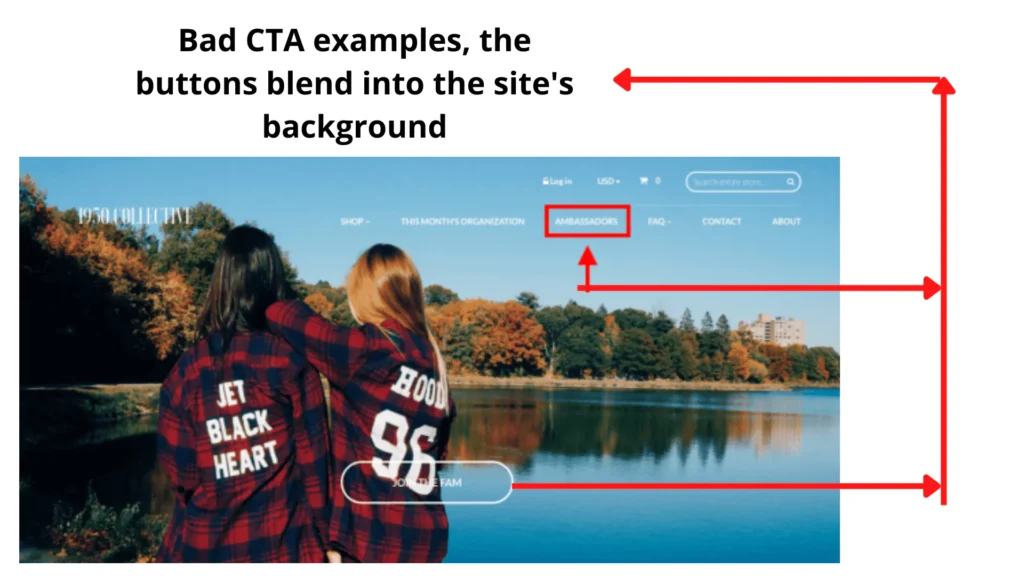
- Questionable Colour Choices: CTAs should be the striking focal point, not an afterthought blending into the background. Ditch background/text colours clashing with your brand or surrounding page elements.
- Cramped, Cluttered Spaces: White space is critical for CTAs, so don’t cram them into cluttered areas or let surrounding elements cramp their style. Give those buttons some room to breathe!
- Fiddly Microscopic Buttons: Handy hint: people need to be able to see and click your CTAs. Keeping them fiddly and microscopic, especially on mobile, is a one-way ticket to abandon-ville.
- Confusing Designer Debris: Shadows, gradients, underlines, italics, capitalisation – all these little stylings must be implemented thoughtfully on CTAs. Add too many on, or they’ll look like hot messes.
Role of Colour Psychology in CTA Effectiveness
Colour is not just a design element; it can inspire action. Red often signals urgency, while green suggests safety and ease.
Choosing the right colours can complement your brand and increase click-through rates. Consider your demographic and cultural associations with colours to maximise impact.
Consider the psychological implications of your colour choices. For instance, blue is often associated with trust and professionalism, while orange is linked to creativity and enthusiasm.
These subtle cues can evoke specific feelings and actions. Using split tests to determine which colours resonate best across different CTAs and audiences will maximise their efficiency.
Be consistent with your brand identity while adapting strategically to elicit the desired responses.
Get the CTA design nailed down with care and insight to maximise clickthroughs. In many cases, it pays to make them bigger and bolder.
#4: Forgetting About User Intent and Motivation
A “Submit” button is not a CTA – it’s a label for an input field. Similarly, “Click Here” buttons are about as exciting and motivating as poppadom farts.
The most compelling CTAs reflect and capitalise on the user’s core intent and mindset at that particular step.
For example, when presenting a lead magnet like an ebook, ditch drab “Download” buttons for something punchier like “Yes, Give Me the Free X Masterclass!” That hooks into the user’s underlying desire for whatever’s being offered.
Or how about subbing out a vanilla “Buy Now” with a benefits-orientated “Get Lifetime Access Today”?
The best CTAs speak to that specific visitor’s motivations, alleviating their doubts and reinforcing the reasons to follow through.
Use of Personalisation in CTAs
Personalising CTAs can dramatically boost engagement. Using a person’s name or referencing their recent activity on your site helps create a tailored experience.
It’s not just about familiarity; it’s about showing that you understand and anticipate their needs. This personal touch can significantly enhance the effectiveness of your CTAs.
Personalisation approaches can be simple, like including the user’s name, or more complex, such as tailoring offers based on past interactions. Custom CTAs that shift based on customer behaviour provide a seamless, buyer-focused path.
By displaying remarketing CTAs, you’re reminding users of their interests, creating a personal incentive to re-engage. Such personalised experiences can significantly uplift these key metrics on your conversion pathway.
Think hard about your visitor’s mindset, desires and potential objections at each stage of your funnel. Make CTAs work as hard as your copy.
#5: Not Aligning CTAs With Funnel Stages

Similarly, your CTAs must change and progress with your funnel’s different stages. They can’t just be static, one-size-fits-all buttons plastered across every page.
Early funnel stages like awareness and consideration call for CTAs focused on free education and straightforward lead generation:
- “Tell Me More About X”
- “Send Me the Ultimate Guide”
- “Book a Free Discovery Call”
Middle and bottom-of-funnel stages can turn up scarcity and commitment:
- “Claim My Early Bird Discount!”
- “Apply Now – Only 5 Spots Left”
- “Add to Cart While Stocks Last”
Post-purchase stages, meanwhile, might leverage upsells, cross-sells and referrals:
- “Get 25% Off Your Next Purchase!”
- “Share X With 3 Friends, Get Y Free”
- “Leave Your Review and be Entered to Win Z!”
Get the flow of your CTAs aligned perfectly with your audience’s mindset. That ensures maximum relevance and urgency with every single click.
#6: Overlooking Microcopy and Clarity
Here’s a woeful example that still haunts me:
“Click Here”
That’s it. That’s the CTA. No extra context or elaboration whatsoever. Just a big ol’ “Click Here”.
Click where, exactly? What happens if they click? Why should they even bother clicking in the first place?
Compelling CTAs need a solid payload of supplementary microcopy answering those basic FAQs:
- What exact action are they taking? (Sign up, download, purchase, etc.)
- What is the incentive or benefit of taking the action?
- What are the precise next steps, if any?
Take one of my favourite CTA templates:
“Download the ‘Y Secrets to Fast X’ Ebook for Free?”
The microcopy here clarifies:
- Taking Action: Download an ebook.
- Benefit/Incentive: It’s free.
- Next Steps: Access ‘Y Secrets to Fast X’ insights.
A little supporting microscopy goes a long way. Don’t just cross your fingers and bank on “Click Here!”
#7: Being Too Pushy and Impatient

Imagine visiting a new website immediately struck by a barrage of aggressive CTAs, pop-ups and overlays demanding data and dollars. You’d be gone before you could type “Quick, hit the back button!”
CTAs need to be persuasive, urgent and incentivised. But they absolutely shouldn’t bludgeon people over the head before earning the right to ask for the sale.
Bombarding first-time visitors with aggressively promotional, BUY NOW messaging is a big no-no.
That stuff might work later on warm leads, but cold visitors usually need a gentler introduction first. Focus on educating, building value/trust, and then gradually ramping up CTAs with their buying mindset.
Also, remove obnoxious barrier CTAs that generate frustration instead of action. Stuffing CTA roadblocks in people’s faces with no context or proper introduction is a conversion killer.
Don’t be spammy and overeager with your CTAs. Patiently temper them to match the visitor’s awareness and mindset. Gently guide, don’t goggle-punch.
#8: Failing to Create a Sense of Urgency
While overly pushy is a cardinal sin in CTA-land, that doesn’t mean you shouldn’t add any fire or urgency. The fact is, a lack of any perceptible deadline or motivation to act gets ignored.
Smart CTAs take advantage of appropriate scarcity tactics, creating a sense of urgency and FOMO for visitors to pull that trigger. I’m talking tactics like:
- Countdown timers and progress bars: “Only 5 Days Left to Claim This Offer!”
- Limited-time bonuses: “Upgrade Now and Get X Free (This Week Only!)”
- Stock scarcity: “Just 3 Spots Left at This Price”
- Social proof nudges: “267 Other People Are Viewing This Deal Right Now!
This persuasive, timely motivation helps drive perceived value and stakes without being overly pushover.
But it’s also essential not to overuse urgency for everything. Fire that bazooka too often, and it’ll lose its effect. Save those motivating scarcity CTAs for your hotter leads further down the funnel.
#9: Not Investing in Ongoing Testing and Optimisation

Do you know precisely which CTA variations perform best on each page? Do you have rock-solid conversion data proving the difference between winner and loser buttons?
Most businesses, unfortunately, don’t. Their CTAs exist in a bizarre, untested vacuum, prioritising guesswork over complex data.
Blind CTAs are almost always crippling your conversions. So you need to be constantly testing variations:
- Microcopy
- Design styles and placement
- Colours and sizing
- Positioning on page
Importance of Testing CTA Button Shapes
Different shapes of CTA buttons can influence click rates significantly. Studies have shown that rounded buttons are more inviting, leading to higher engagement. It’s worth experimenting with various shapes to see what resonates best with your audience.
Incorporating rounded corners or pill shapes can add a subtle emphasis that steers users towards your intended action.
These shapes are often perceived as more approachable.
Continuously testing various button shapes against each other is a smart strategy to find what engages your audience most intuitively. Even minor modifications can lead to measurable improvements in your campaign’s performance.
Run those split tests continuously to optimise and refine your CTA arsenal until your conversion rates soar into the stratosphere.
The best part? Your A/B testing insights have to compound returns across every page you transplant those data-driven CTAs onto.
Leveraging A/B Testing Tools for CTAs
A/B testing is indispensable for refining CTAs.
Tools like Google Optimize and Optimizely offer easy split testing to compare variations.
By testing different copies, colours, and placements, you can pinpoint what drives the best results.
It’s all about letting data guide you to higher conversion rates and improved performance.
#10: Not Aligning CTAs Across Channels and Campaigns
I mentioned keeping CTAs relevant to the user’s immediate context per page. But it’s equally crucial to align and synchronise them at a higher channel and campaign level, too.
Nothing undermines conversions like an incongruous mess of CTAs that aren’t consistently matched to their proper campaigns, marketing flows and messaging.
Ensure your CTAs are always in lockstep with your overarching strategies, whether that’s:
- Driving awareness, acquisition or sales
- Promoting a specific event, product or offer
- Picking up the baton for an email drip, webinar or auto-responder sequence
- Serving different CTAs per traffic source, device type and so on
Even something as simple as sharing different CTAs or links across socials, ads, emails and web content can undermine your conversion funnel royally.
Map everything out meticulously across touchpoints. Joined-up, cohesive thinking with every CTA is an absolute must.
The Nitty-Gritty Statistics Situation (It Gets Real)
If those CTA fails weren’t painful enough to read, let’s bring the science and stats into this shame spiral.
Mmmmm, glorious data:
- Only 16% of people will click a “book now” CTA. The other 84% are lost. – Source: Unbounce
- CTAs in the right-hand sidebar get about 1/5th the clicks of CTAs in the main content area. – Source: Jakob Nielsen
- CTAs with accessory info like stars, graphics and text specifics earn significantly more conversions. For example, this variation increased clickthroughs by 33%: – Source: Visualwebsiteoptimizer.
- Button copy making a personal and specific request beats generic calls like this button, outperforming “Sign up” by 90%. – Source: Michael Aargaarduk
- Adding the word “Free” increased conversions by up to 62.7% for payment software company Chargify. – Source: Apptamin
- CTAs with video thumbnails boosted sign-ups by 16% compared to plain image thumbnails in one case. – Source: CXL
Nightmarish. Those eye-watering percentages show how much traction you’re probably losing right now without properly optimised CTAs.
BONUS: A Few Quick CTA Copy Templates to Get Those Creative Juices Pumping
Before I wrap things up, here are a few tried-and-tested CTA copy formulas to get that hamster wheel spinning and spark some inspiration:
- The [Free Lead Magnet Angle]: “Download Your Free X Cheatsheet PDF”
- The [Time-Sensitive Scarcity Play]: “Get Y Now Before This Sale Ends”
- The [Chained Benefit-Driven String]: “Secure Lifetime Access to X, Cut Y in Half, and Gain Z Free Today!”
- The [Button + Clearly Defined Next Step]: “Buy the [Product Name] Course? Then Join Our Private Community!”
- The [Question/Quote-Based Teaser]: “‘Ready to Smash Your Q2 Goals?’ Click Here to Learn the System”
- The [Startup Freemium Hook]: “Join X Free for 14 Days, Upgrade Any Time”
- The [Value-Emphasised Bundle]: “Get All 3 of Our Top-Rated Ebooks for Just Y!”
You get the gist – pithy, benefit-driven, immense clarity. The exact kind of snappy, enticing copy that triggers clicks and makes visitors go, “Oooh!”
So Don’t Keep Making These CTA Optimisation Mistakes…
To recap, the biggest CTA optimisation blunders tend to fall into these dopey buckets:
- Poor positioning and context
- Bad designs (especially on mobile)
- Vague, meaningless, demotivating copy
- Not aligning with the user’s mindset
- Getting overeager/pushy too soon
- Not building in urgency/incentives
- Failing to test and iterate toward perfection
- Not ensuring synchronised, cross-channel alignment
Get those fundamentals locked down from the get-go, and suddenly, your CTAs start calling way louder and working harder for you.
Always remember that optimising CTAs is an intricate art AND meticulous science. Don’t unknowingly undermine one of the most vital components of your funnel by leaving your calls to action an afterthought.
Be strategic, systematic and laser-focused with them, and they’ll love you back with more leads, options, sales and more $$$ in the bank account.
Happy CTA-ing, CTAers!

