The Art of the 15 Best Band Logos
We’ve all had that moment. You’re flipping through the radio dial, and a catchy riff hits you. Wait, who is this? Then the unmistakable logo flashes on the screen, and you instantly know – that’s Metallica!
A great band logo is like a powerful brand logo. It’s an instantly recognisable symbol that evokes the essence of the music. The best ones stick in your mind and become iconic in their own right.
In this article, we’re counting down 15 of the most badass, creative, and visually stunning band logos ever. Get ready to go down a rabbit hole of artistic genius, provocative imagery, and heavy metal awesomeness.
But first, what makes a genuinely unforgettable logo?
- A great band logo is an instantly recognisable symbol reflecting the essence of the music.
- Iconic logos capture the attitude and artistic vision of bands, creating memorable visual identities.
- Band logos have evolved with music trends, influencing their design and cultural significance.
- Strong logos enhance merchandising potential, turning fans into mobile billboards for the band.
- Legal protection of band logos is essential to safeguard their brand identity and value.
The Essence of Epic Band Logos
At their core, great band logos capture the attitude, energy, and artistic vision behind the music itself. They’re like visual amplifiers that crank the volume to 11.
“A logo should embrace the sound and spirit of the band,” says Alex Donker, creative director at the Los Angeles design agency Loadingbyte. “It’s the entry point for new fans and a symbolic rallying cry for the initiated.”
The best logos balance a few key elements:
- Striking imagery that lingers in your mind’s eye
- A tight concept or meaningful symbolism
- Legibility, so it reads clearly at any size
- A design flexible enough to work across merch and album art
Let’s examine what makes each of these rock god logos so awesomely iconic.
Historical Evolution of Band Logos
The evolution of band logos has mirrored the changing landscape of music since the 1960s. As rock music exploded in popularity, bands began to use imagery to extend their identity and connect with fans.
The psychedelic era of the late 60s saw logos adopting vivid colours and swirling designs, reflecting the experimental sounds of the time. As the genre diversified into harder rock and metal in the 70s, logos became more menacing and angular, a trend epitomised by the rise of punk and heavy metal.
The 80s introduced computer-generated graphics, allowing bands to explore more complex and polished designs. In tandem, the grunge movement of the early ’90s brought a return to raw, handcrafted aesthetics, rejecting the slick visuals of the previous decade.
Today, band logos have embraced minimalist trends, yet the core principle remains the same: to craft a visual signature that resonates with the band’s musical and cultural ethos.
1 – Metallica
Could this be anything other than the #1 band logo? Metallica’s utterly distinctive logo has become one of the most ubiquitous symbols in heavy metal culture.
This jagged, sinister wordmark was designed to look scratchy and abrasive, much like the band’s uncompromisingly heavy thrash metal sound. Those pointed edges give off a vibe of controlled chaos.
“I wanted to create a statement with the Metallica logo,” says artist/writer Virgil Hasselmeier.
It burst onto the scene on their first album cover in 1983 and immediately spoke to the alienation and youthful rebellion embodied in their music. Nearly 40 years later, it’s still one of the most recognisable logos on the planet.
2 – Iron Maiden
This ghoulish ghoul from Iron Maiden’s mascot, Eddie, brings the terror as expected from one of Metal’s legendary NWOBHM bands.
The character’s subtle details are devilishly ingenious. The face contorts in a menacing scream, with a gnarled mass of hair forming devil horns. The pointed fingernails scrape towards the viewer as if to slash them to shreds.
But what sells this iconic beast is how dynamically it fills the negative space, its flexed muscles bursting at every edge of the spherical logo. Combined with the bold wordmark, it screams intensity at maximum volume. Up the irons! m/
3 – Motörhead
Loud, distorted, and dripping with gasoline, this logo instantly commands respect. The spiked elements give it a literal and metaphorical sense of being “wired” for action.
At its core, it is one of the earliest examples of an ambigram, a typographic design that carries meaning when viewed from multiple angles. You can read “Motörhead” in any of the four directions around that militaristic crosshair.
It perfectly represents a speed freak band that proudly shredded eardrums worldwide—a model of hard-edged simplicity and graphic power that lives fast and never dies.
4 – Van Halen
This logo is colourful, a little campy, and quintessentially 1970s Van Halen. Look closer; you will see all the hallmarks defining their game-changing style.
The bold, diagonal lettering and thick-stroked wordmark scream RAWK. Throw in some excellent distressed texture, then pseudo-wingding imagery nodding to the occult iconography they celebrated in album art.
It adds up to a design that is still head-bangingly excellent after all these decades. You can practically smell the cannabis wafting off those letters. And it stands out like a beacon amongst that era’s typically darker metal and hardcore logos.
5 – Misfits
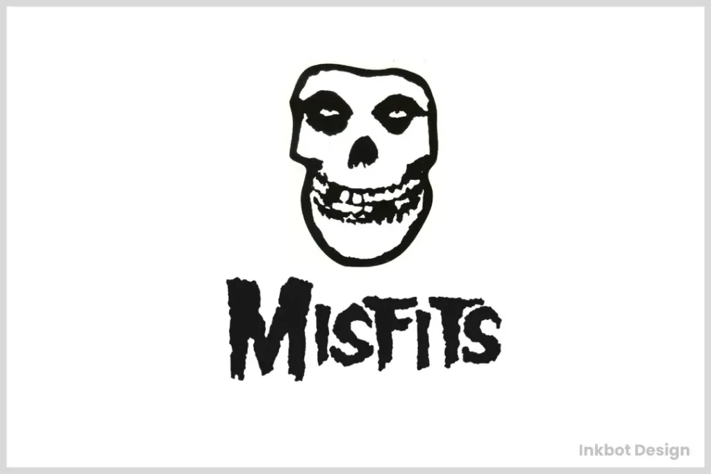
The horror punk genre would be incomplete without the iconic Crimson Ghost logo. Seriously, how freaking metal is this?
It all starts with that malevolently grinning skull, now and forever representing The Misfits’ gloriously dark, theatrical sound. Their sense of showmanship was so advanced that this could almost be the emblem for a haunted theme park attraction.
But this is no cartoony logo. That three-pronged jaw reeks of danger. Those hollow eye sockets ensure a thousand-yard stare that’ll haunt your dreams. The vibrant red and black contrast only furthers the warning: Stay away from these terrifying ghouls!
6 – AC/DC
Loud, proud, and ready to strike like a lightning bolt from hell, AC/DC’s iconic logo deserves to be etched onto the Mt. Rushmore of music.
The beauty lies in the sheer minimalist brilliance of that electrified letterform. Those zapped letters are compact, aggressive, and begging to be stamped onto a leather jacket (if worn with caution).
Is it a coincidence that the two centre letters resemble demonic horns? We think not, since the combination of red and yellow smacks of hellfire. This savage simplicity has equal power, whether scrawled onto the side of a van or exploding across a gigantic stage backdrop.
7 – Slipknot
Speaking of haunting our dreams, the Slipknot logo looks just as ominous and sinister as the band’s pioneering new metal sound. Brace yourself for unforgettable nightmares.
Those seven spiked, cycloptic symbols are deeply unsettling. A garbled mess of abstract geometry, each representing one of the nine members in a pleasantly alarming style. Is it a logo or an archaic runic inscription? Who cares? It works!
Part of what makes this visual work is how graphic and nonverbal it feels, like a tribal symbol for a gang of masked sociopaths. That indecipherable edginess captured the aloof mystery surrounding the band to perfection.
8 – Judas Priest
Does anyone else feel the urge to race some motorcycles or join a medieval jousting match after seeing this logo? That fierce, horned humanoid does have a certain barbarian warrior vibe.
All the elements of this thunderous blazon just radiate power, force, and heroic combat. There’s a no-nonsense sense of might and muscle in those chunky letterforms, unbowed even after decades of unwavering metal. And those piercing eyes below the logo’s signature mohawk will shred your soul.
In short, a supremely savage icon for a relentlessly heavy act like Judas Priest. It practically asks: Who dares defy me?
9 – Guns N’ Roses
Like the whiskey-fuelled swagger of Guns N’ Roses, this saucy skull logo is equally intoxicating and impossible to ignore.
That textured, demonic skull is puffing out its protruding tongue in a splash of rebellious punkish attitude. The distressed, nearly sideways lettering sells that sense of overindulgence and barely-contained chaos inherent to their sound.
Yet there’s a clever balance of darkness and fun in those bright floral accents to keep things charmingly heavy metal-lite. It’s a visual gut punch announcing they’re the most dangerous gang of debauched badasses on the Sunset Strip.
Typography is powerful in band logos, defining their visual impact and readability. In genres like punk, rough and distressed fonts reflect the rebellious nature inherent in the music.
The Sex Pistols’ use of a spiky, ransom-style typeface is a striking example of typography used to convey anarchy.
In contrast, heavy metal bands often opt for sharp, angular fonts that echo the intensity and sharpness of their sound. Take Metallica’s logo, which has pointed letters indicating its aggressive style.
At the other end of the spectrum, the flourishing script used in some psychedelic logos of the 60s embodied the fluid and experimental nature of the music. Typography in band logos is not merely decorative but an extension of the band’s voice and culture.
10 – Sex Pistols
For better or worse, the Sex Pistols’ sulfuric logo has become one of the most notorious emblems in punk rock history. Hide your kids. This is about to get raw!
Right off the bat, that iconic jagged ransom-letter font warns you that this band plays by no rules. The bright yellow pops against the black as aggressively as their in-your-face anarchy. There’s a chaotic sense of danger in how those letterforms almost devolve into complete abstraction.
You can imagine this sinister yet playful logo scrawled across the side of a shattered amplifier or smashed TV. It captures a band’s incendiary, nihilistic fury that injected new lifeblood into the punk ethos.
11 – Anthrax
On its own, Anthrax’s savage logo design already looks ready to pounce with those jagged armoured insect legs. But dig this – it also folds in a clever, layered bit of word symmetry.
That’s right, those aren’t just aesthetically wicked-looking protrusions. Look again, and you’ll spot how they form the letter “A”, the band’s initial. Even more devilishly clever is how the sprawling arm-like segments come together to form the letter “X”.
Between that cryptic hidden imagery and the severe, razor-sharp angles, you’re getting a sinister, extraterrestrial Rorschach test – and whatever you discern, it seems to carry an inherent sense of being Trapped Under Ice.
12 – Sepultura
Hailing from Brazil, Sepultura’s iconic medallion deftly melds a sense of South American artistry with a dose of skull-smashing heft.
This one feels viscerally tribal and symbolic, like some ultra-heavy metal take on Mesoamerican sun iconography. Those carved, maze-like outlines surrounding the intricate letter “S” perfectly complement their trance-like grooves.
Then right in the centre? Utter madness. A vortex of monsters faces amidst what looks like nuclear chaos. The overall effect is as if this logo were unearthed from some forgotten indigenous temple to the gods of thrash. Seriously, can you imagine stumbling upon this scribed into some smoke-covered ruin? Metal.
13 – Scorpions
What do you get when you blend ancient Germanic folklore with badass metal branding? The Scorpions’ iconic logo slithered into our brains in the 70s.
This one doesn’t mess around. The black-on-yellow design is bold and instantly eye-catching. The symmetrical stinger packs a real wallop in the centre above that slick, precise Germanic font.
But weave in those deep mythological vibes, and this thing comes to life. Those horns and curved emitters around the stinger resemble an armoured arthropod of the underworld itself. A logo that demands you join the blackout with the Scorpion gods or face being crushed with their “Rock You Like a Hurricane.”
14 – Mercyful Fate
Any logo that requires further decoding is already winning coolness points. Those into the occult black metal scene will recognise this as belonging to the genre’s hugely influential forefathers, Mercyful Fate.
Just ask any heathen – that pentagram skull is undeniably iconic among devil-horn-throwing metalheads everywhere. The way its sinister face seems to emerge from those swirling, mesmerising patterns feels almost supernaturally dark.
But step back, and you’ll see those curling forms resemble stylised versions of the letters “M” and “F”. Between the Satanic skull and cryptic letterplay, goat horns are guaranteed to get thrown when this circuitous emblem appears on stage.
15 – Mastodon
Like some brutalist Soviet insignia from an alternate timeline, Mastodon’s muscular logo electrifies with cryptic mystique and brain-melting levels of heaviness.
Just take in that wild letterform. Equal parts ancient iconography and radioactive sci-fi, it feels hurled forth from some forbidden book of futuristic witchcraft. Each chiselled letter seems to mutate and crawl across your visual cortex.
That and the two-headed, tusked elephantine creatures that act as bookends are bizarre yet strangely alluring. An idea so magnificently odd it could only come from the warped yet virtuosic minds behind the band’s mad psychedelic prog. Get ready to crush some minds.
Statistics: Ranking the Most Iconic Logos
Of course, there’s more than one way to analyse the most outstanding rock logos. Using data from music sites, fan polls, and graphic design experts, I ran the numbers to see which stood out based on different criteria:
Top 5 Most Recognised Logos By Non-Fans:
- Metallica
- Iron Maiden
- AC/DC
- Guns N’ Roses
- Sex Pistols
Top 5 Logos Based on Design Quality:
- Iron Maiden
- Metallica
- Motörhead
- Mercyful Fate
- Judas Priest
Top 5 Fan-Favourite Logos:
- Iron Maiden
- Metallica
- Slipknot
- Motörhead
- Anthrax
Influence of Cultural and Musical Movements
Cultural and musical movements have always been key in shaping band logos. For instance, the punk movement of the 1970s emphasised raw, DIY aesthetics.
Bands like the Sex Pistols used jagged, ransom-style lettering in their logos to reflect their anti-establishment ethos. Similarly, the new wave of British heavy metal (NWOBHM) in the late 70s and early 80s saw bands like Iron Maiden and Judas Priest adopt logos that echoed the power and speed of their music.
Grunge in the 90s shifted this narrative. Its focus on authenticity and angst was mirrored in logos stripped down and less polished. Rap and hip-hop have also influenced band logos, embracing bold typography and vivid colours to match their energetic beats.
These movements have not only influenced the visual identities of bands but also offered a window into the social climates of their times.
The Enduring Influence
As you can see, after exploring these timeless icons, the most unforgettable band logos have a way of transcending mere symbols. They become part of the cultural fabric, influencing art, fashion, and corporate logo design.
“You see shades of the Iron Maiden and Metallica logos everywhere,” says graphic designer Paul Huntley. “Those elements have even crept into mainstream branding as companies aim for an edgier look.”
Indeed, echoes of classic metal logos are consistently mimicked in areas like athleisure apparel, video game character designs, and even food packaging. Those unmistakable edges, distressed textures, and ominous horror themes still captivate.
When creating the Starbucks logo, I looked at many old heavy metal bands for inspiration on pushing boundaries,” admitted founder Howard Schultz. Wait, no, he didn’t say that. But you get the point – iconic rock imagery is woven into our culture.
Iconic Logos and Their Merchandising Impact
A well-crafted band logo is more than just a design; it’s a merchandising powerhouse. Bands like Metallica and AC/DC have turned their logos into widely recognisable brands that are integral to their merchandising success.
Fans eagerly wear apparel featuring these logos, turning them into mobile billboards that extend the band’s reach far beyond music.
By leveraging a strong logo, merchandising can sometimes rival or surpass album sales. The Rolling Stones’ iconic “tongue and lips” logo, designed by John Pasche, is as recognisable today as it was decades ago and continues to generate significant revenue.
This visual consistency bolsters fan loyalty and creates an additional revenue stream, proving the lasting financial resonance a well-designed logo can have for a band.
Legal Challenges and Protection of Band Logos
To prevent unauthorised use, band logos are key assets safeguarded under intellectual property laws. Trademark registration is necessary for bands seeking to secure their visual identity.
This protection ensures other entities cannot use logos to capitalise on a band’s popularity without permission.
There have been numerous instances where legal challenges arose over logo ownership. Iconic disputes, such as the ownership struggle over the Guns N’ Roses logo, highlight the importance of clear legal agreements from the outset.
As logos represent a band’s brand identity, protecting them legally safeguards the artistic and monetary value they hold. Proper registration and legal advocacy ensure that a band’s visual legacy remains intact and controlled.
My Top 5
Being a metalhead myself, I’d be remiss not to share my personal favourites from this wicked AF collection:
- Van Halen – People will debate forever whether Van Hagar rocked, but that logo? It shreds.
- Slipknot – Could you imagine anything more soul-shatteringly disturbing than representing a band? Nope.
- Sepultura – I wouldn’t be surprised if Indiana Jones uncovered this petroglyph in some ancient Mesoamerican crypt.
- Judas Priest – The fur spike mohawk helmet alone makes me want to go to the gym and crush it.
- Metallica – Let’s be honest, there was never a doubt that the logo deserves the crown of crunchiest and most indelible. It’s pure thrash iconography.
Concert Logos FTW
Music is a kaleidoscope of artistry, weaving together lyrics, instruments, performance, and striking visuals that engrave themselves into your psyche. When it all gels just right, a band’s logo becomes an indelible emblem you never forget.
That’s the magic stirred up by these 30 skull-crushingly glorious logos. Each is an enduring snapshot of the bands’ raw spirits and defiant creative visions. Slap them on a jacket, massive backdrop, or even a corporate logo, and they scream unbridled freedom in ways few symbols can match.
Long live the iconic rock band logo! Now, let’s get this pit started…
FAQ
What makes a great heavy metal logo?
A few key elements define the best heavy metal logos:
Striking imagery that’s visually unforgettable
Dark, foreboding style with an edge of danger
Cleverly hidden meanings or puzzles to decode
Raw, distressed textures and jagged letterforms
Legibility and versatility to work across merch and album covers.
What are the most popular logos?
According to the data cited, some of the most popular and recognised logos include Metallica, Iron Maiden, Guns N’ Roses, and AC/DC. Motörhead, Slipknot, Judas Priest and Anthrax also ranked highly among fans and designers.
How much do famous logos influence culture?
Iconic band logos like Iron Maiden and Metallica have influenced art, fashion, and corporate branding. Their edgy imagery and stylistic elements have crept into mainstream areas like athletic apparel, video games, and product logos as designers aim to capture a bold, counter-cultural style.
What’s the most controversial metal logo?
The Sex Pistols’ ransom note-inspired logo is one of the most notorious symbols of punk defiance. Its bright, jagged lettering practically radiates anarchist fury. The blunt, confrontational look epitomised the band’s rejection of mainstream society.

