The 5 Best 1440p Monitors for Entrepreneurs and Designers
You run a business, not an esports team. You need to stop buying monitors designed for one.
The market is saturated with screens screaming about “240Hz refresh rates” and “1ms response times.” This is noise.
It’s a relentless marketing push for features that have zero impact on your ability to design a compelling brand identity, analyse a P&L spreadsheet, or lead a clear video call.
This list is the antidote. It’s for entrepreneurs, small business owners, and creative professionals.
We’re ignoring the gaming hype and focusing exclusively on what drives business value: clarity, colour fidelity, and workflow efficiency.
- Prioritise 1440p (QHD) for sharp text, ample screen real estate, and native 100% scaling—ideal on a 27‑inch monitor for business and design.
- Focus on colour accuracy, USB‑C power delivery, and ergonomics—these three specs drive brand fidelity, single‑cable workflows, and comfort.
- Avoid paying for high refresh rates; allocate budget to colour, connectivity, or ergonomics for real productivity gains.
Why 1440p is the Unbeatable Sweet Spot
For years, the choice was between fuzzy 1080p (Full HD) and expensive, demanding 4K. That choice is now obsolete. The sweet spot is 1440p, Quad HD (QHD, 2560×1440 pixels).
On a standard 27-inch desk monitor, a 1440p display provides the ideal pixel density (around 109 pixels per inch, or PPI). This delivers two critical benefits:
- Crisp Text and Images: It’s a significant upgrade from 1080p. Text is sharper, icons are clearer, and you can see finer details in design work.
- No Scaling Headaches: Unlike 4K on a 27-inch screen, which often requires scaling up text and UI elements to make them legible (negating some of the benefit), 1440p is perfectly usable at its native 100% scaling.
It’s the resolution that offers more screen real estate and clarity without demanding a high-end graphics card or a five-figure budget.
macOS High-DPI Scaling & The 1440p Myth
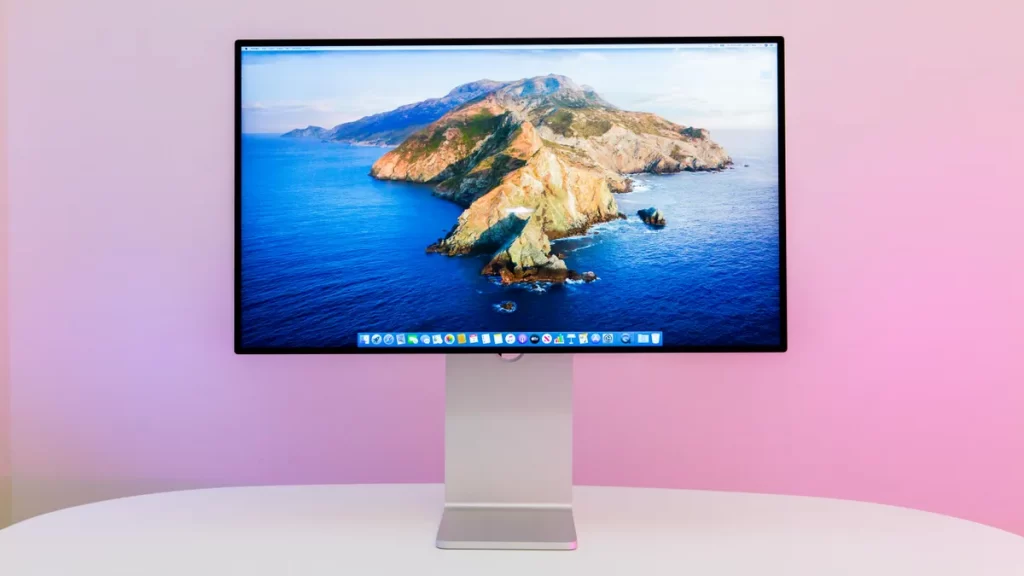
If you are a Mac user, you have likely heard the warning: “Only buy 5K or 4K monitors, or macOS will look blurry.”
This is a simplified version of a complex truth regarding High-DPI scaling (Retina). Apple designs macOS to look best at either 110 PPI (standard resolution) or 220 PPI (Retina). A 27-inch 1440p monitor sits at exactly 109 PPI.
This means that, mathematically, a 1440p monitor is the “perfect” non-Retina display for a Mac.
Unlike a 27-inch 4K monitor, which sits at roughly 163 PPI—a “no man’s land” that forces macOS to work harder to scale the UI—1440p lets you run the OS at its native size without blurriness or “shimmering” caused by fractional scaling.
When you plug a MacBook Pro or Mac Studio into a high-quality 1440p panel, the text size matches Apple’s legacy Thunderbolt Displays perfectly.
The myth of 1440p “blurriness” usually stems from users choosing 32-inch 1440p panels. At 32 inches, the pixel density drops to 92 PPI. Here, the “screen door effect” becomes visible, and macOS text rendering—which no longer uses “Subpixel Antialiasing”—begins to look jagged.
For a designer, the 27-inch 1440p form factor is the only one that maintains the sharp, professional aesthetic required for typography and UI layout.
The Quartz Scaling Penalty Most users don’t realise that running a 4K monitor at “looks like 1440p” scaling on a Mac actually forces the GPU to render at 5K and then downsample. This consumes roughly 10-15% of your GPU’s overhead and can cause lag in heavy Adobe Creative Cloud files. By using a native 1440p monitor, you bypass this scaling overhead entirely, keeping your system thermals lower and your UI more responsive.
The 5 Best Value 1440p Monitors for Entrepreneurs and Designers
Each monitor on this list is chosen based on the practical, business-first criteria we just established.
1. Dell UltraSharp U2724DE: The Unbeatable All-Rounder
Best for: The professional who needs a monitor that is also a complete, no-fuss docking station.
Dell UltraSharp U2724DE
Your current monitor is a dumb, 60Hz bottleneck that strains your eyes. This is an intelligent upgrade. It’s engineered with a buttery-smooth 120Hz refresh rate and a smart sensor that automatically adapts the picture to your room. It’s a tool that works for you, not the other way around.
As an Amazon Partner, when you buy through our links, we may earn a commission.
| Specification | Detail |
| Size & Panel | 27-inch IPS Black |
| Resolution | 2560 x 1440 @ 120Hz |
| Colour | 98% DCI-P3, 100% sRGB, Delta E < 2 |
| Connectivity | Thunderbolt 4 (90W PD), DP 1.4, HDMI 2.0, Hub |
| Key Feature | Built-in KVM switch, extensive port selection |
| Est. Price | £450 – £550 |
The UltraSharp line is a legend in the business world for a reason. This model is the pinnacle of productivity. The “IPS Black” panel technology provides a fantastic contrast ratio for deeper blacks, making text and images pop. But the real reason it’s number one is the Thunderbolt 4 hub. It’s a single-cable masterpiece that delivers 90W of power, downstream Thunderbolt for daisy-chaining, and a built-in KVM switch that lets you easily control two computers with one keyboard and mouse. It’s the definition of workflow efficiency.
IPS Black: A Critical Upgrade for Text Clarity
The traditional weakness of IPS (In-Plane Switching) panels has always been “IPS Glow”—a silvery sheen that appears over dark areas of the screen.
This results in a contrast ratio of roughly 1000:1, which can make black text on a white background look slightly “greyed out” and reduce the depth of shadows in photos.
The Dell UltraSharp U2724DE features the new IPS Black technology. This engineering breakthrough doubles the contrast ratio to 2000:1, which is transformative for designers.
It provides the deep, rich blacks previously only seen on VA panels (which have terrible colour accuracy) or expensive OLEDs (which suffer from text fringing).
With IPS Black, the “visual weight” of your typography is more accurate. You can see fine details in dark UI mockups that would be lost on a standard IPS screen.
If your work involves long hours of coding or layout design, the increased contrast of IPS Black significantly reduces eye fatigue because the characters “pop” against the background with much higher definition.
2. BenQ PD2705Q: The Designer’s No-Nonsense Tool
Best for: Visual creatives—graphic designers, illustrators, UI/UX professionals—who demand guaranteed colour accuracy.
BenQ PD2705Q
You’re a creative pro, but your monitor’s colour is a lie, and your desk is a cable nightmare. This isn’t just a screen; it’s a professional workstation hub. You get factory-calibrated QHD colour accuracy, plus a built-in KVM and single-cable USB-C hub to streamline your entire workflow.
As an Amazon Partner, when you buy through our links, we may earn a commission.
| Specification | Detail |
| Size & Panel | 27-inch IPS |
| Resolution | 2560 x 1440 @ 60Hz |
| Colour | 100% sRGB/Rec.709, Delta E < 3 |
| Connectivity | USB-C (65W PD), DP 1.4, HDMI 2.0, USB Hub |
| Key Feature | Factory Calibrated, Calman/Pantone Validated |
| Est. Price | £350 – £450 |
BenQ’s PD series is purpose-built for designers. It’s not flashy, but it is ruthlessly effective. Each unit includes a factory calibration report in the box, ensuring colour accuracy. It’s Calman and Pantone Validated, giving you confidence that the colours you see are the colours your clients will see. It also includes specialised modes such as CAD/CAM and Animation. This is a tool, not a toy, for professionals who take their craft seriously.
Crafting a precise brand identity requires this level of visual integrity. Our graphic design services are built on colour-accurate workflows that start with monitors like this.
Calibration Reality Check: Factory Reports vs Real-World Accuracy
A “Factory Calibration Report” is a beautiful piece of marketing. It tells you that when the monitor left the factory in Taiwan or China, it met a Delta E < 2 standard.
But here is the professional reality: the moment you take that monitor out of the box, the environment changes. Your room lighting (ambient temperature and colour) and the natural “settling” of the backlight will alter the accuracy.
For designers whose “colour is the product”—such as those working in Pantone-matching for print—factory calibration is merely a starting point. Over time, the organic components in an LED backlight degrade, causing a subtle shift towards yellow or blue.
To maintain professional integrity, you should implement a quarterly calibration schedule using a hardware colourimeter like the Calibrite Display Plus HL.
This tool bypasses the monitor’s internal settings and creates a custom ICC Profile for your specific GPU and lighting conditions.
If you choose the BenQ PD2705Q, you can use their “Palette Master” software to save these calibration settings directly onto the monitor’s hardware, ensuring the colour remains accurate regardless of which computer you plug into it.
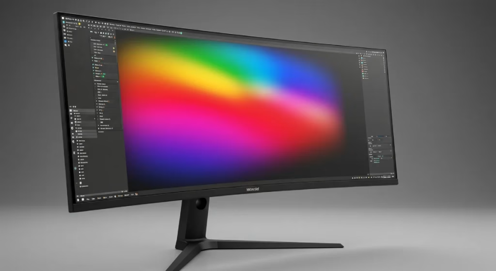
3. LG 34WQ75C-B: The Ultrawide Multitasking Powerhouse
Best for: Anyone who works across multiple documents, spreadsheets, or timelines and wants to ditch a dual-monitor setup.
LG 34WQ75C-B
Your dual-monitor setup is a clunky, inefficient workflow with a bezel right down the middle. This is the fix. It’s a single, curved ultrawide canvas that gives you an immersive, uninterrupted command centre for your work. You can even view two different computers side-by-side on it. Stop juggling windows.
As an Amazon Partner, when you buy through our links, we may earn a commission.
| Specification | Detail |
| Size & Panel | 34-inch Curved IPS |
| Resolution | 3440 x 1440 @ 60Hz |
| Colour | 99% sRGB |
| Connectivity | USB-C (90W PD), DP 1.4, HDMI 2.0, RJ45 Ethernet |
| Key Feature | 33% more screen space than a 27-inch 16:9 monitor |
| Est. Price | £400 – £500 |
This isn’t your typical 1440p monitor; it’s an ultrawide (21:9 aspect ratio) with a 1440-pixel vertical height. The benefit is massive, uninterrupted horizontal space. You can have a reference document, your work-in-progress, and a communications app open side by side with no bezel in the middle. This layout is transformative for video editors, music producers, and spreadsheet wizards alike. This LG model offers excellent connectivity, including an Ethernet port, making it a powerful single-cable hub for your laptop.
4. Apple Studio Display: The Ultimate Mac Companion (with Caveats)
Best for Mac-based businesses that prioritise seamless ecosystem integration, have phenomenal build quality, and have the budget to match.
Apple Studio Display
You’ve plugged your powerful Mac into a cheap, dumb monitor with a garbage webcam. Fix it. This isn’t just a screen; it’s a complete studio hub. It’s a stunning 5K display with a built-in 12MP smart camera, studio mics, and a six-speaker sound system. One cable runs everything.
As an Amazon Partner, when you buy through our links, we may earn a commission.
| Specification | Detail |
| Size & Panel | 27-inch IPS |
| Resolution | 5120 x 2880 (5K) @ 60Hz |
| Colour | P3 Colour Gamut, 600 nits brightness |
| Connectivity | 1x Thunderbolt 3 (96W PD), 3x USB-C |
| Key Feature | Unmatched build quality, class-leading speakers & webcam |
| Est. Price | £1,499+ |
Wait, a 5K monitor on a 1440p list? Yes, because its default mode is “pixel doubling” to give you the screen real estate of a perfect 2560×1440 workspace, but with four times the pixel density. The result is impossibly sharp text and images. The build quality is in a league of its own, and the integrated webcam and speakers are the best you can get in a monitor.
The caveats are significant: the price is astronomical, the glossy screen can be a problem in bright rooms, and Apple unforgivably charges extra for a height-adjustable stand. But if you live in the Apple ecosystem and demand the absolute best integration, it’s an undeniable (if painful) upgrade.
5. Acer Nitro XV272U: The Savvy Value Champion
Best for: Startups and budget-conscious professionals who refuse to compromise on the quality of the actual display panel.
Acer Nitro XV272U
Your slow monitor is a bottleneck that’s killing you. This is the fix. It’s a 240Hz, 0.5ms speed machine, engineered to give you a massive visual advantage over the competition. Stop blaming lag and get the gear that actually keeps up with you.
As an Amazon Partner, when you buy through our links, we may earn a commission.
| Specification | Detail |
| Size & Panel | 27-inch “Agile-Splendour” IPS |
| Resolution | 2560 x 1440 @ 170Hz |
| Colour | 95% DCI-P3, Delta E < 2 |
| Connectivity | DP 1.2, 2x HDMI 2.0 (No USB-C) |
| Key Feature | Exceptional panel quality for the price |
| Est. Price | £250 – £300 |
This is the smart buy. Acer markets this as a gaming monitor, and you should completely ignore that. The reason it’s on this list is simple: for a remarkably low price, you get a high-quality, fast IPS panel with an excellent DCI-P3 colour gamut and great accuracy. You get the visual performance of a monitor that costs twice as much.
The trade-off? The build is plastic, the stand is basic, and it lacks USB-C single-cable connectivity. But if you already have a docking station or don’t mind a few extra cables, you can put the savings towards another part of your business while getting a truly first-class image.
The Three Specs That Actually Matter (and One That Doesn’t)
Forget the marketing jargon. When buying a monitor for your business, your evaluation comes down to three things.
1. Colour Gamut & Accuracy (Your Brand’s Visual Integrity)
Your monitor is the window to your brand. If the colours on that window are wrong, your brand is wrong. Colour gamut defines the range of colours a monitor can display.
- sRGB: The standard for the web. A good monitor should cover at least 99% of the sRGB gamut.
- DCI-P3 & Adobe RGB: Wider gamuts used in digital cinema and professional print/photo work. Coverage here is a bonus for most, but essential for specialised creatives.
Delta E measures accuracy. A value of Delta E < 2 means the difference between the intended and displayed colours is virtually imperceptible to the human eye. This is the threshold for professional confidence.
Colour Depth Secrets: 8-bit, 10-bit, and Why Your Gradients Break
When you see a monitor advertised as having “1.07 billion colours,” you are looking at a 10-bit panel. Most standard office monitors are 8-bit, capable of showing only 16.7 million colours. For a designer, the difference isn’t just a bigger number; it’s the end of “banding.”
Have you ever designed a subtle sky gradient or a soft shadow in Photoshop, only to see ugly, visible “steps” in the transition? That is a limitation of 8-bit colour depth.
A true 10-bit workflow provides 1,024 levels of grey per channel, compared to the 256 levels in 8-bit. This is critical when working in DCI-P3 or Adobe RGB colour spaces, where the “distance” between colours is wider.
However, beware of “8-bit + FRC.” Many mid-range monitors, including the Acer Nitro XV272U, use Frame Rate Control (FRC). This is a form of temporal dithering where the pixels flicker between two colours so quickly that your eye perceives a third colour.
While 8-bit + FRC is excellent and often indistinguishable from “True 10-bit” for static design, high-end video editors should still aim for native 10-bit hardware to ensure absolute signal integrity.
2. Connectivity (The Single-Cable Dream)
A modern business monitor should simplify your desk, not complicate it. The non-negotiable feature for this is USB-C with Power Delivery (PD).
This allows a single cable to connect your laptop to the monitor, transmitting video, data (for the monitor’s built-in USB ports), and, crucially, power to charge your computer. It effectively turns your monitor into a docking station, eliminating a mess of cables and adapters.
Look for at least 65W of power delivery to charge most laptops, with 90W being a safer bet for more powerful machines.
3. Ergonomics (The Unsung Hero of Productivity)
A brilliant screen on a wobbly, fixed stand is a failure. Proper ergonomics are not a luxury; they prevent physical strain and allow you to work comfortably for longer periods.
A great stand offers full adjustability: height, tilt, swivel (side-to-side), and pivot (rotating to vertical). If the included stand is poor, ensure the monitor has a standard VESA mount (e.g., 100x100mm) so you can attach it to a high-quality monitor arm.
Motion Design & 120Hz: Why Smoothness Isn’t Just for Gamers
While the original article suggested high refresh rates are a “waste of money,” the landscape has shifted for 2026. If you are a UI/UX designer or a motion graphics artist, a 120Hz refresh rate—found on the Dell UltraSharp U2724DE—is now a productivity requirement.
Modern interfaces are defined by motion. We design microinteractions, spring physics animations, and kinetic typography.
Viewing these at 60Hz is like looking at a flip-book; you see the “judder” between frames. At 120Hz, the motion is fluid, allowing you to spot tiny easing errors or “pops” in an animation that you would otherwise miss.
Furthermore, as Apple and Windows have moved to high-refresh “ProMotion” screens on laptops, returning to a 60Hz external monitor feels sluggish and “broken” to your brain, actually slowing your perceived UI navigation speed.
Quick Decision Guide: Which Monitor Is Right for You?
Still unsure? Let’s simplify.
- For the best connectivity and all-in-one convenience: Dell UltraSharp U2724DE.
- For pure, uncompromising colour accuracy in design work: BenQ PD2705Q.
- For maximum screen space and multitasking: LG 34WQ75C-B.
- For the ultimate (and most expensive) Mac setup: Apple Studio Display.
- For the best panel quality on a tight budget: Acer Nitro XV272U.
A Final Thought on Your Most Important Business Tool
Your monitor isn’t a peripheral. It’s the primary lens through which you view and build your entire business. It’s where you spot the typo in a proposal, perfect the shade of blue in a logo, and read the data that informs your next big decision.
Investing in the correct display isn’t an expense; it’s a direct investment in your efficiency, physical comfort, and the final quality of your professional output. Choose wisely.
Frequently Asked Questions about 1440p Monitors.
Is 1440p better than 4K for graphic design?
It depends on your screen size. On a 27-inch screen, 1440p offers a perfect “native” UI size without scaling. 4K is sharper but requires scaling, which can lead to GPU overhead and occasionally “soft” rendering in older design software.
Is a 1440p monitor worth it for non-designers?
Absolutely. The enhanced clarity improves readability for everything, from emails and web pages to complex spreadsheets, reducing eye strain and boosting general productivity.
Do I need an expensive cable for 1440p?
Yes, if you are using USB-C. You need a “Full Feature” USB-C cable rated for 10Gbps data and 100W power. The thin charging cable that comes with your laptop will often not work for video.
Why is my 1440p monitor not showing 120Hz?
Check your cable. To achieve 120Hz at 1440p, you generally need to use DisplayPort 1.4 or HDMI 2.0/2.1. Older HDMI 1.4 cables are limited to 60Hz at this resolution.
Is a curved monitor better for work?
For standard 16:9 monitors, a curve is mostly a matter of personal preference. For ultrawide (21:9) monitors, a gentle curve is highly recommended, as it makes the screen edges easier to see and reduces distortion.
Is an ultrawide 1440p better than two 27-inch monitors?
An ultrawide like the LG 34WQ75C-B eliminates the middle bezel, which is better for video editing and timelines. However, dual 27-inch monitors provide more total screen real estate (5120 pixels wide vs 3440 pixels wide).
What is the best 1440p monitor for a MacBook Air?
The Dell UltraSharp U2724DE is the top choice. It delivers 90W of power, more than enough to charge a MacBook Air at full speed, and its 120Hz refresh rate matches the smoothness users expect from modern Apple devices.
What does “factory calibrated” mean?
“Factory calibrated” means the manufacturer has individually tested and adjusted the monitor before it leaves the factory to ensure it meets a specific standard for colour accuracy, often including a report in the box to prove it.
Is HDR important for business and design work?
For most, no. Actual, impactful HDR (High Dynamic Range) requires very high brightness (HDR600 or HDR1000 standards) and is still a niche feature. The common “HDR400” certification offers a negligible visual improvement and can be safely ignored.
Should I buy a 27-inch or 32-inch 1440p monitor?
A 27-inch monitor is the sweet spot for 1440p, providing a sharp 109 PPI. At 32 inches, the same number of pixels is spread over a larger area, resulting in a lower PPI (around 92), which makes it look closer to a 24-inch 1080p monitor in terms of sharpness. Stick with 27 inches for the best clarity.
Your brand’s visual identity is your most valuable asset. Viewing it on the right screen is non-negotiable, but creating it requires expertise. If you’re ready to build a brand that looks as professional as your new monitor, explore our graphic design services or request a quote to see how we can help.


