The History of Graphic Design: It’s Not Just for Museums
When you hear “history of graphic design,” your eyes probably glaze over. You picture dusty textbooks and academics droning on about fonts.
But as someone who’s been in the branding trenches for two decades, I’ll be blunt:
Ignoring this history is costing you money.
Most modern branding fails because it’s built on the “Canva-Clone” effect—business owners grabbing fleeting Instagram trends without understanding the why behind them. This leads to brands that look dated in 18 months, or worse, total mismatches between a brand’s message and its medium.
This isn’t an academic paper. It’s a goldmine of solved problems.
In this guide, we’re moving past the “tweed-jacket” lectures to give you a framework for making strategic, profitable decisions for your brand. By understanding the history of design, you stop guessing and start building something that lasts.
- Design history is a practical toolkit, not academic; it helps businesses stop wasting money on fleeting trends and make strategic choices.
- Global influences (e.g., Japonisme, Russian Constructivism) shaped modern aesthetics; borrowing proven principles creates commercial value.
- Grids and systems (from medieval canons to Swiss Style to responsive CSS) build legibility, consistency, and user trust across mediums.
- Match form to purpose: movements like Bauhaus and Art Deco teach that clarity or luxury must align with brand promise and audience.
The Global Lens: How Non-Western Aesthetics Shaped the West
To understand the history of graphic design, we must stop looking exclusively at Europe.
While Gutenberg was refining his press, the East was already mastering the art of visual economy. The “discovery” of Japanese Ukiyo-e (woodblock prints) by European artists in the mid-19th century acted as a primary catalyst for what we now call Modernism.
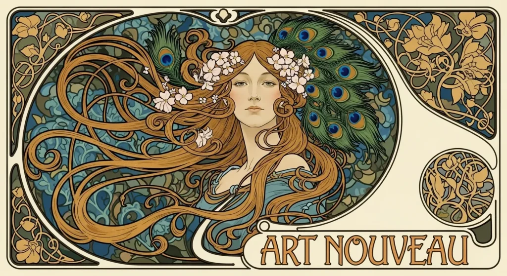
The Japanese Influence
Flatness and Flow. When Japanese goods began flooding European markets in the 1850s, they were often wrapped in woodblock prints by artists like Katsushika Hokusai and Utagawa Hiroshige. Western designers, accustomed to the heavy, shaded, and perspective-obsessed Victorian style, were shocked.

These prints featured:
- Bold, flat areas of colour with no traditional shading.
- Asymmetrical compositions that allowed the subject to “breathe”.
- Elegant, sweeping lines that suggested movement rather than static realism.
This aesthetic—known as Japonisme—directly gave birth to Art Nouveau. Without the Japanese influence, the flowing posters of Alphonse Mucha or the minimalist layouts of the Glasgow School would simply not exist.
For a modern business owner, this is the earliest lesson in “less is more.” The Japanese understood that the human eye is drawn to the relationship between the subject and the surrounding empty space (Ma).
Russian Constructivism: The Geometry of Power
Fast-forward to the early 20th century. While Art Nouveau was being flowery in Paris, Russian designers like El Lissitzky and Alexander Rodchenko were treating design as a form of social engineering. They rejected “art for art’s sake” in favour of Constructivism.
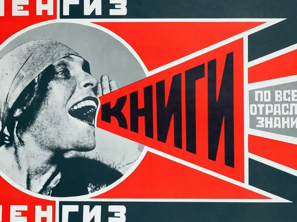
This movement introduced the world to the “photomontage”—combining high-contrast photography with sharp, aggressive geometric shapes and heavy sans-serif typography. They weren’t just making posters; they were building visual machines.
This aggressive, functionalist approach became the structural backbone of the Bauhaus and, later, the Swiss Style. When you see a modern tech brand using slanted text and bold red/black/white colour palettes, you are looking at the ghost of the Russian Revolution.
The “Japonisme” ROI In the 1890s, the French department store Au Bon Marché saw a 30% increase in foot traffic after adopting Japanese-inspired poster aesthetics. Why? Because the simplicity of the “flat” design stood out against the muddy, over-detailed Victorian advertisements of the time. This was the first historical proof that visual contrast creates commercial value.
A (Very) Quick History of Graphic Design: From Cave Walls to Clicks
Graphic design, at its core, is a form of visual communication. Its job is to solve a problem: “How do I tell someone something without (or in addition to) speaking?”
This began 30,000 years ago with the creation of cave paintings in Lascaux. Those painters weren’t just decorating; they were conveying a message. “Here’s the beast we hunt,” “This is our handprint; we were here.” It was a message.
However, for business, our story really begins with one invention: the printing press.
Around 1440, Johannes Gutenberg changed the world. Before him, every book was copied by hand. It was slow, expensive, and reserved for the elite.
Gutenberg’s movable type press enabled the mass duplication of information. This was the birth of mass communication.
Suddenly, you could print 500 identical posters and tell an entire town about an event, a new law, or a product for sale. This invention created the need for what we now call graphic design. Someone had to decide:
- What font (typeface) should we use?
- How big should the headline be?
- Where does the image go?
- How do we make it readable and persuasive?
Fast-forward to the Industrial Revolution in the 1800s. Factories boomed. Cities exploded. For the first time, you had hundreds of identical products (soap, flour, beer) competing on the same shelf.
How do you make your soap stand out? Advertising. And advertising needed designers.
The Victorian Era (1837-1901): When More Was More
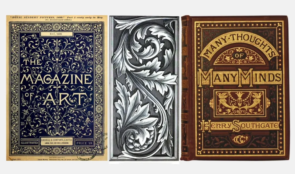
The Industrial Revolution led to a surge in print technology, particularly in the development of chromolithography. This allowed for cheap, multi-colour printing.
And designers went mad with it.
- What it looked like: Extremely ornate, decorative, and complex. Fonts were dripping with flourishes. Layouts were crammed with illustrations of flowers, angels, and elaborate borders. Every spare inch was filled.
- Why it happened: It was a status symbol. “More” meant “better.” It showed a business had money to spend on a complex, colourful poster. It was the design equivalent of a massive, gaudy mansion.
- The Business Problem it Solved: Standing out through sheer spectacle. It was about capturing attention in a newly crowded, dirty industrial city.
- The Lesson for SBOs Today: Clutter is the enemy. Your customer is overwhelmed with thousands of messages a day. The Victorian approach fails completely in a digital world. Your goal isn’t to be the loudest and most complex; it’s to be the clearest. Simplicity cuts through the noise.
Arts & Crafts (1880-1920) & Art Nouveau (1890-1910): The Rebellion Against the Machine
After decades of cheap, mass-produced, and often ugly Victorian goods, a rebellion started.
The Arts & Crafts Movement, led by figures such as William Morris, despised the factory system. They believed design had lost its “soul.”
- What it looked like: A return to craftsmanship. Organic, medieval, and nature-inspired patterns. Hand-drawn, intricate lettering. It valued the human hand over the machine.
- Why it happened: A direct reaction against the Industrial Revolution. It was about quality, authenticity, and social reform.
- The Business Problem it Solved: Differentiation by values. This was one of the first movements to use design to send a philosophical message: “We are not a faceless factory. We are artisans. Our product is made with care.”
Art Nouveau was its stylish, more commercial cousin. Think of the flowing, dreamlike posters of Alphonse Mucha or the iconic Paris Metro entrances.
- What it looked like: Flowing, organic lines. Asymmetrical layouts. Nature-inspired (vines, flowers, insects). It was elegant, sensual, and dramatic.
- Why it happened: It embraced new technologies (like lithography) but used them to create art, not just clutter. It was the first “modern” style intended to be beautiful for its own sake.
- The Lesson for SBOs Today: Your brand’s “look” must match its “promise.” Arts & Crafts proved that design can communicate values. Does your brand stand for sustainability? Authenticity? Handcrafted quality? Your design is the first and fastest way to prove it. If you sell eco-friendly soap with a cold, corporate logo, you’ve created a disconnect.
The Unsung Architects: Women Who Built Design History
History has a habit of airbrushing the women who actually did the work. In the story of graphic design, women weren’t just participants; they were the ones who translated radical theories into commercial reality.
The Bauhaus Weavers and Designers.
While Walter Gropius and Wassily Kandinsky took the headlines, women like Anni Albers and Marianne Brandt were redefining the relationship between materials and form.
Albers, specifically, used the loom to experiment with geometric abstraction that pre-dated modern digital “grid” theory by decades. Her work proved that complex information could be organised into simple, repeating visual patterns—a core tenet of modern web design.
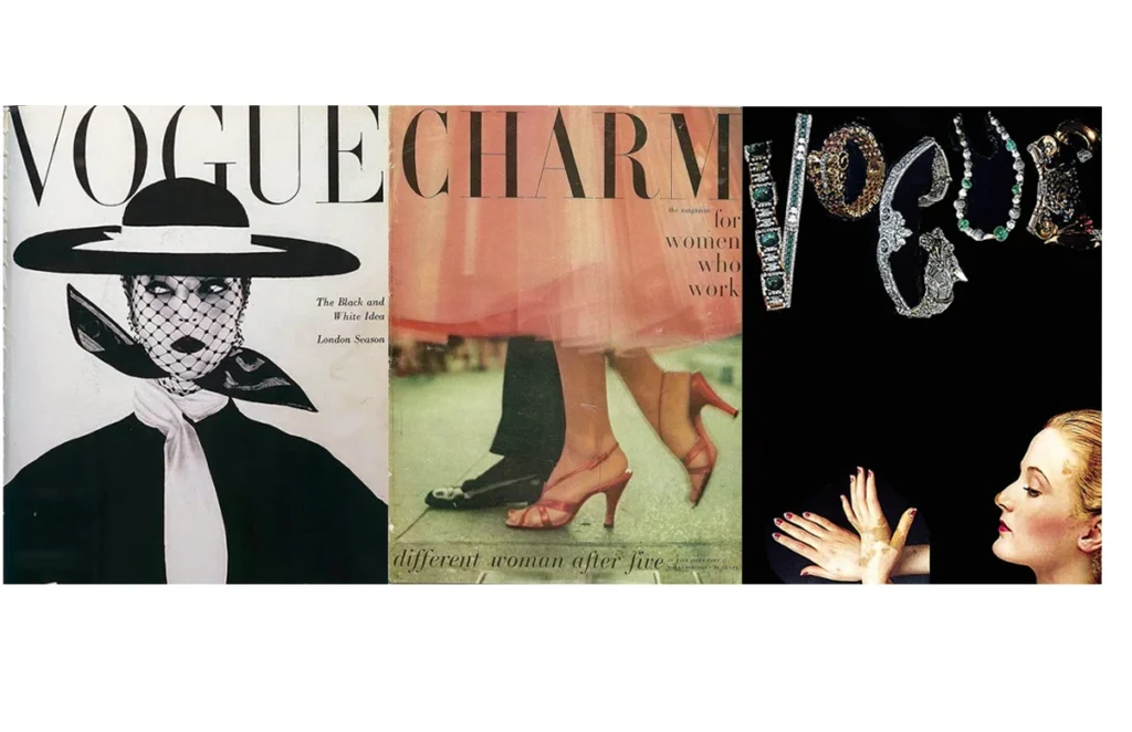
Cipe Pineles: The First Female Art Director
In the 1940s and ’50s, Cipe Pineles broke the glass ceiling of the “Mad Men” era.
Working for Seventeen and Charm, she was the first to hire “fine artists” to illustrate mass-market magazines. She pioneered the “unstructured” layout, allowing type and image to overlap in ways that felt cinematic and alive.
Her work laid the groundwork for the editorial design we see in high-end lifestyle brands today.
Muriel Cooper: The Godmother of Digital Design
If you use a computer today, you owe a debt to Muriel Cooper. As the first design director of the MIT Press and a co-founder of the MIT Media Lab, she was the first person to ask: “How will design work in 3D digital space?”
In the 1970s and 80s, while most designers were still using T-squares and ink, Cooper was creating “soft typography” and interfaces that moved and breathed.
She predicted the “infinite canvas” of modern tools like Figma and FigJam before the internet even had a public face.
The 20th Century Disruptors: Bauhaus & Art Deco
This is where things become truly interesting for modern businesses. Two movements emerged with opposite goals.
Bauhaus (1919-1933)
The Bauhaus was a German art school, but it was really a radical experiment. After the trauma of World War I, they wanted to rebuild society. Their philosophy: “Form follows function.”

- What it looked like: No more decoration. At all. Design was reduced to its purest essentials. Geometric shapes (circles, squares, triangles), primary colours (red, yellow, blue), and clean, sans-serif fonts.
- Why it happened: A desire for a new, rational, and “honest” way of living. If an object (a chair, a building, a poster) did its job perfectly, its “form” would be beautiful by default. Useless ornamentation was seen as dishonest.
- The Business Problem it Solved: Clarity and efficiency. Bauhaus principles focused on creating systems that were easy to understand and inexpensive to mass-produce.
- The Lesson for SBOs Today: This is the DNA of your website’s User Interface (UI) and User Experience (UX). Every time you use a clean website layout, a simple icon, or a clear “Buy Now” button, you are using Bauhaus principles. Ask yourself: Does this element serve a purpose? If not, cut it.
Art Deco (1920s-1930s)
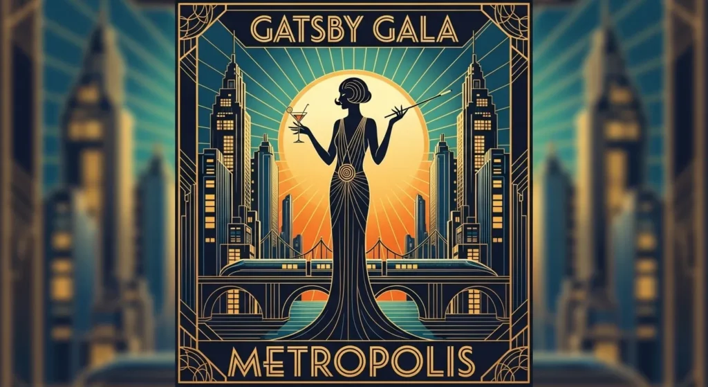
While the Bauhaus was being frugal and functional, Art Deco was having a party. Think The Great Gatsby, the Chrysler Building, and high-speed locomotives.
- What it looked like: Luxurious, glamorous, and geometric. Strong vertical lines, symmetry, rich materials (gold, lacquer), and streamlined “machine age” shapes.
- Why it happened: A celebration of post-war optimism, technology, speed, and wealth. It was the look of the Roaring Twenties.
- The Business Problem it Solved: Communicating aspiration and premium quality. This was the style of luxury ocean liners, expensive radios, and high-end cinemas. It told the customer, “This is modern, this is desirable, this is the future.”
- The Lesson for SBOs Today: Design is a powerful tool for positioning your brand. Art Deco is a masterclass in signalling “premium.” If you run a luxury brand, offer a high-end service, or sell an aspirational product, the principles of symmetry, strong lines, and curated materials (even in a digital context) can instantly convey that value.
Design as a Weapon: Dadaism, Constructivism, and Protest
Graphic design has never been “neutral.” It has always been a weapon for changing minds, sparking revolutions, and challenging the status quo.
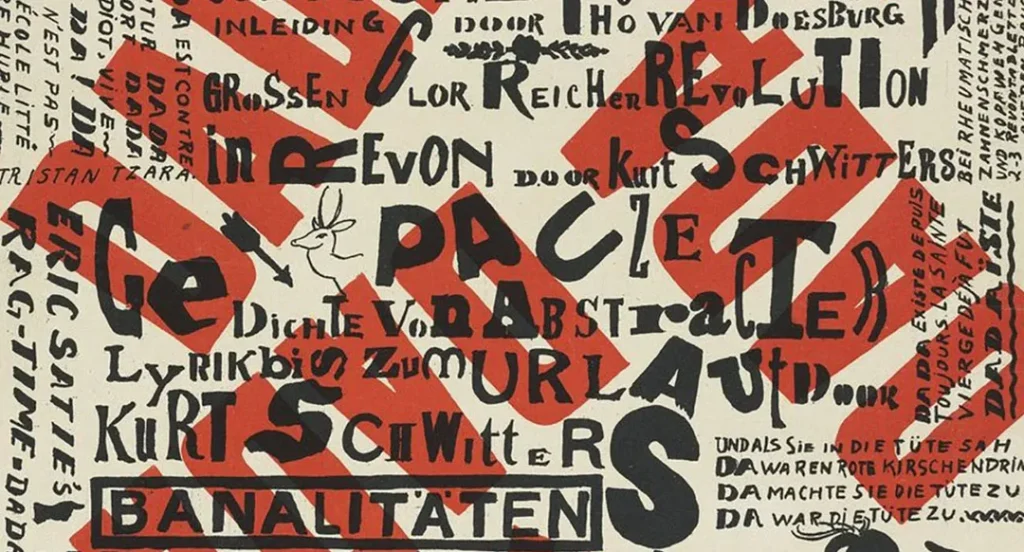
Dadaism: The Art of Chaos
Emerging from the horrors of World War I, the Dadaists believed that logic and reason had led to the war, so they embraced the “anti-logical.” Their design was built on Collage and Chance. They took newspaper clippings, photos, and random scraps of paper and glued them together to create jarring, uncomfortable images. They proved that design could be used to disrupt and provoke, not just to sell soap.
Protest Posters and the “First Things First” Manifesto
In 1964, designer Ken Garland published the “First Things First” manifesto. It was a call to arms for designers to stop wasting their talents on “trivial” advertising and instead focus on social issues like education, health, and environmentalism.
This led to a surge in Protest Design. Think of the iconic “Silence = Death” posters of the 1980s AIDS crisis or the “Hope” poster by Shepard Fairey. These aren’t just images; they are symbols that coordinated mass movements.
Business Application: Values-Based Design
In 2026, consumers don’t just buy products; they buy “beliefs.” If your brand stands for something—sustainability, equality, or local community—your design needs to reflect that “protest” energy. It shouldn’t look like a corporate brochure; it should look like a manifesto.
From Manuscripts to CSS: The 1,000-Year History of the Grid
The most powerful tool in your designer’s arsenal isn’t a software package; it’s a mathematical concept that is over a thousand years old: The Grid.
Many business owners view the grid as a cage that limits creativity. History shows us the opposite: the grid is the skeleton that allows the body to move. Without it, design is just a pile of “stuff.”
The Golden Canon of Page Construction
Long before the printing press, medieval scribes used a system called the Villard de Honnecourt diagram. This was a geometric method to divide a page into harmonious proportions.
They discovered that a page felt “right” when the margins and the text block followed the Golden Ratio (1.618).
This wasn’t just for beauty; it was for legibility. A reader’s eye needs a predictable path to follow, or they will tire and stop reading.
The Modernist Revolution: Josef Müller-Brockmann
The grid stayed relatively static for centuries until the 1950s, when Josef Müller-Brockmann and the pioneers of the Swiss Style turned it into a science. They moved away from the “centred” page and towards a flexible, multi-column system.
Müller-Brockmann argued that the grid was an “expression of a certain mental attitude.” By using a grid, the designer could ensure that every element—a photo, a headline, a paragraph—had a mathematical relationship to every other element.
This created a sense of “objective” truth. For a global company like IBM, this was vital. It meant their brand didn’t look like an opinion; it looked like a fact.
The Digital Shift: From Fixed to Fluid
In the 1990s, the grid broke. Web designers tried to force fixed-width grids onto screens of varying sizes. It was a disaster. The history of graphic design in the last 15 years has been the history of the Responsive Grid.
Today, we use CSS Flexbox and CSS Grid. These are digital echoes of the Villard de Honnecourt diagram, but with one major difference: they are elastic.
A modern grid doesn’t just hold content; it recalculates its own proportions based on the device. When your website looks great on both an iPhone and a desktop, you are seeing 1,000 years of “Grid Theory” in action.
The “Grid Trust” Metric
A 2024 eye-tracking study revealed that users spend 4.2x longer on pages that follow a clear 12-column grid structure compared to “free-form” or “artistic” layouts. Why? Because the human brain is wired to seek patterns. A broken grid signals a lack of professional authority, which translates directly to a lack of consumer trust.
The International / Swiss Style (1950s-1970s): Corporate Identity is Born
This is arguably the most important movement for modern branding.
After World War II, the world was globalising. Companies like IBM, Lufthansa, and Shell were no longer just local; they were international. They faced a new problem: “How do we look the same and be understood in New York, London, and Tokyo?”
The answer came from Swiss designers.
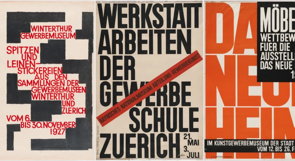
- What it looked like: The Grid. This was the core invention. Layouts were built on a rigid mathematical grid, creating a sense of order and harmony.
- Key Elements:
- Sans-serif fonts: Specifically, Helvetica and Akzidenz-Grotesk. They were perceived as neutral, objective, and highly readable.
- Asymmetrical layouts: Balanced but not rigidly symmetrical.
- Photography: Use of clean, objective black-and-white photos.
- White space: Used deliberately as a design element to create breathing room and focus.
- Why it happened: A need for universal, objective, and “unbiased” communication. It was the logical evolution of the Bauhaus’s “form follows function,” applied to corporate communication.
- The Business Problem it Solved: Brand consistency. The Swiss Style created the first true brand style guides. A logo, font, and grid could be handed to any designer anywhere in the world, and the result would be consistent.
- The Lesson for SBOs Today: Consistency is king. It builds trust. This is why you need a style guide. It’s why your logo, font, and colours must be the same on your website, your business card, and your social media profiles. It makes your brand look stable, professional, and reliable.
The Masters of Meaning: Rand, Bass, and the Birth of Modern Identity
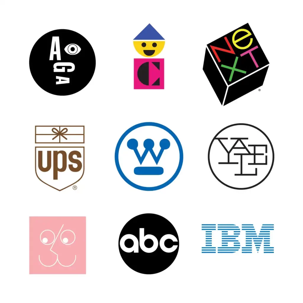
In the mid-20th century, the “Graphic Designer” evolved from a person who made things look pretty into a “Commercial Artist” who solved business problems. Two men defined this transition: Paul Rand and Saul Bass.
Paul Rand: The King of Corporate Identity
Rand believed that a logo should be a “symbol of the spirit of the company.” Before Rand, logos were often literal illustrations—a picture of a factory for a factory. Rand gave us the IBM stripes, the UPS package, and the ABC circle.
His genius was in simplicity and wit. He famously said, “Design is everything. Everything!” He taught businesses that a logo doesn’t need to explain what you do; it needs to identify who you are.
The IBM logo doesn’t show a computer; it shows efficiency, speed, and authority through horizontal lines.
For a small business today, Rand’s lesson is clear: don’t try to tell your whole story in your logo. Just give the audience a mark they can remember.
Saul Bass: Design in Motion.
While Rand was conquering the boardroom, Saul Bass was conquering Hollywood. Before Bass, movie credits were boring lists of names on a static background.
Bass turned them into an art form. His title sequences for films like The Man with the Golden Arm or Vertigo used “minimalist symbols” to set the mood of the entire film before a single actor appeared.
Bass understood that design is storytelling. He applied this to logos too, creating the iconic AT&T globe and the United Airlines ‘U’.
His work proved that a brand isn’t just a static mark; it’s a feeling that persists across different touchpoints—from a business card to a 40-foot cinema screen.
The Corporate Boom: When Design Met the Boardroom (1950–1970)

The era between 1950 and 1970 was the “Golden Age” of corporate design.
As companies grew into international conglomerates, they realised they had a “chaos problem.” They had thousands of employees and hundreds of offices, and everyone was designing their own letterheads and signs. The result was a fragmented, weak brand.
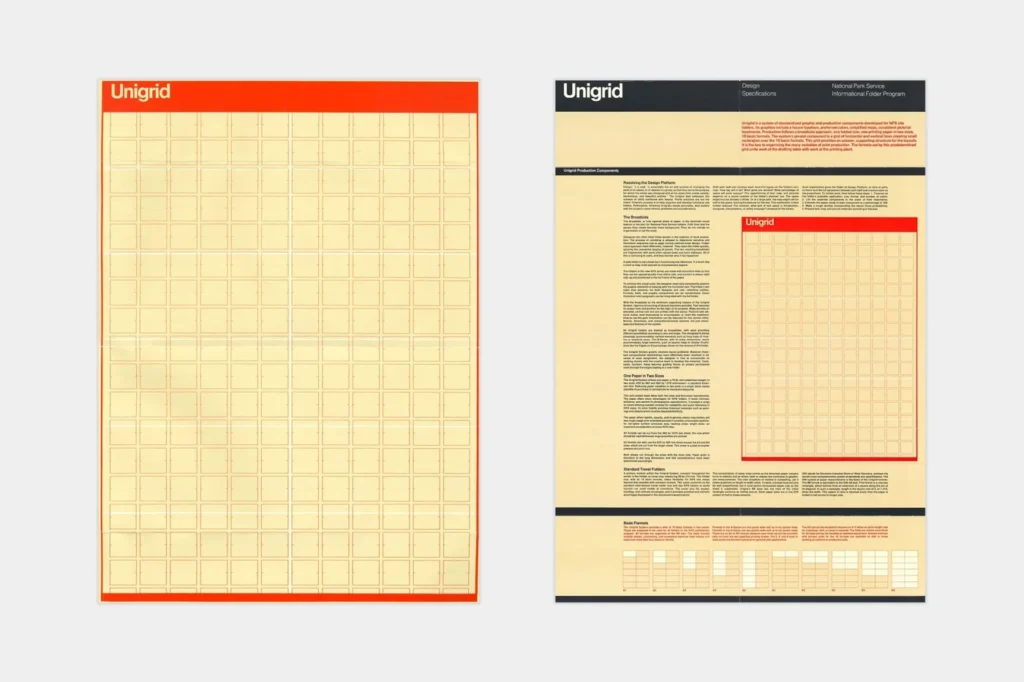
The Birth of the Brand Manual
The solution was the Corporate Identity Manual. The most famous of these was the 1970 NASA Graphics Standards Manual. It didn’t just show a logo; it gave strict rules on how much “clear space” must be around the logo, which fonts were allowed (and which were banned), and exactly which shade of red to use.
This wasn’t about being “bossy.” It was about Visual Equity. Every time a customer saw a perfectly consistent NASA or IBM sign, the “value” of that brand increased in their mind.
Why SBOs Fail Here: Most small businesses today ignore this historical lesson. They have one logo on their website, a slightly different one on Facebook, and a third one on their invoices.
In the 1960s, this was seen as a sign of a failing, disorganised company. In 2026, it’s seen as a sign of an amateur.
History teaches us that consistency is the cheapest form of marketing.
The Great Trip: Psychedelia and the Counter-Culture Shift
While corporations were perfecting their rigid grids in the 1960s, a vibrant rebellion was brewing in San Francisco’s streets. Psychedelic Design was the visual roar of the counter-culture movement.
Illegibility as a Choice
Designers like Wes Wilson and Victor Moscoso threw the Swiss Style rulebook into the fire. They created concert posters for bands like the Grateful Dead using vibrant, vibrating colour combinations (like orange against purple) that literally made the eyes work harder to see.
Crucially, they made the type illegible. The letters were distorted, melted, and squeezed into every available inch. This was a deliberate “in-group” strategy. If you could read the poster, you were “part of the scene.” If you couldn’t, you were “the man.”
The Lesson: Know Your Tribe
Psychedelia proved that “clarity” isn’t always the goal. Sometimes, the goal is connection.
If your brand is aimed at a specific, niche subculture, following the “rules” of clean design might actually make you look out of touch. History shows that you can break every rule of legibility if it helps you bond with your specific audience.
The Digital Revolution & Postmodernism: Breaking All the Rules
By the 1980s, designers were getting… bored. Swiss Style was seen as rigid, cold, and corporate. The computer was just arriving. It was time for another rebellion.
Postmodernism (1980s-1990s)

If Swiss Style was about “following the rules,” Postmodernism was about breaking them.
- What it looked like: Chaotic, layered, deconstructed, and playful. Designers like David Carson famously shattered grids, overlapped text, and used “broken” or illegible fonts. It was expressive and loud.
- Why it happened: A reaction against the “boring” corporate modernism. The new Macintosh computer provided designers with tools to experiment in ways that were previously impossible with traditional paste-up.
- The Business Problem it Solved: Capturing the attention of a cynical audience. It was perfect for youth-focused media (like Ray Gun magazine) and brands that wanted to signal “we’re different,” “we’re edgy,” “we’re not your parents’ brand.”
- The Lesson for SBOs Today: Know the rules before you break them. Postmodernism only works because it’s subverting a known structure (the grid). Pure chaos is just chaos. If your brand is rebellious, you can use these principles—but it’s a very fine line to walk.
The Memphis Group & 80s Postmodernism

If the Swiss Style was a “neat suit,” the Memphis Group was a neon tracksuit with one leg rolled up. In the 1980s, a group of Italian designers led by Ettore Sottsass decided that design had become too serious and too “good.”
They embraced Postmodernism by using:
- Clashing patterns (zebra stripes with polka dots).
- Squiggly lines (the “Bacterio” pattern).
- Primary and pastel colours together.
- Non-functional shapes just for the sake of play.
For a long time, the Memphis look was considered “tacky.” But in the last 5 years, it has exploded in popularity again (often called “Millennial Pink” or “Neo-Memphis”).
The Lesson: Design history is cyclical. What is considered “ugly” by one generation becomes “iconic” to the next. If you feel your brand is getting too “corporate” and boring, look to the 80s for permission to be playful and expressive.
The Digital Big Bang: How the Macintosh Killed the X-Acto Knife
Before 1984, “graphic design” was a physical, messy, and extremely expensive process.
If you wanted to change the size of a headline, you had to re-order “phototypesetting” from a specialist lab, wait 24 hours, and then manually glue the new text onto a board using hot wax or rubber cement.
The 1984 Macintosh
When Apple released the Macintosh, the world changed overnight. For the first time, a single person could do the work of a typesetting lab, a darkroom, and a paste-up artist from one desk.
The “Ugly” Era of Empowerment
Initially, professional designers hated it. The first wave of computer design was… let’s be honest… hideous. People used every font and every “shadow effect” just because they could.
But this era of “Desktop Publishing” (DTP) democratised design. It allowed small businesses to create their own flyers and newsletters without needing a $100,000 budget.
The Birth of Photoshop (1990)
If the Mac was the body, Adobe Photoshop was the soul. It allowed for the manipulation of reality. Suddenly, designers could layer images, blur backgrounds, and create “digital collages” that were impossible by hand.
This led directly to the chaotic, layered look of the 90s—pioneered by designers like David Carson, who famously said, “Don’t mistake legibility for communication.”
The Digital Age (1990s – Now)

This isn’t one movement; it’s a rapid-fire series of movements, all driven by technology.
- The Early Web (1990s): Driven by limitations. Low-res screens, “web-safe” colours, and pixelated fonts. The design was crude because the technology was not yet advanced.
- Skeuomorphism (2000s-early 2010s): As screens improved, designers began to create digital objects that resembled their real-world counterparts. Apple’s old iOS was the king of this: the notepad resembled a yellow legal pad, and the bookshelf resembled wood.
- Why? To teach people how to use a new technology (the touchscreen). “This looks like a button, so I should press it.”
- Flat Design (2010s-Now): Once users understood how touchscreens worked, all the fake wood and shadows became unnecessary clutter. Influenced by… You guessed it… the Swiss Style and Bauhaus, design became flat, clean, and simple again.
- Responsive Design (The “Now”): This is our current constraint. A design must be compatible with both a 30-inch monitor and a 5-inch phone. This forces designers to prioritise information, use flexible grids, and focus on mobile-first clarity.
- The Lesson for SBOs Today: The medium is the message. You cannot design a website without first considering the mobile experience. This is a non-negotiable constraint. Ask your designer, “How does this look on mobile?” before you ask anything else.
What Your Business Can Steal from History (A Practical Table)
History is a toolkit. Here’s a cheat sheet for what to steal and when.
| Design Movement | Core Principle | Modern Business Application |
| Arts & Crafts | “Honest materials, human touch.” | Use it to signal authenticity. Great for organic products, craft beer, or artisan services. |
| Bauhaus | “Form follows function.” | The guiding principle for your website UI/UX. If it’s not functional, it’s noise. |
| Art Deco | “Luxury, speed, and aspiration.” | Use its symmetry and strong lines to position your brand as premium or aspirational. |
| Swiss Style | “Clarity and consistency.” | The blueprint for your brand style guide. Use its grid principles to build trust. |
| Postmodernism | “Break the rules, be expressive.” | For rebellious or youth-focused brands. Use it sparingly to stand out, not to confuse. |
| Digital (Flat) | “Mobile-first clarity.” | A non-negotiable for all modern design. Your website must be simple and responsive on mobile devices. |
The Great Divide – Why Print is Not Digital
The biggest mistake I see SBOs make is approving a logo on a white background, only to find it’s unreadable as a tiny profile picture on Instagram. The context is the design.
| Design Element | Print Constraint (e.g., 1960s Magazine) | Digital Constraint/Opportunity (e.g., 2025 Phone) |
| Typography | Font was fixed. Had to be legible in one size, in static ink. | Dynamic. Must be readable at 12px and 72px. Can be a web font (e.g., Google Fonts). Needs high contrast. |
| Colour | Limited by printing process (e.g., 4-colour CMYK). Colours were final. | Illuminated (RGB). Colours glow from a screen. Can be animated. However, it must also account for accessibility (colour blindness). |
| Layout | Static Grid. The page size was fixed. The user’s eye path was predictable (left-to-right, top-to-bottom). | Responsive Grid. Layout must reflow for dozens of screen sizes. The user scrolls (vertical path). |
| Logo | One version was usually enough (e.g., for letterhead). | Needs a ‘responsive’ logo system. A complex primary logo, a simpler secondary one, and a tiny icon (favicon/profile pic). |
| Interaction | None. The user is a passive viewer. | Everything. The user taps, swipes, and clicks. Buttons need to look “tappable.” Feedback (e.g., a button changing colour) is critical. |
The History of Graphic Design
You can’t shape the future of design if you’re ignorant of its past. This book is the definitive playbook of the modern era. It’s a massive visual map that deconstructs the seminal works and profiles the masters from the 1960s to the present day. Stop designing in a vacuum and get the context.
As an Amazon Partner, when you buy through our links, we may earn a commission.
So, Why Does a Small Business Owner Need to Know This?
You’ve made it this far. You’ve seen how design evolved from “clutter” to “clarity” and from “print” to “phone.”
Here’s why this matters to your bank account.
- It Stops You From Wasting Money on Trends. The “hipster logo” (crossed arrows, rustic fonts) of the 2010s was just a lazy echo of the Arts & Crafts movement. Businesses that bought in now look horribly dated. Understanding history helps you distinguish between a fleeting trend and a timeless principle.
- It Gives You a Language to Talk to Your Designer. Stop saying, “make it pop” or “I don’t like it.” Start saying, “I need this to be clearer—more like the Swiss Style”, or “Our brand is aspirational, like Art Deco,” or “This UI isn’t following Bauhaus principles; the form isn’t matching the function.” You will achieve better results more quickly.
- It Anchors Your Brand in Strategy, Not Decoration. Your logo isn’t a “pretty picture.” It’s a strategic tool. Your website layout isn’t “art.” It’s a functional system for getting a customer from A to B. History proves that the best design solves a problem.
History shows us that design is a conversation. Victorian design was shouting in a crowded room. Swiss design was making its presence felt in a global boardroom. Digital design is having a 1-on-1 chat with a user on their phone.
Knowing the history helps you decide what you want to say and how to say it clearly.
It’s Time to Build a Brand That Lasts
Look, you don’t need to be a design historian to run your business. That’s our job.
However, understanding why these principles exist makes you a more informed and effective business owner. You’ll be able to approve designs with confidence, knowing they are built on a foundation that has been tested for decades.
If you’re tired of chasing trends and want a brand built on a timeless, strategic foundation, maybe it’s time we talked. At Inkbot Design, we don’t just make things look good; we build systems based on these historical principles to solve your business problems.
Check out our graphic design services to see how we apply this thinking, or request a free quote if you’re ready to get started.
FAQs
What is graphic design, really?
It’s the art and practice of visual communication. It combines images, words, and ideas to solve a problem or convey a specific message to a target audience.
Why does graphic design history matter for my small business?
It stops you from wasting money on fleeting trends. History is a catalogue of solved problems; knowing it helps you build a timeless brand identity and communicate more clearly with your customers.
What was the most important event in design history?
Arguably, two: Gutenberg’s printing press (which created the need for mass communication) and the rise of the Swiss Style (which created the rules for modern corporate branding).
What is the “Swiss Style” of design?
Also known as the International Typographic Style, it’s a movement from the 1950s to the 1970s that prioritises clarity, objectivity, and order. It’s famous for its use of grids, sans-serif fonts (like Helvetica), and asymmetrical layouts.
What’s the difference between Bauhaus and Art Deco?
They were concurrent but opposite. Bauhaus was about “form follows function”—minimalist, functional, and for the masses. Art Deco was characterised by luxury, glamour, and aspiration—decorative, geometric, and typically reserved for the wealthy.
How did the internet change graphic design?
Completely. It shifted the medium from static (print) to interactive (digital). This forced a new focus on User Experience (UX), responsive layouts (mobile-first), and accessibility, rather than just static aesthetics.
What’s the difference between UI and UX design?
UI (User Interface) is the look and feel—the buttons, fonts, and colours. It’s the “Bauhaus” part.
UX (User Experience) is the overall feeling and process—how easy is it to use? Does it solve the user’s problem? It’s the strategy behind the UI.
What is a “responsive logo”?
It’s a logo designed to adapt to different screen sizes. You have a complex version for a large website header, a simpler version for a mobile header, and a tiny icon (favicon) for a browser tab or profile picture.
What’s the biggest design mistake business owners make?
Thinking of design as a “decoration” to be added at the end, rather than a “strategic tool” to be used from the beginning.
How can I utilise this history when discussing it with my designer?
Use it as a shortcut. Instead of “make it look cleaner,” say, “I’m drawn to the clarity of the Swiss Style.” Instead of “this feels cheap,” say, “How can we make this feel more premium, like Art Deco principles?”