Beyond the Bite: The Untold Story of the Apple Logo Design
The Apple logo design is one of five symbols on the planet you could show to almost anyone, anywhere, and they’d know what it is. It’s more recognisable than most national flags.
But its history isn’t the clean, perfect fairy tale of creative genius you’ve been told.
It’s a messy, practical, and sometimes brutal business strategy story. It’s about a series of cold, calculated decisions transforming a brand from a garage project into a global superpower.
Forget the myths. This is a deconstruction of the Apple logo’s evolution, with real, actionable lessons for anyone trying to build a brand that lasts.
- Newton Crest (1976) was overly complex, unreadable, and impractical for scaling on products and small interfaces.
- Rob Janoff’s 1977 silhouette with a bite solved scale ambiguity, ensuring instant recognition at any size.
- The rainbow stripes were marketing strategy, signalling the Apple II’s colour display, not a tribute or hidden meaning.
- 1998 monochrome pivot signalled a strategic brand rebirth: selling an ethos of simplicity and design, not a product feature.
- Core lesson: a strong, simple silhouette endures—adapt finishes, but keep the fundamental shape timeless and functional.
The First Attempt: The Overly-Complex “Newton Crest” (1976)
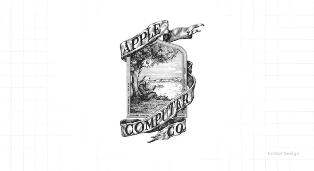
The very first Apple logo looked nothing like what you see today. It was an intricate, pen-and-ink illustration.
It depicted Sir Isaac Newton sitting under a tree, with an apple dangling precariously above his head. A ribbon wrapped around the frame, bearing the name “Apple Computer Co.”
It was designed by Apple’s third co-founder, Ronald Wayne. The intent was clear: to associate the new company with a legacy of genius and discovery. It was an attempt to look established, intellectual, and serious.
But it was a commercial disaster.
This wasn’t a logo; it was a woodcut for the cover of a 19th-century novel. It was complex, hard to read, and functionally useless for a modern technology company. Imagine trying to print that on a keyboard key or shrink it for a product manual. Impossible.
Steve Jobs knew it. The logo lasted about a year.
The Core Lesson: An Illustration is Not a Functional Logo
For any entrepreneur, this is lesson number one. A beautiful drawing and a functional logo are two different species.
A logo must be:
- Scalable: It must be clear and legible on a massive billboard and as a tiny favicon in a browser tab.
- Memorable: People should be able to recall it and even sketch a rough version after a single glance.
- Versatile: It has to work in black and white, in different colours, and on various backgrounds.
The Newton Crest failed every single one of these tests. It was a piece of art, but a terrible piece of branding.
The Geometry of Genius: Was it the Golden Ratio?
A common point of contention among designers is whether Rob Janoff used the Golden Ratio (1:1.618) to construct the Apple logo. If you overlay a series of Fibonacci circles onto the mark, the curves of the apple and the leaf seem to align with eerie precision.
However, the truth is more human. Janoff has explicitly stated that he did not use mathematical formulas or the Fibonacci sequence during the initial 1977 sketch. It was designed “freehand,” guided by an intuitive sense of balance and visual weight.
Technical Specifications for Modern Branders
To achieve the “Apple look” in your own projects, you must understand the principles of Constructive Geometry. The logo isn’t just a shape; it’s a series of intersecting circles.
- The Leaf: Created by the intersection of two identical circles.
- The Bite: A perfectly circular “cutout” that matches the diameter of the leaf’s curves.
- Symmetry vs Balance: The logo is actually asymmetrical. The bite is larger than the leaf, but they balance each other out across the vertical axis, creating a sense of dynamic stability.
The Rainbow Revolution: Rob Janoff’s Iconic Design (1977-1998)
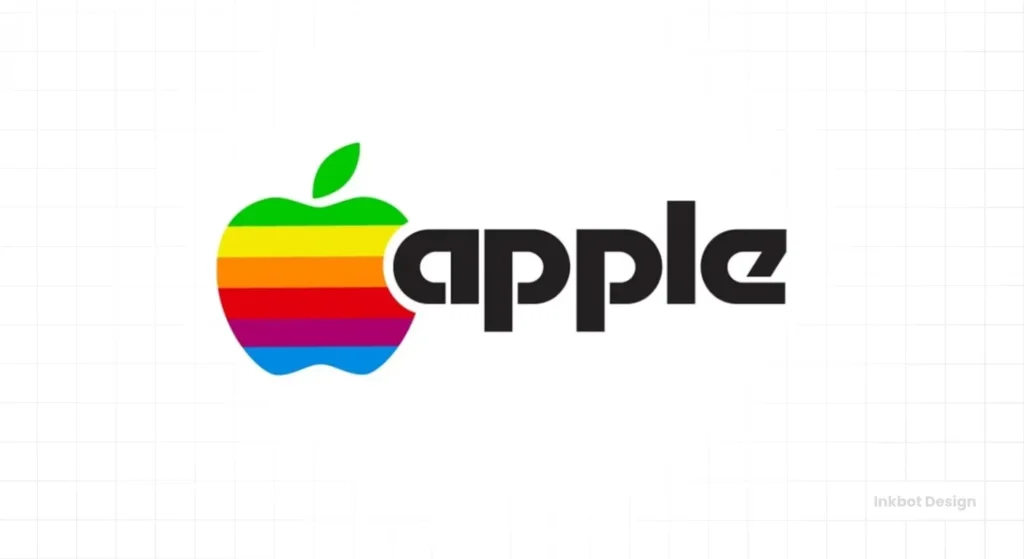
Jobs needed something clean, modern, and usable. He turned to the Regis McKenna advertising agency, where a designer named Rob Janoff was tasked with the project.
The brief Jobs gave Janoff was beautifully simple. It contained a single, critical instruction:
“Don’t make it cute.”
Janoff bought a bag of apples, sliced them up, and studied their shapes for a week. He eventually presented a simple, two-dimensional silhouette of an apple with a bite taken out of it. The shape that, with minor tweaks, would define the company for the next 50 years was born.
But the two most debated elements of this design—the bite and the colours—are surrounded by myths. The reality is far more practical and instructive.
Why the Bite? It’s About Scale, Not Stories.
Ask someone why the Apple logo has a bite, and you’ll get a dozen romantic answers.
Some say it’s a nod to the biblical story of Adam and Eve, representing the fruit from the Tree of Knowledge. Others claim it’s a clever pun on “byte,” the unit of digital information.
A more recent, persistent myth is that it’s a tribute to the father of modern computing, Alan Turing, who died by suicide using a cyanide-laced apple.
They are all good stories. And they are all wrong.
The real reason, according to Janoff himself, was brutally practical. When he designed the simple apple silhouette, he worried that it would look like a cherry or a tomato when scaled down.
The bite was added for one reason: scale. It ensured that, no matter the size, the fruit was unambiguously an apple. The “byte” pun was a happy accident that the creative team noticed later. It was a bonus, not the objective.
Why the Rainbow? A Masterclass in Product Marketing.
The “tribute to Alan Turing” theory is also fiction. While a poignant story, it has no basis in fact.
The real reason for the six colourful stripes was pure business genius. The Apple II, the company’s first mass-market success, was one of the very first personal computers capable of displaying colour graphics.
This was its Unique Selling Proposition (USP).
The rainbow logo was a direct, in-your-face advertisement for Apple’s key feature in a world of beige and monochrome competitors. It screamed “colour” from every ad and every box. It humanised the technology and made the company feel accessible and creative.
The logo wasn’t just a brand mark; it was a sales tool. It demonstrated the product’s core value without a single word.
Back from the Brink: The Monochrome Era (1998-2000s)
By 1997, Apple was on the verge of bankruptcy. Steve Jobs returned to the company he founded and began a ruthless overhaul.
The brand had become diluted. It was seen by many as a quirky, colourful “toy” for schools and creative types, but it was not a serious contender. Once a symbol of innovation, the rainbow logo now felt dated and childish.
As part of the legendary “Think Different” campaign, the brand needed to grow up. It needed to be seen as sophisticated, elegant, and design-led.
The solution was radical in its simplicity. Jobs didn’t scrap the logo; he stripped it down. The iconic shape remained, but a solid, single colour replaced the rainbow.
Its first significant appearance was as a translucent, ice-blue logo on the side of the revolutionary iMac G3. It looked sleek, modern, and professional. It was the perfect symbol for a company reborn.
The Strategic Pivot: From Selling a Feature to Selling an Ethos
This change marks one of the most critical pivots in branding history.
The rainbow logo was designed to sell a specific product feature: colour.
The monochrome logo was designed to sell an entire philosophy: simplicity, elegance, and minimalist design. It was no longer about what the machine did; it was about what the brand was.
This new logo was incredibly versatile. It could be solid black, stark white, or embossed onto the aluminium body of a new PowerBook. It was an identity confident enough to let the product be the hero.
For a business owner, the lesson here is critical. As your company matures, your branding may shift from explaining your product to embodying your brand’s core values.
Exploring professional logo design services is the logical next step if your business is ready for a logo embodying its core ethos.
The Glossy Interlude: “Aqua” and “Chrome” (2001-2013)
The Apple logo took on a more three-dimensional feel for over a decade. This wasn’t a random change; it was a direct reflection of the dominant software design trend of the era: skeuomorphism.
With the launch of Mac OS X, Apple’s interface became famous for its “Aqua” look—glossy buttons, realistic textures, and drop shadows. The goal was to make the digital interface feel familiar and tangible, like a physical object.
The logo adapted to match. It was rendered as a glassy, 3D orb, often with a visible sheen or gradient. This evolved into the “Chrome” version that launched with the first iPhone in 2007, perfectly matching the device’s polished hardware.
This phase shows how a great logo can adapt to prevailing design trends without losing its core identity. The shape was constant; only the finish changed.
Comparing the Titans: How Apple’s Identity Differs
In the landscape of Silicon Valley, branding philosophies generally fall into two camps: the “Literal” and the “Abstract”. Apple’s choice of a literal fruit—rather than a digital-sounding name—was a calculated move to stand out against its peers.
| Company | Logo Type | Strategy | 2026 Status |
| Apple | Pictorial Mark | Emotional & Minimalist | Iconic; remains unchanged for 45+ years. |
| Microsoft | Geometric / Symbol | Modular & Professional | Updated to the four-panel “Window” in 2012. |
| Wordmark | Playful & Accessible | Shifted to “Product Sans” for better readability on mobile. | |
| Meta | Abstract (Infinity) | Futurist & Immersive | Designed specifically for 3D/VR environments. |
While Microsoft and Google focus on utility and accessibility, Apple’s logo is aspirational.
It doesn’t tell you what the product does; it tells you who you become when you use it. This shift from Functional Branding to Lifestyle Branding is why the logo retains its value even as technology becomes a commodity.
The Modern Era: Flat, Simple, and Ubiquitous (2014-Present)
Skeuomorphism’s reign came to an end. The design world, heavily influenced by Apple’s shift to flat design with iOS 7 under Jony Ive, embraced flat design.
The focus returned to pure digital simplicity: clean typography, bold, solid colours, and the removal of all artificial textures and gloss.
Naturally, the Apple logo followed suit.
It shed its 3D effects, gradients, and reflections, returning to the simple, two-dimensional silhouette Rob Janoff had created decades earlier. This flat version—typically in black, white, or grey—is the ultimate expression of the brand’s minimalist ethos.
It’s infinitely adaptable. It works flawlessly as a tiny icon on a watch face, an engraving on the back of an iPad, a glowing symbol on a MacBook lid, or a massive graphic on the side of a store. It is the final stage of a 40-year journey of simplification.
Spatial Branding: The Logo in the Age of Vision Pro
As we move further into 2026, the Apple logo is facing its biggest challenge since 1998: Spatial Computing. With the mainstream adoption of Apple Vision Pro and high-fidelity Augmented Reality (AR), a flat, 2D logo can sometimes feel “paper-thin” in a 3D environment.
Apple’s current strategy is Dynamic Adaptability. In 2026, the logo isn’t just a static file; it’s a responsive asset.
- Volumetric Lighting: When viewed through a headset, the logo subtly catches “virtual light” from the room, giving it a ghost-like presence without returning to the heavy skeuomorphism of the 2000s.
- Micro-Interactions: When a user “gazes” at the logo on a software interface, it may exhibit a slight pulse or glow—a technique known as Haptic Visuals.
- Variable Opacity: To ensure the logo doesn’t obstruct a user’s view in the Metaverse or AR workspaces, it often adjusts its transparency based on the background’s complexity.
The Final Lesson: A Timeless Shape Endures
Every trend—from colourful stripes to 3D gloss—has come and gone. The one constant has been the foundational shape: an apple with a bite taken out of it.
This is the most powerful lesson for any entrepreneur. Fads are fleeting. Colours can be changed. Gradients can be added or removed. But the core mark, the fundamental silhouette of your logo, must be strong enough to stand on its own.
Get the shape right, and it will last a lifetime.
What Every Founder Can Steal from Apple’s Logo Journey
You don’t need Apple’s budget to apply its branding principles. The entire history is a masterclass for businesses of any size.
- Embrace Brutal Simplification. The journey from the Newton Crest to today’s flat icon is a relentless process of removing everything non-essential. When in doubt, simplify.
- Function over cleverness. A logo that works at every size is infinitely more valuable than one with a clever backstory that no one gets. Ensure your logo is functional before you worry about its poetry.
- Your Logo Must Serve Your Strategy. The rainbow advertised a feature. The monochrome signalled a corporate rebirth. The flat logo represents ultimate versatility. Your logo should reflect where your business is going, not just where it has been.
- Don’t Be Precious. When the rainbow logo no longer served the brand’s strategic direction, Apple killed it without sentimentality. Be willing to evolve your visual identity when your business strategy demands it.
How to Build an “Apple-Grade” Logo for Your Startup
You don’t need the budget of a global giant to create a logo that lasts. Following the Apple Evolution Framework, you can pressure-test your brand identity using these four steps:
1. The Silhouette Test (The “Janoff” Rule)
Can your logo be recognised in pure black? If your design relies on gradients or multiple colours to be understood, it will fail at small scales.
- Action: Convert your logo to solid black. If it looks like a “blob,” simplify the paths in Adobe Illustrator or Figma.
2. The Scalability Audit
In 2026, your logo must work as a Favicon ($16 \times 16$ pixels) and on a 100-foot digital billboard.
- Checklist: Ensure line weights are consistent. Avoid thin “serifs” or tiny details that disappear when shrunk.
3. The “Bite” Factor (Functional Memorability)
Does your logo have a unique “hook”? The bite was Apple’s hook. Without it, the logo was just a fruit. With it, it was a brand.
- Question: What is the one “intentional flaw” or unique geometric cut in your logo that makes it unmistakable?
4. The Ecosystem Alignment
Your logo must live within a broader Design System. Whether you are using Material Design principles or Apple’s own Human Interface Guidelines, the logo should feel like it belongs to the same family as your typography and UI buttons.
Conclusion: Your Logo is a Business Tool
The Apple logo is more than just a pretty design. It’s a historical document that tracks the company’s strategy, products, and philosophy over the decades. It survived near-bankruptcy, defined entire product categories, and became a global symbol of innovation.
It achieved this not through a single moment of genius, but through a constant, ruthless strategic adaptation process.
So look at your own logo. Is it just a decorative picture or a hard-working business tool?
Building a timeless brand starts with a foundational mark that’s both simple and strategic. It might be time to get a professional perspective if you’re ready to stop chasing trends and start building a logo that works as hard as you do.
Explore our logo design services at Inkbot Design or request a no-obligation quote today to see how we can help.
Visit our [homepage] to learn more about our branding approach.
History of the Apple Logo Design (FAQs)
Who designed the first Apple logo?
The first Apple logo, the Newton Crest, was created in 1976 by Ronald Wayne, one of Apple’s three co-founders.
Who designed the famous rainbow Apple logo?
The iconic rainbow Apple logo was created in 1977 by Rob Janoff, a graphic designer working for the Regis McKenna ad agency.
Why is there a bite in the Apple logo?
Designer Rob Janoff added the bite for scale. He wanted to ensure that, even when the logo was small, it would be instantly recognisable as an apple and not mistaken for a cherry or a tomato.
Is the Apple logo based on Alan Turing?
No. This is a popular myth, but there is no evidence to support it. The rainbow colours were a marketing decision to highlight the Apple II’s colour display capabilities.
What do the colours in the old Apple logo mean?
The six rainbow colours signify that the Apple II computer had a colour screen, a central selling point at the time. The colours didn’t have specific individual meanings; they collectively represented “colour.”
When did Apple stop using the rainbow logo?
Apple officially began phasing out the rainbow logo in 1998 after Steve Jobs returned to the company. It was replaced with monochrome versions to create a more sophisticated and modern brand image.
Why did Apple change its logo to monochrome?
The change to a monochrome logo in 1998 was a strategic business decision to signal a corporate turnaround. It helped reposition the Apple brand as more mature, elegant, and design-focused, moving away from the “toy-like” perception the rainbow logo had acquired.
Is the Apple logo based on the Golden Ratio?
While many designers have retroactively shown that the Apple logo can be deconstructed into circles based on the Golden Ratio or the Fibonacci sequence, the original designer, Rob Janoff, has stated that he did not use these mathematical principles. The design was created freehand.
How does the Apple logo contribute to brand loyalty?
The logo acts as a “tribal signifier.” Research in Neuromarketing suggests that seeing the Apple logo activates the same brain regions in fans as religious iconography does in believers, fostering an emotional connection that transcends technical specs.
What is the “Apple Logo” Alt Text for accessibility?
For 2026 web standards, the most effective Alt Text is: “Apple Inc. corporate logo, a minimalist silhouette of an apple with a bite taken out of the right side.” This provides both context and brand identification for screen readers.
Can I use the Apple logo on my website?
Strictly speaking, no. The logo is a protected Trademark of Apple Inc. You can only use it under specific “Fair Use” conditions (like news reporting) or if you are an Authorised Reseller following their strict Brand Guidelines.
What is the significance of the “Leaf” angle?
The leaf is tilted at 45 degrees. This creates a sense of “upward movement” and energy, preventing the logo from looking too static or heavy.
Was the Apple logo ever green?
While “Green Apple” seems logical, the company has rarely used a standard green for its primary logo. It jumped from the Rainbow (which included green) straight to Monochrome and then various “Aqua” shades.

