App Icon Design Isn’t Art. It’s Your #1 Sales Tool
Your app icon is your most important, concentrated, overlooked marketing piece.
It’s not a miniature piece of art. It’s not a place to show off your illustration skills. And it’s certainly not an afterthought you hand off to an intern.
It’s a psychological trigger. It’s a button that screams “download me” or whispers “ignore me.” It’s your entire brand, promise, and storefront crammed into a space as small as 16×16 pixels.
Frankly, most small businesses and entrepreneurs get it disastrously wrong. They treat it as a final tick-box exercise and fail to grasp that this tiny square is a primary driver of discovery, conversion, and retention.
A poor icon doesn’t just look bad; it actively costs you money. It reduces click-through rates in the App Store and gets lost on a user’s home screen, killing engagement. A great icon, on the other hand, is a critical component of brand awareness, acting as a constant, silent reminder of your value.
As a brand consultant who has seen the data, a strategic icon redesign can lift conversion rates by 15-30% without changing anything else.
But to get there, you must stop making the same lazy mistakes.
- Icons are sales tools, not art — design to convert, not to showcase illustration skills.
- Simplicity wins: single bold symbol that reads at tiny sizes and passes the squint test.
- Design for scalability: build a vector system that works from 1024px down to favicon sizes.
- Use colour and contrast to differentiate from competitors and remain visible in light/dark modes.
- Treat the icon as the core brand asset: test in situ and A/B test to prove impact.
The 5 App Icon Design Issues That Drive Me Mad
Before we get to the “how-to,” let’s clear the air. If you’re doing any of these, stop. Just stop. You’re blending in, and blending in is death for an app.
- The ‘First Letter’ Monogram: This is the pinnacle of laziness. Taking the first letter of your app (e.g., ‘F’ for ‘Fintly’), picking a font, and sticking it in a coloured box. It’s forgettable, has zero conceptual meaning, and screams “I used a template.”
- The Unreadable Word: Trying to write your app’s name inside the icon. It’s completely redundant—the name is literally right below the icon. At home screen size, it becomes an illegible smudge.
- The Overly Complex Illustration: You’re not painting a masterpiece. You’re designing a symbol. Trying to cram a detailed scene, a complex mascot, or multiple objects into the icon is a classic amateur mistake. It just looks messy and confusing.
- Ignoring the ‘Blob’ (Adaptive Icons): Designing a beautiful icon that looks perfect as a circle or square, then forgetting that Android (and various manufacturer skins) will force it into a “squircle,” a “rounded rectangle,” or some other arbitrary shape. Your key elements get cropped, and it looks broken.
- Chasing Micro-Trends: The current obsession with hyper-realistic 3D, neon glows, or the ‘neumorphism‘ fad from a few years back. Trends die. Your icon will look dated in 18 months. A strong, simple, symbolic form is timeless.
The Hard Truth: Your Icon is a Sales Tool, Not a Painting
Let’s reframe this. Your app icon has two jobs, and neither is to be “pretty.”
- Job 1 (Acquisition): Stop the App Store scroll and earn a click.
- Job 2 (Retention): To be instantly findable on a user’s cluttered home screen.
That’s it. It’s a tool for conversion and engagement.
I once worked with a client with a brilliant fintech app but zero traction. Their icon was a drab, grey box with a stylised ‘B’. It was “elegant” and “minimalist,” and completely invisible.
We A/B tested a new version: a vibrant, symbolic glyph representing a coin in motion. It was simple, bold, and conceptually relevant. Downloads tripled in the first month. We didn’t change the app’s features or the ad spend. We just changed the front door.
Your icon is the front door. Most entrepreneurs offer a plain, grey, steel door that looks identical to every other door on the street.
Principle 1: Brutal Simplicity and Instant Recognition
The single most important rule of app icon design is simplicity.
Your icon will be seen enormously on the App Store page and as a speck in a notification tray. It must work at all sizes. A simple, bold, singular idea is the only way to achieve this.
The human brain processes symbols far faster than text or complex illustrations. You are designing a modern-day hieroglyph.
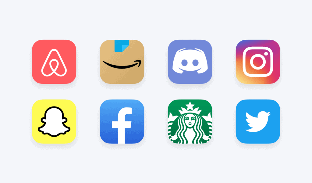
- Good (Spotify): A green circle with three curved lines. That’s it. It’s abstract, yet unique. You can spot it from across the room.
- Good (WhatsApp): A speech bubble with a phone icon. It perfectly communicates “phone-based messaging.”
- Bad (Countless Photo Apps): A mess of gradients, a camera lens, a paintbrush, and a sparkle effect, all fighting for space. It communicates nothing but visual noise.
The Squint Test
Here’s a practical test. Create your icon design, put it on a screen with 20 other icons, and then step back 10 feet. Now, squint your eyes.
Does your icon dissolve into a blurry mess? Or can you still make out its core shape and colour? If it vanishes, it’s failed. A strong icon (like Target’s red bullseye or Nike’s swoosh) is still recognisable even when blurred. It relies on a “distinctive visual asset,” not on fine detail.
Focus on one single object or symbol. Not two. Not a scene. One.
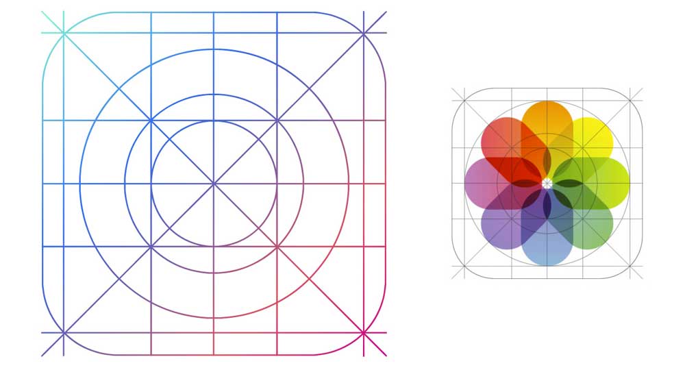
Principle 2: Master Scalability (Or Suffer the Consequences)
You don’t design an app icon. You design an app icon system.
Apple and Google will resize this single design file into dozens of different formats. It must look sharp and clear everywhere, from a developer’s 1024x1024px master file to a 29x29px settings icon.
This is where complexity dies.
- Thin lines disappear.
- Small text becomes a smudge.
- Subtle textures turn to mush.
- Low-contrast details merge into a single colour.
Your design must be vector-based and built with bold, clean shapes. You have to design for the smallest possible use case first. If it works as a 16x16px favicon, it will likely work when scaled up. The reverse is never true.
Effort Marker: The ‘Will It Scale?’ Test
Before you commit to a design, run it through this checklist.
| Test Case | Size (Approx.) | Purpose | Pass / Fail? |
| App Store | 1024×1024 | The “hero” shot. Needs to be high-res. | |
| Home Screen (iOS/Android) | 180×180 | The most common view. Needs to be clear. | |
| Settings Menu | 87×87 | Seen in a list. Needs to be identifiable. | |
| Notification Tray | 72×72 | Seen at a glance. Must be recognisable. | |
| Spotlight Search | 60×60 | Competing with other small icons. | |
| 1-Bit Monochrome | Variable | Does the symbol work without colour? |
If your icon fails any of these—especially the smaller sizes or the monochrome test—it’s not strong enough. The core form is weak.
Principle 3: Stop Blending In. Use Colour and Contrast Strategically.
Your app doesn’t exist in a vacuum. It exists in the App Store, right next to all your competitors.
The worst thing you can do is look like them. Go and search for your primary category (e.g., “fitness,” “productivity,” “finance”). What do you see?
If you’re a productivity app, you’ll probably see a sea of blue and white. If you’re a finance app, you’ll see blue and green. If you’re a food app, you’ll see red and yellow.
Using “startup blue” because it feels “safe” and “corporate” is the fastest way to become invisible.
Your colour choice should be differentiating.
- Analyse your competitors’ icons. Put the top 20 on a single artboard.
- Identify the dominant colour palette.
- Choose a colour that stands in stark contrast.
If everyone is blue, be orange. If everyone is red, be purple. This isn’t just about aesthetics; it’s about discoverability. A unique colour creates a “visual hook” for the user’s eye as they scroll.
Furthermore, ensure your icon has high contrast. It must work on both a pure white background and a pure black background (for light and dark modes). An icon with subtle, low-contrast grey tones on a white background will completely disappear on a dark-mode home screen.
Principle 4: The Icon is the Brand (Not Just a Part of It)

For a mobile-first company, your app icon is not a “logo.” It is your primary brand identifier.
People will see your app icon 100x more than they will ever see your full logo on your website. This tiny square is your brand.
This means it must be the anchor of your entire visual system. The icon’s colours, shapes, and symbolic language should inform your website design, social media profiles, and marketing materials—not the other way around.
Too many businesses design their website and overall brand identity first, then try to “squash” their horizontal wordmark logo into a square icon.
This. Never. Works.
Your app icon must be designed as a core component of the brand, built for its specific, square, scalable context.
- Nike: The brand is “Nike + Swoosh.” The app icon is just the Swoosh.
- McDonald’s: The brand is “McDonald’s + Golden Arches.” The app icon is just the Arches.
- Instagram: The brand has evolved, but the icon (the stylised camera) is the brand.
The icon is the most distilled, potent version of your brand. It must be able to stand alone and still be yours.
Principle 5: Don’t Ignore the Android ‘Blob’ (Adaptive Icons)
This is a technical but critical point that many designers (especially those who only use iPhones) miss entirely.
Since Android 8.0, Google has used “Adaptive Icons.” This system forces your icon into a shape defined by the phone’s manufacturer (Samsung, Google Pixel, Nothing, etc.). This could be a circle, a square, a rounded square (“squircle”), or a “teardrop” blob.
You can’t just provide a transparent PNG of your cool, star-shaped icon. You must design your icon with a “safe zone” in mind.
Think of it like a TV broadcast “safe area.”
- Your core symbol must be contained within a central “safe” circle.
- The area outside this circle (the “danger zone”) might get cropped off at any time.
- You must provide a full-bleed background colour or gradient that fills the entire 1024x1024px square, even if you think your icon is a circle.
Android will take your icon, shrink it, and paste it onto an ugly white-or-black generic box if you don’t. It looks unprofessional, and it’s completely avoidable.
A Simple Process for Designing an Icon That Doesn’t Suck
How do you actually do this? Here’s the process.
Step 1: Brainstorm the Metaphor, Not the Function
Stop thinking about what your app does. Start thinking about the feeling or the result it provides.
- A calendar app doesn’t “show dates.” It “organises time.”
- A meditation app doesn’t “play audio tracks.” It “provides peace” or “focus.”
- A banking app doesn’t “show transactions.” It “grows wealth” or “provides security.”
Brainstorm symbols for these metaphors. “Peace” could be a smooth stone, a ripple, a leaf. “Security” could be a shield, a lock, a vault. “Organising time” could be a stack, a checkmark, or a clear path.
This conceptual work is 90% of the battle.
Step 2: Sketch 50 Terrible Ideas
Get a pen and paper. Do not open Adobe Illustrator.
Sketch at least 50 tiny, thumbnail-sized ideas for your icon. They will mostly be rubbish. That’s the point. You are emptying your brain of the obvious, clichéd ideas (like the ‘first letter’ monogram) to get to something unique.
Circle the 3-5 ideas that feel simplest and most symbolic.
Step 3: Vectorise and Test in Situ
Now, open your design software. Vectorise your top 3 concepts. Keep them simple. Bold shapes, 1-2 colours.
Do not look at them maximised on your 30-inch monitor. Export them immediately and put them on your own phone’s home screen. Live with them for a few days.
- Which one do you naturally tap?
- Which one gets lost next to Facebook?
- Which one looks awful when you get a notification?
You will learn more in 24 hours of real-world testing than in 24 hours of pixel-pushing in a design app.
Step 4: A/B Test for Real Data
Your opinion doesn’t matter. Your co-founder’s opinion doesn’t matter. Your mum’s opinion definitely doesn’t matter.
The only opinion that matters is the market’s, which you measure with data.
Use App Store and Google Play’s built-in “Store Listing Experiments” or ad-based A/B testing. Create two versions of your App Store page, identical in every way except for the icon.
Test your simple, bold, new design against your old, fussy one. Test a red version against a blue version. Test a “shield” metaphor against a “vault” metaphor.
Let the click-through rate decide the winner. A “boring” icon that gets 20% more downloads is a “brilliant” icon.
Summary: Stop Designing for Yourself
Your app icon is the single hardest-working element of your brand. It’s a failure if it’s just “nice.” It must be distinctive, simple, scalable, and relevant.
Here’s a final checklist to pin to your wall.
App Icon Design: Core Principles vs. Deadly Sins
| Principle (The Right Way) | Deadly Sin (The Wrong Way) |
| Simple & Symbolic: A single, clear metaphor. | Complex & Literal: A detailed scene or illustration. |
| Scalable: Looks sharp from 1024px to 16px. | Fragile: Relies on thin lines or textures that vanish. |
| Distinctive: Uses colour and shape to stand out. | Camouflaged: Uses the same colours as all competitors. |
| Relevant: Conceptually related to the app’s value. | Irrelevant: A generic letter or abstract shape with no meaning. |
| Tested: Proven with A/B data and in-situ testing. | Subjective: Chosen based on the founder’s personal taste. |
Your Icon is Your First Conversation
Ultimately, your app icon is the first part of your conversation with a potential user.
It has less than a second to make a promise. Is that promise “professional and clear,” or “amateur and confusing”?
Treating your icon design as a critical business function, rather than a decorative task, is the first step toward building a brand that people actually notice. If you’re struggling to nail that core symbol, it’s often a sign that your brand identity is wobbly.
If you’re ready to build a brand where every element, from the app icon to the website, works together, let’s talk. At Inkbot Design, we build cohesive brand systems that get noticed. See our brand identity work here or get a professional quote if you’re ready to stop blending in.
App Icon Design: Frequently Asked Questions (FAQ)
What is the most essential rule of app icon design?
Simplicity. Your icon must be instantly recognisable at a tiny size. It will fail if it relies on fine details, text, or complex illustration.
Should my app icon be my company logo?
Only if your logo is already a simple, square, scalable symbol (a ‘logomark’). Never try to squash your full, horizontal wordmark (your company name) into a square icon. It’s illegible and looks amateur.
What are the standard app icon sizes for iOS and Android?
You’ll need to export a wide range of sizes. The primary “master” file for both stores is 1024x1024px. From there, they will be resized for everything, including 180×180 (iOS Home Screen), 192×192 (Android Home Screen), and dozens of smaller sizes for settings, notifications, and search results.
How do I test my app icon?
The best way is a live A/B test using your app store’s built-in experiment tools. Barring that, the “in-situ” test is critical: put the icon on your phone’s home screen, surrounded by other apps, and use it for a week.
What’s the biggest mistake people make with app icon colours?
Blending in. They choose a “safe” colour (like blue for a tech app) already used by all their competitors. Your colour should be a differentiator that helps you stand out.
What is an ‘adaptive icon’ for Android?
It’s a system where Android forces your icon into a uniform shape (like a circle, square, or ‘squircle’). You must design your icon with a “safe zone” for your main symbol and a full-bleed background, or it will look broken.
Should I use a gradient in my app icon?
You can use it to create depth and contrast, not just for decoration. A subtle, high-contrast gradient (e.g., light blue to dark blue) is fine. A low-contrast, multi-colour “rainbow” gradient often looks messy and dated.
Why is putting text in my icon a bad idea?
It’s redundant and illegible. The app’s name is always displayed directly below the icon on the home screen and in the app store. At a small size, that text just becomes an unreadable smudge.
How long does it take to design a good app icon?
The thinking (conceptualisation and metaphor) is the longest part. The actual design (vectoring) might be relatively quick. A professional process, including research, sketching (50+ concepts), vectoring, and testing, can take a few days to weeks.
Can I just use an online app icon generator?
You can, but you will get a generic, template-based icon that looks like thousands of other apps. Your icon is your primary brand identifier; using a generator is like using a generic template for your company’s primary logo. It signals a lack of investment and originality.
How important is the icon for App Store Optimisation (ASO)?
Extremely. Your icon is a primary driver of your click-through rate (CTR). A professional, appealing, and relevant icon will get more clicks from search/browse results than a poor one, which directly signals to the store’s algorithm that your app is a good result.
Should my icon reflect what my app does?
It should reflect the value or metaphor of what it does. For a notes app, don’t show a ‘text file’. Show a ‘thought’ (like a lightbulb) or ‘ideas’ (like a stack of paper). Be symbolic, not literal.

