Massimo Vignelli: The Discipline of Timeless Brand Logic
If you are an entrepreneur or an SMB owner, you likely view design as an annoying expense—a coat of paint you apply at the end of a project.
You are wrong. Design is the project.
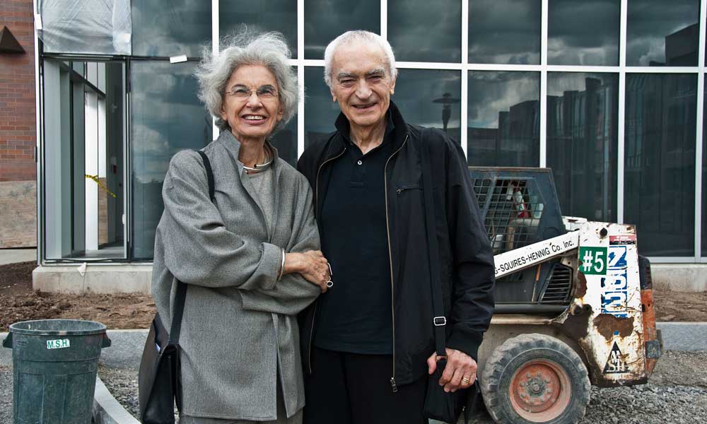
Massimo Vignelli, one of the most famous graphic designers to ever pick up a pencil, understood this better than anyone.
“If you can design one thing, you can design everything.”
He didn’t make “pretty pictures.” He built systems that lasted half a century. In an era where the average brand rebrands every three years to “stay relevant,” Vignelli’s work stands as a poignant indictment of our modern obsession with the new over the functional.
Ignoring the principles of Massimo Vignelli isn’t just an aesthetic choice; it’s an expensive operational leak. Every time a customer has to “guess” if a piece of content belongs to your brand, you lose money.
- Design is the project: treat branding as a systemic discipline, not a decorative afterthought.
- Intellectual elegance: use clarity, limited typefaces and colours to reduce cognitive load and signal competence.
- The grid governs consistency: a mathematical substructure enables scalable, repeatable, high-quality brand outputs.
- Timeless systems beat trends: disciplined design saves money, improves trust, and endures across decades.
Who is Massimo Vignelli?
Massimo Vignelli (1931–2014) was an Italian designer who championed Modernism, a philosophy that prioritises clarity, logic, and functionality over decoration.
He believed that “Design is One,” meaning the discipline of design is the same whether you are creating a spoon, a chair, a book, or a corporate identity for a multi-billion-pound airline.
Core Elements of the Vignelli Method
- Intellectual Elegance: The rejection of anything that doesn’t serve a specific communicative purpose.
- The Grid System: A mathematical framework that ensures every element on a page or screen has a logical relationship to every other element.
- Limited Palettes: A strict adherence to a handful of typefaces (usually Helvetica, Bodoni, and Garamond) and primary colours.
The Economics of Intellectual Elegance
Most business owners think they need a “creative” logo. They don’t. They need a functional one. Massimo Vignelli’s work for American Airlines in 1967 is the ultimate proof of design-led ROI.
For 45 years, American Airlines did not change its logo. Think about the marketing budget saved over four decades. While competitors were spending millions on “brand refreshes” and agencies that sold them the “visual language of the future,” AA sat still.
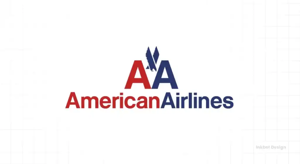
Why? Because Vignelli used two words, two colours (red and blue), and one typeface (Helvetica). It was so logically sound that it couldn’t be improved upon.
Research by McKinsey & Company found that companies with high design scores outperformed the S&P 500 by 219% over a ten-year period. This isn’t because they had “prettier” logos. It’s because their design systems reduced friction in the buyer’s journey.
The Cost of Visual Pollution
Vignelli famously hated what he called “visual pollution”—the clutter of unnecessary fonts, drop shadows, and gradients. In a B2B context, visual pollution creates Cognitive Load.
“Almost all the great American graphic designers have used white space as the significant silence to better hear their message loud and clear.”
According to the research, users feel overwhelmed when presented with too many competing visual signals.
When your brand appears disorganised, your potential clients assume your operations are equally disorganised. Vignelli’s “discipline” was actually a way to signal competence and stability.
The Grid: Your Brand’s Manager
If your marketing team is constantly asking, “Where should the logo go?” or “What font should we use for this flyer?” you are wasting billable hours. Vignelli solved this using the Grid System.
A grid is a set of horizontal and vertical lines used to align elements. For Vignelli, the grid was a “substructure” that allowed for infinite variety within a controlled environment. This is exactly what a modern business needs for its logo design and branding.
The Technical Reality of the Grid
| Feature | The Amateur Way (Decoration) | The Vignelli Way (Discipline) |
| Alignment | “Eyeballed” or centred based on “feeling.” | Strictly adhered to a mathematical grid. |
| Typography | Uses the font that is currently trending on Canva. | Uses 2–3 timeless typefaces for all communications. |
| Hierarchy | Everything is bold; everything is loud. | Clear visual hierarchy based on the importance of information. |
| Scalability | Breaks when moved from a business card to a billboard. | Designed to work at any scale, from a postage stamp to a plane tail. |
By implementing a grid, you remove the “artistic” guesswork. You transform visual storytelling into a seamless assembly line of high-quality, consistent output. This is how you scale a brand without a 50-person creative department.
Case Study: The New York Subway (MTA)
In 1970, the New York City subway system was a labyrinth of conflicting signs. Vignelli and his partner Bob Noorda created the Graphics Standards Manual. They didn’t just design signs; they designed a language.
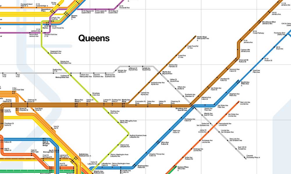
They specified exactly how high the signs should be, which dots denoted which lines, and the exact weight of Helvetica to be used.
They understood that communication in marketing—or in this case, public transit—is about moving people from Point A to Point B with the least amount of mental effort.
The Lesson for SMBs: Your customer is in a hurry. They are “navigating” your website or your proposal just like a commuter navigates a subway station. If your design doesn’t provide a clear path, they will exit.
Debunking the Myth: “Minimalism is Boring”
A common criticism of Vignelli’s work is that it’s boring or “soul-less.” This is usually whispered by designers who want to charge you for “creative exploration” or by business owners who think a logo needs to tell their entire life story.
The Reality Check: A logo doesn’t need to “tell a story.” It needs to be a hook that resonates with the customer’s emotions. This is the core of emotional branding.
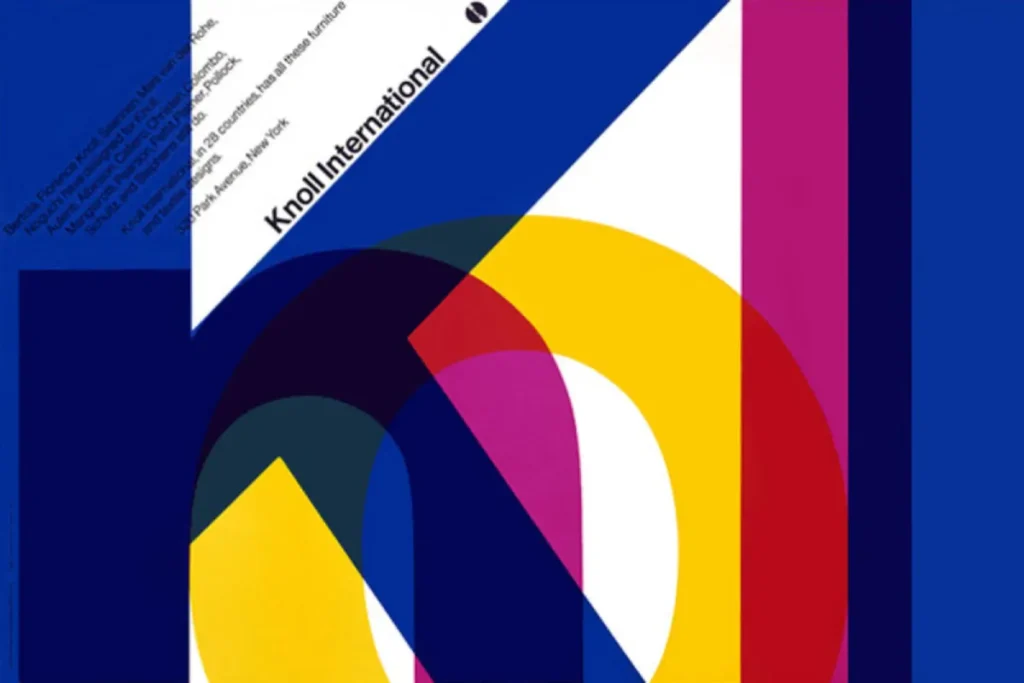
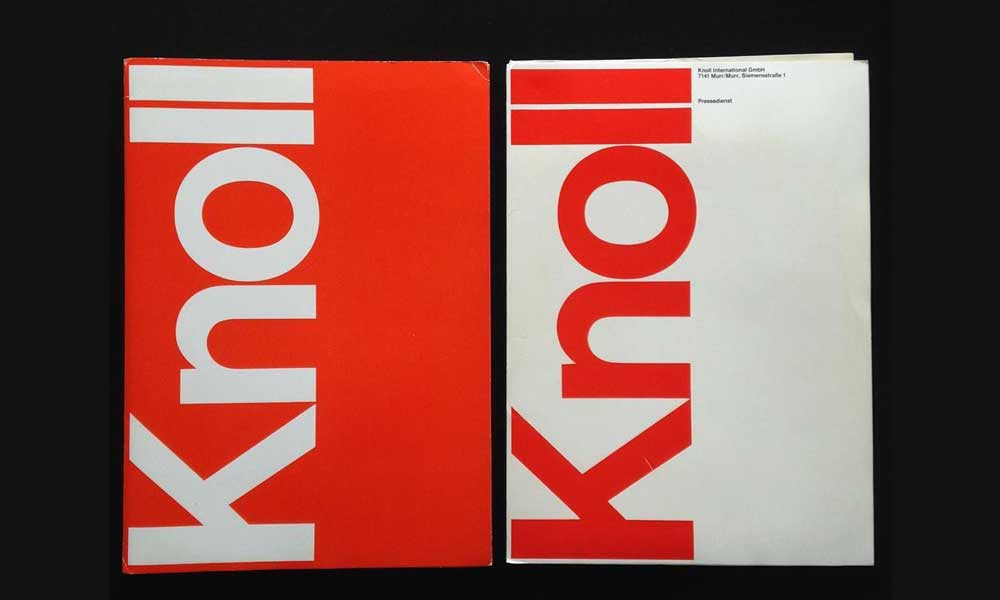
Vignelli’s work for Knoll or IBM wasn’t “boring”; it was transparent. He believed the design should be the window, not the view.
If you are selling high-end consulting services, your brand should be a clear window into your expertise, not a stained-glass window that draws attention to itself and obscures what you actually do.
If you examine the 100 most famous logos of the last century, the ones that have survived are those that followed Vignelli’s lead: simplicity, legibility, and a refusal to follow the herd.
The State of Design Systems in 2026
As we move further into 2026, the “Vignelli Style” is experiencing a massive resurgence. Why? Generative AI.
AI-generated design often produces “hallucinated” clutter—excessive detail that serves no purpose. In response, human-led design is pivoting back to the “Root Attributes” of Modernism.
We are seeing a shift toward “Neo-Modernism,” where brands are stripping away the AI-generated fluff in favour of stark, high-contrast, grid-based layouts.
The cost of digital “real estate” on mobile devices is also forcing this change. On a 6-inch screen, there is no room for decoration.
There is only room for function. If your brand isn’t Vignelli-compliant by 2026, it will be invisible to consumers.
The “Vignelli Audit”
In my fieldwork as a Creative Director, I often see companies suffering from “Brand Bloat.” They have too many colours, too many “sub-brands,” and zero discipline.
I once worked with a tech startup that had three different “primary” blues. When I asked which one was the real one, the marketing manager said, “It depends on who is making the PDF.”
That is a failure of leadership.
Massimo Vignelli didn’t just design; he enforced. He wrote manuals. He created rules. If you want a brand that has the “intellectual elegance” of a global leader, you need to stop asking for “options” and start asking for standards.
At Inkbot Design, we don’t just “draw logos.” We build standards. We create visual storytelling frameworks that enable your business to communicate effectively without stumbling over its own words.
The Verdict: Design is a Discipline
Massimo Vignelli’s legacy isn’t a specific font or a map of Manhattan. It is the idea that the visual world should be organised, not decorated. For an entrepreneur, this is the ultimate competitive advantage. While your competitors are chasing the latest design “trend,” you can build a system that is as relevant in 2070 as it is today.
Design is not a “creative” whim. It is a forensic tool for business growth.
If your brand feels like a collection of random decisions rather than a cohesive system, it’s time to apply some Vignelli-level discipline.
Would you like to build a brand that outlasts the competition?
- Explore Inkbot Design’s Services
- Request a Quote for Your Project
- Read more about the logic behind famous graphic designers on our blog.
Frequently Asked Questions (FAQ)
What was Massimo Vignelli’s “Design is One” philosophy?
It was the belief that design is a single, universal discipline. Whether designing a building or a business card, the underlying principles of logic, structure, and clarity remain identical. For businesses, this means your brand should be a cohesive system, not a collection of unrelated parts.
Why is the 1972 NYC Subway map so famous?
Designed by Vignelli, it employed an abstract, diagrammatic approach rather than adhering to geographical accuracy. It prioritised “wayfinding” logic over terrain. While controversial at the time for its lack of surface landmarks, it is now celebrated as a masterpiece of functional information design.
What fonts did Massimo Vignelli use?
How did Vignelli’s work influence modern branding?
He moved branding away from “illustration” and toward “systems.” His work for American Airlines and Knoll demonstrated that a brand could be built on a mathematical grid and a strict set of rules, resulting in decades of visual consistency and substantial cost savings.
What is the “Vignelli Canon”?
The Vignelli Canon is a short book written by Massimo Vignelli outlining his design principles. It covers concepts such as “Semantics,” “Syntactics,” and “Pragmatics,” serving as a guide for creating designs that are both intellectually elegant and functionally sound.
Is the grid system still relevant in web design?
Yes, arguably more than ever. Modern web frameworks, such as CSS Grid and Bootstrap, are digital evolutions of the grid systems championed by Vignelli in the 1960s. They enable responsive layouts that maintain structural integrity across various devices and screen sizes.
Why did Vignelli prefer Helvetica?
He viewed Helvetica as the ultimate “objective” typeface. It didn’t carry the “baggage” of historical styles or decorative whims. For Vignelli, it was a tool for clear communication that allowed the content to speak without the distraction of the “voice” of the font.
What is “Intellectual Elegance” in design?
It is the point where a design solution is so logical and refined that it becomes “elegant.” It’s not about being “fancy”; it’s about the beauty of a perfect solution that uses the minimum amount of resources to achieve the maximum result.
How can a small business apply Vignelli’s principles?
Start by stripping away. Limit your brand to two fonts and three colours. Use a grid for all social media posts and documents to maintain consistency and visual appeal. Focus on legibility and hierarchy over “cool” graphics. Discipline creates a more professional image than decorative “creativity” ever will.
Did Vignelli only do graphic design?
No. He was a “total designer.” He designed furniture (notably the Saratoga sofa), interiors, housewares (like the Heller stacking mugs), and even clothing. This reinforced his “Design is One” philosophy—that a good designer can design anything.
What is the cost of brand inconsistency?
According to research by Forrester, brand inconsistency creates confusion and erodes trust. In a B2B environment, if your collateral looks disjointed, it signals a lack of operational rigour, which can be a “silent killer” of high-value deals and long-term client retention.
Why is Vignelli’s American Airlines logo considered a success?
It lasted 45 years without a single modification. In the world of branding, this is an incredible achievement. It was successful because it was built on timeless logic rather than the aesthetic trends of the 1960s, saving the company millions in rebranding costs.

