Atomic Design Principles: Building Scalable UI Components
Most websites today are a lie.
They look cohesive on the surface, but look under the bonnet, and you will find a chaotic mess of hard-coded values, duplicate classes, and fifty shades of grey (literally—I once found 14 distinct hex codes for “grey” on a single enterprise dashboard).
This is what happens when you treat web design as a series of pages rather than a system of components. It is the “Frankenstein” approach: stitching together disparate parts and hoping the user doesn't notice the seams.
The cost of this chaos is not just aesthetic; it is financial. Every time a developer has to reinvent a button or a designer creates a new card layout that doesn't match the old one, you are burning cash. You are accumulating technical debt that will eventually bankrupt your user experience (UX).
The solution isn't “more creativity.” It is a rigid, scientific structure. It is Atomic Design.
- Design systems treat UIs as components, not pages, preventing inconsistent, unmaintainable interfaces.
- Atomic hierarchy: Atoms → Molecules → Organisms → Templates → Pages, enabling reusable, composable components.
- Design tokens centralise visual values (colours, spacing, typography), allowing global, cross‑platform updates like Dark Mode.
- Governance and contribution rules prevent component sprawl; central teams manage core atoms and molecules.
- Atomic Design boosts velocity, reduces bundle size and technical debt, and frees designers to solve high‑level UX problems.
What is Atomic Design?
Atomic Design is a methodology for creating design systems, coined by Brad Frost. It is a mental model that helps us view user interfaces not as a collection of static pages, but as a cohesive system of components.
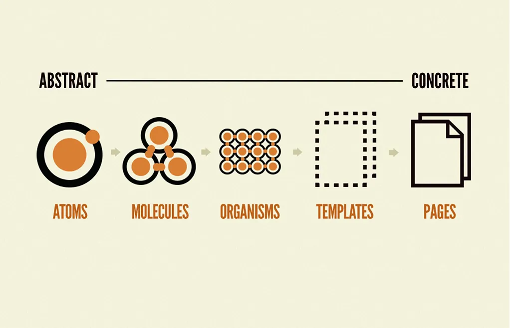
At its core, Atomic Design breaks a UI down into five distinct levels, hierarchically ordered from the abstract to the concrete:
- Atoms: The foundational building blocks (e.g., labels, inputs, buttons).
- Molecules: Groups of atoms functioning together (e.g., a search form).
- Organisms: Complex UI components composed of groups of molecules (e.g., a header).
- Templates: Page-level objects that place components into a layout.
- Pages: Specific instances of templates showing real content.
This is not just a filing system for your Sketch or Figma layers. It is a shared language between designers and developers. When both sides speak “Atomic,” the friction of handing off designs vanishes.
The Business Case: Why “Pages” Are Dead
Entrepreneurs often ask me, “Why do we need a system? Just design the home page.” This mindset is a relic of the print era. On the web, a “page” is a fluid concept. It changes based on the user, the device, and the data state.
If you design page by page, you are building a disposable product.
The Cost of Inconsistency
According to DevOps Research and Assessment (DORA), high-performing teams deploy code 973 times more frequently than low-performing teams. You cannot achieve that velocity if you are rebuilding the wheel for every feature.
Without Atomic Design, you face:
- UI Fragmentation: Users lose trust when the “Buy” button looks different on the checkout page than it does on the product page.
- Spaghetti Code: Developers frequently copy and paste CSS, resulting in bloated style sheets and slower load times.
- Scalability Nightmares: Want to rebrand? If you haven't used atoms (such as global colour tokens), you must manually update thousands of instances.
We recently audited a SaaS platform that had six different date pickers. Six. Each one had its own library, its own dependencies, and its own bugs. By consolidating them into a single “Date Picker Organism,” we reduced their bundle size by 40%. That is the power of Atomic Design.
The Five Stages of Atomic Design
Let’s dissect the biology of your interface. We will move from the granular to the grand.
1. Atoms
Atoms are the irreducible elements of your UI. In the physical world, these are hydrogen or oxygen. In your interface, they are HTML tags.

Examples:
- A colour palette (Hex codes, CSS Variables).
- Fonts (Typography hierarchy).
- Buttons.
- Form inputs.
- Icons.
The Strategy: Atoms are useless on their own. A button floating in a void serves no purpose. However, the quality of your atoms dictates the quality of your entire system. If your “Red” atom is inconsistent, your error messages will look sloppy everywhere.
2. Molecules
Molecules occur when atoms bind together. This is where things begin to resemble a user interface. Molecules are relatively simple groups of atoms that function together as a unit.

Examples:
- Search Form: A Label atom + An Input atom + A Button atom.
- User Card: An Avatar atom + A Name text atom.
The Strategy: Molecules are designed to perform a single function. They should be portable and reusable. If a molecule becomes too complex, it is likely an organism disguised as a molecule. Break it down.
3. Organisms
Organisms are relatively complex UI components composed of groups of molecules and/or atoms and/or other organisms. These form distinct sections of an interface.

Examples:
- Site Header: Contains a Logo atom, a Navigation molecule, and a Search Form molecule.
- Product Grid: Contains multiple Product Card molecules.
The Strategy: This is where the context begins to matter. While molecules are rigid, organisms can be flexible. A “Product Grid” organism might adjust its layout based on screen size (responsive design), but the molecules inside it remain consistent.
4. Templates
Templates are page-level objects that place components into a layout and articulate the underlying content structure of the design. This is the skeleton of the page.
The Strategy: Templates show where components go, but not what is inside them. They are essential for testing the layout's durability. Does the layout break if the headline is 200 characters long? Test it in the template phase.
5. Pages
Pages are specific instances of templates. This is where you pour real content into the shell to see if it holds up.

The Strategy: This is the client-facing deliverable. It’s where you test the fidelity of the system. If the design breaks when you add a real German headline (which is typically 30% longer than an English one), you need to go back and adjust the atoms or molecules, rather than hacking the page.
The “Frankenstein” Test: Audit Your Current UI
Before you begin building, it is essential to understand the current situation. We use a process called an Interface Inventory.
- Screenshots: Go through your site and take screenshots of every button, form, and heading.
- Categorise: Group them by type. Put all the buttons next to each other.
- The Horror: You will likely see slight variations in padding, shadow, and font size.
This visual evidence is what you show stakeholders to get buy-in for a Design System. When the CEO sees 12 different “Contact Us” buttons, the cheque for the refactor usually clears pretty quickly.
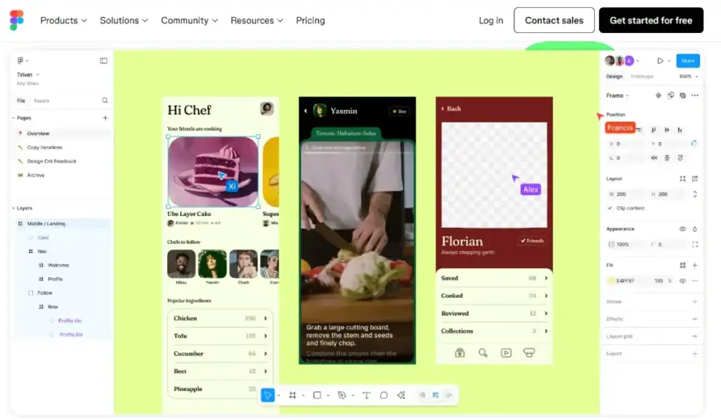
Technical Implementation: From Figma to Code
Atomic Design is just a theory until it comes to life in code. The bridge between the design tool (Figma/Sketch) and the development environment (React/Vue/Angular) is critical.
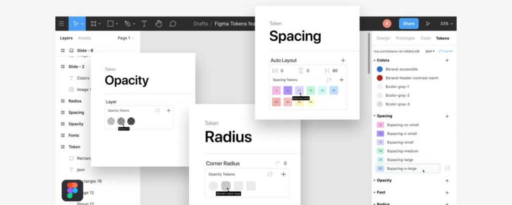
The Rise of Design Tokens
In 2026, we don't just hand off hex codes. We use Design Tokens.
Tokens are the “sub-atomic” particles of a design system. They are variables that store visual design attributes. Instead of hard-coding #FF0000 for an error state, you define a token: color-semantic-error.
| The Amateur Way (Hard-coded) | The Pro Way (Tokens) |
| background-color: #0055FF; | background-color: var(–color-primary-action); |
| font-size: 16px; | font-size: var(–font-size-base); |
| padding: 20px; | padding: var(–spacing-md); |
| Result: A nightmare to update. | Result: Change one file, update the whole app. |
This abstraction allows you to support things like Dark Mode instantly. You just swap the values of the tokens, and the atoms update automatically.
Component Libraries (React/Vue)
Modern frameworks are built for Atomic Design.
- Atoms = Base components (e.g., <Button />, <Input />).
- Molecules = Composite components (e.g., <SearchBar />).
- Organisms = Smart components or containers (e.g., <NavBar />).
Pro Tip: Avoid allowing organisms to dictate the style of the atoms inside them via CSS overrides. If an organism needs a smaller button, create a “Small Button” variant at the atomic level. Do not hack it in the parent container.
The Governance Problem: Who Owns the Atom?
The biggest failure point in Atomic Design is not technical; it is political. Who decides when a new atom is created?
If every developer can add a new button variant, your system will rot. You need strict governance.
The Contribution Model
Establish a decision tree for your team:
- Is there an existing component that performs this function? Use it.
- Can an existing component be extended? Add a variant (e.g., primary, secondary, ghost).
- Is this a snowflake? If a component is used only once, does it need to be in the global library? Probably not. Keep it local to the page until it is needed elsewhere.
According to Salesforce's Lightning Design System, a centralised team should manage the core “Atoms” and “Molecules,” while product teams can build their own “Organisms” as long as they use the approved lower-level components.
Debunking the Myth: “Systems Kill Creativity”
There is a pervasive myth among creative agencies that strict systems stifle innovation. Designers fear that Atomic Design means “painting by numbers.”
This is nonsense.
Constraints breed creativity. By automating the boring choices (padding, button radii, font sizes), you free up mental energy to solve actual User Experience (UX) problems.
Do you really want to spend two hours deciding how many pixels of margin a header should have? No. You want to spend that time figuring out the most intuitive user flow.
Systems handle the Micro so you can focus on the Macro.
The State of Atomic Design in 2026
The methodology has evolved. It is no longer just about static components.
1. AI-Generated Variants
Tools are emerging that take your “Atom” and automatically generate every possible state (hover, focus, disabled, error) and even check them for accessibility (WCAG contrast ratios) automatically.
2. The W3C Design Token Standard
The W3C Design Tokens Community Group is finalising a standard format for tokens. This means that a JSON file of tokens exported from Figma can be natively understood by iOS, Android, and Web platforms without the need for complex translation layers. This is the “Holy Grail” of cross-platform consistency.
3. Headless UI
Libraries like Radix UI or Headless UI provide the logic of the atoms (the accessibility features, keyboard navigation) without the styling. You apply your Atomic styles on top of their logic. This separates behaviour from appearance, a core tenet of robust software engineering.
Common Pitfalls to Avoid
1. Over-Atomisation
Not everything needs to be an atom. I have seen teams break down a simple text link into three different components. If it takes longer to import the components than to write the HTML, you have gone too far.
2. The “Context” Trap
Atoms must be context-agnostic. A button should not know it is inside a checkout form. If you write CSS like'.checkout-form .button { width: 100%}', you break encapsulation. The button should have a full-width prop/variant, and the checkout form should request that variant.
3. Ignoring Mobile
Atomic Design is inherently responsive. If you design your atoms only for desktop, they will break on mobile. Your typography tokens must use fluid units (like rem or clamp()) to scale across devices. Responsive Web Design is non-negotiable.
A Real-World Example
We worked with a logistics firm in the UK that had three separate portals: one for drivers, one for warehouse staff, and one for customers.
The Problem:
- Three different tech stacks.
- Three different design teams.
- Zero shared code.
If they wanted to update their brand colour from Blue to Green, it took six months.
The Fix:
We built a shared “UI Kit” based on Atomic Design principles.
- Phase 1: Define the tokens (Colours, Spacing, Typography).
- Phase 2: Build the core Atoms (Buttons, Inputs, Badges).
- Phase 3: Roll out the system to the Customer portal first (highest visibility).
The Result:
When the warehouse portal needed a refresh, they used the existing molecules. Development time dropped from 4 months to 6 weeks. The Web Design Services we provided paid for themselves in the first deployment cycle.
The Verdict
Atomic Design is not a trend; it is the industrialisation of web design. It moves us away from the artisan “crafting” of individual pages and towards the engineering of robust, scalable systems.
If you are a small business, you might think this is overkill. It isn't. It is future-proofing. It is easier to build an atom right the first time than to fix 500 instances of a broken button three years from now.
Stop building pages. Start building systems.
Frequently Asked Questions (FAQ)
What is the difference between Atomic Design and a Style Guide?
A style guide is a static document that describes how elements should be presented (e.g., “Use this hex code”). Atomic Design is a methodology for building the actual functional components in code and design tools. One is a manual; the other is the engine.
Can Atomic Design be applied to existing websites?
Yes, but it requires a “refactoring” approach. You perform an interface audit, identify common patterns, build them as atoms/molecules, and slowly replace the old code with the new components. It is like changing the tyres on a moving car, but it is possible.
Do I need a large team to use Atomic Design?
No. Even a solo developer benefits from it. By defining your atoms early, you save yourself from writing duplicate CSS later. It keeps your codebase clean and manageable, regardless of team size.
How does Atomic Design impact SEO?
Indirectly, it helps significantly. Cleaner code means faster load times and better Core Web Vitals, which are ranking factors. Consistency also improves user engagement metrics, resulting in lower bounce rates.
Is Atomic Design suitable for mobile apps?
Absolutely. The principles apply to any UI, whether it is iOS, Android, or Web. In fact, using Design Tokens allows you to share the same visual DNA across your mobile app and website effortlessly.
What tools are best for Atomic Design?
For design, Figma is the industry standard due to its robust “Component” and “Auto Layout” features. For documentation, Storybook is the go-to tool for developers to visualise and test components in isolation.
How do I handle “organisms” that don't fit the system?
If an organism truly doesn't fit, question why. Is the design necessary? If yes, build it as a “snowflake” (one-off) component. But be warned: too many snowflakes will cause an avalanche of technical debt.
Who is responsible for maintaining the design system?
Ideally, a “Design Ops” or “Frontend Infrastructure” person. In smaller teams, it should be a shared responsibility between the lead designer and lead developer to approve changes to the core library.
Does Atomic Design limit creative freedom?
No, it frees you from repetitive tasks. By standardising the basics (atoms), designers can spend more time on high-impact creative problems (organisms and templates) and user flows, rather than pixel-pushing.
How much does it cost to implement Atomic Design?
The upfront cost is higher because you are building a system, not just screens. However, the long-term ROI is massive. Request a quote to learn how a design system can help reduce your future development costs.

