
The 25 Best Negative Space Logos Ever Created
Look at the FedEx logo. Specifically, look at the space between the ‘E’ and the ‘x’.
See it? The arrow.
Once you see it, you can never unsee it. That arrow is the perfect, unspoken promise of the FedEx brand: forward movement, speed, direction, and precision. It’s not a decoration; it’s the entire business strategy hidden in plain sight.
This is the power of a brilliant negative space logo.
Negative space, quite simply, is the area around and between the main subjects of a design. In logo design, it’s the art of using that “empty” space to create a second, equally important image.
But let’s be clear. The logos on this list aren't just here because they're clever. They're here because they are masterclasses in Intentional Duality.
This is where the main image (the positive space) and the hidden image (the negative space) work together to tell a deeper, more compelling story about the brand.
It's a powerful tool. But it's also dangerous for a business owner to fall in love with.
- Negative space logos creatively use surrounding space to reveal hidden images that enhance brand messaging.
- Successful logos avoid irrelevant hidden images, ensuring clarity and relevance to the brand’s core message.
- A great negative space logo must be simple, scalable, and produce an instant “aha!” moment for viewers.
- Examples of effective logos include FedEx, WWF, and Baskin-Robbins, showcasing intentional duality in design.
- A logo's primary goal is to be memorable and communicate value; cleverness should not compromise clarity.
The Dangerous Allure of a “Clever” Logo
There's a trap many entrepreneurs fall into. They see a list like this and decide they must have a logo with a hidden trick. They chase the gimmick, believing cleverness equals quality.
Most of the time, they're wrong. This obsession leads to logos that are a mess.
Here’s my list of pet peeves—the tell-tale signs of a negative space logo that has failed.
My first is the Irrelevant Hidden Image. You see a logo for a coffee shop, and the designer has cleverly hidden a wrench in the steam. Why? Who knows. It has nothing to do with coffee. It's a visual pun that adds zero value and only creates confusion. The cleverness doesn't serve the message.
Next is the Scalability Nightmare. A designer presents a logo on a massive screen, revealing an intricate silhouette of a city skyline hidden between two letters. It looks incredible. Then you shrink it to the size of an app icon on your phone, and it becomes an unrecognisable smudge. A logo must be a workhorse; it has to work everywhere, from a billboard to a 16-pixel favicon.
Finally, there's the “I Don't Get It” Problem. The design fails if you must explain the hidden image to a customer. The “aha!” moment of discovery should delight the viewer, not a puzzle they must be coached through. It should feel like a small, personal discovery.
A great negative space logo avoids all three of these traps. It's relevant, simple, and the reveal is almost instantaneous.
The Gold Standard: 25 Negative Space Logos That Actually Work
Right, let's get to it. We’re not just going to look at pretty pictures here. We're going to dissect why these 25 logos are brilliant business assets. I’ve grouped them by what they achieve to show you the different ways this technique can be put to work.
Category 1: The Unmistakable Icons
These are the logos that define the genre. They are simple, globally recognised, and absolutely flawless in their execution.
1. FedEx: The Benchmark for Purpose. We started with it for a reason. Designed by Lindon Leader in 1994, the arrow isn't just a hidden shape; it's the visual embodiment of the company's entire value proposition. It communicates speed and precision without a single word. This is the gold standard because the hidden element is the brand's core message.
2. World Wildlife Fund (WWF): The Power of Simplicity The WWF panda, designed in 1961, is one of the most recognisable logos on the planet. It uses the animal's natural black and white markings to create the form from minimal, broken shapes. The negative space isn't hiding a second image; it is the image. It’s emotionally resonant and beautifully simple.
3. NBC: The Modern Classic The National Broadcasting Company's peacock is a masterclass in corporate branding. The six feathers represent the company's six divisions during its 1986 redesign. The peacock's head faces forward, a deliberate choice to suggest looking to the future. It’s a colourful, optimistic mark that has stood the test of time.
Category 2: Fusing Two Ideas Into One
This is where things get really clever. These logos merge two separate concepts into a single, cohesive mark.
4. Spartan Golf Club: The Perfect Hybrid Look closely. You see a golfer in mid-swing, the arc of their club creating a dynamic sense of motion. But look again, and you know the profile of a Spartan warrior, complete with a helmet and plume. It perfectly combines the two parts of the name into one powerful image. This is a high-difficulty design executed flawlessly.
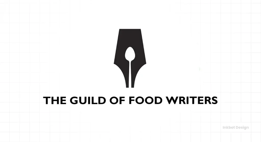
5. Guild of Food Writers: The Tools of the Trade. What do food writers use? A pen to write and a spoon to taste. This logo elegantly combines both. The negative space inside the fountain pen’s nib perfectly forms the shape of a spoon. It's an immediate, intelligent “I get it” moment.
6. Pittsburgh Zoo & PPG Aquarium: A Face-Off of Forms. This is a personal favourite. A sprawling tree is formed on the edges by a flock of birds. But the negative space on either side of the trunk reveals two powerful, hidden profiles: a gorilla on the left and a lioness on the right, staring each other down. It's a complete ecosystem in one mark.
Category 3: Hidden Stories & Sense of Place
A logo can do more than identify a company; it can tell a story about its origins or mission.
7. Toblerone: A Sweet Piece of Heritage. Everyone sees the Matterhorn mountain, a nod to the chocolate's Swiss origins. But look at the left side of the mountain. Hidden in the snowy relief is a dancing bear. This isn't random; it's a tribute to Bern, Switzerland—the “City of Bears”—where the Toblerone was created. It adds a rich layer of authentic heritage.
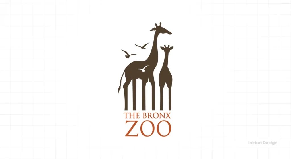
8. The Bronx Zoo: An Urban Jungle. At first glance, you see two giraffes and some birds. But the negative space between the giraffes' legs forms a stunning New York City skyline silhouette. This brilliantly captures the zoo's identity: a world of nature within a world-famous urban landscape.
9. Hope for African Children Initiative: Emotion in the Emptiness. This logo is incredibly moving. The positive space creates a vibrant outline of the African continent. However, the negative space within it shapes the figures of an adult looking down at a child, conveying a message of care, connection, and hope for the future generation.
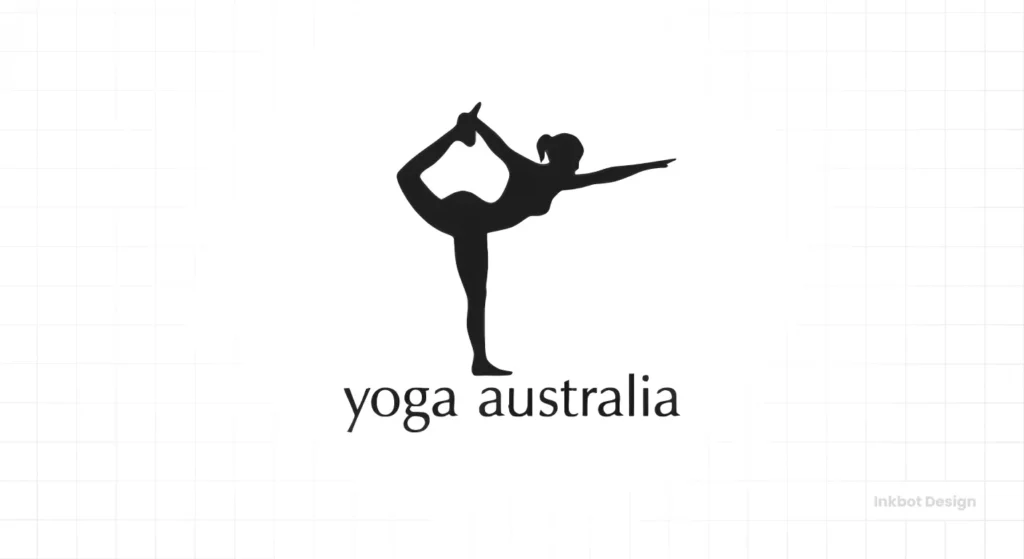
10. Yoga Australia: The Body as Landscape. A woman is holding a leg-raise yoga pose. Simple enough. However, the negative space created between her leg, torso, and arm perfectly forms the geographical shape of Australia. It's a clever and direct way to connect yoga practice with its national governing body.
Category 4: Genius in the Alphabet
Sometimes the best place to hide something is within the letters themselves. Typographic logos are a huge challenge, but when they work, they're unforgettable.
11. USA Network: The Invisible ‘S' The logo clearly shows a ‘U' and an ‘A'. The negative space snaking between them altogether forms the ‘S'. This binds the three letters together into a single, unified mark that is compact and incredibly smart.
12. Carrefour: The Subtle Initial Carrefour is a French word meaning “crossroads.” The logo depicts two arrows, one red and one blue, pointing in opposite directions. The negative space between them forms a subtle but clear letter ‘C'. Many people haven't seen this for years, and the discovery is a delightful surprise.
13. Goodwill: The Letter is the Feeling. The word ‘goodwill' is featured, but look at the top left. The stylised lowercase ‘g' in the name is also a cropped image of a smiling face. It visually reinforces the positive feeling the organisation's name and mission evoke.
14. London Symphony Orchestra: A Conductor in the Cursive This beautiful, fluid mark looks like cursive writing spelling out “LSO.” But the lines also elegantly trace the form of an orchestra conductor, arms raised, baton in hand. It’s art and music rendered in a few simple strokes.
15. MyFonts: A Helping Hand The word ‘My' is stylised to look like a hand, as if it's presenting the fonts to you. It's a simple, friendly, and effective way to make a digital product feel more personal and tangible.
Category 5: The Numbers Game
Embedding numbers into a logo is a direct way to communicate a key business fact.
16. Baskin-Robbins: The 31 Flavours. For decades, Baskin-Robbins' key selling point was its “31 flavours”—one for every day of the month. Their 2005 logo redesign cleverly hid the number '31' in pink within the initials ‘B' and ‘R. It’s a playful nod to their heritage.
17. Formula 1 (Old): The Essence of Speed. The classic F1 logo (used from 1994-2017) was genius—a black ‘F' for Formula, and a red pattern signifying speed and energy. The negative space between the two perfectly created the number ‘1'. It was a mark that screamed speed before you even read it.
Category 6: The Hall of Fame (Classic Sports & Travel)
Some of the most beloved negative space logos come from the world of sports and travel, where identity and place are paramount.
18. Hartford Whalers (Old): A Whale of a Mark A sports logo icon. The green ‘W' sits atop a blue whale's tail. Simple. But the negative space between the two elements forms a perfect white ‘H' for Hartford. It’s one of the most perfectly balanced and clever sports logos ever.
19. Milwaukee Brewers (Old): The Catcher's Mitt This beloved logo (used from 1978-1993) looks like a classic baseball catcher's mitt. But the mitt is formed by the lowercase letters ‘m' and ‘b' for Milwaukee Brewers. It’s a clever design, and I loved that the team still uses it on throwback uniforms.
20. Northwest Airlines (Old): The Built-in Compass Another classic from the days before airline mergers. The mark is a circle containing both an ‘N' and, with a small triangle, a ‘W'. The ‘W' also points directly North-West within the circle, turning the logo into a functional compass—pure genius.
Category 7: Brands That Build Worlds
These final examples use negative space not just for a single reveal but also to create a whole universe of meaning.
21. Tostitos: A Shared Moment Look at the two ‘t's in the middle of the word. They form two people dipping a tortilla chip (the yellow triangle over the ‘i') into a red bowl of salsa. It's not just a logo for a food product; it's a logo about the experience of sharing that food.
22. Unilever: Unity in Diversity The Unilever ‘U' comprises 25 smaller icons, each representing a different aspect of their business—a sun for vitality, a spoon for nutrition, a flower for beauty. The negative space gives each icon its shape and allows them to coexist within the larger whole, representing the company's vast but unified portfolio.
23. Cisco: A Bridge to the Digital World The vertical lines in Cisco's logo represent a digital signal. However, they also form a silhouette of the Golden Gate Bridge, a tribute to their hometown of San Francisco (the name “Cisco” derives from the city name). It connects their digital work to a physical, iconic landmark.
24. LG: Life's Good (and Simple) The logo is simple: the letters ‘L' and ‘G' arranged inside a circle. But they are arranged to form a human face—the ‘L' is the nose, and the ‘G' is the rest of the face. A single dot forms the eye. By shifting the ‘L' up slightly, the face can even appear to wink. It’s friendly and approachable.
25. Elefont: The Conceptual Masterclass. You'll often see this logo in design roundups. It’s a lowercase ‘e' where the negative space in the letter's counter perfectly forms an elephant's trunk. It's brilliant. However, it's crucial to note this is often cited as a conceptual piece by designer Mike Erickson. It serves as a perfect example of the technique, but also highlights the difference between a clever portfolio concept and a mark that's been battle-tested in the real world.
The 3 Questions to Ask Before You Commission a Negative Space Logo
Inspired? Good. Now, let’s bring this back to your business. Before you get carried away and ask a designer to hide a dolphin in your company's logo, you must ask yourself three critical questions.
1. Does the Hidden Element Reinforce My Core Message?
This is the most critical test. The hidden element cannot be random. It must add a layer of meaning that supports your brand's purpose.
The FedEx arrow works because it means speed. The Toblerone bear works because it means heritage. If the hidden image doesn't strengthen your primary message, it's a distraction. It's a gimmick, and it's weakening your brand.
2. Will This Work as a 16×16 Pixel Favicon?
This is the acid test for simplicity and scalability.
Take your brilliant, complex logo concept and shrink it. Shrink it down to the size of a tiny square in a browser tab. Can you still see the effect? Is the logo still legible? If the answer is no, the design is too complicated. A logo that doesn't work at all sizes is not professional.
3. Is the “Aha!” Moment Instant?
Don't fool yourself. Show a draft of the logo to five people who have never seen it. Don't say anything. Just watch them.
Do their eyes light up in a second or two as they “get it”? Or do they stare blankly, turn their head sideways, and ask, “What am I supposed to be looking at?” If you have to explain it, it’s failed. The magic of a great negative space logo is in the effortless discovery.
So, Should Your Business Use a Negative Space Logo?
Maybe. But probably not.
It’s a high-risk, high-reward strategy. For every FedEx, there are a thousand confusing, poorly executed attempts. They require a crystal-clear brand story, a straightforward concept, and a highly skilled designer.
Remember, a simple, strong, and clear traditional logo is infinitely better than a “clever” one that misses the mark.
The ultimate goal of a brand identity is not to be clever; it's to be memorable and to communicate your value instantly. Sometimes, negative space is the perfect tool for the job. And sometimes, it’s an unnecessary complication. Knowing the difference is the key.
Getting this right isn't easy. The difference between a timeless icon and a confusing smudge costs you customers. A professional perspective is non-negotiable if you're exploring a new identity for your business. Look at our logo design services to see how we approach building powerful, effective brand marks.
Frequently Asked Questions About Negative Space Logos
What is a negative space logo?
A negative space logo is a design that uses the background or space around a subject to create another meaningful image or symbol.
Why is the FedEx logo so famous?
The FedEx logo is renowned for its subtle use of negative space to create an arrow between the ‘E' and ‘x', perfectly symbolising the company's focus on speed, direction, and delivery.
Are negative space logos a good idea for a small business?
They can be, but they are challenging to execute well. A small business is often better served by a transparent, simple, and direct logo than a complex one that might confuse potential customers.
What is the figure-ground relationship in design?
Figure-ground is a principle of perception where we tend to segment our visual world into “figure” (the object of focus) and “ground” (the background). Negative space logos play with this principle by making the ground as crucial as the figure.
How much do negative space logos cost?
The cost isn't determined by the style but by the designer's skill and process. Because they require more conceptual thinking and refinement, they may need more investment than a simpler logomark.
What makes a negative space logo “bad”?
A negative space logo is bad if the hidden image is irrelevant to the brand, if the design is too complex to be legible when scaled down, or if the hidden element is so obscure that people can't see it without an explanation.
Can a logo have more than one hidden image?
This dramatically increases complexity, like the Pittsburgh Zoo logo (gorilla, lioness, tree, birds). It's challenging to pull off successfully without creating a visual mess.
What is the oldest example of a negative space logo?
While the concept has roots in ancient art, one of the earliest modern examples is the NBC peacock, which was first used in various forms starting in 1956 to highlight the new technology of colour television.
Do negative space logos work well online?
They work well if they are simple. A complex negative space logo can lose its effect as a small favicon or social media profile picture. Simplicity is key for digital applications.
What's the difference between a negative space logo and a clever logo?
A great negative space logo is clever, but not all logos use negative space. The key distinction is that the cleverness must serve the brand's message and not just be a gimmick for its own sake.
Ready to Build an Unforgettable Brand?
A logo is more than a pretty picture; it's the face of your business. Getting it right is crucial. If you want a brand mark that is not just clever, but clear, memorable, and practical, we should talk.
- Explore our professional logo design process.
- Ready to start? Request a quote for your project today.
- See more of our work and insights at Inkbot Design.

