History of The Burger King Logo Design: Finding the Beef
Most brand histories are sanitised, self-congratulatory timelines that offer little real-world value. This isn’t one of them.
The history of the Burger King logo is something more. It’s a 70-year story of a brand fighting for its soul.
It’s a battleground where brilliant simplicity has clashed with corporate vanity, and chasing fleeting trends nearly destroyed decades of brand equity.
This is more than a history lesson for any entrepreneur or business owner. It’s a masterclass in the high-stakes decisions that define a brand’s identity, full of victories to emulate and disastrous mistakes to avoid.
So, let’s dissect the good, the bad, and the ugly of a fast-food giant’s face.
- Burger King's logo history is a 70-year journey of brand identity evolution.
- The Bun Halves logo embodies simplicity and clarity, representing the core offering effectively.
- Chasing design trends can undermine a brand's core identity and values.
- The successful 2021 rebrand emphasised heritage, authenticity, and warmth over slick corporate designs.
The Early Years (1953-1968): Searching for a Face
Every brand starts somewhere, and the beginning was visually… messy for Burger King.
Their initial logos weren’t the product of a grand strategic vision; they were the functional, almost generic marks of a business trying to figure out what it wanted to be.
1953: The Half-Sun Logo

The very first Burger King logo, used for less than a year, was a literal rising sun. It was a simple, one-colour design to convey optimism and a new beginning.
The Verdict: It’s a logo. That’s about the kindest thing you can say. It’s generic, has nothing to do with burgers, and feels more suited to a Florida motel than a fast-food joint.
The Takeaway: Your first attempt at a logo is rarely your best. The goal at the start is to simply get a mark in the world. Evolution is inevitable, so don’t agonise over making it perfect on day one. Just start.
1954: Just the Facts, Ma’am
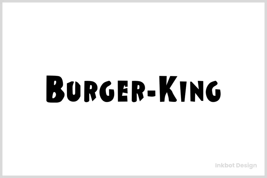
The sun set permanently a year later, replaced by a brutally simple, almost crude, sans-serif wordmark. “Burger King” in plain black text.
The Verdict: This is a step towards function, but a step away from personality. It is legible and communicates the name, but that’s it. It has the visual appeal of a shipping label.
The Takeaway: Clarity is non-negotiable. People must be able to read your name. But legibility is the bare minimum, not the end goal. A great logo does more than just state a name; it starts a conversation.
1957: Enter the King

This is where things get interesting. Burger King introduced its mascot, a slightly smug-looking King, sitting atop a burger, often holding a beverage. The text was now a playful, bouncy font.
The Verdict: This was the first real injection of personality. It’s a bit goofy and complex for a logo, but it clearly signals that they understood the need for more than just a name on a sign. They needed a character.
The Takeaway: Don’t be afraid to show some personality. A unique character or visual element can make your brand memorable. The key is to refine it over time so it supports, rather than distracts from, your core product.
The Golden Age (1969-1998): The Bun Halves Find Their Groove
After more than a decade of searching, Burger King finally found its face. And it was so simple, so perfect, it would define the brand for the next 50 years.
This was when they stopped making logos and started building an iconic identity.
1969: Perfection is Achieved

The breakthrough was revolutionary in its simplicity. The words “BURGER KING” were set in a rounded, friendly font and sandwiched between two bun halves. That’s it.
The Look: A clean, perfectly balanced mark where the container (the bun) became synonymous with the content (the name). The colours were a vibrant red-orange, stimulating appetite and energy.
The Context: The fast-food industry was booming. McDonald’s Golden Arches were an icon of efficiency and family fun. Burger King needed a mark that was just as simple and memorable, and screamed “burgers” even louder.
The Verdict: Absolute genius. This logo is the product. You see it from a hundred yards away, and your brain thinks “burger.” It’s easy to reproduce on signs, wrappers, and uniforms. It’s friendly, confident, and utterly unmistakable. It is one of the most effective fast-food logos ever created.
The Takeaway for Your Business: The most powerful logo is often the one that most directly represents your core offering. Don’t get lost in abstract concepts. Ask yourself: “What is the simplest, most literal way I can represent what I sell?” That kind of clarity is the foundation of an effective Logo design.
1994: A Subtle Polish
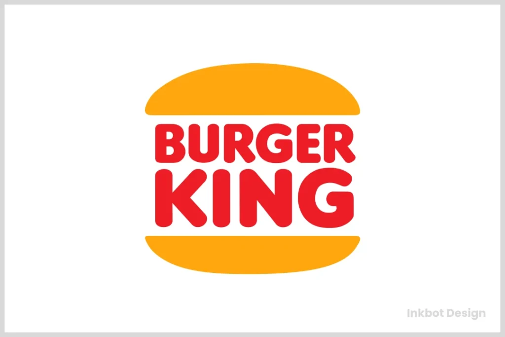
After 25 years of success with the Bun Halves, Burger King made a smart, conservative update.
The Look: The design was fundamentally the same, but it was cleaned up. The font became slightly more structured, the bun shapes were modernised, and the colours were given more precise definition. It was an evolution, not a revolution.
The Verdict: A masterclass in brand stewardship. They recognised the immense equity they had built in the Bun Halves concept and chose to refine it for a new era rather than throwing it away. It showed maturity and confidence.
The Takeaway for Your Business: Never perform a radical overhaul when a simple refresh will do. If your logo is well-recognised and working for you, a subtle update can keep it feeling current without confusing your customers or sacrificing decades of goodwill.
The Dark Ages (1999-2020): The Great Mistake of the Blue Swoosh
And then, they lost the plot.
At the turn of the millennium, driven by a desire to appear “modern” and “dynamic,” Burger King made one of the most misguided rebranding decisions in fast-food history. They abandoned the flat, simple perfection of the Bun Halves for a logo that reeked of corporate trend-chasing.
The Look: A Tilted, Gradient-Filled Mess
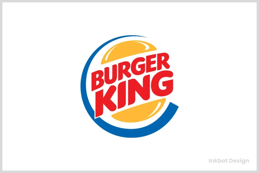
The new logo, designed by Sterling Brands, kept the bun idea but sterilised it. The buns became glossy, dimensional shapes. The text was italicised and put on a slant to imply “speed.” And, most egregiously, the entire thing was wrapped in a vibrant blue crescent—a blue swoosh.
The Context
You have to remember the late 1990s. The dot-com bubble was in full swing. Every brand, from Pepsi to Microsoft, was obsessed with looking futuristic, high-tech, and “dynamic.” Gradients, swooshes, and tilted logos were the visual shorthand for progress. Burger King got swept up in the hysteria.
The Verdict
It was a complete disaster. Here’s why:
- It Lost Its Soul: The simple, friendly charm was gone, replaced by a cold, corporate sheen. It looked less like a place to get a burger and more like the logo for an internet service provider.
- The Blue is Unforgivable: Blue is famously one of the least appetising colours in the spectrum. It’s often associated with mould and poison; it is a known appetite suppressant. It was marketing malpractice to introduce it as a primary brand colour for a food company.
- It was a Solution in Search of a Problem: The 1994 logo was not broken. It was not dated. It was iconic. This change was driven not by customer need or brand strategy, but by a boardroom’s insecurity and desire to look “cool.
The Takeaway for Your Business: This is the most critical lesson in the entire article.
Trends are a trap. Never, ever sacrifice your core identity to chase a fleeting design fad. Your brand should be built on your authentic story and values, not the Adobe Illustrator effect of the month. Your customers can smell a fake a mile away.
The Renaissance (2021-Present): A Confident Return to Form
After 20 years in the visual wilderness, Burger King finally came home. In early 2021, they unveiled a comprehensive rebrand that was met with near-universal praise from the design community and customers alike.
The Strategy: Embracing Heritage
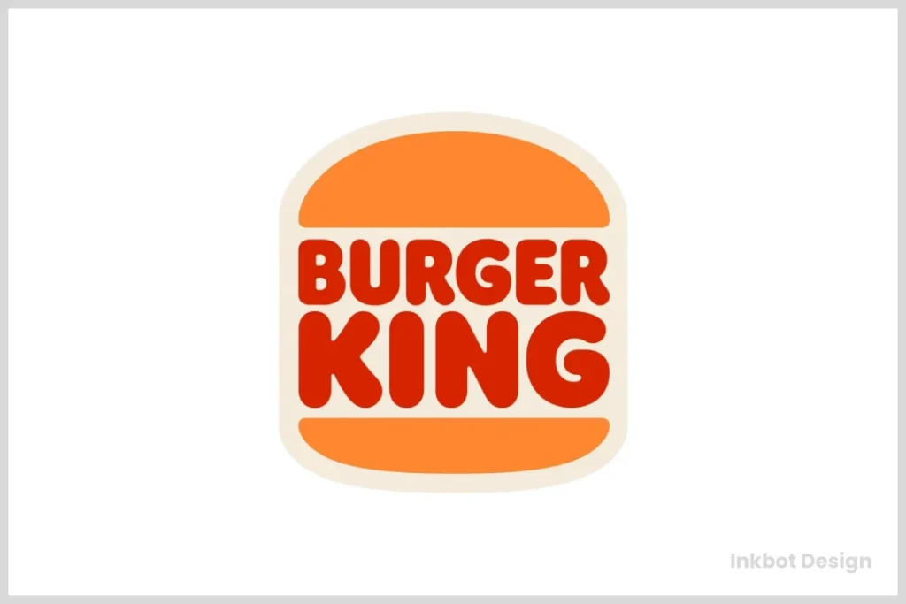
The new identity, masterfully executed by the agency Jones Knowles Ritchie (JKR), was not about creating something new. It was about finding the confidence to embrace what had always made the brand great.
The Look: The blue swoosh was gone. In its place was a beautiful, refined version of the 1969 and 1994 logos. The bun halves are back, but with perfected proportions. The new identity is supported by a warm, retro-inspired colour palette and a custom, chunky, delicious-looking font called “Flame.”
The Verdict: Pitch perfect. This is arguably one of the best rebrands of the last decade. It isn’t just nostalgia; it’s a strategic move that radiates confidence. It says, “We know who we are. We sell delicious, flame-grilled burgers. We don’t need gimmicks.” The entire visual system, from the logo to the packaging and staff uniforms, feels authentic, warm, and unapologetically focused on the food.
The Takeaway for Your Business: Your history can be your most powerful marketing asset. Before you look for inspiration in what your competitors are doing, look in your own archives. What made your business special in the first place? Find a way to capture that original spirit with modern execution.
4 Brutal Lessons from the Burger King Logo for Your Business

Let’s boil it all down. Here are the actionable takeaways from Burger King’s 70-year journey.
Lesson 1: Your Logo Should Signal Your Product
The Bun Halves logo worked because it looked like a burger. A winery with a grape in its logo, a carpenter with a saw—it’s not rocket science. The most effective logos create a direct mental shortcut to what you sell.
Lesson 2: Simplicity is Confidence
The 1999 logo was complex because Burger King was insecure. The 2021 logo is simple because they are confident. A simple, clean mark tells the world you don’t need to shout or decorate. Your product and service speak for themselves.
Lesson 3: Trends Are a Trap
The Blue Swoosh will forever be a monument to the foolishness of chasing trends. When a design trend is popular enough for a major corporation to adopt, it’s already on its way to being dated. Build on timeless principles, not temporary fads.
Lesson 4: Authenticity is Your Greatest Asset
The 2021 rebrand works because it feels true. It connects to a real history and a real product. Your customers are tired of slick, soulless corporate branding. They crave authenticity. Find what’s real about your business and put that at the heart of your identity.
Your Brand Identity is a Long Game
The Burger King story is a perfect reminder that branding is not a one-time event. It’s a continuous definition, refinement, and sometimes correction process. They lost their way for two decades but had the wisdom to return to their core truth.
Your logo isn’t just a pretty picture. It’s a decision about who you are, what you stand for, and why customers should choose you. It’s the tip of the spear for your entire brand.
If you’re tired of chasing trends and want a brand identity built to last—one rooted in your unique story—then it’s time for a conversation. You can see our no-nonsense approach to branding at Inkbot Design or get a straight-to-the-point quote for your project today.
Frequently Asked Questions about the Burger King Logo
What is the current Burger King logo?
The current Burger King logo, introduced in 2021, is a minimalist design featuring the company name nestled between two bun-like shapes. It is a modernised version of the logo used from 1969 to 1999.
Who designed the new Burger King logo?
The 2021 Burger King rebrand and new logo were created by the creative agency Jones Knowles Ritchie (JKR).
Why did Burger King change their logo in 2021?
Burger King changed its logo to reflect its food and brand heritage better. The rebrand moved away from the slick, corporate look of the 1999 logo to a more authentic, warm, and food-focused identity inspired by their classic designs.
What was the Burger King logo from 1999 to 2020?
The logo used during this period featured stylised, glossy bun halves, tilted text, and a prominent blue swoosh or crescent that encircled the design. It was a significant departure from previous versions.
Why did the 1999 Burger King logo have a blue swoosh?
The blue swoosh was added to make the brand appear more modern, dynamic, and fast at a time when many companies were adopting tech-inspired design trends. The choice of blue was widely criticised for being unappetising.
What is the oldest Burger King logo?
The first Burger King logo from 1953 was a simple graphic of a rising half-sun. This was quickly replaced in 1954 by a simple text-only logo.
What is the font used in the new Burger King logo?
The new Burger King branding uses a custom font called “Flame.” It’s a thick, rounded sans-serif designed to be friendly and evoke the shape of their food.
How many logos has Burger King had?
Burger King has had seven major logo designs throughout its history: 1953 (Half-Sun), 1954 (Text), 1957 (Sitting King), 1969 (Bun Halves), 1994 (Updated Bun Halves), 1999 (Blue Swoosh), and 2021 (Modernised Bun Halves).
Is the Burger King logo a burger?
Yes, the most iconic versions of the Burger King logo (1969, 1994, and 2021) are designed to look like a burger, with the company name acting as the “meat” between two bun halves.
What is the meaning behind the Burger King logo?
The primary meaning of the iconic “Bun Halves” logo is to directly and simply communicate the company’s main product: burgers. The warm colours (red and orange) stimulate appetite and create a feeling of warmth and fun.
