
The Toyota Logo: A 90-Year Masterclass in Scalability
If you want a real-world, PhD-level education in logo design, stop browsing Pinterest trends and start studying Toyota.
The Toyota logo design isn't just a “good logo.” It's a relentless, multi-billion-dollar lesson in scalability, long-term strategy, and pure brand equity. It’s an asset that has survived decades of trends, technological shifts, and global expansion without breaking a sweat.
I have a few pet peeves when clients ask for a new logo:
- The “Hidden Meaning” Obsession: They want a logo that’s a visual puzzle box, crammed with 10 hidden symbols that no customer will ever see or care about.
- Trend-Chasing: They show me “Top 10 Logo Trends for 2026” and ask for the latest gradient, script font, or minimalist fad, guaranteeing their brand will look dated in 18 months.
- Forgetting the System: They think they're buying a single .jpg file. They don't consider how it will look as a 16px favicon, embroidered on a shirt, or stuck to the side of a van.
The history of the Toyota logo systematically debunks every one of these bad habits. It demonstrates how powerful true symbolism in logos can be when it's built on a foundation of strategy, not just fleeting aesthetics.
We're not just going to look at pictures. We're going to dissect why this logo works so hard, and what lessons you, as a business owner, can steal for your own brand.
- Relentless scalability: Toyota’s simple, geometric three-oval mark renders clearly from 16px favicons to car grilles, ensuring consistent recognition.
- Timeless system over trends: Built as a flexible brand system (symbol, wordmark, lockups), the logo favours enduring shapes, not fleeting fashions.
- Strategic patience and purpose: Name change, five-year redesign, and brand architecture (Lexus, Scion, GR) show long-term strategy beats gimmicks.
Before the Ovals: The Gritty Origins of a Global Brand
The Toyota story doesn't start with cars. It starts with looms. Kiichiro Toyoda, the founder, was in the business of automatic weaving looms.
When he decided to pivot to automobiles in the 1930s, he wasn't just building a company; he was trying to build a new industry for Japan.
His first “logo” in 1935 was simply the founder's name, “Toyoda,” in a traditional red, diamond-shaped emblem. It was functional, but it was tied to the family, not the future.
The 8-Stroke Epiphany: From “Toyoda” to “Toyota”
The single most important branding decision in the company's history happened in 1936. They ran a public competition for a new logo, and the winning entry wasn't a complex symbol. It was a simplification.
They changed the name from “Toyoda” (豊田) to “Toyota” (トヨタ) in Japanese Katakana script.
Why? This is the kind of strategic thinking that builds empires:
- Numerology & Luck: “Toyota” (トヨタ) takes eight brush strokes to write. Eight is a lucky number in Japanese culture, signifying prosperity and growth. “Toyoda” (豊田) took ten.
- Sonic Branding: The “ta” sound was considered clearer and less “muddy” than the “da” sound. It had a better rhythm.
- Separation: It strategically separated the business from the Toyoda family, making it feel like a larger, more public entity.
This new 8-stroke Katakana wordmark, enclosed in a circle, became the company's badge. It was simple, modern, and culturally resonant.
The Business Lesson: Don't be so precious about your “brilliant” name. Is your business name hard to spell? Hard to pronounce? Does it limit your future growth? Toyota made the hard call early on to optimise its primary brand asset—its name—for success.
The Utilitarian Wordmark (1949-1989)
For the next 40 years, as Toyota expanded across the globe, its primary identifier wasn't a symbol at all. It was a simple, bold, sans-serif “TOYOTA” wordmark. You've seen it on the back of countless Corollas and indestructible Hilux trucks.
This was a logo of pure function. It was confident, legible, and industrial. It said, “We make cars. They work. They don't break.” It didn't need to be clever; it just needed to be present. It was a badge of reliability, stamped onto millions of products.
The 1989 Tsunami: Crafting the “Three Ovals”
By the late 1980s, Toyota was a global powerhouse. But it had a new problem. It wasn't just competing on reliability anymore. It was competing on brand and prestige. Mercedes had the three-pointed star. BMW had the roundel. Audi had the four rings.
Toyota had a word.
To celebrate its 50th anniversary and, more importantly, to launch its new luxury division, Lexus, Toyota knew it needed a true global symbol.
This wasn't a quick job. The development of the “Three Ovals” logo took five years. Let that sink in. Five years of research, design, and testing to create a symbol that could represent the company for the next half-century.
Deconstructing the Ovals
This is where clients get fixated on hidden meanings. And yes, the Toyota logo is full of them. But as we'll see, they are clever bonuses, not the primary reason the logo works.
- The Two Inner Ovals: These form a stylised “T”. They are also said to represent the interlocking hearts of the customer and the company.
- The Outer Oval: This represents the world embracing Toyota. The globe.
- The Negative Space: The white space within the logo is designed to represent “infinite value” and the boundless potential of the company's technology.
- The “Hidden” Word: This is the cleverest part. If you look closely, you can supposedly trace every single letter—T, O, Y, O, T, A—within the geometry of the ovals.
It’s a brilliant piece of design. But honestly, 99.9% of customers just see a “T” in a circle. And that is 100% fine.
The logo's primary job is identification. The hidden story is just gravy—something for the brand book, the press releases, and the design nerds like me to admire. It doesn't get in the way of the logo's real job.
The Toyota Logo Evolution: A Visual Timeline
To understand the journey, you need to see it laid out. This wasn't a series of random redesigns; it was a deliberate, patient evolution.
| Year | Logo / Mark | Key Design Feature | Business Context |
| 1935 | “Toyoda” (Diamond) | Founder's name (“Toyoda”) in traditional Japanese script within a red diamond. | Toyoda Automatic Loom Works, automotive spinoff. Family-run. |
| 1936 | “Toyota” (Katakana) | 8-stroke Katakana “Toyota” wordmark, often enclosed in a circle. | Official name change. 8 is a lucky number. Simpler, more modern. |
| 1949-1989 | “TOYOTA” (Wordmark) | Simple, bold, sans-serif English wordmark. Usually in red. | Post-war global expansion. Focus on reliability, function, and mass production. |
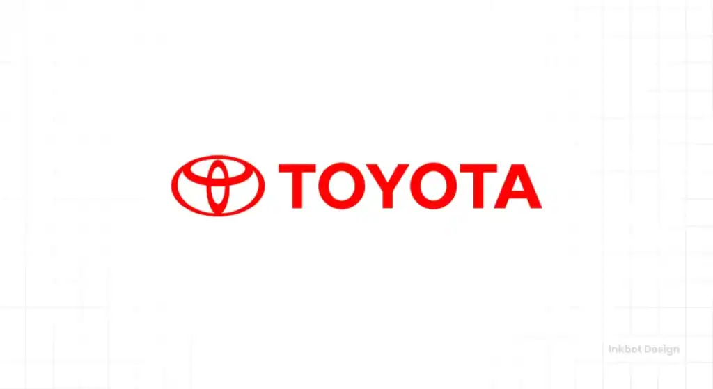
| 1989 | The Three Ovals | Interlocking ellipses forming a “T” and (optionally) the full name. | 50th anniversary. Lexus launch. Need for a global symbol to compete with German luxury brands. |
| 2005-2020 | 3D Metallic Version | The 1989 logo rendered with 3D gradients, bevels, and a metallic sheen. | The “Web 2.0” era. Logos were made to look like physical, shiny car badges. |
| 2020-Present | 2D Flat Version | A return to a simple, flat, 2D version of the 1989 logo. Usually in red or black. | Digital-first branding. Optimised for screens, apps, and modern, clean aesthetics. |
Why the Toyota Logo Works: A Practical Breakdown for Business Owners
This is the most important section. This is the “why.” What can you, a small business owner, learn from this £200bn company's branding?
You can't afford a five-year design process. But you can afford to steal their principles.
Principle 1: Brutal Scalability
This is my favourite thing about the Toyota logo. I've seen it as a 30cm-wide chrome emblem on the grille of a Tundra. I've seen it as a 16×16 pixel favicon in my browser tab.
It works. Perfectly. Every single time.
The design is simple, with bold lines and clear negative space. It doesn't rely on tiny, fussy details. It doesn't have a thin script font that disappears when small. It's a robust, geometric mark.
The Business Lesson: Before you approve your new logo, demand to see it in real-world mockups. How does it look as a tiny app icon? How does it look on a pen? How does it look on a 5-metre-tall trade show banner? If it breaks, it's a failed design.
Principle 2: Timelessness Over Trends
The 1989 logo was designed at the peak of '80s excess. It could have been all neon, chrome, and aggressive angles. Instead, they chose ovals.
Ovals are organic, softer than squares, and more dynamic than static circles. They imply motion, technology, and harmony. They are timeless geometric shapes.
Because the foundation is pure geometry, it has survived the '90s minimalism, the 2000s “web 2.0” gloss, and the 2020s “flat design” revolution. The rendering changes (from flat to metallic and back to flat), but the core mark is untouched.
The Business Lesson: Stop looking at “logo trends of 2026.” Trends are, by definition, temporary. A good logo shouldn't be fashionable; it should be enduring. Build your logo on simple, strong shapes, and it will last you for decades.
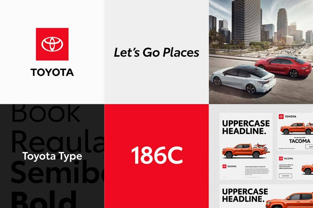
Principle 3: The Power of a “System”
When you think of Toyota, you probably picture the ovals and the wordmark. This is a combination mark. But Toyota's genius is that they've built a system where the pieces can be used independently.
- Symbol (The Ovals): Used on the car grille, the steering wheel, the app icon. This is the “badge.”
- Wordmark (The “TOYOTA” type): Used on the boot lid, in advertising copy, on corporate letterhead. This is the “signature.”
- Combination (Both together): Used on the website header, on dealership signs, in formal presentations. This is the “full lockup.”
This flexibility is a superpower. It allows the brand to be present in any context, at any size, without losing recognition.
The Business Lesson: You are not buying one logo. You are (or should be) investing in a brand identity system. Ask your designer for a primary logo, a secondary logo (e.g., just the symbol or just the wordmark), a brandmark (the symbol), and a clear set of rules on when and how to use them.
If your “logo designer” just emails you a single .jpg file, you've been ripped off. You've bought a picture, not a brand system. If you need a proper system designed, we at Inkbot Design specialise in creating comprehensive brand identities that grow with your business.
Principle 4: Meaningful… But Not Too Meaningful
Let's go back to my pet peeve. Yes, the hidden T-O-Y-O-T-A is clever. The interlocking hearts are a nice story.
But the logo works without you knowing any of that.
It's a distinctive, symmetrical “T” shape. That's it. That's the 0.5-second read. It's an empty vessel that Toyota has spent billions filling with meaning: “reliability,” “quality,” “innovation.”
The logo doesn't shout “we are reliable.” It identifies the company that proves it's reliable with every car it makes.
The Business Lesson: Your logo's first job is identification. Its second job is distinction. That's it. Stop trying to tell your entire company story in one tiny symbol. A simple, memorable mark is infinitely more powerful than a complex, unreadable puzzle.
The Toyota Logo: Design Principles vs. Business Takeaways
Here’s a simple cheat sheet. Read the design principle, then immediately read the business takeaway.
| Design Principle | What It Means (Technically) | The Business Lesson (What You Must Steal) |
| Symmetry | The logo is perfectly symmetrical horizontally. | Symmetry creates feelings of balance, stability, and trust. It looks “correct” and engineered. Crucial for an automotive brand, but valuable for any business wanting to communicate stability (e.g., finance, tech). |
| Scalability | The design's simple lines and clear negative space render consistently at any size. | Your logo must work as a 16x16px favicon and on a 10m billboard. Test it at both extremes before you pay the invoice. This is non-negotiable. |
| Distinctiveness | It doesn't look like the Honda ‘H', the Nissan ‘circle', or the Mazda ‘wings'. | Your logo's #1 job is to not look like your competitor. Avoid industry clichés at all costs (e.g., a green leaf for an eco-brand, a globe for a global company). |
| Flexibility (The System) | It's a “combination mark” (symbol + wordmark) that can be broken apart and used in different contexts. | Demand a full system from your designer: a symbol, a wordmark, and a primary lockup. A single logo file is not a brand identity. |
| Symbolism (Secondary) | The interlocking ovals represent hearts, the world, and the “T”. | The story is fantastic for internal culture and PR, but recognition is what sells. Focus on a strong, simple, recognisable mark first. The story is a bonus. |
The Logo in the Real World: Beyond the Grille
The true test of a brand identity isn't the logo; it's the architecture. How does the brand stretch?
This is where Toyota's strategy is truly masterful.
Case 1: Lexus (The Prestige Play)
In 1989, Toyota knew the “Toyota” brand, and its new ovals, meant “reliable, affordable, mass-market.” You can't sell a £60,000 luxury saloon under that same banner. The brand equity was wrong.
So, they created a new brand: Lexus. It got its own name, its own identity, and its own logo—a stylised, futuristic “L” in a circle. It was designed to compete with Mercedes and BMW, and it was kept separate from the “Toyota” mothership.
The Lesson: One logo can't do everything. Sometimes, to enter a new market or reach a new audience, you need a new brand.
Case 2: Scion (The Failed Youth Play)
In the 2000s, Toyota tried to capture the youth market in North America with the Scion brand. It had its own edgy, angular logo and “weird” cars. It failed and was folded back into Toyota.
The Lesson: This failure proves the strength of the core brand. By creating a separate sub-brand, the failure of Scion didn't damage the reputation of “Toyota.” The brand architecture acted as a firewall.
Case 3: GR (The Endorsed Play)
Today, you see GR (Gazoo Racing), Toyota's performance division. The “GR” logo is modern, aggressive, and racy. But it often sits alongside the Toyota oval. This is an “endorsed brand.” The GR logo says “this is the special, high-performance version,” while the Toyota logo says “it still has all the quality and reliability you expect.”
The Lesson: A strong brand system allows you to create sub-brands and endorsements that add new meaning (like “performance”) without diluting your core message.
If you're a business owner juggling multiple product lines, services, or locations, you're facing a brand architecture problem. A chat with a brand strategist now can save you millions in confusion later. We can help you structure that.
The 2020 Refresh: Why “Flat” is the Future (Again)
For about 15 years, Toyota (like every other car brand) used a 3D, metallic, bevelled version of its logo. It was designed to look like the physical chrome badge on the car.
Then, in 2020, Toyota (Europe) quietly introduced a new, flat, 2D version. A simple, red-on-white or black-on-white mark.
Why the change? The world is digital.
That shiny, 3D, “realistic” logo looks dated, clunky, and frankly, a bit cheap on a website. It's hard to animate. It doesn't work well in an app interface.
The new flat logo is pure, confident, and digital-first. It's a return to the logo's 1989 roots—a pure symbol. It signals a shift from “car manufacturer” to “mobility company.”
The Business Lesson: Your logo must be designed for a screen first. That “cool” 3D effect, that subtle watercolour texture, that photorealistic element? It will probably look terrible on your website and be impossible to use on social media.
Simpler is stronger. Always.
My Final Take: Your Logo Isn't a Picture
The Toyota logo's history is a 90-year lesson in strategic patience.
It started with a name change for better luck.
It survived for 40 years as a simple word.
It was reborn in a five-year process as a timeless symbol.
It was protected by a brand architecture that allowed it to stay focused.
And it was simplified to face a digital future.
Your small business isn't Toyota. You don't have billions in marketing or five years for a redesign. But you can adopt the same mindset.
Stop thinking of your logo as a pretty picture. Start thinking of it as your hardest-working employee.
Is it scalable? Is it timeless? Is it simple? Is it part of a flexible system?
If the answer to any of those is “no,” it's not working. It's a liability, not an asset.
If you're sitting there looking at your current logo and feeling that pit in your stomach—the one that says “this feels dated,” “it looks fuzzy online,” or “it just doesn't feel us anymore”—then it's probably time for a strategic update.
A logo isn't just for day one. It's for year 10. We build brands for year 10.
If you're ready to build a logo system that works as hard as you do, check out the logo design services we offer at Inkbot Design. Or, if you know what you need, get in touch for a direct quote.
Toyota Logo FAQs
What is the meaning of the Toyota logo?
The logo consists of three interlocking ovals. The two inner, perpendicular ovals form a stylised “T” and represent the interlocking hearts of the customer and the company. The large outer oval represents the world embracing Toyota.
When did the current Toyota logo debut?
The three-oval symbol was introduced in October 1989 to celebrate the company's 50th anniversary and to create a strong global symbol.
Why did Toyota change its name from “Toyoda”?
They changed it in 1936 for several reasons: “Toyota” (トヨタ) takes eight brush strokes (a lucky number) in Japanese Katakana, while “Toyoda” took ten. It also sounded clearer and separated the corporate brand from the founder's family name.
Can you find the word “Toyota” hidden in the logo?
Yes. The designers cleverly embedded all the letters of “T-O-Y-O-T-A” within the geometry of the three ovals, though this is a “hidden” feature rather than the logo's primary meaning.
Why did Toyota have a simple wordmark for so long?
From the 1940s to the 1980s, the “TOYOTA” wordmark was used globally. It was simple, highly legible, and built a massive reputation for reliability and quality. It was a badge of function.
How long did it take to design the Toyota ovals?
The design process for the 1989 logo was incredibly thorough, taking five years from brief to final selection.
Why does Lexus have a different logo?
Toyota created Lexus as a separate luxury brand. It needed a different logo (the stylised “L”) to build its own equity around prestige and luxury, as the Toyota brand was associated with reliability and value.
What's the difference between the Toyota logo and the Lexus logo?
The Toyota logo is three ovals forming a “T,” symbolising hearts and the world. The Lexus logo is a simple, stylised “L” within an oval, designed to communicate sleek, futuristic luxury.
Why did Toyota change its logo from 3D metallic to 2D flat?
In 2020 (in Europe), Toyota began using a flat, 2D version of its logo for digital branding. This new “flat design” works better on screens, in apps, and on websites, appearing cleaner, more modern, and more confident than the dated 3D metallic effect.
What is the key to the Toyota logo's success?
Its success lies in its scalability (works at any size), timelessness (simple geometry, not trends), flexibility (it's a system, not one image), and distinction. It's instantly recognisable.
What is the Toyota GR logo?
“GR” stands for Gazoo Racing, Toyota's performance and motorsports division. The “GR” logo is a more aggressive, modern mark used to brand high-performance vehicles, often appearing alongside the main Toyota oval.
What colour is the Toyota logo?
The primary Toyota colour is red, often used for the wordmark or the flat 2D symbol. This connects to passion, energy, and the red sun on the Japanese flag. However, on vehicles, the logo is almost always chrome silver.

